Bandai by PAOS, 1983
Written by Richard Baird Posted 9 November 2023
The following is a guest article from Logo Histories, a weekly Substack newsletter from the team behind BP&O. Each week, Logo Histories shares the context, concepts and considerations behind some of the most interesting logos and corporate identity design programmes of the past. Read about Saul Bass’ work for Warner Communications, Otl Aicher’s brand identity for ZDF and Walter Ballmaer’s logo for Olivetti. Discover these and a 100+ more here.
By the 1980s Bandai Co., Ltd–a Japanese multinational toy and games manufacturer and distributor founded in 1950–had grown to become an industry leader, operating eight groups covering a variety of different product categories. In 1982 these groups were merged into one.
The restructuring was instrumental in getting Bandai listed on the Tokyo Stock Exchange and expressed its readiness and ambition to move beyond an area of business that was described as a ‘cottage industry running on inspiration’.
Recognising that the entertainment industry would expand far beyond toys and games (Bandai would later be responsible for launching the electronic pet craze with Tamagotchi) Bandai sought out a new corporate identity. This would outwardly convey the restructuring and renewed ambition of the company and prepare it for further expansion whilst also maintaining the ‘vitality inherent to a medium-sized business. In charge of this would be PAOS, fresh off working on iconic Japanese brands such as ASICS and Kenwood.
In March 1983, Bandai would begin a new era of diversification, adding film production, publishing and fashion to its core interests alongside toys and games. The concept ‘Bandai: Creation of Dreams’ provided the strategic positioning necessary to merge the various groups and interests, and would launch with a new logo.
PAOS, known for their outsourcing of key specialists for each project, hired three designers to ‘compete’ to create the logo for the newly merged corporation. The winning design would be selected based on its ability to satisfy two key conditions; that it be able to remain appropriate as the company continued to diversify and, ‘in some way’, reflect the nature of the business. Designers, one of which included Shin Matsunaga, explored various typographical directions, and largely focused on developing an iconic ‘B’ as a shorthand symbolmark.
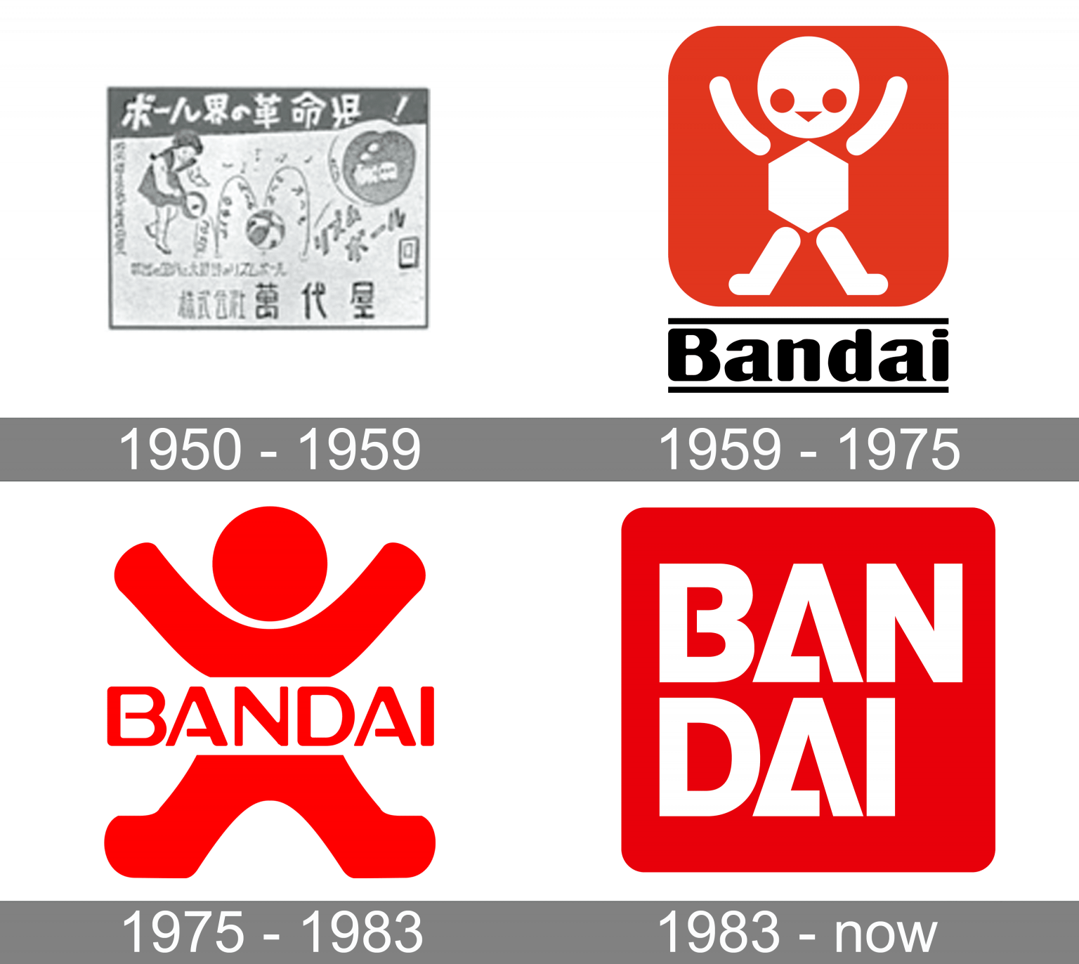
Shin Matsunaga’s winning design, a two line wordmark set within a bright red box with curved corners, was said to possess both ‘neutrality’ and ‘interest’. And specifically, that the typeface selected had no strong idiosyncrasies except the bar of the A. Further, the breaking of ‘Bandai’ on to two lines improved readability and overall attractiveness. The red round-cornered, square ‘cartouche’ that enclosed the wordmark–which had been used in a previous iteration of the Bandai logo between 1959-1975–was favoured for its ability to project a sense of ‘relaxation’ whilst providing a focus for the eye.
The ‘originality’ reflected in the two-tiered structure of the wordmark and the design’s overall ability to express a new diversified Bandai (away from the specific image of the previous logo) were also key factors in the eventual selection of Matsunaga’s concept.
Once the design was selected, PAOS perfected the design and developed the design system. This included the addition of a black outlined version which intended to broaden the appeal of the symbol ‘as a representative of the entertainment industry’ and deliver strong visual impact. Further, sequential designs, created using dots that would disperse, and multi-colour version expanded on the symbolic potential of the logo particularly on screen and in motion.
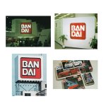
The solid colour design worked well applied to envelopes, business cards, as well as large format signage and stood out on packaging that often featured colourful product photography or artwork.
As the brand continued to grow and diversify, a blue version of the Bandai logo was added to mark products that came under the new ‘Bandai Spirits’ range which were designed for the adult market such as construction kits. The rest continued to be distributed under the red logo, which came to be ‘symbolic of Bandai’s originality’ and continue to be used today.
Logo Histories is a weekly Substack newsletter. To instantly access an archive of over 100 Logo Histories, just like this one, and receive weekly stories straight to your inbox, subscribe here.