Philharmonie Luxembourg by NB Studio
Opinion by Anna Marar Posted 14 November 2023
It is fair to say that rebrands of music organisations, of which there have been a number in the past few years, have benefitted from the recent explosion of graphic design into the world of sound and motion. Music has always inspired other forms of art, but these new digital tools are uniquely suited for producing design solutions for these kinds of organisations. Accordingly, NB Studio’s decision to create a ‘rhythmic identity which responds to live music’ for Philharmonie Luxembourg, a world-renowned concert hall, while sharp, successful and considered, is also unarguably part of a larger trend. Collins’ work on San Francisco Symphony comes to mind, as well as Studio Dunbar’s collaboration with Amsterdam Sinfonietta and NN North Sea Jazz Festival, Superunion’s reimagining of the London Symphony Orchestra, and Orchestra Sinfonica di Milano by Landor and Fitch. All these identities ‘change form in reaction to sound and music’ to some degree, but the execution in NB Studio’s case is distinctly focused and precise.

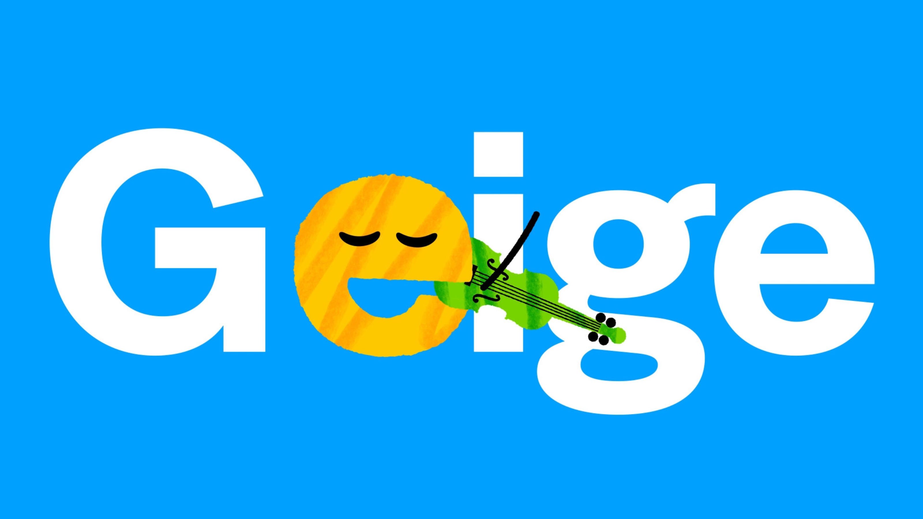
NB Studio developed a generative motion tool with creative coder Patrik Hübner (using JavaScript, WebGL and Vue.js) that allows the Philharmonie’s logo to respond dynamically ‘to the rhythm of any piece of music’. The shape of the logo is inspired by the columns of the iconic Luxembourg Philharmonie building itself, which was designed by Christian Portzamparc and completed in 2005. The columns of the logo inspire a system of lines that dictate the way type and image are refracted throughout the identity. There are lovely details within this system — like the fact that only the letters ‘A’ to ‘G’ (the ones associated with musical notes) appear to ‘vibrate’ and refract on the page. Overall, there is an impressive symbiosis between the visuals, the building, and the movement and sound of the design.
![]()

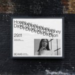
Most orchestras currently share the goal — and challenge —of appealing to a younger and more modern audience. With this in mind, NB chooses a colour palette which is saturated and energetic, and makes familiar images of classical performers feel updated and fresh. Even in print, the designs seem to be moving and filled with life, with layers of text, colour and image, and that distinctive logo all conveying a sense of passion and musicality. The typeface, Basel Grotesk, is a modern choice with a hint of Swiss style nostalgia — fitting, as reflexively, nostalgia itself is a contemporary trend. There is a poster campaign featuring some excellent copywriting taking stereotypical assumptions about classical music and flipping them, for example ‘boring… is a night in on the sofa / shake up your calendar at the Philharmonie’.

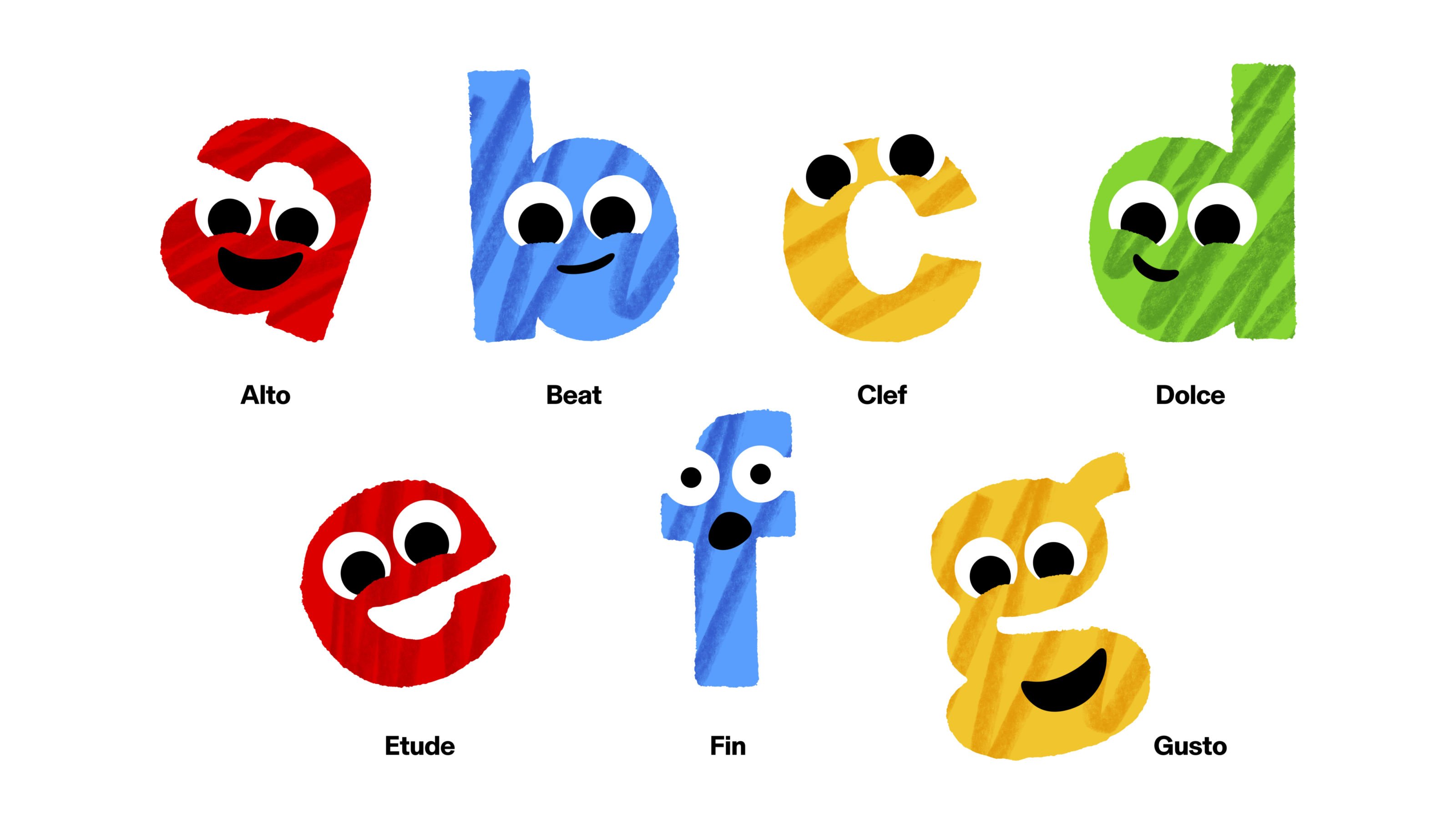
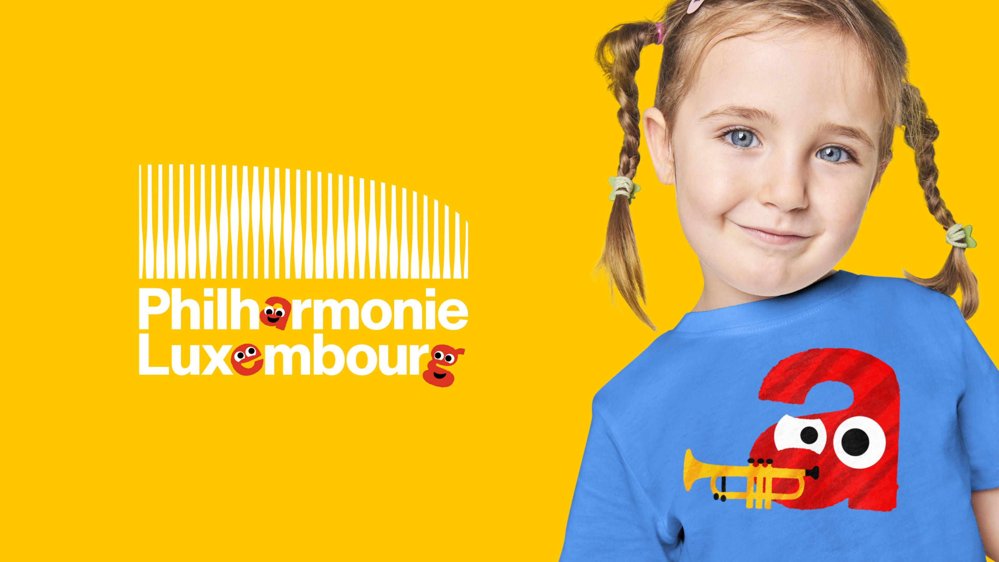
NB Studio looks even further into the future by creating a separate section of the identity specifically aimed at children. The branding of cultural institutions like museums and galleries often has to negotiate appealing to both adults and children. Frequently the choice is a compromise between the two — Pentagram’s redesign of the National History Museum is a recent example. NB Studio chooses both — a collaboration with Rabbit Hole animation studio has produced the ‘Kid’s Phil’ section of the branding. Instead of refracted letters, there are colourful characters (Alto, Beat, Clef, Dolce, Etude, Fin and Gusto) interwoven with the principal logo. It is perhaps surprising that a classical musical concert hall would have a dedicated focus on their younger audience, but the emphasis makes sense as the offering for kids ‘makes up roughly 40% of the yearly program’. The aim is to move away from a traditional restricted classical music audience, and appeal to a wide variety of people.

Using the building’s iconic architecture as inspiration serves this mission — as Sam Pittman, design director at NB Studio points out that ‘people within Luxembourg and beyond knew the building, but so many had no idea what actually went on inside.’ The building therefore seems like the perfect visual cue to develop awareness of the Philharmonie. At the same time, it might seem counterintuitive for an identity with movement at its core to be inspired by a static object. But the refracting lines throughout the design system in fact remind me of the effect of walking past a set of columns, mirroring the way those lines seem to collapse in on themselves. A panning shot of the outside of the building, depicting this refracting effect, appears in a brand video produced by NB. The identity in general aims to ‘soften the boundaries between the physical and digital experience’: with these movements of lines throughout the visual system, it feels like you’re walking towards a concert that is about to begin.