Casa Malka by Nihilo
Opinion by Emily Gosling Posted 23 November 2023
Branding agency Nihilo is more adept than most at shattering stereotypes – both in the work they make, and in terms of who the agency is, and what it’s all about. Founded by designer Emunah Winer and writer Margaret Kerr-Jarrett in Israel in 2021 and now based in Columbus, Ohio, the agency takes its name from the Latin term ‘creatio ex nihilo’ – meaning to create something from nothing.
Neither Winer nor Kerr-Jarrett went to design school or climbed up the ranks at a big-name agency before founding Nihilo; and it’s perhaps their unusual route into design that’s made their work so original and engaging. The first project they worked on together was interactive design and poetry platform Two Jewish Women, which aims to educate people about Orthodox Jewish women like Winer and Kerr-Jarrett, and challenging preconceptions about them.
This idea of going in with fresh eyes – subverting expectations and approaching familiar categories anew – permeates throughout Nihilo’s portfolio. While the agency’s client list includes the likes of Victoria’s Secret, Dice, Design Studio, Orthodox Union, and Bath & Body Works, today the agency mostly works with first-to-market and founder-led companies. One such company is tequila brand Casa Malka, which officially launches in 2024, for which Nihilo created this striking, seductive visual identity and brand world which totally shatters the mould when it comes to what we normally see in the category.
When Casa Malka approached Nihilo, it had little more than its name, which translates as ‘House of the Queen’ (Casa is Spanish for house, and Malka means ‘queen’ in Hebrew). The agency worked across the strategy, visual and verbal brand identity, packaging design, and a series of 3D rendered images created in collaboration with CG artist Haruko Hayakawa.
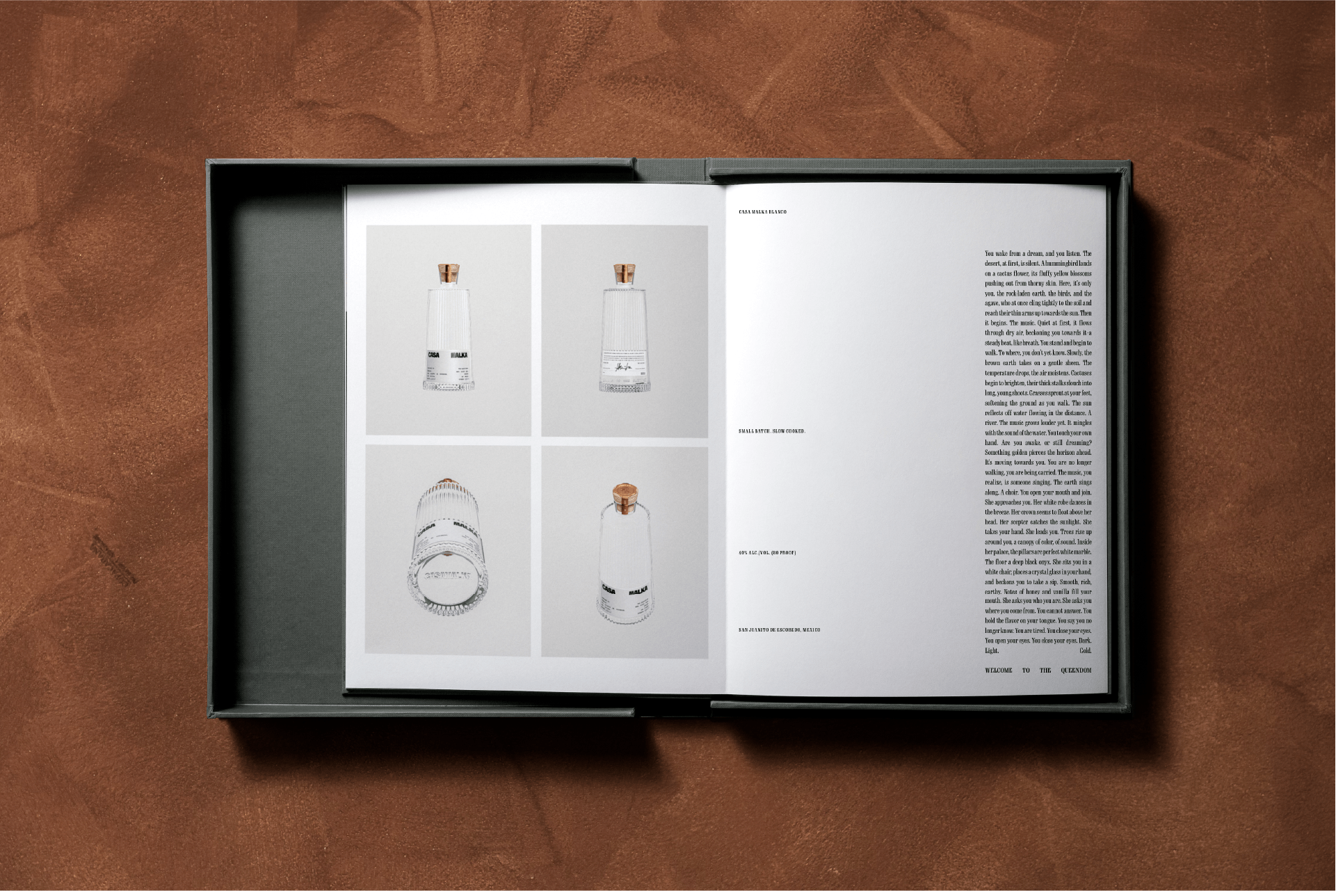
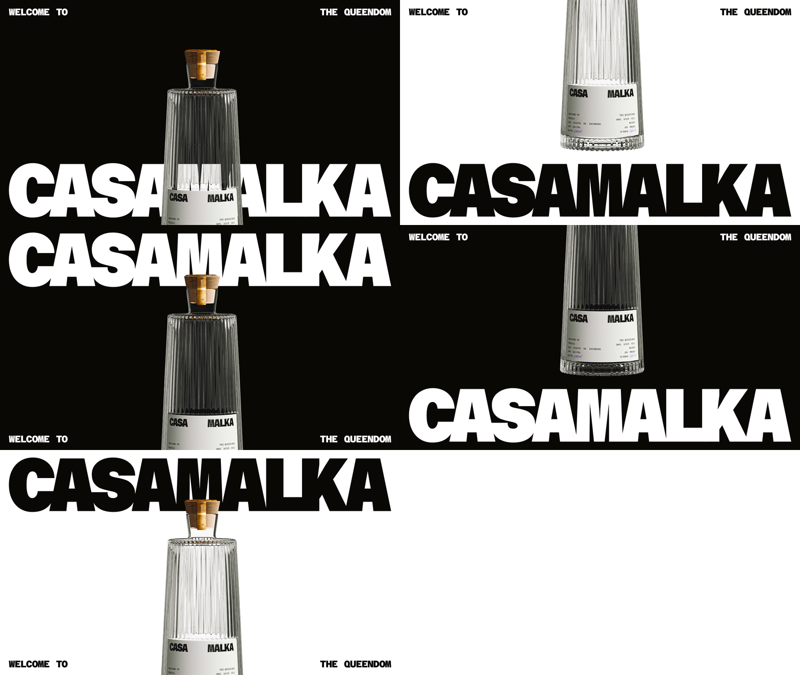
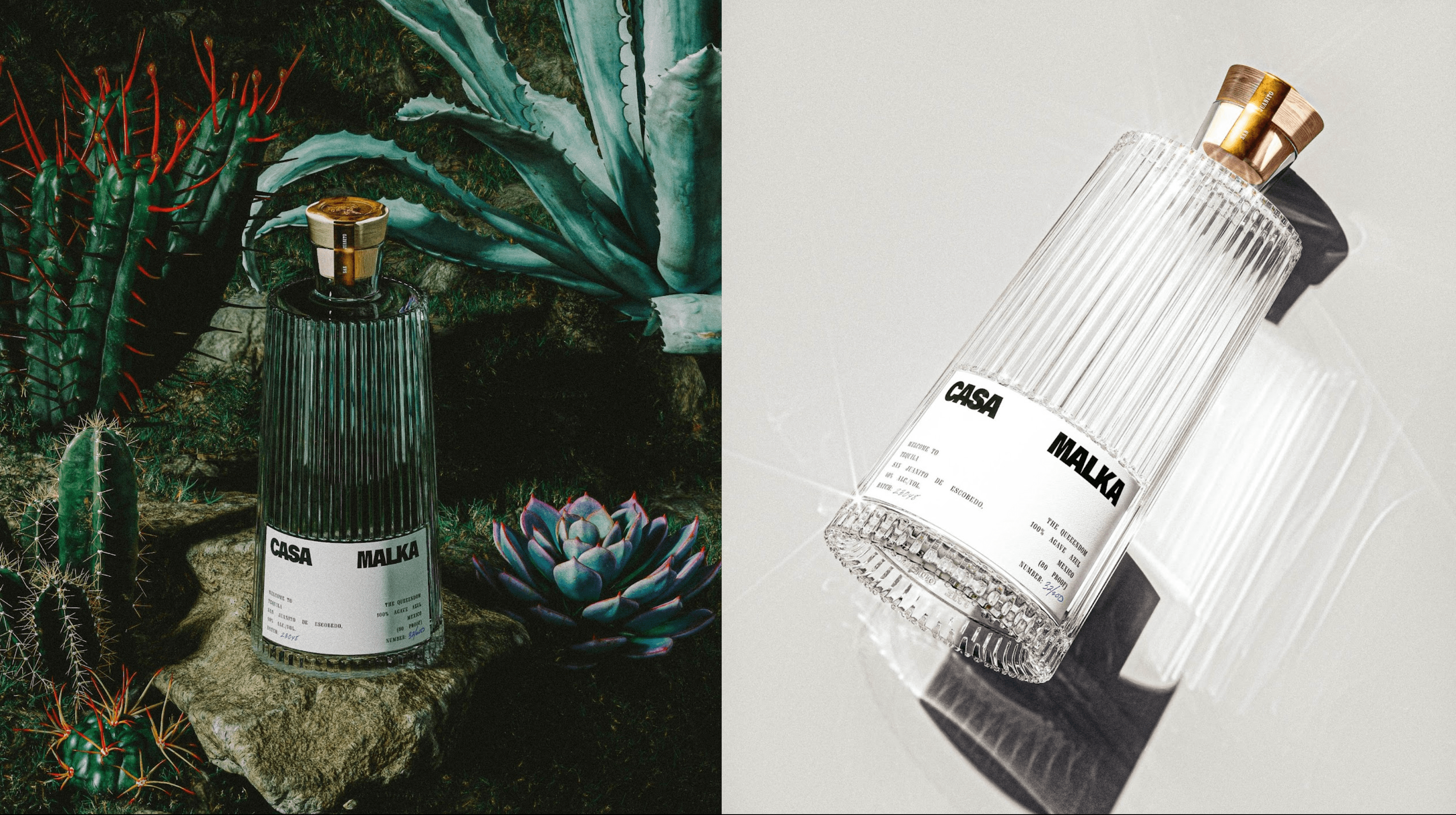
Unusually, it also worked on the structural packaging side of things, too, taking responsibility for the bottle design and fabrication – a standout piece of design that feels like the fulcrum for each and every other brand element and touchpoint. The bottle itself is truly beautiful – tapering from the base upwards in a simple, elegant line; with a raised ribbed texture and topped off with a sleek cork and deliciously gloopy gold wax seal. It’s thoroughly, thoroughly classy. Nihilo has said that the designs were deliberately kept minimal in terms of how many materials and colours were used in the bottle itself; looking to underscore the idea of clarity and contrast.
Nihilo says that ‘like the product itself’, many elements of the brand identity are ‘comprised of a mix of soft and hard, feminine and masculine’. To me, however, the whole thing feels entirely gender neutral – neither category sprang to mind at all on first seeing the images.
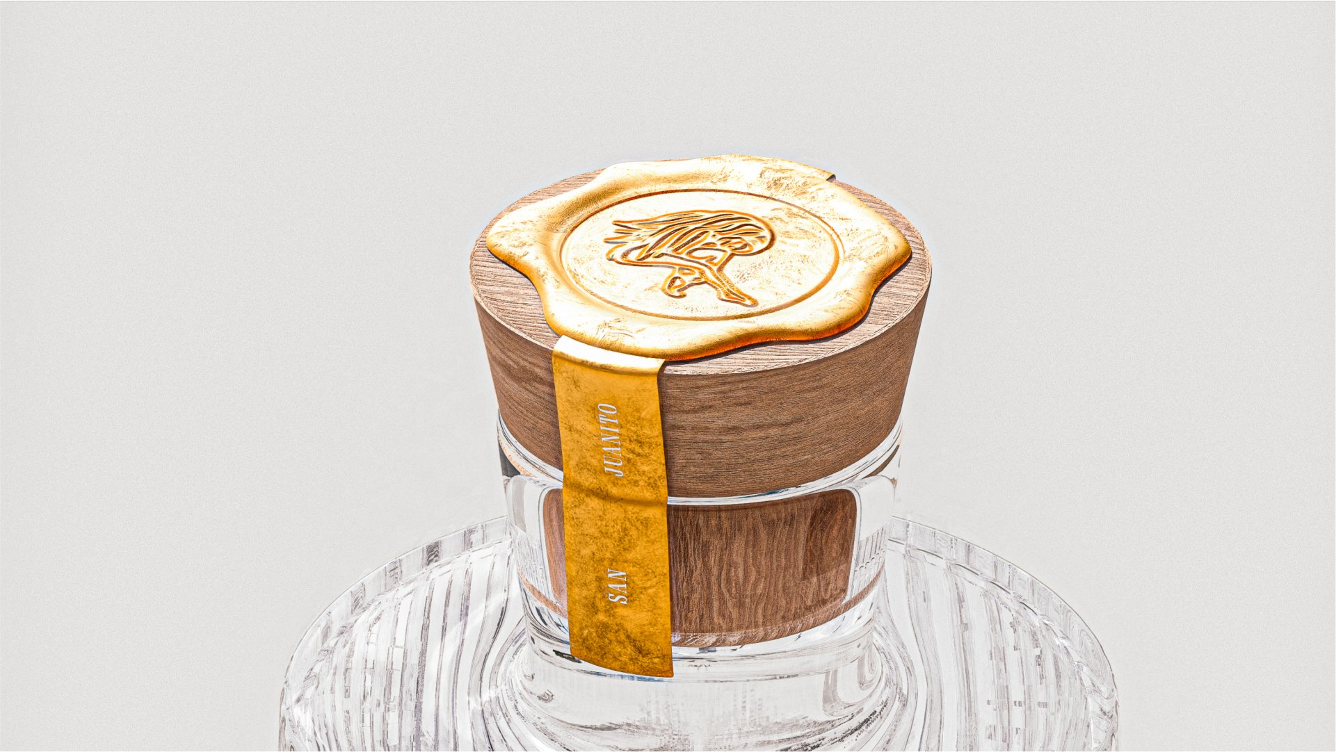
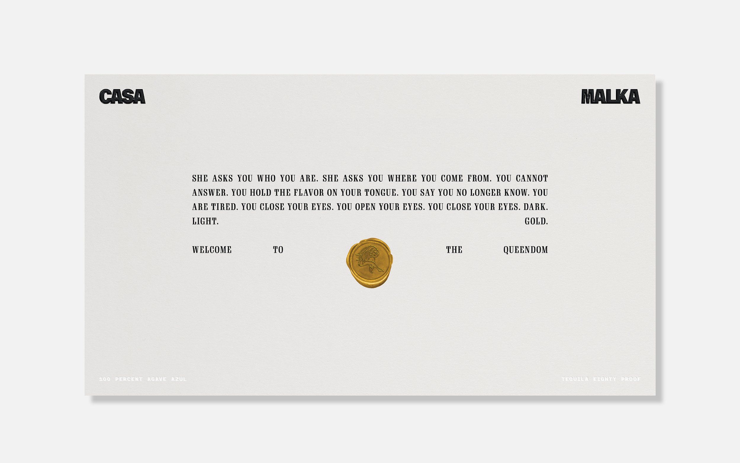
The simplicity keeps things neatly non-gendered, in my opinion: even the ‘queen’ herself, depicted in simple, textural black brushstrokes against a white background, strikes a pose that makes her body feel almost abstracted; and the monochrome palette eschews any of the cliched tropes of ‘femininity’. The queen character’s illustration was created in-house by Nihilo, and is primarily used on the gold wax seal on the bottle cap and on branded print collateral.
The softer elements, like that illustration, never become too gentle since they’re contrasted with the confident, assertive and bold main brand font, Azeret Mono, by Prague-based foundry Displaay. This Brutalist style font is used across both the wordmark and title copy; while Gimlet Display Compressed is used for body and supporting copy. Gimlet is described by its designer David Johnathan Ross as a ‘friendly quirkhorse’, which seems very apt indeed. The typographer continues, ‘I have gone out of my way to make sure that Gimlet’s charm doesn’t detract from its usefulness as an all-purpose serif’. It’s a statement that feels neatly reflective of Nihilo’s aims with the Casa Malka branding more holistically: ‘Visually, the brand succeeds through restraint – paired back but exuberant at the same time.’
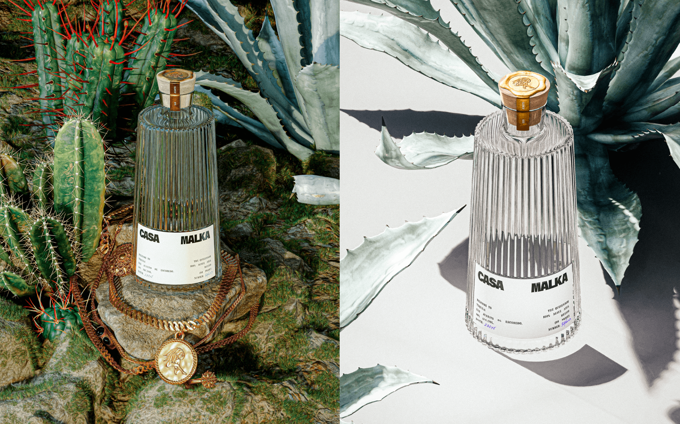
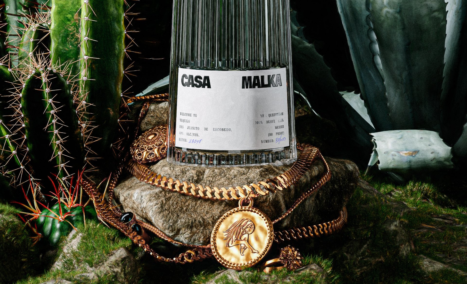
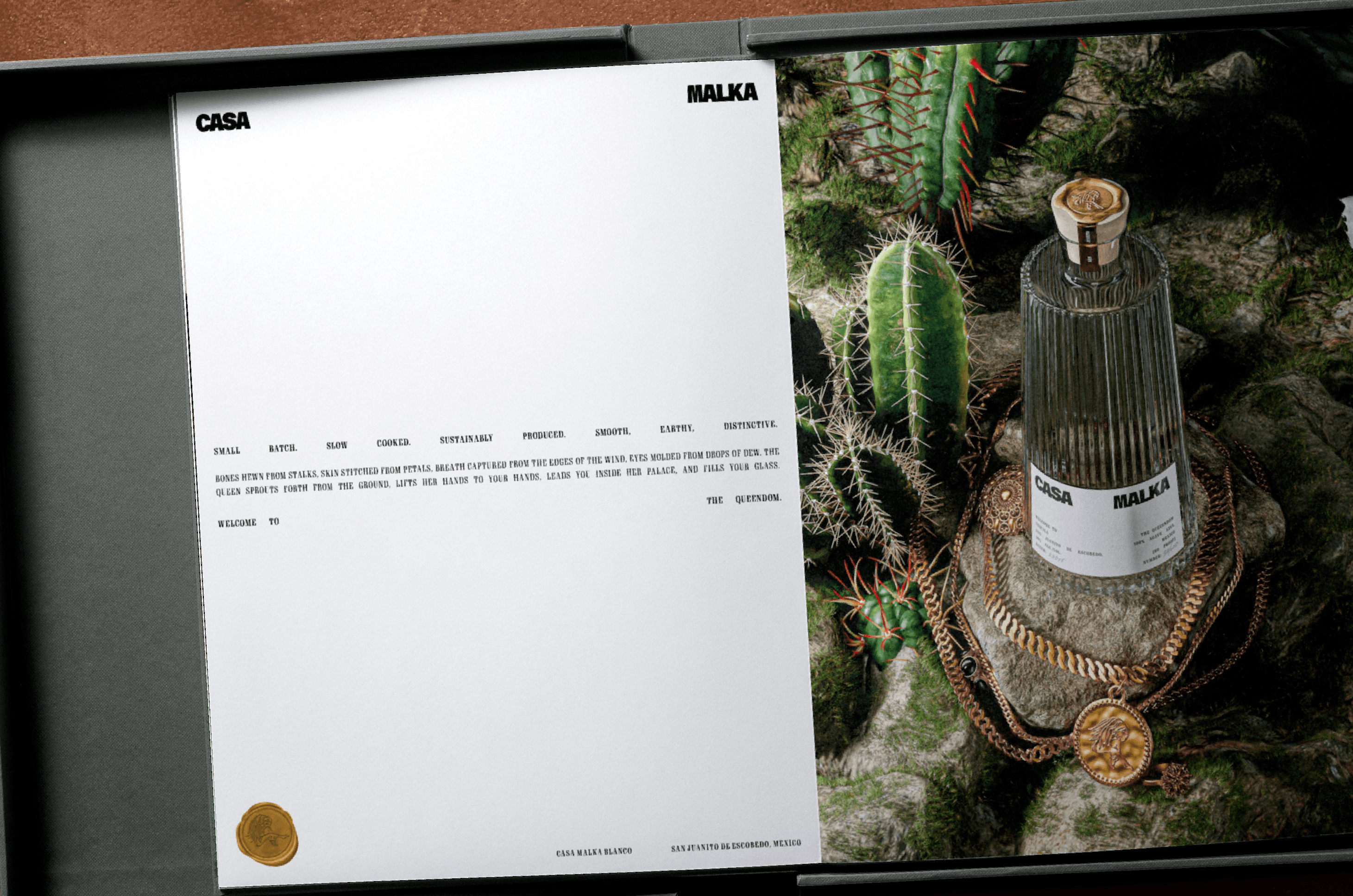
While the bottles themselves do a huge amount of heavy lifting when it comes to conveying Casa Malka’s brand story, things really come to life in the supporting imagery created with Hayakawa. Where the bottle design is stylish, yet functional – as underscored by the typewriterish roots of Gimlet – the visual landscapes of Casa Malka’s art direction is altogether more fanciful and exotic. It’s all rich, lush greenery; moody chiaroscuro; glimmering gold chains; and a delicate, organic sort of opulence.
Nihilo describes these images as ‘dream-like worlds,’ and says that the process of creating them played a significant role in ‘determining the brand DNA’. Decisions around the lighting, types of plants, textures and compositions went on to indicate how the Casa Malka brand would behave across different applications. And because Nihilo created this brand while the tequila was still in pre-production, these images served as the primary vehicle for marketing efforts as well.
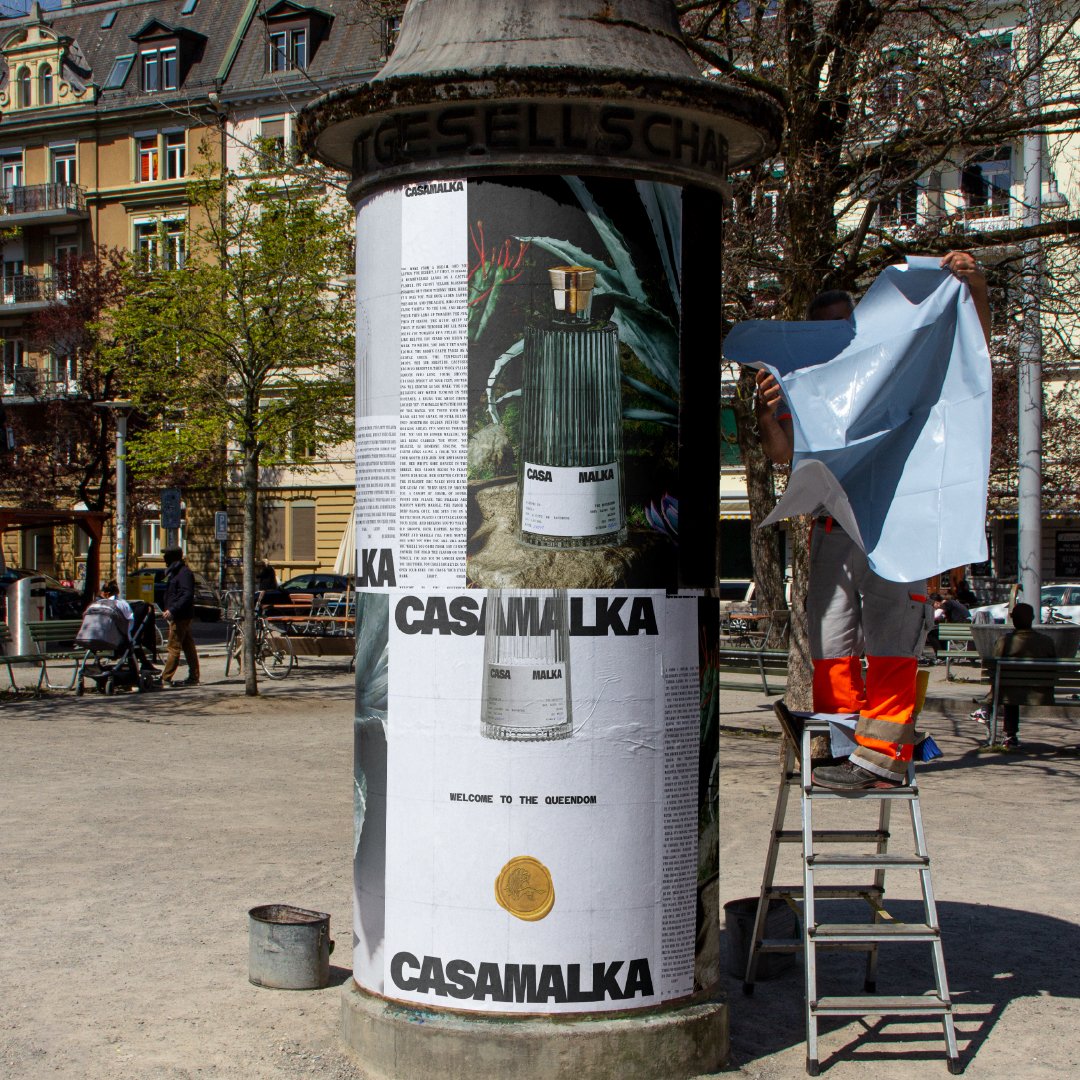
As such, the supporting brand assets now directly mirror the look, feel, and overall emotional tone reflected in the physical bottle and in the beverage itself. The tone of voice in brand copy is as lush as the greenery of the forests, looking to evoke ‘an extremely sensual and inviting atmosphere that feels at once intimate and accessible’.
While Nihilo has said that these images are the primary way of telling Casa Malka’s brand story, we’d argue that this sells the packaging design itself, and other branded elements like the superb website design, short. The site’s bold use of longform copy and responsive elements, alongside playful twists like the spinning gold Casa Malka seal at the bottom of the page, are superb.
Overall, the branding feels like a masterclass in craft and restraint, and demonstrates just how powerful design can be when an agency is able to take a totally holistic overview of a project – from structural packaging and fabrication to illustration and art direction.
