Erbert by AUGE
Opinion by Thomas Barnett Posted 28 November 2023
Few countries on Earth take their food as seriously as Italy. It’s not difficult to justify the enormous pride Italians take in their spectacular culinary heritage, with their cuisine considered the ‘most exported’ on the planet. But while the wider world is undeniably in thrall, Italians’ patriotic palettes create and necessitate a notoriously conservative domestic cooking culture. Italian ingredients, recipes and traditions are lionised above all others, and are fiercely protected from compromises in the name of such tawdry things as convenience.
This is a tricky (albeit delicious) landscape in which to successfully establish a small burgeoning food chain dedicated to creating nutritionally-balanced, individually-portioned pre-prepared lunches aimed at time-scarce white-collar workers. This deceptively mundane mission statement involves sailing against prevailing winds on not just one but three fronts: prioritising healthiness as much as deliciousness; overcoming Italians’ natural distrust of pre-prepared food; and daring to be a chain in a country that is also territorially proud of its independent eateries. This is the daring mantle taken up by plucky up-start start-up Erbert. Founded in 2020, Erbert is a small chain of five shops scattered throughout the city of Milan. Erbert started life as a health-focused supermarket, but it has repositioned as a fast food restaurant serving healthy, ready-to-eat meals.
Its choice of location is strategically wise: the North of Italy significantly leads the rest of the peninsula when it comes to demand for ready-prepared food. This tallies with broad generalisations about the North of the country being more urbane, cosmopolitan and homogeneously European than the more traditional South. And yet, according to a survey of office workers and students, still only 42% said that consuming a ready-prepared lunch was a ‘daily habit’.
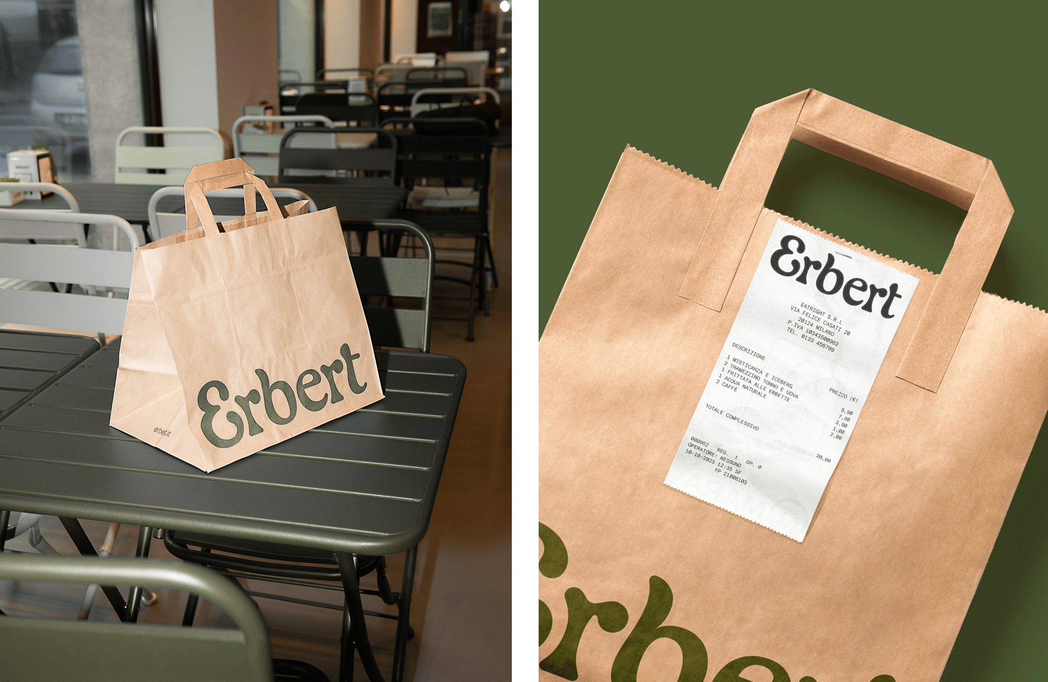
In the localised context of Milan then, Erbert is, if not a complete anomaly, at least something of a departure from the familiar topography of the wider culinary landscape. In a city like London (which is almost entirely fueled by harried midday Pret, Leon and M&S meal-deals), it seems hard to believe, but Erbert represents a relatively uncommon proposition – not least because it straddles the worlds of catering to both individual customers and supplying offices with lunchtime catering in bulk. The branding of this radical offering then needed to rise to the uniqueness of the occasion. Florentine agency AUGE were selected to tackle that tricky brief.
AUGE has devised a fresh and charismatic identity that will help to steer Erbert through the transformation from straightforward supermarket to hybridised foodie destination, keeping just enough signifiers of the former identity to ground it in recognisable reality, while moving the brand into stylishly ambiguous terrain in a way that evokes genuine curiosity.
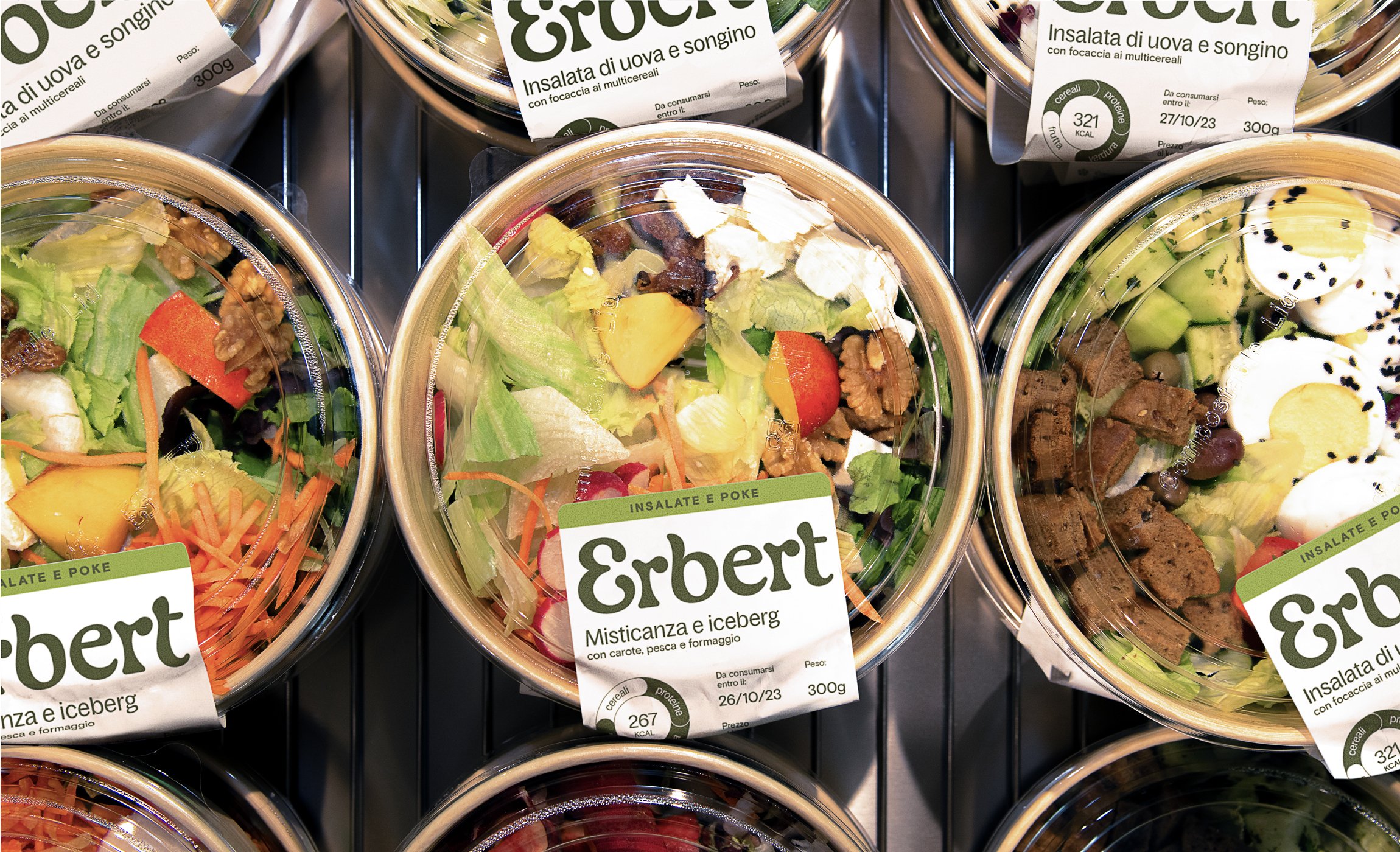
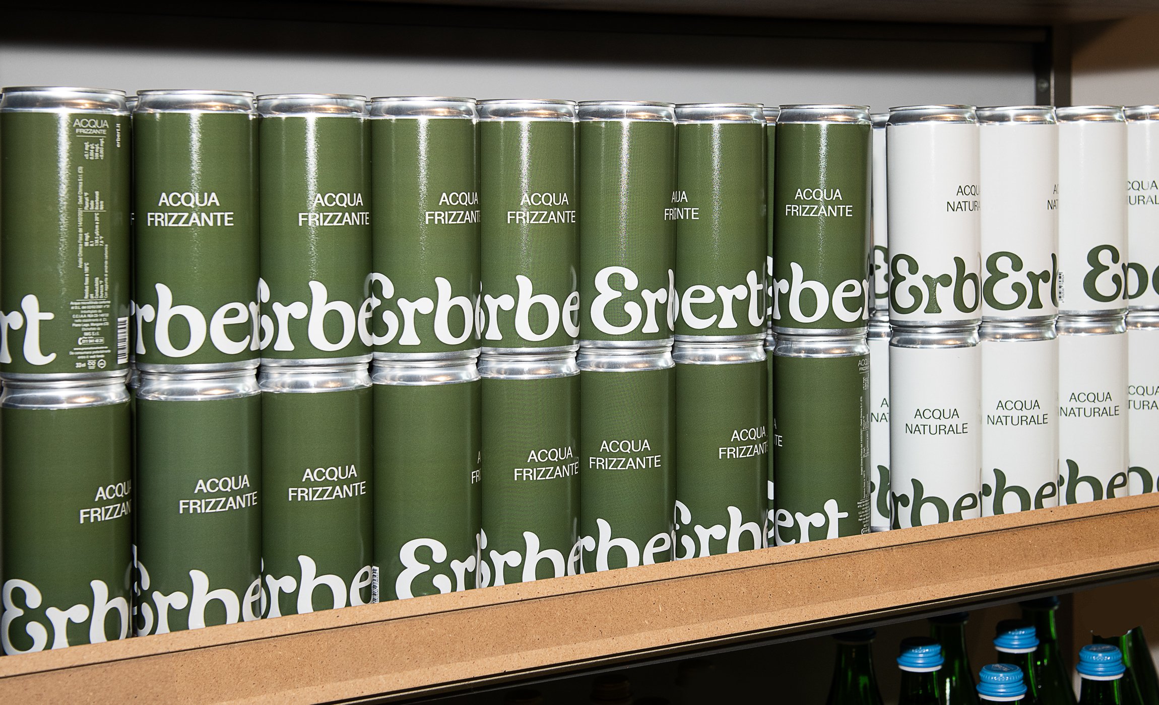
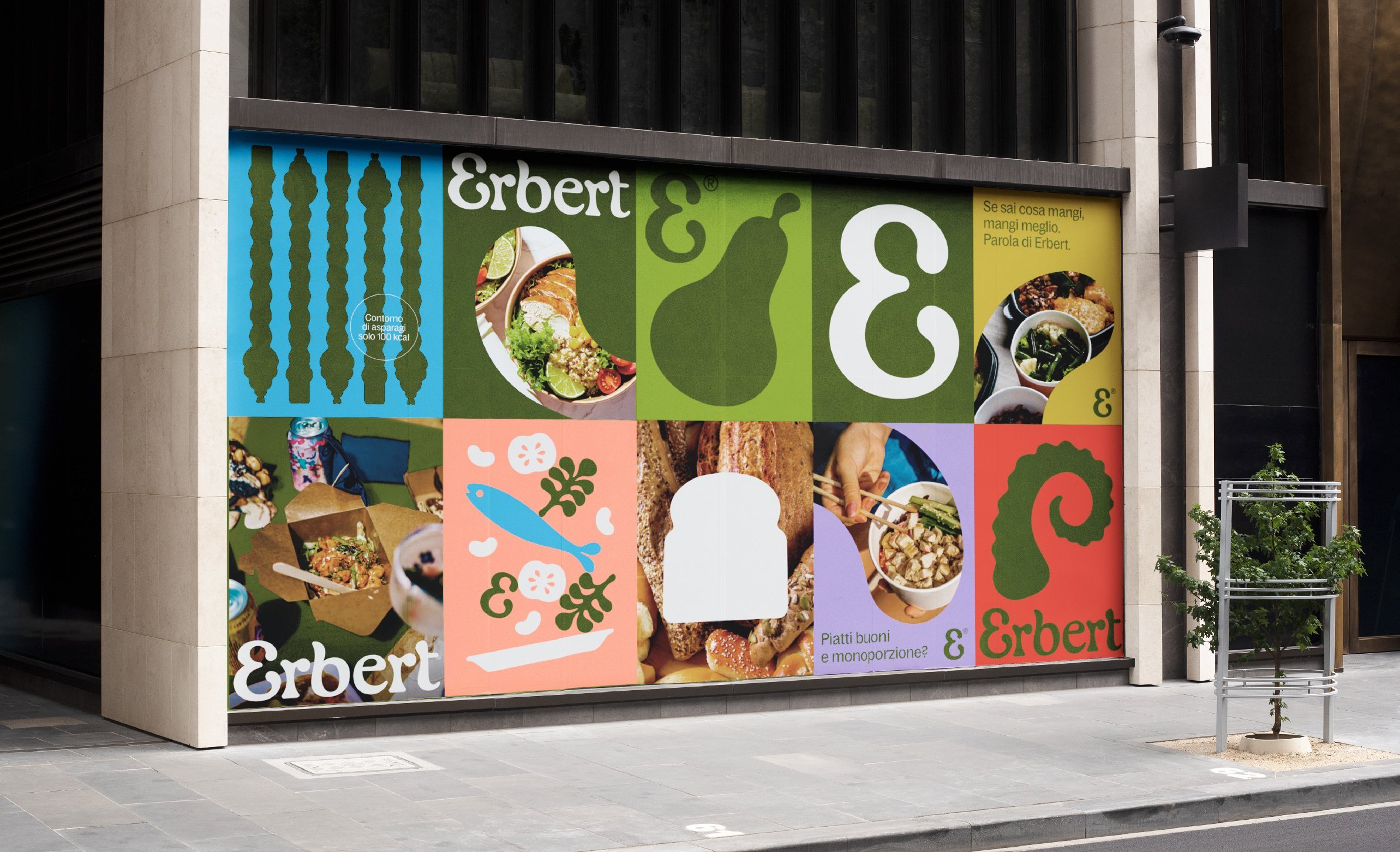
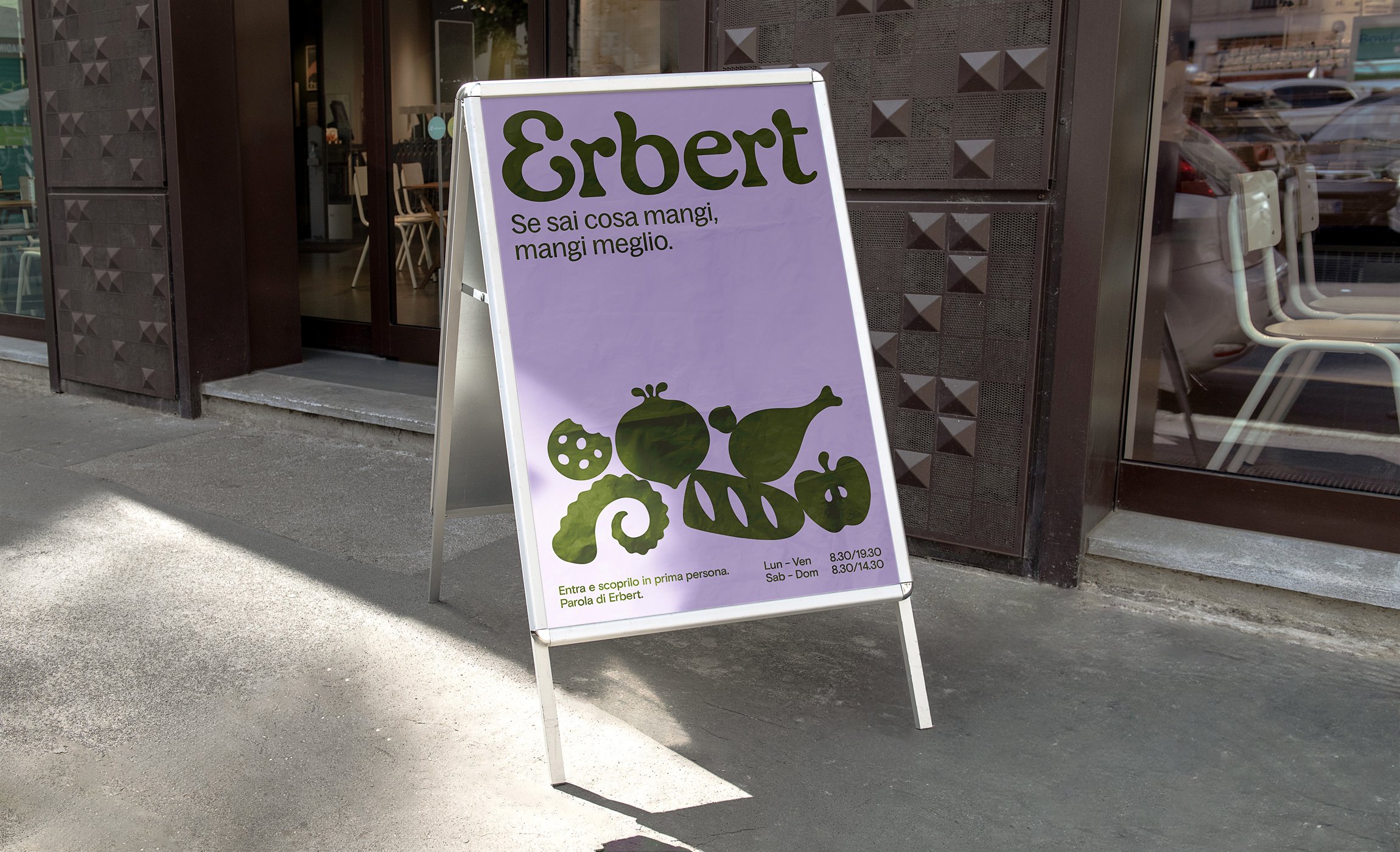
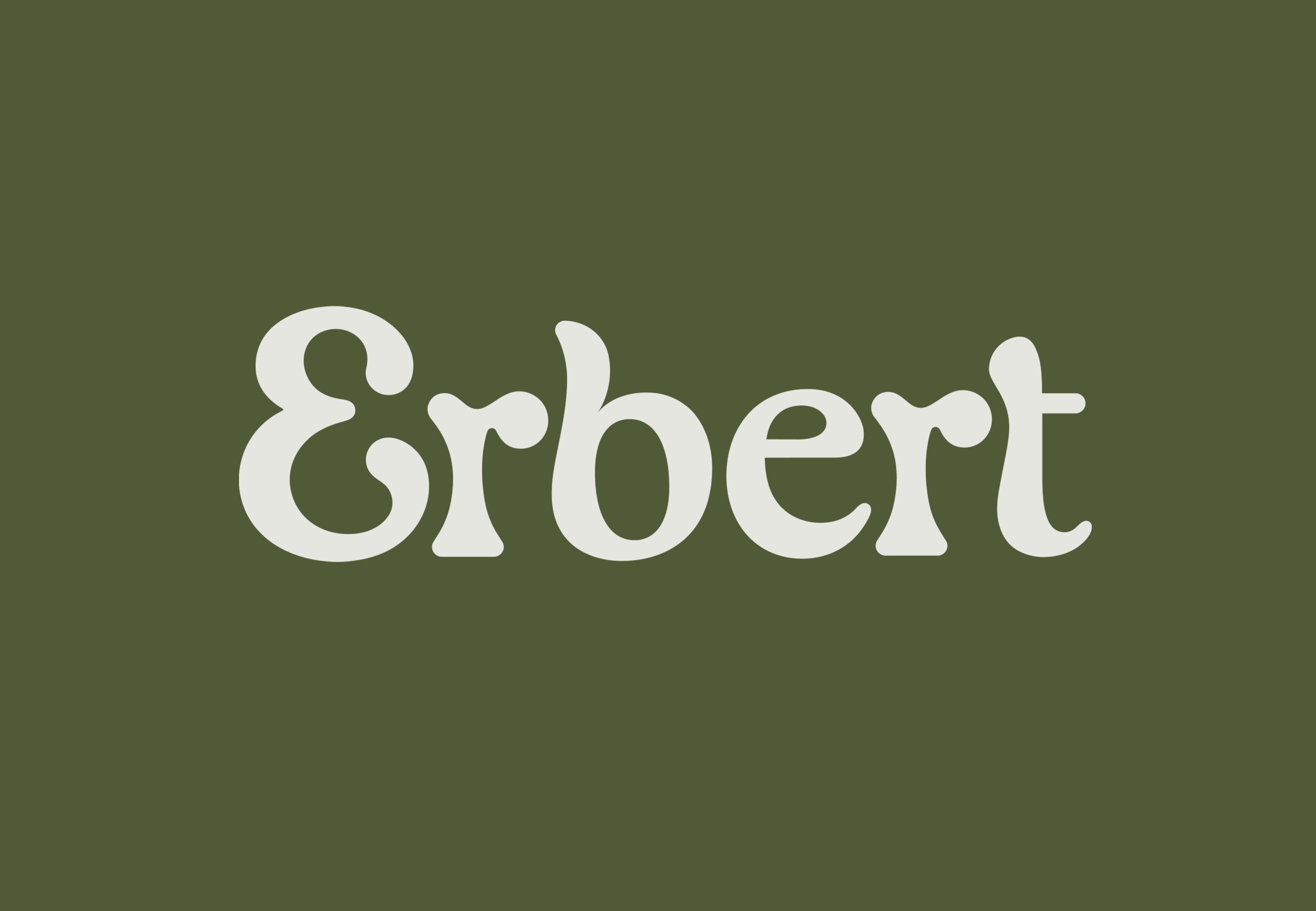
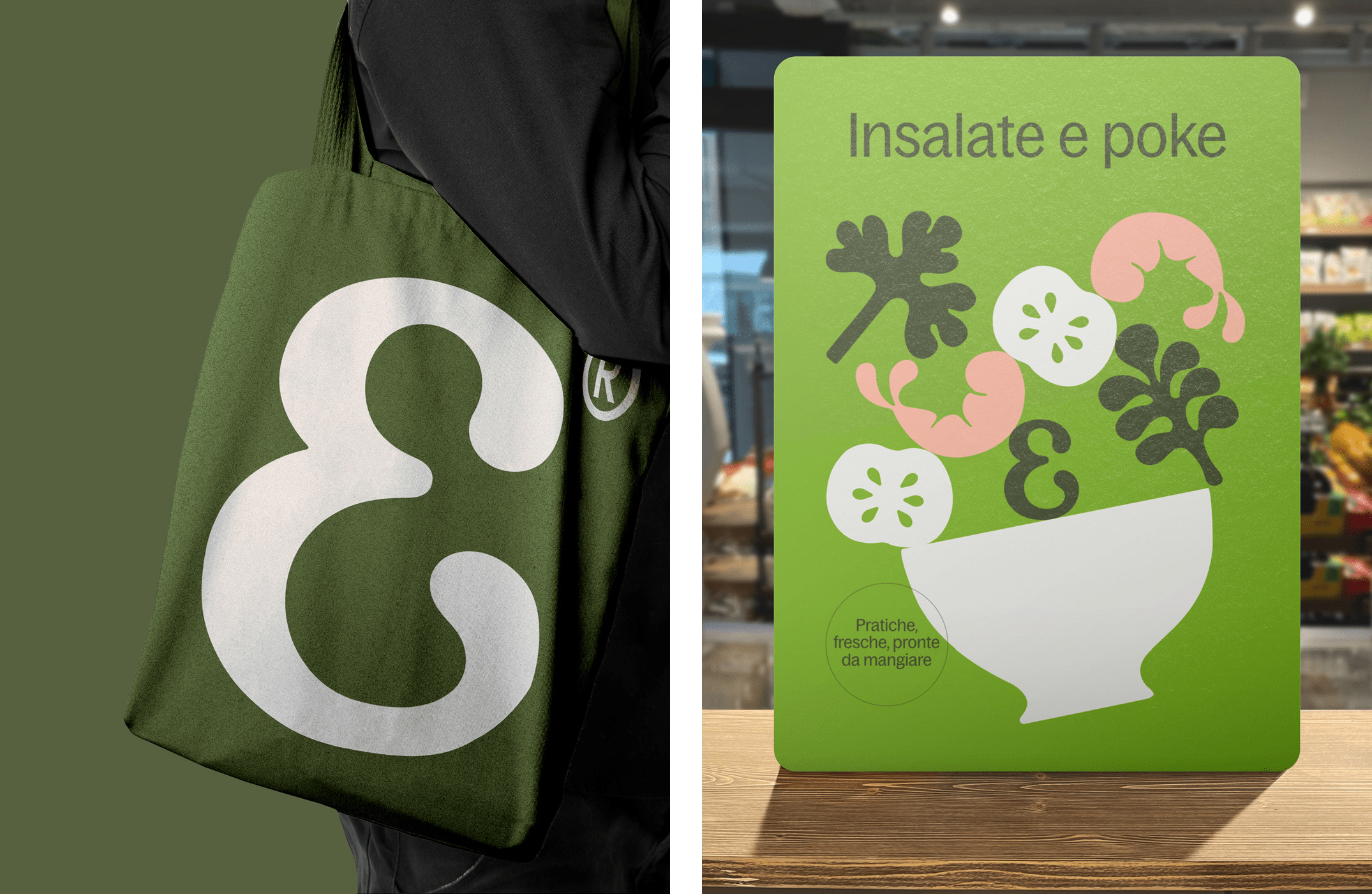
Central to this carefully poised ambiguity is a truly excellent logotype. The characterful rounded-serifs are bang on trend, while simultaneously making a subtle gesture to classically ornate Art Nouveau signwriting – imagine it picked out in gold leaf on a painted wooden shop-front, while top-hatted dandies strut past. Yet this nod to belle-epoque European design is not overwhelming, as the custom logotype is also freshly reminiscent of the soft, frilly undulations of curly cavolo-nero leaves. There is just enough organic juiciness to the form, while avoiding overtly food-like gimmicks. When used alone as an initial, the rounded E is also pleasantly reminiscent of plump curled prawns. With a few judicious typographic choices, a whole menu of delicious morsels are ingeniously, tantalisingly conjured.
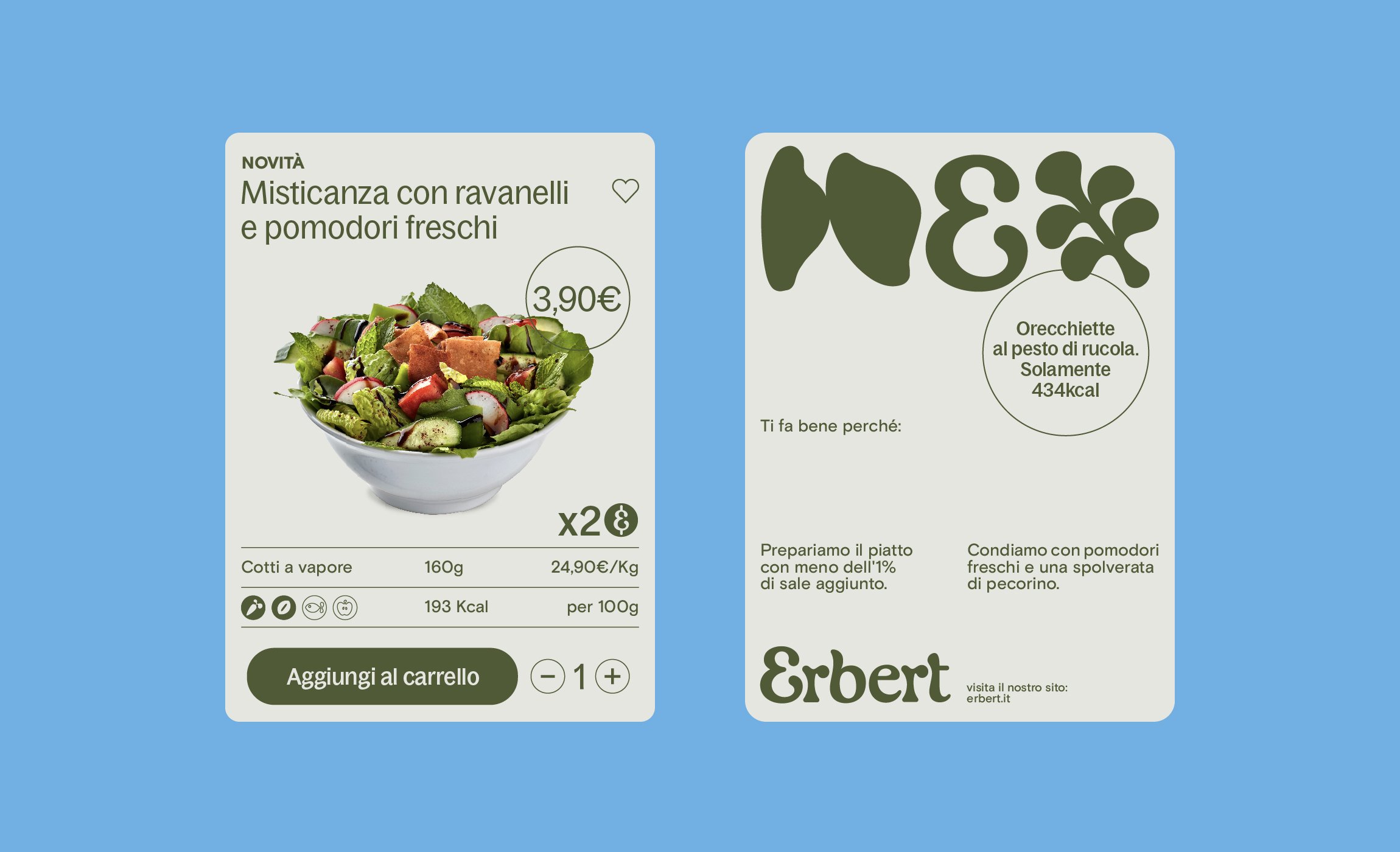
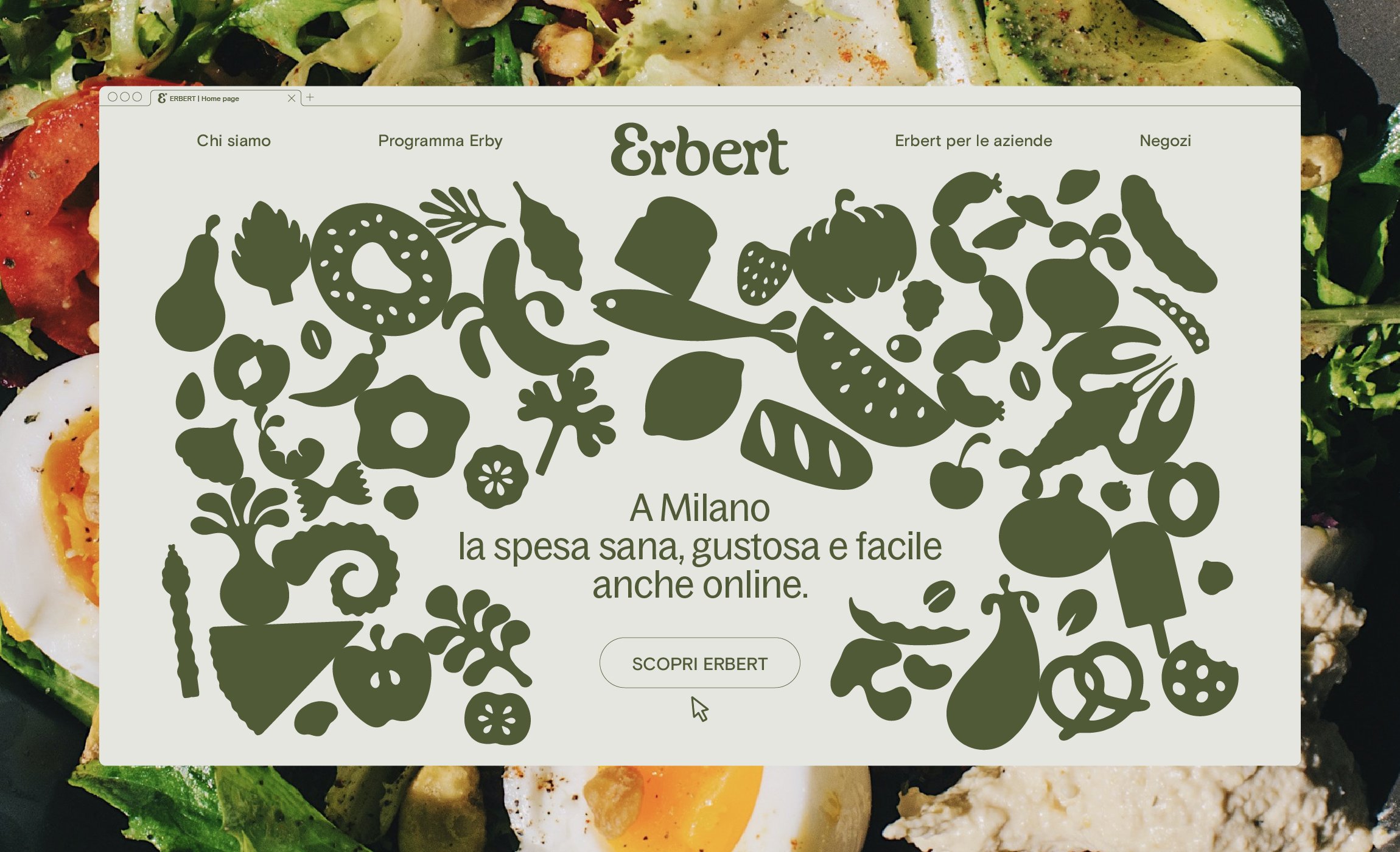
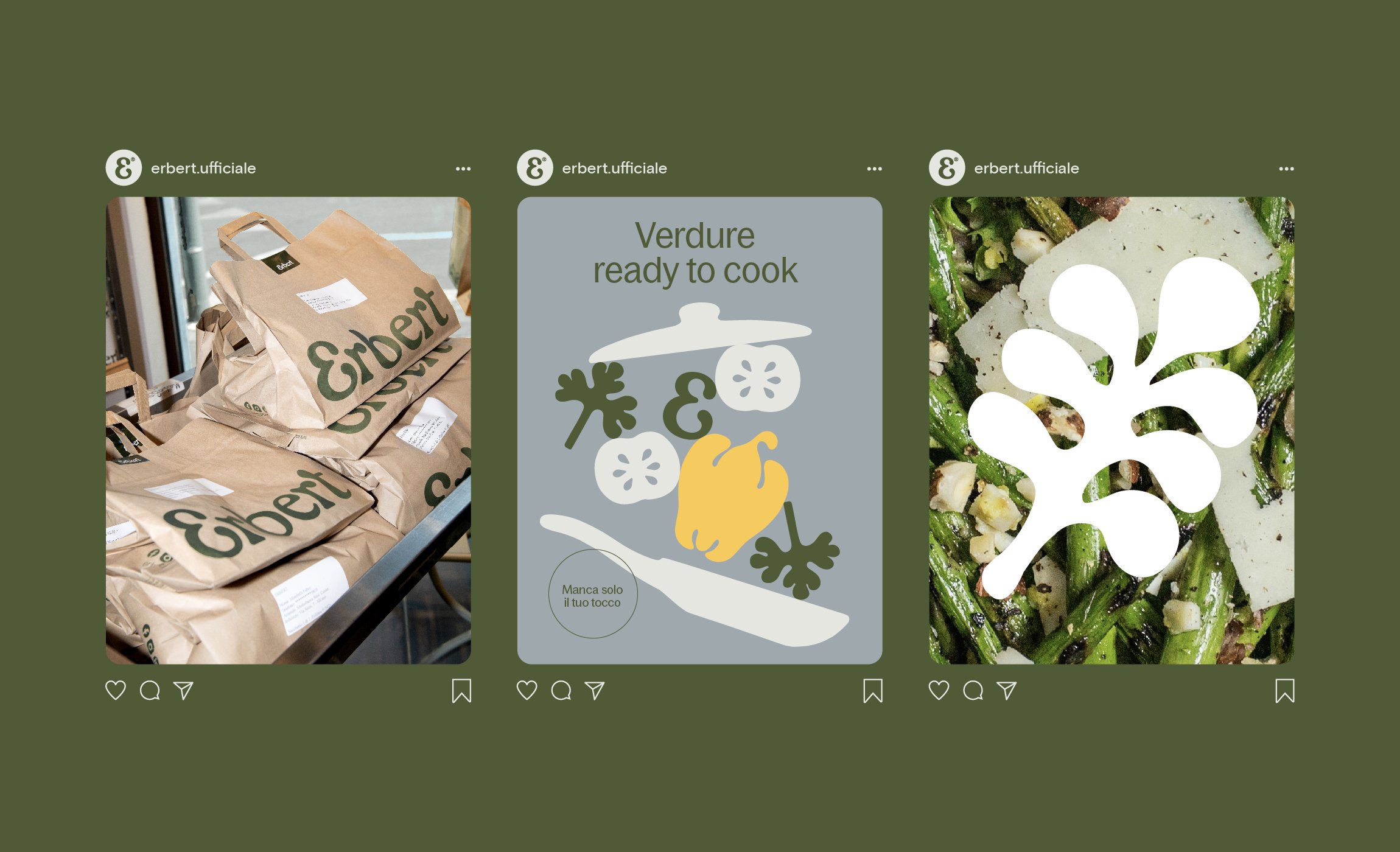
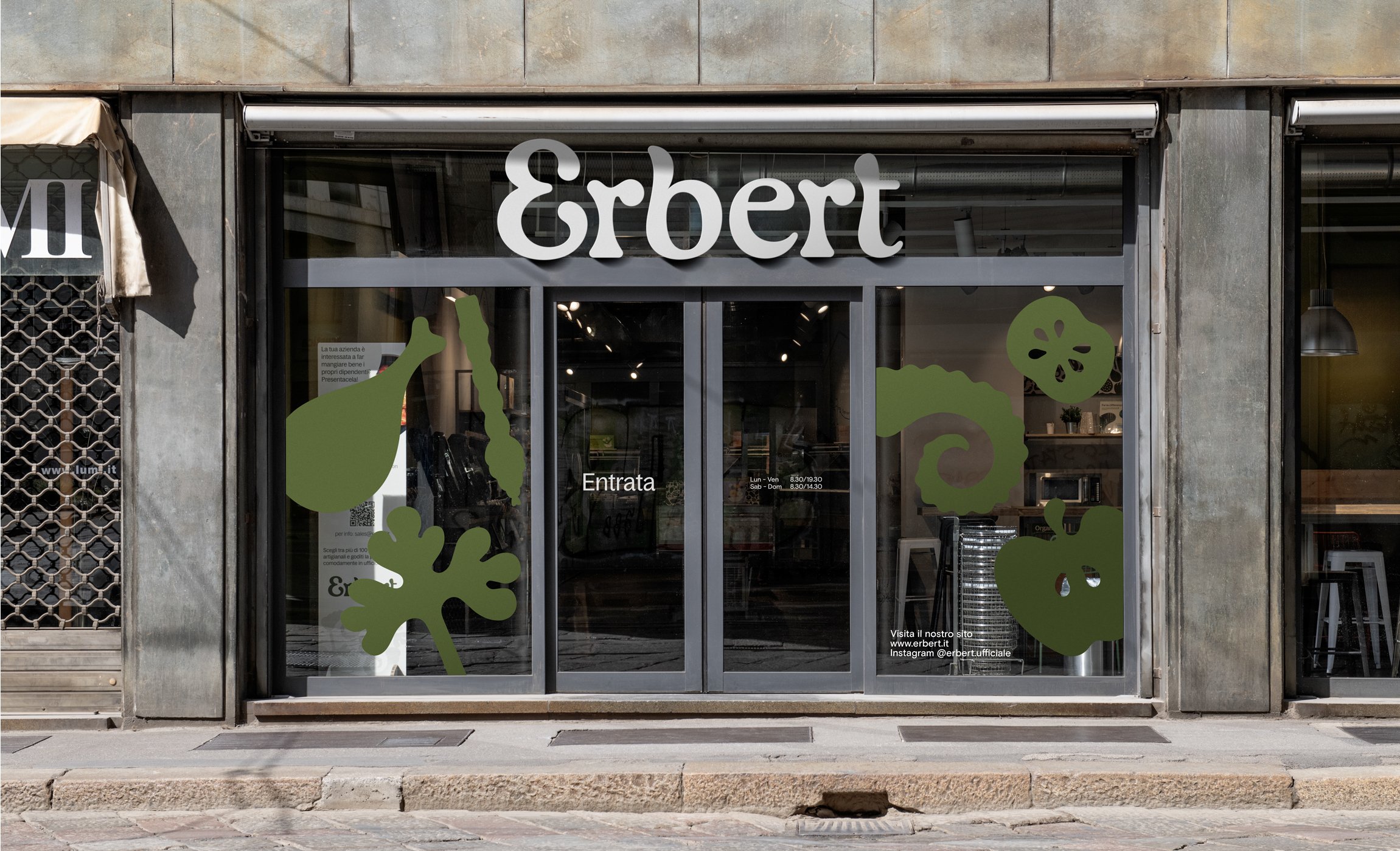
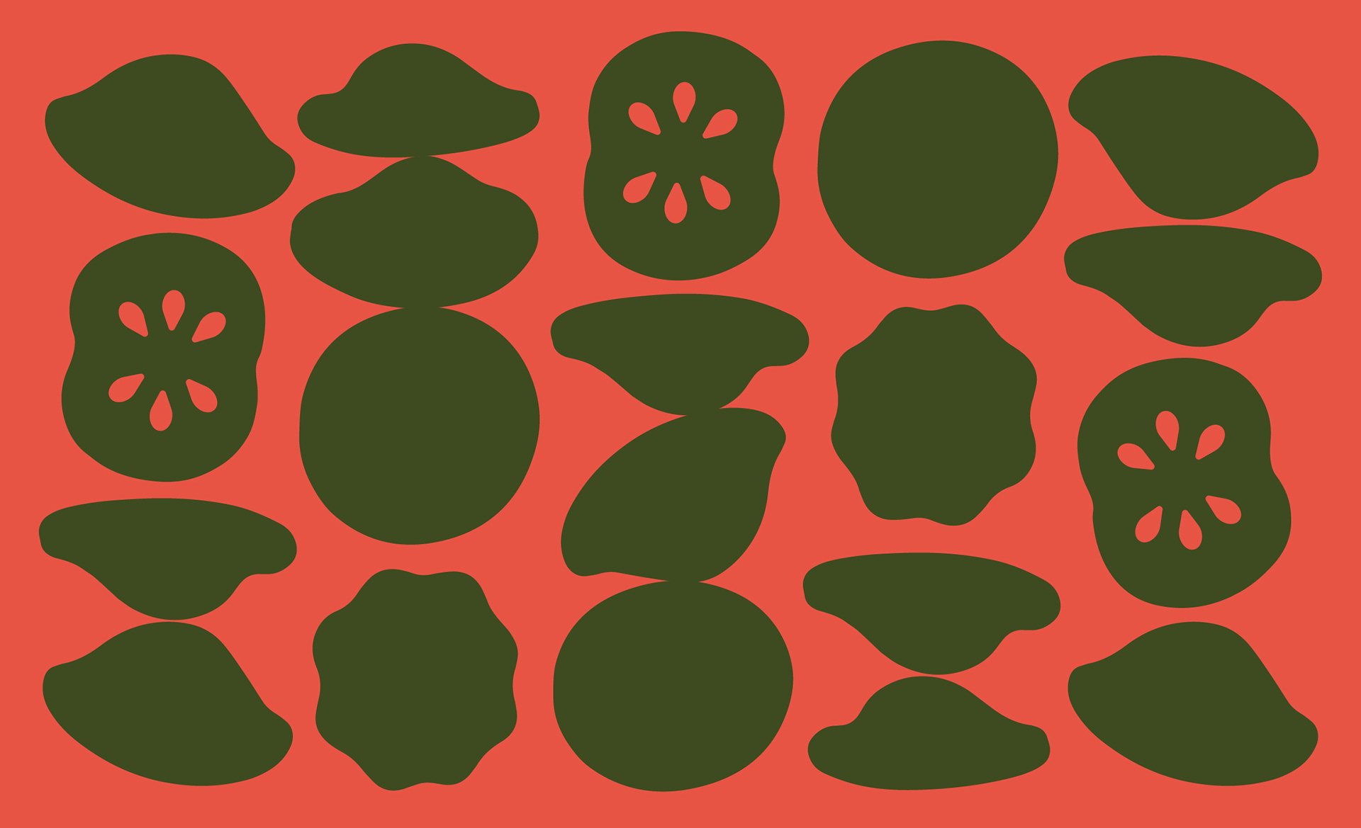
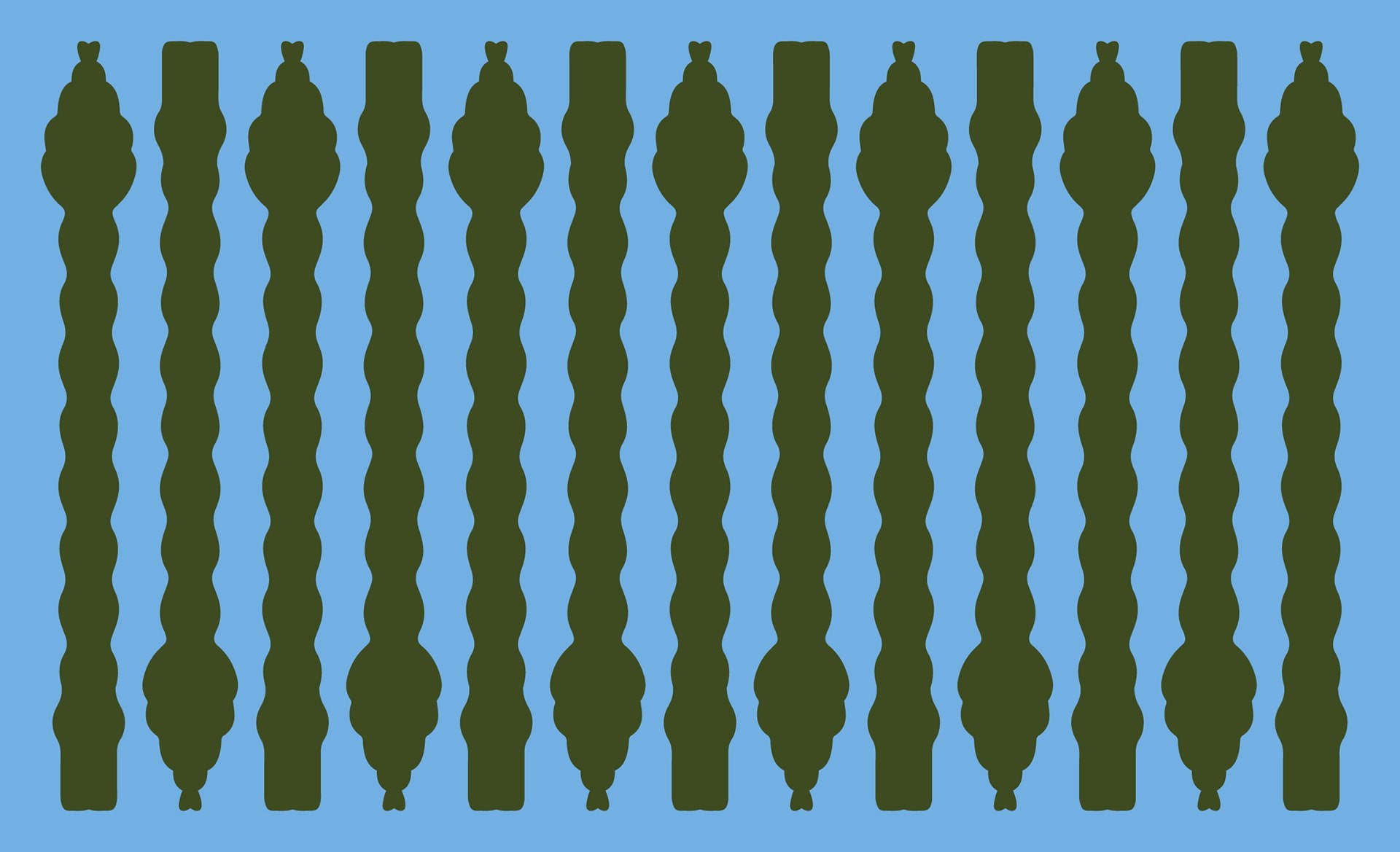
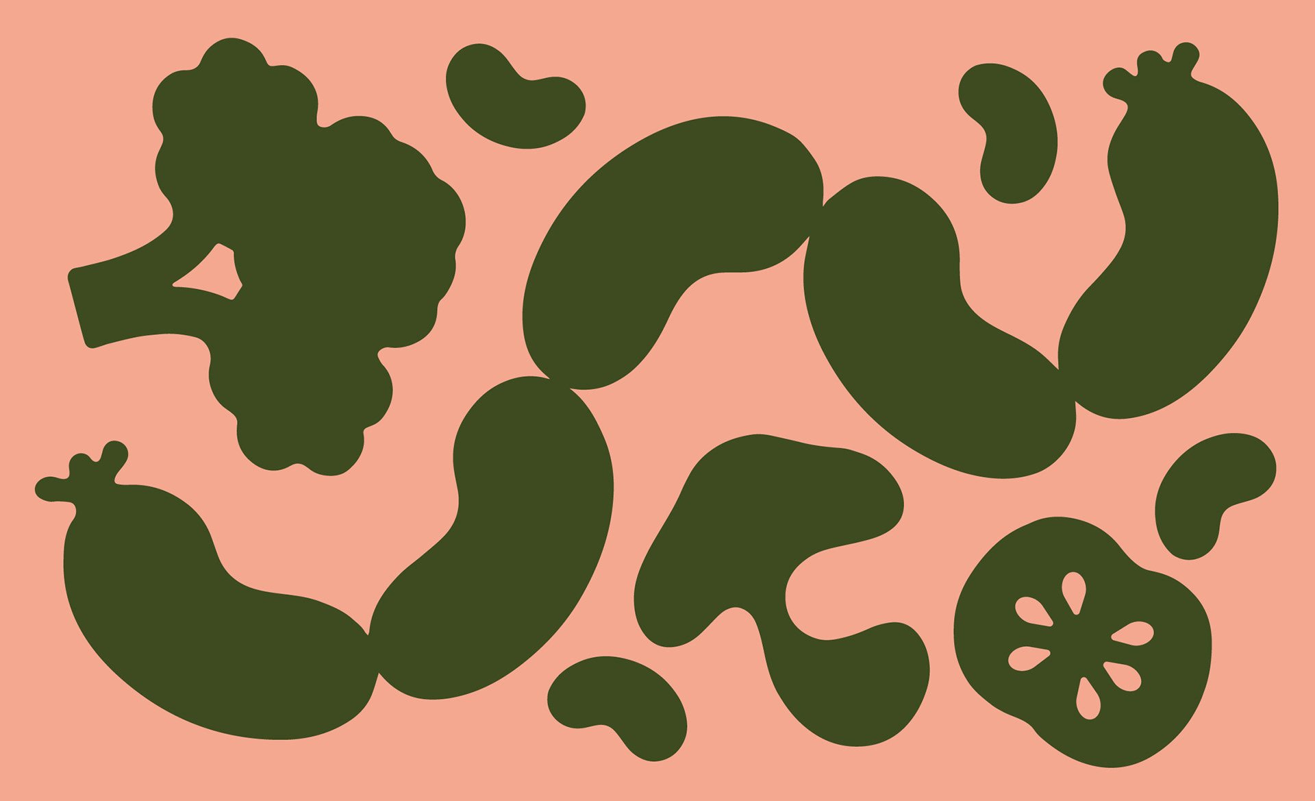
The letterforms of the logo are wonderfully echoed in the accompanying kit of illustrations of various food-stuffs, which manage to convey a lushness and desirability even though they are only block-colour silhouettes in fairly muted green tones. Salad leaves are rendered with the same chunky, wobbly, rounded serifs of the logotype, while striated bell-peppers and squashes are rendered cleverly with negative space cut-ins. The illustrations are simple, but formally compelling – a coyly curled octopus tentacle and a wibbly-wobbly beetroot are particularly lovely to gaze upon, and look great layered over photography.

In AUGE’s words: “The whole [visual identity] adopts a colour palette where green is the main protagonist, both on printed materials and in retail”. That green is an understated, dark olive shade that marries well with a bright, organic accent palette of apple green, lavender, buttery yellow, sky blue, salmon pink and blood red. In most applications, the olive green manages to avoid looking sludgy, although when used for the labels of cans of acqua frizzante it does perhaps succumb to this a little – perhaps it is just an imperfect ink match or troublesome paper finish that makes the otherwise smart olive veer strangely into a drab khaki.
Although, one senses that part of the point of this brand is the subversion of the conventions and expectations of produce/supermarket branding: why do we have such specific graphic expectations when our taste-buds and stomachs are involved? When did we decide what graphically looks ‘appetising’ in a literal sense? Erbert successfully eschews the cliches of food branding and manages to look tasty, fresh, classic and modern all at the same time. AUGE’s visual identity is deceptively simple. With some extremely smart typographic decisions, a well considered colour palette and a joyful jumble of expressive illustrations, it has allowed Erbert to manoeuvre itself into a brave new space in the Italian food scene. First Milan, then the rest of the world. Will lunchtime ever be the same again?
