Bata by Design Research Unit, 1969
Written by Richard Baird Posted 12 December 2023
The following is a guest article from Logo Histories, a weekly Substack newsletter from the team behind BP&O. Each week, Logo Histories shares the context, concepts and considerations behind some of the most interesting logos and corporate identity design programmes of the past. Read about Saul Bass’ work for Warner Communications, Otl Aicher’s brand identity for ZDF and Walter Ballmaer’s logo for Olivetti. Discover these and a 100+ more here.
Despite having its 1960s headquarters in the Canadian city of Toronto, the shoe manufacturer, distributer and retailer Bata was founded in Zlin, Czechoslovakia by Tomáš Baťa, a 9th generation shoemaker.
By 1969, 75 years after its founding, the Bata Shoe Organization was holding 98 Bata companies in 89 countries over seeing 90 factories, 5,000 stores and 90,000 employees. During this period of growth Bata maintained a strong focus on ‘producing and selling the best quality footwear at the most economical prices’. This had found it warmly welcomed in many countries.
Such growth and scale presented challenges around the brand’s image, the consistency of its application, flexibility within evolving retail spaces, and distinctiveness within a competitive industry.
Prior to 1969, the Bata visual identity was a wordmark. This had its origins in a version drawn in 1924 and then iterated on in 1928 and again in 1938. Bata worked with renowned British design company Design Research Unit (DRU) on a ‘Store Standardization Program’ which would include a review of its current wordmark and the development of a visual identity which intended to improve the recognition and impact of the brand on the high street, making it feel more upscale in European markets. The program also then extended to shop interiors.
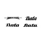
The script version of the Bata wordmark, which had been in use since 1924 had become well-known. Its distinctive cursive letterforms and total ‘word shape’ was felt to have substantial recognition and goodwill associated with it. So, it was decided that it should be retained. However, recognising the need for flexibility and the increasing contexts the wordmark needed to operate within, small changes were made. These included removing the ball from the ‘t’ of Baťa, essentially internationalising it, and making it more ‘cushioned’ (a responsibility given to young DRU designer Chanddrashekhar Kamat). The overall intention was to make it more appropriate for the 1960s, a period of increasing modernisation throughout retail and manufacturing.
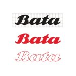
Further variations of the wordmark were added to broaden its applicability. This included an outline version (for advertising) and a reversed and knocked out wordmark placed within a square to maximise its legibility and enhance its recognition in busy contexts. A grid was also applied and introduced into the standardisation document to improve the quality of its reproduction by sign-makers, an important detail as Bata operated in many countries and with third party suppliers speaking different languages.
Although the wordmark would be the main link between all aspects of the company’s business, appearing largely unchanged from its earlier 1938 form, it had become necessary to develop a more powerful graphic element for an increasingly competitive environment.
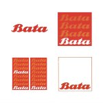
A new graphic element was devised by DRU. This sought to facilitate quicker recognition than the wordmark would allow for on its own, and develop its presence of the brand on the high street.
The basic form of the new symbol placed a repeated wordmark in a square. In its basic form, the Bata wordmark was repeated four times. However, to improve flexibility, impact and build a visual identity system, the symbol was based on modules of the wordmark which could be increased or decreased in number and extended laterally to create tall banners and long fascia signage.
There were two versions of the core symbol, one with four repeats for use on signs and in situations where maximum impact was necessary. The other, with one wordmark at the bottom of a outlined square, was created for more ‘restrained use’ such as on stationery and other corporate materials. In addition, there were two colour ways: one using red, orange and white, the other black, gray and white. For newspaper advertising, this would be reproduced in black and white with a 50% tint to create the third colour.
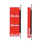
The new house colours, just like the wordmark, were a progression of what had come before. Red had been associated with Bata over many years of use, however, when it was used with white only, it was felt that it was not sufficiently interesting to command attention within the competitive high street environment. With this in mind, DRU introduced an orange, creating a distinctive colour combination that would afford the company variety and further interest.
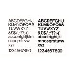
The standardisation of colours, fonts and signage, and the economies of scale, would not only help develop a consistent image throughout the countries Bata operated in, but significantly lower production costs. This also accounted for the selection of Helvetica. This choice made sense for a global corporation operating in many countries as Helvetica had wide distribution and was readily available.
Helvetica would be the main typeface for display materials, general graphics in stores, all stationery, and publications. Used in two weights, Medium and Regular, it would improve the clarity and legibility of all of Bata’s communications.
Through the standardisation program, the Bata image was formalised, made more consistent, and its recognition and visual interest improved. This also extended to the design of a prototype shop interior, also by DRU, which intended to make the brand feel more upmarket. This would later be rolled out across Europe.
The continuity that Bata maintained in its logotype from 1928 through to 1969 and to present day, made it synonymous with good quality affordable footwear in many countries. In fact, it became so loved and commonplace, it is not unusual for people from countries outside of Czecholosvakia (now Czech Republic) to believe that it originated in their own countries!
Logo Histories is a weekly Substack newsletter. To instantly access an archive of over 100 Logo Histories, just like this one, and receive weekly stories straight to your inbox, subscribe here.

