Wholesome by Universal Favourite
Opinion by Thomas Barnett Posted 7 December 2023
Wholesome is a new breed of supermarket that doesn’t fill a gap in a market so much as it positions itself at a nexus of multiple intersecting demands. The pursuit of ethical grocery and household shopping has, for decades, been both deeply commendable and exasperatingly time-consuming, expensive and convoluted. One supermarket will stock Fairtrade products but have a scant gluten-free selection. Another will excel at vegan options but be mired in a sticky pool of palm oil. Australian design studio Universal Favourite observes that ‘the pandemic saw a boom and growing trust in online grocery delivery services but introduced a whole new level of choice paralysis. Add healthwashing and greenwashing into the mix and it’s near impossible to know what to choose or trust.’
Wholesome brings all these (and more) specialist product categories together under its newly coined umbrella category of ‘eco-health’. Serious, intersectionally ethical consumerism has moved out of the fringes and into the mainstream, and Wholesome aims to be the one-stop destination to service those multilayered needs. In short, if it gets Piers Morgan’s knickers in a twist, Wholesome will stock it.
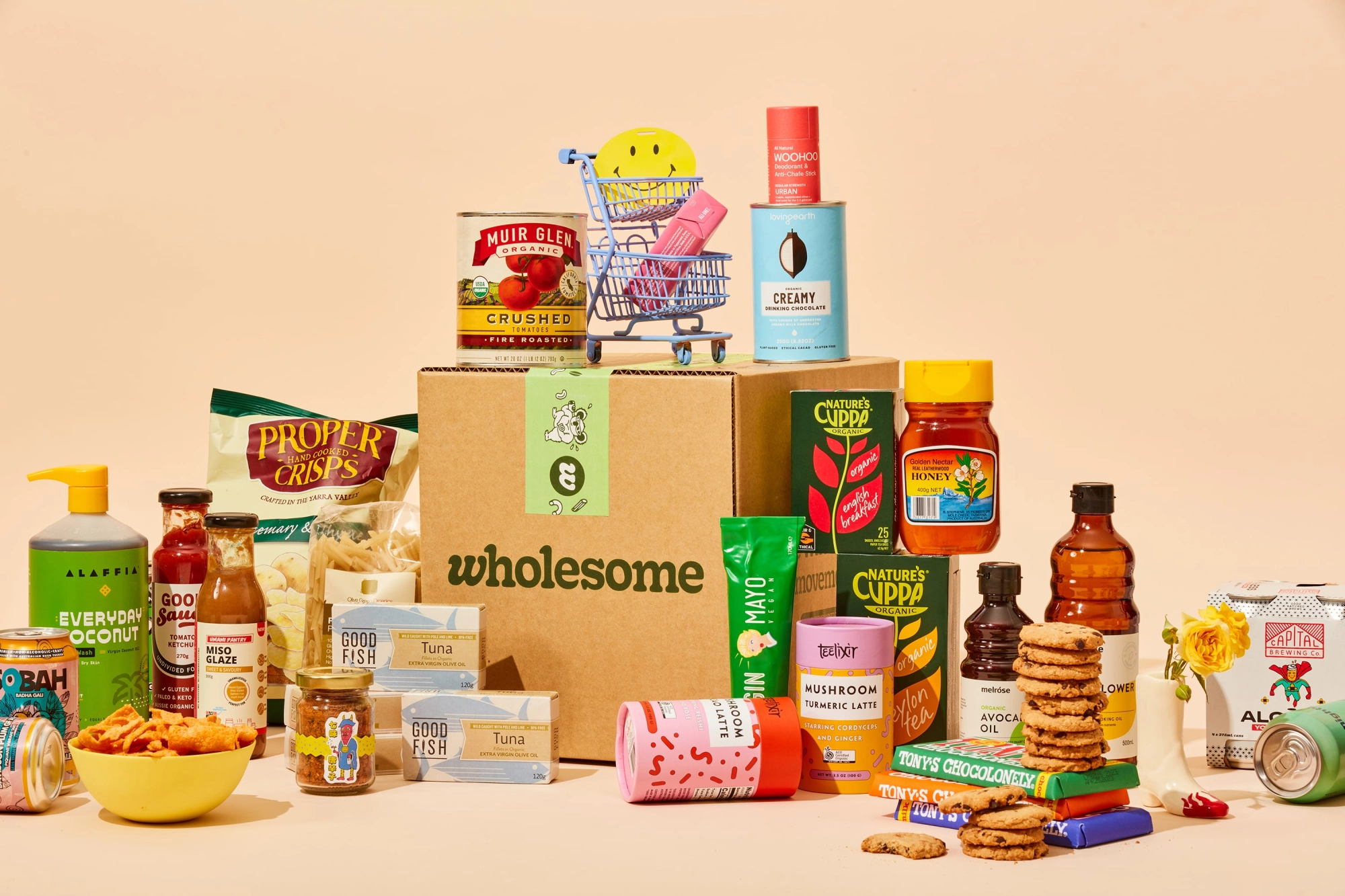
Universal Favourite was tasked with an end-to-end brand overhaul ‘that would reflect the innovation of [Wholesome’s] DTC offering, looking, feeling and sounding as good as the brands and products they stock’. In this summary of the project the studio highlights one of the key challenges of a brand like this: that it needs to be distinctive enough in its own right, yet discreet enough not to shout over the nested product brands that it is designed to foreground and sell.
Another key aspect of the Wholesome brand is that it offers a membership. Rather than the usual tawdry points and clubcards, this inner sanctum of sustainable shopping is touted as ‘The Wholesome Movement – a band of empowered people buying better, together, to change the world for the better’. Universal Favourite notes that ‘the visual and verbal identities seamlessly carry this idea through to every touchpoint of the brand, embracing an educational ethos that informs consumers and gives their choices power’. The resulting brand successfully presents this empowering vision of better consumerism, bottling a typically Antipodean mix of sunny optimism with laid-back unpretentiousness.
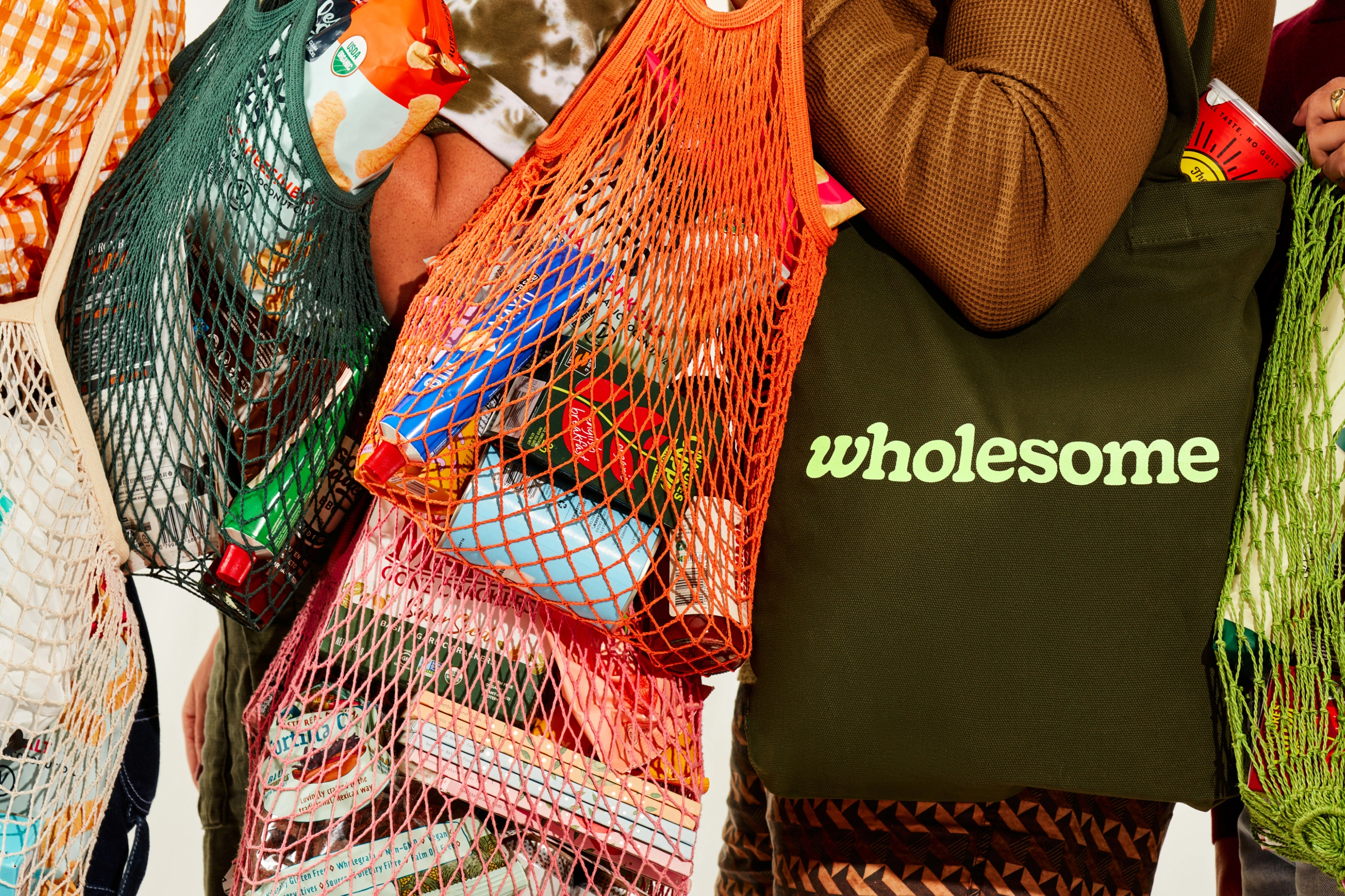
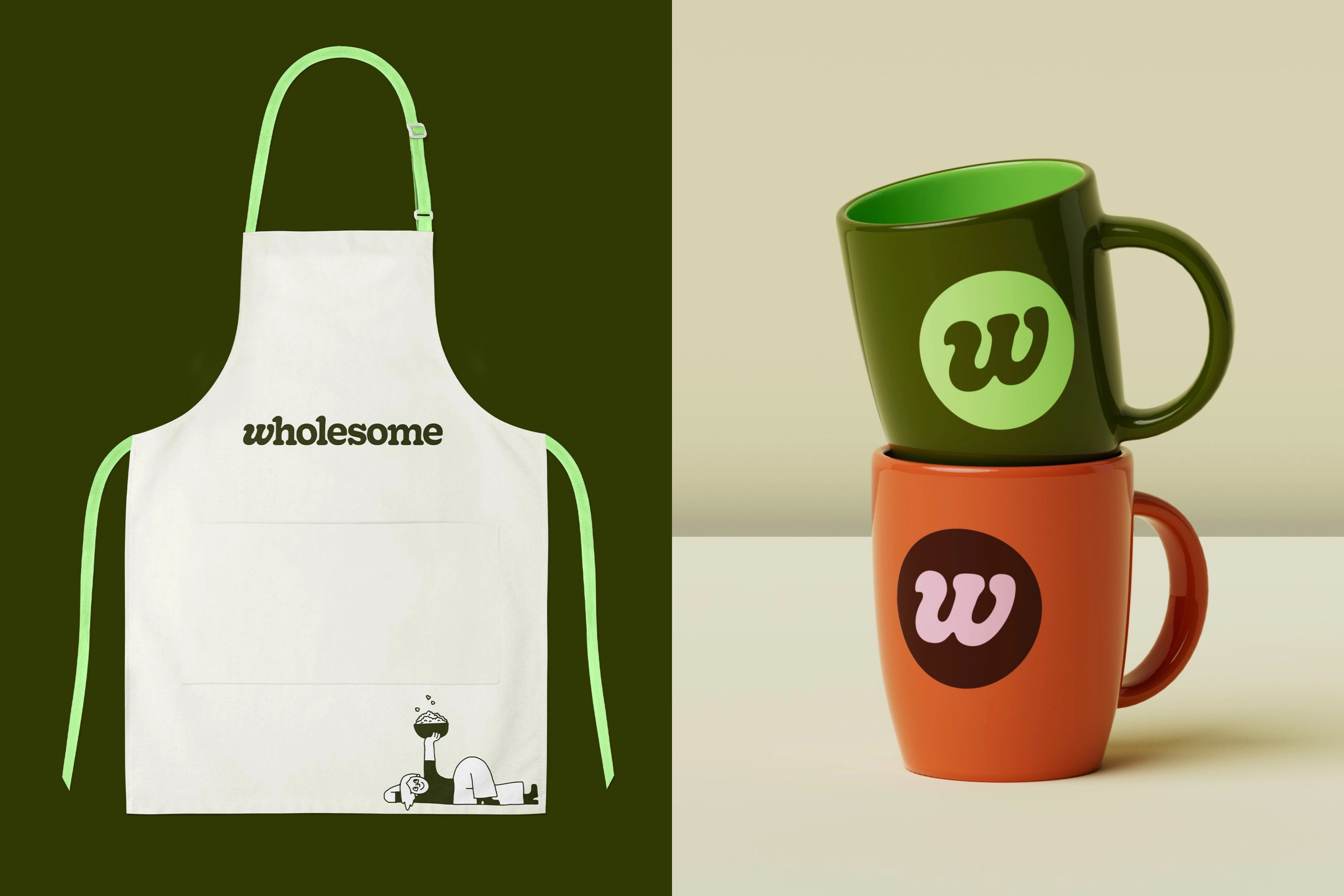
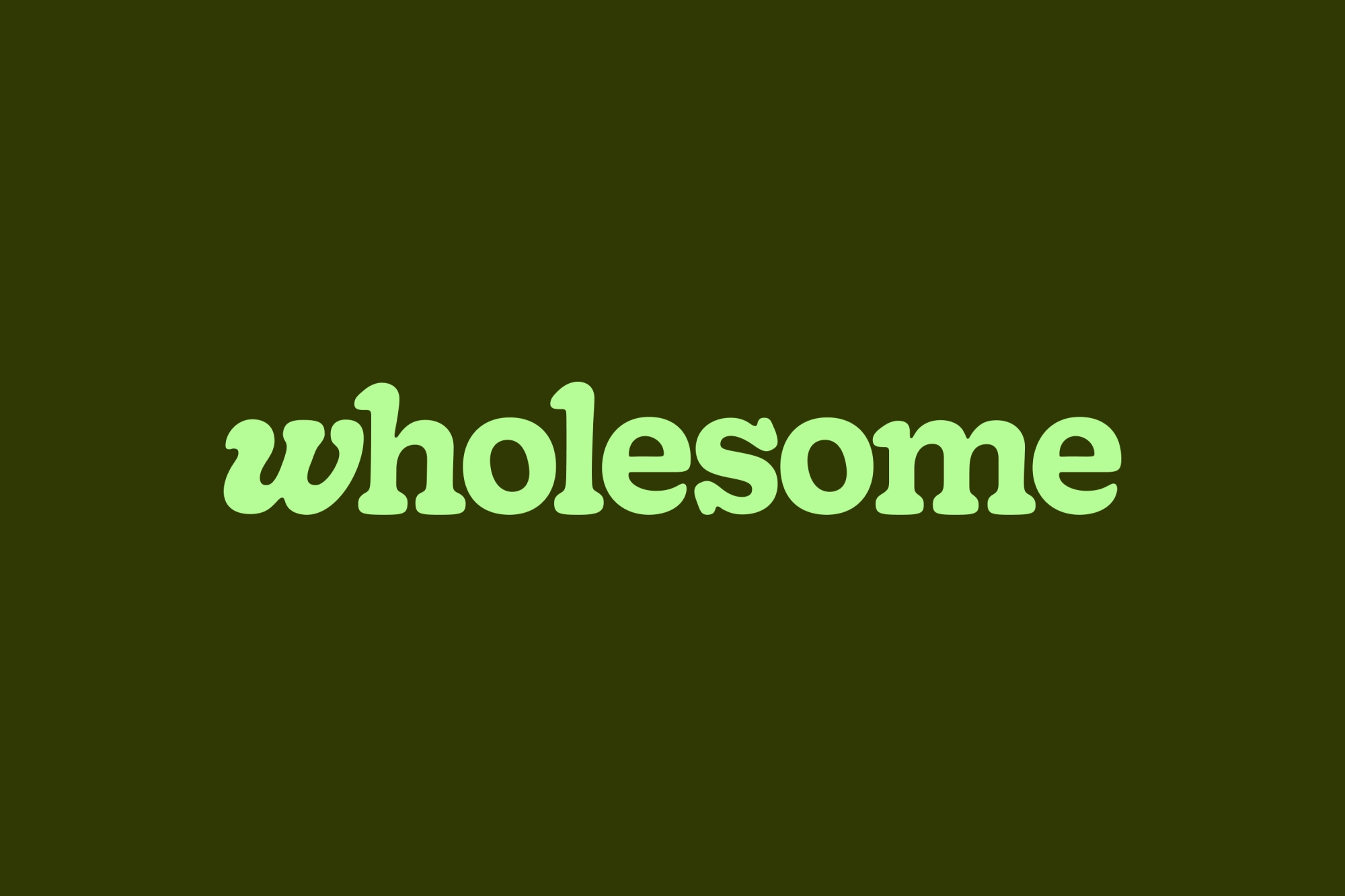
The pleasingly wobbly logo uses a custom version of Cooper that has been bulked up and softened around the serifs to become ‘Gooper’. The ‘w’ is lower-case and has been italicised to endearingly shelter under the overhanging ascender serif of the ‘h’. It gives the logo a cuddly softness, as well as a propulsive energy. This idiosyncratic typographic twist inherently feels like it should have some kind of cute animation, showing the ‘w’ snuggling up to its phonically silent but structurally supportive neighbour.
In the case-study, Universal Favorite gestures towards an interesting application of the brand as stickers of the wordmark, and ‘w’ letters are stuck over other branded products. It is unclear whether this is used on the actual grocery products as a way of marking ‘brought to you by Wholesome’, but it is an interesting, eco-friendly and playful way of reimagining how an overarching store brand interacts with the product brands that it stocks.
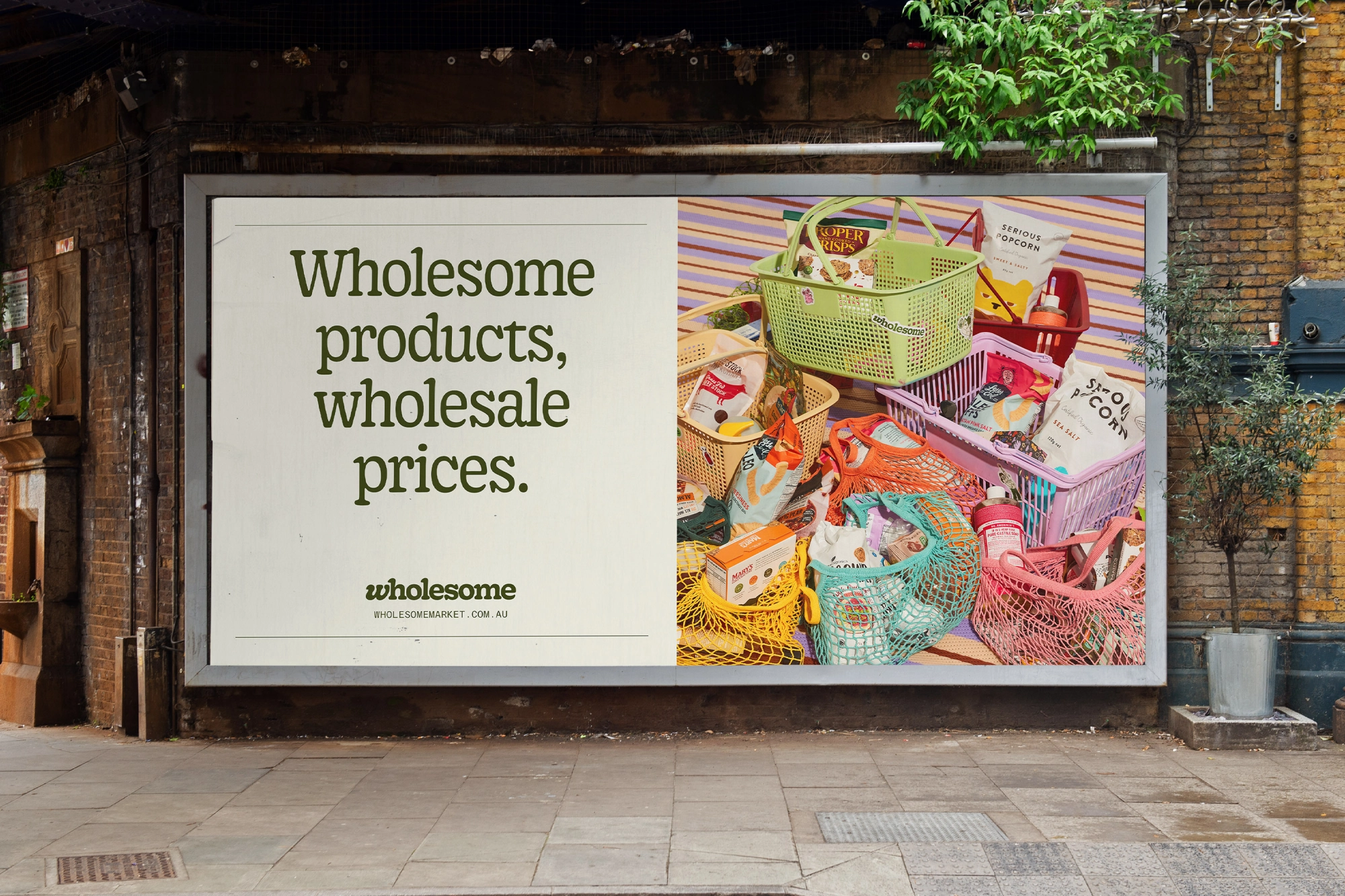
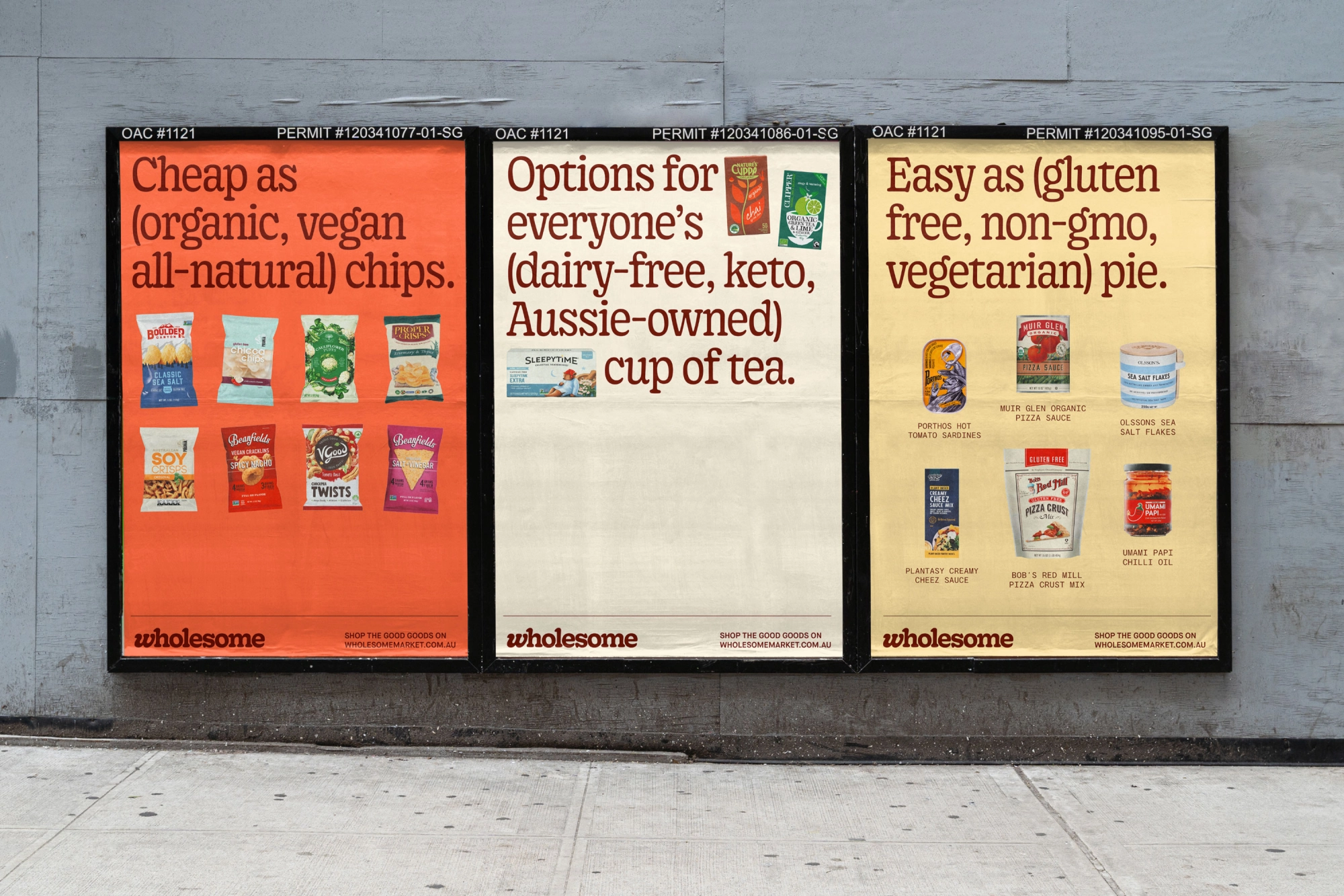
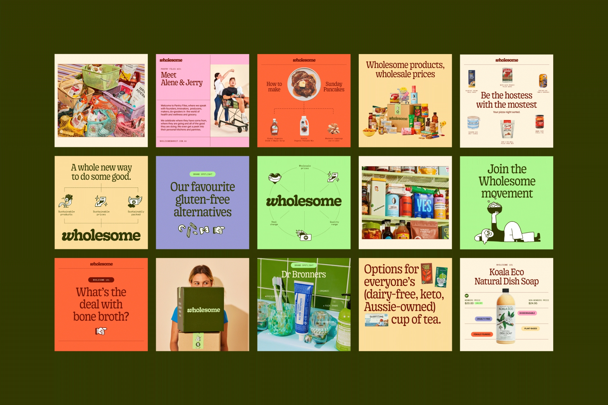
Gooper Semi-Condensed is the main brand font – a slightly taller, skinnier version of the logotype. It works wonderfully for headings and large applications. Universal Favorite describe it as having ‘just enough charm’, but this does it something of a disservice. It oozes character, with its subtly wobbly, bowed profile and extravagantly curly serifs. It is reminiscent of sign-painting, conjuring the hale and hearty farm-shops and market-stalls of days yore. It feels pleasingly un-digital (although by this point in the condensed serif renaissance, fonts like Gooper are teetering on the edge of becoming the new normal for well-appointed digital brands). It is surprising not to see an italic version deployed for select words to mirror the italicised ‘w’ of the logo – especially as the copywriting style (devised by Cat Wall) specifically uses parenthetical asides: ‘Cheap as (organic, vegan, all-natural) chips’; ‘Easy as (gluten free, non-GMO, vegetarian) pie’. The copy idea is smart, but it somehow gets a little lost in the overly straightforward typographic execution. A tiny touch of variation in weight, italicisation or colour would make the idea sing as it should.
Maison Neue is used for body copy, a friendly, rounded sans serif that does the job and chimes with the approachability of the brand. The typographic treatment is rounded out with tertiary font Kale Sans, a typewriter-influenced sans serif that is reminiscent of the monospace on printed receipts. It has a nice vintage market-y feel, but is only used for web addresses, diagram labels and other such peripheral typographic applications. Whilst it creates a nice link to that analogue market vibe, it nonetheless feels a little superfluous. One wonders if what Universal Favorite calls in their (sometimes perplexing) case study write-up, the ‘wholey trinity’ of fonts couldn’t instead have been a more restrained duo, with some subtler weight/italic/underline variations.
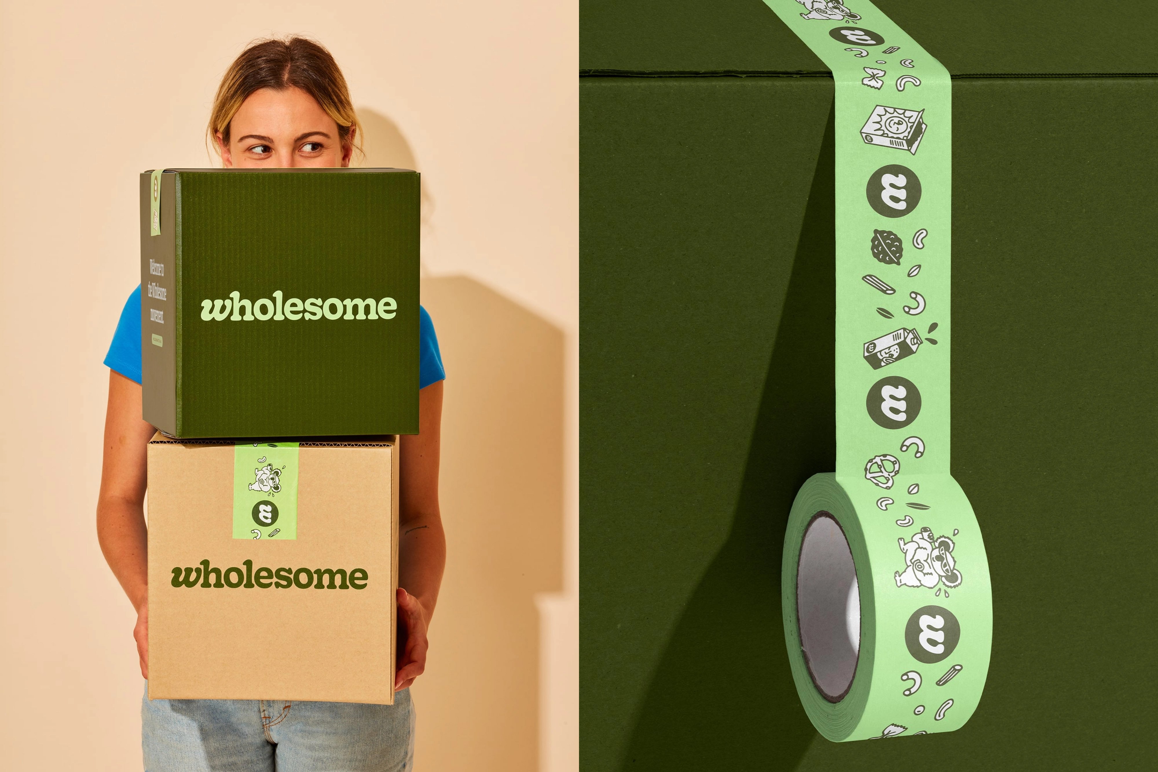
A hand-drawn iconographic language adds levity to the brand. The sketched style sometimes feels a little at odds with the rest of the visual system. Examples that use goopy, solid-filled shapes that echo the logotype are more successful, but the more jagged instances (eg. an envelope with a flaming tail) miss this echo of the forms integral to the logo and typography, and so feel a little jarring. A flower with trailing petals/hair in goopy form and a juice carton spurting the same shapes are instances of where the style works well, and how a fractionally stricter approach may have tied these elements more tightly to the inherent formal qualities of the brand.
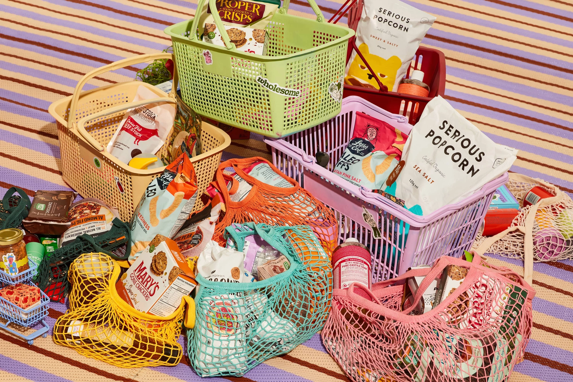
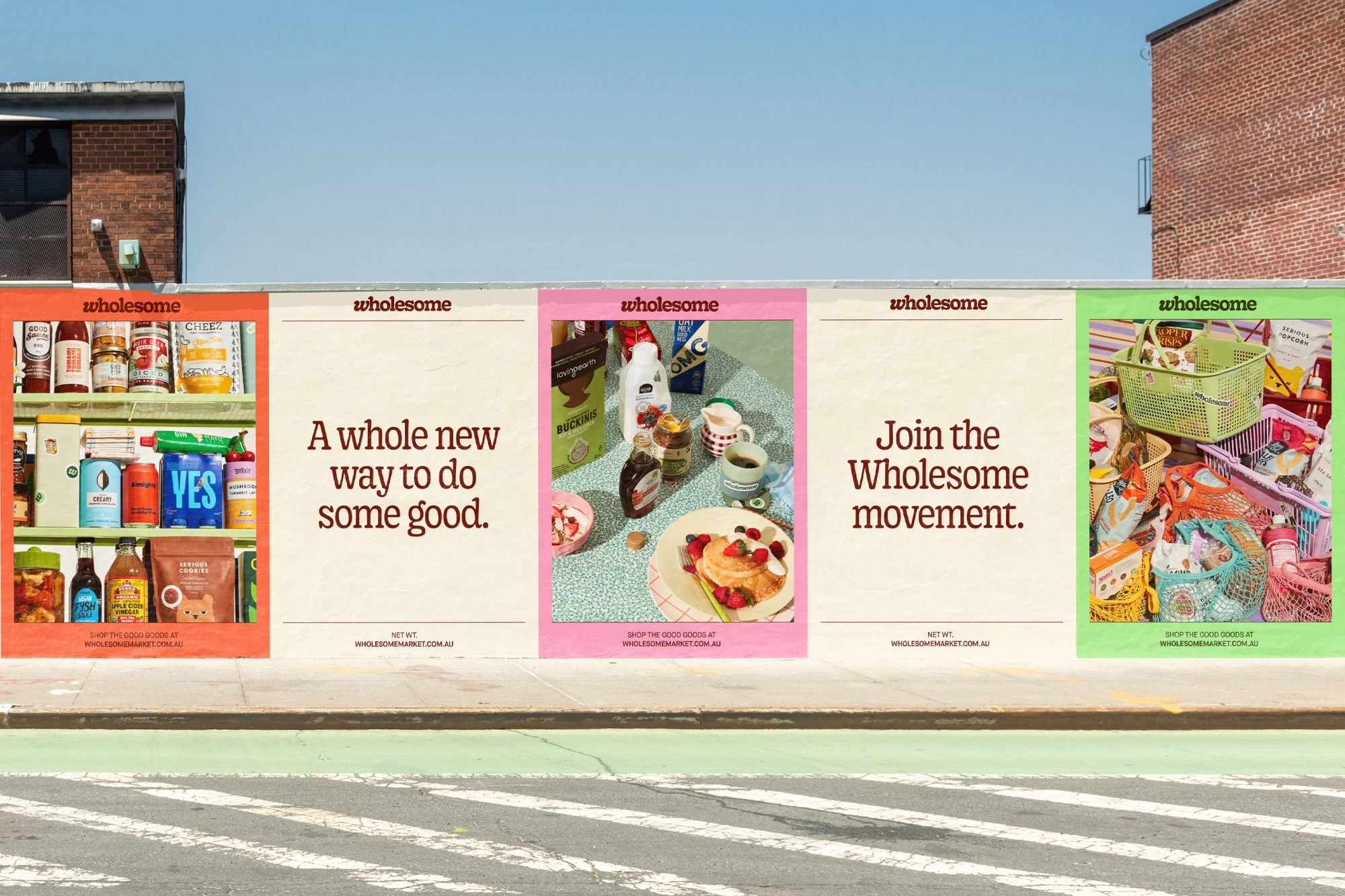
A brand-led photoshoot by photographer Shelley Horan and stylist Jerrie-Joy Redman-Lloyd has generated some interesting, colourful and chaotic images. Mesh tote bags and plastic shopping baskets echo the pastel-y accent colour palette of orange, lilac and grass green. Universal Favorite states that it wanted to tread a middle-ground ‘in a [brand] category thats [sic] art direction often skews either too minimal or overly messy’. It is hard to imagine how these shots could be messier, but the tangled mass of bags, tins, spoons, biscuits, lids and kitschy formica countertops somehow works, forming a disorienting yet pleasing Jackson Pollock-esque spatter of colour that makes your average grocery photoshoot look very dowdy indeed.
Nitpicking aside, all of these elements come together superbly in the website design. It is clean yet characterful. Dotted outlines, rounded corners and headings styled as file tabs gesture towards an analogue, tactile feel that makes this otherwise most nebulous of entities, an online-only grocery store, somehow feel as tangible and solid as our bricks-and-mortar aisles. Universal Favorite’s work is a tantalising glimpse of what it could look like if a major supermarket ever had an actually tasteful rebrand. UK-based readers be warned: after a visit to Wholesome’s sun-dappled online pastures, logging on to Sainsbury’s for your next home delivery is going to feel very dull and dour indeed.
