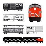
Canadian National Railway by Allan Fleming, 1960
Written by Richard Baird Posted 16 January 2024
The following is a guest article from Logo Histories, a weekly Substack newsletter from the team behind BP&O. Each week, Logo Histories shares the concepts and considerations behind logos and corporate identity design of the past. Read about Saul Bass’ work for Warner Communications, Otl Aicher’s brand identity for ZDF and Walter Ballmaer’s logo for Olivetti. Discover these and a 100+ more here.
The formation of the Canadian National Railways (CN) dates back to 1923 when the Canadian government merged a number of bankrupt railroads to form one large rail network, with Canadian Pacific as its only national competitor. By the mid-century, however, shortsighted management had led to unprofitability. To correct this, CN went ahead with a programme of substantial modernisation. Steam was replaced with diesel, computer controlled systems were installed, the freight fleet was restored, equipment upgraded and its organisational structure revised.
Despite this extensive programme, a public attitude study involving in-depth interviews with 4,000 adults initiated by CN’s Public Relations Department suggested that the improvements were going unnoticed. Canadians still looked on the railway as old-fashioned and appearing the same as it did prior to modernisation.
With this realisation in mind, the head of CN public relations Dick Wright and assistant Charles Harris (who would later replace Wright), suggested that the corporation revitalise its image in a way that would outwardly express the progressive and modern enterprise it had spent the 1950s working on becoming. This was seen, at this early stage, as a straightforward project to develop new logo, with Wright seeking the outside expertise of New York designer Jim Valkus to oversee it. “You don’t want a trademark program – you want a corporate design program” was Valkus’ suggestion, put forward in a four-page brief on the areas he intended to cover and the approach he would take.

Valkus was given the authorisation to work up a more detailed and formal proposal, assigning Lorne Perry, who was engaged in a sign-analysis project at the time, to work with him. Perry would later be responsible for rolling out what would become a full-scale corporate identity programme, covering large format surfaces such train paint schemes and building exteriors, and down to signage, stationery and sugar packets.

CN’s image of itself as a contemporary, forward-looking company and the public’s image of the railway as ‘antique’ was gap that needed to be bridged. Valkus felt the railway needed to appear ‘mechanised’ and ‘marvellously efficient’, and that the logo needed to suggest that the corporation was progressive, dynamic and future-oriented. Public Relations head Wright added that the logo also be capable of being seen as both customer-friendly and ‘technologically savvy’. Technically, the logo would need to be bilingual and work as well as on a business cards as it would on moving trains and large buildings. With all things considered, it was also felt that a maple leaf wasn’t best-suited to the viewing conditions created by a fast moving train. It was a tough ask, so Valkus handed the job to Alan Fleming, a well-known Canadian graphic designer. Fleming would develop a logo and apply it to various company ‘paper pieces’ for Valkus’ presentation.
On a flight to New York, Fleming sketched out ideas on a cocktail napkin. He explored ideas around combining the letters CN, some with the addition of an arrow. Each brought together the C and N as one continuous line, said to be ‘rushing straight into the future’. “Apart they are two separate letters-joined together they become a single line running from one point to another.” The result conveyed a railroad on the move as the eye moves from C to N, the total image suggests fluidity and motion. “It’s a route line that incidentally spells CN,” Allan explained when presenting the logo. “It represents the movement of people, materials, and messages from one point to another.”

The flowing ‘signature logo’, later colloquially known as the CN ‘Worm’, was a departure from the railway heralds of the past. As later recounted by Perry, this was seen as a risk. “There was a lot of controversy about this bold new look and the CN red, but ultimately the company moved forward with this design because of all the strong features. The logo was a powerful moving billboard for CN’s powerful trains.”

Valkus was given a one-year contract, with the understanding that Canadian National would then proceed on a five-year program of implementation. The five years ended in 1965 but the program the programme, at the scale that it was, continued. Despite the logo’s continued use, and it being recognised as one of the world’s greatest logos, it became inseparable from the progress and improvements made throughout the rail network, and continues to do so today.
Logo Histories is a weekly Substack newsletter. To instantly access an archive of over 100 Logo Histories, just like this one, and receive weekly stories straight to your inbox, subscribe here.

