Black Bee Honey by OMSE
Opinion by Richard Baird Posted 11 January 2024
It was yesterday I made a run to the local supermarket to pick up some essentials. I had two choices, turn left to Waitrose or right to Morrisons. Despite being somewhat price conscious, I enjoy looking at the packaging at the higher-priced Waitrose, so went left–let’s say it’s the cost of being a designer.
Anyway, honey was on the list. Not for me but my fiancé. She’s not picky, so I tend to opt for Waitrose’s Essentials. Essentials for the essentials. Fine, I like that. Honey is not something I’ve thought too much about, but just like batch-roasted third wave speciality coffee, there’s a brand ready to educate me on the details of production and convince me to pay more.
The OMSE case study sets Black Bee Honey up as an antagonist to ‘fake’ honey. Apparently, our shelves a littered with untraceable sugar-syrup blends. Wow, I may have been failing to actually buy my fiancé honey all this time. (I did double check, and although it is a blend, it is actually honey, no syrup). I’m not entirely convinced of the accusation, perhaps a trip to Morrisons? Anyway.
The future, in the mind of Black Bee Honey, is a bit like craft coffee before it; fully-traceable and single-origin. The cost for such a guarantee is triple. That requires some seriously strong messaging, a decent brand and an awareness of what the market sees value in and is prepared to pay for. Luckily, Black Bee Honey worked with East London-based design studio OMSE.
![]()

As an aside, like olive oil, honey is out on the counter, close to hand. Anna, my fiancé, loves to have honey water in the morning so it’s usually close to hand. These products are decorative in nature. Set dressing for the kitchen. See Unto and Graza. Cool shit on the counter, a bit of intrigue (or taste-signalling) when guests visit. For me, I’ll take a bit of joy wherever I can get it. If that’s a bright illustrative honey label, it might be worth the premium.
The set-up is straightforward. “Keep British Honey Wild”. I love the double meaning around wild. And it’s pretty wild, with a protagonist bee character, sufficiently anthropomorphised to give it a sense of individuality, a life of its own, away from the hive. It’s a bit special like that. This plays out across website and packaging. Not strictly narratives, more individual cells of a comic book. The bee is depicted lazily sitting around or yawning. Then it’s flower-hugging and flag waving. A lot of effort has gone into creating a character with personality, which can be context relevant and built out as more product lines are added.


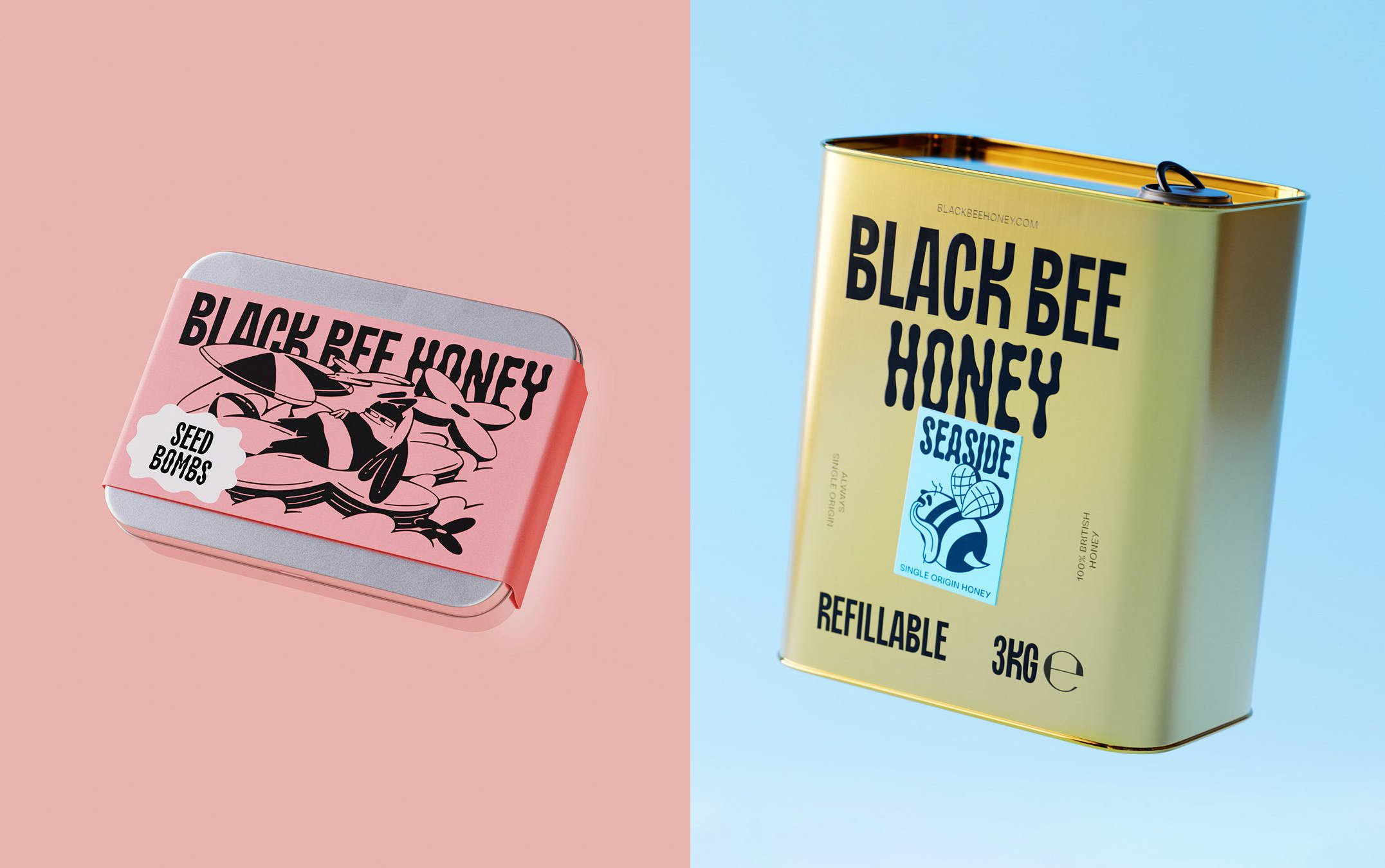
‘Wildness’ also comes through in the angular forms used throughout the illustrations. These are loud and busy, eye-catching from a distance (really helped by colour) and more legible up close. These demand enquiry, and benefit from the current and sad state of honey branding and packaging. Online, the story and positioning is fleshed out and not a disappointment. Everything is consistent with packaging. For many of the brand jobs I research, this still isn’t always the case…
Alongside the illustrations, OMSE crafted a gloopy honey-like condensed sans-serif typeface ‘Black Bee Sans’. This has something of a campaign visual language about it, but with enough quirkiness to keep all from being shouty. There’s a wonderful variable quality to this that lends the brand a bit of a tonal flexibility depending on the messaging and context, or what what word might need emphasising. This is paid with some playful, but on the nose copywriting, which basically rounds out a full house (custom typeface, motion, photography, illustration). There’s nothing OMSE hasn’t employed (but beautifully corralled into a cohesive identity), which gives it a huge advantage. There’s lots to love about this, and it makes it clear as honey, flower-to-jar could be the next big thing to hit East London.