Omlet by Ragged Edge
Opinion by Emily Gosling Posted 25 January 2024

We’re undeniably in an age of pet care 2.0: the post-fur-baby era, where people are finally beginning to see their animals’ needs and wants as independent to their own (i.e. dried pigs ears over vegan dog treats, eschewing leads for cats, and so on).
These shifts in how we think about what it means to have and look after animals have precipitated further shifts in pet care branding. Things have moved on from functional pack designs and stock photography, and from its more premiumised counterpart, the sorts of products that look more suited to the ladies’ toilets in a West London restaurant than a West Highland terrier.
But with a wider and more saturated market, brands are having to work harder than ever to differentiate themselves from one another; and we’re seeing a raft of great designs and thoughtful commissioning across branded illustration, photography, video, animation, and more.
One of the strongest examples of forward-thinking, innovative, fun, and above all, cute, projects is this work for Omlet by Ragged Edge. The London-based consultancy worked across the global rebrand for Omlet, partnering with the brand to overhaul its entire strategy and branding, working across Omlet’s positioning, visual and verbal identity to help its products reach a global audience and ‘challenge the status quo on an international level’.
Omlet was founded in 2004 by four former product design students at London’s Royal College of Arts, where they created the prototype for the Eglu – a revolutionary kind of chicken coop that’s inspired – as with all Omlet products – ‘by the magic when humans and animals connect’, according to the brand. The Eglu has now sold over 150,000 units around the world.
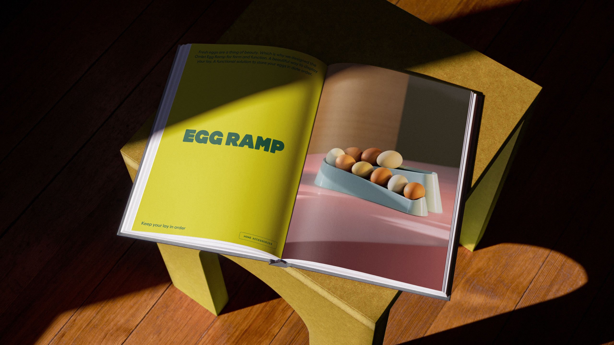
Where Omlet sets itself apart from other brands is its approach to product design: ‘we watch, learn, ask and invent’, as Omlet puts it. This means its range is based on animals’ needs, rather than the ‘assumptions’ of humans who look after them, and innovating on products based on findings from studying pet behaviour.
This ethos of constant questioning, and seeing things through the eyes of pets rather than owners, informed the ‘big creative idea’ Ragged Edge identified for Omlet – ‘a world of wonder for pets’, which is largely expressed through a series of brilliant tactile 3D illustrations and cute characters.
![]()

‘The pet product category is full of stuff designed for humans – wendy-house chicken coops and toys that look like fast food. We’ve projected ourselves onto pets instead of designing for them,’ explains Max Ottignon, Ragged Edge co-founder. Omlet takes the opposite approach, starting from scratch to design solutions for pets, not people. Every product they create aims to deepen the connection between pets and their owners.

Following a new round of funding, Omlet wanted the new branding to help its expansion globally, and we can’t see how this work wouldn’t: it’s eye-catching, flexible, and despite the bright colours and expansive cast of characters, the identity maintains a sense of clarity. The website, for instance, is a vast improvement on the previous iteration: it’s bright, straightforward and boasts intuitive navigation and clear categorisation.

The new branding is centred on a 3D illustration-led approach inspired by product design prototypes. Ragged Edge commissioned Holly Szczypka to create the illustrations, choosing her work that’s to the fact it’s ‘full of wit’ and tactility, as well as offering a highly distinctive aesthetic that directly references the products themselves.
Animator Adam Garbutt then brought the illustrations to life for motion applications, further underscoring the idea of Omlet embracing the more humorous sides and ‘imperfections’ of how we interact with pets.
For the new wordmark, Ragged Edge opted to make the most of Omlet’s existing brand equity by redrawing it in a way that retains much of its former design. Certain features have become more exaggerated, such as the redrawn ‘O’ which has become more egg-shaped, in a nice tongue-in-cheek self-referential nod.


The overall aesthetic of the letterforms looks to align more with the Omlet products’ design language, and Ragged Edge made some excellent font choices to accentuate that even further. The agency opted for Hammer Bold by Zurich-based type foundry Out Of The Dark thanks to it feeling ‘satisfyingly solid and durable’; while the supporting font is Swiss foundry Grilli Type’s GT Maru Mono, chosen for its ‘boilerplate feel’. Finally, the body copy is Prague-based Displaay foundry’s Fellix, selected for its combination of warmth and easy legibility.

There’s no denying how simply, brilliantly cute Omlet’s new identity is. And while some corners might argue that its unabashed adorableness undersells the products’ rigorous, unique design credentials, we’d argue that here, the two sides aren’t in opposition of each other, but in support of both sides. Cute doesn’t mean fluffy, but it can; likewise great industrial design needn’t be thoroughly po-faced to demonstrate its worth. With rigorous, considered branding work like Ragged Edge’s for Omlet; hopefully we’ll only be seeing more of that idea of co-existence rather than dichotomy in future.