Chilli Bomba by New Genre
Opinion by Emily Gosling Posted 30 January 2024

Based in what’s been optimistically named London’s ‘Design District’, New Genre is a pretty youthful studio that’s racked up an impressively broad range of projects and clients in its short life. Just shy of two years old, the studio has thus far worked across fintech, a non-profit art organisation, a pub, a beauty brand, and a campaign for Jamie Oliver Group-founded youth activist movement Bite Back.
Such a wide-ranging miscellany of work could be dismissed as unfocused, but in New Genre’s case, it’s pretty strong stuff across the board – perhaps an agency finding its feet, rather than one without direction. I’d argue that its strongest work to date, however, is in good old fashioned FMCG – a classic branding and packaging project that shows off the studio’s knack with deftly selected typography, superb illustration, bold colour, punchy messaging and playfulness.
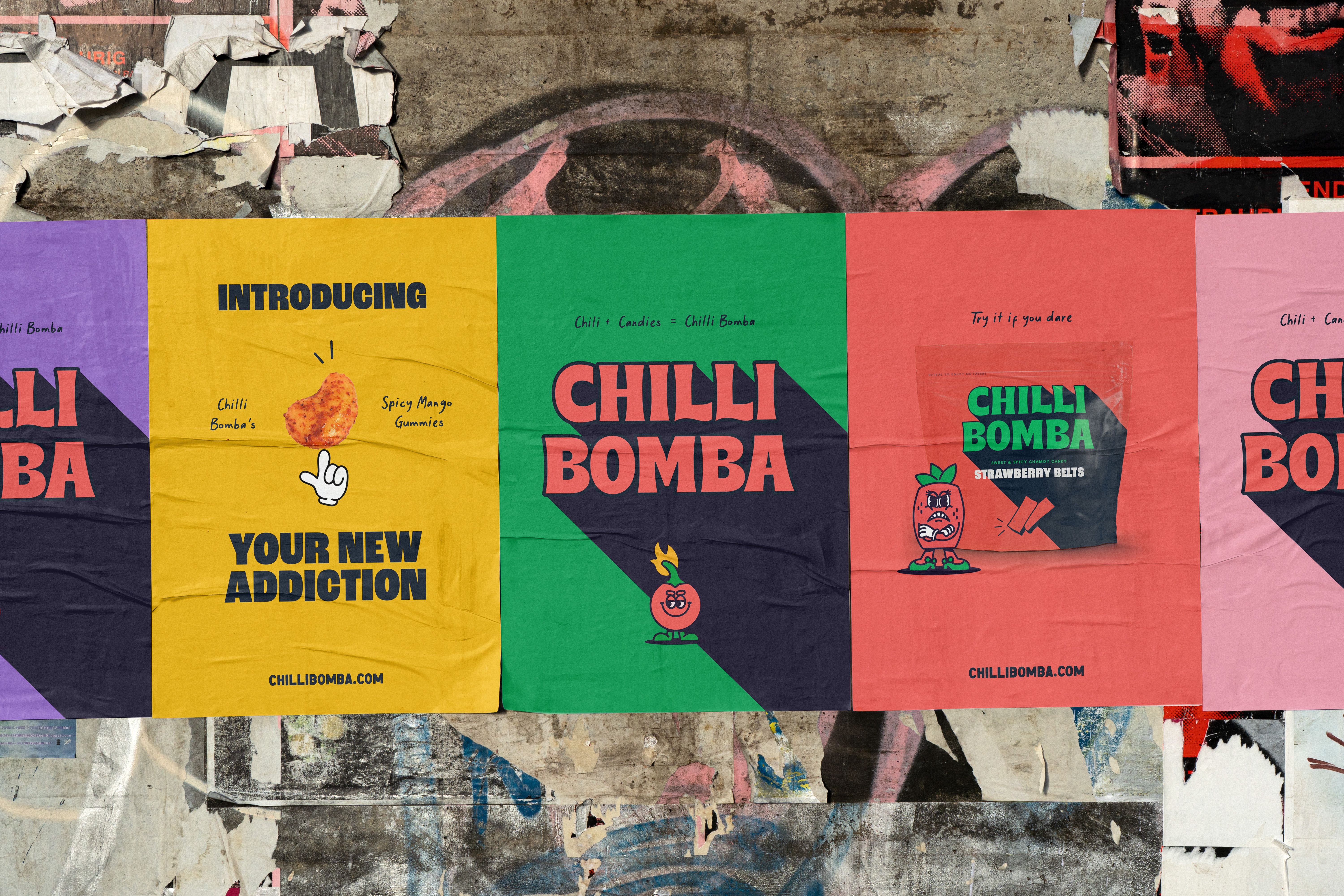
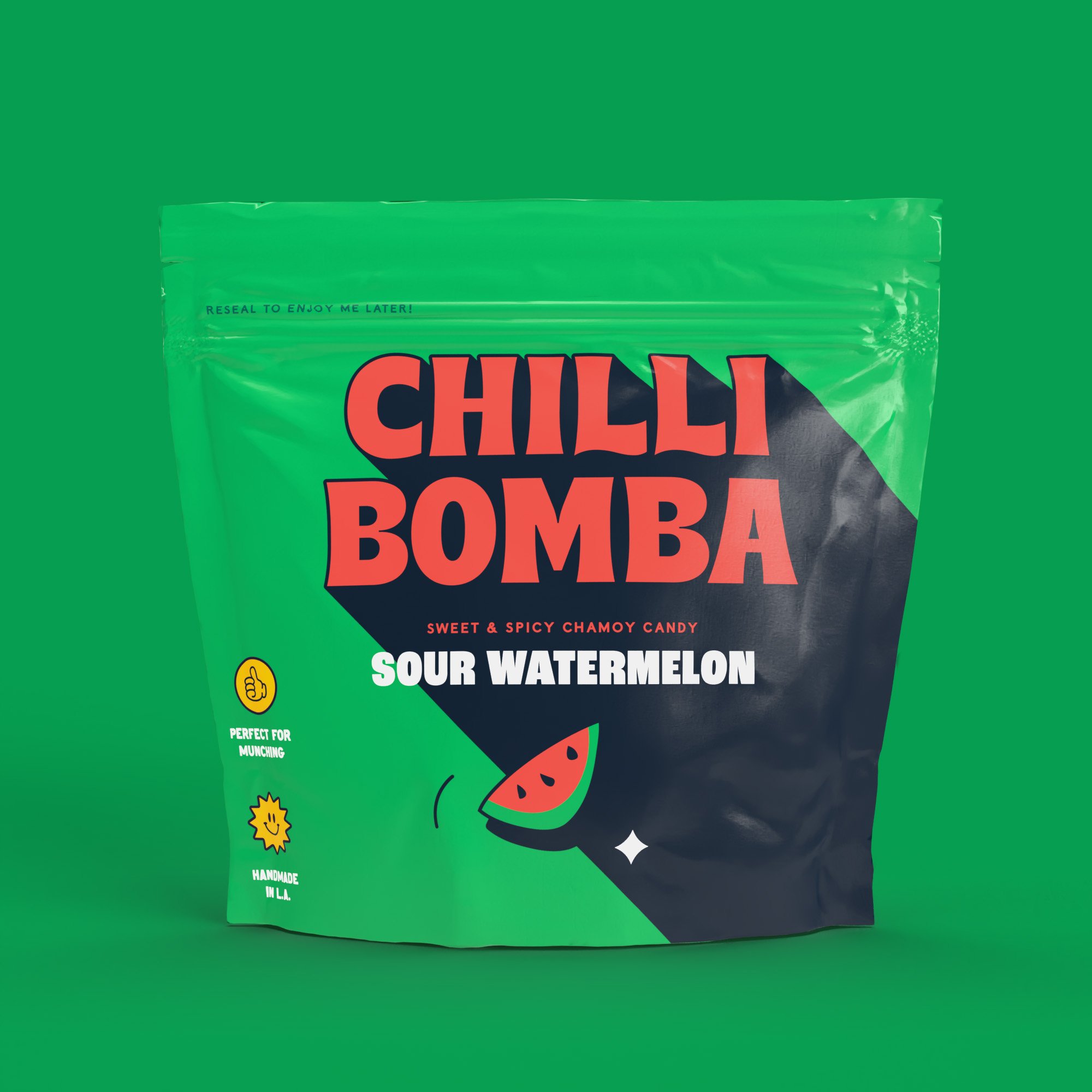
Said project saw New Genre create the identity for Chilli Bomba, a pretty unusual-sounding “gourmet” range of candy that’s billed as “equal parts sweet, spicy, and savoury,” and promises to break “the monotony of the overtly sweet candy-land”.
Based in LA, the small-batch-produced candies are mainly aimed at adults; and according to New Genre, the core of its strategy “quickly became” Candy for rebels’.
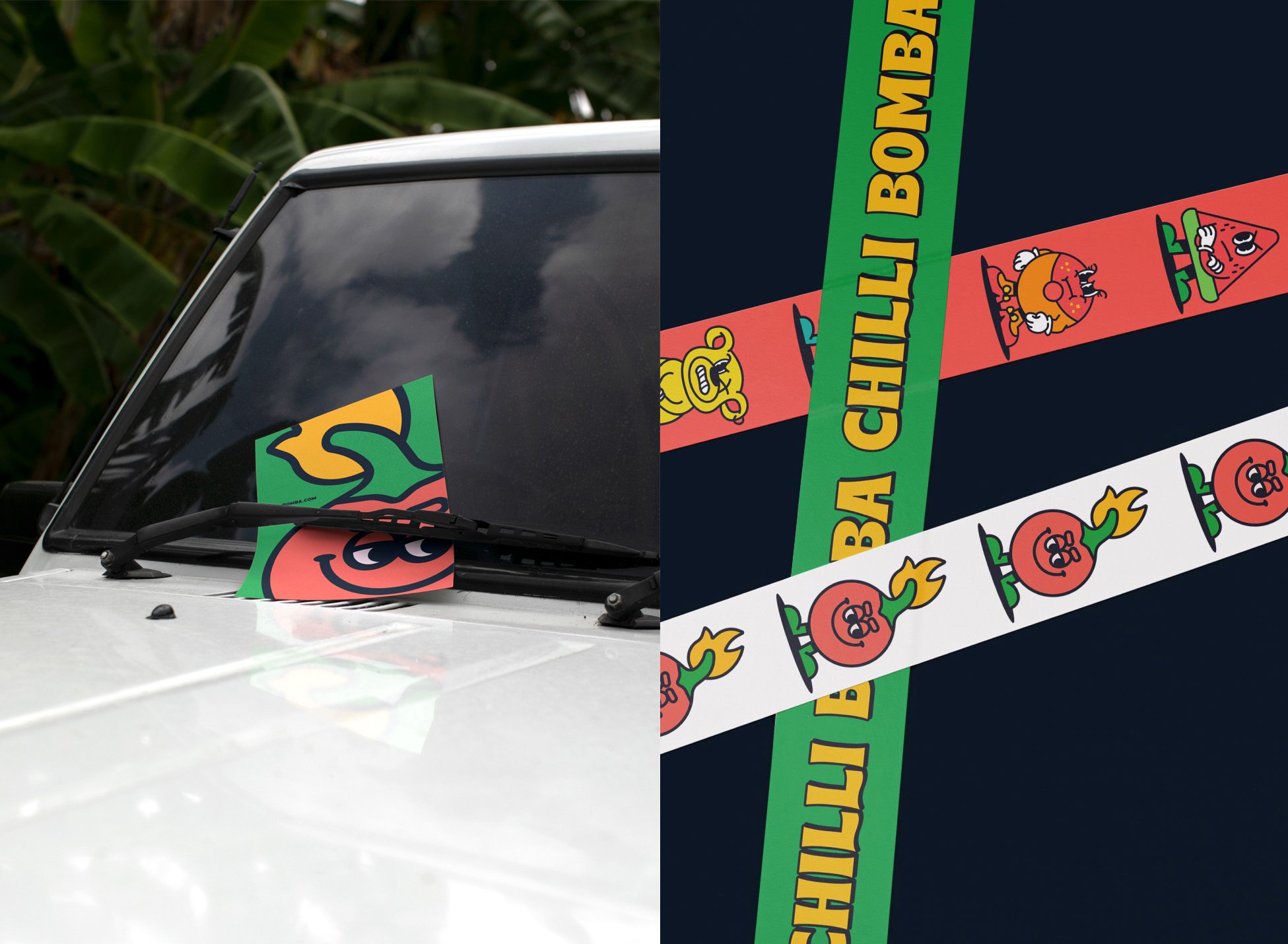
While the brand is resolutely adult-focused (and it’s hard to imagine an unwitting candy-seeking kid taking too kindly to an unexpected whack of chilli), there’s a whiff of childlike-leanings in the brand’s central mascot who, naturally, is named Mr Bomba. According to New Genre, this “dangerously playful” character represents “the explosive mix of sweet and spice”. He’s got a supporting cast of candy pals representing the various Chilli Bomba product flavours, too, which New Genre says are “known as the ‘Scovillains’”. We’re particularly taken with this furious-looking take on the ‘sexy’ green M&M, who represents the Spicy Peach Rings variant – a curious mix of Minnie Mouse gloves, racy red heels and a very furrowed brow. Spicy indeed.
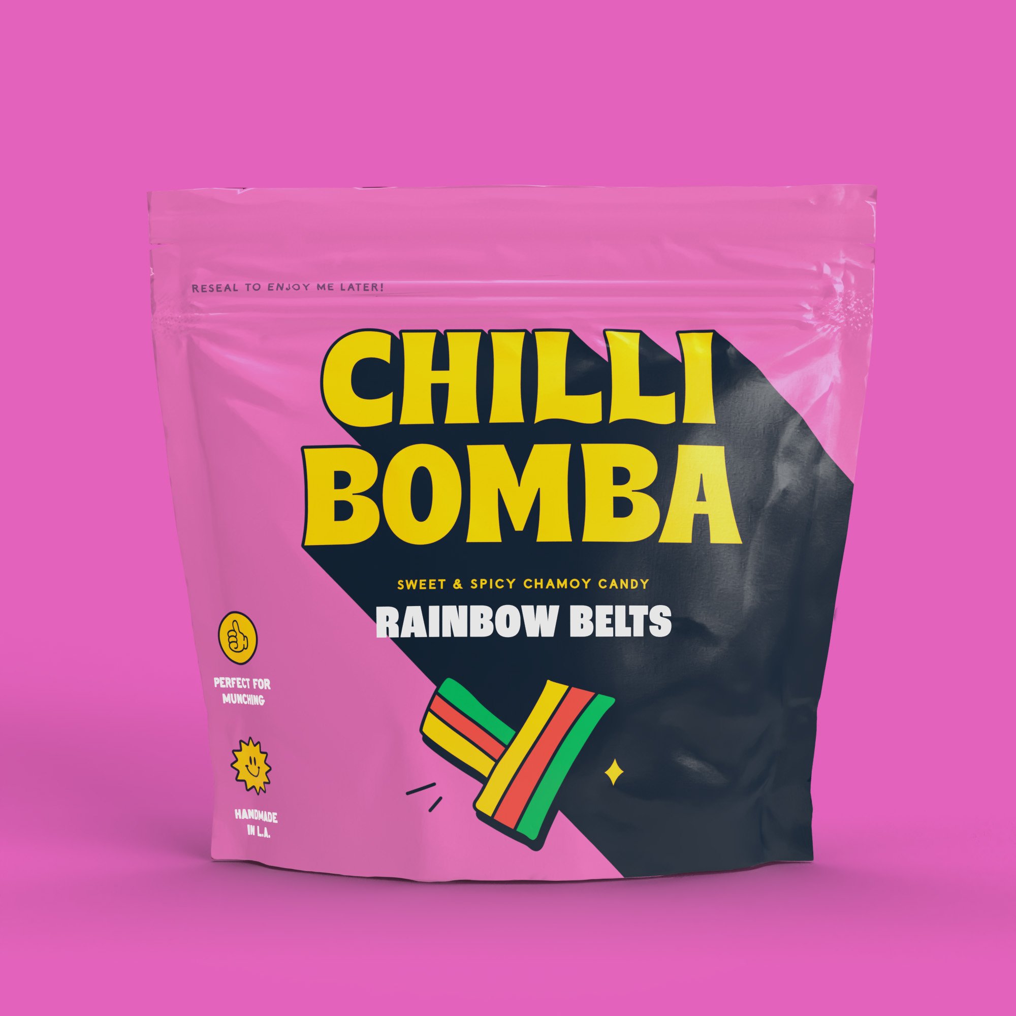
The illustrations are the standout element of Chilli Bomba’s branding: their slight fuzziness creates a sense of texture that makes the thick, black linework and gaudy colours feel that little bit different. The cartoonish, skateboard-sticker illustration style has certainly been doing the rounds lately – it’s been used on everything from finance software (The Collected Works’ Expensify) to cannabis gummies (Robot Food’s identity for Goldmine) to an influencer-founded coffee in the designs for Top of the Mornin’ – but Chilli Bomba’s illustrations still feel refreshing and relevant. There’s a sense with these characters that they’ve been bedded in – they feel like hardy perennials somehow –vmore a scruffy pair of Converse than the blinding white of box fresh Nikes. They’re also, simply, adorable; as well as being a smart flexible brand asset that can flex online in both static and animated formats, as 2D stickers, on billboards and other campaign materials and more.
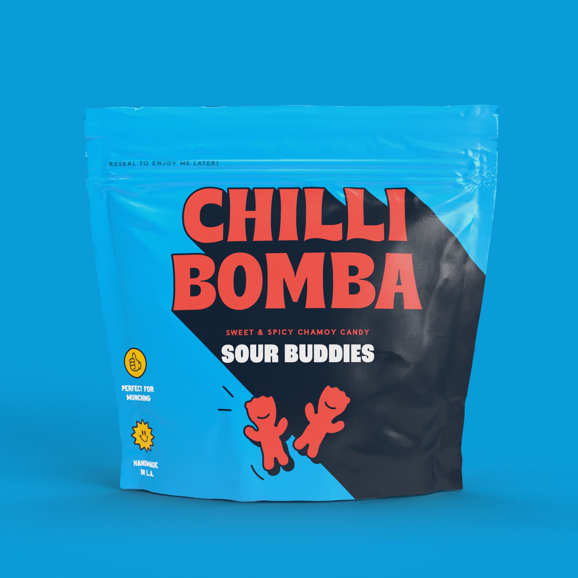
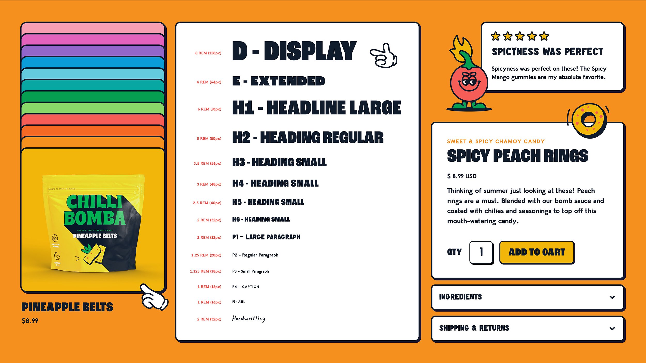
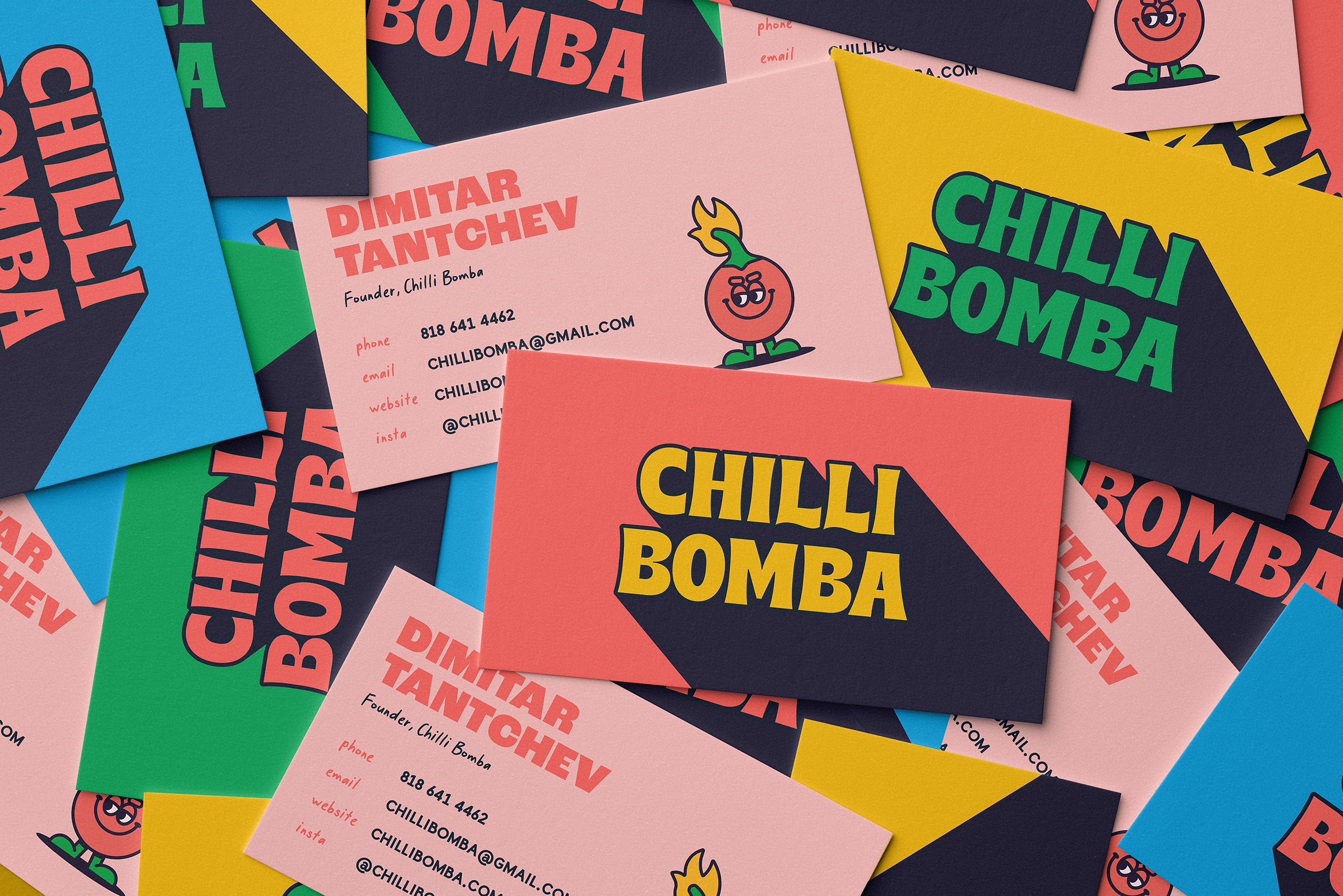
Alongside the illustrations, the other main feature that stands out is the typography. New Genre opted to use a combination of Brice by Typeeverything (which appears as the Chilli Bomba wordmark, as well as on other headline type), Adobe font Roc Grotesk, the deliciously shonky iII Hand by type designer ill Wookie, and finally another font that seemingly takes its name from the same bucket as many Soundcloud rappers, Lil Grotesk – a “quirky workhorse”, as New Genre describes it, from foundry Noir Blanc Rouge.
New Genre also designed the new Chilli Bomba e-commerce site, which showcases the most playful elements of the branding with sweet little touches like a cartoonish white gloved hand cursor, and no shortage of interactions with the characters that make the brand come to life.
It’s no mean feat to create an identity for a product that doesn’t (as far as I know) have any real peers or precedents: the branding has to do a fair bit of legwork in actually communicating what it is (here, chilli/spice-packed sweeties), where more familiar product ranges (things like jelly sweets, gifting boxes of chocolates) can let the ‘what’ take a backseat, and focus on the brand itself.
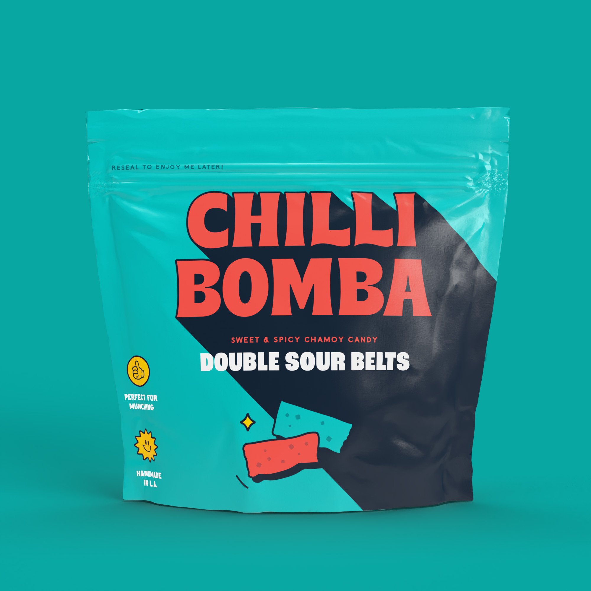
This is one area that New Genre hasn’t quite nailed: a quick glance at the packs and campaign didn’t tell me what these products were, and it was only on reading the case study that I fully grasped it. The individual SKU names don’t help – save for the on-pack illustrations, it’s not easy to decipher what ‘Rainbow Belts’ or ‘Mish-Mash Gummies’ are.
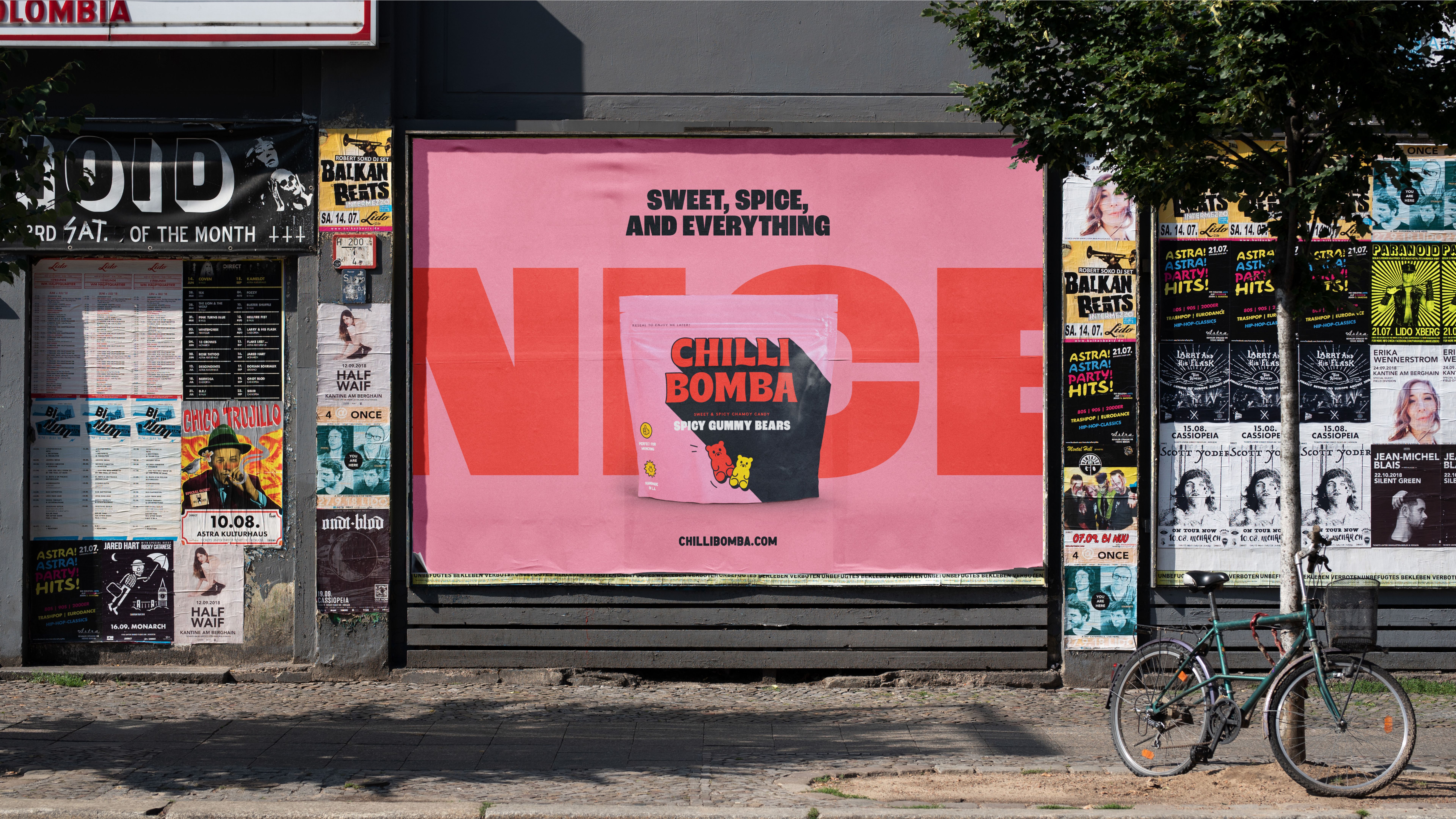
The only other questionable design decision is more an art direction one. The photography style is that rather on-trend high-contrast, unflinching starkly detailed hipsterish look, which is all well and good for the shots of some dude using a laptop emblazoned with Chilli Bomba stickers; but pretty terrible for shooting the actual product. Sure, it’s an honest depiction of what the candies really look like, but to us at least, a very off putting one. Unless you know they’re sweets, the red-flecked nuggets look like some sort of uncooked meat, all sweaty and bacteria-laden and grim. They look more like the sort of thing that’s sat in the window of a late night kebab shop since 2003 than a small-batch “gourmet” range of candy.
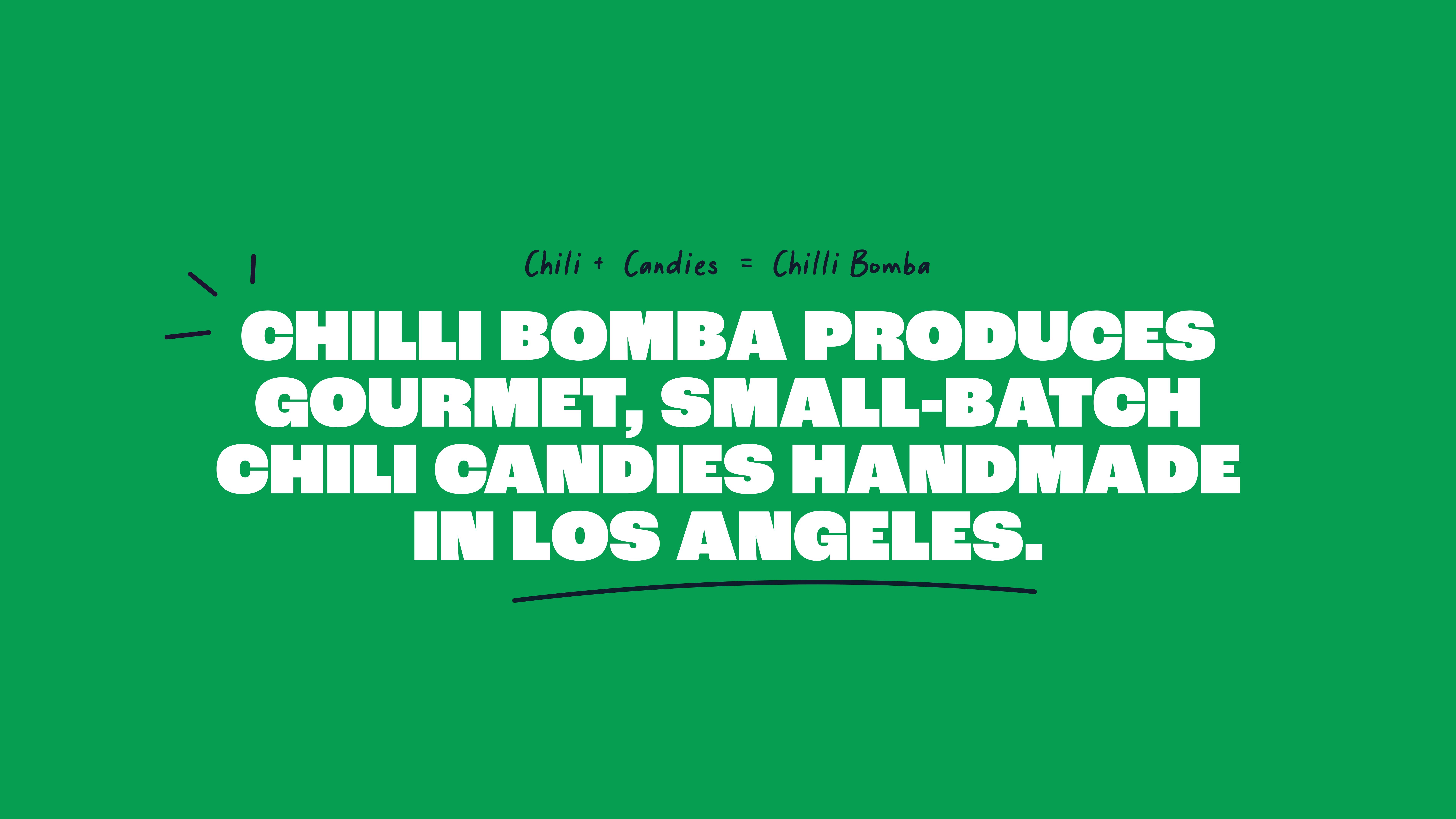
However, overall, the work is great. As well as facing the ‘relatively unknown product’ challenge, New Genre also had to navigate balancing bold, striking and – dare we say it – disruptive, with gourmet and grownup, all the while giving hints of artisanal foundations. That’s why New Genre’s work is smart: it’s all shouty wordmark, bright colours, and brilliantly drawn, cheeky character design, but there’s absolutely nothing childish about it.
