Mr Yum by Re Design
Opinion by Emily Gosling Posted 6 February 2024
Sometimes a project comes along that doesn’t just make you think about how nice its typography is, or ponder if millennial pink is making a comeback (or indeed,, if it ever went away), or why suddenly a branded bucket hat seems to be a key facet of any company/product/concept’s ‘swag’. Sometimes, it makes you think about what ‘branding’ even means, or its very function – it’s a sprawling term, encompassing everything that sets one company or product apart from another – its visual and verbal identity, its raison d’etre, its logotype and colours and fonts and attitude.
But how far does branding also have to actually help us understand what a product, company or service is, or explain what it is or does?All of these more existential musings came about thanks to Mr Yum. Who is he? What is he? What does he do? Is he even a he at all? Does he/it actually exist? Honestly, I have no idea. Still, Mr Yum’s branding looks pretty great. But is that enough?
What I do know is that Mr Yum is (or was – more on that later) a tech platform, and something to do with restaurants – billed as ‘the fusion between tech food and people’. We know this because it’s heavy on QR codes and lovely pictures of food, diners, and dining establishments. Beyond that – and I’ve really tried – I feel pretty clueless about it (almost Richard Madely levels of QR-code incompetence).
Nonetheless, onto the design. Mr Yum recently underwent a rebrand thanks to Re Design, a design/branding agency arm of the M&C Saatchi Groupwhich describes Mr Yum as a “mobile ordering and payments service” that’s a “critical part of the dining experience” and which helps venues grow.
![]()

It seems likely that the refreshed branding came about following a merger between Mr Yum and fellow food and beverage tech platform me&u last September. According to the site Power Retail, these companies had been in competition since beginning life as startups in Australia 2018 and “provide the hospitality industry with mobile ordering and guest marketing through QR code technology”. What’s slightly confusing is that this, as well as numerous other articles and posts (such as this one) from December 2023 state that the merger meant both businesses would operate only under the name me&u, dropping the whole Mr Yum thing entirely and working under a single new icon.
Re Design’s case study, however, makes no reference to either me&u nor the merger, instead saying that the studio was brought in because “Mr Yum needed a design system to convey their new positioning of ‘Better Together’, one that could power all parts of their business and capture the energy of their incredible culture”. Re Design adds (rather improbably, at least for those of us in the UK), “If you’ve eaten out lately, you’ve probably scanned a Mr Yum QR code”.


A key part of the brief was to “make a tech platform more human” according to Re Design, which worked across Mr Yum’s visual identity, website, illustration and motion design. All of these sit together to underscore the brand’s fusion of food, technology and people; and whatever it is that Mr Yum does or did, the new designs certainly achieve that aim.
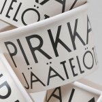
Everything from the colour palette to the fonts, layouts, photography style, wordmark and more point towards a youth-led, tech-centred, semi-aspirational but thoroughly playful sensibility – the latter underscored further by the rather daft, but lightly charming name, Mr Yum.

Re Design’s references to the tech stuff might be deemed a little ham-fisted if they didn’t look so great: it’s all grids, pixel fonts, and even patterns that replicate QR codes. They’re very obvious signifiers, but in the grand scheme of the branding, the agency gets away with it.
The visible grid also creates a sense of consistency across the branding, sitting beneath every layout whether that’s a sandwich board ad, social media post, merch item, stationery, or billboard.
The use of colour, too, is a smart way to unite the worlds of food and tech. There are three main primary brand colours, which are then subdivided into six further colours (including black and white), each with names that belie the usual formalities of Pantone numbers or hex codes: green becomes Margarita; purple becomes ‘Burple’, meaning that human element can peep through again. These colours are supplemented by a suite of secondary tones, some of which are gradients rather than a single shade. These, too, toy with food-led names: there’s a nice ‘Sauv Broccolini’ (whatever that is) green-to-white gradient; a saccharine millennial pink ‘Frosé’; and the relatively straightforward lurid yellow tone, Cheddar.


Again, the font choices are excellent: a nice tongue-in-cheek reinforcement of the idea of uniting emotion-led, lifestyle-leaning human elements with the cold, hard 1s and 0s of tech. Re Design commissioned a custom typeface by Wei Huang that “nods to QR codes”, according to the agency, which is used interchangeably with Söhne byNew Zealand-based Klim Type Foundry.

Re Design added further touches of playful personality with a suite of icons that look like the pixelated emoticons of yesteryear (there’s a particularly charming little martini glass); while the Mr Yum wordmark really comes to life in motion applications, morphing between a mouthwatering mass of letterorms made from churros and dripping in chocolate sauce, to appearing as shiny sushi salmon slabs.
It’s a shame that this lovely work for this confusing brand doesn’t seem to have had a chance to live and breathe in the world: when you click on mryum.com on this site, it redirects automatically to the me&u homepage. Still, not a totally wasted project: even just as a portfolio piece for Re Design, it’s a visually striking, dynamic, and ultimately very fun bit of work.