Spar by Raymond Loewy, 1970
Written by Richard Baird Posted 23 February 2024
The following is a guest article from Logo Histories, a weekly Substack newsletter from the team behind BP&O. Each week, Logo Histories shares the concepts and considerations behind logos and corporate identity design of the past. Read about the logos for Apple, Coca-cola and FedEx, Otl Aicher’s brand identities for ERCO, Bilboa Metro and FSB. Discover these and a 100+ more here.
Dutch organisation ‘DESPAR’ was established in 1932 by entrepreneur Adriaan van Well. Just like the Co-op, DESPAR was founded on a close co-operation between retailers and wholesalers at a local level, with the intention of better meeting the needs of customers with products at affordable prices. The name, styled ‘De Spar’, was an expression of this mission, and an acronym (or ‘backronym’) of the slogan Door Eendrachtig Samenwerken Profiteren Allen Regelmatig. In English this translates as ‘everyone benefits from working regularly together’.
In the late 1940s the organisation’s name was changed from DE SPAR to simply SPAR. In 1947 Spar Central Office in the Netherlands was approached by a number of grocery wholesalers in Belgium for guidance on forming voluntary groups. With their help, Spar was launched in Belgium in 1948. Later, in 1954 Internationale Spar Centrale NV was set up in Amsterdam to co-ordinate further international expansion and in the following years another 14 other countries were expanded into. Spar could be found almost anywhere in Europe as well as in South Africa, Greece and Japan. It would eventually introduce over 4000 stores to the UK, making it somewhat ubiquitous to the British.
In 1966, with the intention of unifying all Spar’s activities under a common organisational image, it embarked on a corporate identity programme and hired renowned designer Raymond Loewy and his Parisian design studio Compagnie de l’Esthetique Industrielle (C.E.I.) who were also working with French Coop at the time.
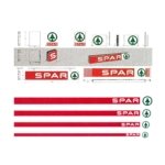
C.E.I designed a house style for Spar that consisted of three basic elements; the logo, logotype and an expanding red stripe.
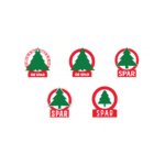
In Dutch, De Spar translates as fir tree (and sparen as ‘savings’). This was aptly used to identify the retailer from its initial founding. Even in 1932, the fir tree was depicted in a simplified manner and printed with a solid green colour on top of a red circle. This was adapted several times as the organisation grew and flourished.
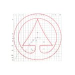
In order to present Spar as an increasingly modernised initiative, the fir tree logo was updated again. It was simplified further and given a more formalised geometric structure, improving the ease of its replication as signage, an important consideration as it expanded internationally and used foreign suppliers and sign-makers. This new version was used in the familiar Spar Green in order to capitalise on the reputation associated with the old logo, and establish, alongside the fir tree, a continuity. The logotype was also updated. This was changed from a condensed sans-serif to a unique custom drawn extended sans-serif. This made better use of the long shop fascias and road vehicles which were moving billboards.
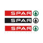
The addition of a further graphic element; a red stripe which could expand and contract, running the length of shop facia, provided Spar with a flexible element that could be adapted to fit and connect different shop types with vehicles and marketing. Helvetica, a typeface that was readily available in many different countries, was also introduced as the corporate typeface and would be used for signage and promotional materials.
Red, green and white, the basic colours of the old logo, were retained as it was felt that these were associated with notions of ‘freshness’ and ‘cleanliness’ and important elements in the recognition of SPAR. These would help transfer the goodwill that had already been established over a forty year period.
The new modernised system created by Raymond Loewy and C.E.I. afforded Spar far more flexibility when it came to unifying a diversity of storefronts in different countries with a range of architectures. It would also standardised interior graphics and promotional items that, through economies of scale, would reduce the cost of production. Strict design guidelines were created where none had been previously been instituted and, while individual countries would be invited to subscribe on a voluntary basis, Spar saw large-scale take-up as the identity was rolled out in 1970. This remained in place and in use for over fifty years and can be seen, largely unaltered, on shop fronts across the world today.
This article first appeared on Logo Histories, a weekly Substack newsletter. To instantly access an archive of over 100 Logo Histories, just like this one, and receive weekly stories straight to your inbox, subscribe here.