TWYG by Seachange
Opinion by Emily Gosling Posted 27 February 2024

At some point over the past half decade or so, someone somewhere decided that vowels were profoundly uncool: see Anthropologie’s wedding line BHLDN; “virtual sneaker” brand [what?!] and Nike acquisition RTFK; Blndr (yes, it’s a blender) and the likes of Tumblr, Pixlr, and Flickr, which dared to sneak in just the one. Reading such words feels a bit like learning shorthand again, but no one does that anymore; or saving as much space as possible in a txt msg to avoid forking out another 10p. But again, no one does that anymore.
Last year saw the launch of ‘TWYG’ – a resolutely all-caps, vowel-free luxury skincare brand that hails from New Zealand as is, of course, pronounced ‘twig’. It’s a rather sweet name really, but perhaps one that doesn’t scream ‘luxury’; or at least, that is, until you see the superb branding and packaging created by fellow New Zealander Seachange, an ever-impressive brand and design agency based in Auckland.

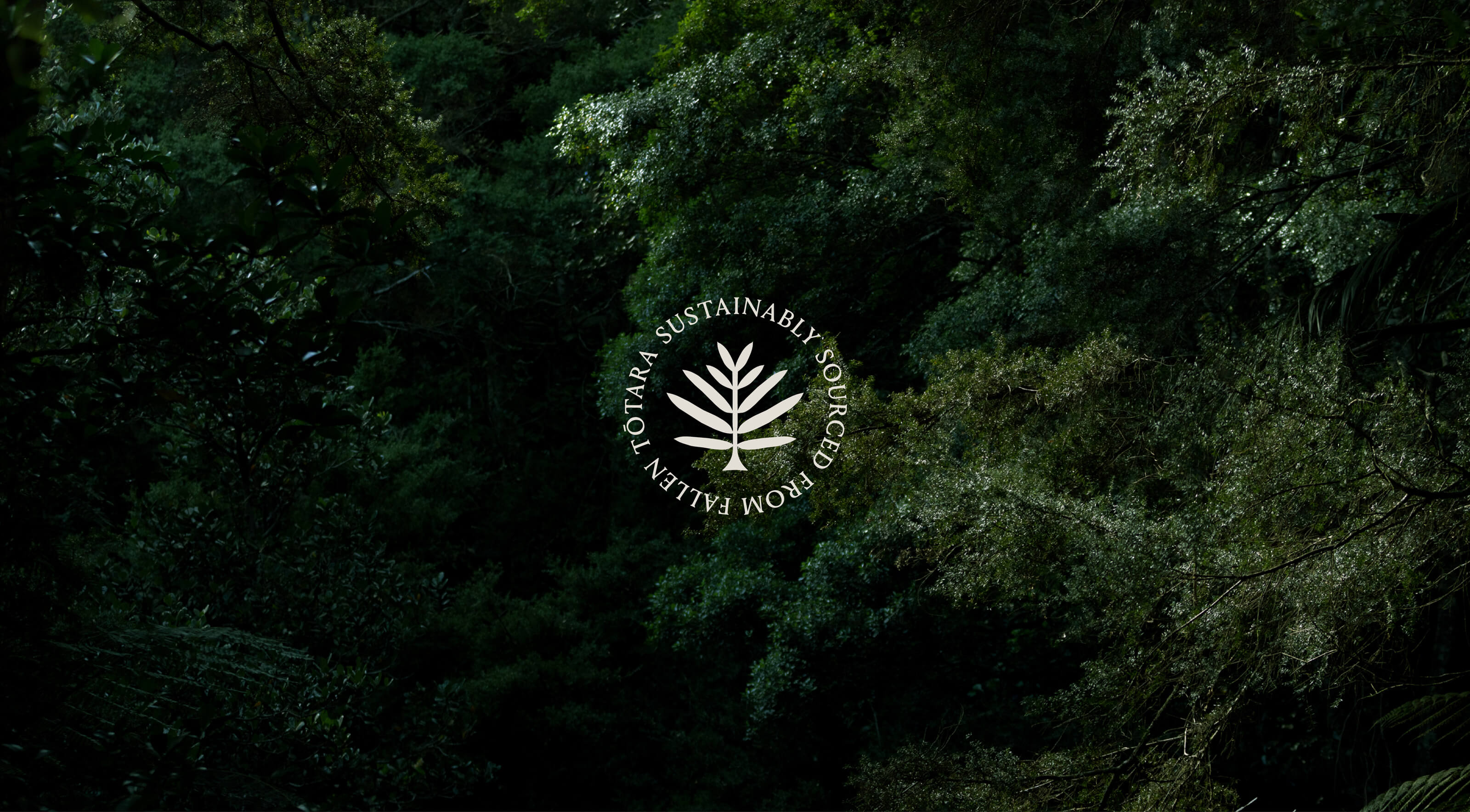
TWYG’s founders say the brand was created to tackle “environmental damage to our skin, that can lead to premature ageing” using an ingredient called Totarol which “dates back 100 million years”. This is harvested from the Tōtara tree and enables it to live for hundreds and sometimes thousands of years. “When carefully harvested, Totarol has the same antioxidant and protective properties for skin,” says the brand, which bills itself as “the world’s first luxury skincare with high-dosage Bioactive Totarol”.
![]()

Seachange created the name, brand identity, packaging designs and website for TWYG, having been brought in to work on the project – “an 18-month labour of love” – in around early 2022.
While the name might not be the best in my opinion, the structural packaging more than makes up for it. Seachange says the containers – gorgeously sculptural, contemporary orange forms – were inspired by the concept of ‘a forest of skincare’. The forest influence is thoroughly abstract, bar perhaps the differing heights and forms of the variants in the TWYG range, which currently includes facial oil, serum and “multitasking hydration cream”. But that’s for the best – it’s a forest as imagined by a hybrid of geometry-obsessed Modernists, Mediterranean climates, and Matisse.
If the whole ‘twig’ thing had been interpreted too literally in the designs, we’d be left with spindly brown forms, which would be useless. Likewise the forest has been interpreted with no small degree of artistic licence – green feels far too predictable, and surely it’s nigh on impossible to design skincare packing that resembles an actual woodland.


Seachange says that the packs were inspired by hero ingredient Bioactive Totarol, and that the “vessels represent totem-esk structures [which] when grouped form a forest-like silhouette.” The agency continues, “The palette is an extension of the burnt orange found in the core of the Tōtara tree, otherwise known as the heartwood.”
Seachange says that the custom vessels were designed as “keepsakes,” which makes total sense – the pots and bottles feel like weird little pieces of art that you certainly wouldn’t want to hide in a bathroom cabinet. The structural packing designs become the branding, turning the usual mode of applying 2D branding to existing pack shapes on its head. It’s masterful.


The keepsake idea is reflected in the focus on sustainability in the material choices: the lids, which each take on different semi-circle shapes depending on the product, are made from recycled plastic in New Zealand; while the bases use “infinitely recyclable” glass. TWYG has also said that it’s developing refills to become more environmentally friendly in future.
Since the pack shapes do so much of the heavy lifting when it comes to the visual identity, the wordmark is a lot more pared back. Using bespoke lettering, the serifs subtly underscore the idea of tree roots, branches, and – of course – twigs. It’s a smart choice typographically: while those serifs gently underscore the organic credentials of the products, it looks classy, bringing the rigorous scientific side of things to the fore and creating a sense of authority and trustworthiness. Without being at all shouty, obvious or cliched, the logomark – like the products – unite ancient wisdom and thoroughly modern design sensibilities.


The bespoke type of the wordmark is supported by two secondary fonts: GT Alpina by Swiss type foundry Grilli Type, which describes it as a “workhorse serif” but with some lovely expressive little nuances, and its classic sans seif counterpart, Helvetica, which only ever appears in all-caps.
The website design is a lovely extension of the branding as found on the packaging and other applications, making the most of the suite of distinctive but functional shapes and patterns and using some lovely little moments of motion design that bring it all to life.
If, as TWYG says, the brand is all about “celebrating the ritual of skincare by igniting all of our senses”, Seachange’s designs for it couldn’t be more spot on. They’re truly original, playful and just very lovely to look at – they feel classy without feeling exclusive or exclusionary, playful without being daft, conceptual while remaining functional. More often than not, terms like ‘category-defining’ or ‘disruptive’ are bandied about a little too freely; but here, finally, they seem very fitting.