Ventura Foreman by Studio Blackburn
Opinion by Emily Gosling Posted 7 March 2024

Founded by Robert Ventura and Sophie Foreman, Ventura Foreman is a design and manufacturing studio based in Woolwich, south London, which specialises in quality workwear pieces for clients like Paul Smith, Matches, and much-hyped North London ‘liberal metropolitan elite’ take on the greasy spoon, Norman’s Cafe.
Having been around for a while without a ‘brand’, there came a point in the company’s life that it needed a coherent visual identity, and it appointed London-based Studio Blackburn to take that on.
The brief was something of an unusual one, in that Ventura Foreman wanted an identity, but not a ‘brand’: its workwear-focused, practical roots still had to come through. Like so many brands (or in this case, not-brands) before it, Ventura Foreman wanted to prioritise and convey the idea of ‘authenticity’.
It’s an interesting one, the whole branding-but-not-branding thing; and begs the question, what’s the difference between a brand and an identity? And, for this project specifically, how do you get branding when not a brand? What are the parameters? Is this, then, just a ‘look’?
Whatever the answers to these rather philosophical musings, Studio Blackburn’s approach was to keep things very, very simple and functional.


The idea of an identity that feels sort of ‘off’ underpins the whole concept; deliberately eschewing any sort of perfectionism and celebrating the quirks and peccadilloes of things that are just a bit wrong, slightly off-kilter, colouring it in a wee bit outside the lines.
The idea was to create the perception that the brand is ‘clean, simple and familiar but that something is not quite right’. This feeling of ‘a little bit wrong’ was applied to everything, including the information hierarchy that prioritises Woolwich, the typographic system, the ‘logo’ (which is really a collection of words relating first to place, then the actual company name) and even the way that labels are attached to garments.
The colour palette, meanwhile, doesn’t really exist: paper stocks and different colour tones are instead dependent on the specific clothes themselves, and the fabrics they use. As such, on branded assets like print collateral, labels, boxes and so on, the colours range from muted grey and mauve to pops of bold primary red and blue.
![]()


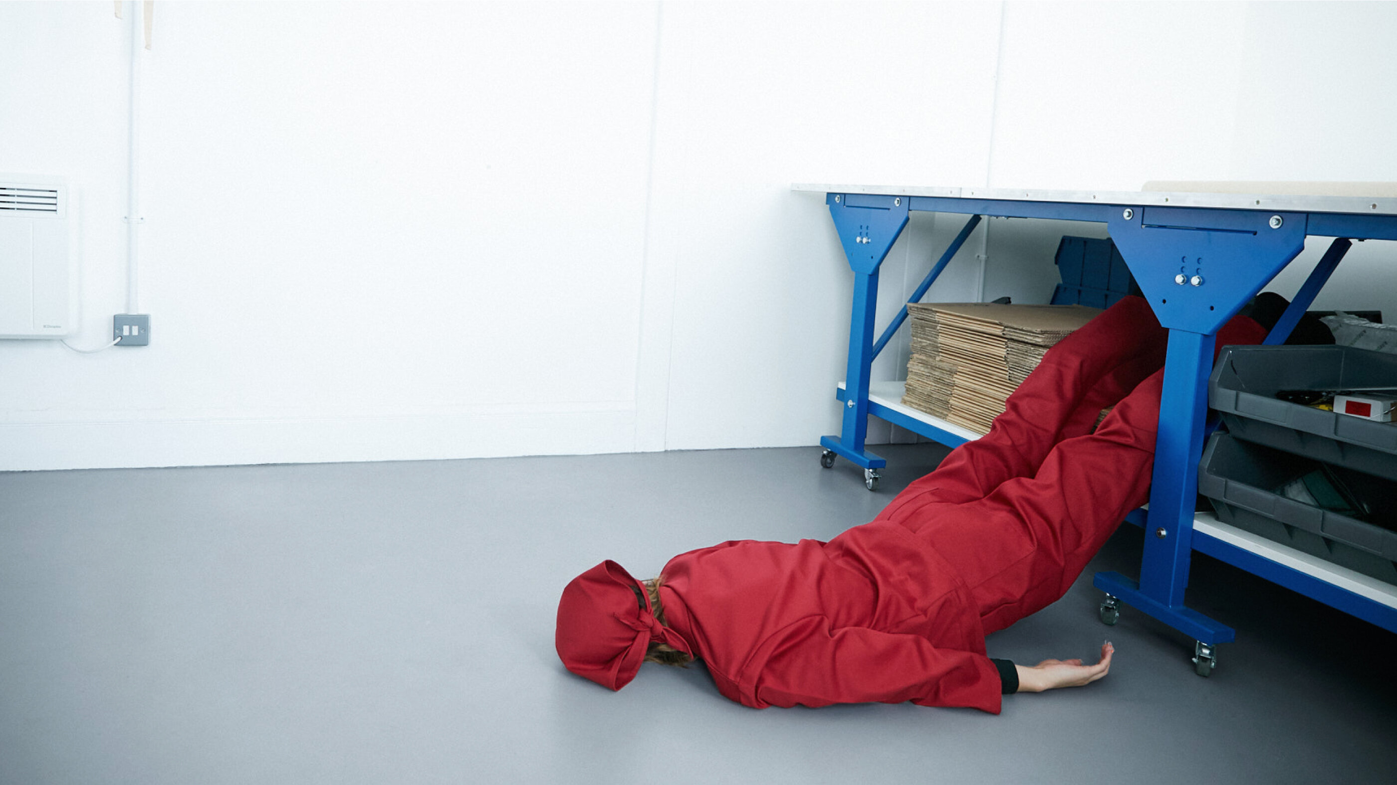
The art direction on the Ventura Foreman photography is also very much ‘a bit wrong’: take this hilariously strange, almost Toiletpaper magazine-esque pic where a woman seems to have flopped off a shelf.


The star of the show is the typeface, a robustly workaday typeface by Berlin-based type foundry Dinamo – ABC Marfa Medium. Described by the foundry as ‘a sturdy, utilitarian typeface’, it’s inspired by the days of metal typesetting and since an update, includes small caps and old style figures ‘just how printers and designers in the late 19th Century liked it’. The identity uses an interesting interplay of the typeface’s lower and uppercase letters, and also of its other characters – the comma, for instance, between the in-your-face all caps of LONDON and UK. There are no other supporting fonts, meaning that it creates a powerful, no-nonsense and stripped back typographic system that feels perfect for the client.


It’s that typeface that allows its co-star to shine, too: Woolwich. Traditionally not a place that’s associated with taking centre stage – more industrial estates, Kafkaesque bus routes, and its place as the filling in a sandwich between Greenwich (picturesque, home of time itself, maritime museum) and Thamesmead (Brutalist, home of countless Goldsmiths performance art projects).
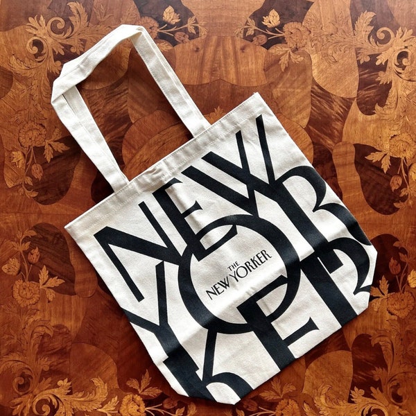
Here, however, Woolwich is elevated to the status of the sorts of places that are adorned on statement tote bags and baseball caps – New York! Berlin! Er, Peckham! The rather long wordmark, if we can call it a wordmark, sees Woolwich placed far above even the name of the company itself: ‘Woolwich LONDON, UK Ventura Foreman’, emphasising the role of place over people; functionality over personality. And it really, really works. If the brief was all about centering Ventura Foreman’s functional, practical, ‘authentic’ roots, then celebrating one of south London’s rather more hidden gems makes perfect sense.


