Moksi by FCKLCK Studio
Opinion by Thomas Barnett Posted 26 March 2024

Dutch studio FCKLCK’s all-caps, blood-red website is full of declarations of belligerent provocations such as ‘OUR FAVOURITE CLIENTS ARE THE ONES WHO HAVE EVEN BIGGER BALLS THAN WE DO’. Talk of ‘CUTTING THROUGH THE BULLSHIT’ is accompanied by a mouseover gif of a defecating bovine. The name is of course an expletive repudiation of serendipity (who needs luck when you’ve such prodigious knackers, right?). Yet, such apparent brashness belies a perspicacity and lightness of touch that allows FCKLCK to create work like its identity for Moksi, a unisex skincare brand that creates skincare products for people who are undergoing cancer treatment.
FCKLCK was approached in late 2022 by aspiring entrepreneur Lies De Nyn. Having recently overcome breast cancer, Lies experienced firsthand the challenges of sourcing and evaluating skincare products compatible with radiotherapy, chemotherapy, and other cancer treatments. As Moksi explains on its website, one of the many side effects of cancer treatments is that ‘your skin’s natural immunity and protective barrier can become compromised, making it highly sensitive to certain ingredients, products and environmental factors’.
In addition to a specially tailored formula, the branding for such a product needs to be precisely calibrated to speak to people for whom illness has become something that begins to define them in the totalising experience of being ‘a patient’. Moksi aims to reclaim some of life’s simple pleasures from the cavernous maw of illness and treatment. Skincare is ritual, and ritual is profoundly human and humanising. FCKLCK’s work for Moksi recognises those essential truths.

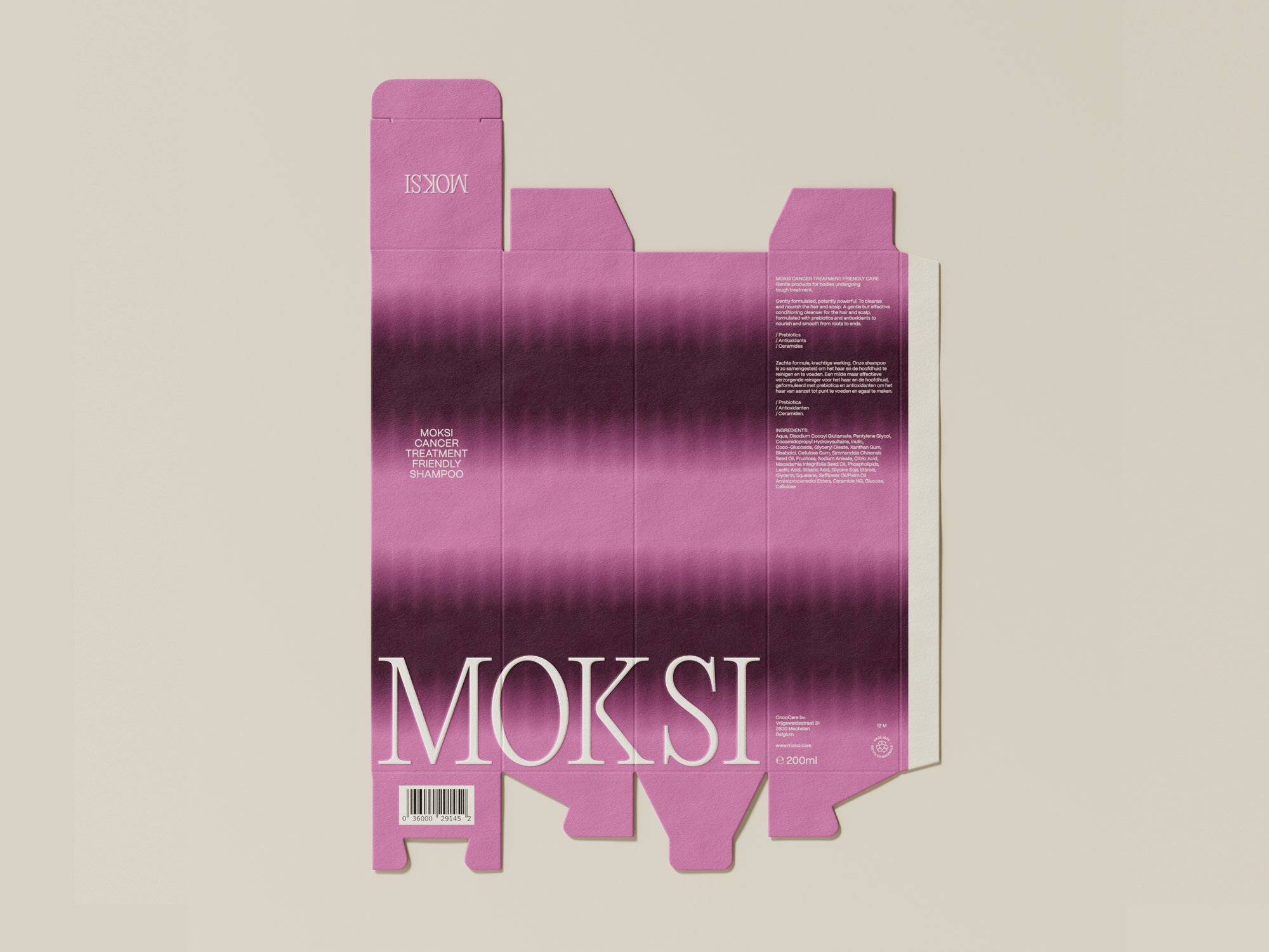
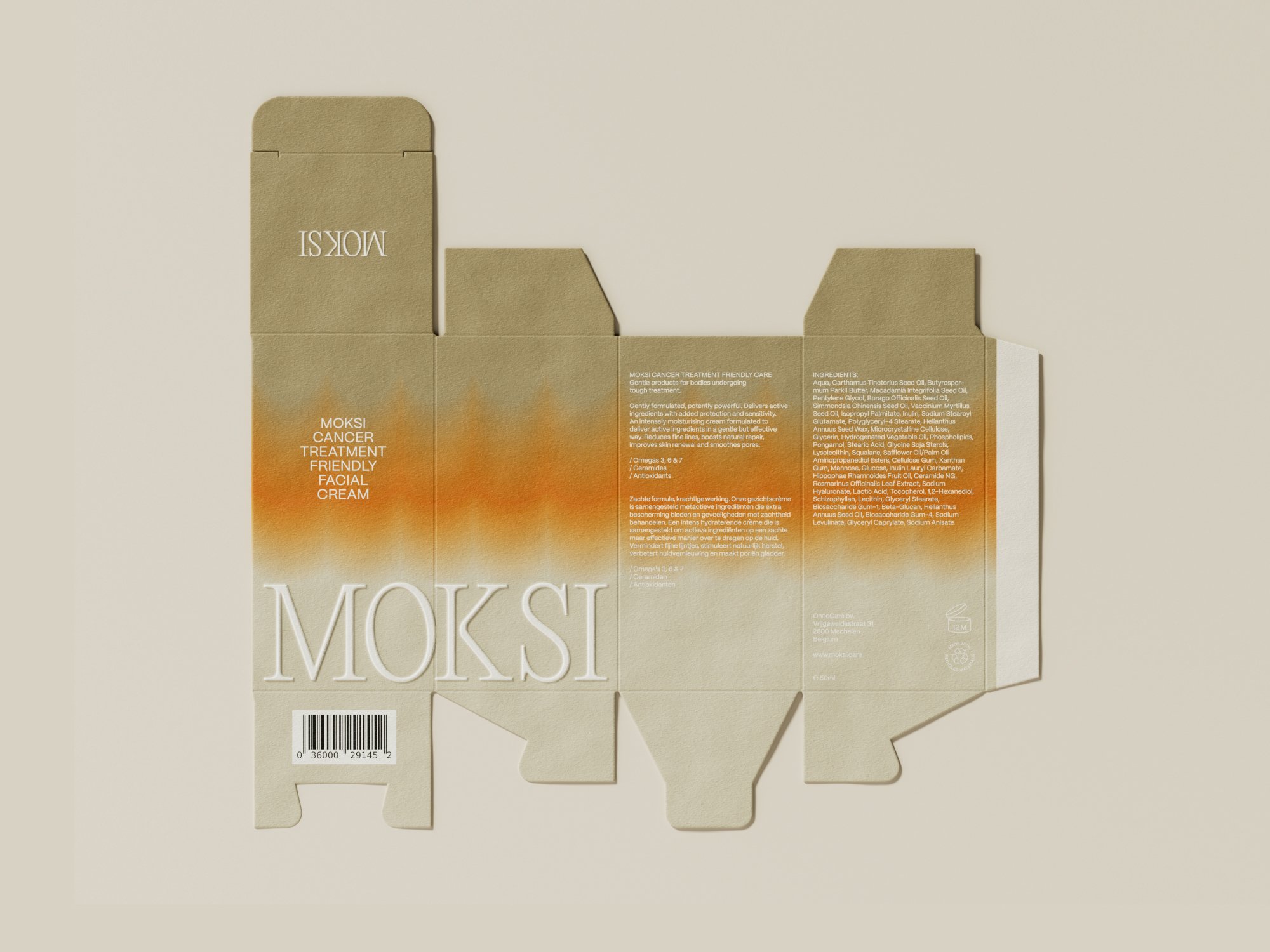
FCKLCK points out that it was involved from the inception of this project, offering input on the naming of the brand. It says the choice was ‘instinctive – upon meeting Lies the word “moxie” immediately resonated’. The adjusted spelling is a canny strategic move, distancing the term from its dated Jazz-age ring of feminine feistiness and instead ‘imbu[ing] the brand with a sense of neutrality’. The phonetic spelling – which in case-study speak ‘incorporat[es] a robust K’ – also becomes ‘a pivotal element in the logo design’.
![]()

FCKLCK’s logotype takes a less-is-more approach, with successful results. The unadorned wordmark is set in Editorial New Ultralight, from type foundry Pangram Pangram. A slight modification to the K (rounding and softening the normally sharp vertex of the upper and lower arms into a sensuous curve) nicely picks up the languidly curved brackets of the serifs, and highlights a satisfying tension between these curves and the otherwise rather spiky profile of this lightweight font.
The logo appears at large scale (often full-width), wherever it is used across website, packaging and posters. The combination of rounded and angular forms creates enough rhythm to sustain interest even when used in this way as a larger graphic element.


PP Editorial New is also used throughout brand communications for top-level headings and pullouts, carrying on from the logo a feeling of elegant restraint and sly subversion of tradition. Most applications, however, are set in Mori Regular (also from Pangram Pangram), used for both headings and body copy. It makes sense to avoid overusing PP Editorial New, since most layouts are already dominated by the large-scale wordmark. FCKLCK contends that ‘the use of Mori Regular contributes sophistication and clarity, ensuring that informative text remains legible and tranquil’. It’s a perfectly rational font pairing with the excellently chosen Editorial New, though there’s something a little cold and robotic about it that slightly misses the mark – perhaps it’s those elongated, linear apostrophes and commas. This font pairing highlights the slightly strange place that this identity occupies, poised between luxury and illness.


If the font pairing misses the mark on this point, then FCKLCK’s highly distinctive colour palette and set of patterned gradients provide the perfect Rothko-esque abstract canvases in which to read spiralling depths of philosophical meaning. They are tentative, gentle, subtly joyful, yet also faintly queasy and pallid. They have a pale, muted beauty, in a way that perhaps speaks empathetically to those undergoing treatment, rather than assailing them with belligerent cheerfulness.
FCKLCK explains that the palette is a deliberate gesture to dawn skies, ‘a symbolic representation of new beginnings and an optimistic approach to taking each day as it comes’. While some of the softer blue and pink palettes more obviously fit this rationale, there is something a little more surreal, more psychedelic, about the idiosyncratic colour combinations and the repetition of the gradients into scalloped, wave-like forms than just a naturalistic simulation of dawn skies. They feel more reminiscent of the blurs of indistinct colour that burst behind your eyelids when you look at the sun too long – that is, there is something about these colour choices and gradients that speaks of an intimate, bodily interiority, at least as much as any exterior reference in the natural world.
These subtle evocations of the colours and textures of our interior world bring to mind Viriginia Woolf’s description, in her celebrated essay On Being Ill, of ‘the undiscovered countries… what wastes and deserts… what precipices and lawns sprinkled with bright flowers’ are disclosed ‘when the lights of health go down’.
That same quiet grace and tenderness pervades the photography, which approaches fine-art levels of documentary lyricism in showing human beings performing the most innate self-care rituals in the face of terrible suffering. This is not the half-hearted stab at ‘no-filter’ realism that is normally produced from such a brief. Many of these shots are genuinely great portraits. You wonder about the people depicted: their names, their diagnoses, their joys and their pain. FCKLCK says that the photography ’employs natural lighting to capture real people in genuine environments, reinforcing the brand’s commitment to transparency and connection.’

In this visual identity, the altered landscape of illness is conjured with such elegance that at no point is Moksi made to feel medicinal or gloomy. Rather, such a nuanced and articulate engagement with illness well equips this brand to frankly survey the topography of that strange land, and to speak to the very real needs of those who find themselves suddenly inhabiting it.