Mazda by Rei Yoshimura & PAOS, 1975
Written by Richard Baird Posted 21 March 2024
The following is a guest article from Logo Histories, a weekly Substack newsletter from the team behind BP&O. Each week, Logo Histories shares the concepts and considerations behind logos and corporate identity design of the past. Read about the logos for NBC, ICI and Spar, Saul Bass’ brand identities for Warner Communications, Lawry’s and Minolta Discover these and a 100+ more here.
Toyo Kogyo Co., Ltd. was the first to develop the commercial application of rotary engines. Despite this technological achievement, it hadn’t been able to move its image away from being a manufacturer of three-wheeled service vehicles.
In 1971, in an effort to reposition the corporation as a leading manufacturer in the minds of consumers it launched ‘Project Eliza’. As part of this, a review of its corporate identity would be undertaken, standardising and bring into coherence all aspects of its communications, future proofing the brand and providing it with a set of stock assets that would live for ‘as long as possible’.
Driving the development of the Mazda corporate image was Japanese design studio PAOS, who defined three ‘conceptual expressions’ to define all aspects of the new corporate identity; progressiveness, high quality and empathy.

Prior to starting on the visual identity, PAOS studied the basic requirements from the standpoint of corporate communication and brand strategy. During this study problems were clarified. The first was the confusion caused by the interchangeable use of corporate name ‘Toyo Kogyo’ and brand name ‘Mazda’. The second was that the ‘circled M’ logo that was being used was often misread as an ‘h’ and ’n’. And thirdly, the basic elements that were used by Toyo Kogyo lacked a system, creating discontinuity and reducing impact.
With these in mind it was decided that the brand name Mazda would be prioritised. The old logo would be replaced with a new and unambiguous symbol. And a system of assets would be developed to standardise all forms of communication going forward
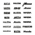
Prior to the development of a new logo, which would be the ‘nucleus’ of a new CI system, a set of design goals were settled on. The new mark must appeal to both a national and international audience. It should be easily readable as ‘Mazda’. And it must be clearly distinguishable from the marks of other corporations.
A two-stage closed design competition was carried out, with six designers being asked to submit proposals. At the first stage, five proposals from four of the six participating designers were selected from a field of 21 (above). To these a sixth proposal was added. This was a refinement of an existing logotype. Proposals at the second stage were subjected to image tests within Mazda to gauge effectiveness. This involved the general public and leading designers.
The proposal selected after this final stage was created by New York-based Japanese designer Rei Yoshimura. This was subjected to careful refinements in letter weight and lateral and vertical proportions to generate four versions from which the final design was chosen.

Yoshimura’s proposal placed emphasis on the letter at the centre of a new logotype with a diagonal stroke cut from the horizontal bars of the ‘Z’. This provided visual interest, dynamism and character, and would be used for general and formal purposes, and when an ‘immediate impression’ was desired.
Following the decision on the new logotype, efforts were directed towards the development of design elements such as colour, a typeface to style product names and supporting visual assets as well as their systematic application.
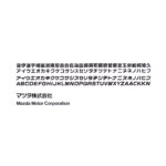
PAOS took the diagonal stroke of the ‘Z’ and developed a secondary graphic element that could be used as a dynamic element across vehicle liveries. Alongside this, a blue square introduced a striking new corporate colour that intended to give the impression of a clear blue sky and express the Mazda’s concern with environmental preservation. This blue square and the logotype formed the basis of a new modular signage program, reducing fabrication costs by 30%.
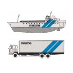
The standardisation of the signage, packaging and stationery would save Mazda vast amounts of money, brought clarity to much of its corporate communications and gave it a future-proof set of parts to grow with.
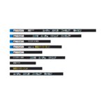
For Mazda, the new corporate identity developed by PAOS was the key to its recovery and was the driving force behind its emergence on the global car market. In 1984, the firm officially changed its name to Mazda. Today, the Mazda logotype exists in a slightly modified form, working in conjunction with symbols introduced in 1991 and then 1997.

This article first appeared on Logo Histories, a weekly Substack newsletter. To instantly access an archive of over 100 Logo Histories, just like this one, and receive weekly stories straight to your inbox, subscribe here.

