PAIST by Two Times Elliott
Opinion by Emily Gosling Posted 4 April 2024
Toothpaste hasn’t historically needed to do a lot, design-wise: it’s a category based on functionality and efficacy, over trends and aesthetics – sensitive teeth, whitening processes, goth-adjacent charcoal formulas, weird little crystals, and so on and so forth.
That function over form thing has meant that over the years, toothpaste packaging has become incredibly monotonous – usually a predominantly white, red and blue confection with occasional glimmers of purple. It’s all a bit sterile at this point, with little differentiation between brands and products.
But if historically-rather-dry sectors like investment firms and home energy insurance plans can be given slick, smart identity revamps, toothpaste can certainly be given a significant shakeup for the better.
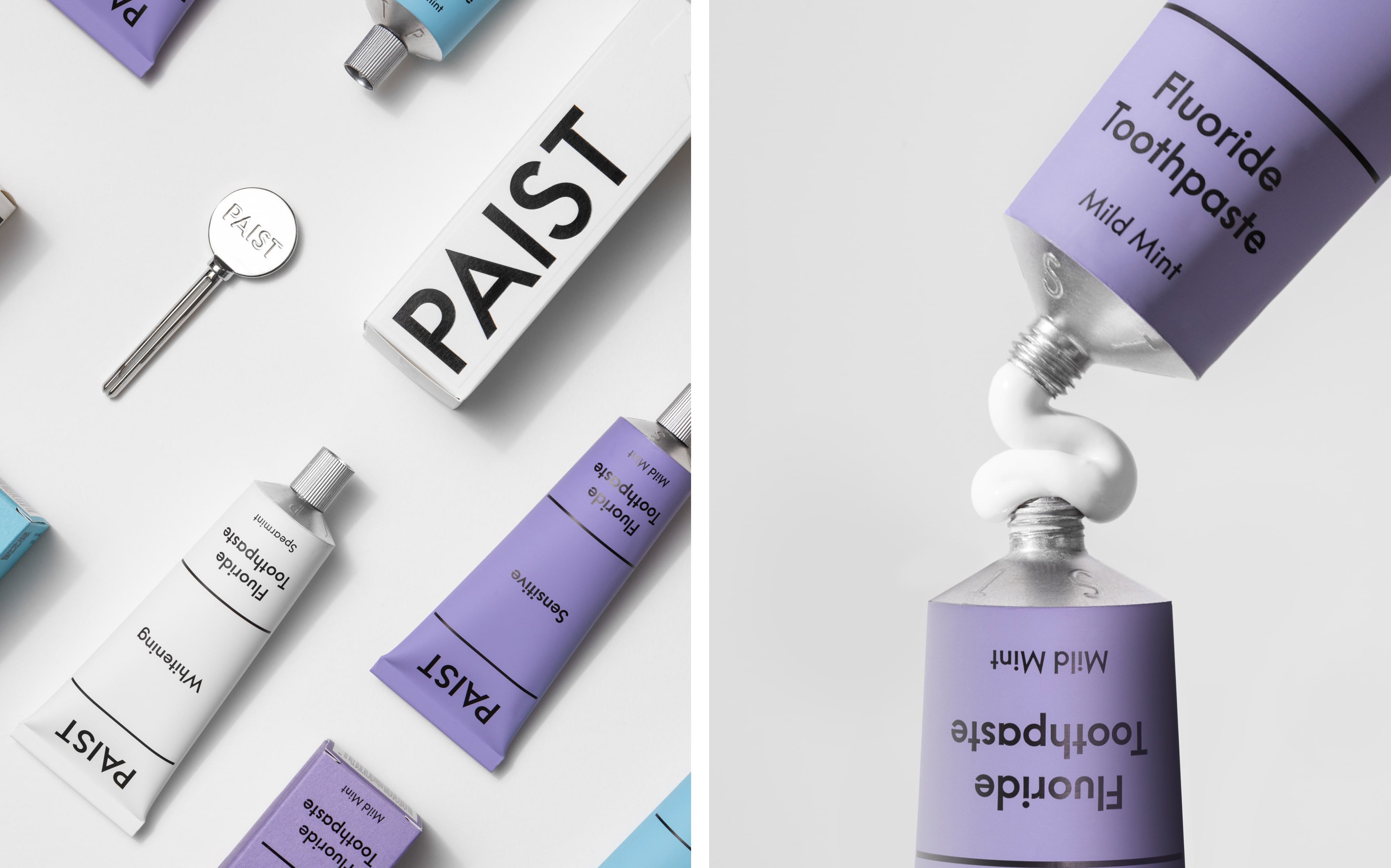
London-based design studio Two Times Elliott has bravely taken on the challenge of ‘disrupting’, for want of a better word, designs for toothpaste. And the results are as brilliant as a dazzling mouth of Turkey teeth.
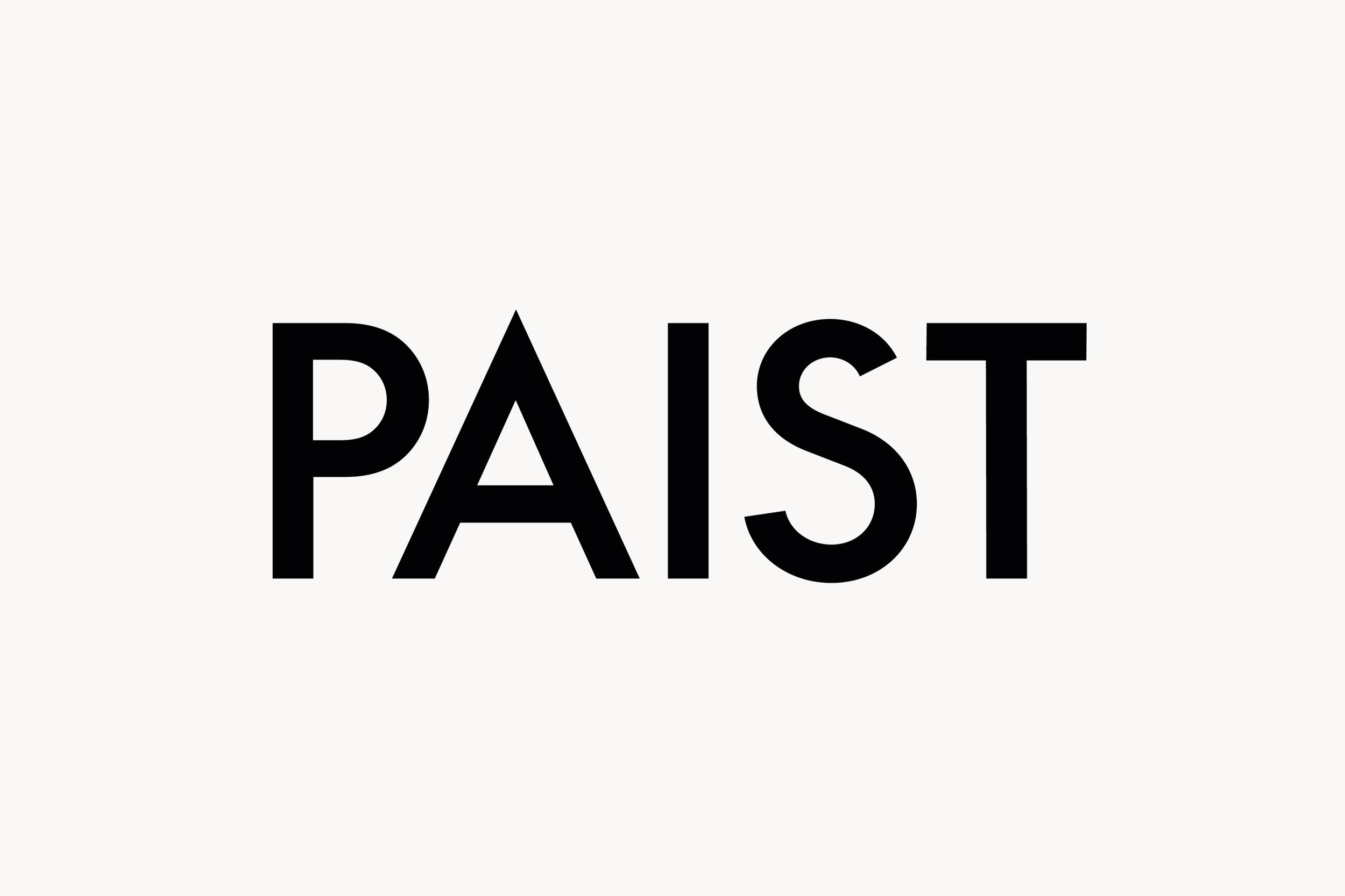
The toothpaste in question is PAIST – how very 2020s a name, with its deliberate skew-whiff spelling and its defiantly all-caps styling. According to Two Times Elliott, the brand ‘dared to shift the established paradigm in a market dominated by uniformity,’ and so the agency’s challenge was to stand out against the established brands and ‘infuse an everyday product with excitement, sustainability, and a distinct tone of voice’. PAIST’s ambition? To be everything the big brands weren’t.
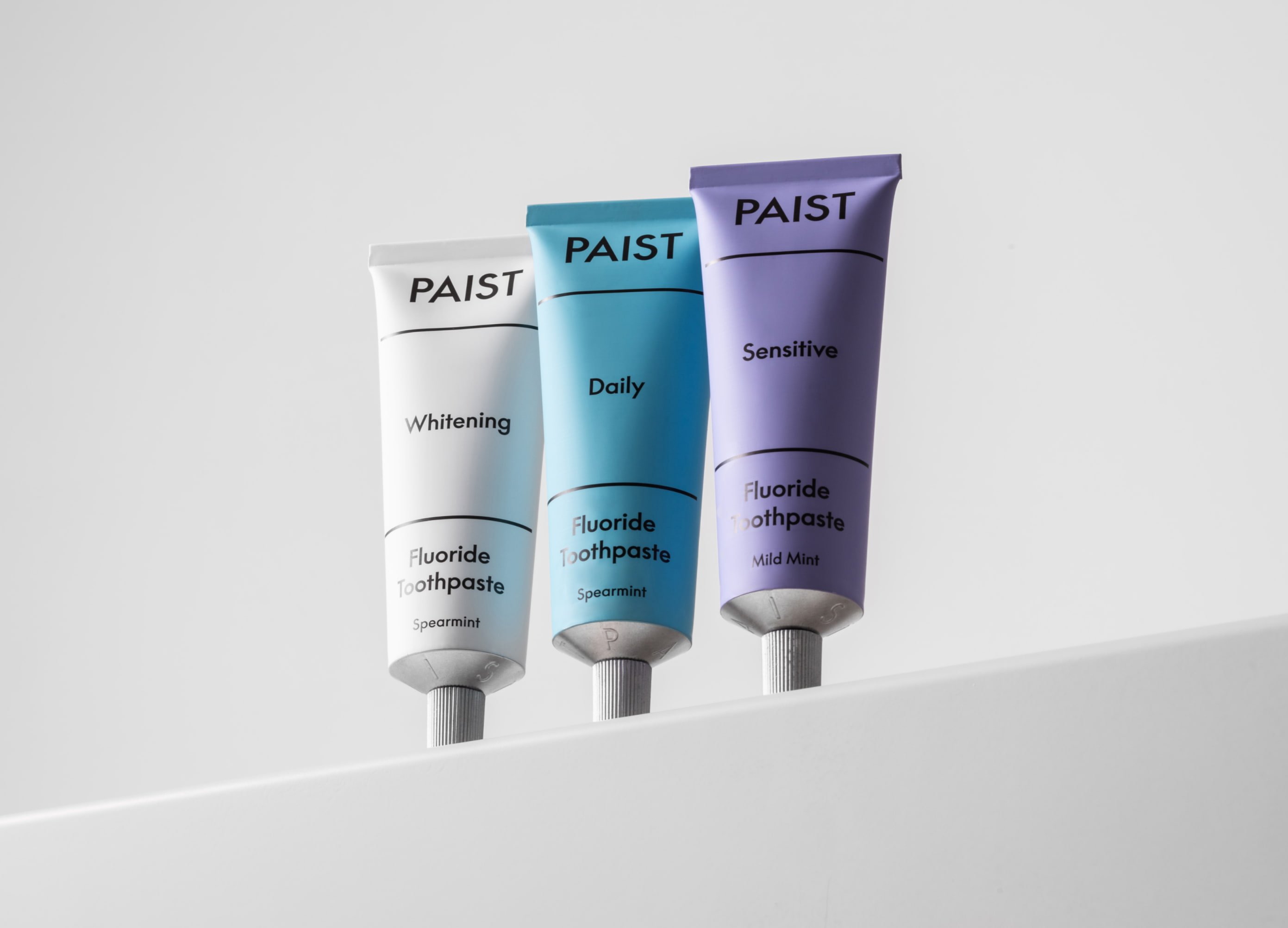
The brand certainly has many unique selling points: it’s free from preservatives, artificial flavours, and sodium lauryl sulphate; as well as being plastic free by opting for a recyclable metal tube.
And design-wise, it’s certainly achieving the aim of going against the grain of established competitor brands. The identity is bold, minimal, and type-led, with the sans serif font LL Supreme doing a lot of the heavy lifting here. The Humanist typeface by Lineto is a new take on the classic Futura, and is described by the foundry as ‘a distinctive, fully functional yet sophisticated typeface’. It’s rather fitting, then, for something like PAIST: the brand wants to stand out, communicate what it is and what it does, and convey a sense of professionalism and scientific rigour.
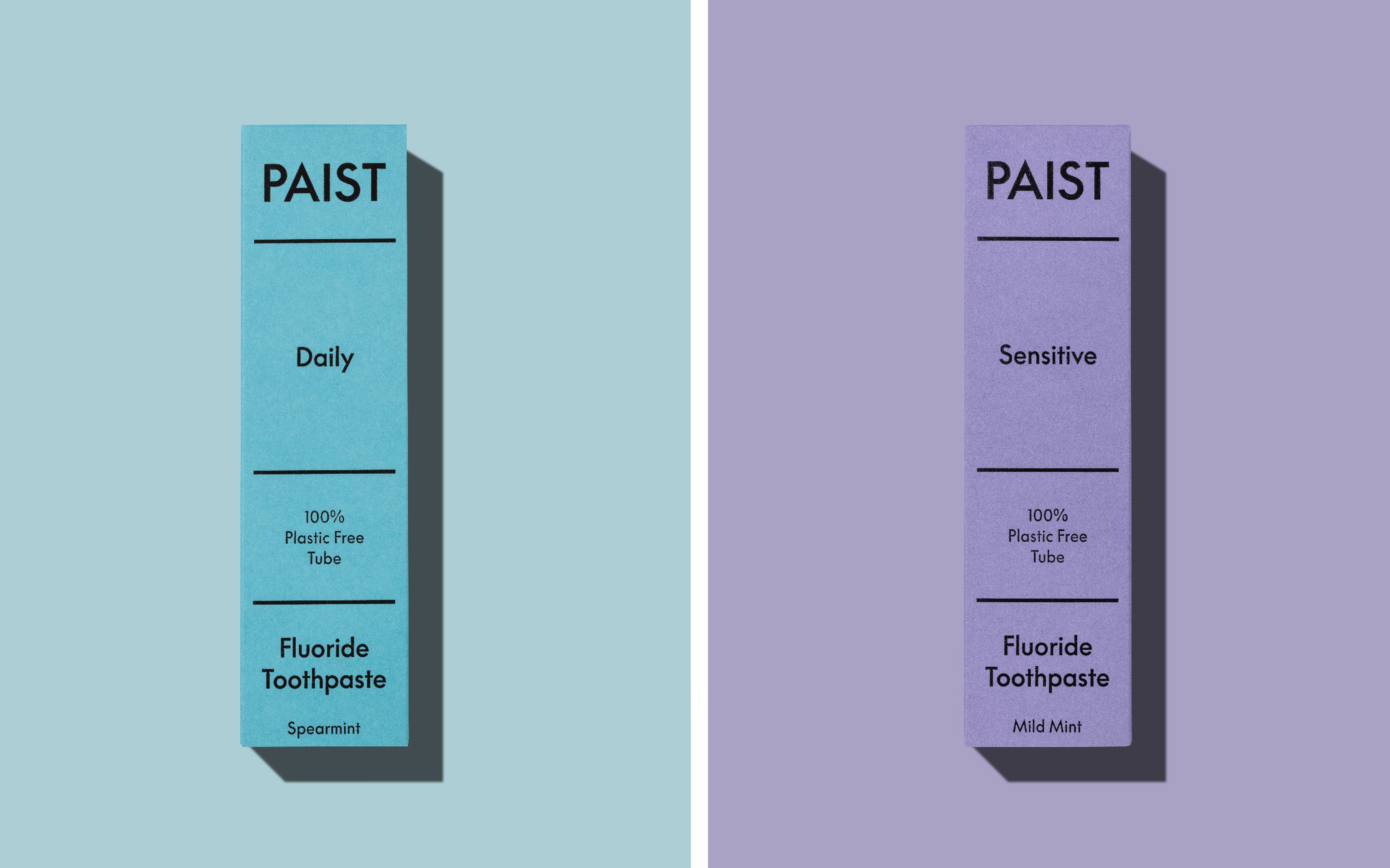
The font choice also chimes with how Two Times Elliott describes the brief for the project: ‘Our journey with PAIST posed a pivotal question: How do we create an identity that embodies trust and efficacy whilst ensuring it’s packed full of energy and freshness so far unseen in the oral care category?’
The agency adds that PAIST was looking for a ‘reliable yet charismatic’ and multidimensional brand that ‘juxtaposes a clinical aesthetic with elements of spirited character’. This duality partly informed the concept behind the identity: the idea of tooth-brushing as a twice-daily ritual – or, as the agency puts it, ‘a consistent bookend amidst life’s chaos.
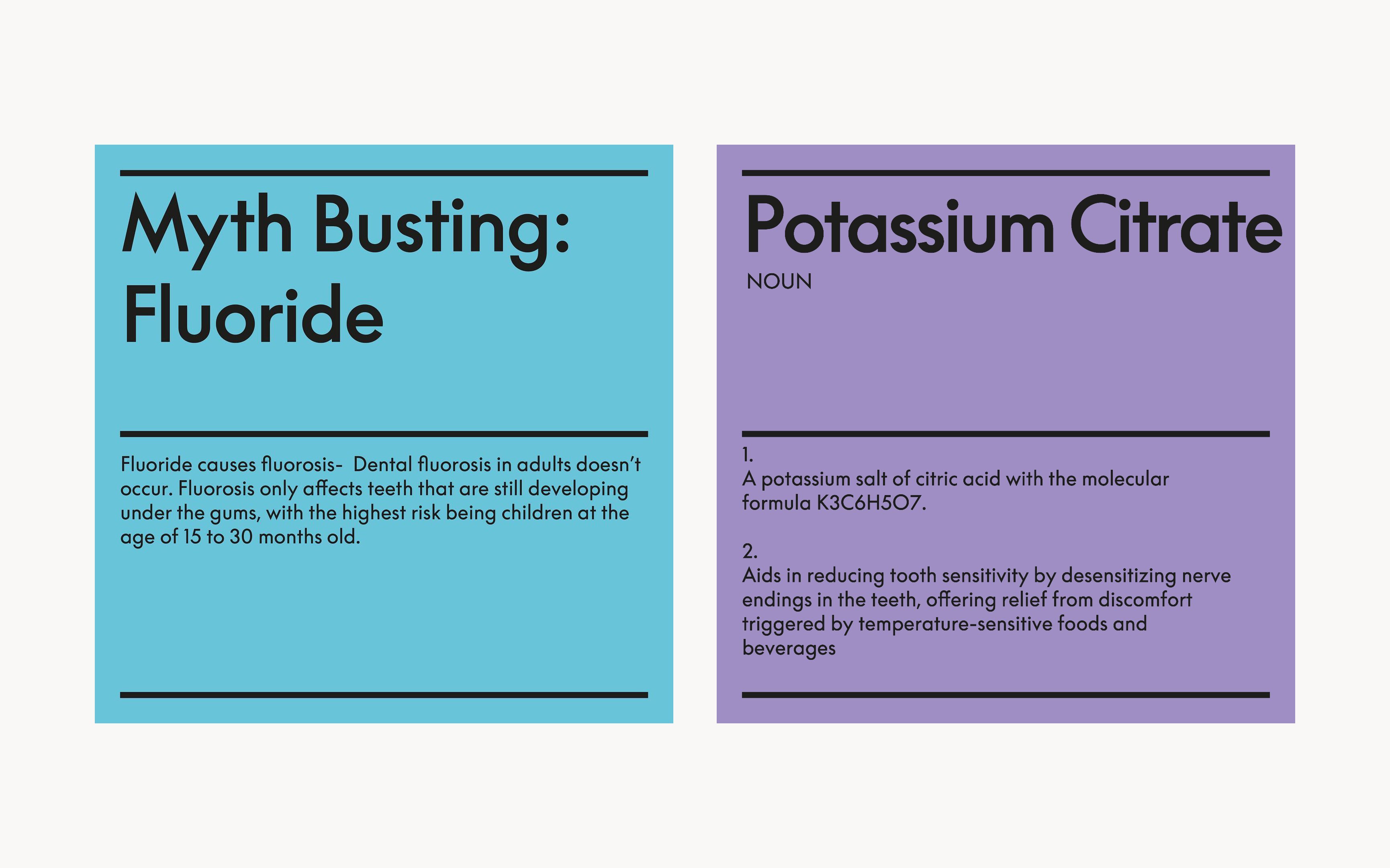
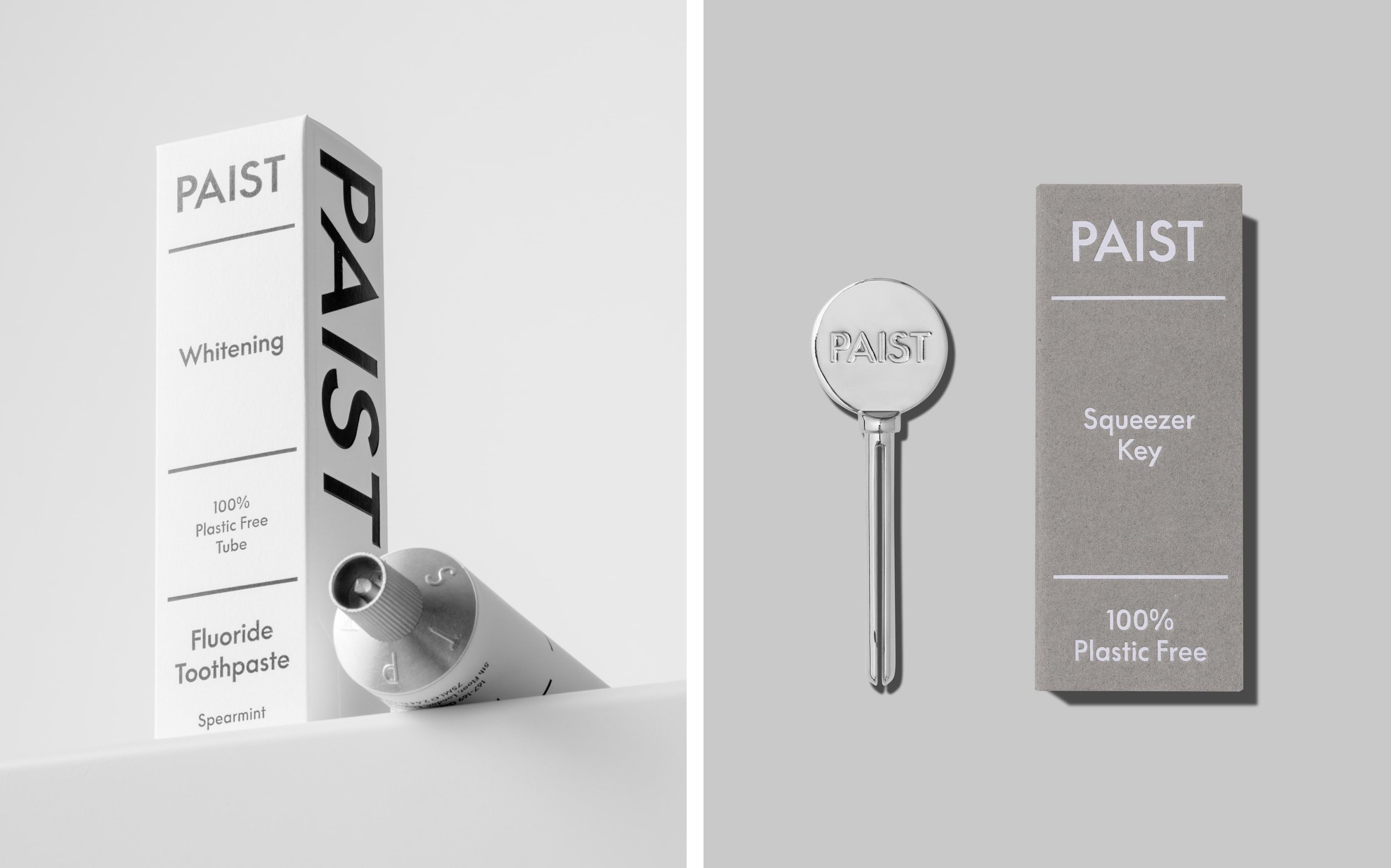
The designs do feel consistent; a calming riposte to chaos – though just how far a humble toothpaste can counter life’s vacillations and tribulations is debatable. Still, it’s nice of PAIST to try – and to go so far as to reimagine ‘oral care as a realm of playful energy and innovative design’.
We’re not sure exactly how playful it all is – but it doesn’t need to be. PAIST’s identity stands out, looks great, and feels both thoroughly modern and coolly trustworthy. That’s partly down to how colour is used across the branding. Each tube uses just one hue, and these don’t depart too much from the blues and whites of the rest of the category palette (for the Whitening and Daily variants respectively), and the purple of the Sensitive product.
It takes confidence and skill to create an identity that shuns pretty much all of the conventions of a category; and Two Times Elliott has achieved that superbly, borrowing from the language of Instagrammable D2C but without learning too far into the whole millennial minimalism thing. It’ll be interesting to see if the oral-care big guns start to strip back their dated tubes and predictable packs post-PAIST, but only time will tell.


