Thick Pickle by Studyhall
Opinion by Thomas Barnett Posted 9 April 2024

Where to begin with Thick Pickle? This conceptual brand began in 2023 as a self-initiated ‘studio side project’ for California-based studio Studyhall. As it blew up though, Studyhall began to wonder if the brand had legs – literally, as demonstrated by the disconcertingly buff, aviator-shade-sporting animated pickle (gherkin or pickled cucumber for the Brits) mascot who strides across pop-up windows at thickpickle.com. Studyhall now describes the project as ‘essentially a pre-kickstarter effort’. The studio claims to have had ‘countless meetings with food scientists, Michelin chefs, expert picklers’, and attests that the website is ‘a testing ground to validate the collective need for huge, juicy big boys’.
It’s difficult to know how seriously to take these statements – where do you apply for the job of ‘expert pickler’? The write-up has whispers of a particularly committed April-Fools bit, a suspicion strengthened by studio founder Matt Yerman’s description of Thick Pickle as ‘something provocative… something youthful and useful’. Provocative? OK. Youthful? Fine. Useful..?
I’m unconvinced that what our increasingly volatile (and hungry) world needs is another cheap-to-produce but expensively branded, virally commodified, trend-driven snack brand. If Thick Pickle does ever become a fully-fledged spin-off, striding out from the realm of concept and onto our shelves, the brand will unquestionably need an ethical angle (some percentage of donated profits) to keep it from drifting into the unflattering territory occupied by such cynical and vacuous endeavours as Prime Energy drinks. Despite the CTA accompanied by a teasing hint that the studio is ‘actually half serious about this whole endeavour’, one assumes that Yerman et al are still in on their own joke, and remain aware of the essential superfluousness of Thick Pickle, whether or not they now think they can make money from it.
As an advertisement for Studyhall, Thick Pickle has undoubtedly been a run-away success, riding waves of viral humour to bring attention from corners of the internet that a design studio would never normally be likely to reach. While self-initiated conceptual branding projects are undoubtedly enormous fun to create, they can also have an off-putting whiff of self-involvement. Thick Pickle’s ultimately harmless lightheartedness only partially exonerates itself from this charge. When designers also get to play the client it puts one in mind of the egotistical actor who writes, directs and stars in their own movie.
![]()


As my colleague Eleanor Robertson wrote in her article last year reviewing self-initiated project .Oddity Fragrance by .Oddity Studio, ‘ultimately it boils down to the question of whether or not design is art’. As Robertson observes, while designers such as Michael Bierut believe that ‘artists create meaning, designers create solutions’, others, like Bruno Munari, write that ‘designing for industry means prostituting oneself to materialism, to the “economic miracle” of the moment, to the policy of the merchandise’. When a studio sets off on a self-initiated project that is deeply personal, artistic, political, unimaginable as a commercially viable entity, then a different set of rules necessarily must apply. However Thick Pickle is not this. It maybe imagines a particularly agreeable client, and the humour (and maybe the budget) go further than a typical client or strategist would be likely to permit, but it’s essentially a viable commercial idea, operating in an already well-established product category, as a provocateur, but hardly as a wildcard innovator beyond the bounds of reality. It makes it tricky to understand the motivation to embark on a project like this, that remains so trend-driven and commercially minded. If not some lofty aim like Munari’s, then perhaps simply self-amusement? Or to cannily showcase the studio’s ability to work in a sector it is keen to break into.
Of course, the question that lies at the heart of (and ultimately justifies) a project like this must be: does it look good? Happily, Thick Pickle is a visual feast. A maximalist, everything but the kitchen sink approach shows Studyhall trying out new ideas without restraint, and there is a joyfulness to the experimentation.


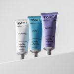
Sharp Grotesk from Sharp Type is used in black weight, variable widths and enormous sizes to create a brash, dense, cacophonous typographic approach. A bright neon green is juxtaposed with ‘earthy olivean tones’. Difference/Exclusion layer blending effects add further vivid tones to the palette when typography is used over photo and video content, perhaps inadvisably at the expense of legibility (which is already impinged on by the extremely dense, heavy typography and vertiginous scrolling effects on the website).
The green palette is enlivened by foil stamping, picking up on the product design of the ‘pocket pickler’ – a comically svelte metal test-tube designed to make pickles portable for the roaming snacker.
3D design has been deployed to show the pickles rotating and floating around in comical fashion, as well as ‘spice balls’, densely packed clouds of swirling garlic, dill, chillies and bay leaves that coalesce like time-lapses of space rocks condensing into planets. Less successful is the animation to accompany the ‘probiotic pickle juice’, showing, presumably, gut microbes being turned vivid green by a microscopic probiotic pickle cell. The snag is that the gut microbes look uncannily like the cross section of pickles, which is a fairly revolting cognitive association for snack branding.

Some of the copywriting is very funny. On the pickle jar labels, a tagline reads: ‘These are the thickest pickles in town. Don’t let nobody tell you otherwise. When you’re done, drink the juice up. It’ll make you smarter’. This surreal and slightly garrulous voice feels unique, and occupies the territory that a paying client would be less likely to sign off on, thus fulfilling the cardinal purposes of self-initiated work: to realise the interesting things that can’t be realised when dullards and cowards get to meddle. The rest of the copywriting achieves this with varying levels of success. ‘Vinegar for the Winegar’ is cute. The CBD-laced ‘soothe-chips’ (singly packaged slices of crinkle-cut cucumber) ‘to help smooth out your internal ridges’ are very funny. ‘Respecc the thiccness’ and the bevy of penis innuendos come up a little short (pun intended), feeling both laddish and a little dated by the lightning-fast standards of internet humour that the Thick Pickle brand aims to be judged by.

There is an inspired use of unidentified archival black and white movie footage, showing a woman decorously crunching a pickle, and then immediately flying into a delightfully unhinged rampage of violence. God knows where StudyHall found such a celluloid curio, but it offers a wonderfully camp, timelessly funny counterpoint to the slightly badgering, laddish comedic tone that prevails elsewhere in the brand.
This leads us on to the second existential question that must be faced by a self-initiated project that is so self-consciously unserious: is this actually funny? On this point, I can’t help but wonder if the whole joke isn’t a little bit… 2017? The year in which Pickle-Rick memes went viral and joined (along with Pepe the frog, Dat Boi, Shrek and Kermit) the late-2010s pantheon of omnipresent, ostensibly amusing green meme entities. You could of course argue that pickles have always been an inherently comical comestible. Partly due to their suggestively phallic association, partly due to the euphonic combination of plosive ‘p’ and clicking ‘ck’ digraph renders the word both satisfying and expressive (as Neil Simon observes in his play The Sunshine Boys, ‘words with a “k” are funny, “pickle” is funny… “cockroach” is funny… “lettuce” is not funny!’).
Perhaps there is something eternal in the comic potential of these humble brined cucumbers. Perhaps it’s a matter of taste as to whether you find this project lovably, fabulously ‘dumb’, or actually just dumb. Perhaps it is a North-America specific thing, where pickled cucumbers just occupy a bigger, thicker, funnier space in the collective cultural psyche.