De-Extinction by Koto
Opinion by Emily Gosling Posted 11 April 2024
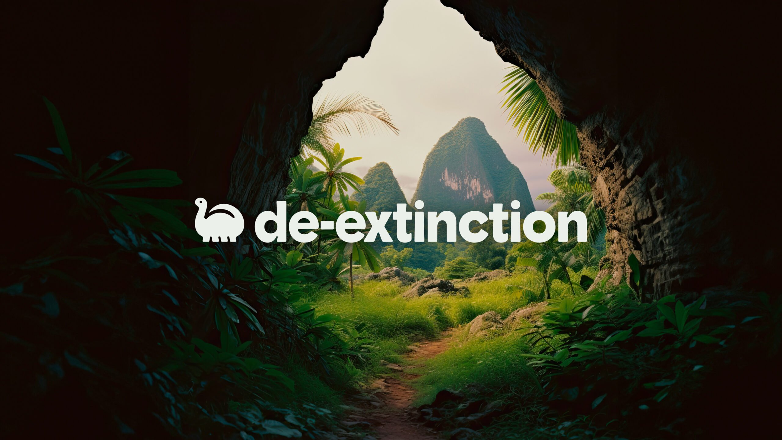
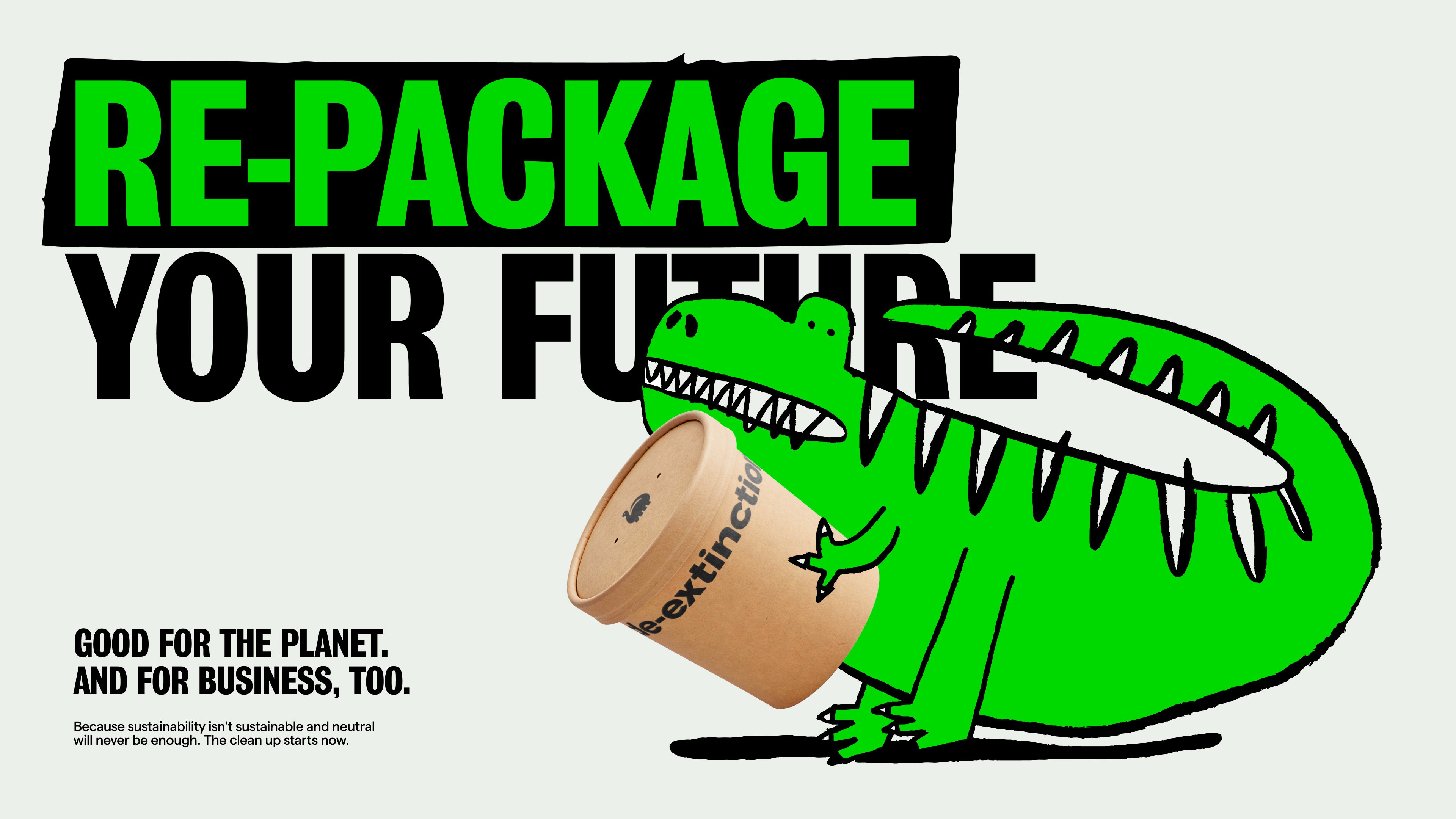
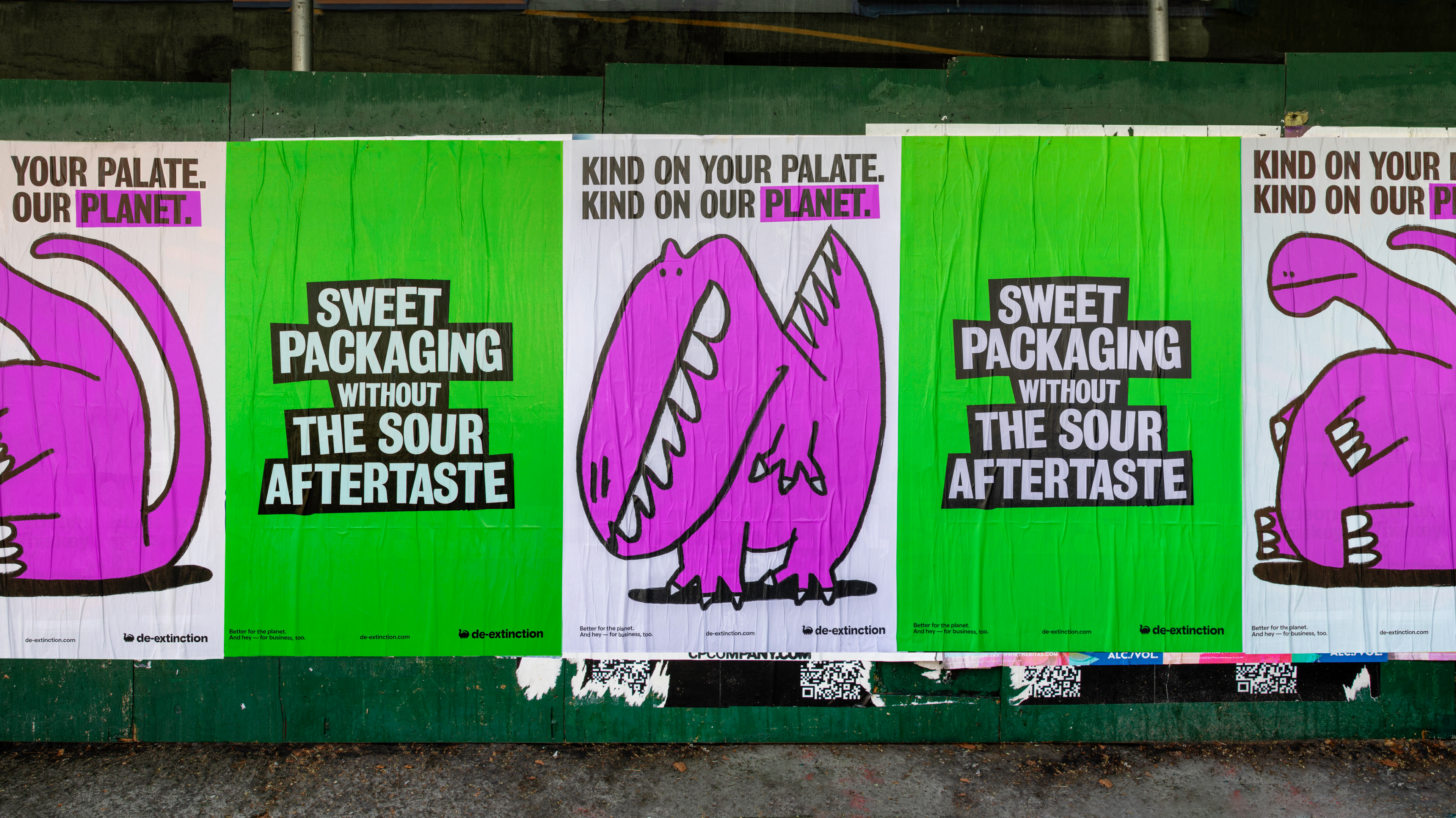
Koto’s new work is undoubtedly gorgeous – after all, what’s not to love about a suite of very cute dinosaurs? Especially when they’re rendered in a charming faux naif sort of style, and the whole colour palette is based around Barney & Friends purpley pink and the effervescently Gen Z-baiting neon of ‘terminal green’.
The project in question is Koto’s work for De-Extinction, which started out around two years ago and supplies plastic-free tableware, cutlery, and food packaging to a roster mostly consisting of restaurants and grocery stores (we’re not sure exactly which ones, however, since at the time of writing the website is down). According to the company’s spiel, its raison d’etre is to help brands ‘move toward a more sustainable future in a way that’s good for businesses, and the planet’.
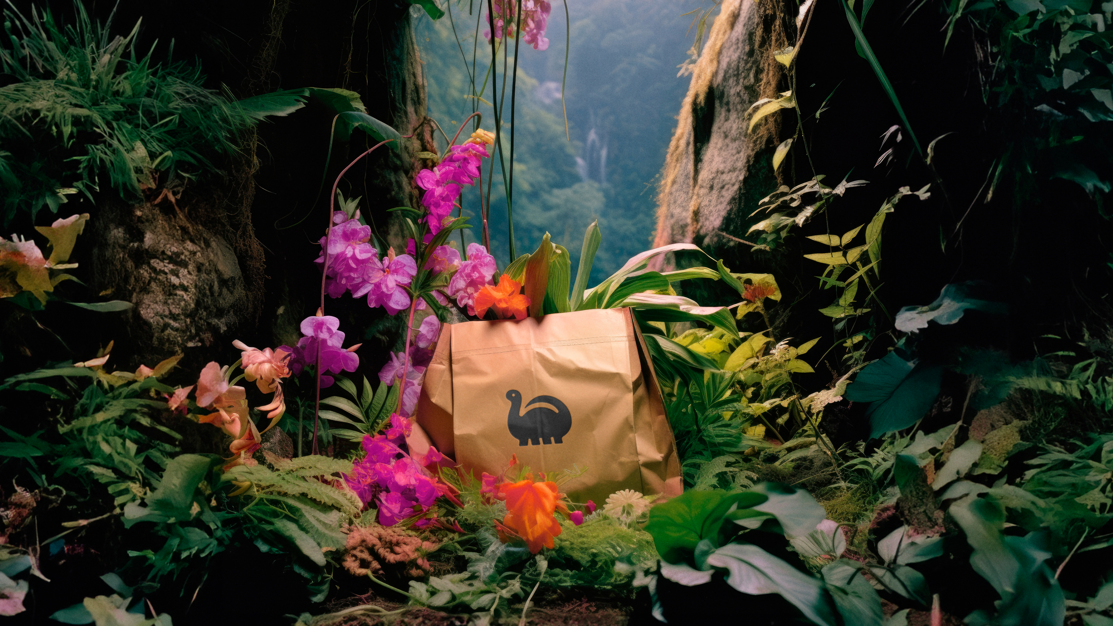
Arguably, it’s not a great name: to me, it conjures up the idea of an Extinction Rebellion-style campaigning group (though as discussed further on, that’s likely deliberate) – some sort of non-profit organisation, perhaps, or an education programme. However, the company is very much sustainability-focused; and promises that its products’ entire supply chain has been fine-tooth-combed to be as environmentally friendly as possible, from how its materials are sourced to their fabrication, transportation, and even disposal.
It’s interesting to note that the brand’s name is in fact also an established scientific term, also referred to as ‘resurrection biology’. De-Extinction is defined by Colossal Laboratories as the process of reversing plant and animal extinctions by ‘creating new versions of previously lost species’ through methods such as ‘back-breeding, cloning, and genome editing’ with a goal of re-establishing ‘dynamic processes that produce healthy ecosystems and restore biodiversity’.
Learning that, it starts to make sense why Koto opted to use the seemingly obtuse moniker: after all, the whole way in which De-Extinction (the packaging company) works is, so we’re told, based on ‘dynamic processes’ that aim to help ‘produce healthy ecosystems’.
According to Koto, when De-Extinction approached the agency to create its name, brand and visual identity it was ‘determined to challenge the status quo in disposable packaged goods… fuelled by a desire for change, a distaste for empty promises and the will to tackle the industry head-on’.
While De-Extinction’s name is something of a bold statement, the packaging supplier sector that it sits within has historically been rather dull – or as Koto puts it, ‘visually bland and verbally formulaic’. The agency’s idea was to buck all usual tropes that had seen competitors bearing a ‘transactional look and feel’ and instead create an identity that was packed with the ‘personality and charisma we felt the cause needed… to make sustainability a concept that drove change rather than an empty platitude’.
And the identity is certainly packed with personality, leading with some very, very delightful illustrations that come to life in motion and relying on a limited but very eye-catching colour palette based on that aforementioned green and purpley pink.
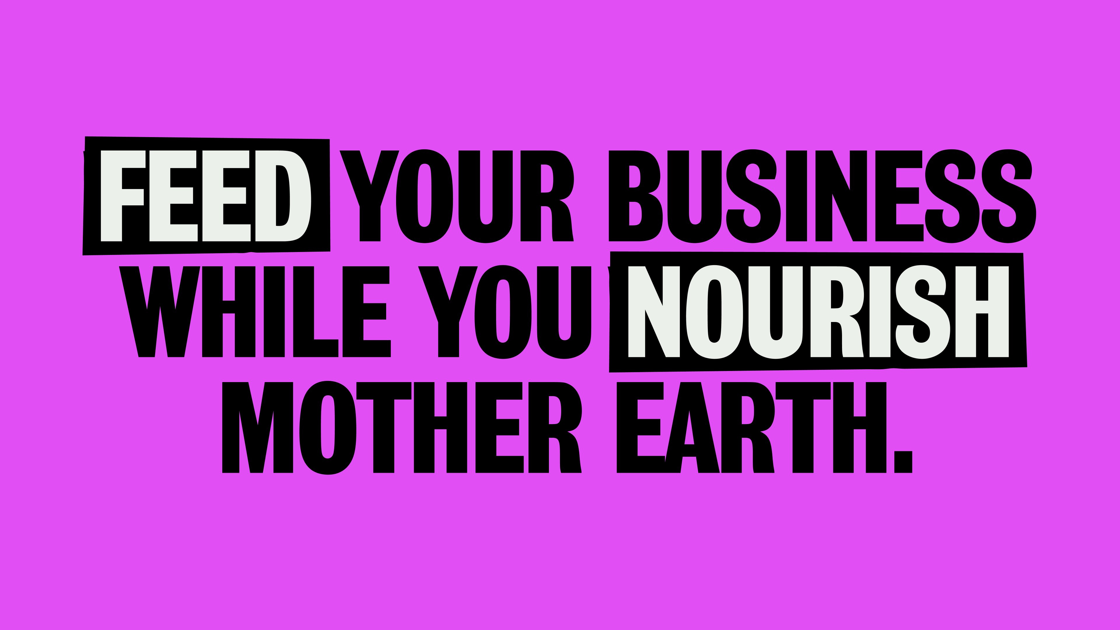
The use of typography is also superb; with Koto opting for the powerful, no-nonsense sans serif Grotesque No.9 by German type foundry URW, which was acquired by Monotype a few years back. The font choice hints at what Koto says was one of its biggest inspirations for the identity: protest. The bold, resolutely legible but slightly off-kilter characters of Grotesque No.9 aren’t hard to imagine emblazoned on placards, and make for a thoroughly striking look that chimes with De-Extinction’s mission to drive positive action when it comes to climate crisis, and convey a sense of urgency around such issues.
Koto has said that the overarching concept informing the identity has similar grassroots, almost countercultural leanings – ‘Leave No Trace’ – a phrase usually reserved for festivals and campsites, and adopted by those leading more alternative lifestyles. But in order to actually do something about the terrifying apotheosis of climate crisis we face in 2024, we have to understand that we need action right now – environmental issues shouldn’t be something filed next to Nag Champa incense and people who go to ecstatic dance events.
De-Extinction, like climate action itself, is about being proactive, but also strategic: even the most ruthlessly capitalistic of businesses have to address environmental issues today, since very soon they will have no supply chain once things like ingredient scarcity become even more widespread. This is something Koto acknowledged in creating the identity: ‘The De-extinction brand warmly invites all stakeholders – wholesalers, restaurants, and clients alike – to introspect their impact, proactively strategise, and collectively strive for improvement’. ‘With audacity, it challenges industry norms, positioning itself as an engaged partner and catalyst, driving significant change in revitalising the packaging supply chain, all while infusing a dash of fun’.
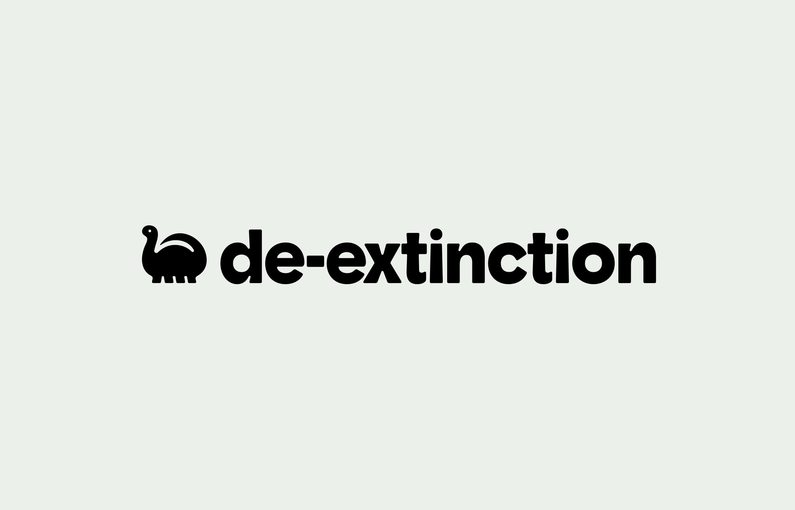
There’s more than a dash of fun here. The logo itself is once again centred on the whole cute dinosaur thing – a sweetly chubby brontosaurus-type creature with all four legs in a row, as a child would likely draw one. He’s rather lovely, and mimics the curves and cutouts of the wordmark, which uses bespoke customised typography that’s characterful but not overtly quirky in its mimicry of the dino logo’s strange anatomy. My only issue with the wordmark is that it unfortunately leans into a trend that I have a (possibly irrational) gripe with – using all lowercase lettering, despite its being a proper noun.
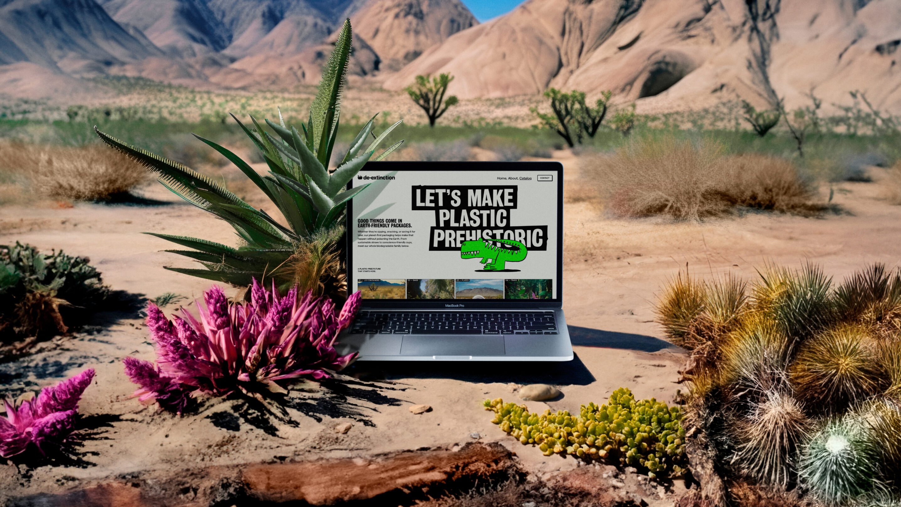
It’s a shame that we can’t see how the branding exists in situ at the moment on the De-Extinction website; since the moving elements across the copy and illustrations work so beautifully in Koto’s case study. The other issue is that it’s very hard to track down the company, since googling ‘De-Extinction’ only seems to throw out scientific results. Hopefully, though, that’s just teething problems, since this charmingly cute, but actively demonstrative identity really does deserve to be out in the world, letting its dinosaurs live and breathe in a way their long-extinct cousins no longer do.
