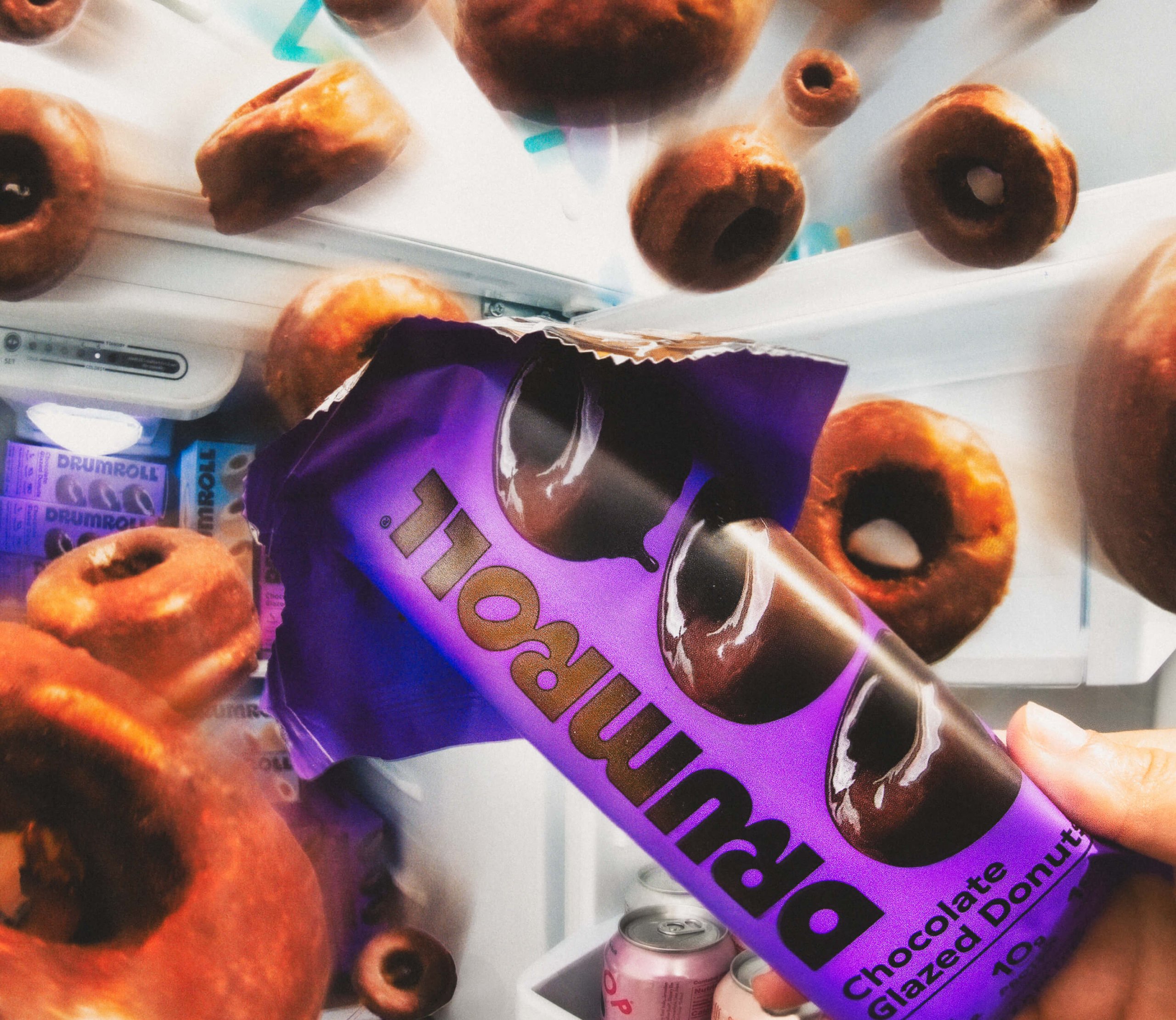
Drumroll by Gander
Opinion by Emily Gosling Posted 13 August 2024

Donuts are one of life’s simplest pleasures, but they haven’t historically been the healthiest choice. Vegan – sorry ‘plant based’ – donuts are nothing new (Krispy Kreme’s been selling some non-dairy alternatives for a while now, and very nice they are too), but until now, we weren’t aware of donuts that also boast high-protein, low-sugar, gluten-free credentials.
That is, until we encountered Drumroll, a range of packaged mini snack donuts that claim to be grain-free, gluten-free, and non-GMO; boasting 10 grams of protein and just 1 gram of sugar. They look rather great, too, thanks to a redesign by Brooklyn-based creative agency, Gander.
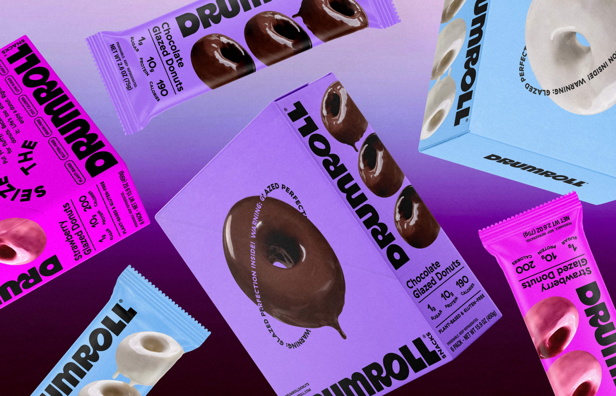
Drumroll was founded in LA in 2019, under the name GreenHouse Foods. Gander’s decision to change it is wise: for such a fun little product, GreenHouse Foods sounds rather dry – almost clinical – and has faint connotations of GM/large-scale factory production. Hardly the friendly plant-based face you’d want for these wee cakes with ‘all the accolades of an inventive new product’. Drumroll, instead, suggests that something exciting is about to happen – you know, like eating a donut.
The new designs are anything but bland or drably factory-feeling, however. Gander has gone hard on the gooey, sticky, indulgent (but not really!) stuff: the Drumroll homepage proudly displays a massive, glistening chocolate donut with some lovely motion design that sees the icing drip down in seductively drool-inducing gloops.
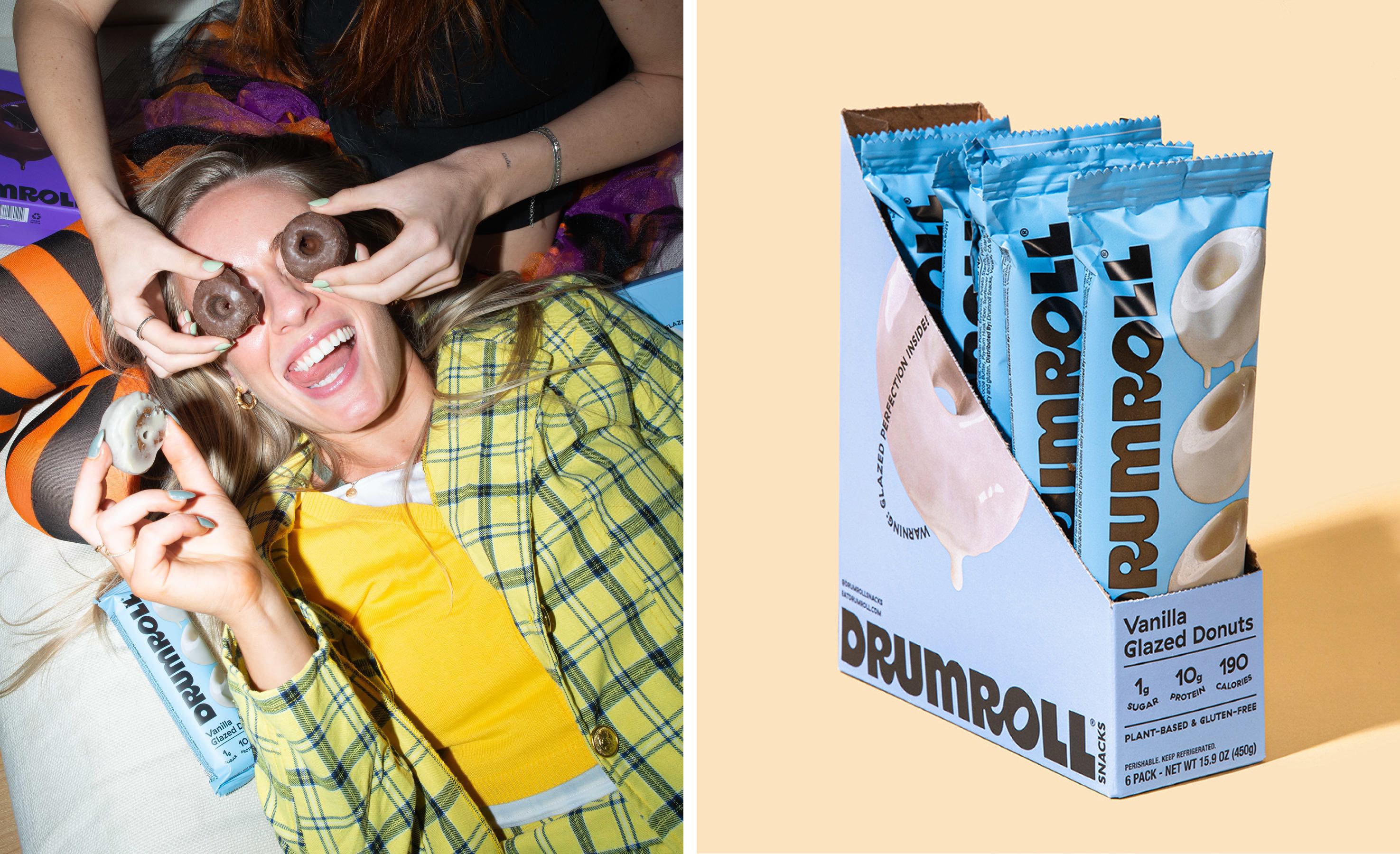

Gloops (and donut holes) play a pretty central role across the identity. ‘Our silky-smooth wordmark emulates the ewwy gooey chocolate dripping from the donuts’, says Gander. That logotype does indeed work beautifully: it feels totally befitting of the rest of the branding and the MO of the product itself; a little off-kilter in its mixing of lower and uppercase and the way the ‘R’ letters ‘roll’ into the characters that follow them. Naturally, the ‘o’ uses an oval window to emulate the look of the actual donuts, a device that’s used throughout the branding as a window through which ‘you enter the world of Drumroll’ – one that ‘encourages you to enjoy the moment’.
One thing that does stand out, however, is how much the identity recalls that of another plant-based, high-protein chocolatey snack treat – Misfits, designed by Koto. It’s more than likely a total coincidence, but the colours (bright purple and vibrant pale blue, for the most part) and the playful tumbling lettering certainly create quite a resemblance between the two products.
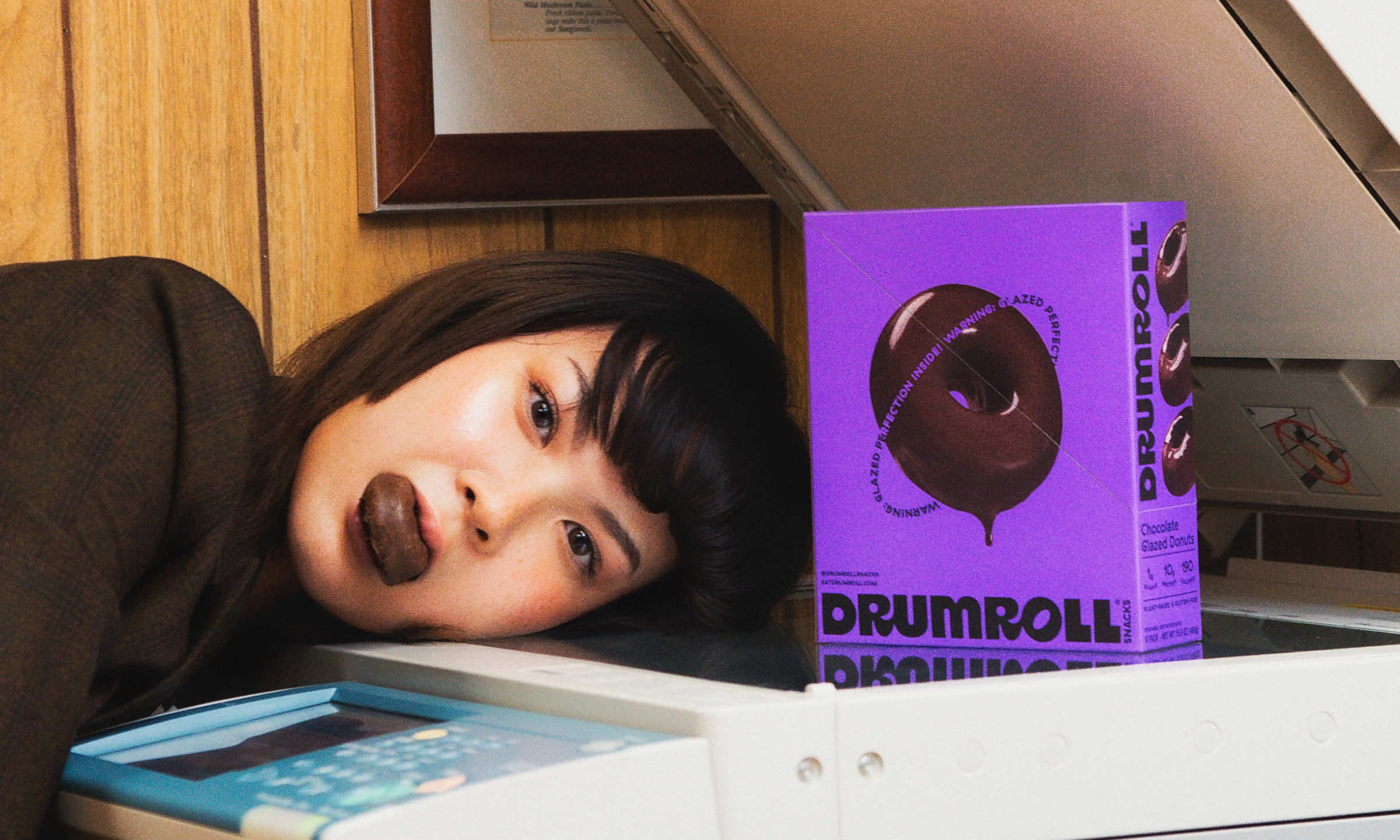
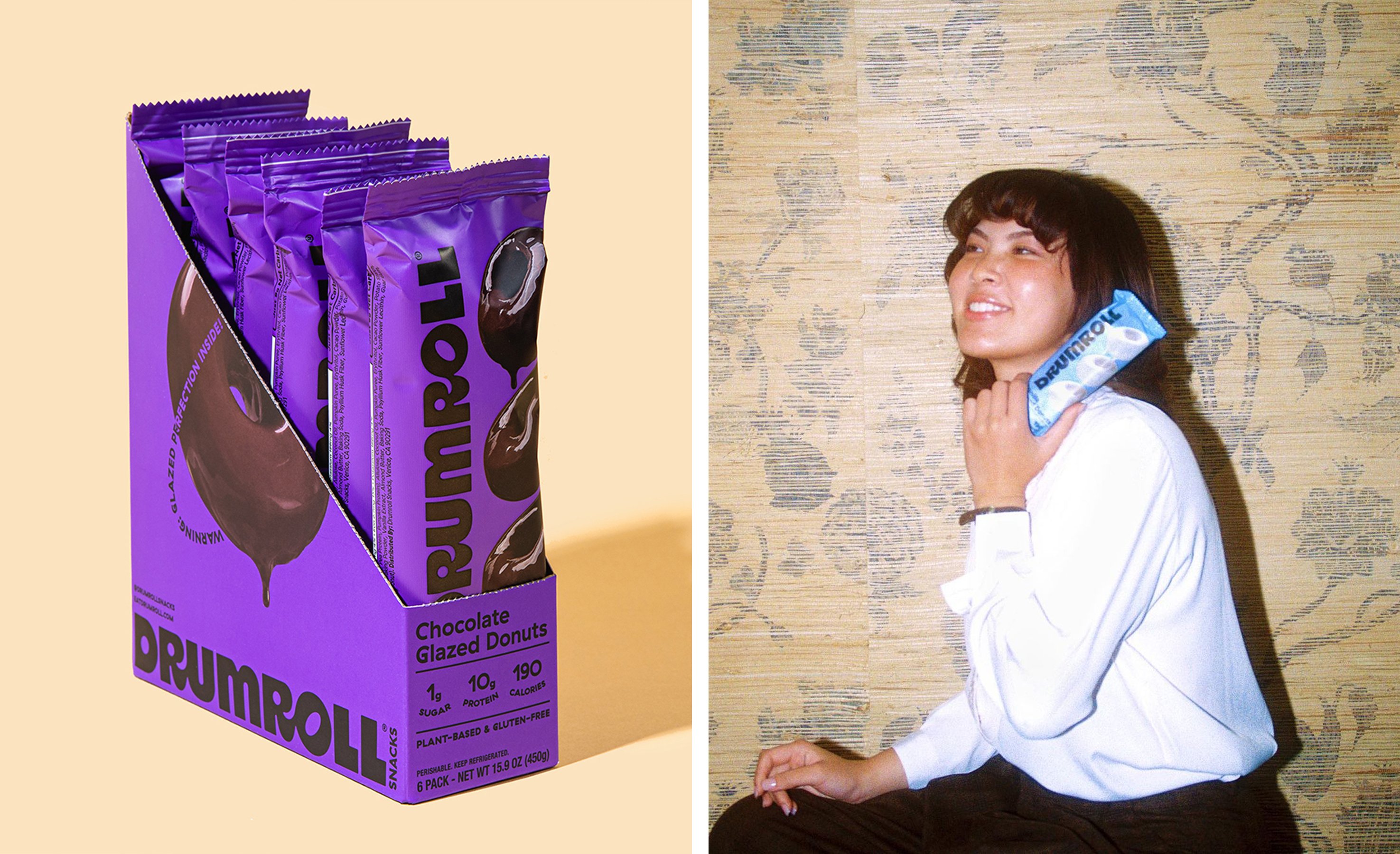
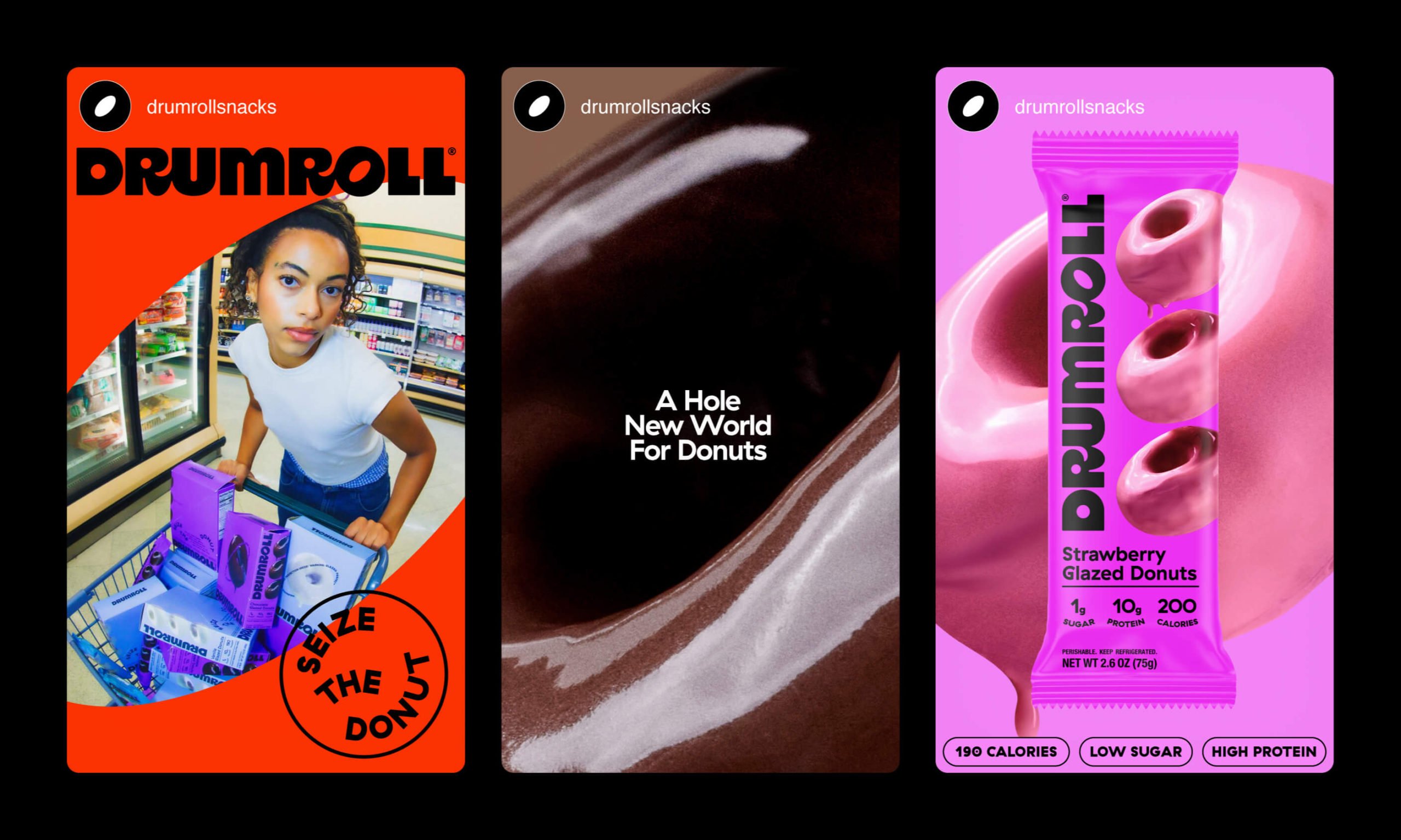
The punchy Drumroll brand colours are used in simple layouts that prioritise strong black type treatments and pithy copy lines that err just on the right side of fun but not irritatingly ‘quirky’: ‘Drum up some joy.’, for instance, and ‘A hole new world for donuts’.
Swiss foundry Grilli Type’s GT Haptik is used in its no-nonsense, stomping Black weight on the packaging, social campaigns, and website, on which the cursor becomes a black circle like the hole in the middle of a donut, which is a nice little touch.
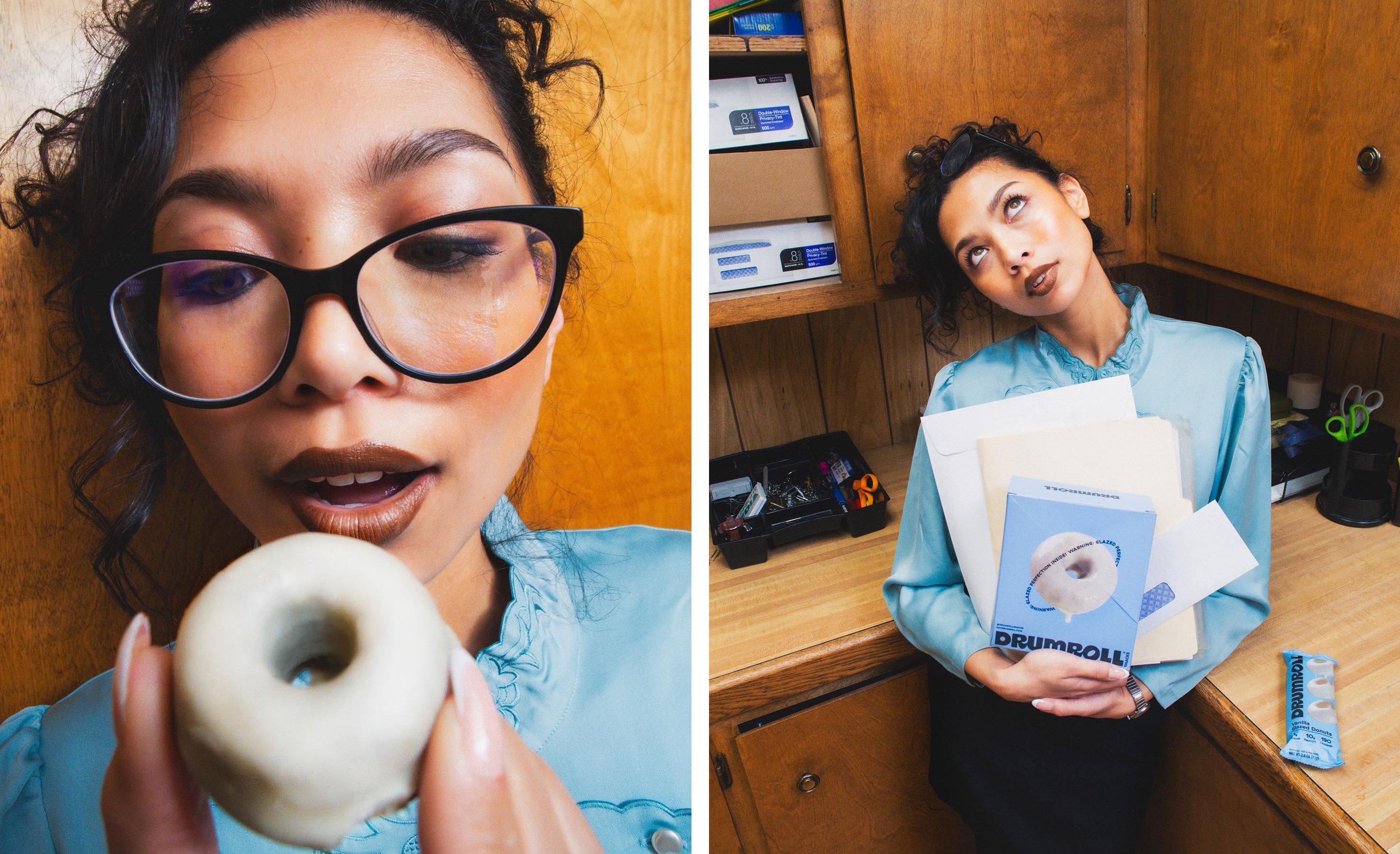
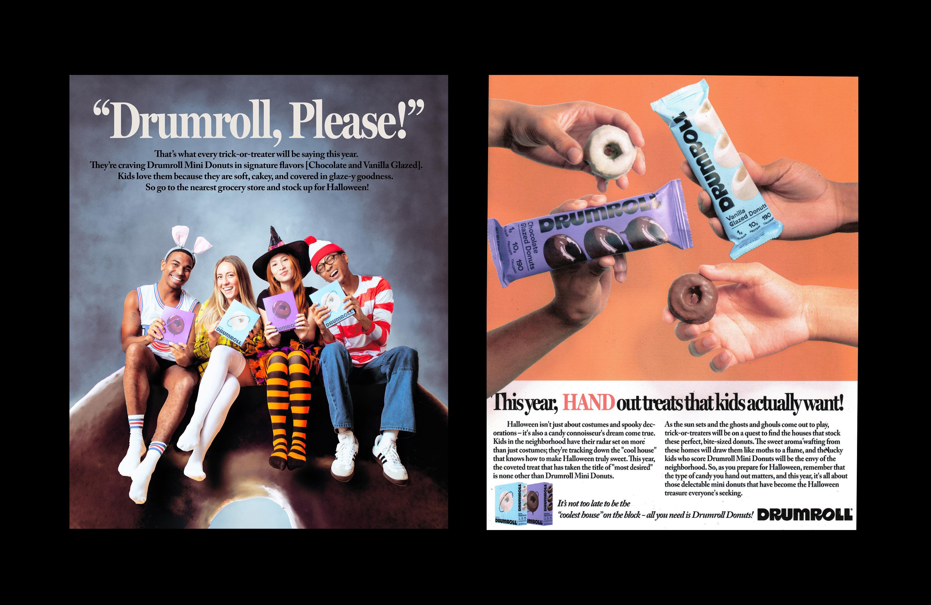
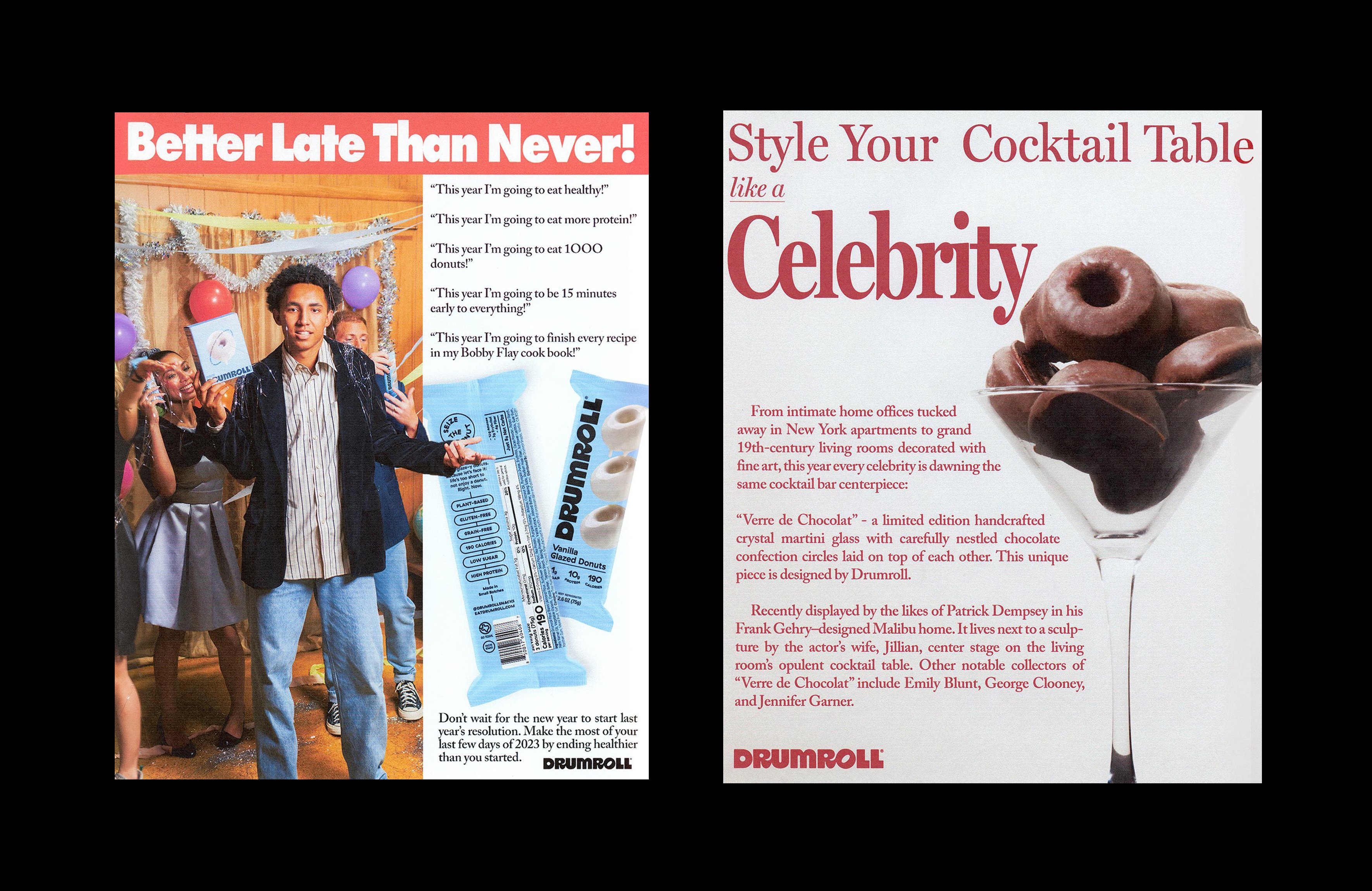
Gander worked across Drumroll’s new strategy and positioning; visual identity and branding; packaging; web design and development; and art direction. The latter serves the brand very well in a series of semi-satirical vintage-esque ads. These take the stylings of 1980s/90s editorial, copy-led ads and essentially make them all about donuts in a way that’s brilliantly self-aware and funny (feast your eyes on this hilarious take on ridiculous stock imagery and real-life magazine style sensationalism, for instance). We’re not exactly sure who’s behind the ads, or indeed the smart social copy, but whoever it is certainly has a sharp sense of parodic wit.
Above all, Gander says that it aimed to create packaging that’s ‘first and foremost, delicious and eye-catching’ – something it’s undoubtedly succeeded with. The agency adds, ‘at the end of the day, these little guys are just a tasty treat that you don’t need to feel guilty about indulging in’.
Perhaps that’s what’s so great about the new branding: for all Drumroll’s health credentials, the designs lean solely into the fact they feel like an actual, tasty treat – not an ‘alternative’ for anyone vegan/gluten-free/cutting back on sugar, and so on. Absolutely nothing about this very fun identity says ‘second place’ or ‘consolation prize’.
