Hello Klean by Two Times Elliott
Opinion by Emily Gosling Posted 15 January 2025
Beauty is, of course, in the eye of the beholder, but there’s no denying that objectively, its branding and identity design has undergone some huge changes over the past decade or so.
Gone are the days of faux-luxurious designs that were all about swathes of abstract silk; women coiffured to within an inch of their life; a microscopic lens on why consumers were all so ugly and old (but you won’t be if you buy this!); billowing ribbons of white and burgundy and purple; made-up faux scientific words like ‘boswelox’.
The new beauty identities – and indeed, the new design codes of luxury more widely – are a far more understated proposition. Where beauty and luxury more widely was once signified with Dubai-esque bling, now, often it’s far more mid-century Swiss – monochromatic black and white, crisp lines, post-Helvetica typography, layouts pared back to within a millimetre of their lives.
And so it is with this lovely new work by London-based design studio Two Times Elliott (Paist, Kettle Kids & Disrepute), for Hello Klean, a brand that offers an unusual take on beauty by focusing as much on the water as the product.
Hello Klean launched in November 2019 with a single product and an unusual premise: rather than touting creams, serums, or sprays, its products addressed the stuff coming out of the tap. That product – a shower head filter – neutralises calcium, magnesium, and heavy metals found in tap water; and was driven by the founder’s own struggles with hard water.
According to Hello Klean “optimising your water is the key to unlocking better hair and skin”; and so its products looked to shelve “clunky, industrial systems” and instead offer a range of “sleek, easy-to-use beauty solutions that address hard water’s hidden problems”. These problems apparently include the fact that hard water leads to a 7% decrease in hair thickness and a 46% increase in childhood eczema, among other issues.
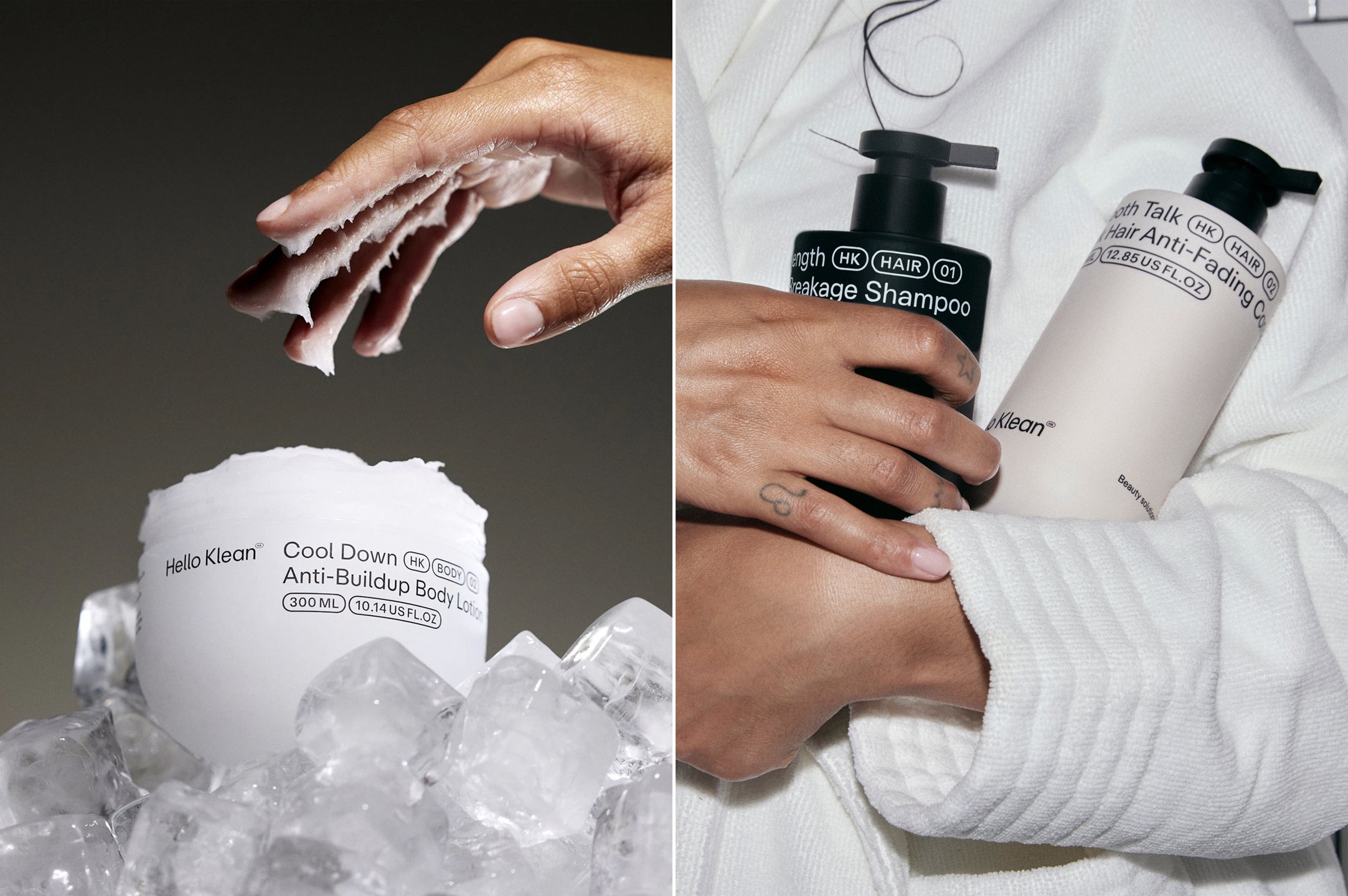
Where more mainstream beauty products can sell themselves on promises, ingredients, and ‘innovations’ as much as branding, to an extent; creating a new identity for a hard-water-solution-based range is trickier. Indeed, water quality and limescale are hardly the most sexy, grabby talking points; but Two Times Elliott has managed to create a look and feel that’s sharp, modern, and dynamic. Making mineral deposit-related brands feel chic is no mean feat, but here, it feels effortless.
Since it began life around five years ago with branding and website design created in house, Hello Klean has expanded its range and offer to include various shower heads and filters, shampoos, body washes, lotions and more. Two Times Elliott was brought in to help Hello Klean “evolve from a showercare essential to a company changing the world of beauty at the source,” says the studio.
Two Times Elliott initially engaged in conversations with customers which revealed the significant impact that the brand had had on their hair and skin, and their overall “sense of self,” it continues. “A key challenge was to bring the power of the emotion experienced by customers to the surface within the brand.”
This was addressed through basing the new idea on the central brand idea ‘Feel Like You’, which looks to reflect and communicate “the impact the products had in helping customers regain control and reconnect to that sense of self.”
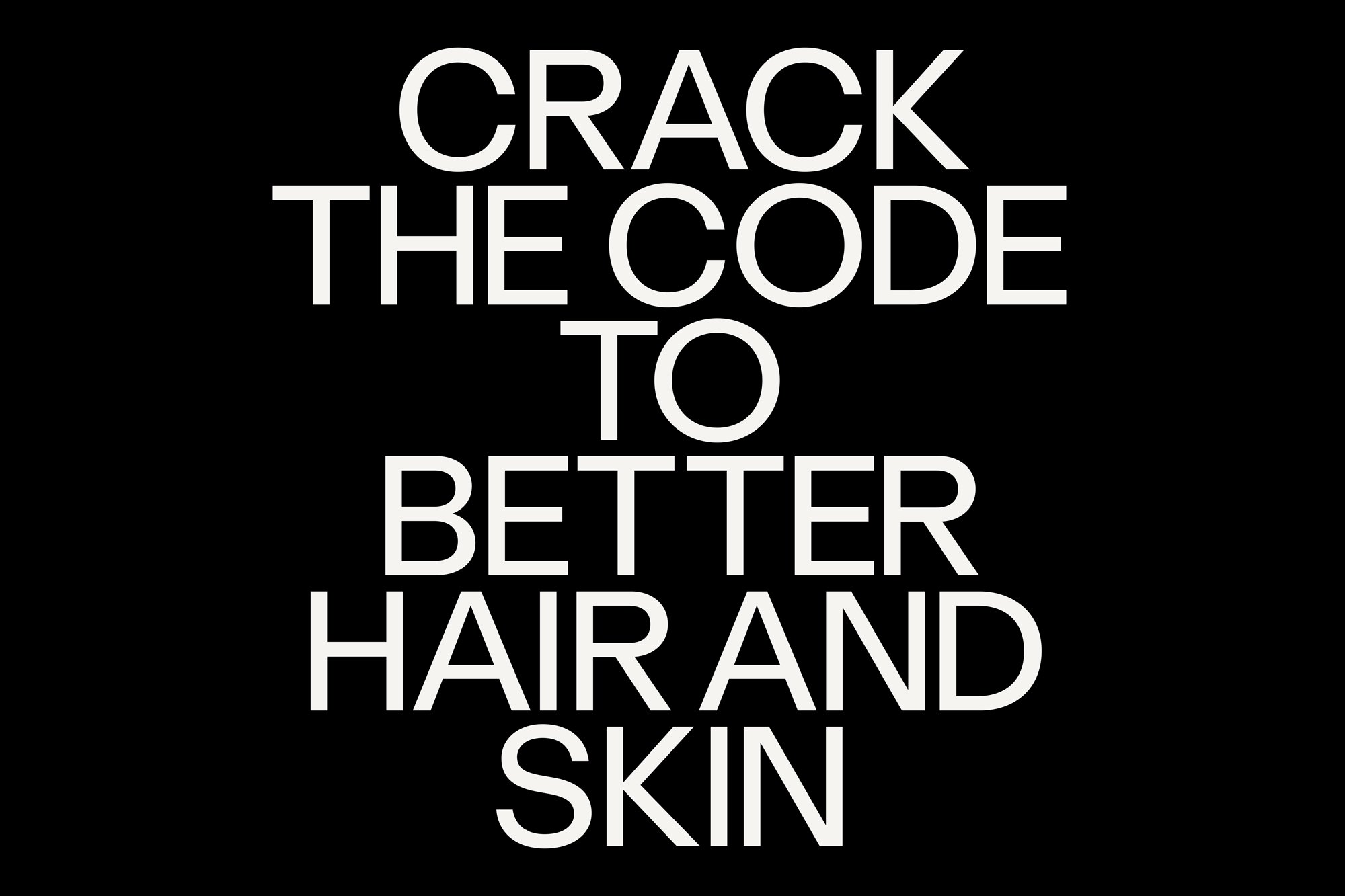
A key consideration with the new branding was also to address the low awareness problem the brand was facing; so it was vital that the designs reflected the holistic ecosystems of products that Hello Klean offers, communicating its expertise and credentials across both shower heads and related hardware and more traditional beauty/toiletry products. To frame all of this in one succinct copyline, Two Times Elliott came up with ‘Beauty solutions for your water’ to encompass the way the entire product range focuses on “making water work for your hair and skin”.
The clean, quietly confident minimalist aesthetic cuts through the noise of flashy packaging and pseudoscientific claims, and situates the brand firmly on the beauty counter rather than the water filter pages of a functional-products-only catalogue. Hello Klean’s tagline, “Your water has a dirty secret. We’re here to spill it,” captures this perfectly—smart, a little cheeky, and laser-focused on a pain point most of us didn’t know we had.
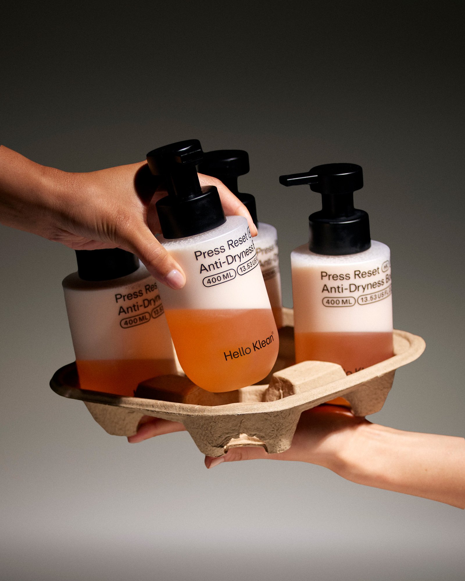
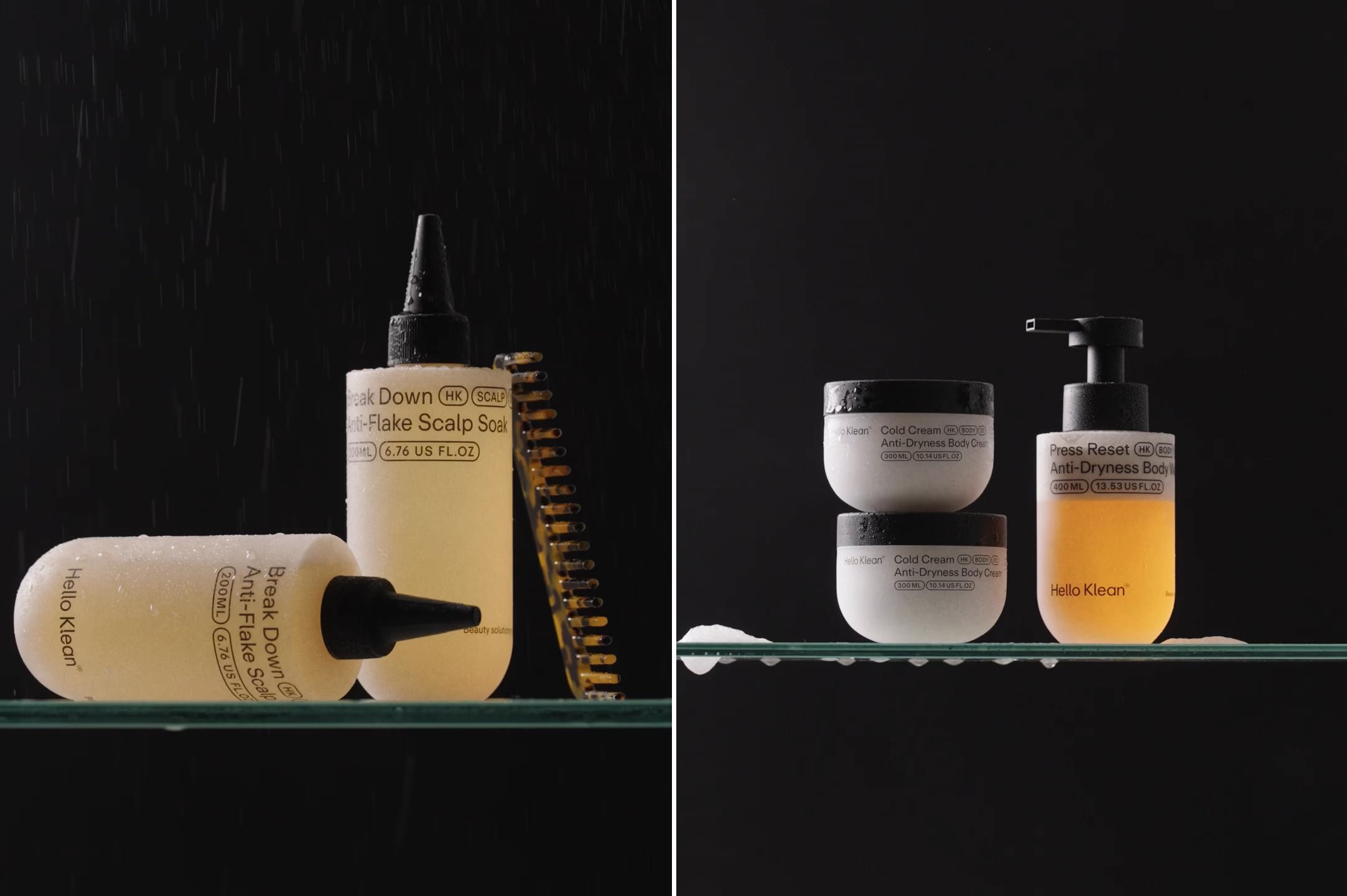
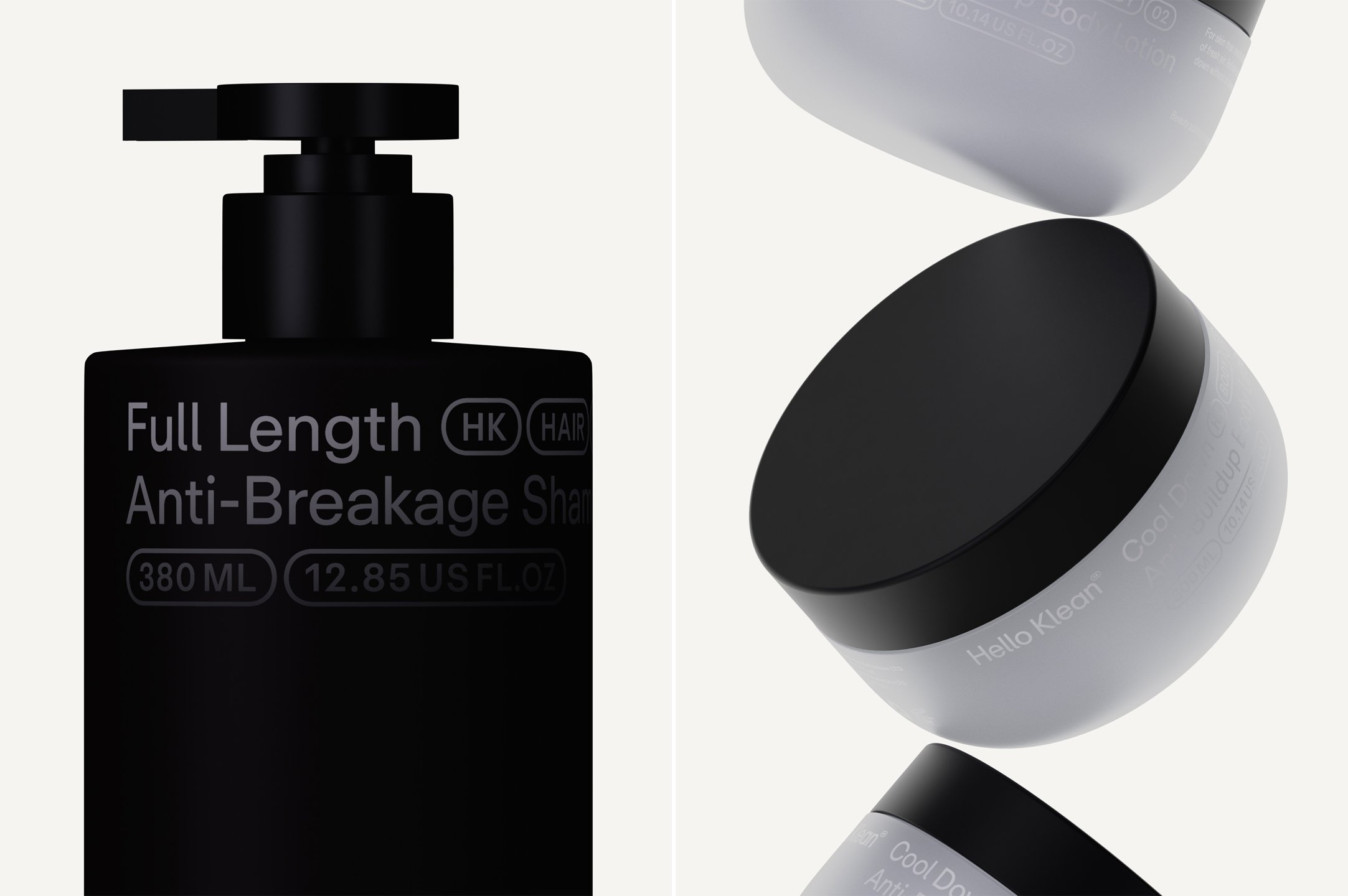
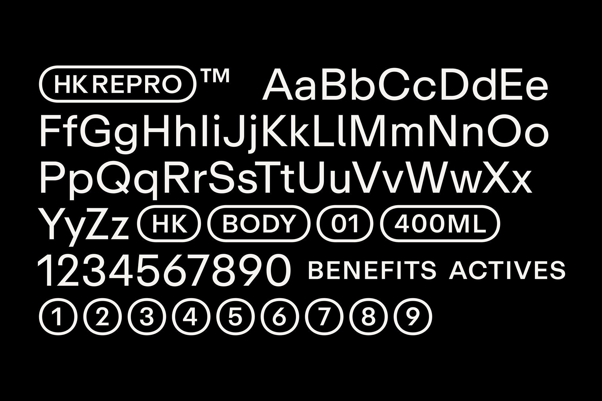
At the heart of Hello Klean’s identity is a custom version of Repro, a sans-serif typeface by Swiss type foundry Dinamo which balances clean, geometric forms with a friendly edge. By opting to use a singular typeface across the entire brand, Two Times Elliott addressed the need to create a future-facing product categorisation system that can scale across current and new product lines. But alongside that very utilitarian piece, the flexibility that’s inherent in the system also allows Hello Klean to communicate “a more emotive brand story”, says the studio.
The type-centric system, then, is both functional and playful; maintaining a cohesive and recognisable visual language but with ample room to flex. It exemplifies the art of doing a lot with a little.
This kind of simplicity is having a moment in beauty branding (thanks in no small part to The Ordinary), but execution is everything. Two Times Elliott’s approach avoids the trap of looking like the raft of D2C beauty brands that come and go on Instagram by grounding Hello Klean’s minimalism in purpose. It’s not about being trendy; it’s about letting the products’ benefits speak louder than the packaging.
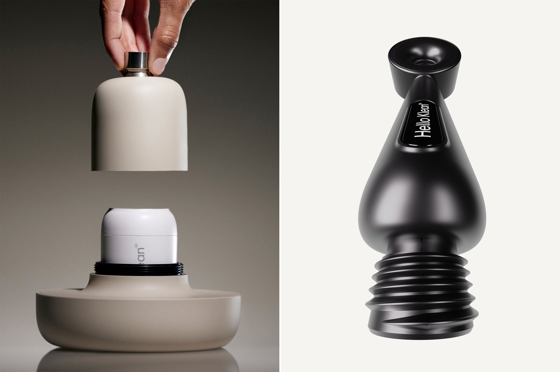
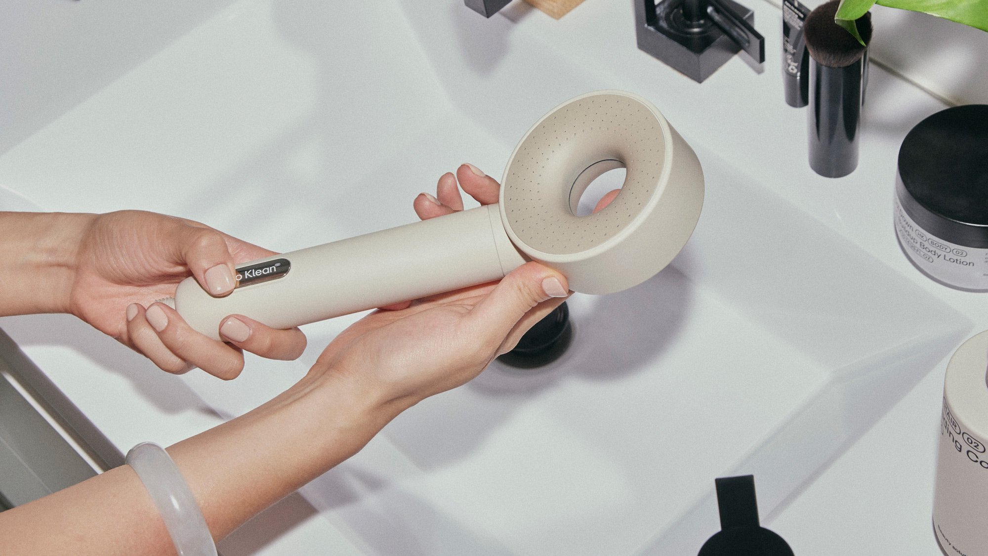
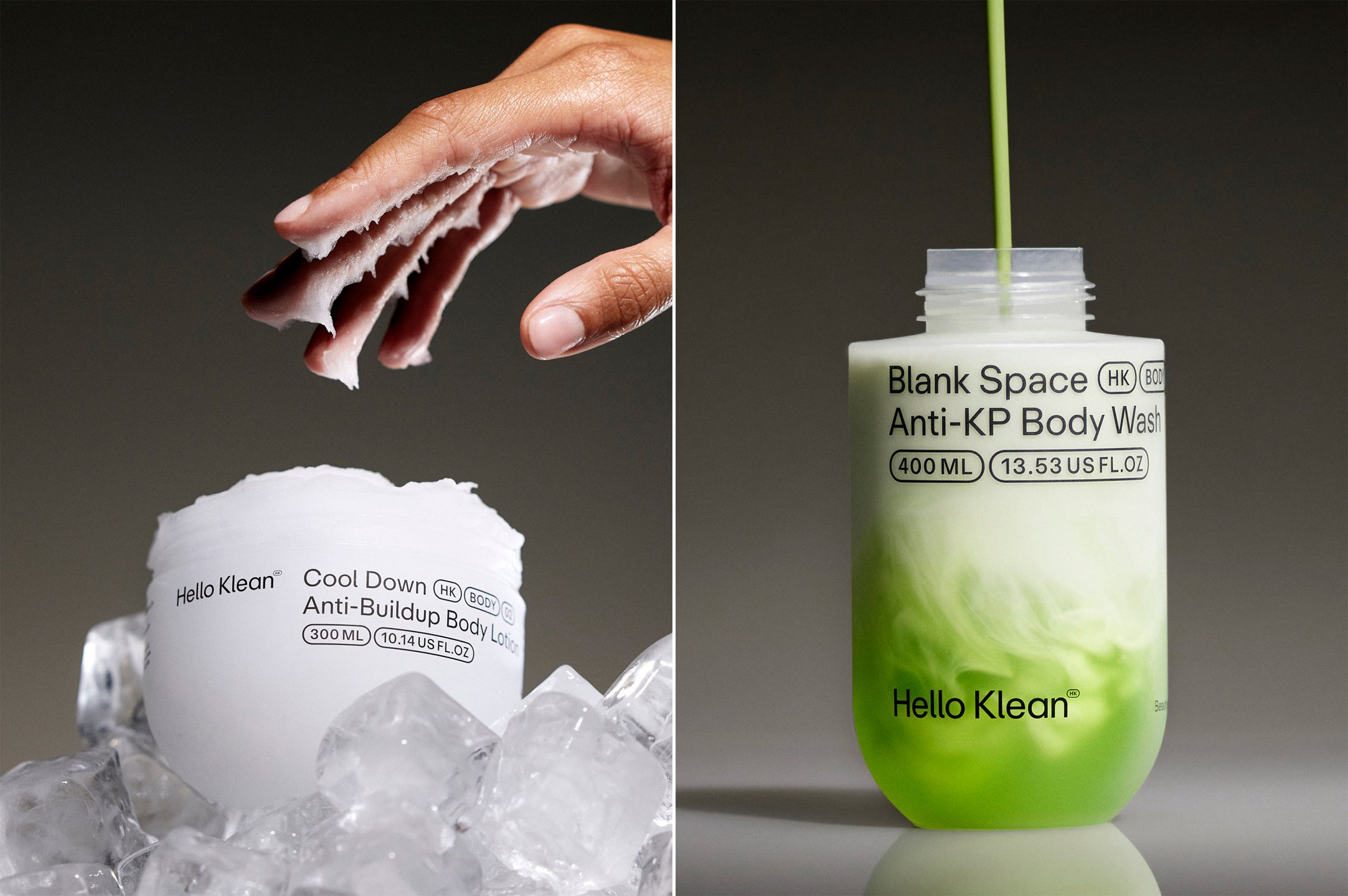
The art direction for Hello Klean’s product and lifestyle imagery plays a pivotal role in its rebrand. Clinical, close-up shots of the products highlight their functional benefits, while lifestyle imagery introduces warmth and relatability by capturing moments of self-care, grounding the brand in everyday rituals. This juxtaposition mirrors the dual nature of the brand itself – science-backed solutions with real human impact. The result is a set of visuals that feel modern, but not cold; premium, but not out of reach
My only gripe is the name – the ‘clean with a K’ cheapens it a little, and the ‘Hello’ calls to mind Hello Fresh rather too much – to the uninitiated, it sounds like the brand might be a sort of delivery services for Domestos, Marigold gloves and the like. The name, or so it seems to me, works against the brand in that it confuses its central premise and purpose rather than helpling enlighten potential customers as to what it actually is and does.
That aside, the Hello Klean rebrand by Two Times Elliott cements its evolution with a visual identity as clean and compelling as the results its products promise.
Simplicity can be a powerful tool in a saturated market – but only when done well. Two Times Elliott’s work avoids the pitfalls of over-simplification, instead leveraging restraint as a canvas for bold storytelling. The minimal aesthetic – often deployed but rarely executed with such finesse – finds its best expression here with a design system that frames the brand as a trusted but modern authority in beauty science.


