North Road by Manual
Opinion by Angelica Frey Posted 12 March 2025
Independent content studio North Road was founded in 2022 to unite a portfolio of companies covering everything from scripted entertainment (‘Chernin Entertainment’) and non-scripted content (‘Kinetic Content’) to non-fiction productions (under ‘Words + Pictures’). Across these entities, North Road is one of the largest global suppliers of TV and film content, and is able to work on over 70 active productions at one time.
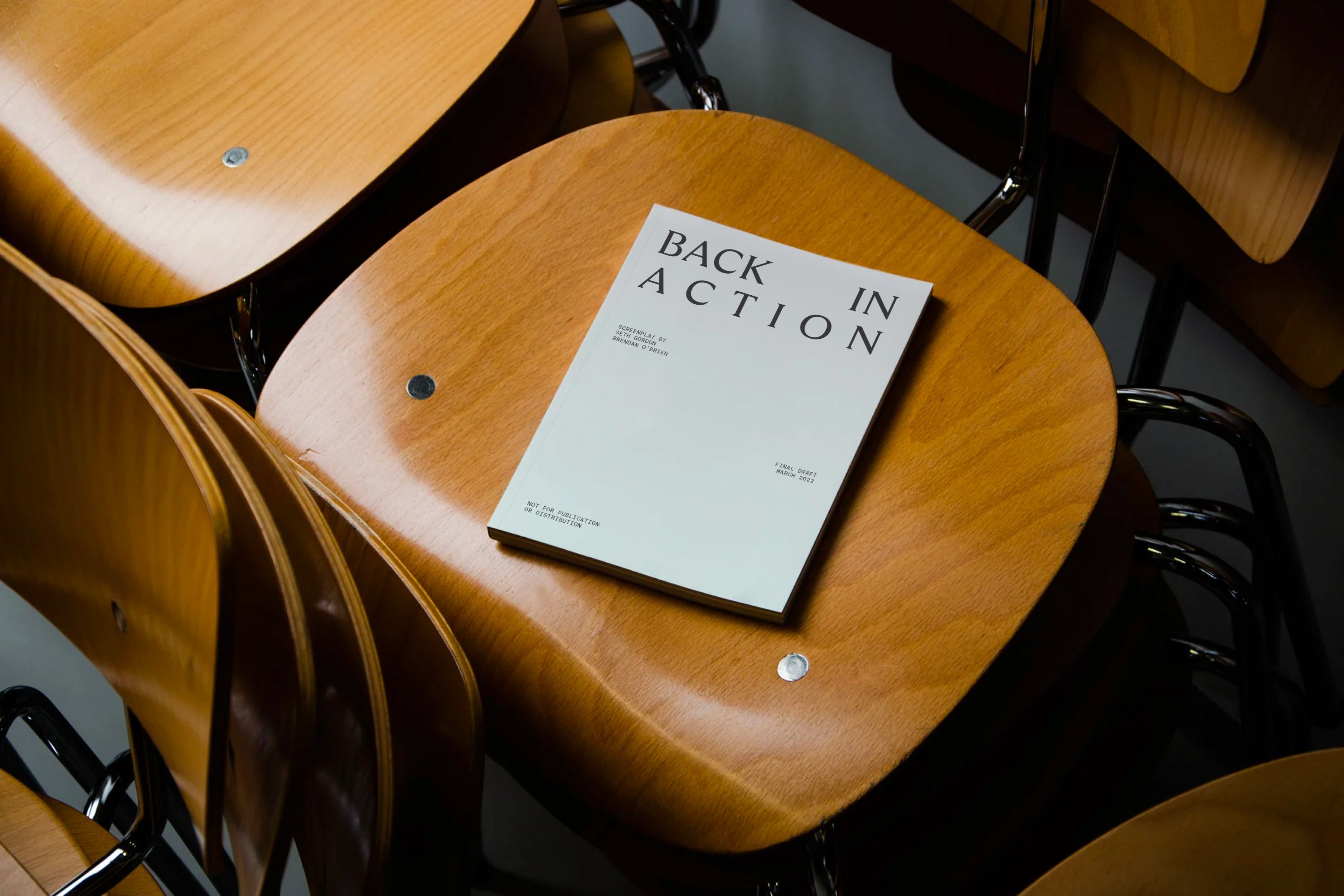
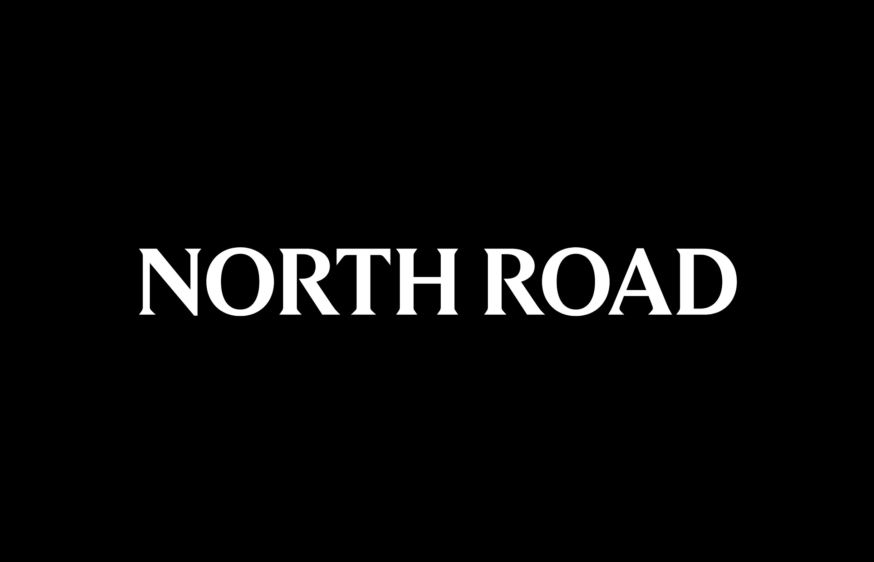
San Francisco-based Manual (Recchiuti, Mill & Eames Institute) worked closely with North Road founder and industry luminary Peter Chernin and his to team to craft a simple yet distinctive brand identity for the company’s debut. The focal point of this work is a bold wordmark and customised typeface, developed in collaboration with Swiss Foundry Grilli Type. It’s an elegant, contemporary serif with calligraphic details (elegant curves and sharp corners), presumably based off GT Ultra.
![]()
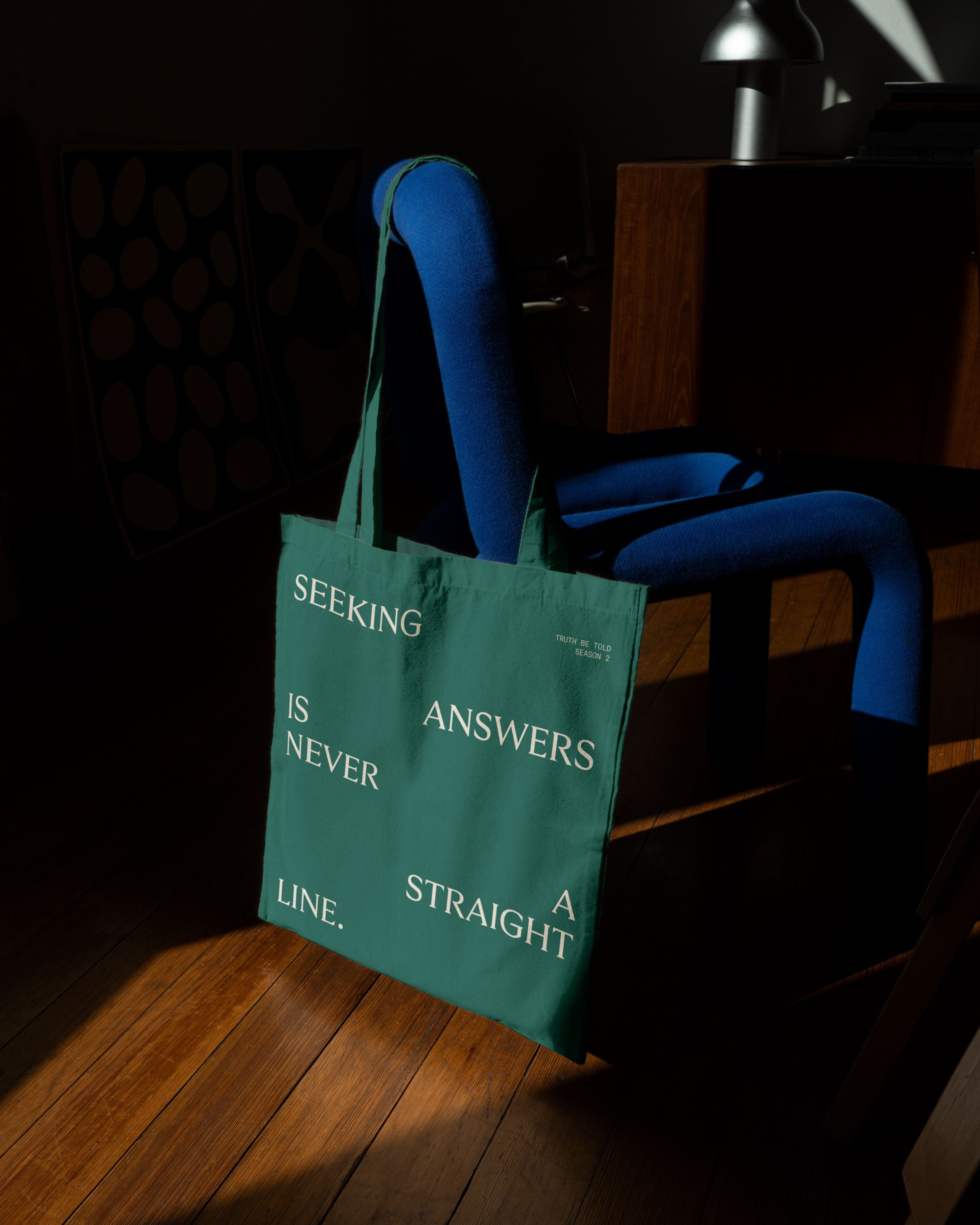
The typography is beautiful but the dynamic motion toolkit is where the visual narrative really comes to life. Since North Road prides itself on its talent and pool of creatives as much as its content, Manual decided to draw inspiration from film and TV title sequences, which are notable for their typographic compositions and layouts. ‘Drawing inspiration from the rhythmic textures and arrangements of titles and names, we developed a dynamic typographic approach for headlines and quotes’, Manual explains.
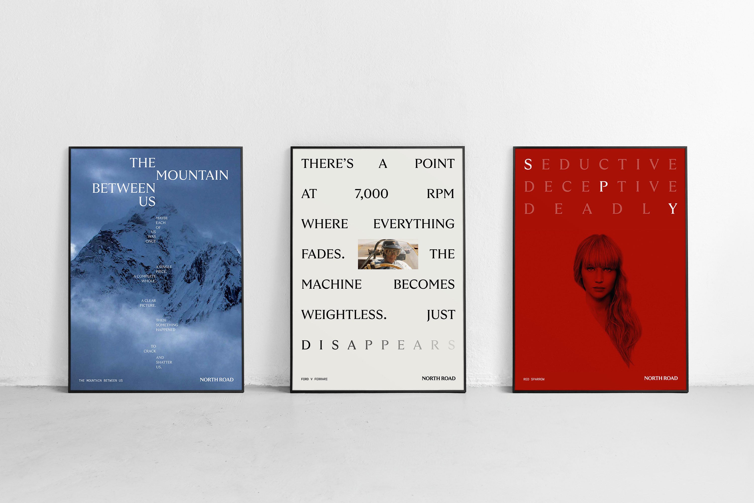
By using this creative framework to build a full digital experience, North Road is able to use one typeface to narrate the compelling stories behind its diverse productions. The injection of movement allows scope to evokes different moods (when typesetting a movie’s name, for example) and brings energy to memorable quotes from beloved characters. ‘When you stay in Slumberland too long, you forget everything’ (Jason Momoa’s Flip, Netflix’s Slumberland) fades out ominously, while the title of ‘Ford v Ferrari’ (20th Century Fox) expands as if revving up.

When you’re talking about TV programmes and films, visuals are important, and Manual’s system deftly allows for type to sit with promo images and stills – sometimes alongside, sometimes overlaid. A framing device in a tasteful, tonal palette creates a point of differentiation from other entertainment conglomerates (full bleed, full colour images are the standard) and ties the disparate portfolio pieces together. The ‘widescreen’ crop format is particular smart, dramatising the cinema experience through aspect ratio alone.
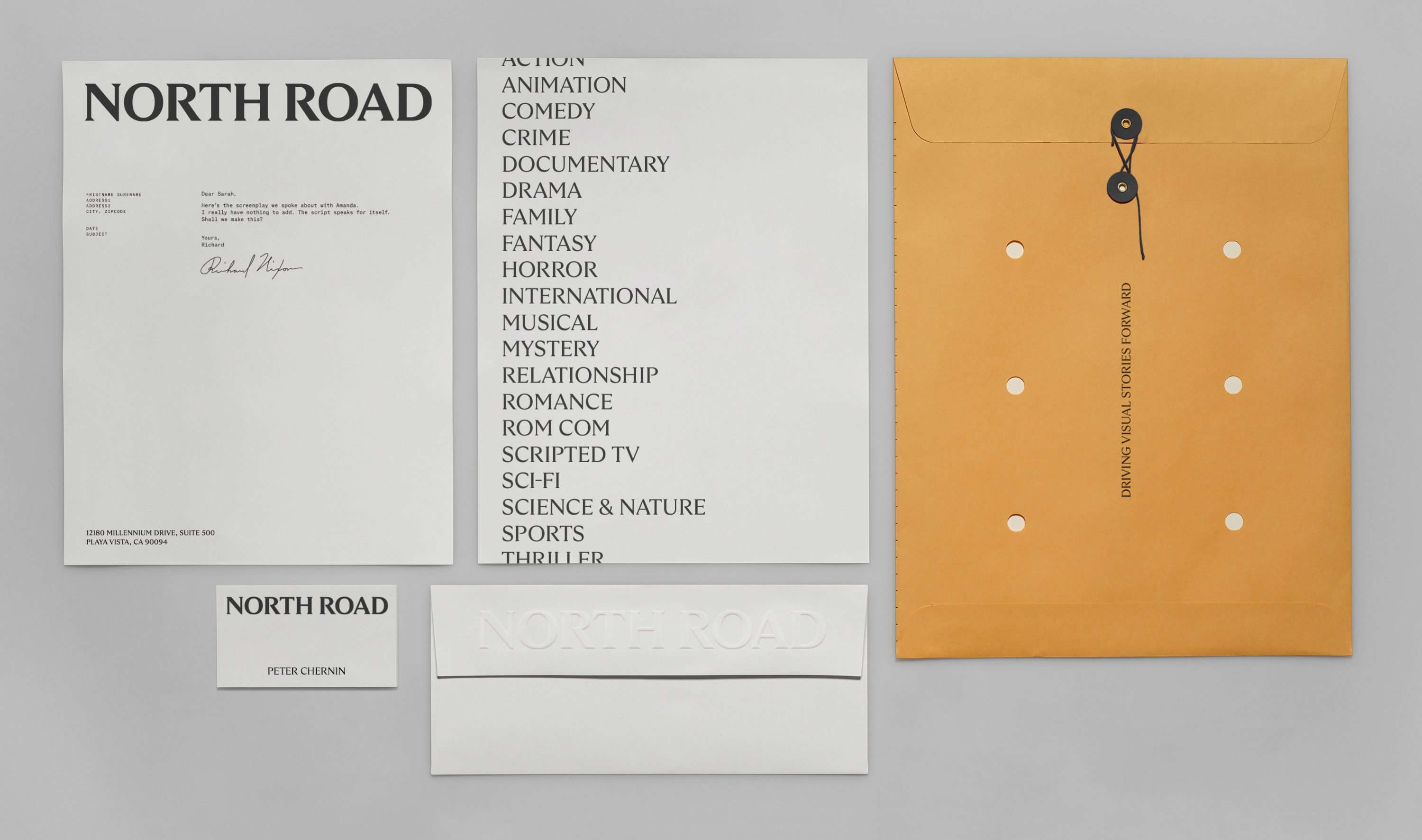
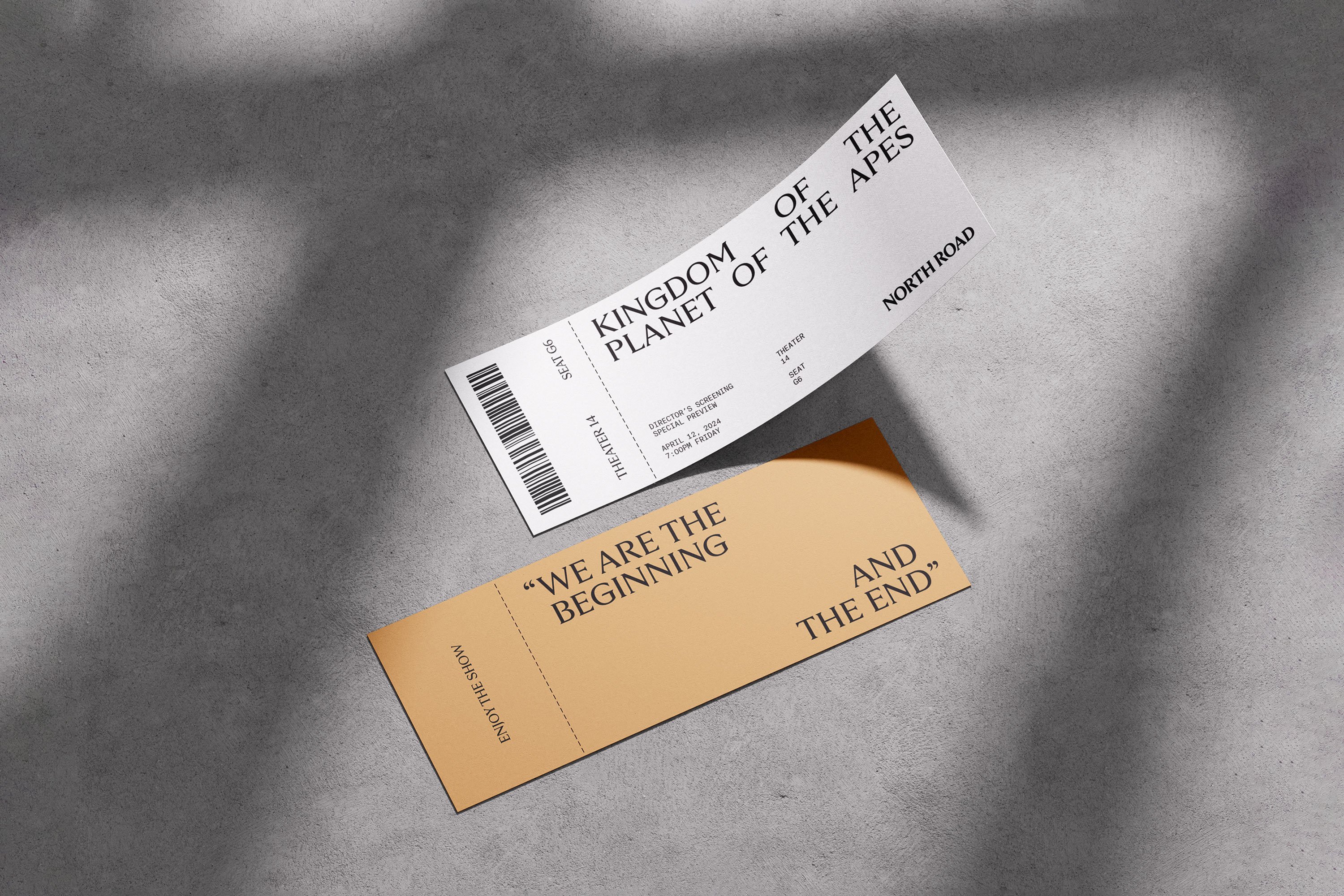
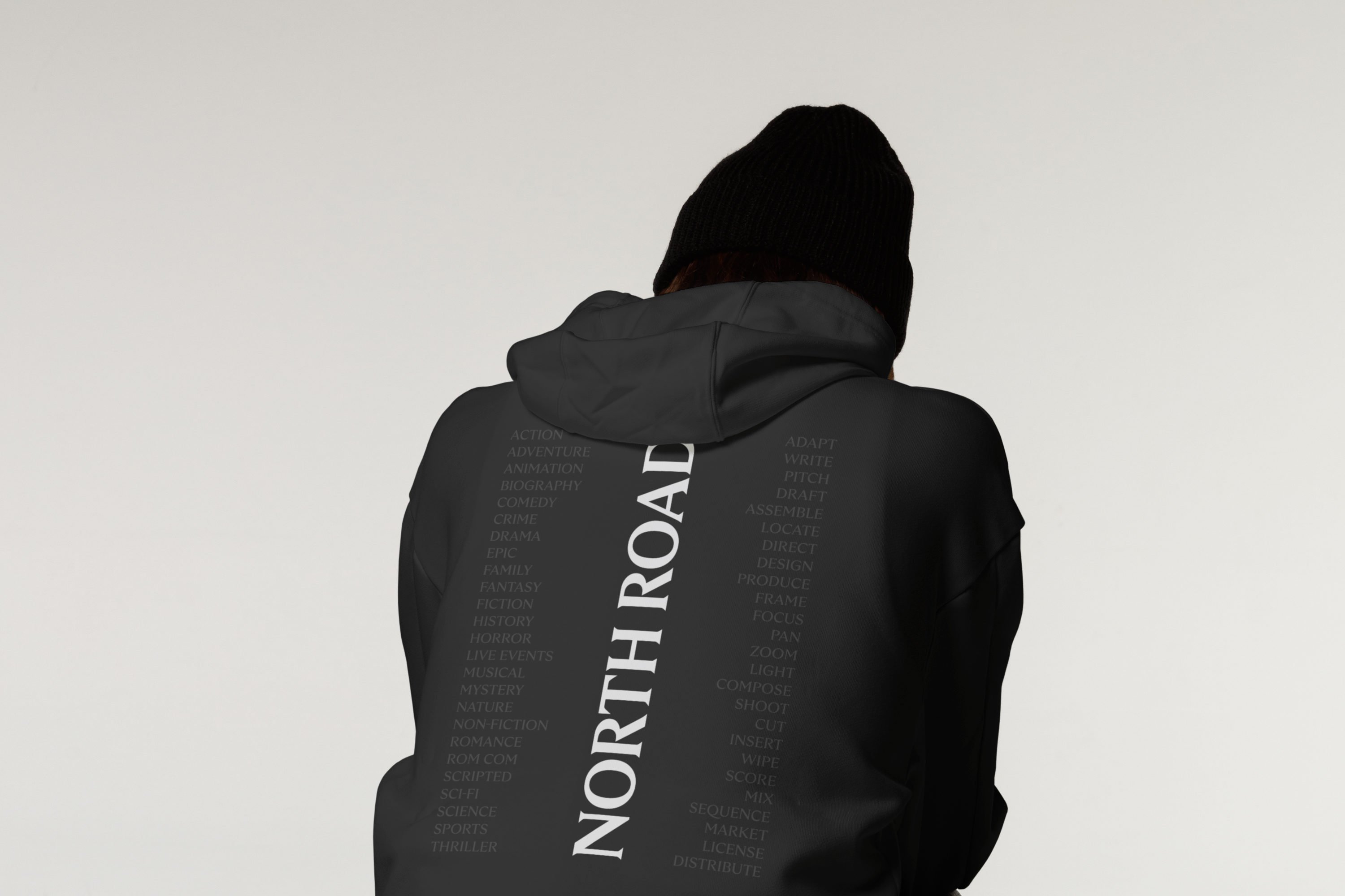
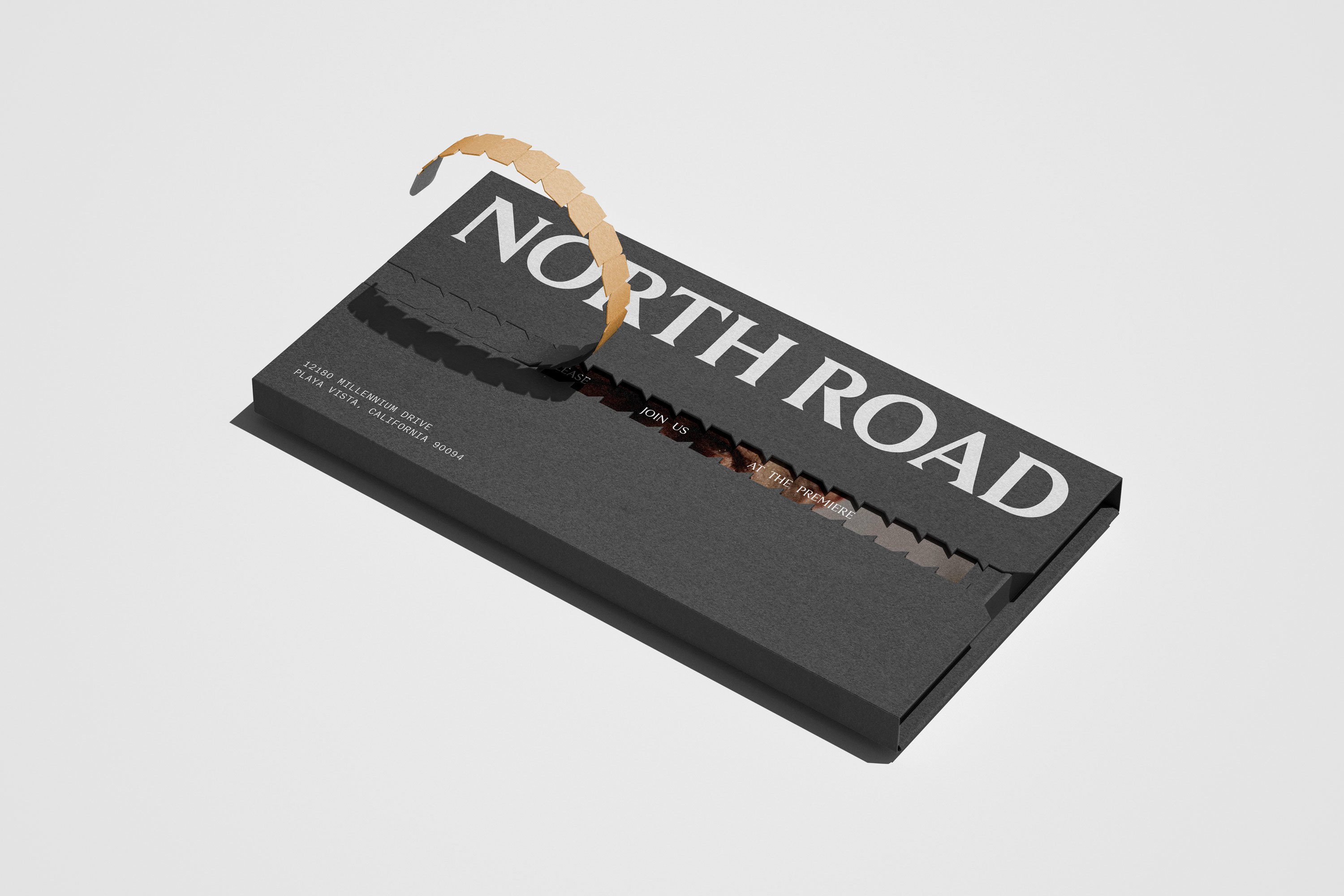
As well as the digital assets (vertical promos, social grids etc), there is printed collateral, including invitation slips, manila envelopes, business cards and tote bags. Here materiality is used to imply craft, from tactile blind embossings to string-and-washer fastenings that perhaps suggest a reel a film. These are confident and clean, giving North Road gravitas and authority.
Taken together, Manual’s branding conveys North Road as a content studio catering to a wide range of different demographics and tastes, united by a single vision. It’s a classy and crafted piece of work.