Ten by Paul Belford Ltd
Opinion by Richard Baird Posted 10 April 2025

I’ve been writing about the work of Paul Belford Ltd. (Next Chapter, Spudos & Social Enterprise) for very nearly fifteen years. Initially, and admittedly, the articles practically wrote themselves, which was ideal for a self-taught designer with very little experience but keen to take an approach to learning that was very much my own. That was to write about a piece of packaging or a new brand identity every weekday in a very public manner (for a bit of accountability) as a way to try to make sense of it.
What I meant by ‘write themselves’ was that there was an ingenuity and simplicity to the brands that this studio was designing. They were often characterised by a few but carefully crafted set of components composed in a harmonious and consistent manner. For someone without a graphic design background, I learnt the fundaments from work like this. And further, that success wasn’t just the the design of distinctive and functional assets, but also the ability to draw a client into believing in (and signing off on) a simple expression and the technical skill to apply them in the real world (this was before there were sophisticated mock-ups). What I also enjoyed was that, despite the creative wit and simplicity, I could guarantee that Paul Belford wasn’t doing it just for fun (or what would now be considered an audience or following). This is of course fine, but not what BP&O is about. An important delineation we continue to hold to.

Of course, as I gained more insights, and practical skills working with clients, writing about projects with more scope and operating cross-platform (this started to include a lot more motion, instances of generative identities, and custom typefaces) the blog evolved into something more substantial. Regardless of this evolution, BP&O has always loved and celebrated a good logo, and why we return to Paul Belford Ltd with a look at the studio’s work for Ten (new website coming soon!), a chain of health and fitness studios in London.

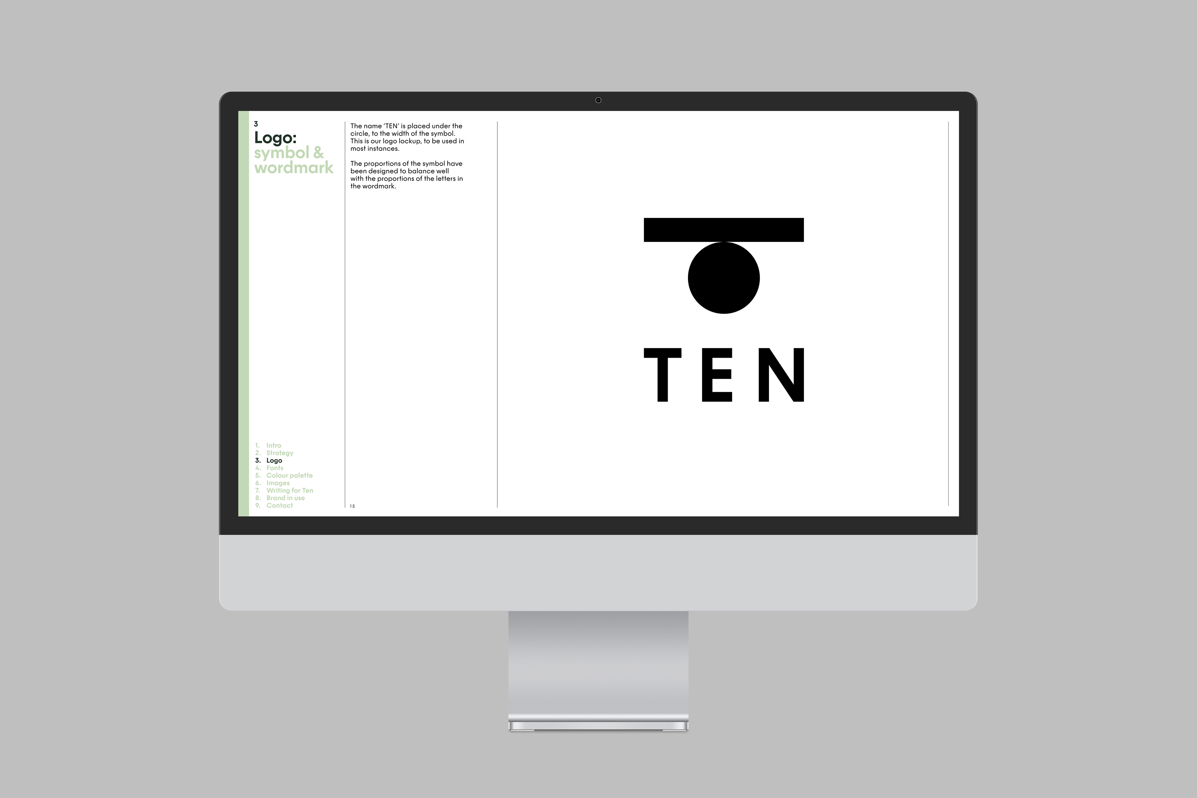
“The symbol is formed by a line balancing on a circle to make an abstracted letter ‘T’. It is designed to work with their strapline: ‘Your centre of balance. A line and a circle are also the constituent graphic elements of a ten numeral.”
Sometimes a logo has a story. Sometimes it is ‘read’, an idea inferred, a feeling conferred, or an abstract form that simply identifies. This is one of those, a-ha, yes, its a ten, and its all about balance. Perfect. Distinctive, simple, ownable (because of the two readings, context matters here). And, in its solid geometric form can be easily applied, scaled up and down, across all the places it needs to exist, from signage, to tote bag to ads, and whatever new merch that a health and fitness studio will find itself producing.

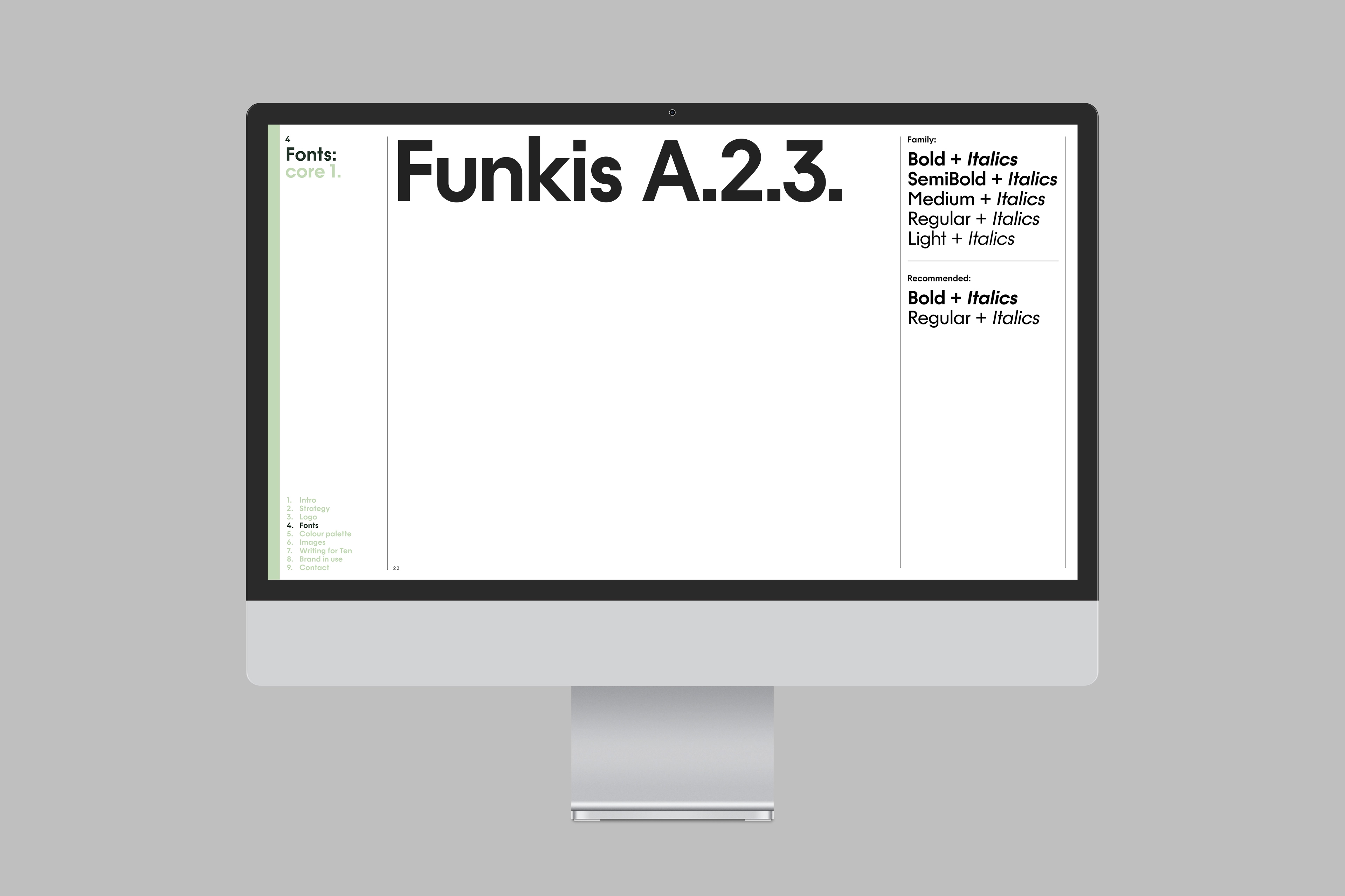
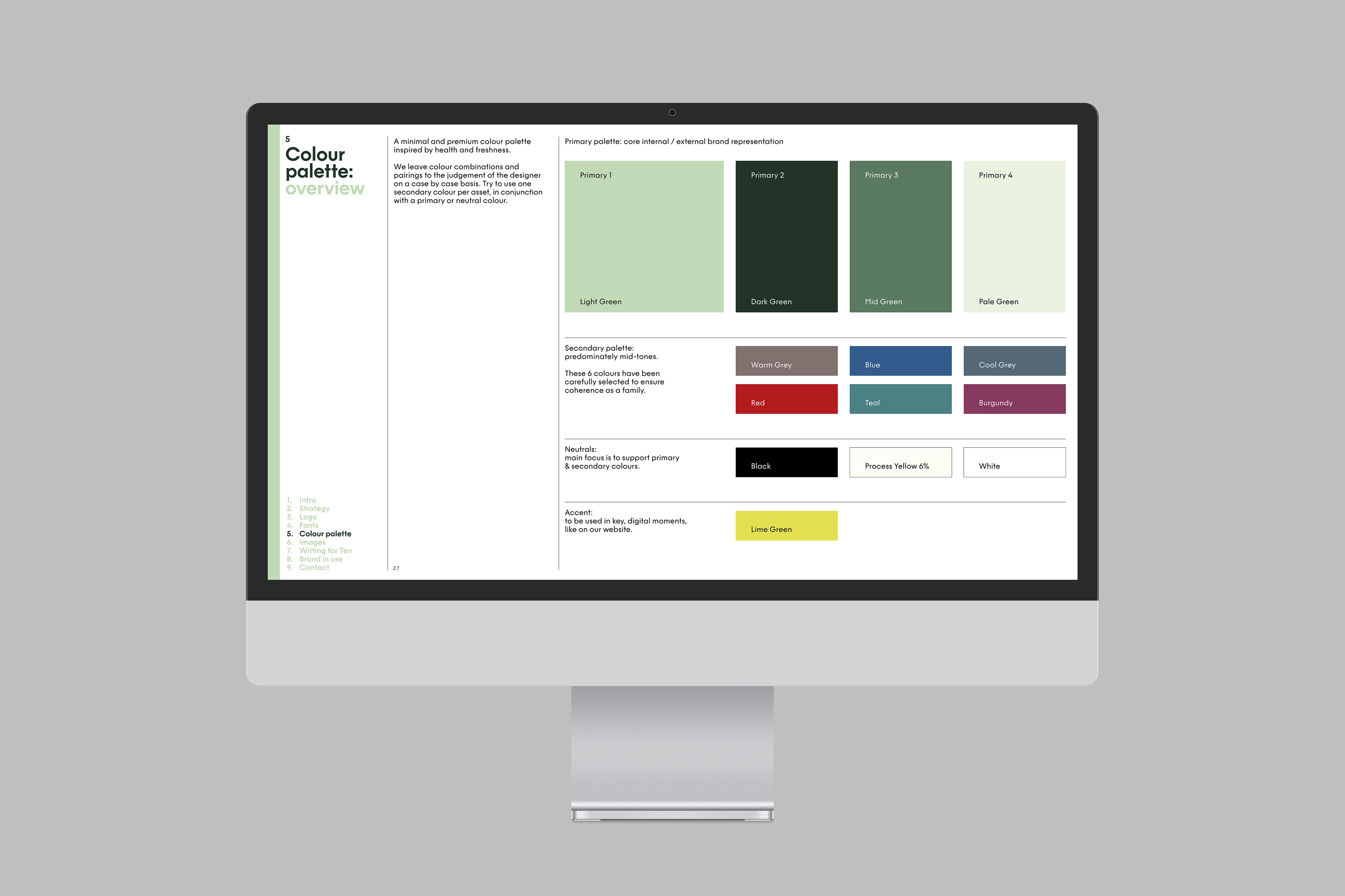
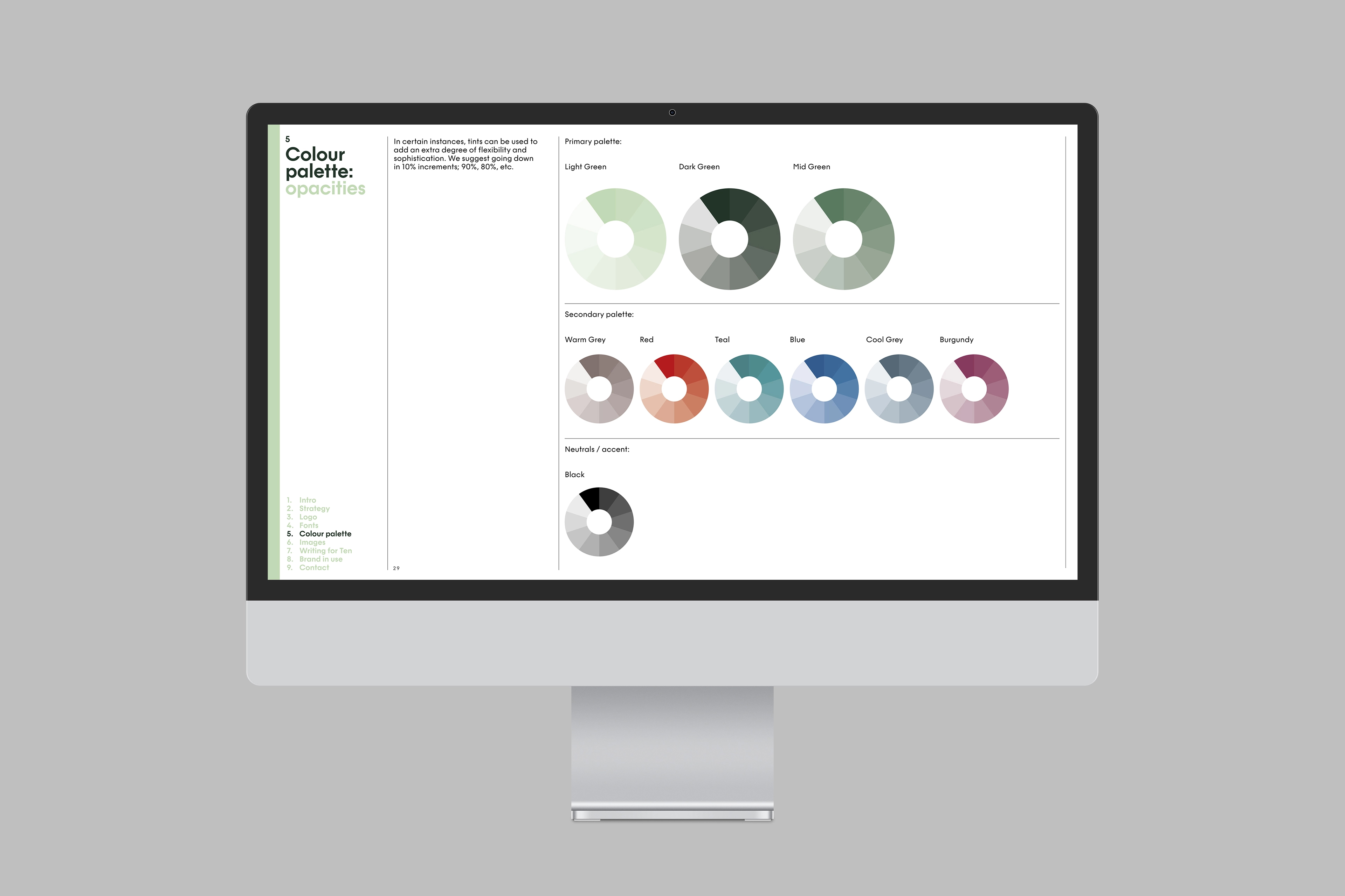
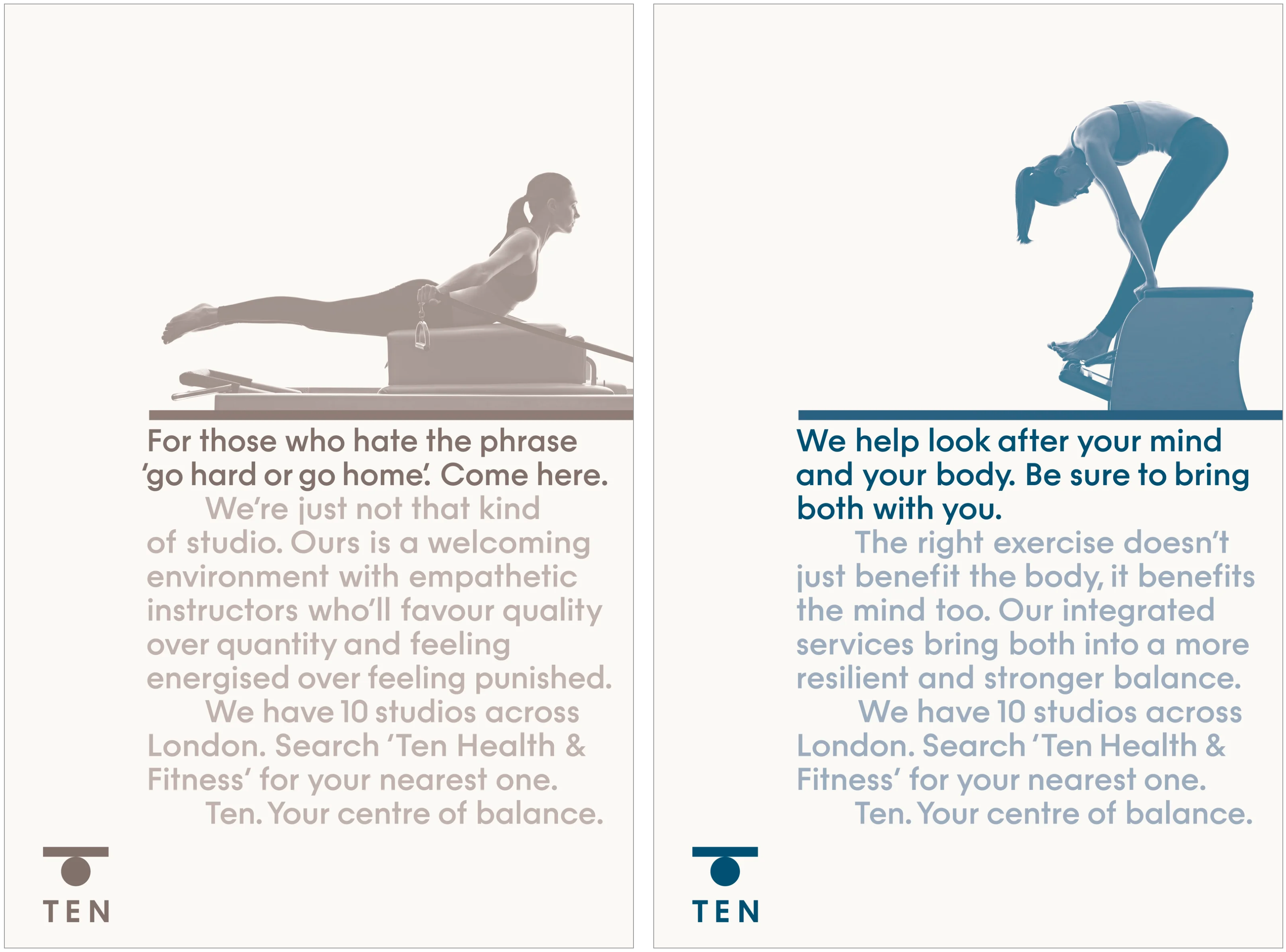
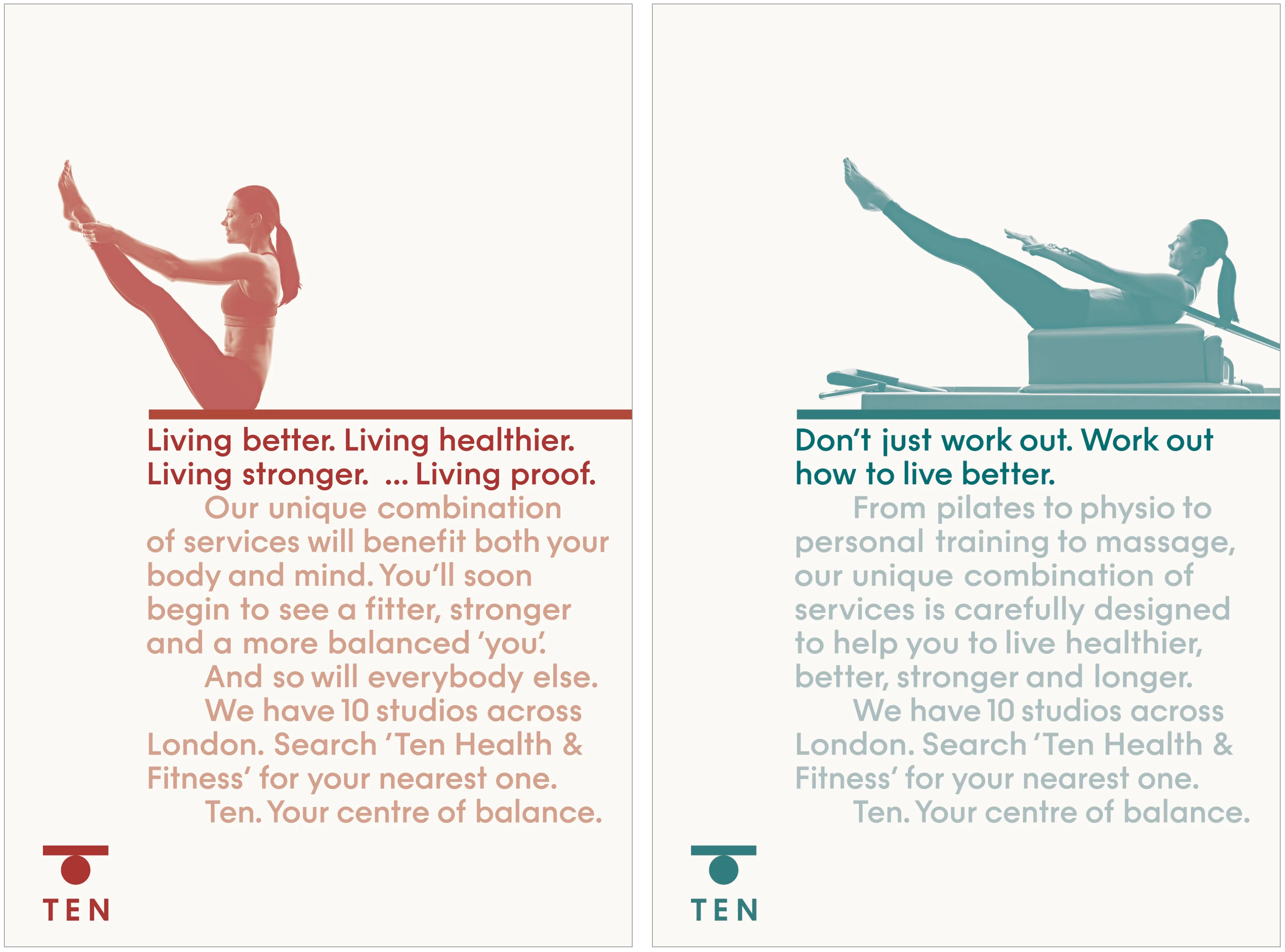
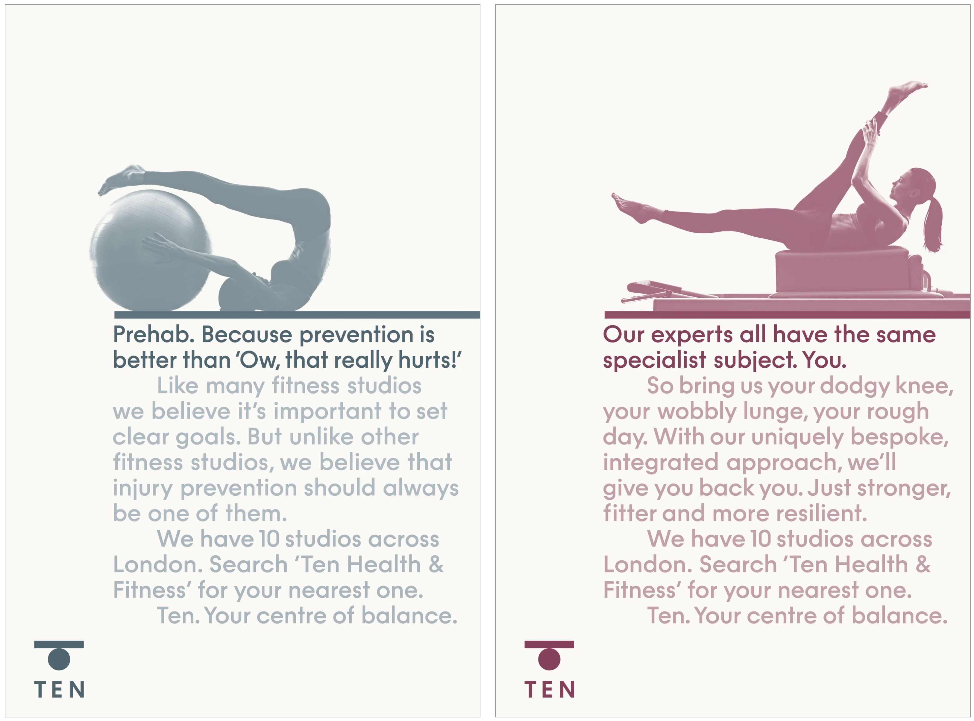
Paul Belford himself has spent part of his career in the advertising industry, and continues to lend this skill to print ads and copywriting. The cold geometry of the logo is juxtaposed by the warmth and inviting tone of these other aspects, further softened by pastel colours, single colour tinted photography and Funkis, a geometric typeface which itself contains some interesting ‘poses’. Belford knows asymmetrical balance well, and the compositions of these ads (single typeface, one size, with tints creating hierarchy and flow) lend themselves well to the overall theme.
It’s tempting to draw articles like these out (500 words is like the 9mins of a Youtube vid, enough to stick some ads into–please subscribe to LogoArchive!), to describe literally what is happening. To call type ‘professional’ and colour ‘reassuring’. Brand is a wonderful world of both complexity and simplicity. We should honour the latter, by keeping things short and to the point where necessary. I love this.
