Rolus by Re
Opinion by Emily Gosling Posted 24 April 2025

Back in the early 00s – the era when arguably Hollyoaks was at its zenith, and bellybutton piercings their most bejeweled – Botox was gradually emerging from the hushed clinics of Harley Street and LA to become part of common parlance. As such, brands cottoned on to the word’s ‘eternal youth’ connotations: I distinctly remember a shampoo ad promising that among its ingredients was something called ‘boswellox’. Or indeed, an absolute load of bosllox.
Where the 00s had boswellox, a quarter of a century later we have ‘adaptogens’ – a vague nomenclature that implies an ingredient that’s probably, surely really good for you. Perhaps a superfood, but a bit more modern? Even scientific papers are unclear on what these actually are: ‘Adaptogens are defined as non-toxic substances of plant origin that are claimed to… normalise body functions’, reads one on the National Library of Medicines site. It continues, ‘The broad and vague definition of the term renders it of little scientific value.’
Still, as a buzzword, it certainly hits that sweet spot between sounding scientific enough that it seems pretty credible, and vague enough for its credibility or lack thereof to feel unimportant anyway.
But if you’re a 21st century health-conscious type, surely given the choice you’d opt for a drink bursting with adaptogens over one that has no such magical properties, right?
A new contender for said drink is Rolus – a name as confusing to pronounce (like ‘bowl us’ or ‘doll us’? No clue) as it is chock-full of promises of not just health, but relentless good times.

The branding was created by design agency Re (Mr Yum, Sydney Design Festival & Ridley), which worked across the brand strategy and identity; packaging; art direction; experience design; and website. Re – part of the M&C Saatchi Group, with offices across Sydney, Melbourne, London, Stockholm and Dubai – sets out its stall rather definitely when it comes to its approach to Rolus’ branding: ‘Let’s face it, the world doesn’t need another self-important drink… promising to transform your life.’ Well quite.
The agency goes on to suggest that Rolus fits into a sector it’s dubbed ‘braincare beverages’, which we can only assume is something to do with those enigmatic little adaptogens again. As a soft drink, it’s concurrently billed as a very zeitgeist alcohol alternative, but it’s also – so we’re told – a lot more than that to boot. ‘It’s refreshing enough to have after yoga, over a long brunch, or on a boat’, Re continues.
‘You can even mix it with your spirit of choice…’ In short, ‘Rolus is a challenger in a very crowded space.’ As such, the branding had to do a lot of hard work to stand out.
![]()

Where much of the burgeoning wellness drinks landscape has come to be awash with cliches of pastel hues (like this, or this, or this, or this); there are a few outliers who’ve taken a more stark, almost Swiss-style approach – a healthy but rigorously [pseudo?]scientific seriousness played out in big sans letterforms and uncompromising black and white.
Rolus veers far more towards the latter, but does stand out in this weird little drinks category: it truly doesn’t look like its competitors, but – dare I say it – certainly has resonances of some of the newer energy drinks that promise something to do with performance and insist they’re nothing like the Monsters, Relentlesses et al before them.
Perhaps as another riposte to the sort of brand that promises chakra realignment or aura enhancement, the tone of voice here is straightforward– messaging is short, punchy, and never takes itself too seriously. But at times, it’s patchy.

The main Rolus tagline, ‘Never still’, is strong; succinctly explaining that it’s both fizzy and potentially will keep you going thanks to its ‘secret botanical blend’ and capacity to hydrate. But in lots of places, I’m not convinced the copy really lands: maybe I just don’t get the joke in slogans like ‘Sip It. Mix It. Electrolyte It’, but it just seems a bit confusing.
For Rolus, Re opted for unapologetically stripped-back packaging, using just white, black and red. It positions Rolus as the sort of brand that doesn’t need to shout to be heard; it almost feels like a deliberate rejection of Goop-era woowoo – deliberately a little dry in tone and severe in pack graphics, while still communicating refreshment.
Aside from the main wordmark – a very direct but never confrontational sans serif in all caps, spaced beautifully – the branding uses Montreal-based foundry Pangram Pangram’s rather lovely PP Neue Montreal and open source font Geologica for the bolder all-caps lettering.
The ticker-tape style copy that appears in white on the large red Rolus ‘R’ on each can is a superb touch, reinforcing the ‘never still’ idea in a way that works just as well as a static graphic as it might in motion, which is no mean feat.

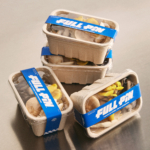
A standout touchpoint is the large multipack boxes: given the space, the branding really comes into its own in a way that doesn’t quite hit on-pack – and the way the barcode becomes a central part of the brand design feels like a masterstroke.
The Rolus website has some slightly strange choices (namely that scratchy hand-lettering font, which feels like it slightly cheapens the whole thing), but away from such gripes the design is really smart in its merging of personality and product. There’s some really interesting layouts in the way that content is layered and overlaid; mixing gifs, stills and videos which range from aspirational poolside vibes to straight up product shots to some slightly confusing aerial shots of what I think might be the great wall of China, with a few mountainous pics à la screensaver thrown in for good measure.
There’s a lot that feels confusing about Rolus, from the name to the copy to the image choices, but overall there’s no doubt this is some strong branding – unapologetic, category-defying, and typographically rigorous. If only we knew how to actually say ‘Rolus’.

