Veikkausliiga by Bond
Opinion by Richard Baird Posted 6 May 2025
How do you bring the fans, teams, and stadiums of the northernmost league together under a shared identity that captures the energy and passion that defines it? For Bond (Saaristo, Cable Factory & Northstar Film Alliance), the answer was in plain sight… the scarf – strewn across the terraces, held high, no matter the team or the weather.
Veikkausliiga is the highest tier of Finnish football, consisting of the country’s 12 top clubs. After 22 rounds – each team playing every other team twice – the bottom six clubs compete in a relegation round, while the top six advance to the championships. The format has created a tournament known for its emotional intensity, because every match counts.
To return to the scarf: as the focal point of Bond’s visual identity system for Veikkausliiga, it scores on both a conceptual and communicative level. Like other high-latitude leagues, Veikkausliiga follows a spring-to-autumn season – typical for cold-climate European sports.
The scarf not only symbolises a deep connection between fans and their clubs, but also their united and unwavering loyalty through the harshest of weather conditions. It represents warmth, both literally and metaphorically – to take it off and wave it in the air when that air is below freezing… now that’s passion.
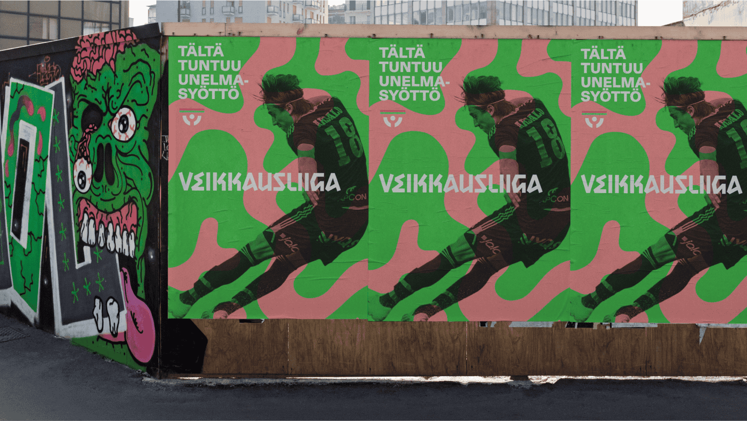
The scarf both unifies and delineates, and the visual identity flows from this. The generic becomes ownable, as the garment is folded into letterforms, becoming a display typeface that lends character to any number of communications, in print and online. This could easily have been lacklustre, but the unusual angles (arranged to follow the folds and movement of fabric) imbue ‘Scarf Display’ with real spirit.
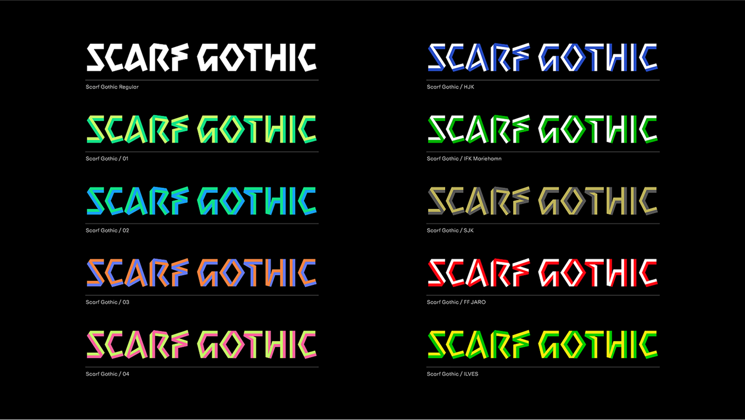
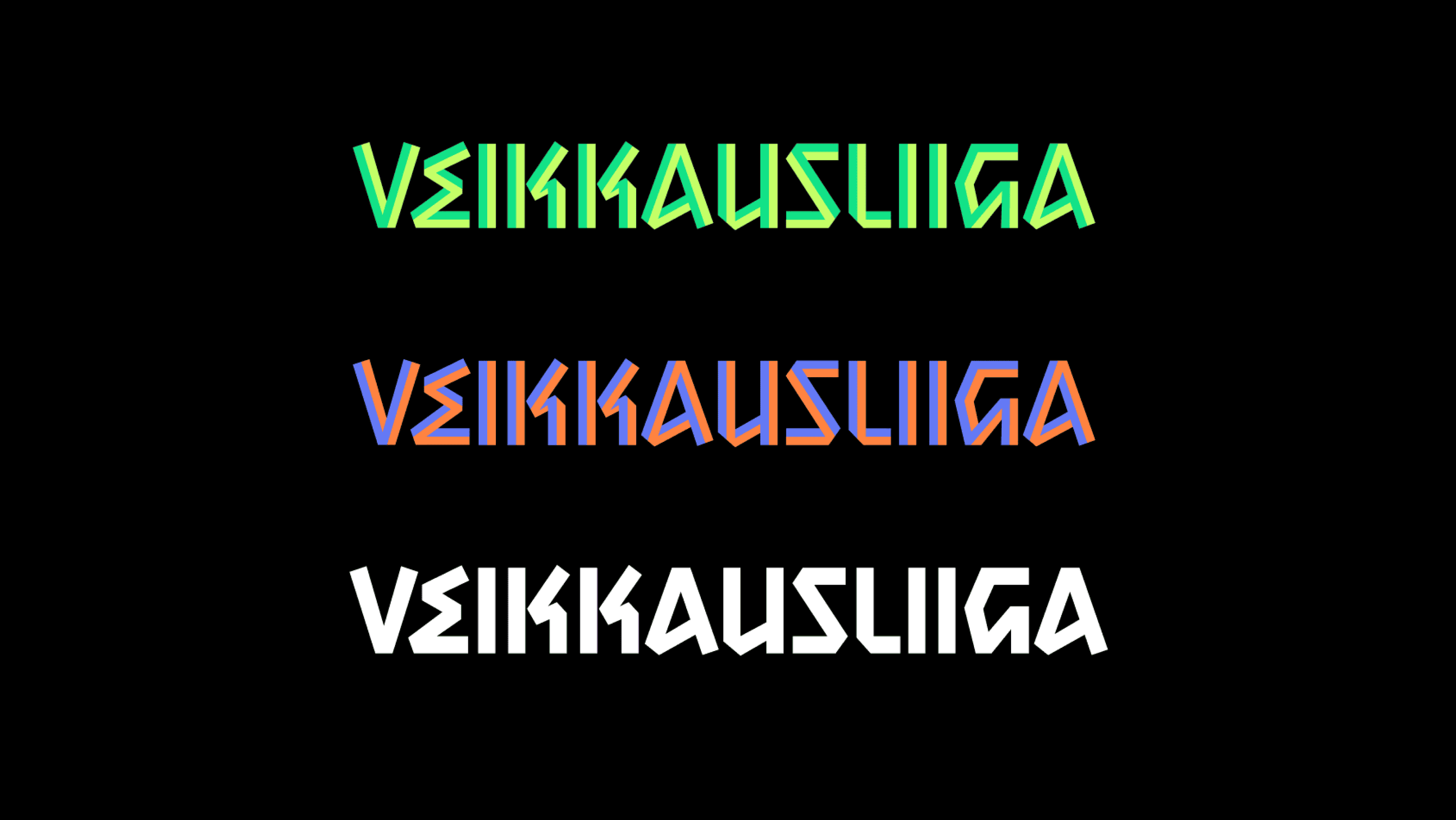
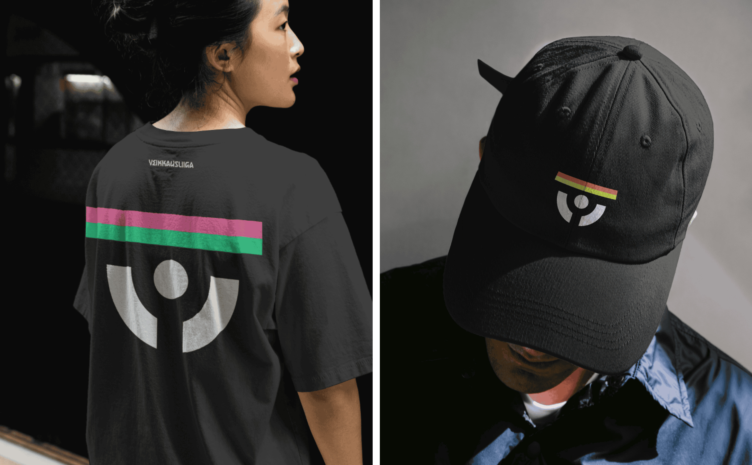
Bands of colour introduce a unifying rainbow of striking hues – inclusive, appealing, and systematic. This is said to align better with a ‘greater spectrum of feeling’ and shines ‘particularly brilliantly when contrasted with the strong use of black – just like stadium lights on an autumn evening’.
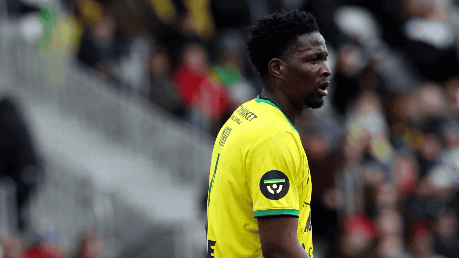
Elsewhere, a modernised version of Veikkausliiga’s previous symbol – a fan holding a scarf aloft – has been developed into a more functional form. With its modernist geometry and abstraction, it is just about readable and sits comfortably on the sleeve of a shirt or scaled down online. A series of Premier League-like dynamic patterns, in the same fluorescents, builds out the visual language of action and energy.
Presently – looking through the social feeds and the brand’s relationship with other assets such as player photography – integration (and custodianship) needs addressing in the rollout to ensure the league remains cohesive as a clearly unified, dynamic, and striking cross-platform brand. But, nonetheless, as Veikkausliiga positions itself for future growth, seeking relevance both domestically and internationally, Bond’s identity delivers adaptability and scope.
