Siuru by Bond
Opinion by Richard Baird Posted 20 May 2025
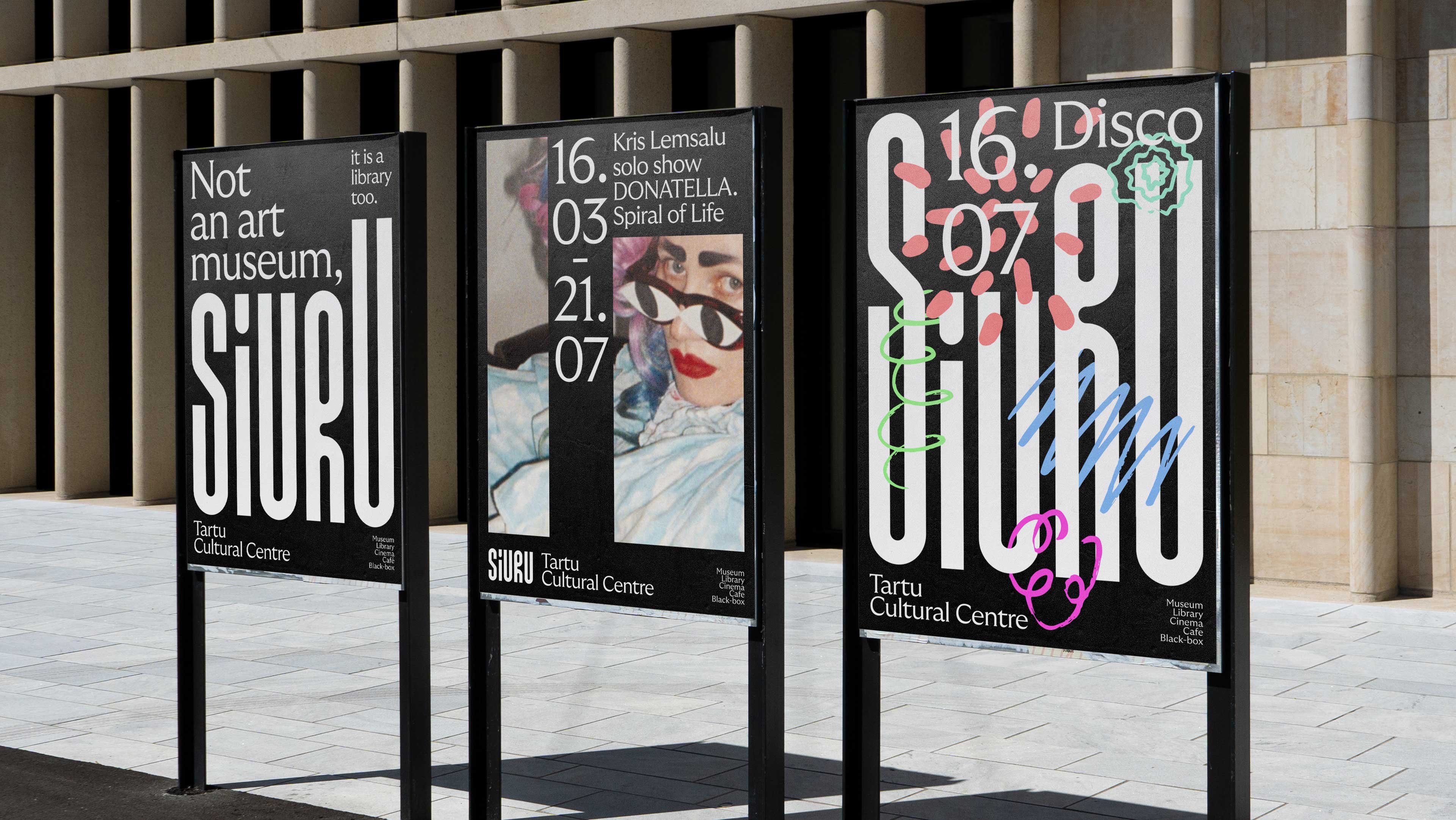
Estonia’s Siuru plays with important questions, subverting and, at the same time, fulfilling expectations. Is it an art museum? A library? A cinema? Or a cultural institution? For a Bond (Veikkausliiga, Saaristo, Cable Factory) the design studio in charge of developing a brand identity for Siuru, this raised the concern, how do you brand something that seeks not to be characterised in explicit terms, and one that is fluid, defined only by the individuals that seek out what Siuru contains and helps to bring meaning to the space and what it holds. The container remains fixed, but its contents does not. In the words of Bond “Siuru is not a building, nor a logo, nor a name—the word is not the thing, and the map is not the territory. They are merely representations.” This entire paragraph is as mind-bending a notion as Schrödinger’s take on quantum positioning, but let’s not go there…
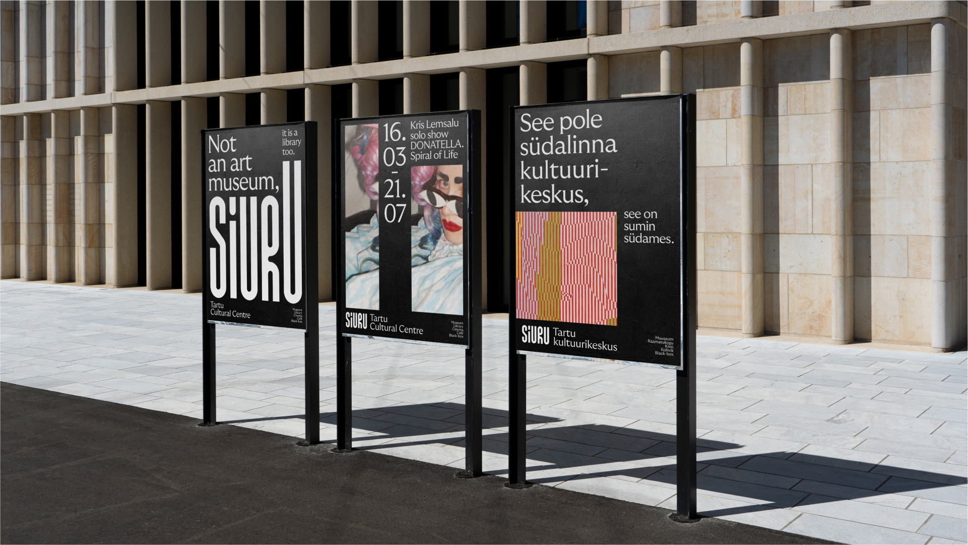
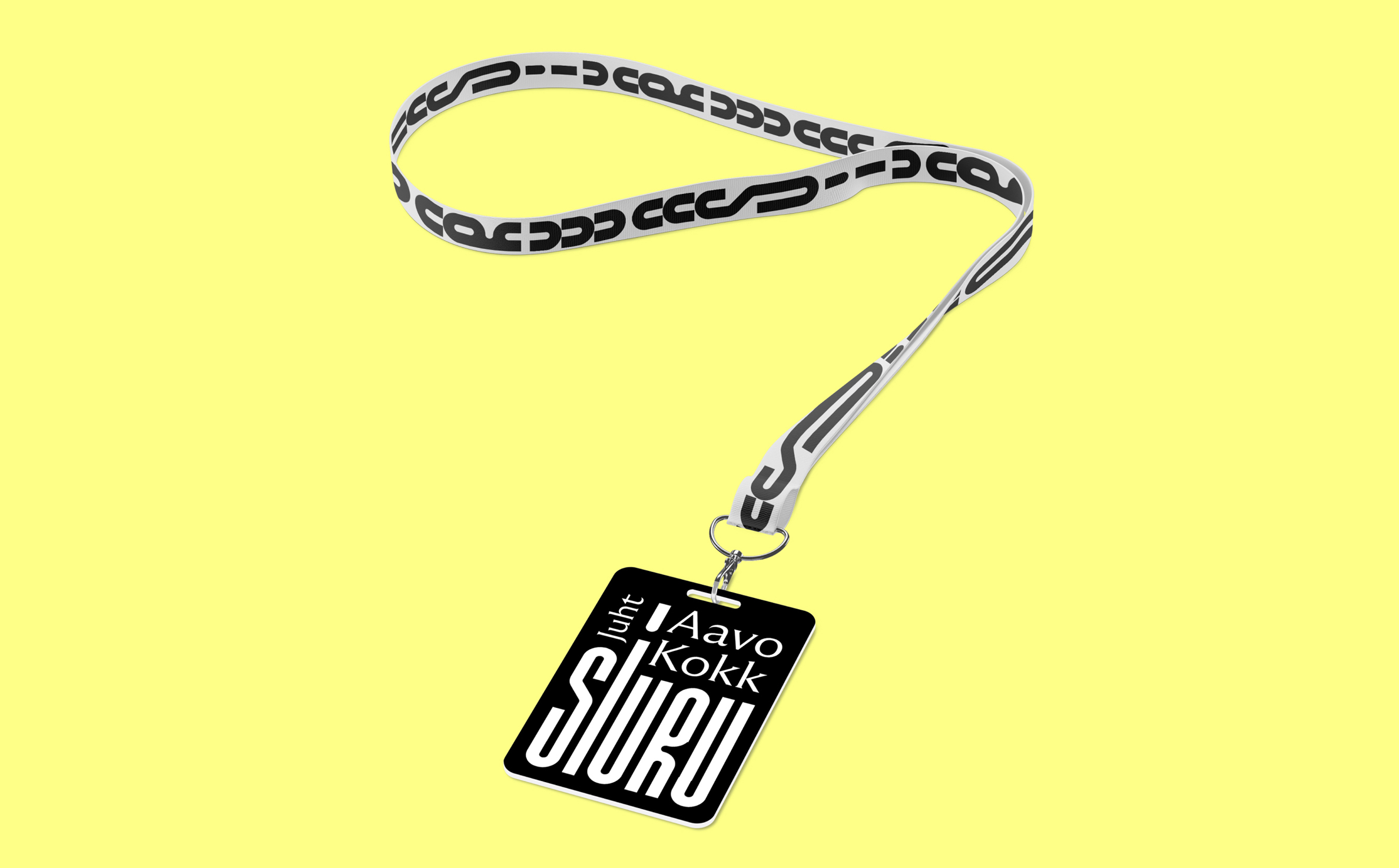
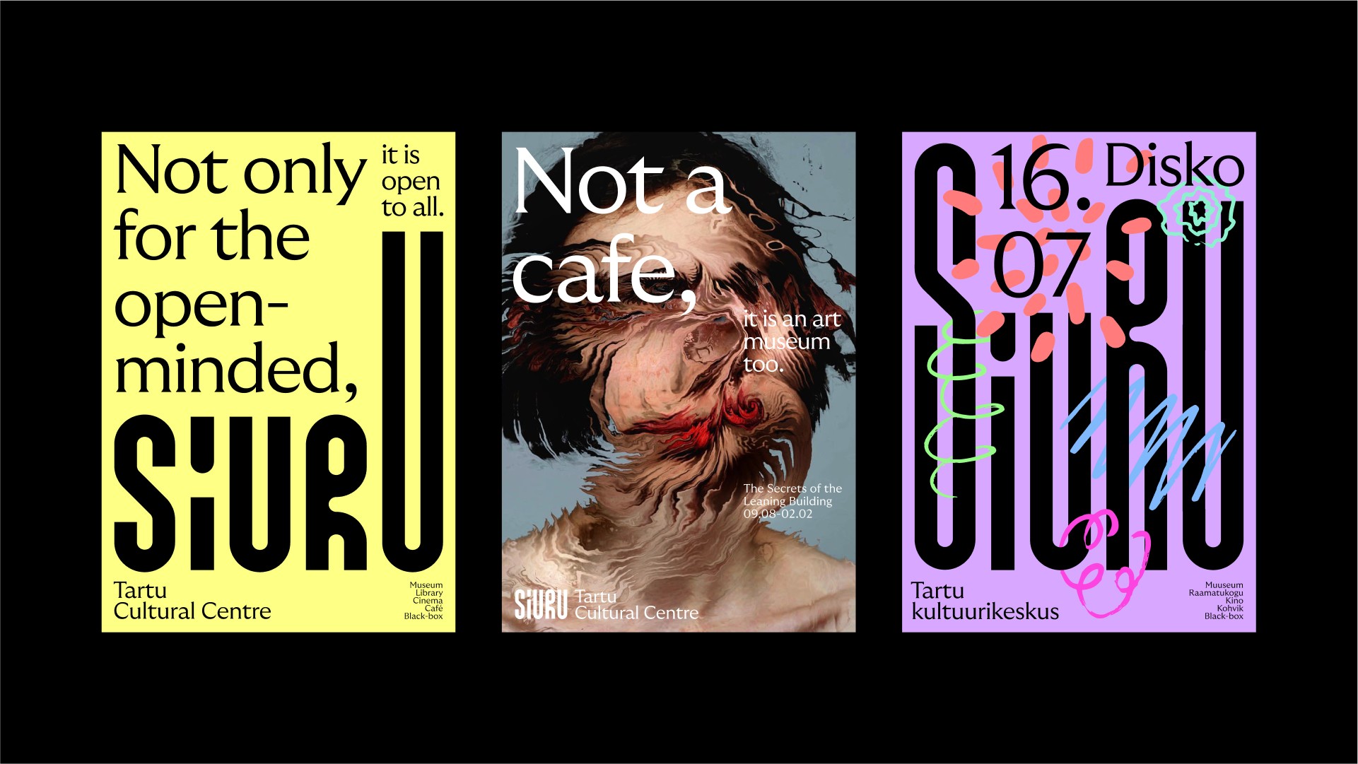
Pillars become the framework for holding up some unifying principles, the things that run as common themes throughout the diverse programming of space. These aren’t fixed ‘meanings’ rather, a stable place to run free, to offer a fluidity. This is visually expressed as a logotype that takes as its reference aspects of the material construction of the building, its pillars. This is given further thought. The suggestion of a tension between structure and programming is surfaced in the fluid push and pull between logotype and various other visual expressions. A jostling for space and meaning are tired to what might happen, and load the work with a sense of future potential rather than definitions fixed in the present.
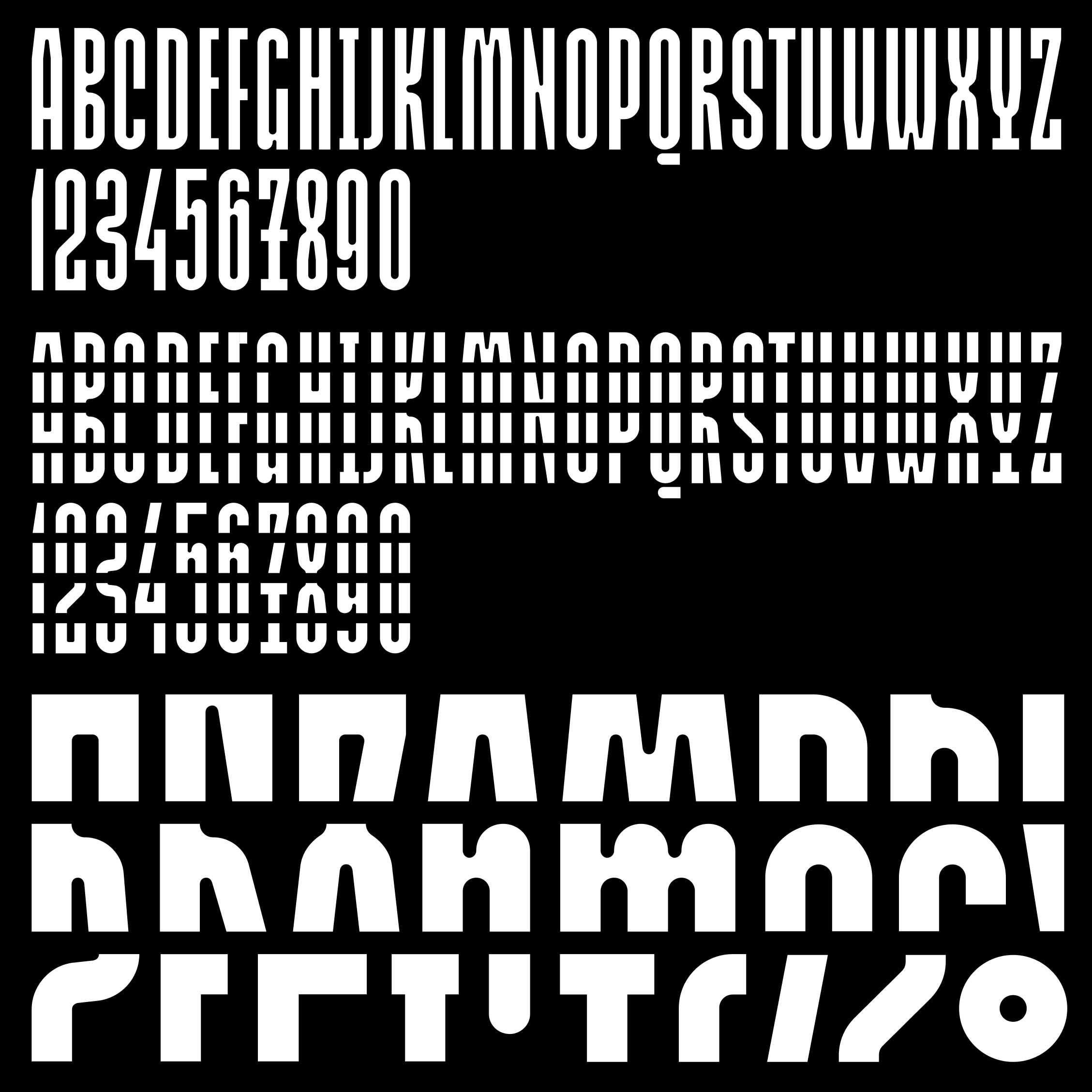
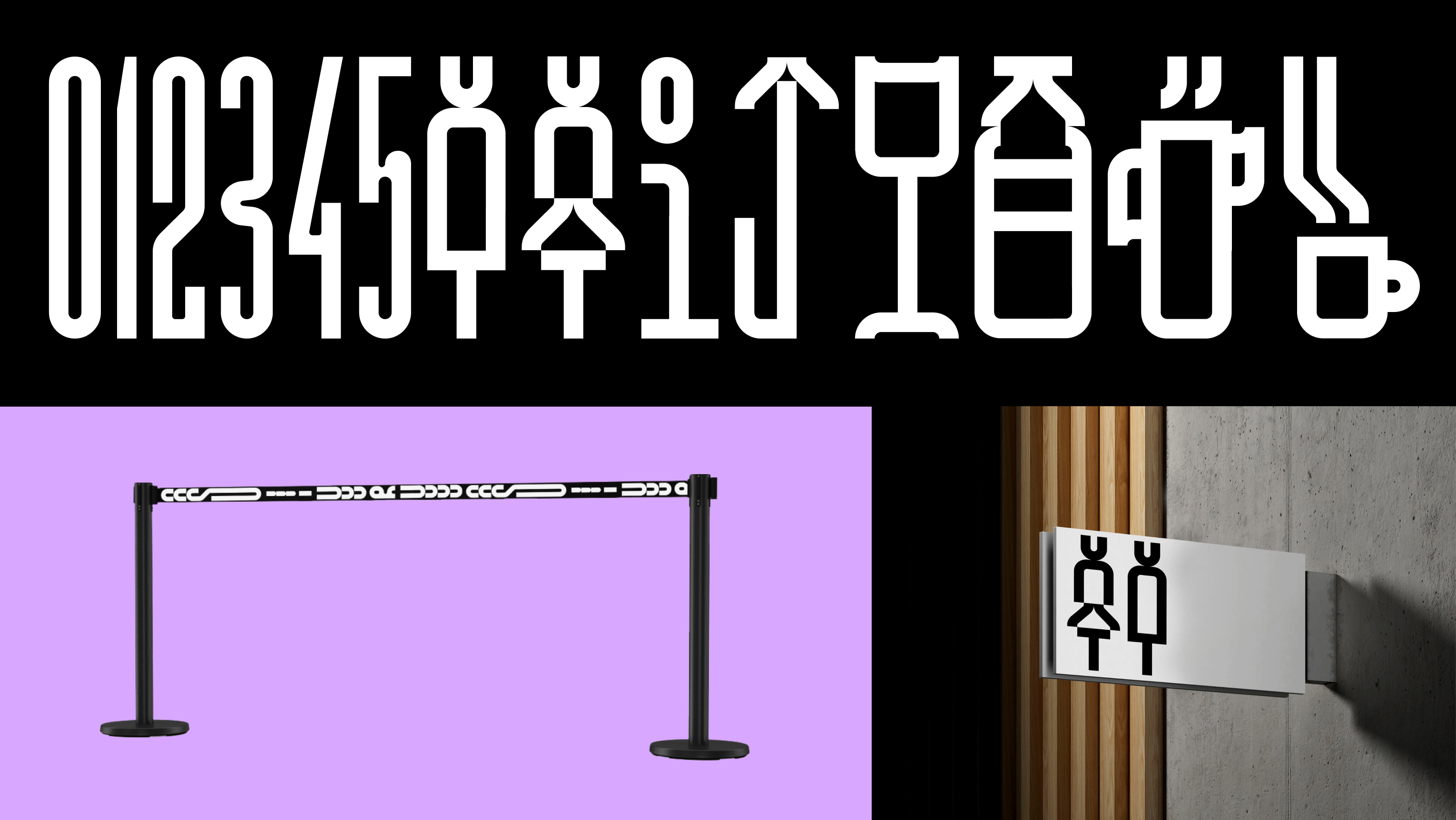
Developing the concept of fixed and unfixed further, Estonian type designer Aimur Takk was commissioned to develop Newfound type, a custom typeface based on a study of a collection of wooden letters at the TYPA Centre. Its modular decompositions from their original condensed bar-like forms, become the antithesis of a cage, elements to endlessly reconfigure.
The obvious tension here is despite the unfixed, a brand identity by its vary nature has to have some form of fixed nature, a continuity and cohesiveness in which to, at the very least, identify and communicate. Ambiguity and total abstraction while inviting meaning making, doesn’t wholly function well in a world seeking definitions and understanding as quickly as it takes to scroll past a post. So, elements such as the arrangement of type, the grids that underpin posters, and the consistent use of a secondary typeface, all function to form an underlying continuity, whilst other elements seek to push back.
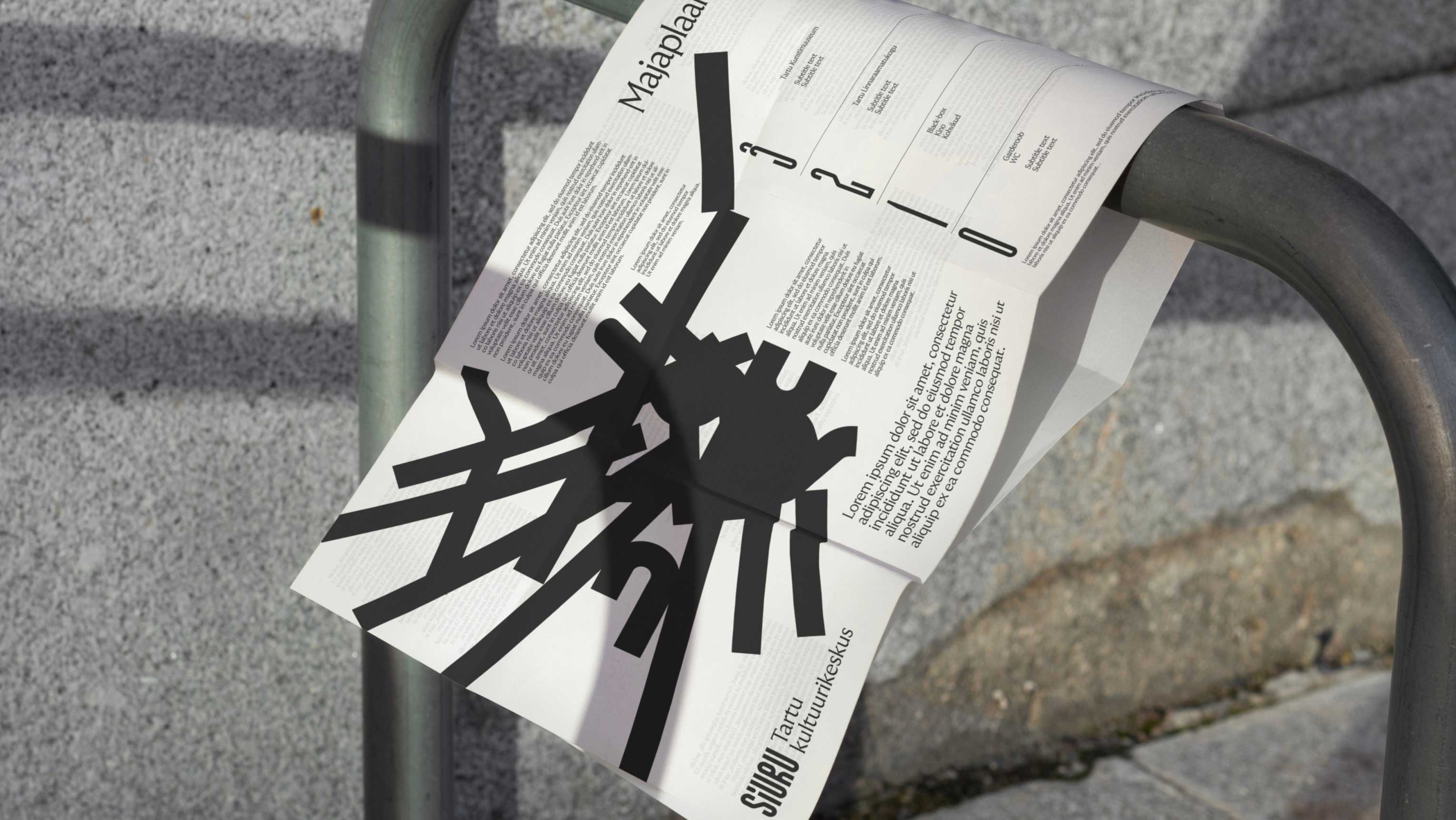
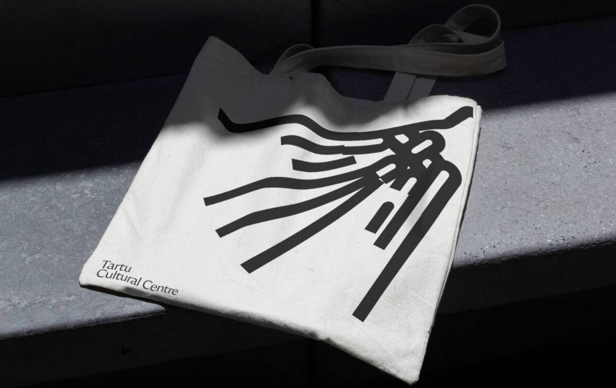
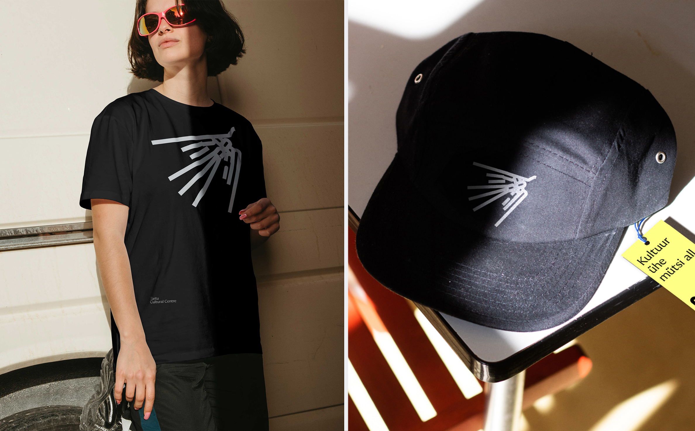
The highlight, for me, is in the moments where the logotype intentionally breaks, collapsing into a pile, no longer discernible as letterforms. Yet, in this new deconstructed form, absent formality, it operates as a more expressive gesture, a symbol, that over time, can be connected to the more stable elements. Collapsing ideas, demolishing preconceptions, building meaning, you could attribute any number of notions to this. For someone that gravitates to the perceptible and the structured, this part is surprisingly the strongest, and it’s because of its defiance. It’s wonderful to see this placed as a primary motif across merchandise such as hats and tote bags.
GT Ultra Median is perhaps the most on-the-nose expression of a cultural institution. It’s finely crafted and lends a reliable air to the more playful and experimental. It still needs to be funded and seen as legitimate within a system that, as much as it seeks to test boundaries of perception, meaning and identity, has to be defined on pieces of paper when aking for money. Bond pushed it as far as possible, and a touch further.
