MAG by LG2
Opinion by Emily Gosling Posted 10 December 2025
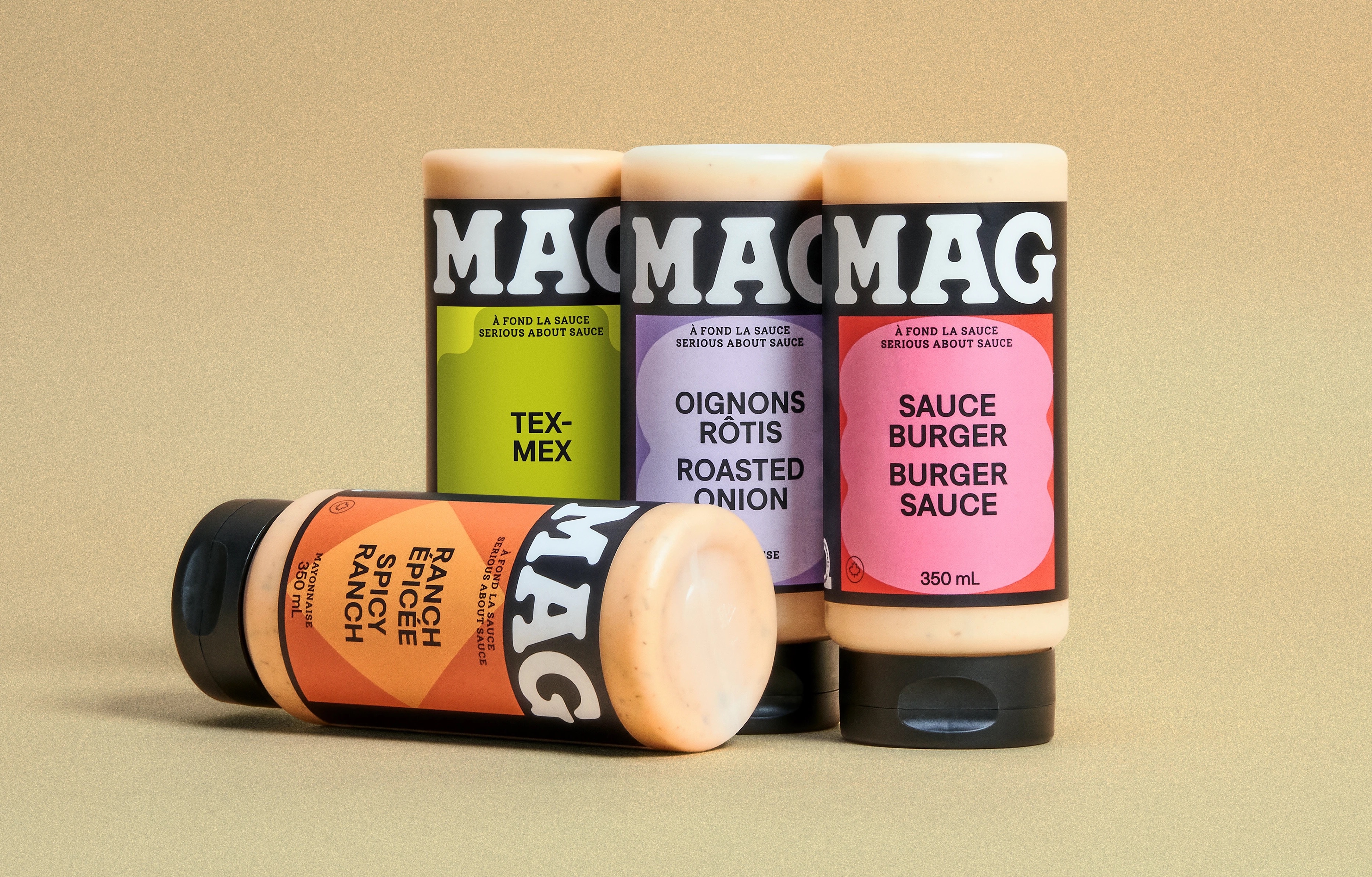
Based in Quebec, MAG is a family-run, family-recipe-based range of condiments anchored by its signature mayonnaise but also comprising dressings and Asian-inspired sauces. The brand made something of a splash earlier this year with its innovative solution to keeping mayo cold in situations like summer barbecues: creating labels using an ultra-thin layer of silica aerogel – an insulator developed by NASA for astronaut suits. It worked, as this fun image shows.
That futuristic solution to something of a quotidian but very real problem was dreamed up by creative agency LG2 – an independent creative agency with studios in Montreal, Toronto and Quebec City – which also rebranded the entire range last year.
If any part of the brief requested the agency to “make it bigger” when it came to the MAG name, there’s no doubt LG2 (Ashton, Toundra, Francos de Montréal) came up trumps – and not just for the sake of it.
The MAG wordmark is an absolute triumph, and deserves its gargantuan placement on packs (and indeed, wherever else across the identity it need appear).
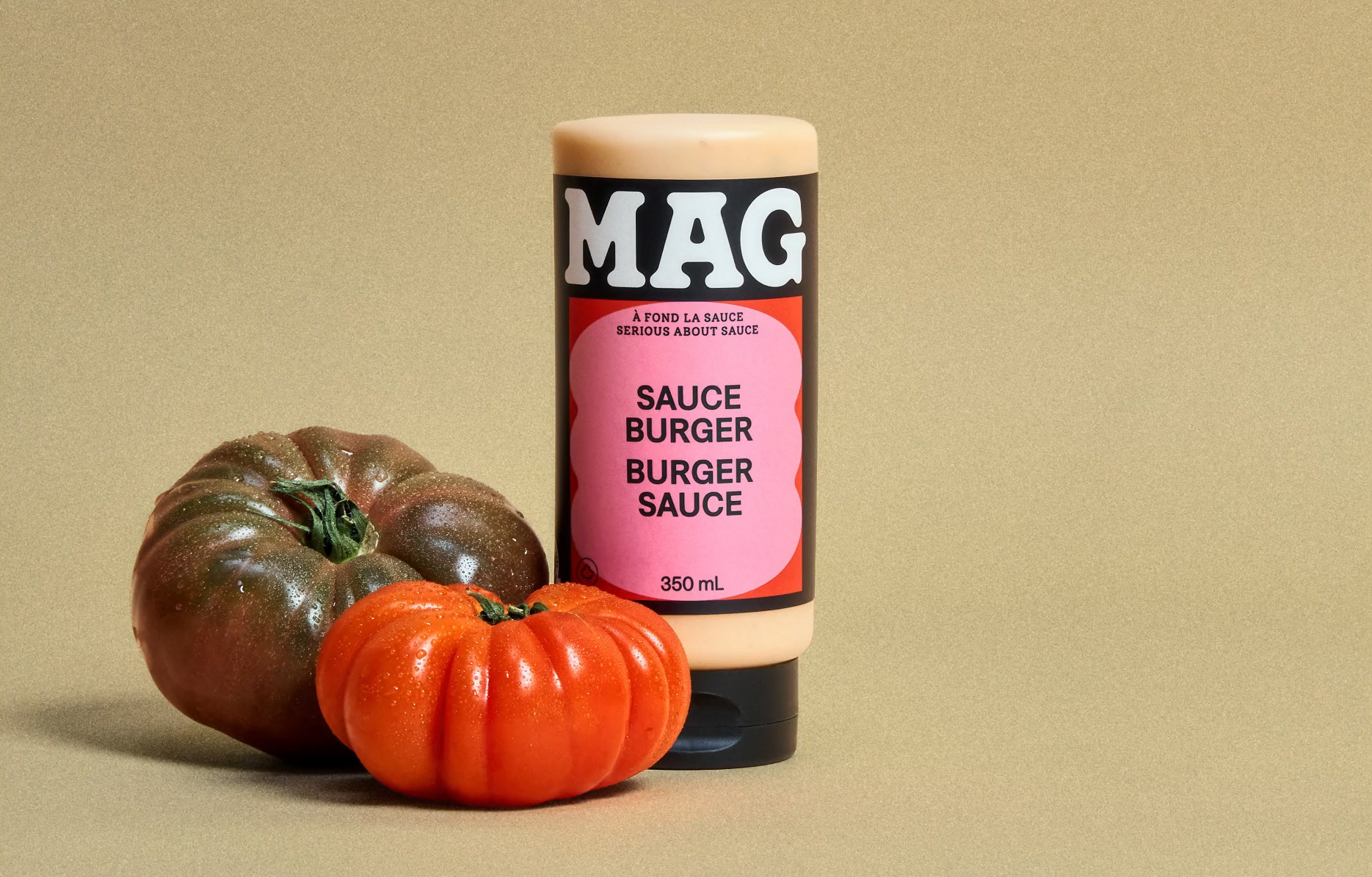
It’s set in a sublimely gloopy, mayo-like all-caps, white lettering splatted against a black backdrop. The contrast is brilliant: not only is it striking in its Cooper Black-esque confidence, it perfectly reflects the product itself. And it makes the most of the succinct brand name, using the wordmark as a logo in itself, and luxuriating in the letterforms’ own curves and aesthetic nuances.
There’s no escaping the retro-leaning joy of the MAG mark, but it doesn’t feel like a pastiche or cheap imitation of some sort of sauce slathered ‘good old days’ gone by: LG2 has skilfully made the identity feel both comforting and contemporary, slick but homely, future-facing while relishing (sorry) in all that’s good about the past.
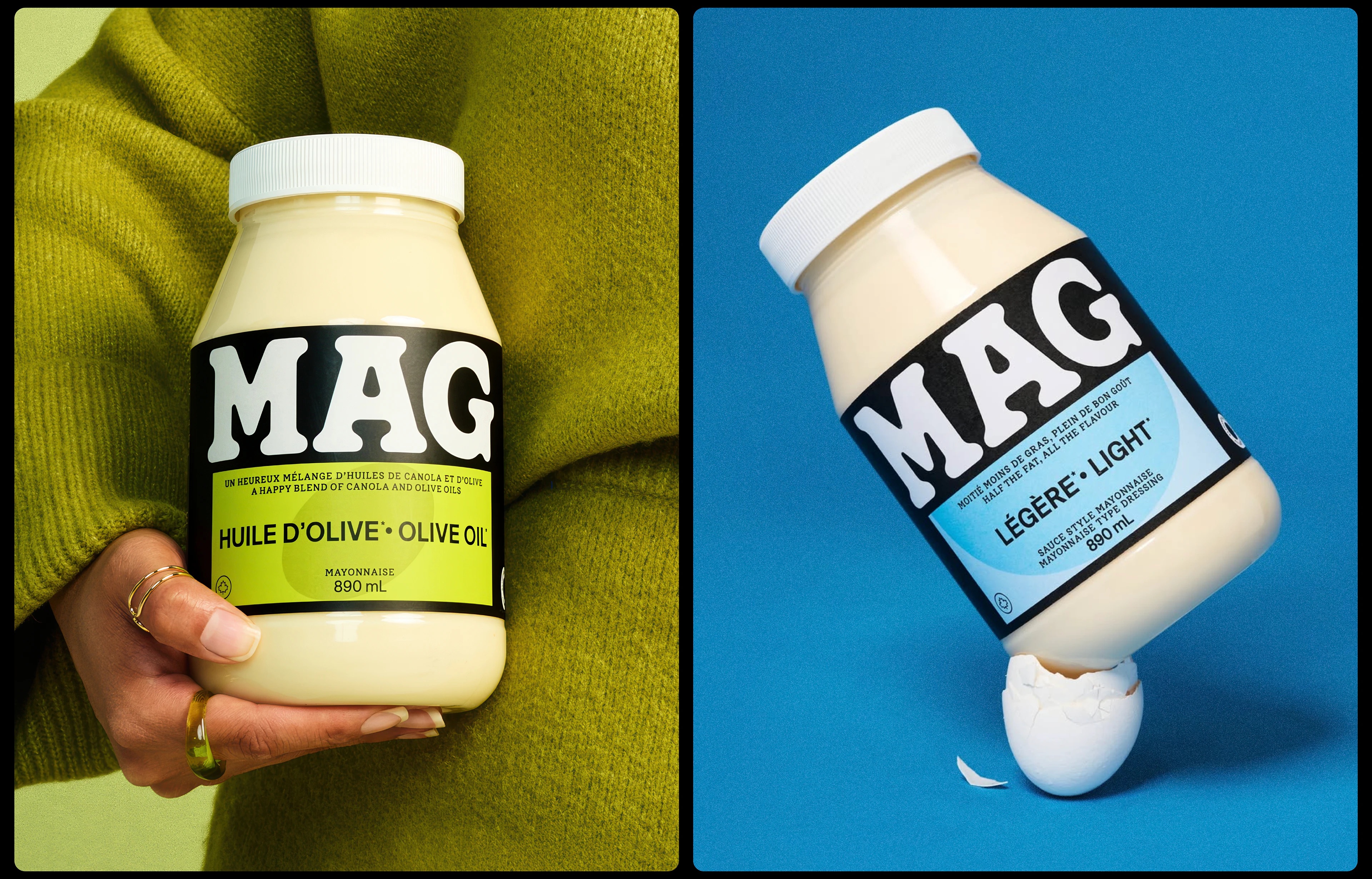
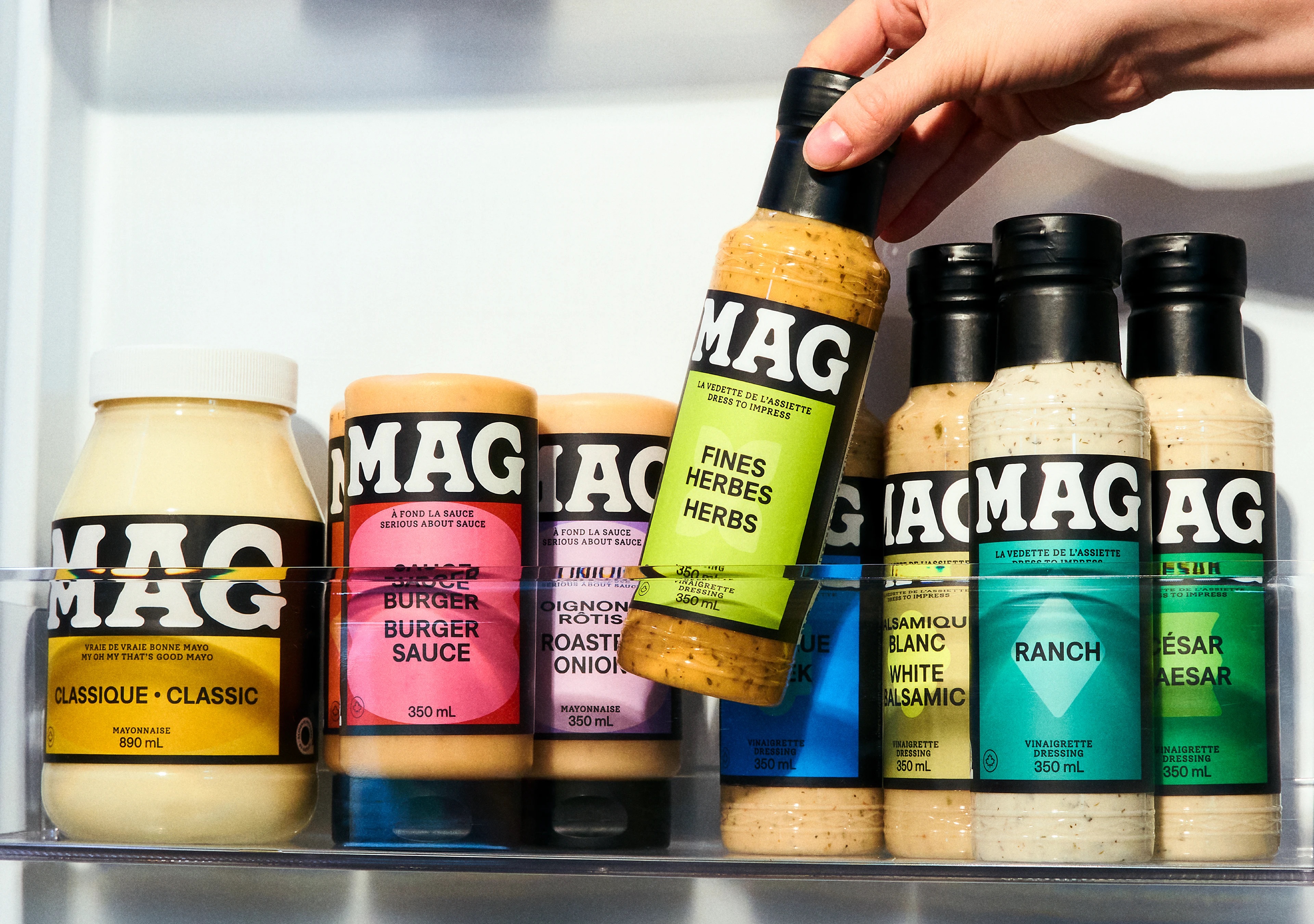
MAG’s branding is a masterclass in simplicity that packs a punch. Everything is stripped right back to what’s absolutely necessary, while ensuring these sauces more than stand out on shelves.
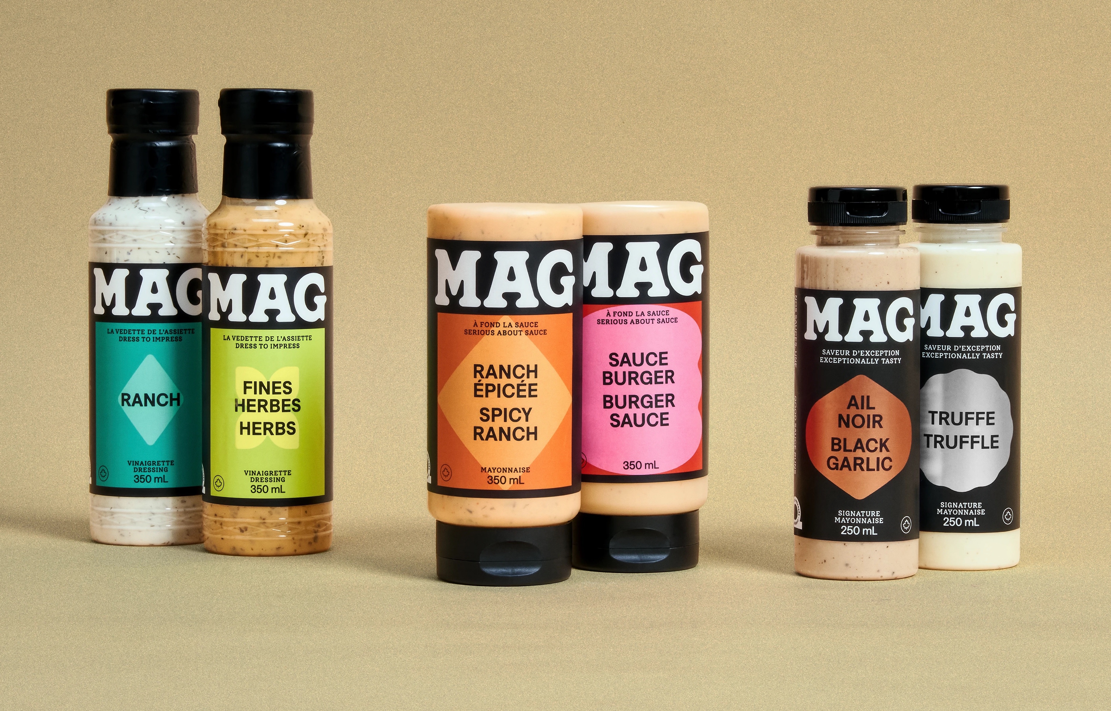
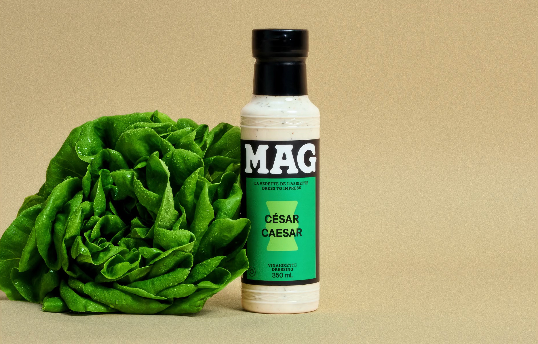
Aside from the brand name, on-pack it’s colour and shape that largely does the talking. It’s super straightforward: each flavour is represented by a unique colour and a shape, set in a lighter tone of the main shade and which acts as a holding device for the text outlining the flavour variant and any other snippets of necessary info.
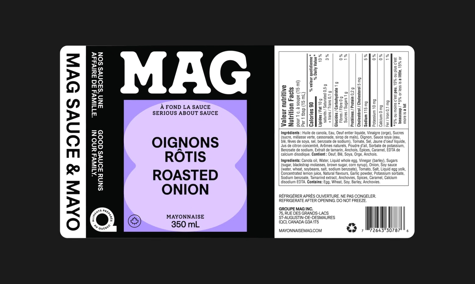
The shapes seem almost like Matisse-style cutouts; more organic than geometric, and they animate beautifully for online and digital applications. Most subtly reference the variant, too, with the burger sauce using an abstraction of a stacked burger shape, for instance.
The colours meanwhile stick sensibly to category conventions: a nice greenish yellow for olive oil mayonnaise; blue for a lighter mayo; bluish-green for ranch, and orange for its spicy counterpart.
All in all, LG2 has forged a new graphic system that adapts beautifully across product lines, packaging, and product types, setting MAG up perfectly for expansion in future.
Elsewhere typography-wise, LG2 opted to use the rather lovely Denim INK by Prague-based foundry Displaay. It’s a nice choice here: just quirky enough to sit as a believable sibling to the characterful MAG lettering but with its feet placed firmly enough in the real world as to be punchy and legible enough to act as a robust little workhorse.
Secondary type online and on packaging is kept straightforward and legible, peppering the identity with a spidery serif in the shape of Rasa, a font created for Google by foundry Rosetta Type.
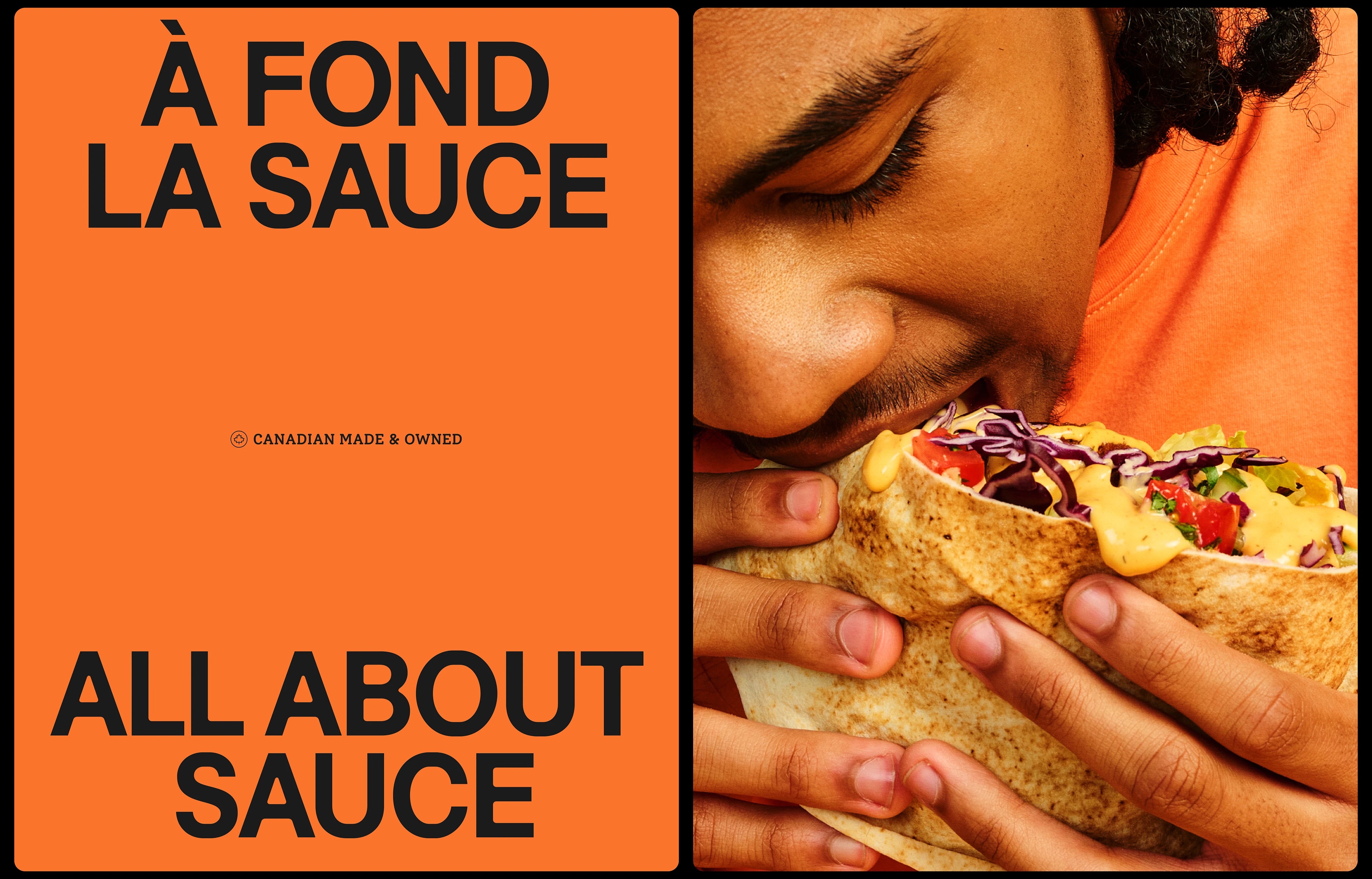
LG2 has also absolutely outdone itself when it comes to the art direction here: seemingly taking cues from editorial and fashion/lifestyle shoots rather than traditional food styling, it’s crisp, dynamic and resolutely modern in its take on hipster-adjacent vintage aesthetics. It’s almost camp, which is no bad thing, but kept just the sensible side of stylised.
“Convinced that the taste of its products could compete with the best in its category, MAG set out to refresh its identity by creating a brand image that is accessible, bold, and that stands out on grocery store shelves,” says LG2 of the project. There’s absolutely no doubt it’s achieved that trinity and then some.
