Hotel Park Ave NYC by Colt
Opinion by Emily Gosling Posted 11 December 2025
Located on the corner of Park Avenue South and East 30th Street in Manhattan’s Midtown, Hotel Park Ave is the artist formerly known as the Mondrian Park Avenue.
Its change in name is thanks to its change in owner: international hospitality company Lore Group announced its acquisition of the site and mooted its subsequent rebrand late last year, and to helm the latter, it brought in London-based studio Colt.
Why a studio from across the pond, some might ask? Well, it’s likely because Lore Group, too, is headquartered in London; and just as likely because of Colt’s specialism in hospitality brands – and its track record of doing them really blummin’ well (see its work on Club at South Place Hotel, if proof were needed).
The Mondrian lineage – opulent, maximal, self-consciously decadent – carries with it a certain theatricality, but it’s clear Hotel Park Ave was looking to take a distinct approach to its predecessor in tone and temperament.
The rebrand reframes the former Mondrian Hotel for a new era, one shaped not by velvet-roped decadence but by a gentler kind of confidence: elegant individuality, and a distinctly design-driven approach to higher-end hospitality.
“This transformation aligns with the evolving needs of today’s travellers, delivering a sophisticated yet approachable experience,” says Colt. “Lore Group saw an opportunity to craft a space that reflects the vibrancy of Park Avenue and NoMad while moving away from predictable corporate sterility…”
Colt has delivered a superb marriage of pared-back but never dull, and proud but never shouty across its visual and verbal tone of voice.
The agency was tasked with handling the brand naming, positioning, identity, signage, guidelines, and a suite of print applications. To unite all these, it created a brand narrative the studio dubs “Stay Bold”, which makes perfect sense here.
The identity’s boldness never veers into bravado: instead the whole thing holds its own through a razor-sharp eye for detail; a sumptuous but never overbearing approach to materiality; and a clarity of intention delivered through limited but punchy colours, smart typographic choices, and beautifully considered approaches to layout across each and every one of the hotel’s many and multifarious touchpoints.
![]()
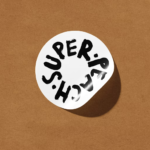
The monogram – as both standalone graphic device and unifying signifier across a multitude of physical and digital touchpoints – is wit, elegance and formal rigour in brand design at its best: it rewards looking and looking again, incorporating not only the H, P and A of the hotel name, but a simplified form of the building’s architecture itself. It feels old-school in its craft: tight, polished, clever, but never too clever for its own good.
There’s an elegance in how it holds the edges – one of those marks that feels almost like a relief sculpture. When embossed or foiled on print materials, it will likely feel even more at home, like a structural element pulled from the façade. All in all it’s just beautifully classy.
Across the identity, Berthold Wolpe’s 1930s, quasi-engraved serif Albertus becomes headline brand font, graphic device, and illustrative decorative flourish. The look and feel of the font – as well as the era, with all its interwar hubristic joyfulness and cautious near-decadence – instantly establishes a certain tone for the hotel that carries throughout the identity.
The way that Albertus’ letterforms feel carved rather than drawn adds to the sense of physicality and architectural heft that’s delivered in a way that looks so effortless here: it’s a superb choice for a hotel identity in the way it reads as quietly monumental.
As a brand font, Albertus has that civic sturdiness of street signage and cast-metal plaques; a hint of patina even when set digitally. For a building on Park Avenue South – surrounded by masonry, rhythm, height – it’s the perfect fit.
As a secondary font, Colt opted to use Univers – almost the direct contrast to Albertus. Acting as a stoically neutral sans-serif counterweight, the font pairing gives applications like stationery and printed materials such as posters a sense of calm and breathing space; while Univers’ precision and calm stop Albertus from tipping into pastiche or any sense of playing 1930s dress-up.
The duo forms a compelling typographic system: one serif with a hand-hewn look; one sans with strict modular geometry. It’s a dialogue of character and control that mirrors the hotel’s distinct but subtle personality and voice: a hint of expressiveness tempered by the discipline of modernity.

I love the rich blue shade that forms one of the four colours in Hotel Park Ave’s limited but powerful palette. It sits alongside a sugary pink, vibrant tangerine-ish orange and mustard yellow – thoroughly contemporary shades that drag the whole thing into the here and now while still nodding to a sense of heritage.
Crucially, these shades really sing thanks to the fact they’re almost solely used on their own: the tones rarely meet, enabling things like headed stationery, hotel room door hangers, and merch such as umbrellas and tote bags to really pack a punch while remaining somewhat sophisticated for all their brightness.
It sums up a lot about what’s so great with this identity: those block colours grab your attention, but can never, ever be accused of trying too hard.
“The limited colour palette of four key shades complements the minimal, art-gallery-inspired aesthetic,” Colt explains. “The wider visual assets are stripped back, with a flexible, force-justified layout that ensures the brand’s name and location appear uniquely in every context, embodying the blend of creativity and sophistication that the hotel seeks to communicate.”
The deft use of type – sometimes spaced wide, hotel name sometimes abbreviated, others spelled out in full – means the brand is able to re-align in countless ways that feel almost editorial.
The name variously echoes the urban grid or the verticality of the neighbourhood, and sets up a confident typographic architecture that stands up just as well in signage as it does in print such as stationery and menus, online, and on physical applications such as the aforementioned umbrellas and totes. It is, fittingly, a brand built for those who appreciate detail.
With Hotel Park Ave, London-based studio Colt has delivered a brand identity that feels refreshingly assured – quietly sculptural rather than loudly “luxury”; New York in tone without leaning on the predictable visual clichés of NYC.
Colt’s skilful interplay of typographic weight, colour restraint and thoroughly considered spatial compositions forges a visual language that’s modern but not fashionable, characterful but not out-and-out ‘look at me!’ quirky – in short, a smashing bit of brand design that’s truly both ‘now’ and totally timeless.
![]()