Super Peach by Pentagram
Opinion by Emily Gosling Posted 16 December 2025
Restaurant brand Momofuku began life with its New York Noodle Bar in 2004 and in the two decades since, has opened more than 15 restaurants across North America, each building on founder chef David Chang’s vision of boundary-pushing cuisine.
Since its naissance Momofuku “became known for reshaping Asian-American cuisine and challenging dining conventions with a bold and innovative approach,” according to Pentagram (Natural History Museum, Nordoff & Robbins, London Fashion Week) which has created the new branding for the eatery’s latest venture Super Peach, located at Westfield Century City in Los Angeles.
This new restaurant “brings Momofuku’s subversive spirit to an all-day, upscale casual format with sharp service designed for everyday dining,” Pentagram continues. “The 196-seat space is immersive and energetic, with a fish counter, open kitchen, and lively bar creating movement and buzz throughout the restaurant. The menu offers American classics reimagined through the Momofuku lens. Familiar, craveable formats are elevated with layered flavors and innovative techniques.”
The brand identity project was helmed by Matt Willey’s team at Pentagram New York, whose concept for the designs is centred on the idea of ‘contrast’. Indeed, this is an identity that embraces friction: like the menu – “American classics reimagined through the Momofuku lens” and “familiar, craveable formats elevated with layered flavours and innovative techniques”, as Pentagram puts it – familiarity rubs up against elements of surprise; graphic restraint tempers visual noise. The result is a brand that feels alive, mutable and intentionally imperfect.
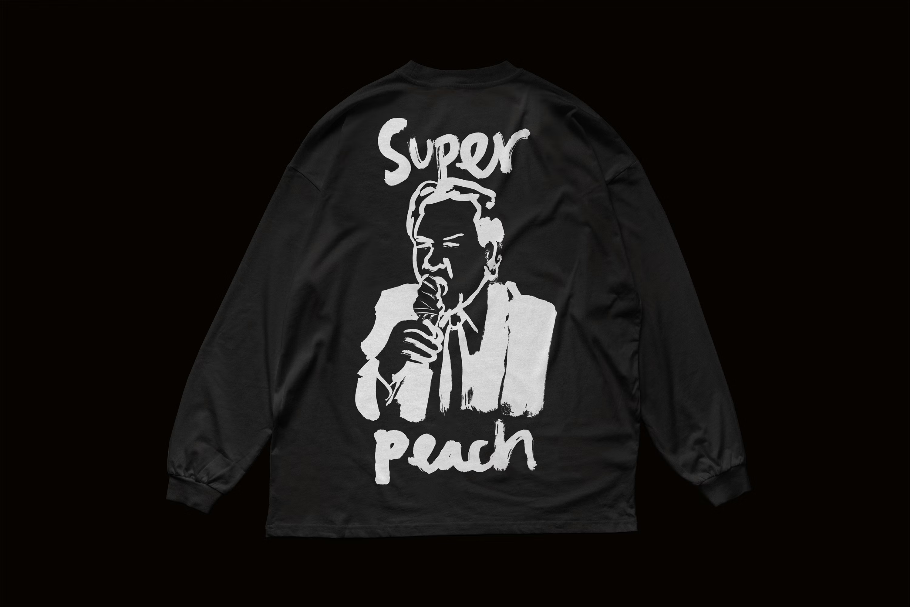
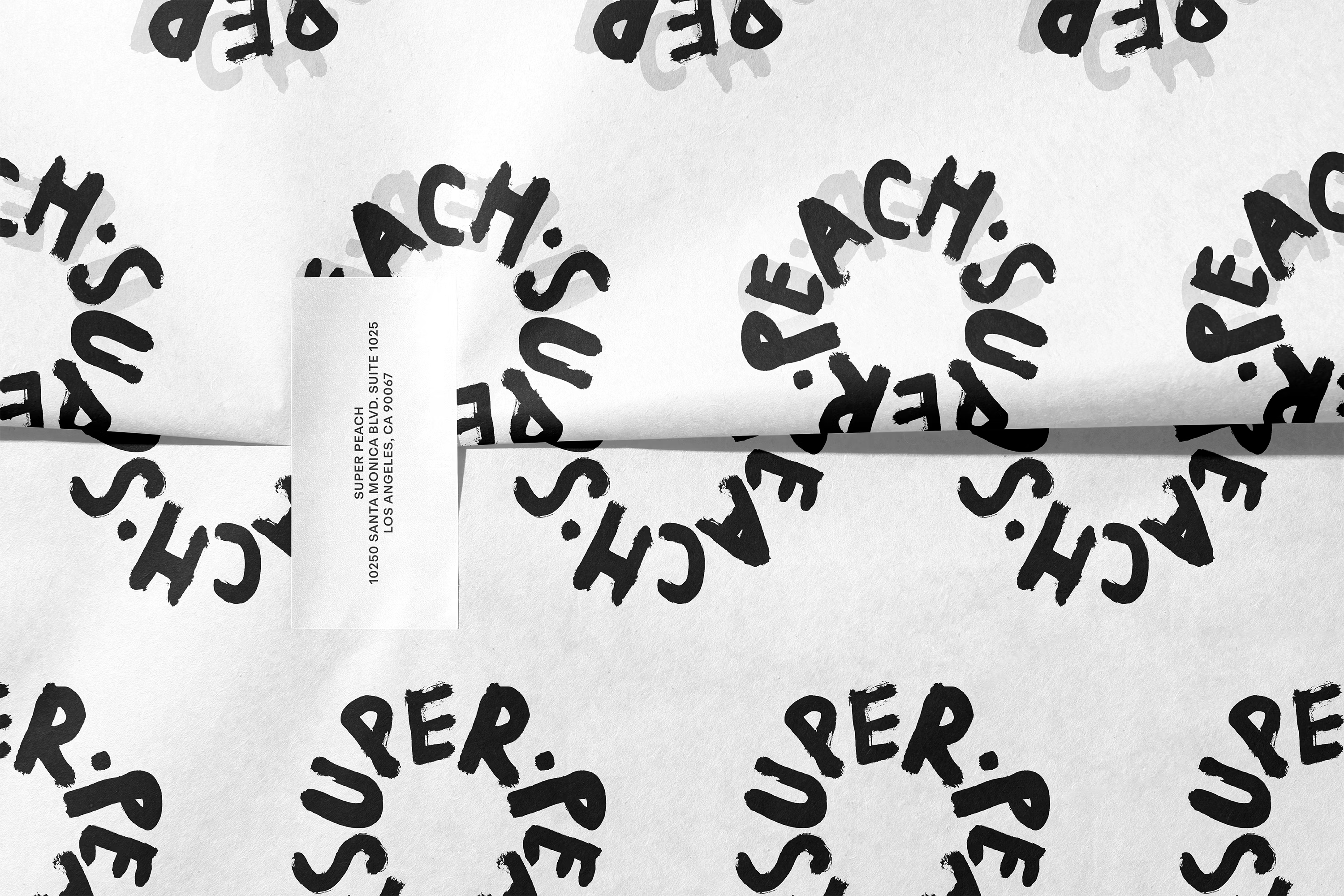
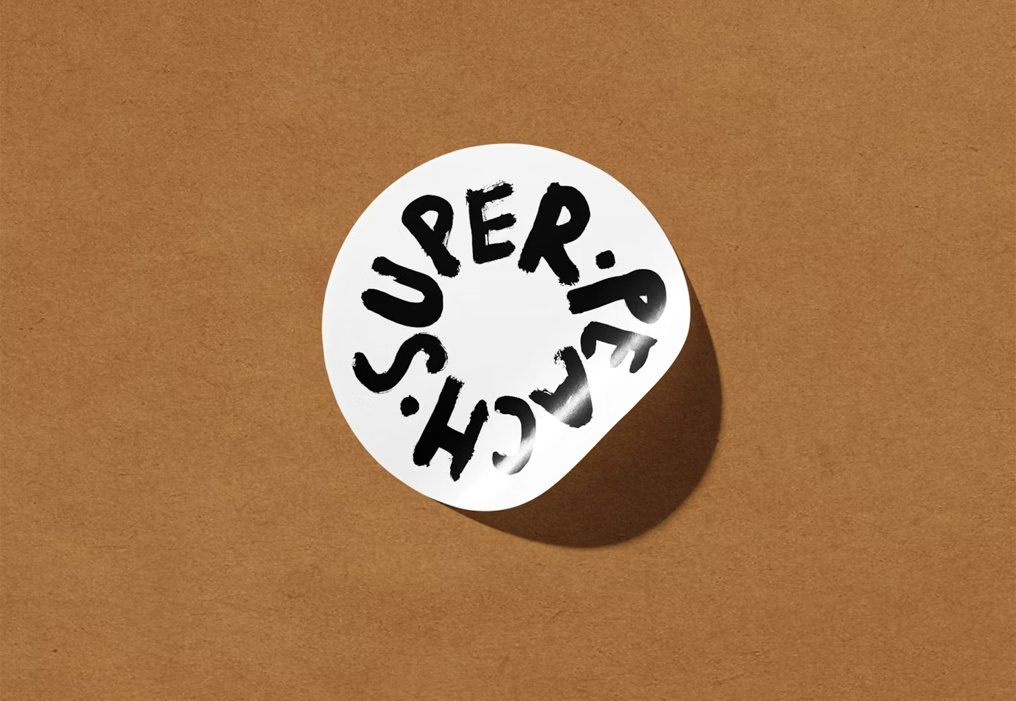
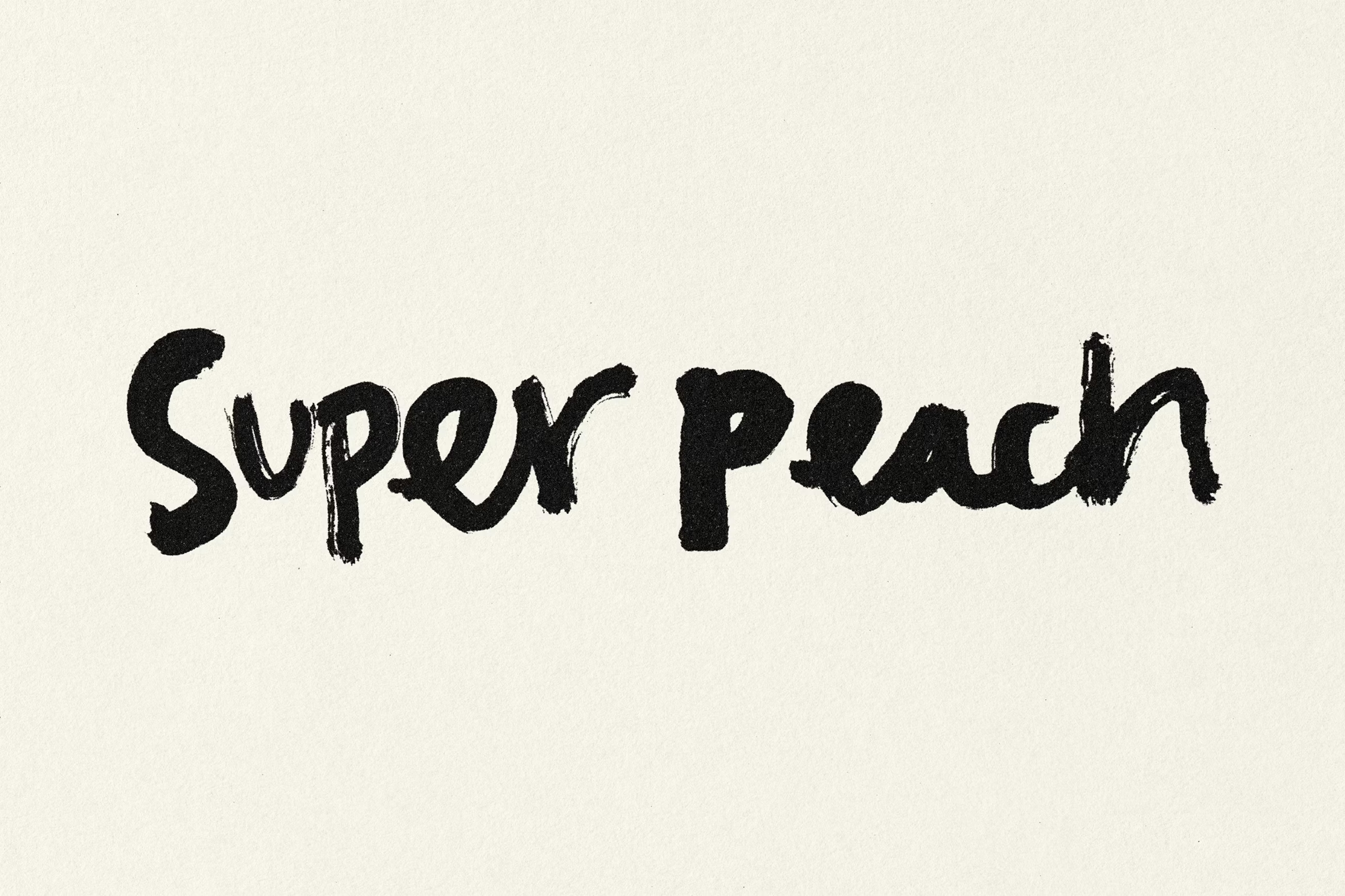
At the heart of the system is a family of hand-drawn wordmarks developed with Spanish illustrator Pol Montserrat. Rather than locking the restaurant into a single logo, Pentagram opted for plurality with the Super Peach name appearing in multiple iterations – stretched, compressed, jittery, bulbous – each one slightly off-kilter, each one carrying a different tonal inflection. Some feel almost childish in their looseness; others verge on aggressive, their letterforms clenching and colliding.
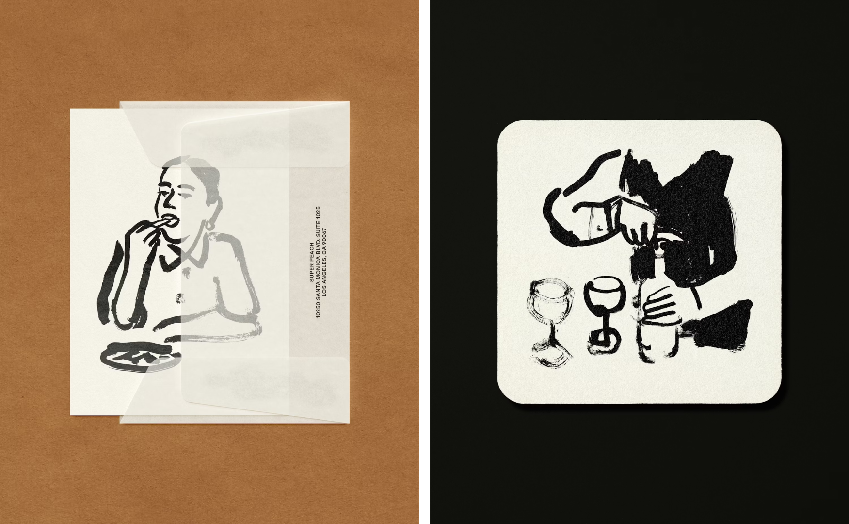
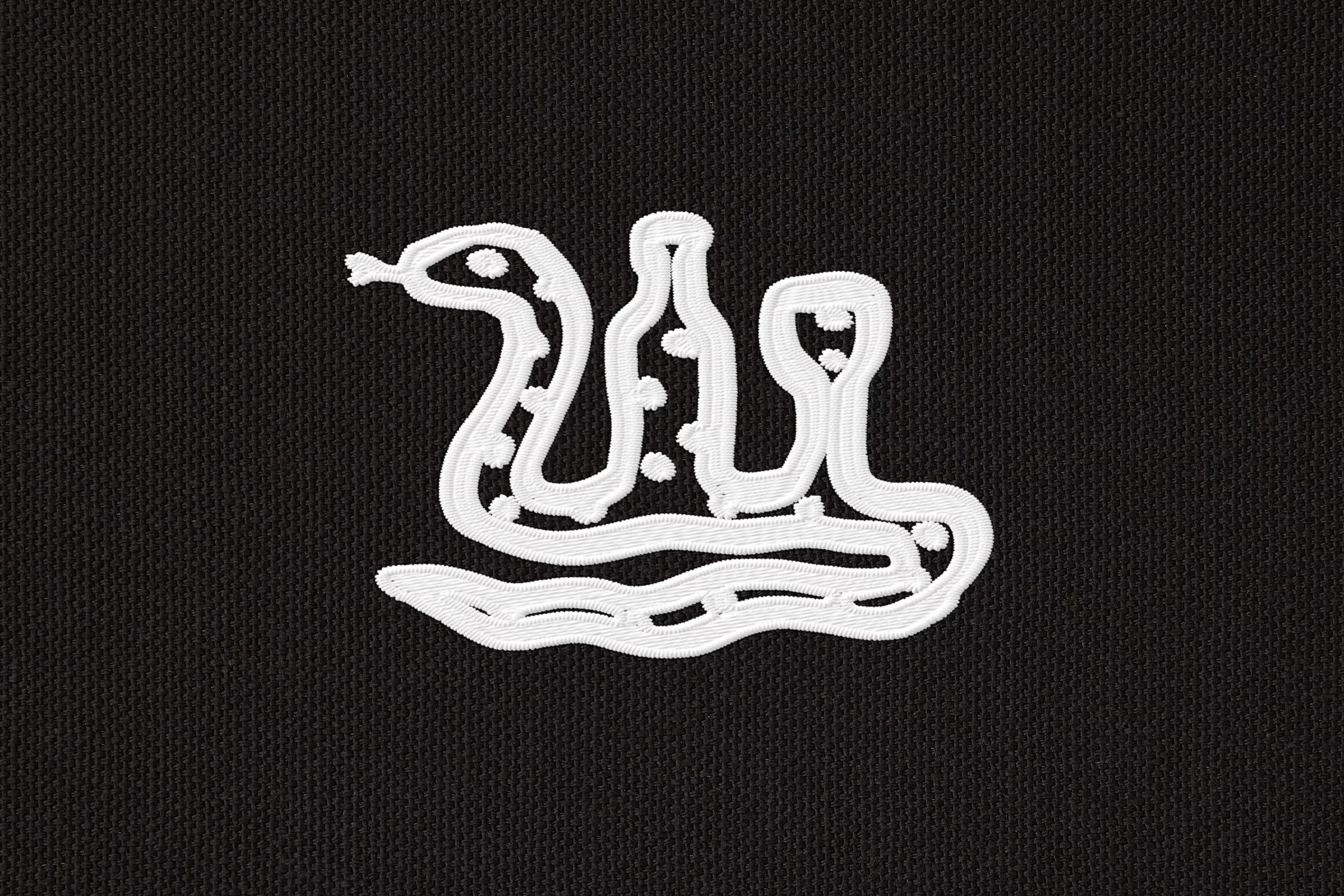
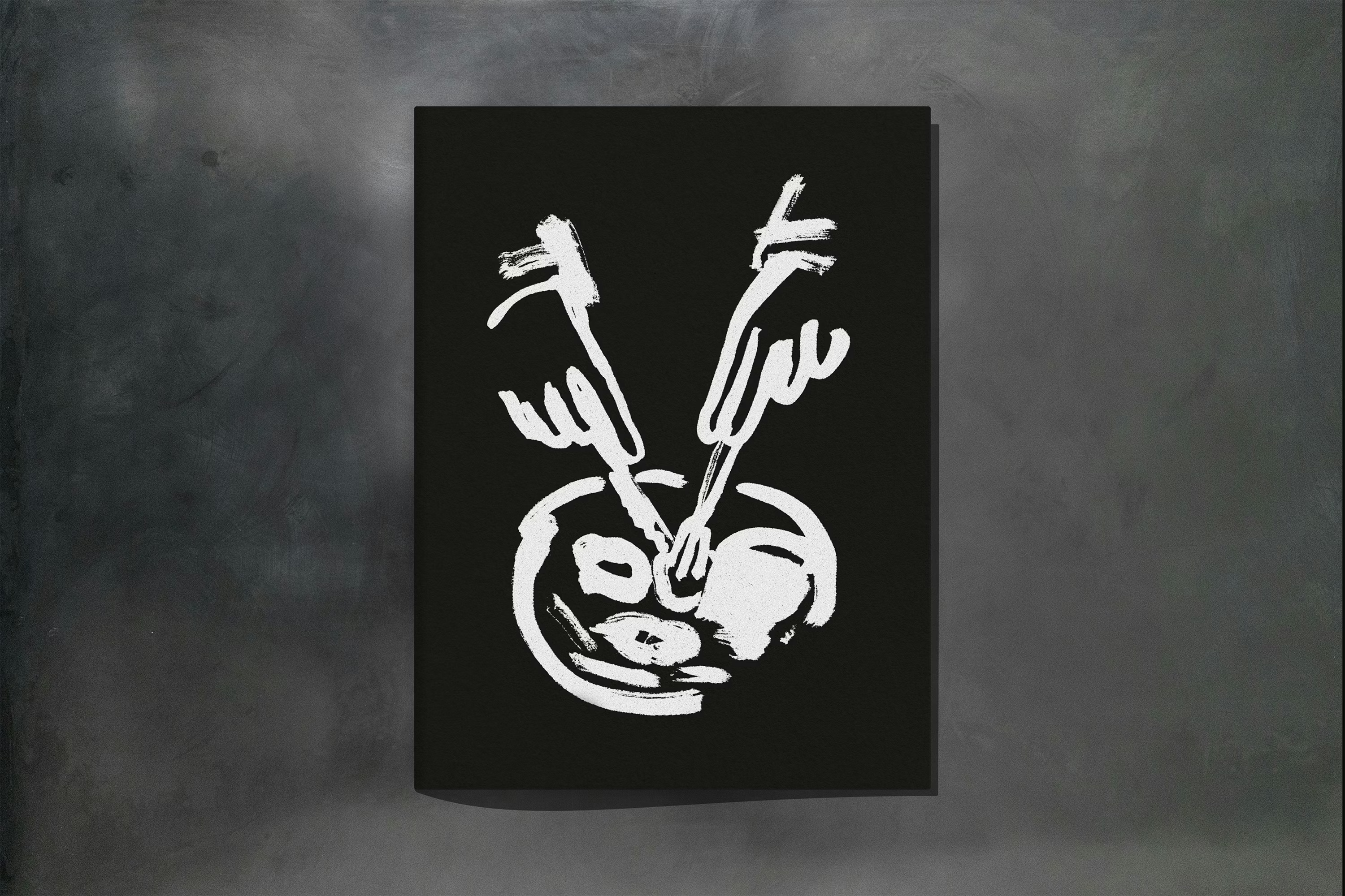
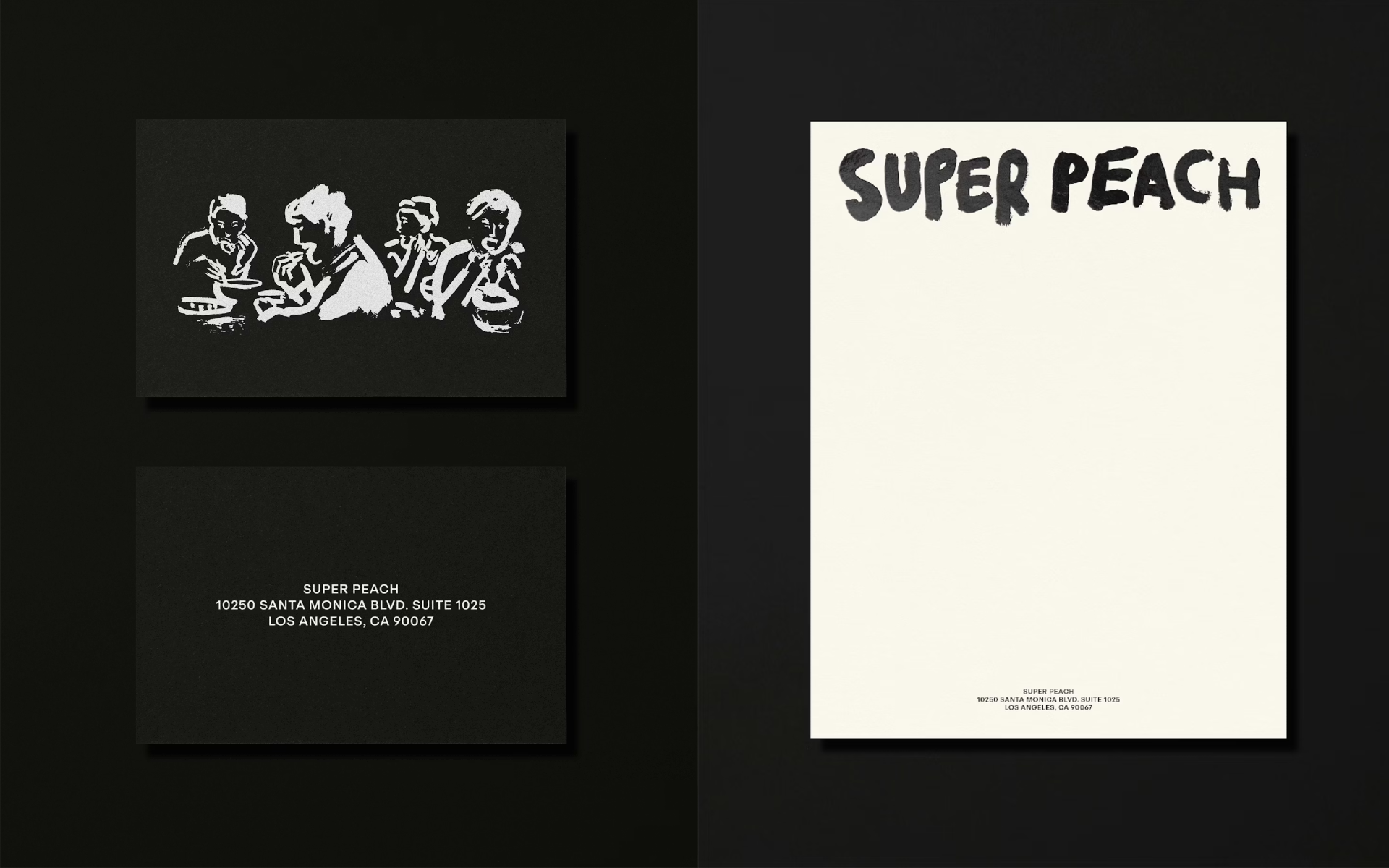
Montserrat also created a suite of brand illustrations used across a multitude of touchpoints, from stationery to menus to merch and more. The expressive, bold black brushstrokes expand the sense of unruliness created by the use of multifarious hand-drawn logos.
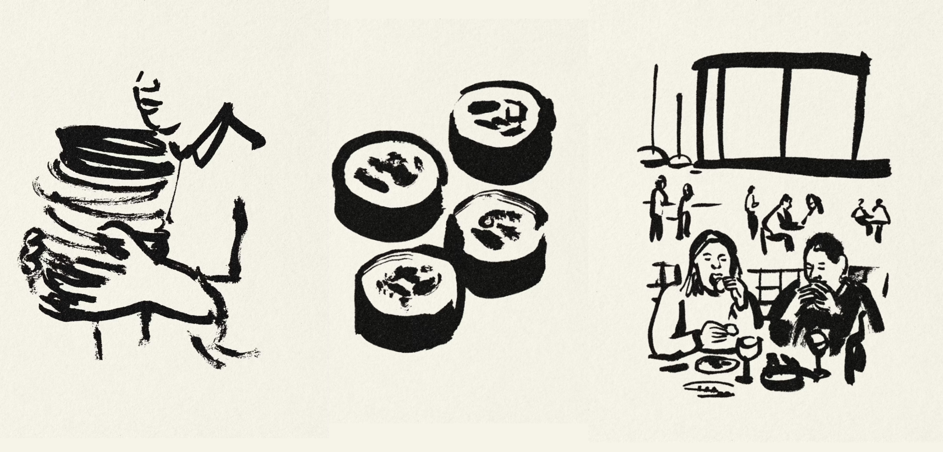
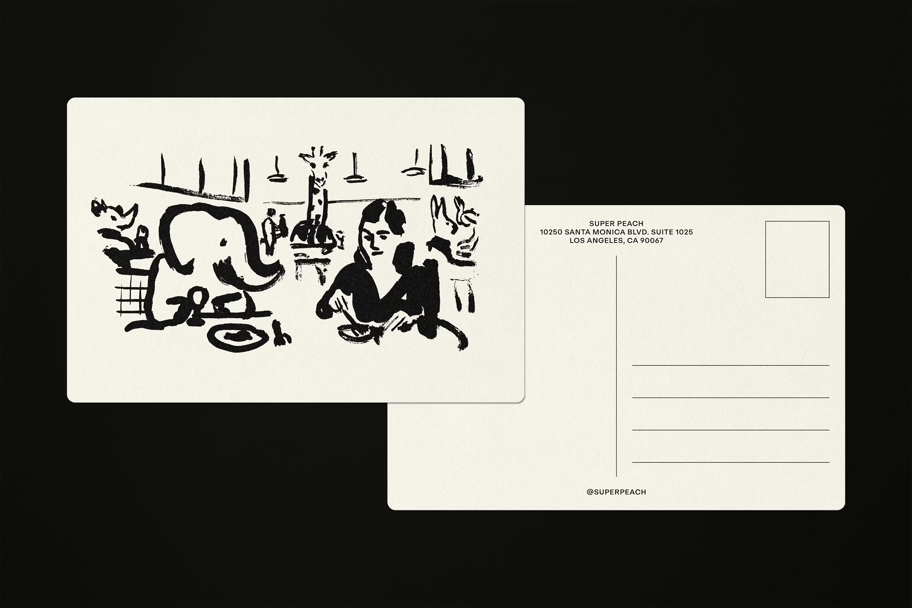
While the illustrations are packed with personality, they never overwhelm an otherwise super restrained approach to branding. Instead, they puncture the system at just the right moments, providing bursts of humour and personality across menus, postcards, coasters and packaging. In a restaurant context where graphic systems are often smothered by texture, photography and atmosphere, these illustrations cut through with clarity.
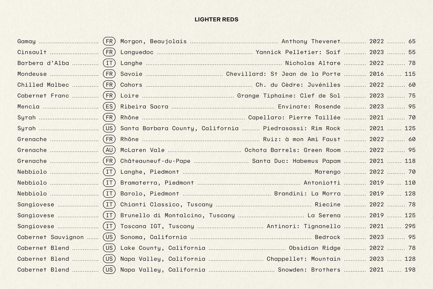
That clarity is supported by the typographic choices here. The main brand font is ABC Repro, Swiss foundry Dinamo’s functional workhorse, or a “friendly, flexible sans serif” as its creators put it. This font alone does the heavy lifting across body copy and informational text and its neutrality offers a calm, legible counterpart to the more expressive, playful dynamic of the wordmarks and illustrative flourishes.
That sense of pared back discipline – as well as the central ‘contrast’ concept – is also brilliantly evident in the colour palette. In fact, you couldn’t really get much more pared back: the palette is limited to just black and white, with flashes of colour coming in through materials or the physical space itself. As such, there’s a lot of a sumptuously textural brown-paper-brown and creamy ogf-white on the stationery; while the moody lighting and saturated tones of the restaurant space provide the chromatic vibrancy when it comes to the interiors.
It’s a smart move to limit the colours here so severely: thanks to the monochrome approach, the identity foregrounds form, gesture and texture; the hand-drawn logos become louder; the illustrations sharper.
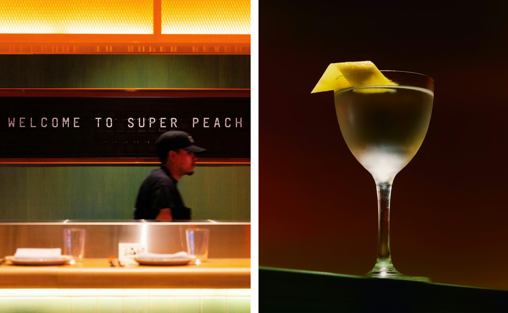
“Super Peach embraces its position at the intersection of familiar and surprising, polished and playful, and sweet and spicy,” says Pentagram, and its impressively elastic, flexible brand design reflects this superbly.
Pentagram’s identity for Super Peach is loose, a little feral, and deliberately unresolved: a brand system that understands that energy, contradiction and a sense of imperfect humanity are sometimes better design drivers than polish alone.
