Yoshi by Saint-Urbain
Opinion by Emily Gosling Posted 8 January 2026
Early days for sure, but this is hands down the best brand identity design I’ve seen this year – kudos to Saint-Urbain for once again putting a project out into the world that’s not only an absolute joy to look at, but which shows a razor-sharp nous for branding that’s both searingly zeitgeist and resolutely, timelessly future-facing.
Said project is the brilliantly named (more on the moniker shortly) Yoshi, “the first premium matcha liqueur and a bold new entry in the global spirits landscape,” as Saint-Urbain puts it.
Billed as a “new kind of ritual for the modern spirits world,” Yoshi’s launch chimes with the wider boom in all things matcha over recent years, an increasingly design-led trend as exemplified by Base design’s Manhattan-based matcha-centric café and retail store 12, which launched early last year.
According to Saint-Urbain (Cob, Buena Fé, Entrée), while matcha has become “a billion-dollar cultural force”, that hasn’t been reflected (as yet) in the liqueur aisle, which it continues “has remained rooted in decades-old formulas”. As the agency – which has studios in New York, Mexico City, Los Angeles and Montreal – puts it, “Yoshi introduces something entirely new: a liqueur that merges ritual, nightlife, and cultural curiosity”.
All that aside though, from a purely aesthetic perspective, it just looks wonderful: playful but never silly, lurid but still enticing, cute but not saccharine – a masterclass in brand design that amps up all the right things and hushes it all down when something a little quieter is in order.
![]()
Back to that name: it’s pretty much perfect. Yoshi: it’s fun to say, a simple two syllables, it’s super memorable, and feels very ‘matcha’ – an effortless callback to the brand’s Japanese heritage that roots it firmly within the exact demographic I’d imagine Yoshi is striving to court: hip in a way that never tries to hard, has a good time without being a tit about it, youngish but old enough to have the sort of disposable income that makes buying things like matcha liqueur possible.
Indeed, it’s very likely that said age group is prime territory for those people with a distinct fondness for the other Yoshi – everyone’s favourite Super Mario World flutter-jumping dinosaur-type creature. He is, obviously, absolutely adorable, and engenders the sort of heart-swelling nostalgia in anyone born in the last, say, four or five decades – from the casual observer to the Barcade-frequenting types alike – that brands are desperate to harness.
But crucially, as a brand identity Yoshi’s never relies on that nostalgia – it becomes a nice to have, not a crutch here. It would be rather daft to do so, with a product that’s unlike any other and a new entrant into the category. Instead, as Saint Urbain says, Yoshi “looks forward” by concurrently drawing inspiration from both contemporary bar culture and “matcha’s centuries-old precision”.
In short though, as a brand name for not only a new product, but a pioneering category, ‘Yoshi’ is a masterstroke in copywriting.
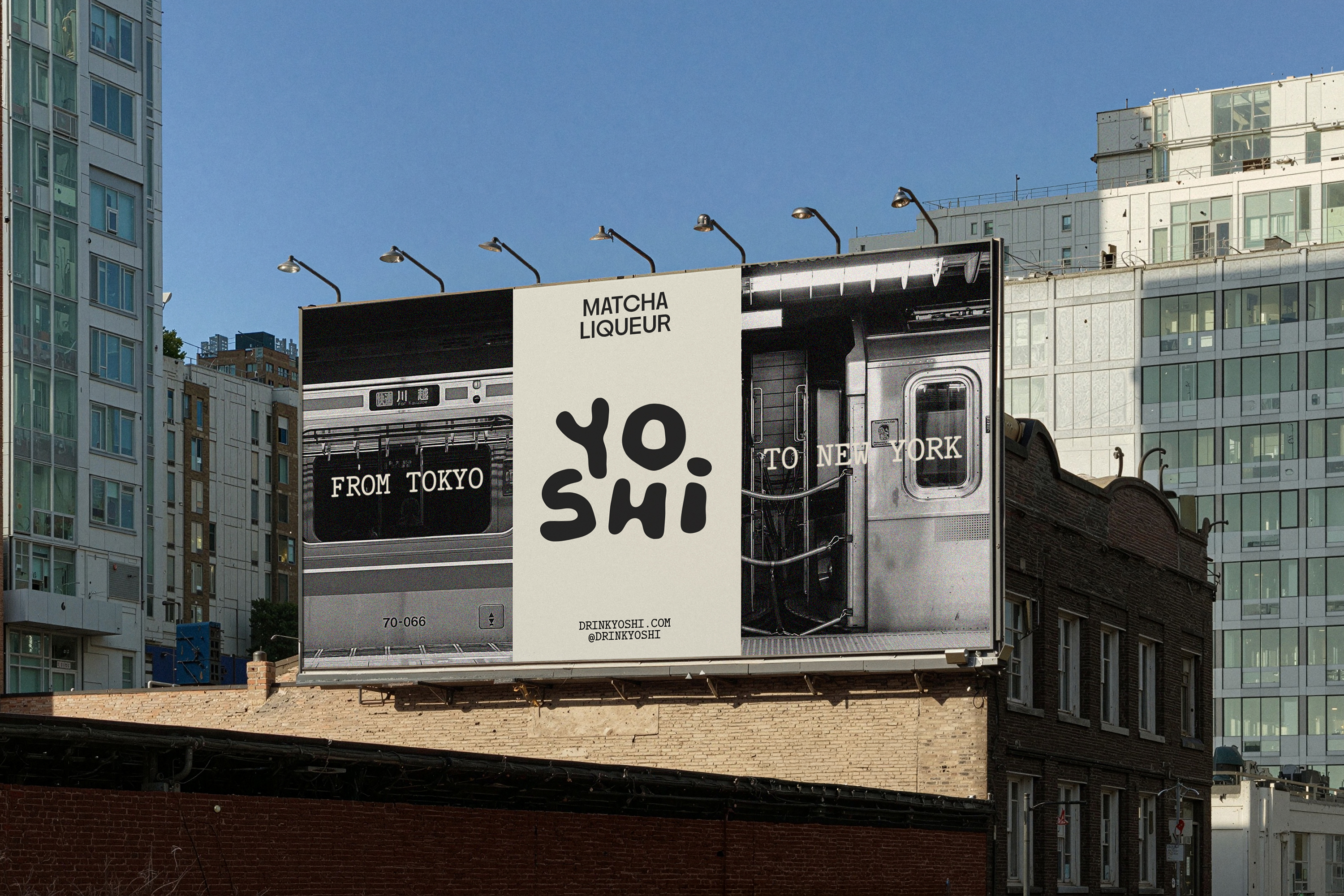
The strategy behind the Yoshi identity is built around a foundation that centres ritual – a key element of matcha and its traditions, machinations and heritage – as well as the idea of “intention”, and creating a “a cross-cultural rhythm” uniting Tokyo and New York.
![]()
Saint Urbain arrived at the concept “a new kind of tradition”. This underpins the entire brand strategy, visual and verbal systems, packaging, and motion design elements. It’s a simple premise, and once deftly executed as per by Saint Urbain.
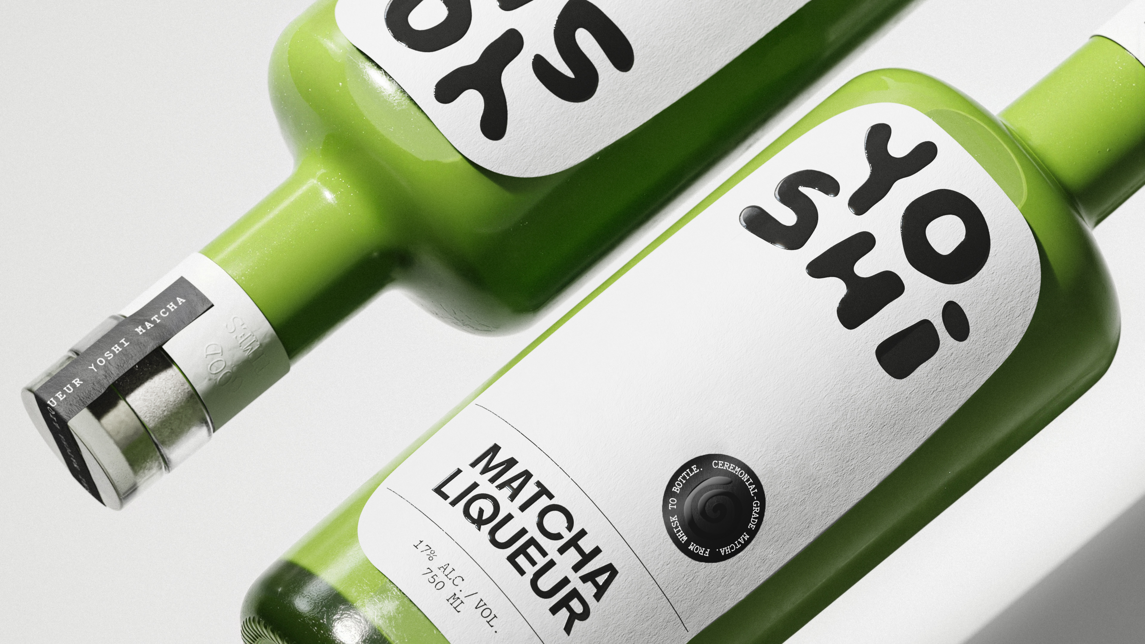
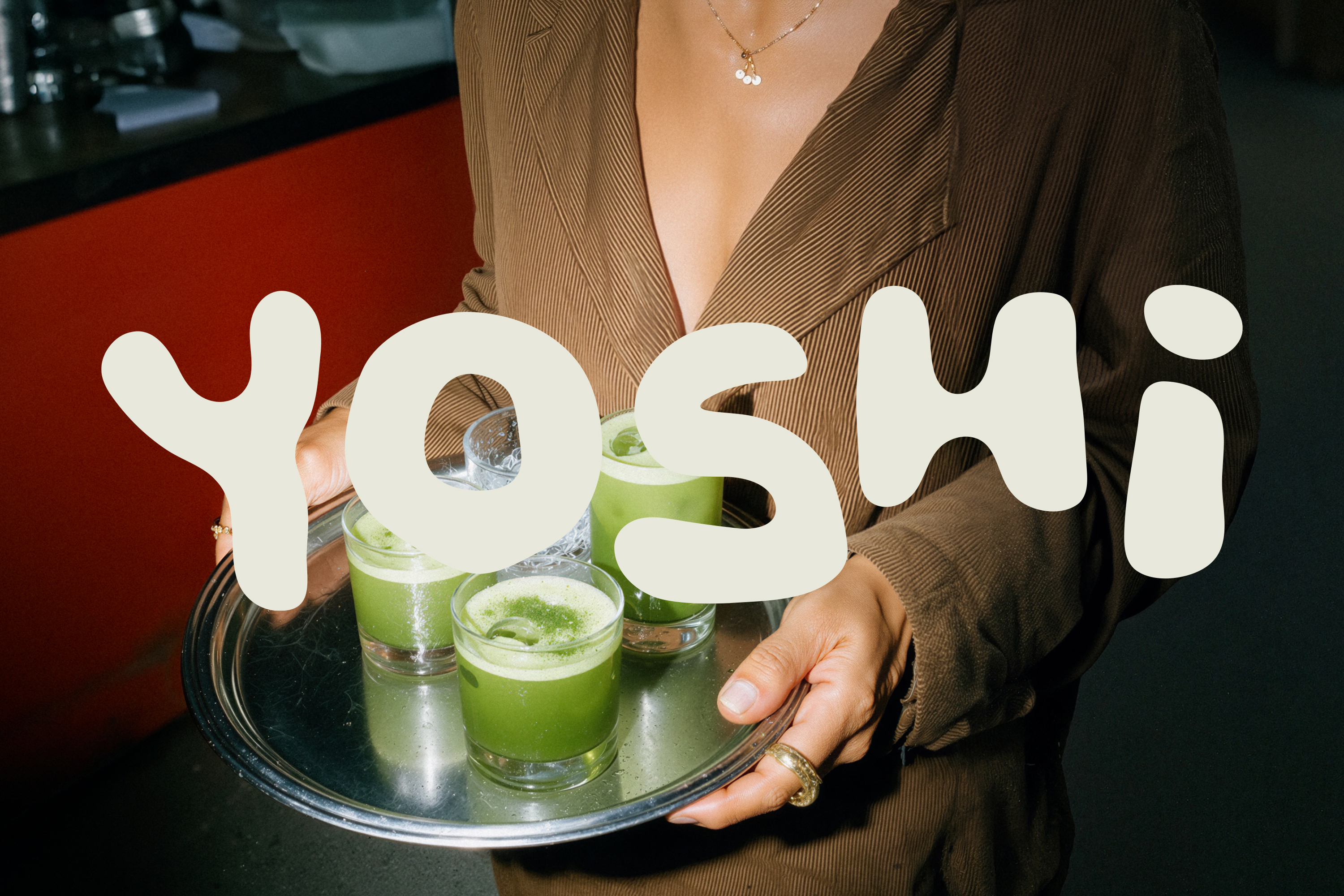
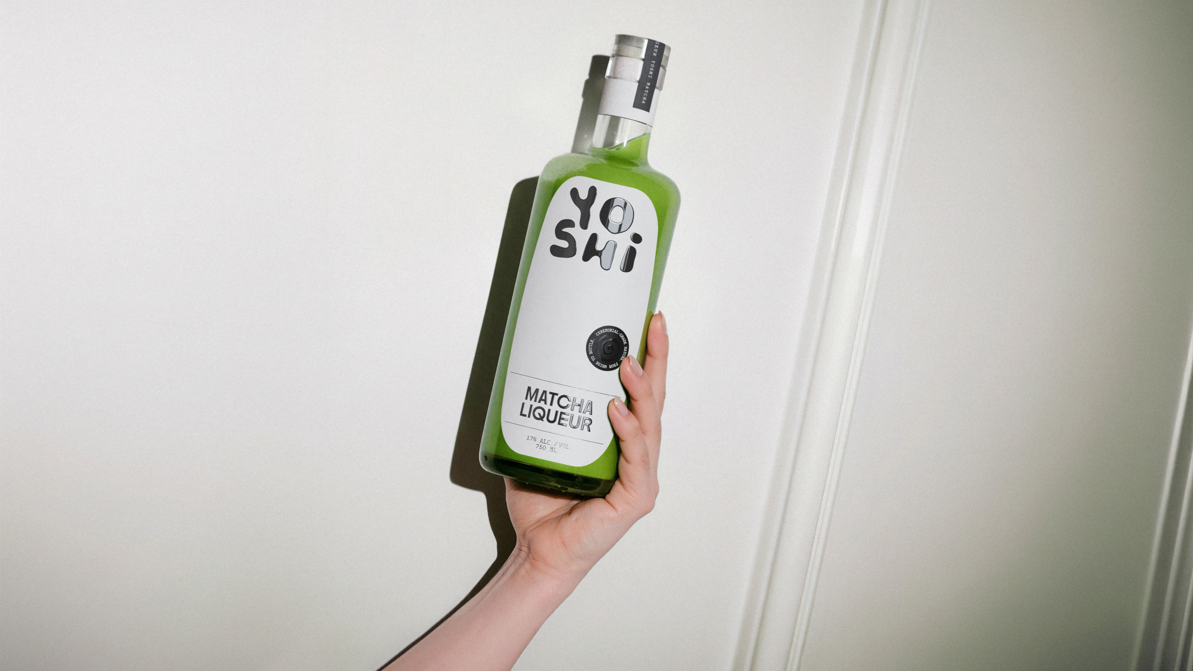
As for the wordmark itself, like Yoshi the dinosaur, it’s cute but packs a punch – memorable, ownable, but functional in its flexibility across multiple touchpoints.
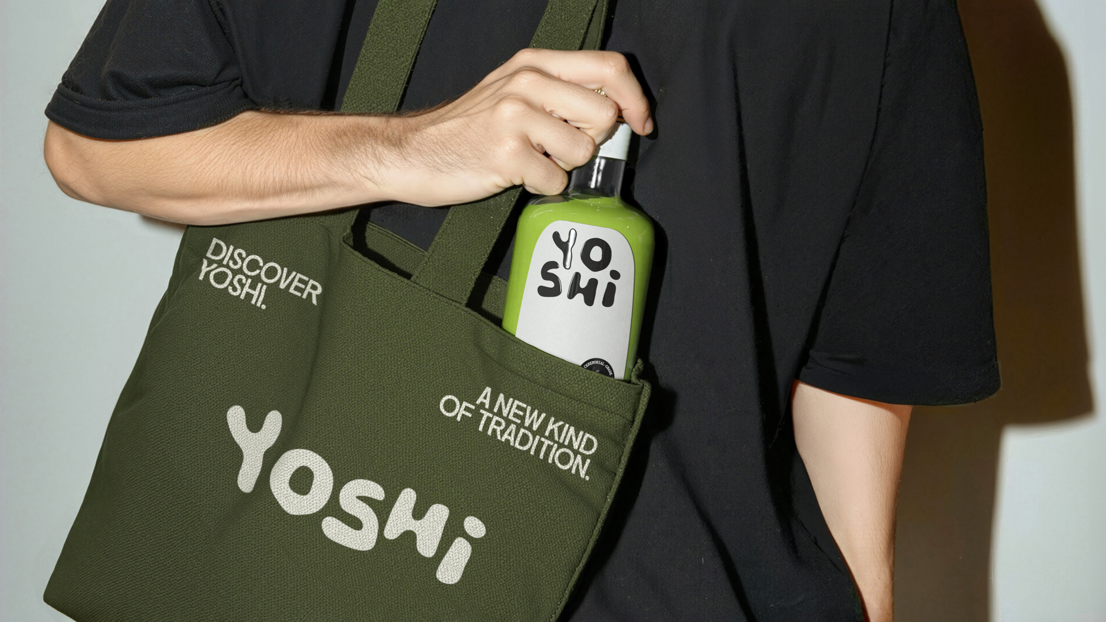
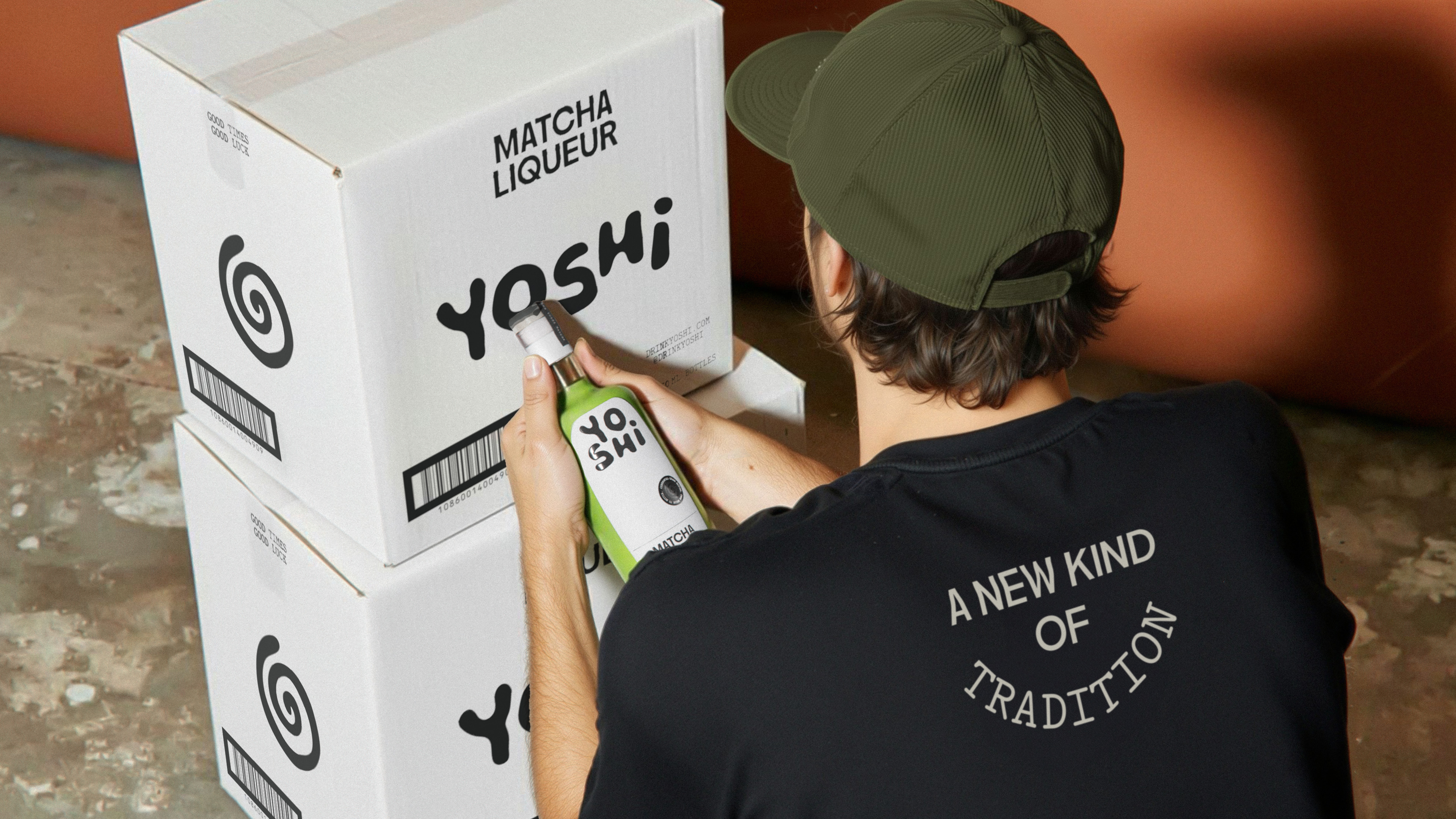
It also looks instantly great on merch: the sort of branding that you’d wear without even knowing it was a brand, simply because it looks good. I’m into the mixing of upper and lower case, because for a five-letter word like yoshi, and its slightly unusual mixture of characters (in English at least), the little dotted ‘i’ against its capitalised predecessors just works really well visually.
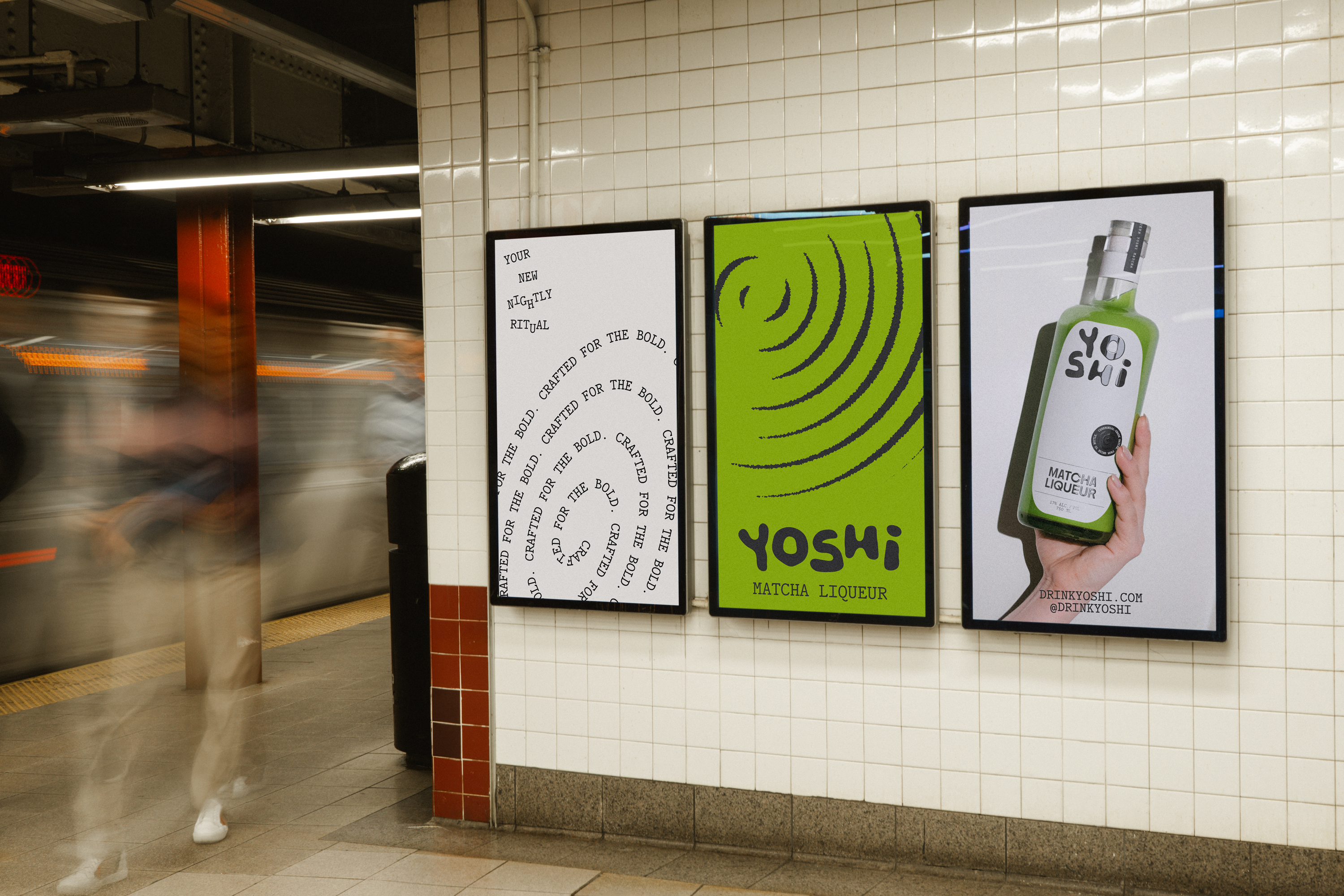
The hand drawn lettering of the wordmark is soft, deliberately irregular in all the right places; warm and inviting but without ever veering anywhere near twee or patronising. It’s frequently paired with a swirl device – the mutable and motion-centric brand mark that appears throughout the identity and chimes with the ideas around ceremony, ritual and intention.
Rather more prosaically, the spiral shape also draws inspiration from “the circular motion of the chasen whisk used in matcha preparation,” says Saint Urbain. Agency founder and creative director Alex Ostroff adds, “We wanted a mark that felt both energetic and meditative – a visual bridge between ritual and nightlife.”
In less capable hands the swirl could easily look like something that was phoned in – it so easily might slip into the territory of infantile or silly, but with the strategic underpinning and flawless execution of it across the wider brand identity, it works brilliantly.

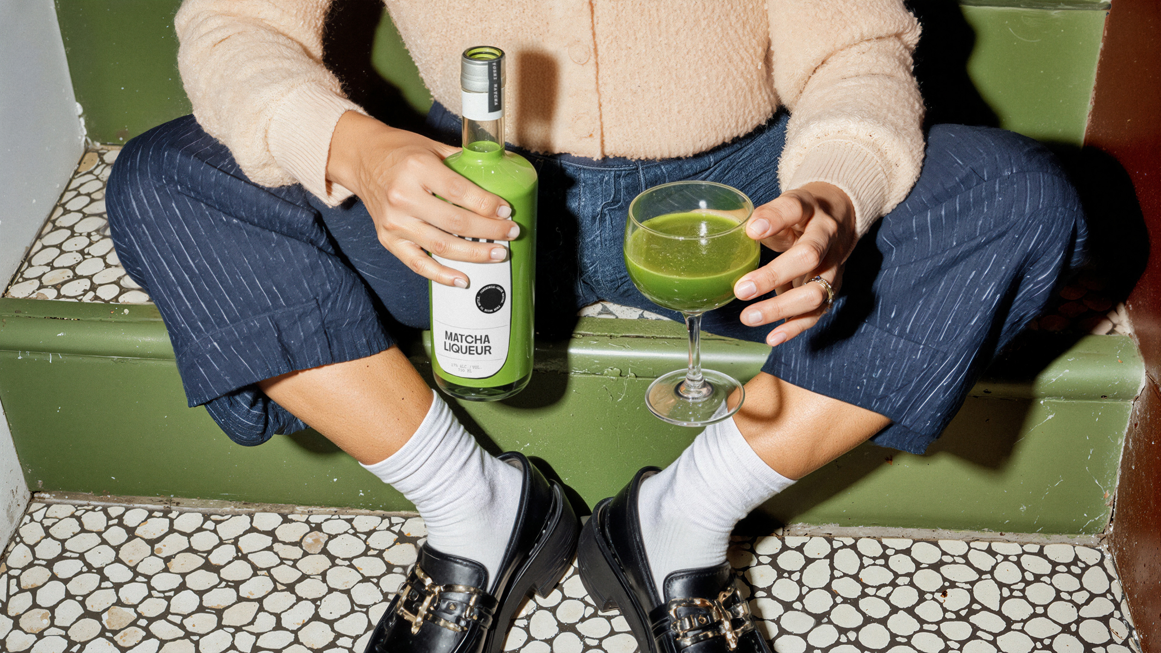
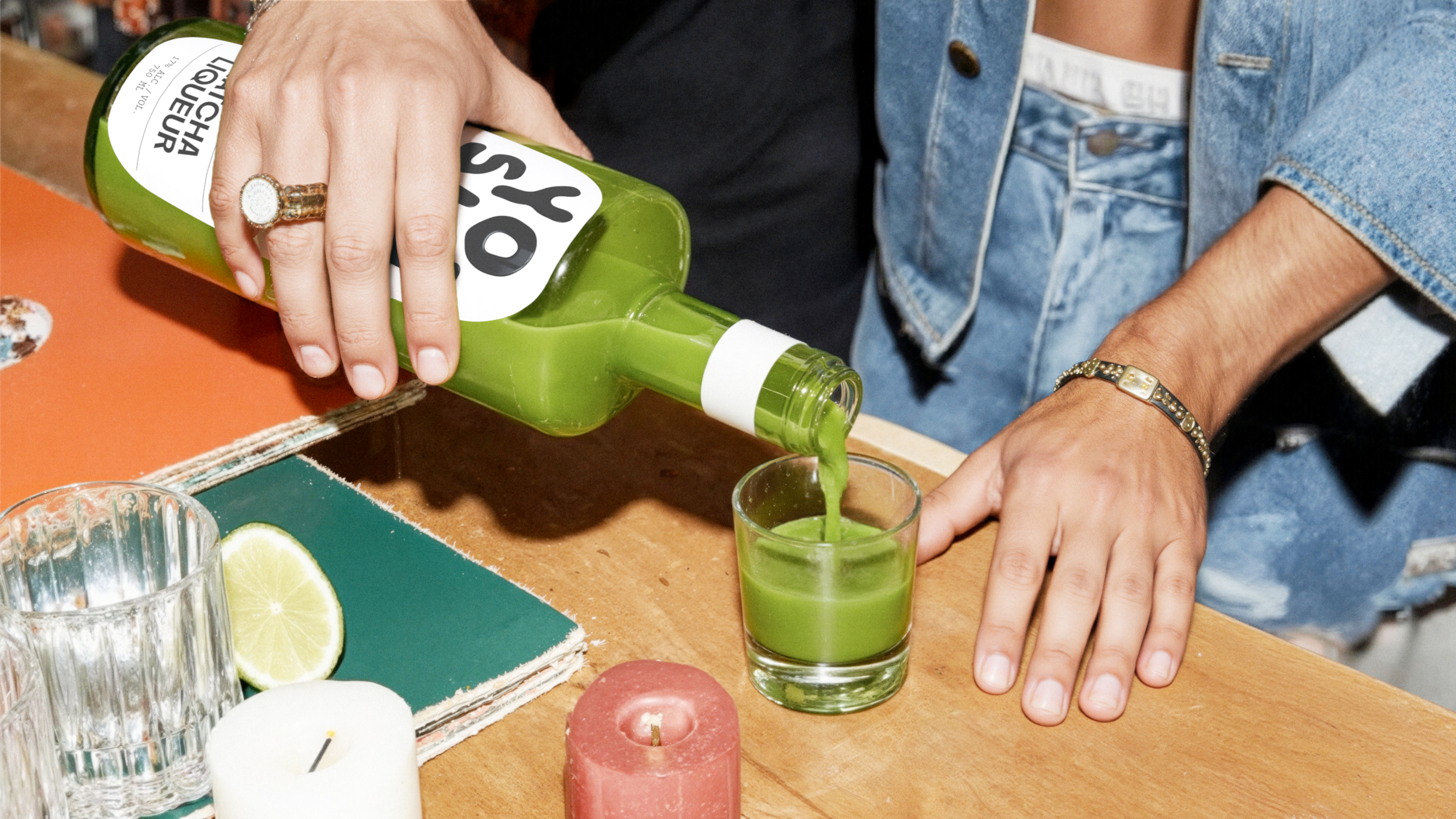
Another standout in this project is the art direction: once again, it feels effortlessly hip, all early Vice magazine hyper-flash and exposure, strange crops, lifestyle-leaning but without overtly selling you a lifestyle. I love the product shots where there’s something like a single arm seemingly emerging from nowhere, or someone who seems to be sat on the naughty step, nursing a glass of viscous green liquid that somehow, next to its bottle, looks absolutely delicious.
The packaging design pares things right back to centre two main things: that lovely wordmark, and the lurid green of the drink itself thanks to its green opaque structural packaging – something absolutely guaranteed to make it standout on a bar back to even the most bleary-eyed night owl. The green is only interrupted by the clean, crisp white label, which keeps text minimal and only goes hard where it needs to: wordmark, colour, and succinct product description – after all, we do need to know that this is ‘matcha liqueur’, since it’s unlikely people have encountered such a liquid before.
Alongside the hand drawn wordmark the rest of the type is both eye-catching in its slight off-kilterness and resolutely legible ad clear: for the most part, Saint Urbain opted to pair PP Nikkei by Pangram Pangram with HAL Repost Mono by Berlin-based HAL Foundry. Elsewhere, and used far more sporadically, other typefaces include VTC Carrie and VTC Marsha by Vocal Type, and Gothic 725 by Günter Gerhard Lange.
As is likely obvious, I love this project: in the most basic terms, it looks really, really great; and strategically, it’s incredibly smart – while matcha is undoubtedly huge, matcha liqueur is not, but this bold entrant into the category feels like it’s been there forever while conveying a fresh, bold sense of fun.
It’s not easy merging these disparate considerations, but Saint Urbain is absolutely on a roll of late, and this project cements the agency as one of the most exciting around at the moment.