Kunsthalle Basel by Porto Rocha
Opinion by Emily Gosling Posted 27 January 2026
Basel is a fascinating place – beautiful but unassuming, relatively small but the undisputed capital of the contemporary art world. Not only is it the host of – as you’d guess from the name – Art Basel, the Art Fair that arguably forms the pinnacle of the global art market calendar, but it also has one of the highest densities of art institutions in the world with nearly 40 museums in an area of 37 square kilometres.
The oldest of said museums that’s dedicated exclusively to contemporary art is Kunsthalle Basel (simply ‘Art Hall Basel’ in its English translation), often abbreviated as KB.
Founded in 1872, KB eschews a permanent collection in favour of a constantly changing series of exhibitions, often showing works by artists earlier in their careers who go on to wider recognition – from Jackson Pollock to Anne Imhof.
In 2024 Mohamed Almusibli became KB’s new director and curator, an appointment which marked a change in direction for the institution. As such, it needed a new visual identity to match – and New York-based design and branding agency Porto Rocha was tasked with creating it.
According to Porto Rocha, Almusibli took the helm “with a clear vision: to turn the institution into a true host. Not just for the art world, but for anyone curious enough to step inside.”
The agency continues, “His approach was warm, expansive, and globally minded – a conscious shift from the neutrality that defines much of Swiss cultural design. The vision was changing, but the old identity was too neutral and ‘undesigned’ to support it.”
According to Porto Rocha (Church, Lunge, PAN NYC) Almusibli took the helm “with a clear vision: to turn the institution into a true host. Not just for the art world, but for anyone curious enough to step inside.”
The agency continues, “His approach was warm, expansive, and globally minded – a conscious shift from the neutrality that defines much of Swiss cultural design. The vision was changing, but the old identity was too neutral and ‘undesigned’ to support it.”
At the heart of the new identity is the intention Porto Rocha laid out, to “build an institutional brand with an anti-institutional spirit”. This meant formulating a design system with rigorous structure and easy, instant recognition; but one which simultaneously reflected KB’s avant-garde ethos by giving the identity “enough freedom to adapt to an art world in constant flux”.
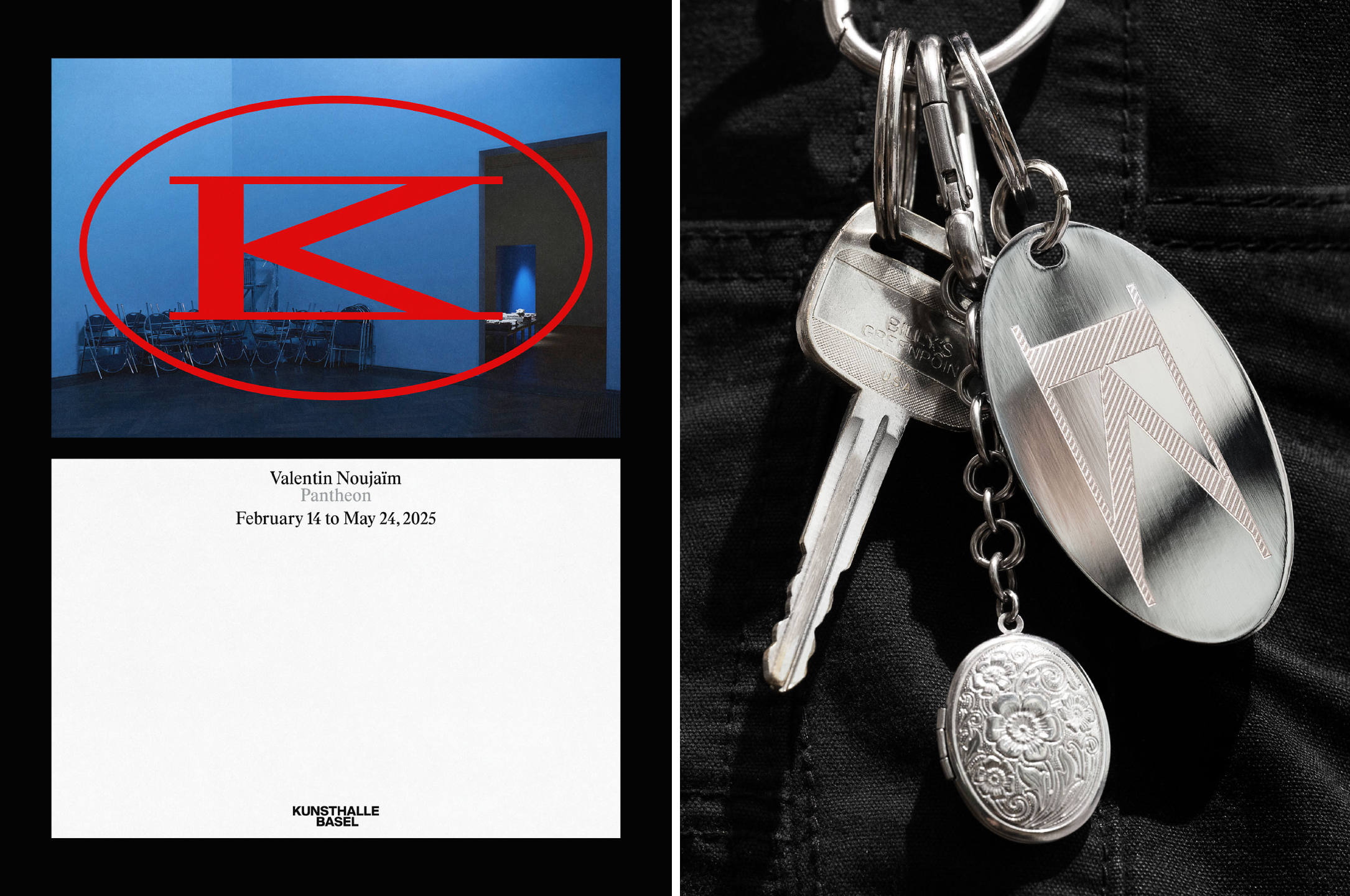
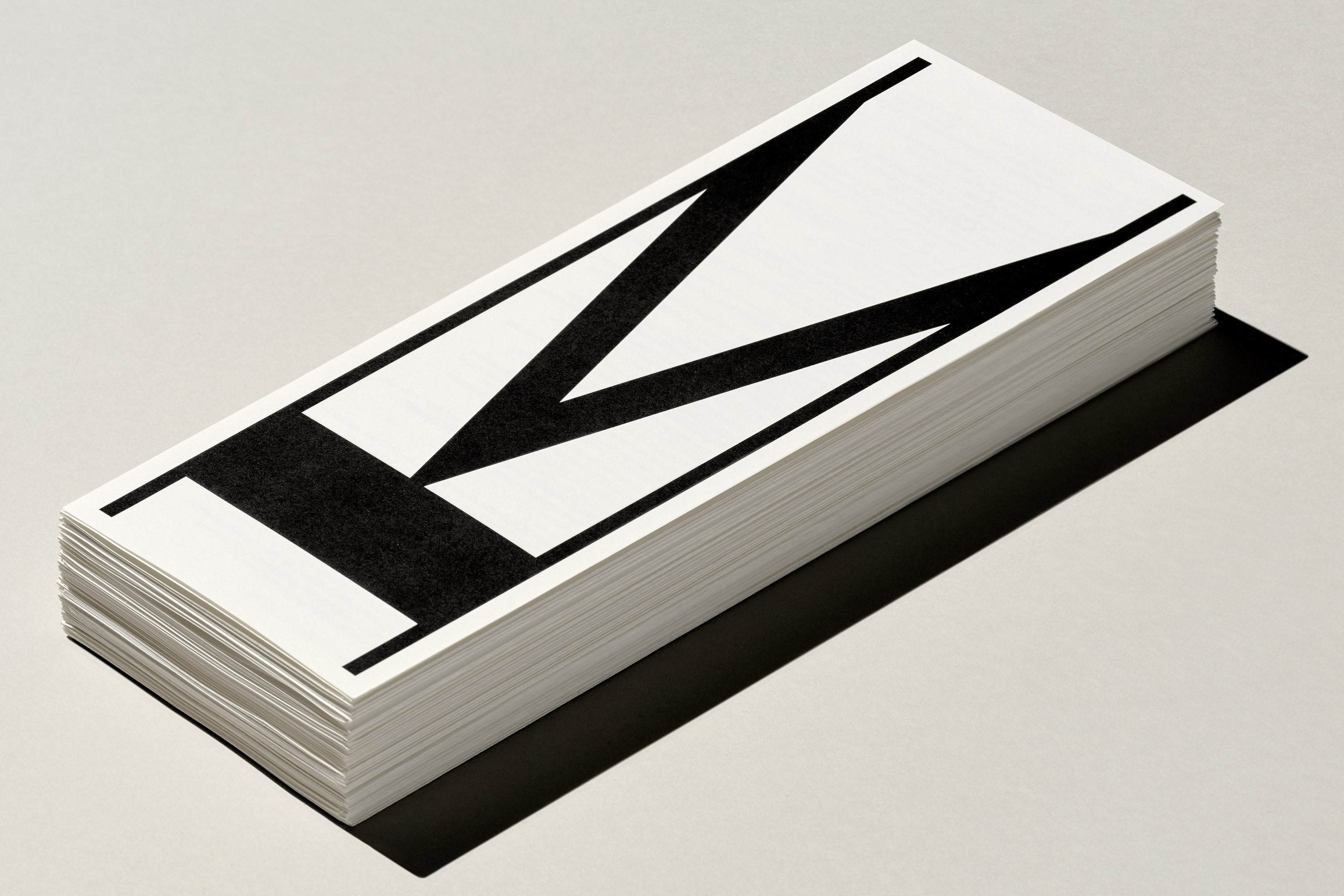
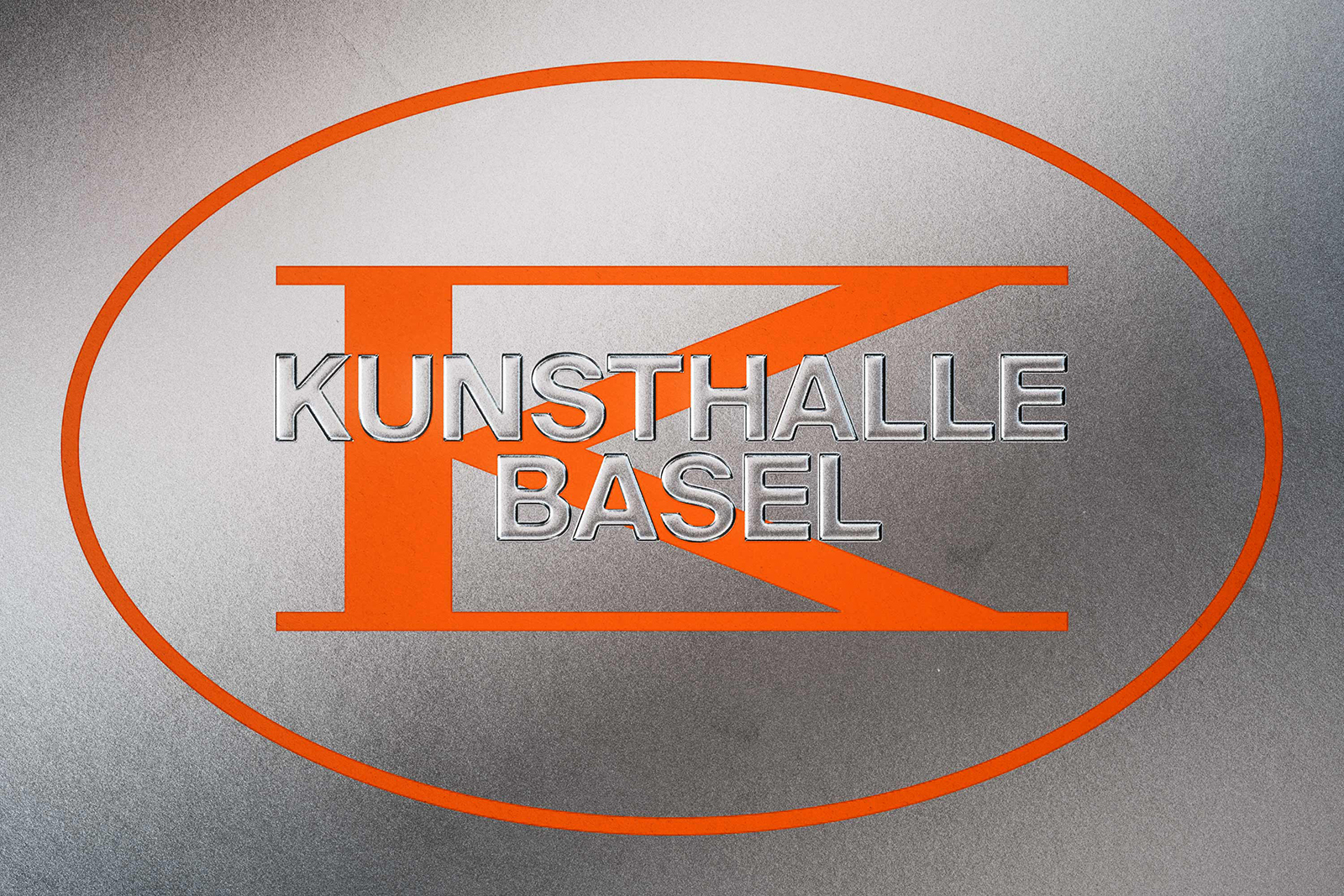
As such, the whole thing is anchored by a slick new monogram, but one which is fluid and transformative – a graphic unit that can morph and change rather than a static, traditional logo.
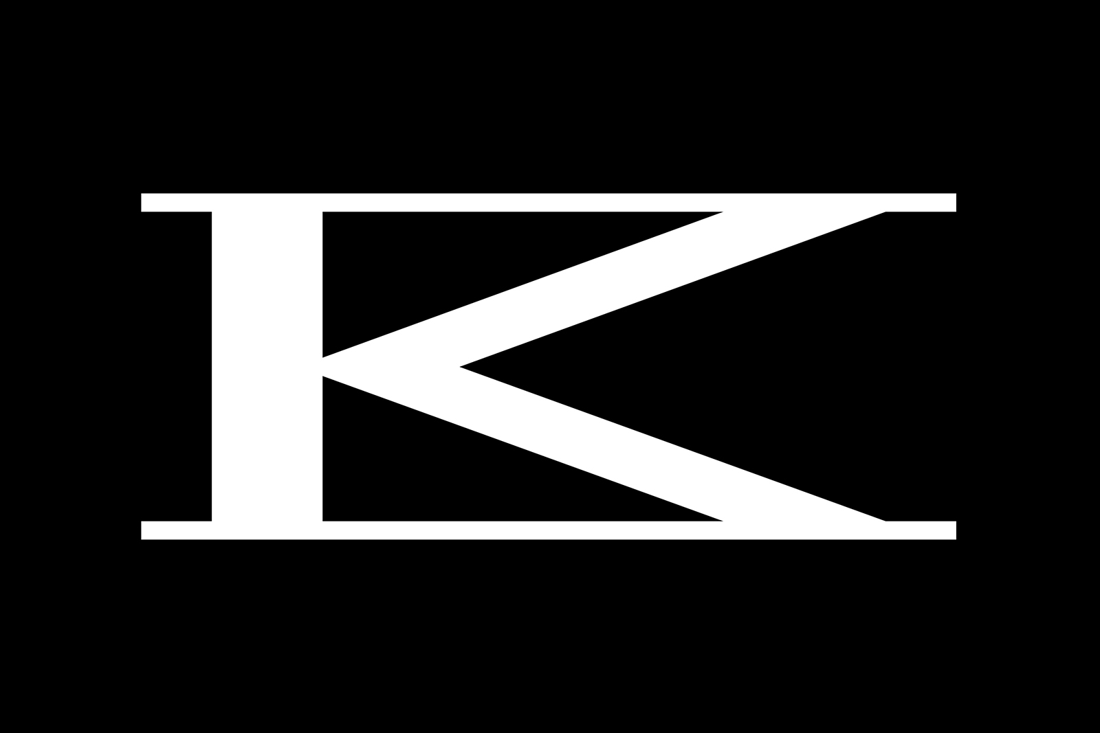
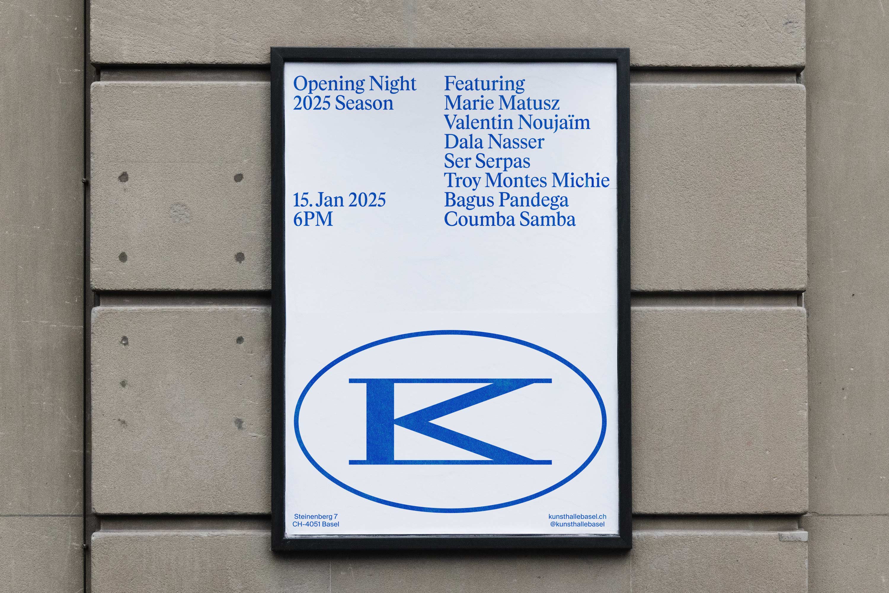
The premise is simple but perfectly executed: a combination of the letters ‘K’ and ‘B’, designed so that the whole thing can be stretched, compressed and rotated while remaining legible, enabling it to respond to different formats, scales and contexts.
This approach reflects the dual character of Kunsthalle Basel itself, an institution embedded in architectural permanence and a proud, centuries-old heritage, but simultaneously characterised by curatorial change and a series of dynamic, resolutely zeitgeist-defining exhibitions.
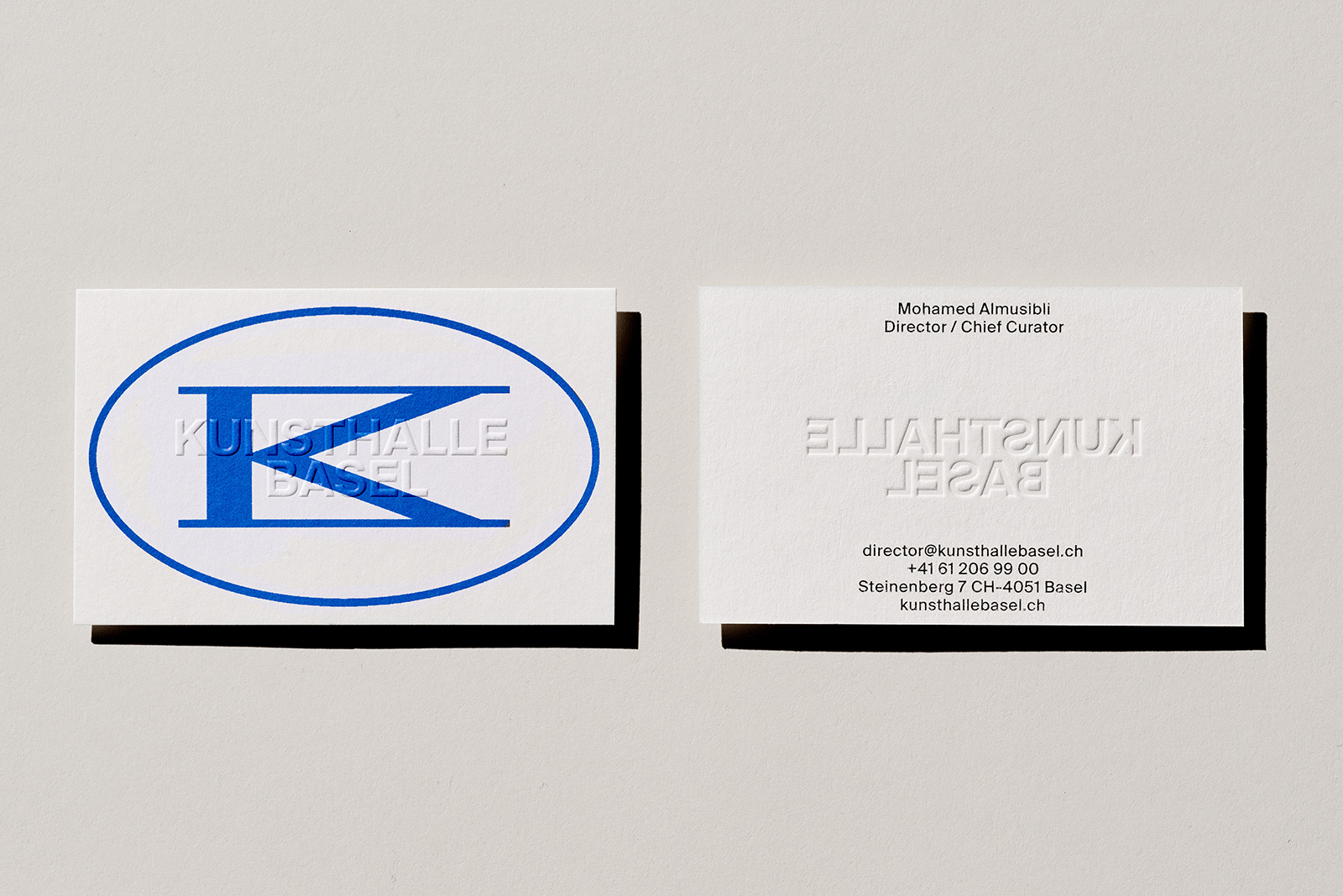
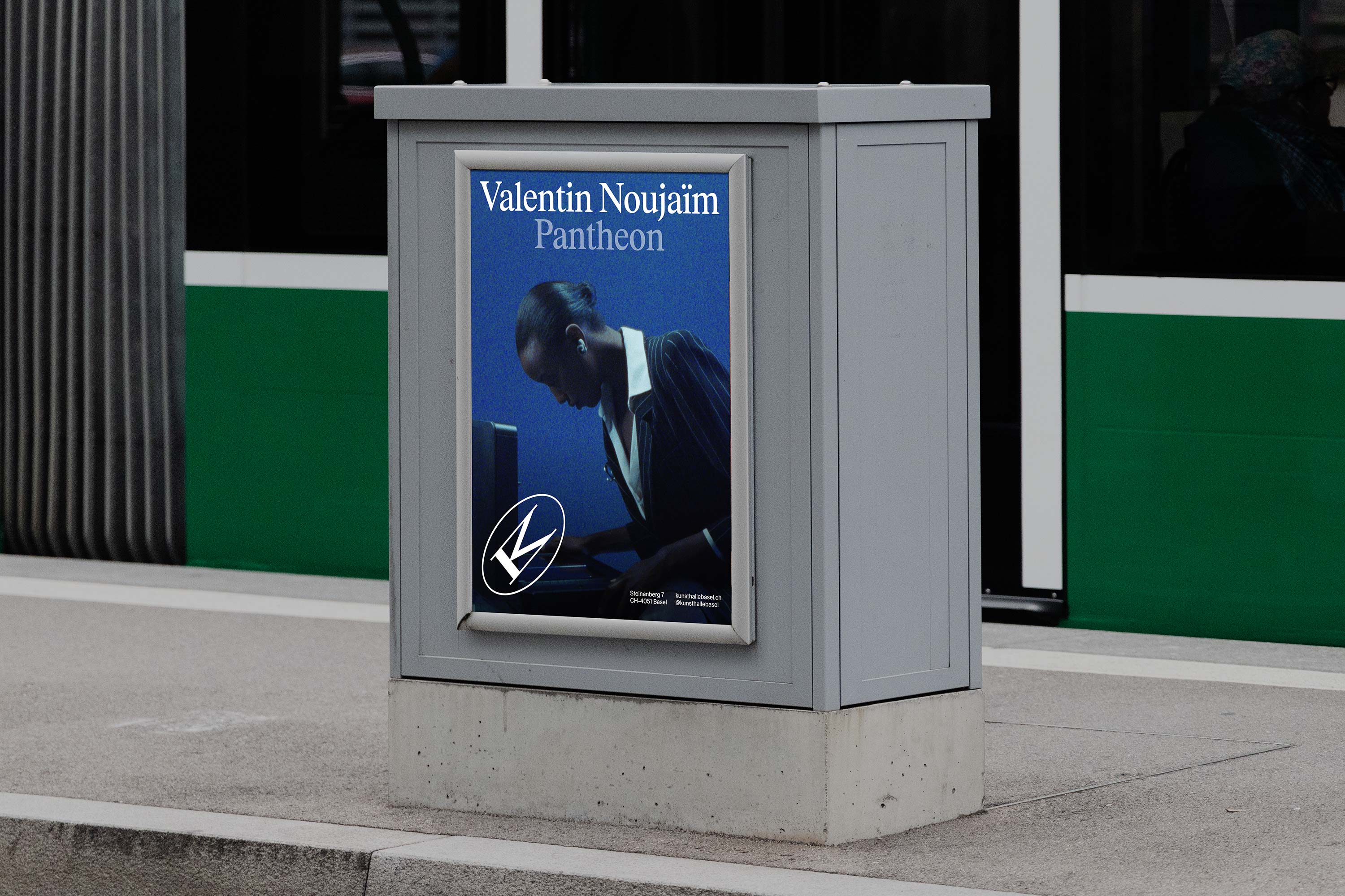
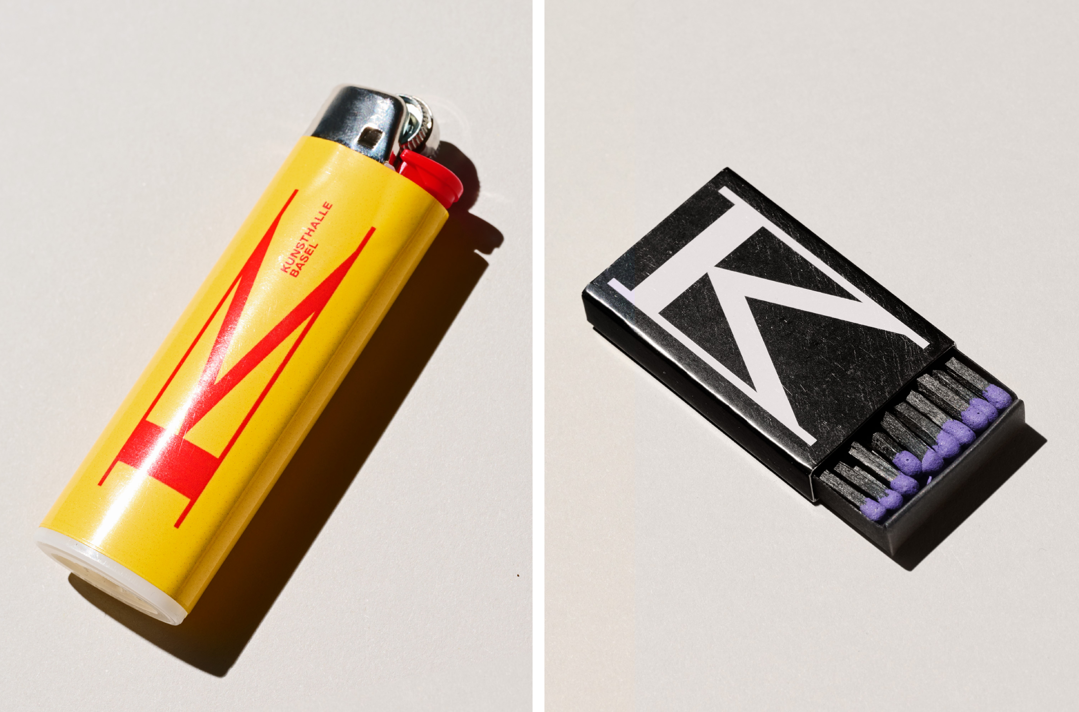
The new monogram acts as an instantly recognisable visual stamp that transcends language, used as traditional monograms are across print, exhibition materials, external signage, internal wayfinding, stationery, merch and more as a fixed mark; but is also used for certain applications as a dynamic form.
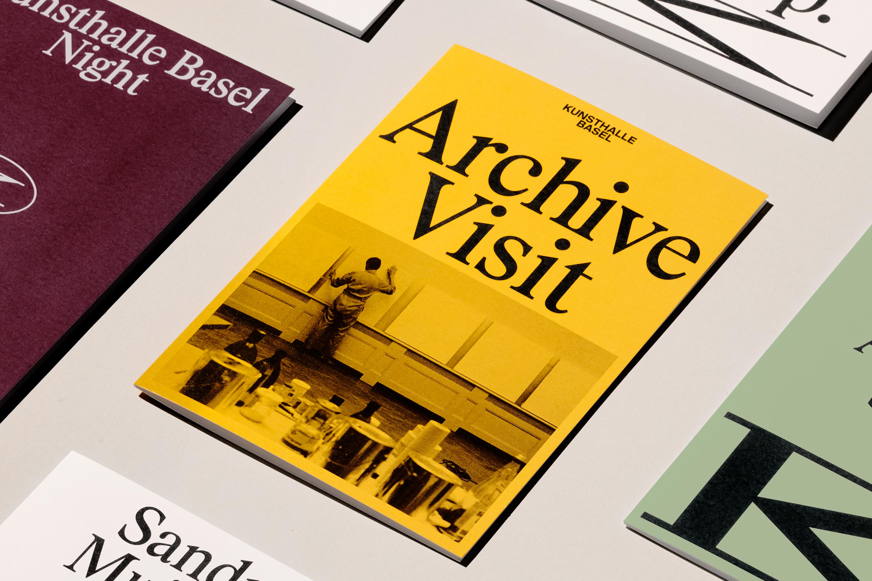
That sense of balancing historical weight and a thoroughly modern, experimental outlook is cemented by the typographic choices.A new custom headline typeface was developed as a collaboration between Porto Rocha and Swiss type foundry Maxitype called KB Rhymes, based on the foundry’s existing Rhymes font – a humanist serif with roots in Times New Roman. It’s a fitting choice here: gravitas and familiarity with a hint of newness, and a sense of levity despite its authoritative overtones thanks to its condensed proportions. KB Rhymes is used across all key branded copy such as headlines, large-scale applications and key institutional messages.
This is supported by Suisse International by Swiss Typefaces; again, a font befitting of an institution like KB, with its balance of neutrality and legibility – ideal for longer swathes of copy and applications such as exhibition texts, captions and long-form content.
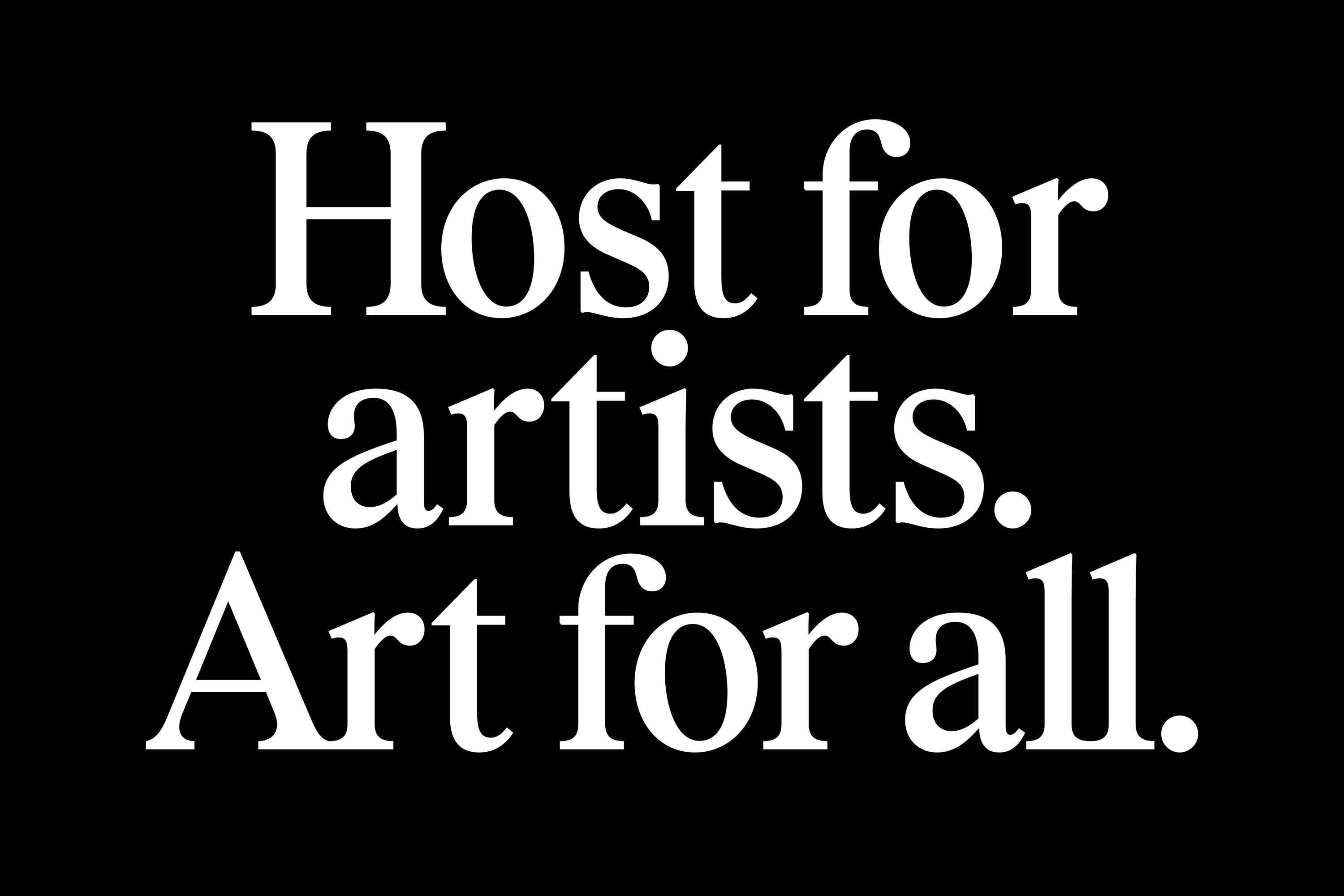
The identity’s strength and robustness owes a lot to the decision to use only these two fonts: their pairing giving both clarity and structure, as well as an ownable character for the institution that feels informed but very much approachable.
Like the mutable monogram, colour is treated as a variable rather than a constant. “We gave the brand two modes: neutral when paired with artwork, and vibrant in type-led layouts,” Porto Rocha explains. “Where the previous identity avoided colour altogether, we introduced a secondary palette with an analogue feel, adding energy and expression while keeping focus on the art when appropriate.”
It’s a testament to the skill with which such hues are applied that you don’t really notice the colours: as with any such institution where art is the foremost priority, it sits back where it needs to and speaks a touch louder when it looks to grab attention.
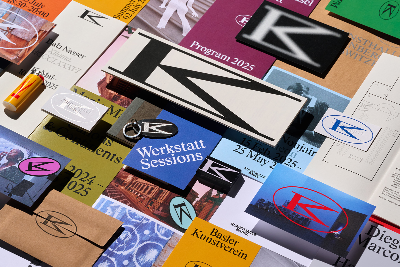
The dynamism inherent to the monogram comes to life beautifully in Porto Rocha’s motion design, which demonstrates the structural integrity of the overall identity design system while also showing its ability to seamlessly transition between states, content types and layouts through stretching, contracting and various circular movement patterns.
This is evident on things like digital posters and the new website. Porto Rocha’s main priority was to rework the information architecture to once again reinforce clarity and accessibility, making it easier to navigate both current programming and Kunsthalle Basel’s extensive archive using a combination of full-bleed imagery and editorial-influenced layouts. A modular UI system supports different types of content, from exhibitions and events to essays and historical material.
What’s so skillful about this project is Porto Rocha’s lightness of touch. Switzerland more broadly feels unique in its resolute adherence to ongoing experimentation in art; at once reverent to art history past and doggedly pursuing newness. But crucially, it does so quietly – it doesn’t yell about how great it is because it doesn’t need to.
Which is exactly what this identity does: there’s gravitas, there’s authority, but there’s never gatekeeping or snobbishness. It’s totally art world appropriate, but its beauty lies in its understated sense of being thoroughly open to all.
