Design for Cultural Institutions
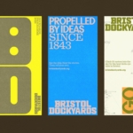
How & How takes a smart, bright collage-based approach to overhauling Bristol Dockyards
For those outside of Bristol, it’s all too easy to assume that the city is merely a place where Triphop and Dubstep were born; a Mecca for trustafarian types on a perennial ‘gap yahhh’ wearing those trousers that make people look as if they’ve had some sort of toilet issue; a place where the streets are paved with ketamine and...
Who knew a spiral could do so much? Pentagram did, in this joyful Tokyo museum identity
The Museum of Narratives (also known as MoN Takanawa) is located in Tokyo’s Takanawa Gateway City, and opened a couple of months ago in March 2026. It’s something of an experimental museum with a cross-disciplinary programme spanning visual art, installations, and performances themed around everything from society to art to science, manga, and anime; merging traditional Japanese culture with hyper-modern,...
Koto breathes new life into Floridian arts institution The Norton
The Norton Museum of Art began life in 1941 in West Palm Beach, Florida, and in the near-century since, its whole raison d’être has been based around its role as a place where “art and life meet as a part of everyday art”. As such, it acts as more than a look-don’t-touch-style gallery space: the garden, gallery and restaurant are...
Off-kilter and elevated
St Paul’s Cathedral is undoubtedly one of the most iconic, recognisable landmarks of London’s skyline: its vast dome, all beautiful copper-tarnished turquoise, resplendent with dazzlingly golden pineapples (one of its architect Sir Christopher Wren’s favourite accoutrements, and back in the 17th century a distinct status symbol representing all that was bountiful and exotic). Until 1963, St Paul’s was the tallest...
Kanal by Base Design
Kanal is a museum-to-be with an admirable yet bold raison d’être that defies much of what we think we know about the nature of highbrow cultural sites: not a “finished institution, but a cultural project in motion,” as its general director Yves Goldstein puts it. Based in Brussels, Kanal will – somewhat surprisingly – become the city’s only museum of...
Kunsthalle Basel by Porto Rocha
Basel is a fascinating place – beautiful but unassuming, relatively small but the undisputed capital of the contemporary art world. Not only is it the host of – as you’d guess from the name – Art Basel, the Art Fair that arguably forms the pinnacle of the global art market calendar, but it also has one of the highest densities...
The Huntington by Base Design
There’s a particular kind of challenge that crops up again and again in cultural branding – not obscurity exactly, but partial recognition. The sort where an institution is famous for one thing, quietly exceptional at several others, and yet rarely understood as a coherent whole. The Huntington, a century-old cultural and research institution in Southern California, sits squarely in that...
INTL 2025 by Warriors Studio and NAM
International Assembly began life as Graphic Design Festival Scotland back in 2014, founded by then-recent-ish grads Beth Wilson, James Gilchrist. The pair also helm Warriors Studio, which has been taking care of the festival’s creative direction, branding and design since its inaugural edition, too. GDFS became International Assembly, or INTL, in 2020; and when the new name and identity, also...
IAAC by Mucho
The IAAC (Institute for Advanced Architecture of Catalonia) is an organisation which boasts a remit that feels both nigh-on impossibly wide but also hyperspecific. Based in Barcelona and founded in 2001 as a hub for innovation in architecture and design, IAAC describes itself as ‘a platform for producing knowledge to shape the future of cities, buildings and society’. The long...
Windham Campbell Prizes by Pentagram
Back in 2013, Michael Bierut’s team at Pentagram (Twelve Labs, Becan & Natural History Museum) created the identity for Yale University’s inaugural Windham Campbell Prizes, a major literary award that honours outstanding achievement in the fields of fiction, non-fiction and drama. Bestowed by the estate of the writer Donald Windham and his companion Sandy M. Campbell, the awards are administered...
Siuru by Bond
Estonia’s Siuru plays with important questions, subverting and, at the same time, fulfilling expectations. Is it an art museum? A library? A cinema? Or a cultural institution? For a Bond (Veikkausliiga, Saaristo, Cable Factory) the design studio in charge of developing a brand identity for Siuru, this raised the concern, how do you brand something that seeks not to be characterised...
Ding by Wildish & Co.
When I left the UK and landed in the Czech Republic – my home between 2010 and 2018 – I found a notable difference in advertising and branding between the two countries. Specifically, I saw an abundance of brand mascots. Now, of course, mascots were also used in the UK and have a global historical precedent, but I was struck...