Kanal by Base Design
Opinion by Emily Gosling Posted 10 February 2026
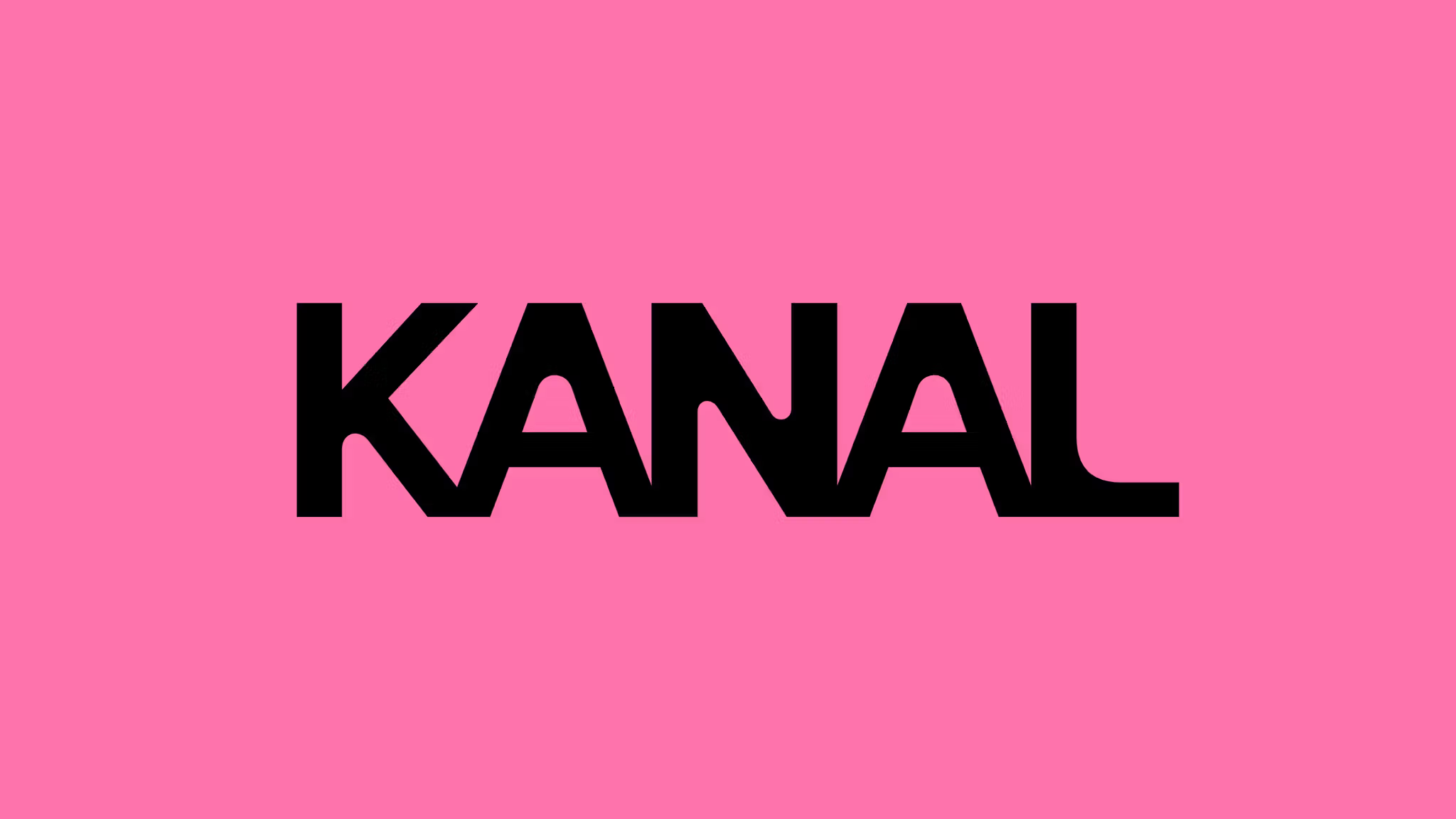
Kanal is a museum-to-be with an admirable yet bold raison d’être that defies much of what we think we know about the nature of highbrow cultural sites: not a “finished institution, but a cultural project in motion,” as its general director Yves Goldstein puts it.
Based in Brussels, Kanal will – somewhat surprisingly – become the city’s only museum of modern and contemporary art and architecture when it opens in November this year in the 40,000 m² former Citroën building.
Billed as a “transformative” and “visionary, ever-evolving public project” that merges art, architecture, performance, food and public space, Kanal’s brand world has been created by the Brussels studio of Base Design (The Huntington, 12, Murray’s Cheese, Divine Farmer).
The core ethos of the identity design mirrors that of the museum itself: just as Kanal aims to be “engaging with the city and its people in a way that is open, plural, and in constant evolution”, according to Goldstein, the branding is fluid, expansive and even in static applications, in a sort of perpetual motion that looks to harness the idea of a dialogue – with visitors, with the city of Brussels, between creative disciplines, between exhibits and visitors.
Indeed, with a project like this surely flexibility is really the only route: it’s one thing to refresh an existing museum brand, but likely incredibly rare to be tasked with creating a brand from scratch for such a vast cultural institution from the ground up. The plus side is that there’s no heritage to retain, or to attempt to shoehorn into something more contemporary (as briefs for existing similar sites seem to generally be wrestling with); but the downside is almost the same – how do you create gravitas within modernity for something so new, but of such inherent, almost instant cultural importance?
I say cultural importance because Kanal isn’t created in a vacuum: its modern art side has come together in collaboration with the Centre Pompidou, no less – that sublime Parisian Richard Rogers exoskeleton that’s famous the world over.
While that connection isn’t hammered home too boorishly within the overarching umbrella brand, it would be churlish to be too subtle about it: as such, the artistic programme is dubbed Kanal-Centre Pompidou; while the architecture and landscape side of things is named Kanal Architecture.
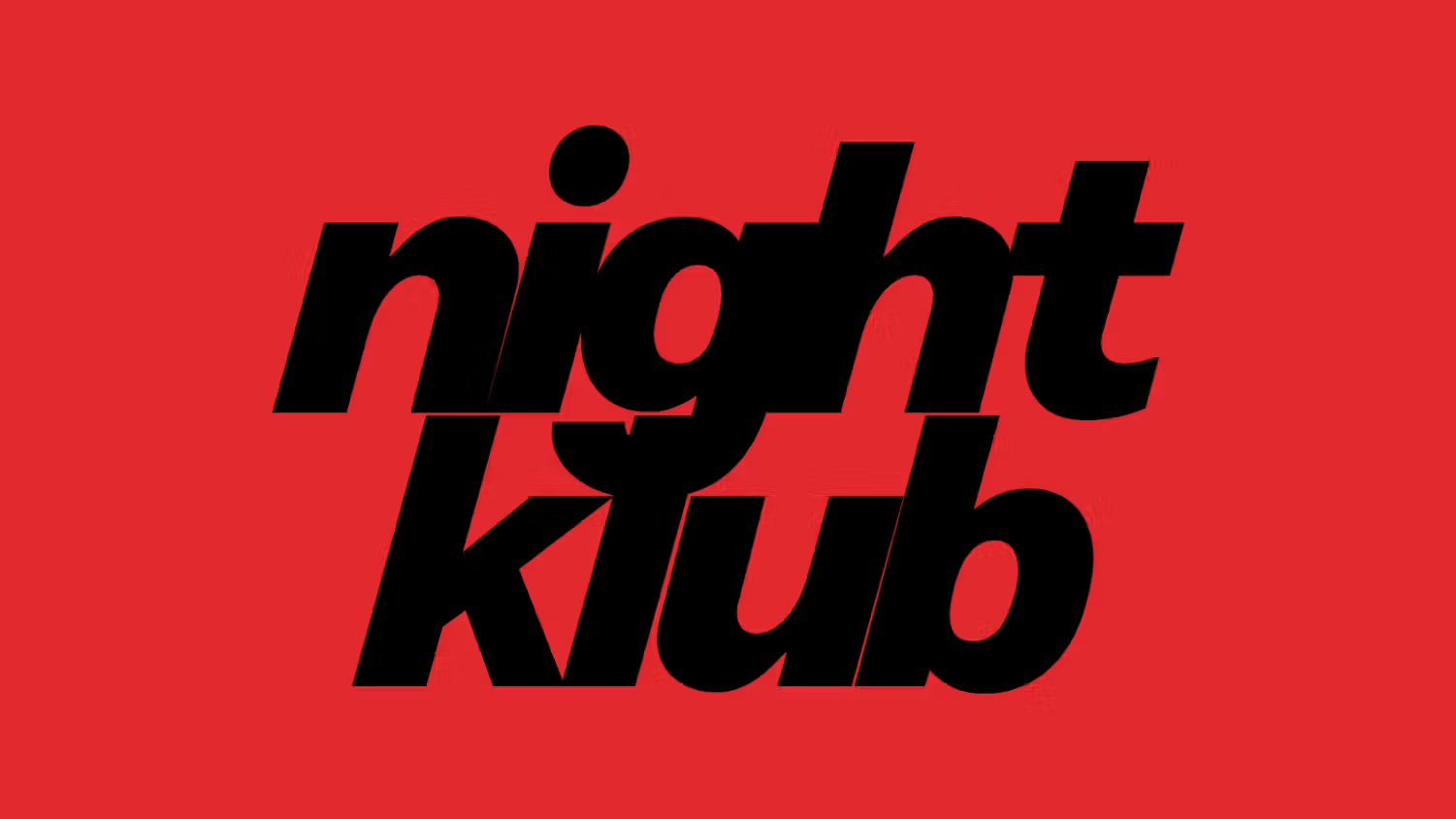
Another key branding challenge was that not only did these two elements have to be married together, but the identity also needs to communicate Kanal’s multifarious other strands – its commitment to live arts and workshops; its performance spaces and civic functions; its food offers and, this being continental Europe, its bakery.
Taking all that into account, fluidity is really the only sensible option – but where Base’s work is so smart is in enabling such elasticity within a look and feel that’s still unified, robust, and thoroughly, ownably ‘Kanal’.
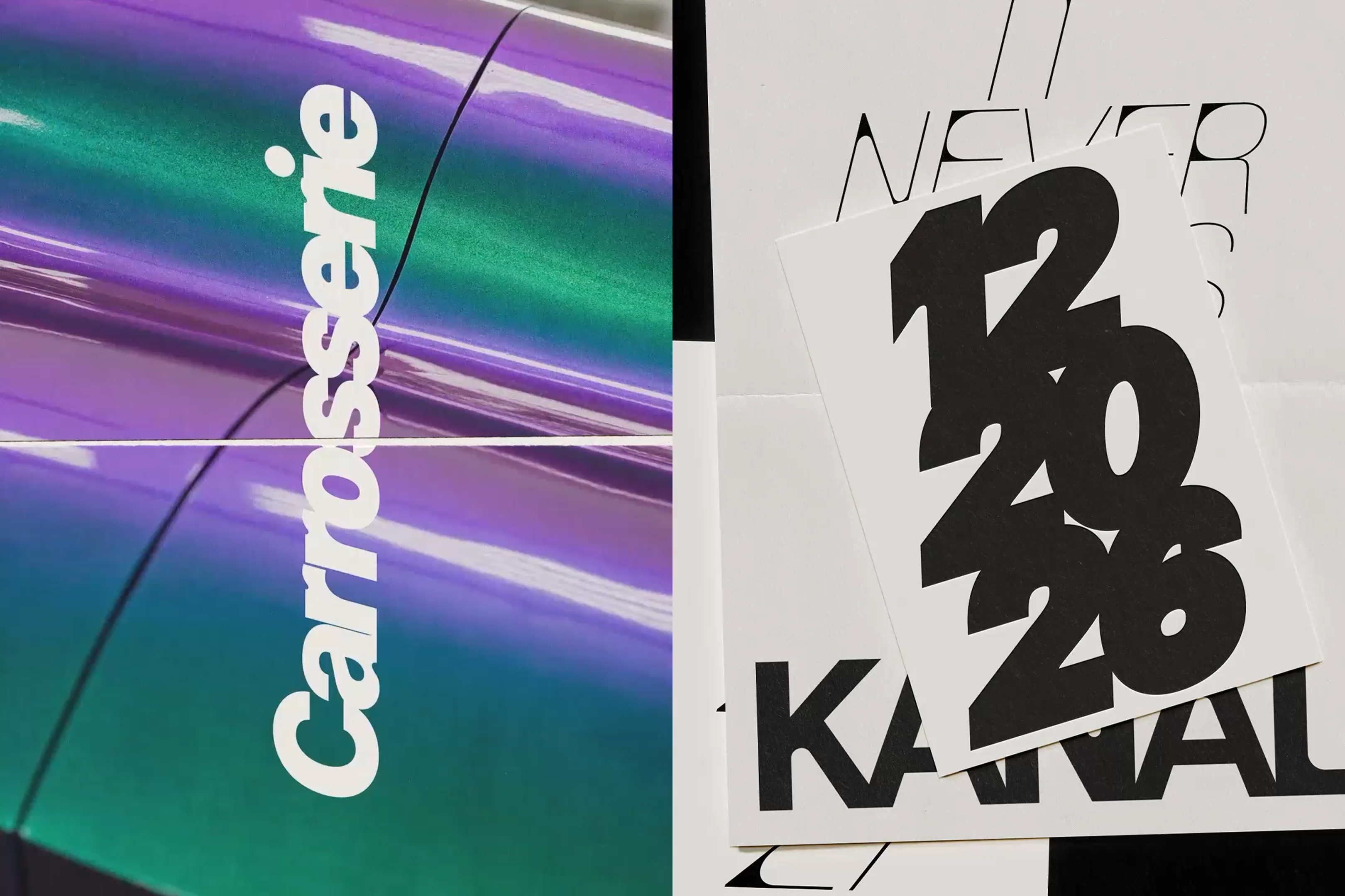
That’s largely thanks to the use of typography here: the whole thing is an absolute masterclass in how to wring the absolute most out of the possibilities of variable fonts. Everything is set in a bespoke brand font, Kanal Edge – a customised version of NewEdge by Charlotte Rohde, the Berlin-based designer and typographer behind lettering for entities as diverse as hipster hookup app Feeld, Berlin’s Haus der Kulturen der Welt (House of World Cultures), and a campaign for Mercedes Benz.
Kanal Edge works incredibly hard – a typeface so variable that it shape-shifts almost beyond the point of recognition, and honestly looks absolutely superb in all its wildly differing permutations, and across any application or scale you can throw at it.
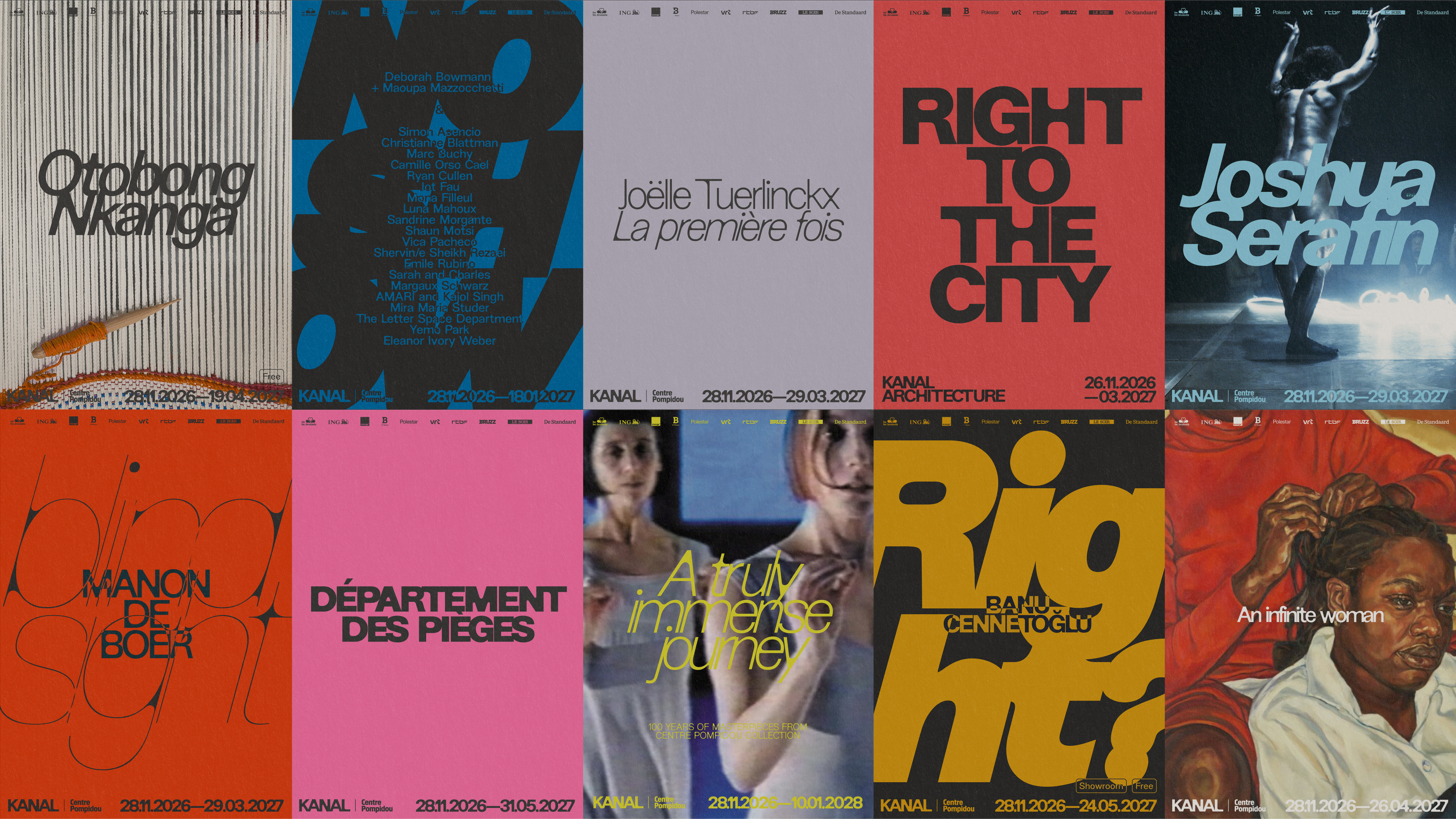
It’s resolutely neat, neutral and clear when it needs to be; it delights in veering into near-illegibility when the touchpoint allows for it – posters, certain aspects of the digital brand, and so on. It also dovetails into the almost zine-like barely contained chaos that makes so many of Kanal’s brand applications look so brilliant: it stretches and curves, it zigzags, it bursts into the foreground and dissolves into barely visible letterform dust.
The rigour of the strategy and design framework allows for such flirtations with a sort of graphic anarchy – a sensibility augmented by Base’s approach to colour. “Kanal has no fixed colour palette by design. The field was intentionally left open,” says Thomas Léon, design director at Base Design.
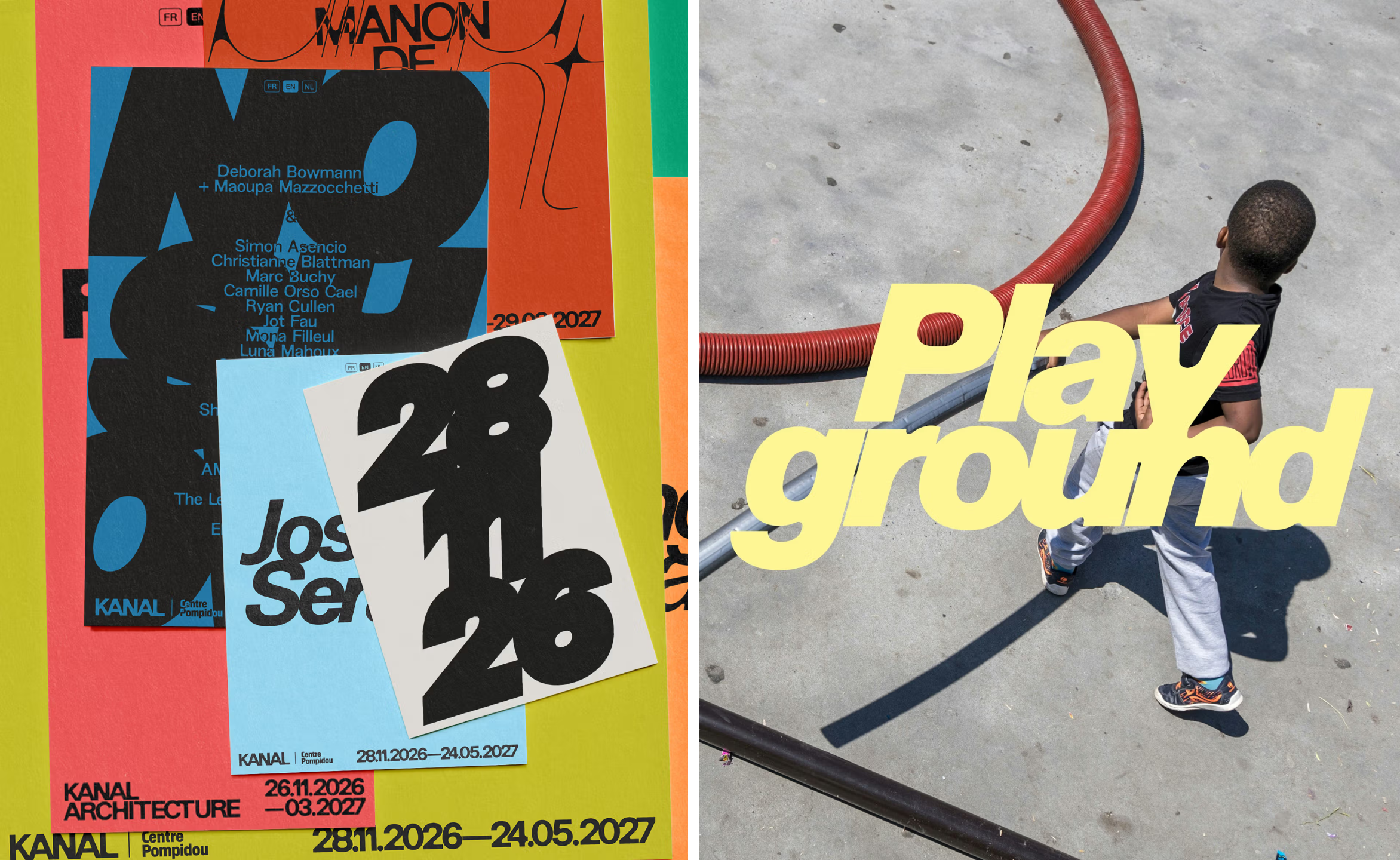
While early references for the colour palette sprang from the physical building itself, which Léon says will be “unexpectedly colourful,” it soon became clear that the possibilities shouldn’t end there.
“We quickly realised we didn’t want to limit the range of expression,” he continues. “We aimed to express the widest spectrum of expression with the tightest set of rules. Colour is a key driver of that multiplicity, shifting from soft and warm to acid and intense to create distinct atmospheres.”
While shades are selected from anything and everything, from the hero image for an exhibition to a physical material used in the interiors of the Kanal brasserie, there’s one rule that’s always adhered to: everything is duotone – black with a single colour, no more.
Where this project really shines is in demonstrating just how brave a skilful brand design team can really be – with a museum project tied to something as revered as the Pompidou, it would be so easy to play it safe and trot out the same old stuff about letting the art do the talking and have the graphics sitting back politely, a sort of aesthetic well-behaved Victorian child, ‘seen and not heard’.
But with Kanal, Base has shown that you can be wildly experimental – drawing on a thoroughly DIY, almost punk-zine style when you do it well, even for something like a vast arts institution. It’s modern but thoroughly timeless thanks to its adaptability; it’s utterly respectful to its subject matter yet still absolutely having fun with it – all the things art should be, really.
