Fizzing with expression
Opinion by Emily Gosling Posted 21 April 2026
It’s always a joy when a project manages to do something that feels new, bold, refreshing and resolutely contemporary; all the while wearing its influences absolutely front and centre on its sleeve.
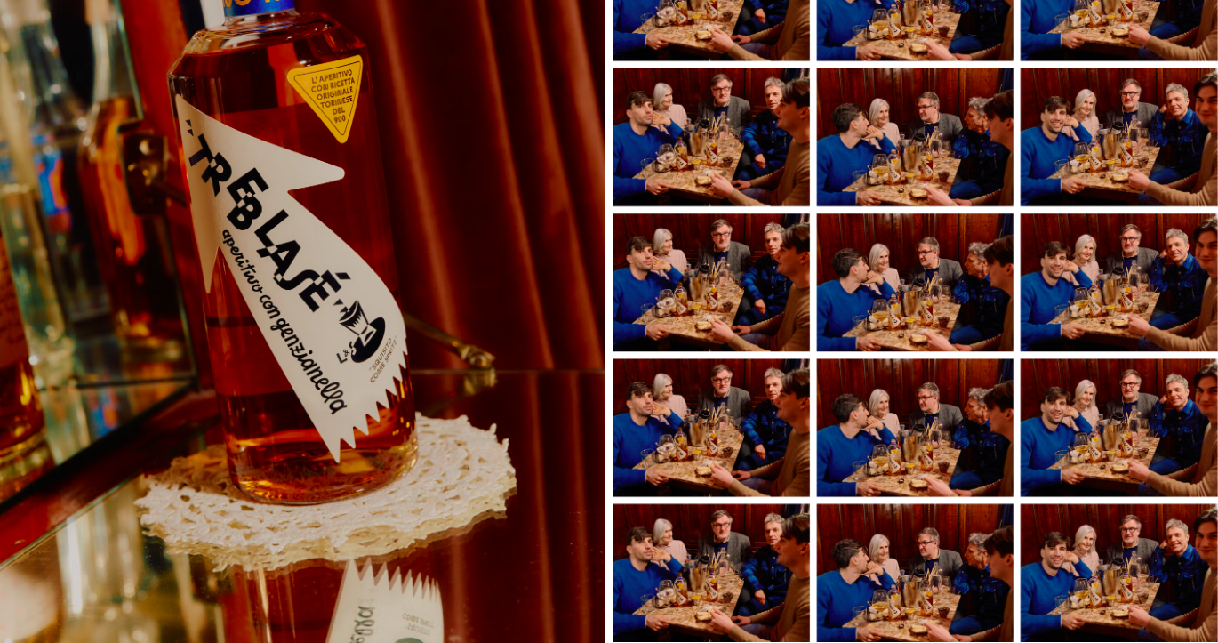
Treblasé is one such project, thanks to this superb brand design by Oslo-based multi-disciplinary design studio Olssøn Barbieri (Pursue Hard Seltzer, Stereoscope, Chelan Beauty).
Riding on the high of recent years’ obsession with all things spritzy, Treblasé is an aperitif with a storied history – and also with, according to the brand itself, genzianella – the Italian term for an Italian term for the ‘gentianella’ or ‘stemless gentian’, a mountain plant often used to make liqueur.
Treblasé specifically “rediscovers and reinterprets a recipe from the Bosso family, who until the 1970s at the Docks Piemontesi on Corso Dante in Turin produced and marketed a selection of liqueurs, bitters, and syrups,” says the brand.

What’s so lovely about this brand design is that it very much takes those 20th century roots and both reverently reinterprets them and makes everything feel so totally new, yet so totally old-school Italian.
And that Italian thing is very important here, as Olssøn Barbieri explains: it turns out that the international barnstorming success in recent years of the spritz, becoming, says the agency, a “symbol of conviviality and relaxed elegance deeply associated with the Italian way of life”, has had a backlash of sorts.

Olssøn Barbieri continues, “this phenomenon has sparked a counter-movement: new Italian brands are looking inward-rediscovering historical roots, forgotten recipes, and locally sourced ingredients.
“This wave reflects a desire to reclaim depth and identity within the aperitivo culture, transforming the monotony of standardised formula into a rich landscape of regional expression.”
As such, the brand design here is all about Italy, but never, ever, about cliches. It delights in pilfering from the best of Italian art and design history, but not necessarily the best known of those tropes.
Namely, here, the design looks to Futurism – more on which in a moment – but first and foremost it looks to Torino, i.e. that aforementioned “rich landscape of regional expression”.
According to Olssøn Barbieri, Torino is “one of the cities where the aperitivo ritual was born and the historical home of Vermouth,” and a place that “represents the intellectual and cultural foundation of Italian aperitivo culture”.
The studio continues, “Its heritage is shaped by botanical expertise, alpine and Piedmontese ingredients, and a long tradition of café society, where taste, conversation, and innovation naturally intersect”.

All that taste and innovation, then, brings us swiftly back to Futurism and its direct influence on these gorgeous designs. Most readers of BP&O, I would imagine, are familiar with the absolutely delectable designs for Campari from around the 1920s – the work of Italian Futurist artist Fortunato Depero, who began collaborating with the brand in 1924.
This brand-artist relationship was no happy accident nor simple ‘cash for creativity’ exchange: indeed, a key aspect of Depero’s practice was all about seeking to bring Futurism beyond painting and into the visual vernacular everyday life, mainly doing so through the typography, packaging, and advertising that make up quotidien rituals.
The influence of works such as the iconic Squisito al Seltz poster is perhaps as obvious in spirit as it is in pilfered stylistic references; but comes through most strongly in the typography here.
I adore these letterforms: they fizz like the drink itself, dancing around in the wordmark, overlapping and cutting in and both revealing and concealing the shapes formed of negative space, in doing so, making it positive again.
Another big influence here is in Depero’s playful but practical use of symbols like exclamation marks and arrows: indeed, the arrow forms the entire framing device and unusual bottle label shape, again merging the practical requirements of a graphic element with all that’s delightful and aesthetically pleasing.
The design for Treblasé is outlandish and daring when it needs to be, and sits back when it doesn’t. The art direction makes superb use of bold blue and effervescent bright orange, but the packs themselves largely let shape and type do the talking.
And the typographic choices here from Olssøn Barbieri are excellent: the main font is Maxi Round from Swiss foundry ABC Dinamo, tempered by the more sensible and legible – but no less charming – Rhetorik Serif by Berlin-based foundry Allcaps.
Everything about Treblasé screams elegance – or at least it would scream, were it not so elegant, so instead it just sort of purrs about it instead, all smoky gravelly tones and ‘come hither’ eyes and promises of an evening full of promises and uncertainties, in all the right ways.