Six Six by A Friend of Mine
Opinion by Emily Gosling Posted 5 May 2026
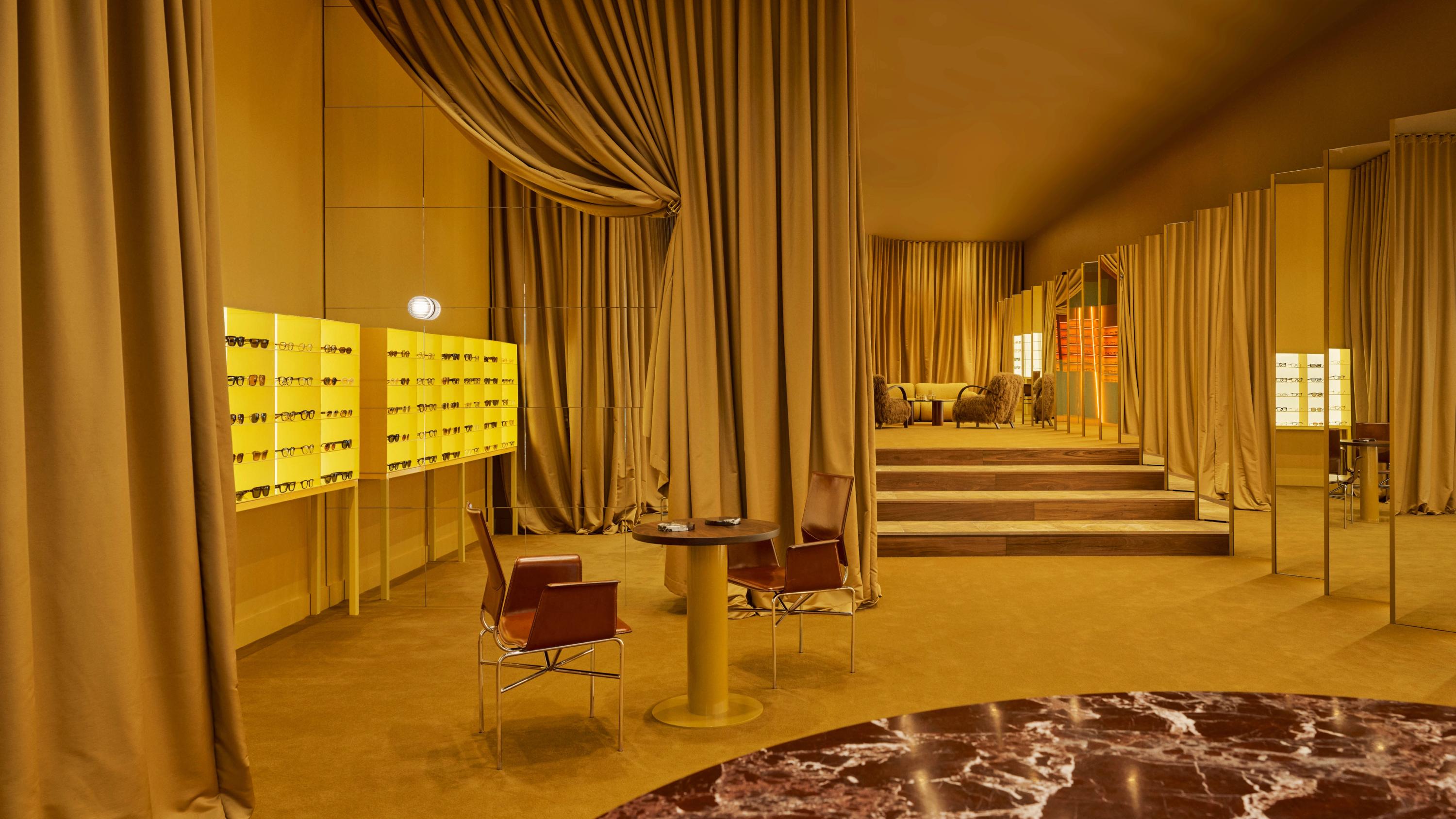
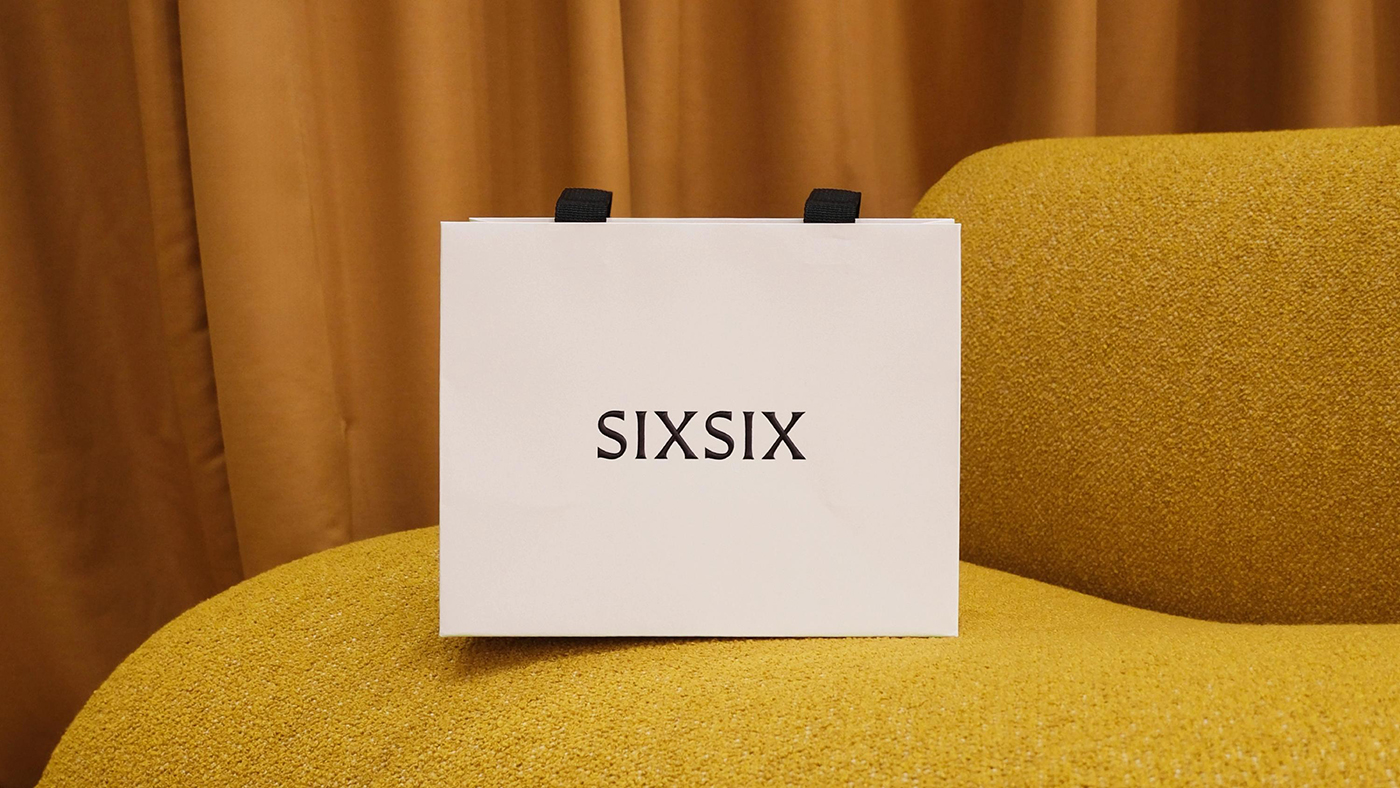
Six Six is an eyewear store and optometrist based in Melbourne, which opened early this year with the aim to be “more like a destination than a store”. Tasked with creating the brand identity to make that happen was A Friend of Mine, or AFOL for short (Embla, Great Wrap, Suupaa), a brand design studio also based in Melbourne which worked across the brand strategy and identity, art direction, signage and more.
The brief centred on that idea of creating a brand that reinforced the notion of the space as being somewhere “experiential and elevated,” taking inspiration from “international retailers who treat their customers as guests and place design and service above all else”.
In short – and to reflect the sort of eyewear shop that’s less Specsavers, more Jacquemus – it had to be classy but modern, sophisticated but with a more playful, edgy sensibility. And that’s exactly what it is: a brand that’s stripped right back when it comes to certain key aspects (type, colour palette, linework, and so on) but with unexpected little junctures that stops it from ever feeling too po-faced, or stuffy, or boring.
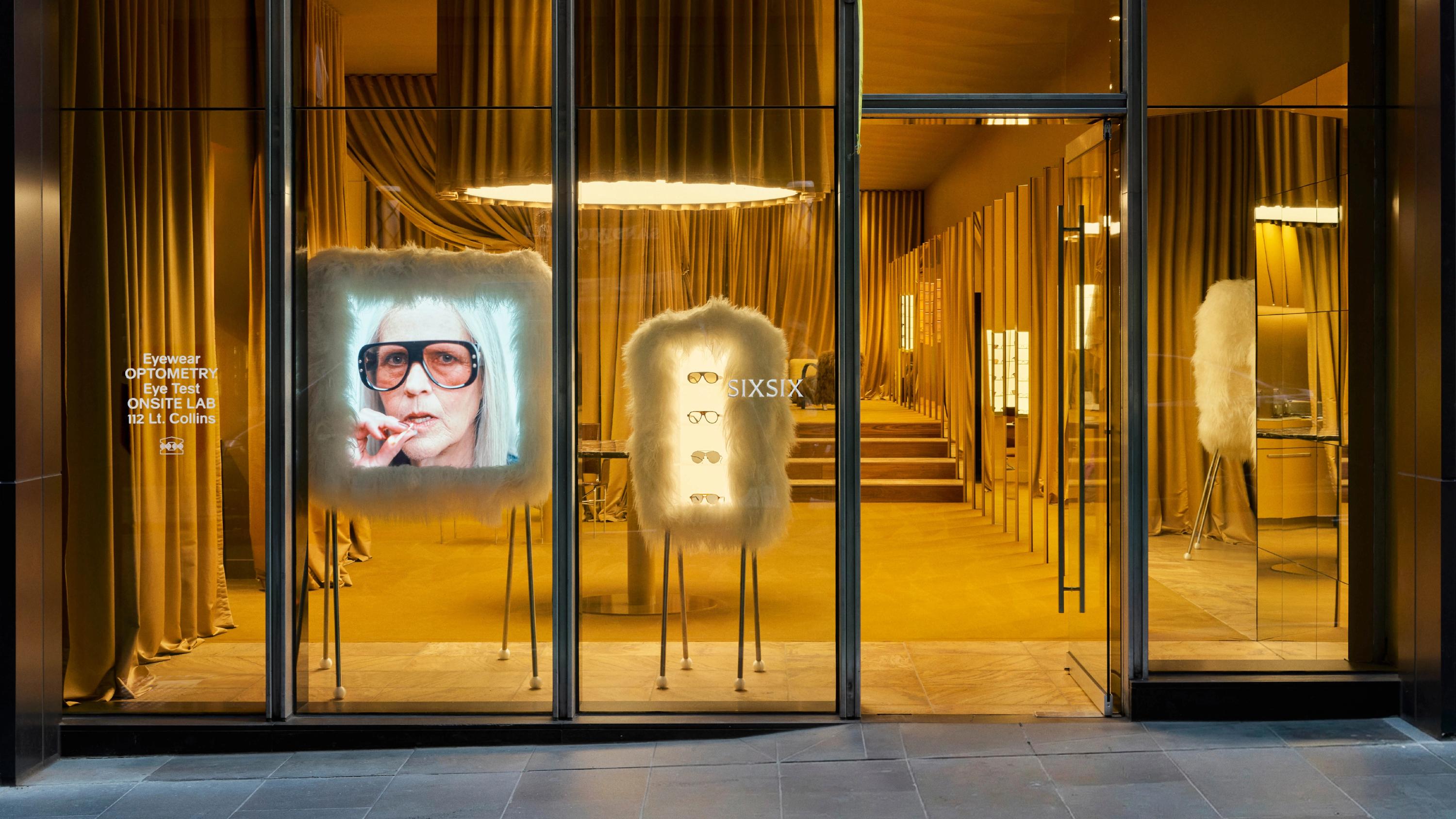
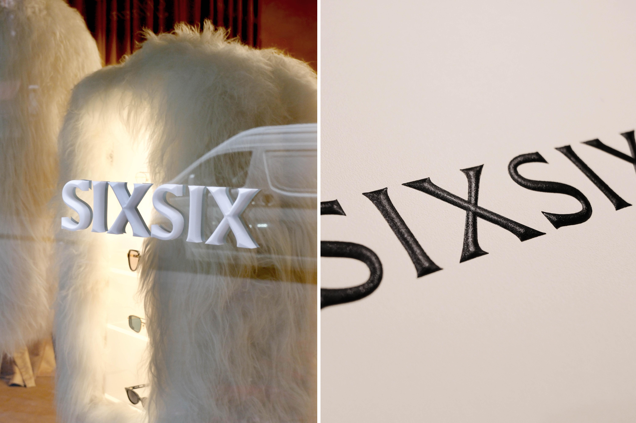
Six Six, it seems, is a brand with lofty sensibilities: according to AFOM, the client described the store space as a “brand temple,” and this concept directly informed the identity – most notably in terms of its wordmark and the logo device, which takes the form of a “contemporary, abstracted temple marque”.

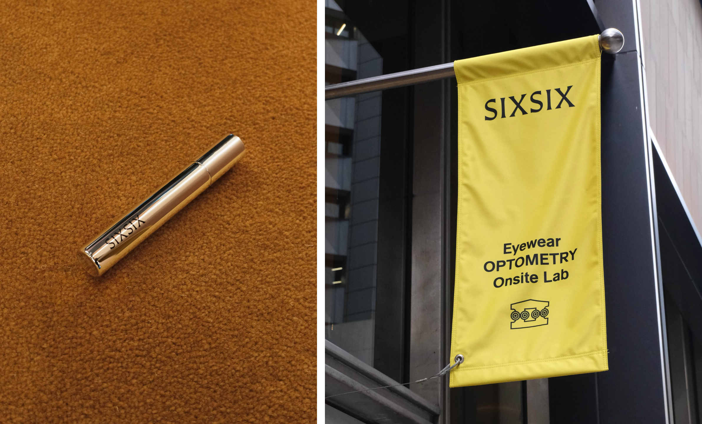
Meanwhile the wordmark is equally inspired by the classics, using all-caps lettering drawn to look like it’s been carved into ancient stone – not in a way that seems hammy, however, thanks to its flattened shapes, and the arresting use of sharp black on a sunshine-bright yellow backdrop.
Likewise, the temple-inspired mark manages to feel thoroughly modern thanks to its stark simplicity: again, it’s rendered in black on yellow, with the shapes stripped down to their most basic forms, and with an added twist.
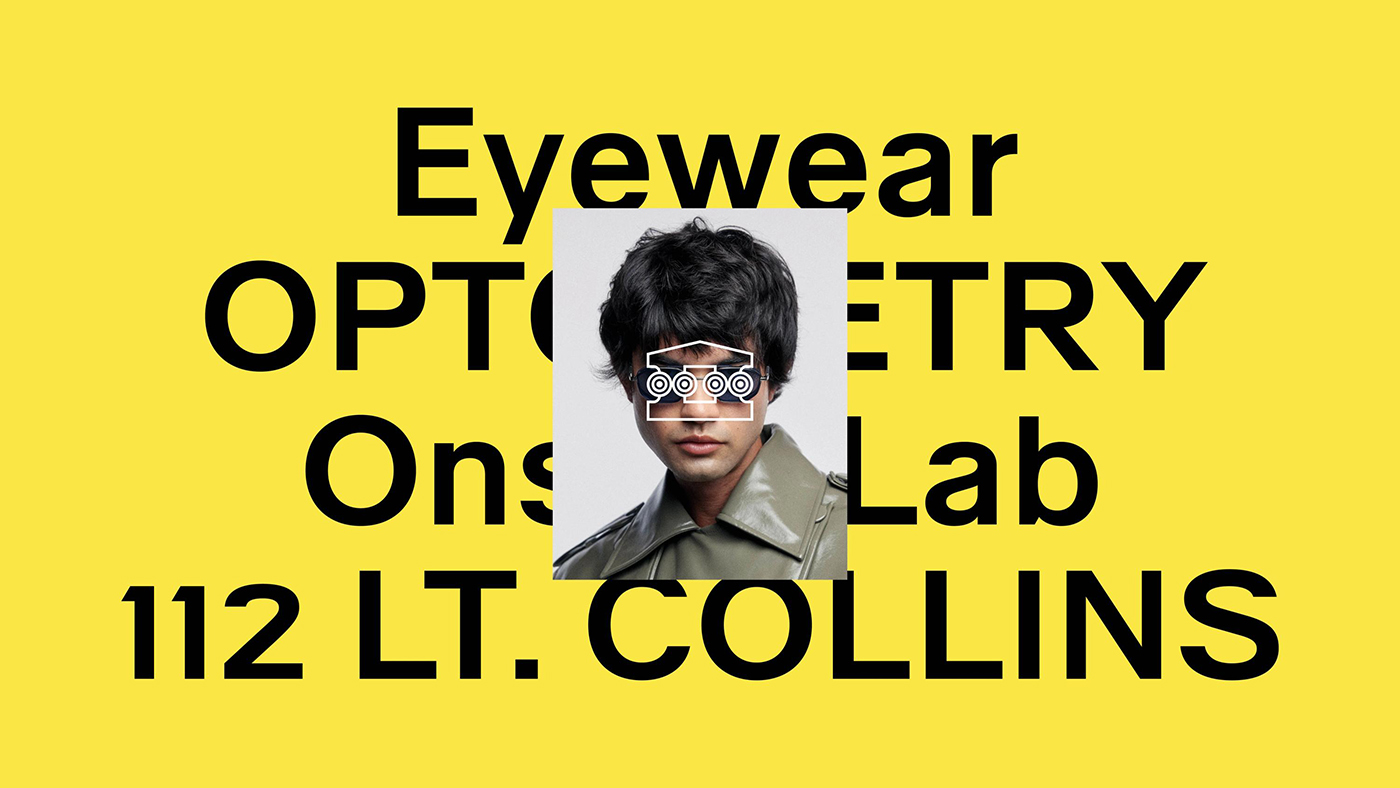
“At the heart of the marque are four circles, each containing radial inset rings referencing the tops of Ionic columns,” AFOM explains. “And within that geometry, the idea of vision held within the temple’s bounds: a reverence for sight.”

Outside of the stone-carving-like wordmark, typography is kept to just one font – Walte Alte by Berlin-based foundry ABC Dinamo. It’s a clever choice, thanks both to its versatility and its formality – after all, Six Six is both a multi-brand eyewear retailer, and optometrist – so it needs to both look aesthetically pleasing and also inspire trust. Eyes aren’t to be messed about with, and had the brand leant too heavily on the retail aspects, it likely wouldn’t inspire all that much confidence around the more clinical, scientifically rigorous side of the business. However, thanks to that careful font choice as one of many super-considered brand elements that always respect the optometry as much as the optics.
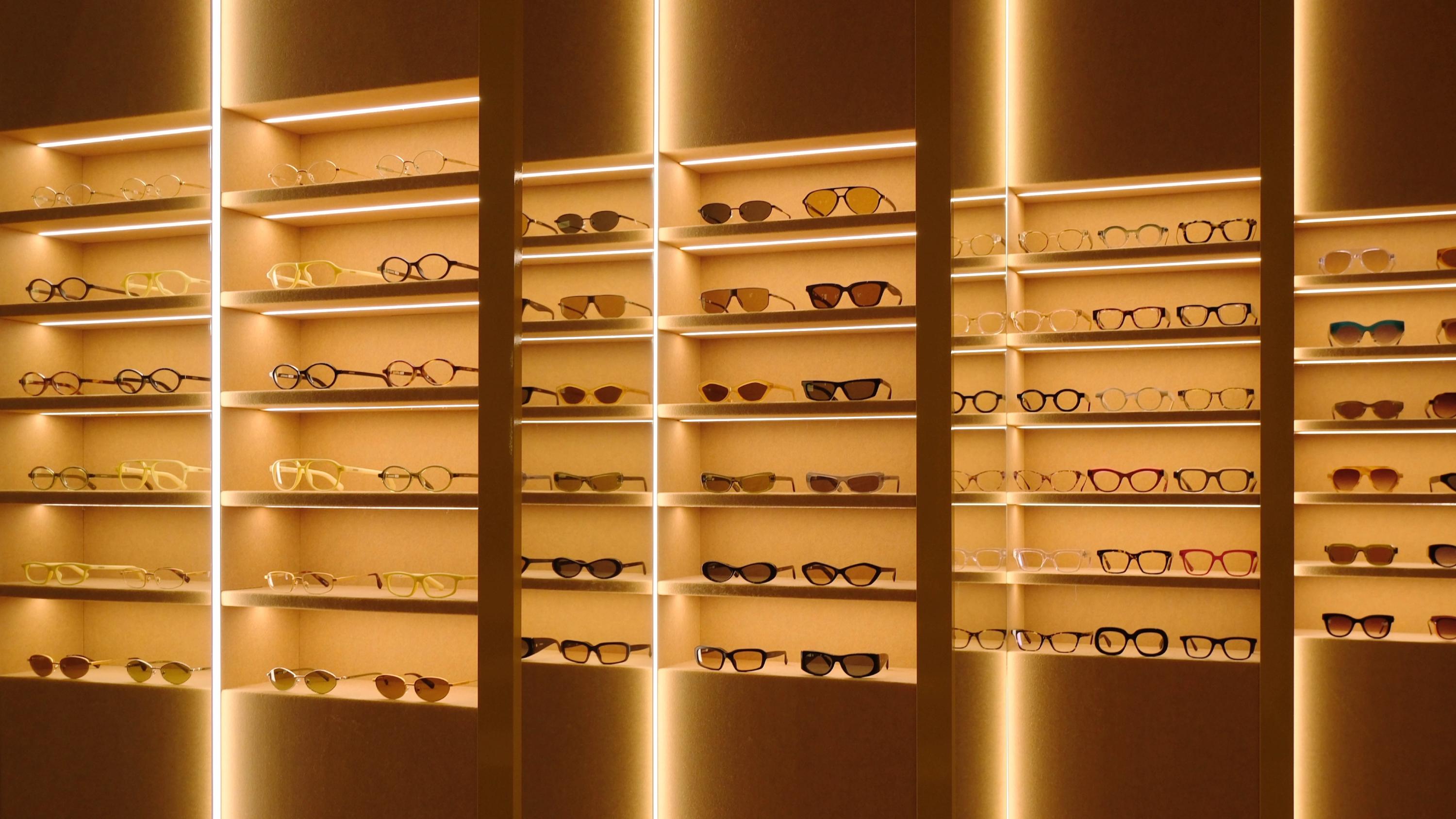
The distinctive Selfridges-esque yellow shade was developed by AFOM in close collaboration with interior architects Kennedy Nolan, which chose the colour for the store space thanks to the way in which it “would complement skin tones and cast shoppers in a flattering glow as they try on frames,” says the branding studio.

As well as being used in their usual promotional roles, with Six Six the brand films and photography are used as additional decorative elements within the store itself. The films play within the Six Six store on an oversized screen upholstered in fluffy white fur, “functioning as a sculptural art object within the space as much as a display surface,” as AFOM puts it.
Punctuating the films is a series of short ident-like animations of the logomark and typography, acting like little ad-breaks that reinforce the Six Six branding without being overtly salesly or in-your-face. “Ever-changing and impossible to ignore, the screen draws in passersby and signals that what’s inside is something worth experiencing,” the agency adds.
“Conceived as small vignettes, the films explore the idea of theatre: the characters we assume through how we present ourselves to the world. This theme extends into the graphic treatments, where the temple marque is boldly overprinted across models’ faces, obscuring their eyes – a provocative gesture that positions the brand itself as the lens through which identity is seen.”
For the films and brand photography, the art direction centres on individual characters and their narratives; aesthetically leaning on the conventions of editorial and fashion imagery but in terms of voice, taking things into more gently humorous, very slightly surreal/borderline-unhinged territory.
This is where I get slightly confused – maybe I’m just not quite hip enough, but I’m not sure I really get a fair few of the copylines. Things like “you have already used this password”, with footage matching that particularly emotionally charged level of frustration, left me a wee bit puzzled.
What I do like however is the type treatment in the films, which uses the brand colours of yellow and black but in a more playful, meme-like, outlined style which nicely offsets the more serious tone of the fashion-led photography. This is a deliberate move to draw attention when the films are used on social, it seems, with each film paired with a bespoke soundtrack created inhouse by AFOM.
The devotion to merging modernity and the sort of classic reference points that might feel a little presumptuous for such a new brand really works here: there’s a very slight hint of tongue-in-cheek, self-awareness when it comes to that sort of thing – elevating a shop that sells glasses into the sort of space that seems to suggest it should inspire worship. Thanks to the skill of AFOM, though, they pull it off – everything screams confidence rather than arrogance.