Great Wrap by A Friend Of Mine
Opinion by Thomas Barnett Posted 5 July 2023
Cling-wrap, cling-film, stretch-wrap, Saran-wrap or food-wrap. Wherever you’re from and whatever you may call the ubiquitous, sticky, transparent stuff, it’s been keeping food fresh since 1949, when the first branded form of cling-wrap made from polyvinyl chloride (PVC) appeared on the market. Once held up as a mould-thwarting modern marvel, the material is now widely derided as an environmental menace.
Cling-wrap is unrecyclable without costly specialised machinery, and when incinerated can release highly toxic chemicals. Safe to say, cling-wrap occupies a not-so-proud place in the overpopulated pantheon of minor modern conveniences to which we remain sadly in thrall, despite our growing collective environmental awareness and attendant consumer guilt. To this dismal scene, enter, Great Wrap.

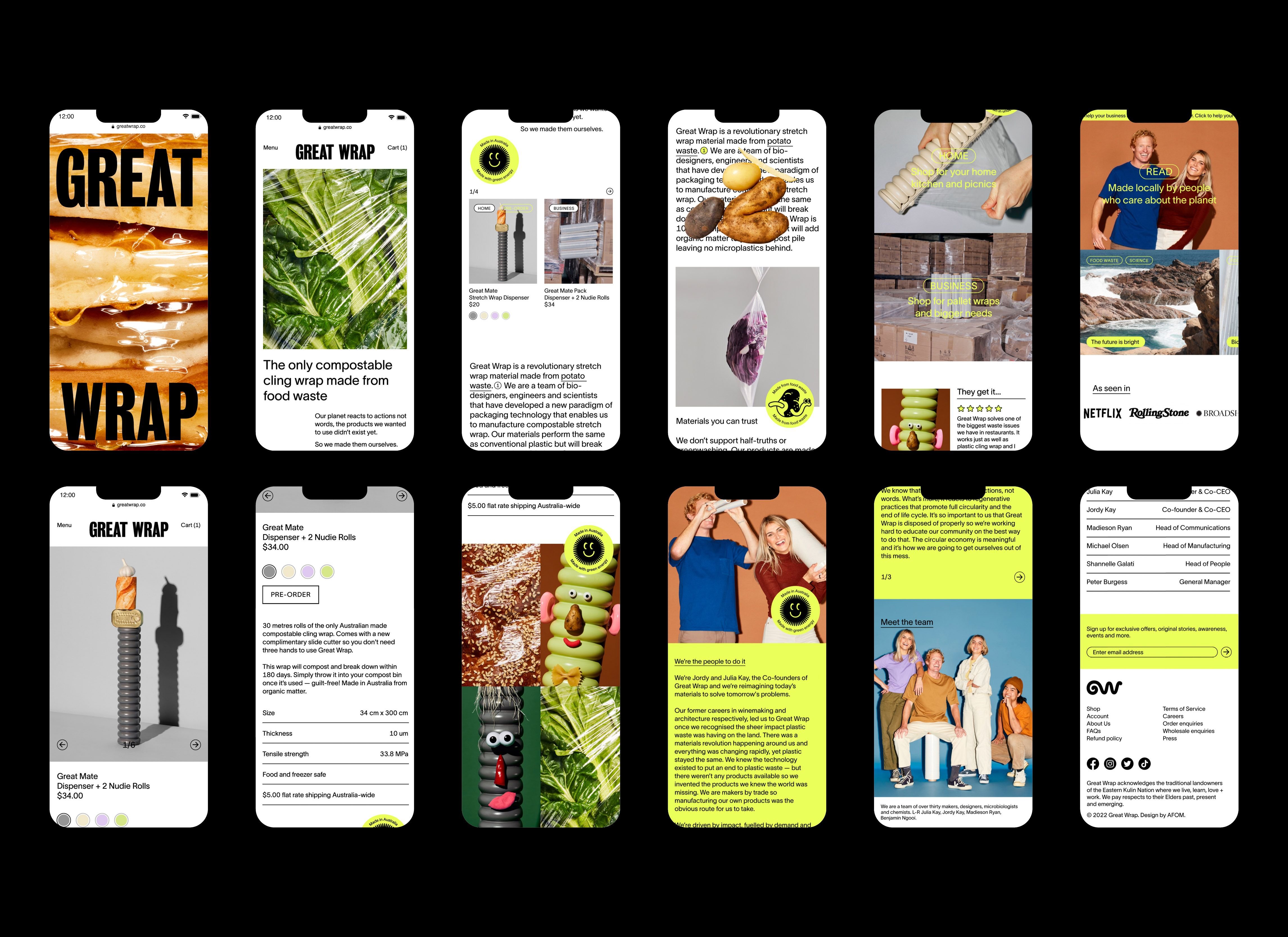
Great Wrap is the Australian-made solution to our global addiction to featherweight food-films with heavyweight environmental footprints. Unlike its petrochemical byproduct counterparts, Great Wrap is made entirely from composted food waste (primarily potato peels), and is then easily composted again once used. Ashes to ashes, compost to compost. There is something deliciously (if disgustingly) circular about this symbiosis of intended purpose and product lifecycle – food being kept from rotting by ghostly, gossamer sheets of reincarnated rotten food.
Suzy Tuxen and Rachel Chew of Australian design studio A Friend of Mine have led the rebrand of Great Wrap for its North American market launch.
Julia Kay, Co-founder & Co-CEO of Great Wrap says of the guiding principles of the rebrand ‘we wanted to instil trust and a level of technicality in our brand whilst still maintaining some of the personality the brand has always had’. Similarly, in their case study, AFOM talks of wanting to ‘balance the brand’s scientific approach’ with playful personality, and, accordingly, they ‘repositioned the brand as more than an eco-friendly brand, but a material science company that is a game-changer in its field.’
Perhaps this is a case of case-study post-rationalisation that doesn’t fairly set the work up, but if we take AFOM at their word and measure the brand against this stated aim, then the resultant design seems heavily skewed in favour of the ‘playful personality’, with scant sign of that game-changing scientific approach. However, the brand excels in creating that playfulness in spades.


That playful personality is most clearly crystallised (and the ‘serious material science company’ vibe feels most tenuous) when we’re being stared down by the surreally anthropomorphised Great Mates – characters formed by adding googly eyes and various Mr. Potato-Head-style noses, lips and ears to the distinctively ribbed dispenser that Great Wrap is sold in.
The idea is fun, and although something about the slightly sardonic execution somehow feels at odds with the intended tone of the brand, the disconcerting googlies of the Great Mates are powerful brand ambassadors.

A potential problem with the focus on the Great Mates is that it emphasises the novelty design of the container over the innovation and material qualities of the wrap itself. In doing so, the brand moves further away from the stated mission of presenting themselves as material science innovators, and further towards the once-cutting-edge but increasingly new-normal brand space of playfully trendy eco-consumer products (think fellow Antipodeans Who Gives a Crap, by Swear Words, or Nuud by Mother).


The problem extends beyond just these mascots though. Whilst undeniably well-presented, the imagery of Julia, Jordy and their Great Mates (along with much of the supplementary photography of food items and cardboard boxes) feels decorative and ultimately evasive. We see a series of ideas that are all trying to inject colour and texture into a brand that necessarily revolves around a transparent, near-invisible material. When the photography focuses too hard on either on the packaging that Great Wrap comes in (or the food items that it is used to wrap) it shies away from the product itself. There is a sense of a missed opportunity to play with more abstract representations of this mysterious material: to visually celebrate its chemical innovation, its distinctively elastic, adhesive, gravity-defying properties, or the poetic circularity of its function and form.
The Great Wrap brand is a tale of two logos. There is a rather stark, condensed Gothic sans-serif wordmark, that exists alongside and overshadows a much lovelier monogram logo. The wordmark feels more hard-edged than playful, but it does feel more authoritative and confident than Great Wrap’s previous wordmark (which was all lowercase apologeticness and punctuated by a limply conventional full-stop). Combined with the modernist form of the wrap container (that is echoed elsewhere in the shape of image containers) the wordmark conjures a diluted Memphis brutalism that risks feeling a little like a loose thread in this stylistic tapestry of a brand.
That deliciously supine monogram, on the other hand, feels like the tip of a much better iceberg. It is executed in an undulating, worm-like single stroke that is brilliantly evocative of both the organic composting processes that are the real innovation of Great Wrap, and the fluid material properties of the product itself. Seeing it interact with the pleasingly crisp Grotesk sans-serif brand font TWS Lausanne and the acid yellow/green from the colour palette gestures towards a potentially more successful way of achieving that stated objective of balancing material science clout and eco credentials with playful consumer appeal.
![]()


There are also some very nicely illustrated sticker badges that fit well with this underused monogram logo. One that features a tenacious little worm crawling through a picturesquely decomposing potato feels like a possible contender for an even more successful and flexible ‘mascot’ than the Great Mates.
Where the Great Wrap rebrand succeeds, it really sings, even though the sum of the parts doesn’t quite add up to a whole. However, in their tireless efforts to inject so much vibrancy, humour and dynamism into a cling-wrap brand, AFOM’s inventiveness is truly commendable, and a fair and fitting match for the technical innovation of Great Wrap itself.