Another Collective’s identity for smash burger brand Brusco deftly reinvents classic burger joint design tropes
Opinion by Emily Gosling Posted 4 June 2026
Food trends are a funny old thing aren’t they. And just as design trends are never just about ‘aesthetics’ – the ‘what something looks like’ divorced from the world around it, food trends aren’t just about ‘edible stuff’, or ‘what things taste like’.
Such movements both hold up a mirror to, predict, and feed back to us (literally, in the case of food) far more wide-ranging goings-on in everything from how we feel about ourselves, to how we feel about each other; to what’s worrying us; to the anything and everything of things like economic, societal, and political shifts.
Take avocado toast: the ultimate shorthand for a weird elder millennial paradox of entitlement, ‘hun brunch’ culture, and genuine struggles to get onto a housing ladder that seemed so accessible for the generations that came before; those who managed to land a career in those heady pre-lapsarian, pre-2008 financial crash years.
All of this is a lengthy preamble to a rather confusing food trend of recent years: smash burgers. What’s that all about,then? At once the most manospherish/brutish approach to a burger (‘YO BRO IT’S LIKE A BURGER BUT WE, LIKE, SMASHED THE SHIT OUT OF IT!’) and the most apologetic (‘Yes it’s a burger but nice and squished and small and delicate’.)

Do they taste nice? I have no idea. Do I understand them? Absolutely not. But there’s no doubting their rise and rise: food site Eater dubbed 2024 ‘TheYear of the Smash Burger’. A really nicely written piece on iD sums up the trend in a fascinating, if scathing summary: “In choosing the smash burger, we accept a compression of choice; we consent to a flattening of creativity.”
However, absolutely no one could possibly level the charge of a ‘flattening of creativity” at this absolutely smashing (yeh I went there) brand identity by Porto-based Another Collective for smash burger joint Brusco.

Another Collective worked across the creative direction, visual identity, brand communication, storytelling, and naming for Brusco, which is described as a smash burger brand with a mission to “elevate fast food without stripping it of its soul”.
What I really love here is how – perhaps like the smash burger itself – the identity knowingly pilfers from many great, heritage-laden, tried and tested fast food design tropes and deftly reworks them into a resolutely contemporary, flexible identity system that’s honestly just gorgeous to look at.
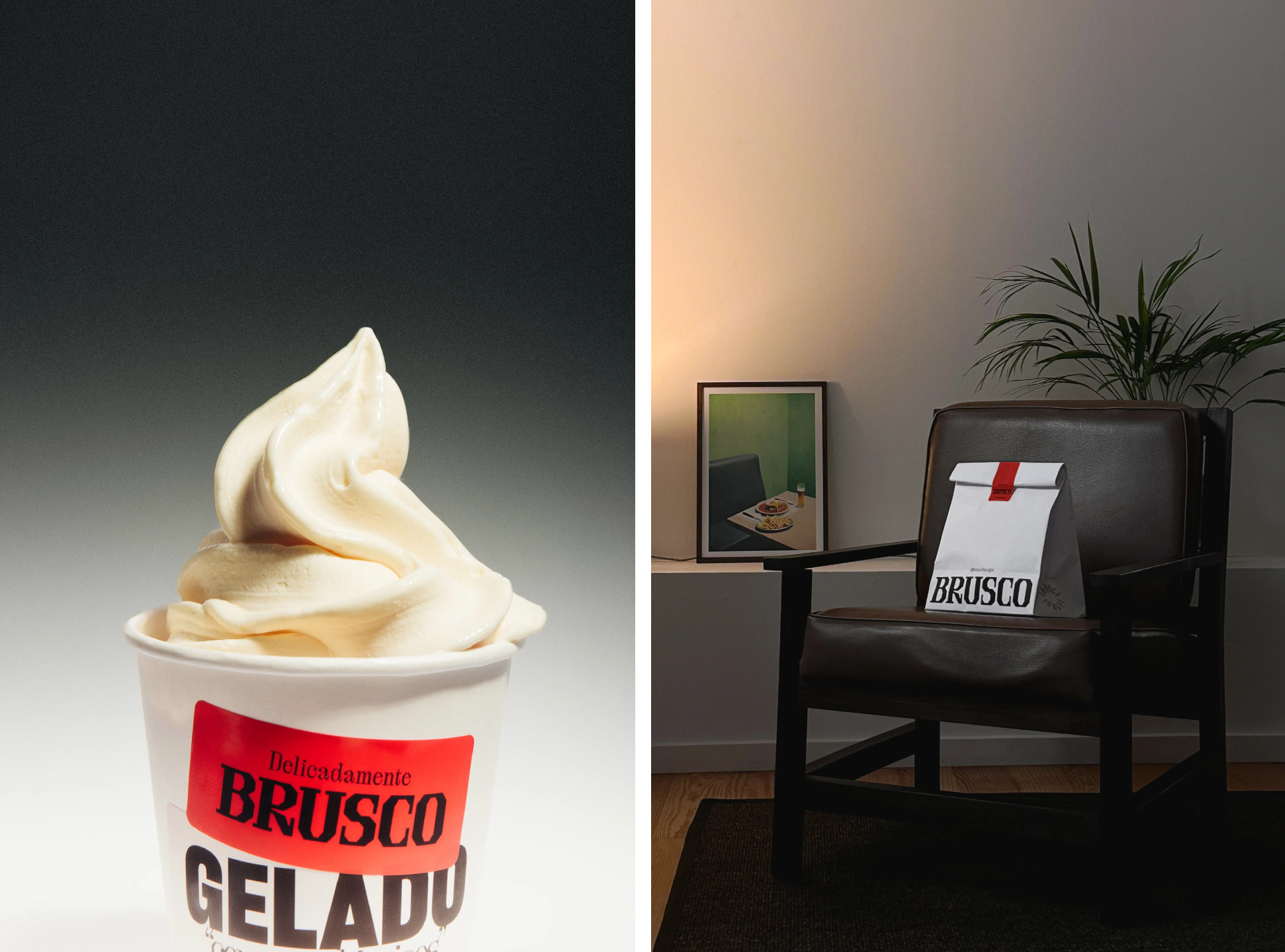
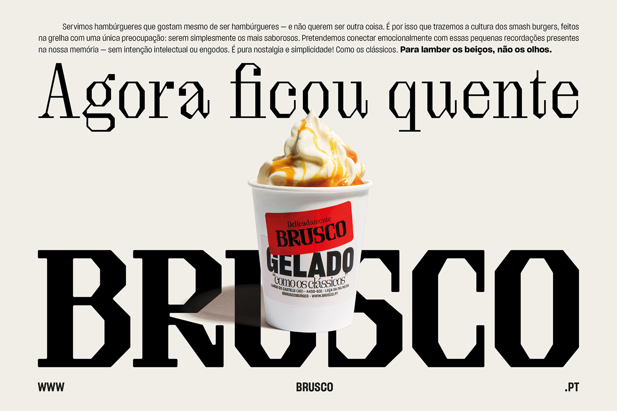
It’s a masterclass in how to do so much with so little in this sort of fast food environment: this identity is skilful in how it packs a punch with such simplicity: just red, off-white and black.
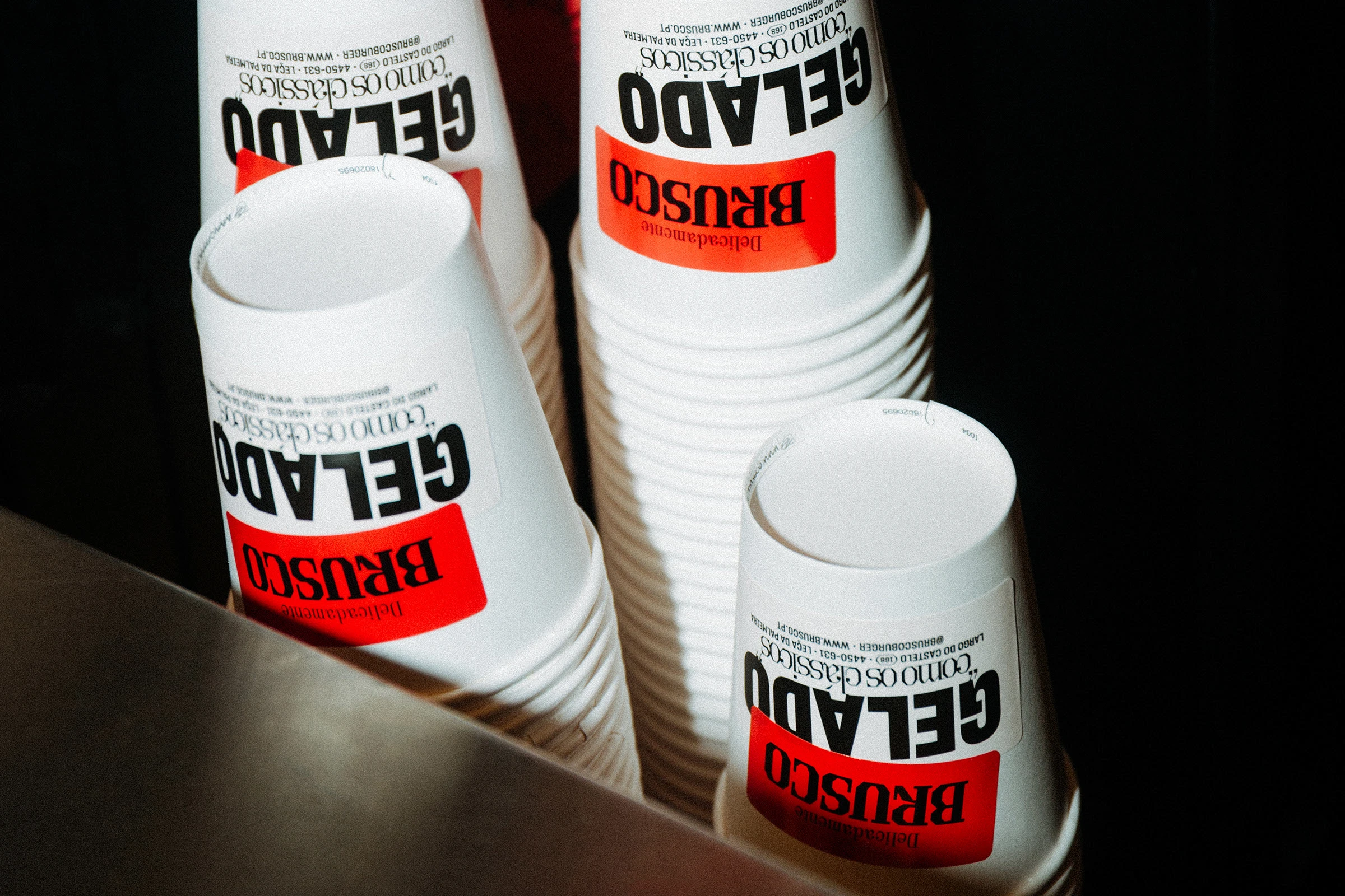
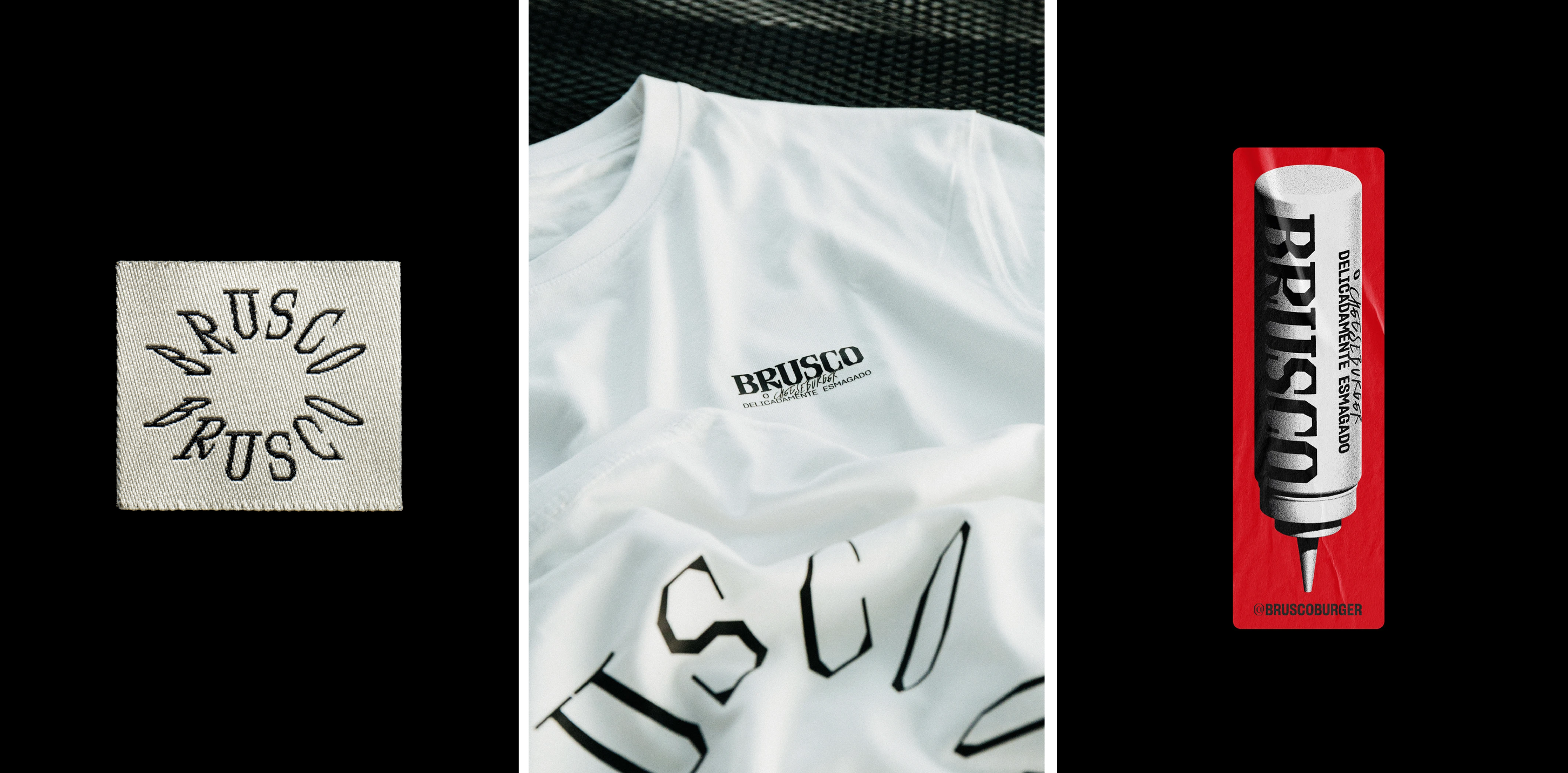
I absolutely adore the wordmark: it feels genuinely different, original, and brave. The mark uses a bold, chunky form of a delightful serif font, Brut by Off Type, a sister foundry to the excellent Canadian typesmiths Pangram Pangram.
Brut is described by its creators as “an unexpected alternative to today’s (and yesterday’s) high-contrast serifs,” which sums it up nicely, and it works brilliantly here as a font that’s not too out-there, but certainly has its quirks. And the way it carries a weird half-digital, half-tactile texture makes it a dream as a brand font for something like Brusco.
Aside from the wordmark, Another Collective opted to use Sharp Grotesk by Sharp Type, a brilliantly versatile sans that proves to be a counterpart to the wordmark that’s legible, but again, slightly off kilter in all the right ways.
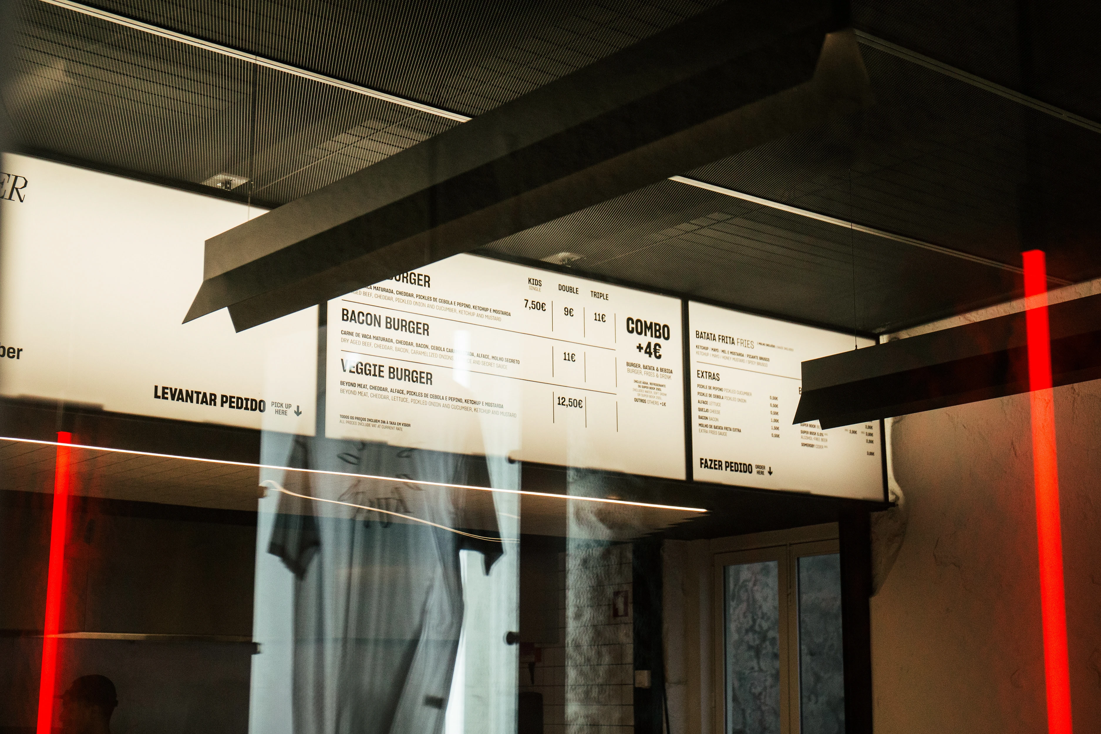
That tension between familiarity and freshness runs through the wider identity. Rooted in the reassuring visual lexicon of classic burger joints, it taps into the emotional pull of such places – the rituals and small pleasures attached to them – while ensuring every element of the experience, from the interiors to the packaging, feels part of the same story.
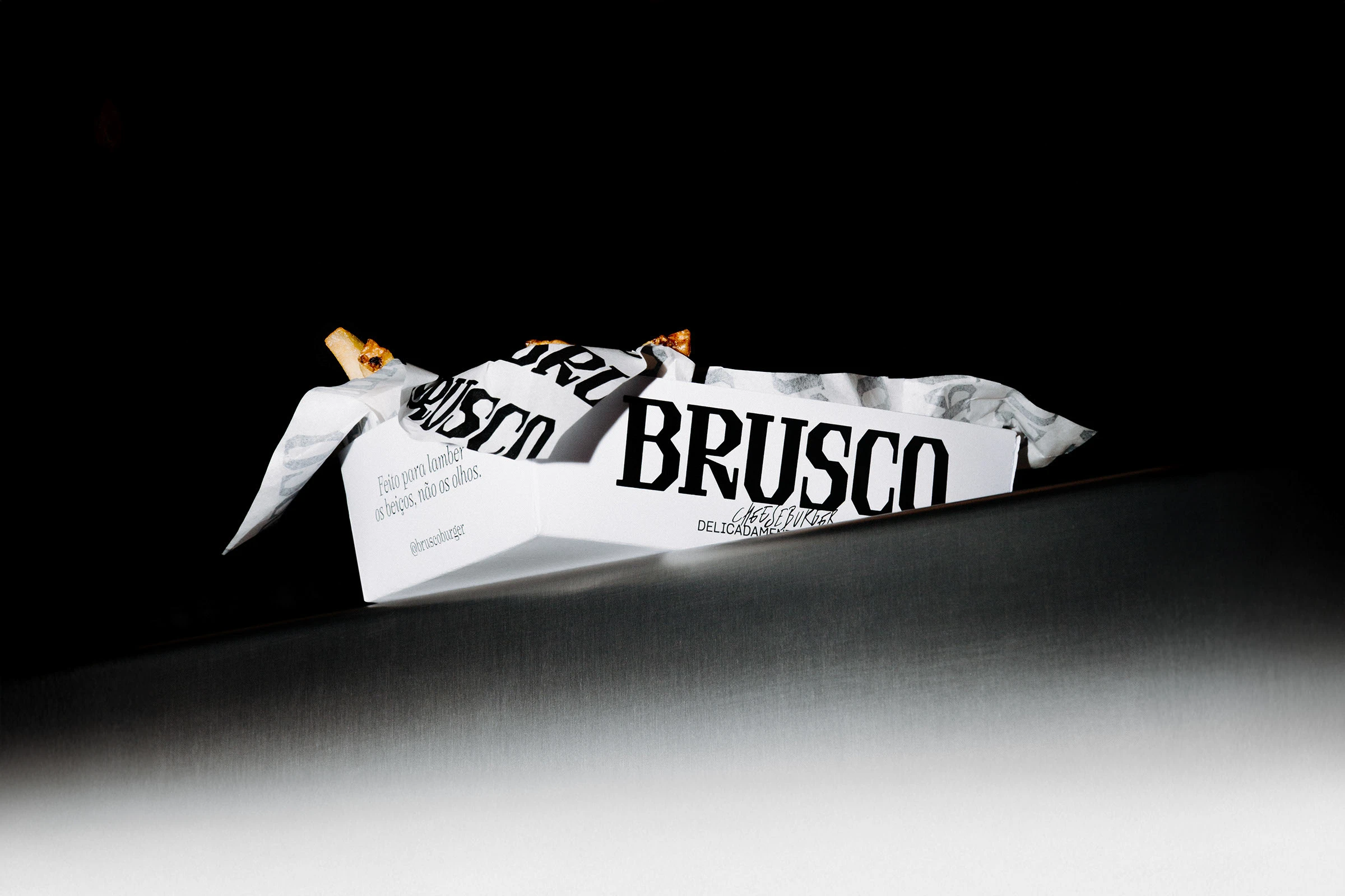
The system is unapologetically type-led, using bold, hefty letterforms: emblazoned across takeaway boxes, cups or environmental graphics, it’s a superbly coherent yet constantly surprising, lively visual language that carries effortlessly from product to physical space.
Throughout, the logo is given room to do the heavy lifting. Rather than being one component among many, it becomes the central character in the brand’s communications.
What’s particularly effective is the way the identity balances nostalgia with a sense of restraint. There’s a deliberate roughness to it; something raw and immediate that aims to echo the smash burger itself as it hits the grill. Yet that energy is tempered by a level of precision and sophistication that stops things tipping into gimmickry. The result is an identity that feels simultaneously premium and unpretentious; gritty without being aggressive, proving just how much impact can come from a confident idea executed with clarity and conviction.