Creative Spark’s bold, no nonsense identity for hair loss brand Leo
Opinion by Emily Gosling Posted 9 June 2026

Leo is billed as a “hair rejuvenation brand”, founded by duo Jason Saks (who carries the rather sweet, and quite funny job title of Director of Hair Loss) and his son Joe, with the broad aim to make hair loss feel “less isolating and less complicated”.
According to Manchester-based design agency Creative Spark, which has created the superb new identity, Leo is the new proprietary brand from Saks, a leading distributor in the UK hair restoration market, which had previously relied heavily on third-party products. Their ambition with Leo was to create something that could future-proof the business, but they faced the challenge of entering an already-crowded market with a tonne of existing brands ranging from legacy pharmaceutical giants to “sleek, tech-led newcomers”.
What I think works really well here is the no nonsense, unabashed clarity and confidence here: despite its prevalence, hair loss still carries stigma; it remains the butt of mean/rarely funny jokes.
A little like treatments like Ozempic/GLP1, and to a lesser extent, botox, hair loss treatment is probably not something which people that use it discuss very openly. Maybe that will change, but for now, there’s still a degree of unnecessary shame around it all; but Leo manages to both be discreet and look like any other modern, efficacious lifestyle brand, and simultaneously be stridently bold in its visual and verbal tone of voice.
It’s a clever move: Leo is bright, it’s pretty unmissable, but it doesn’t shout about being for hair loss. It fits into any person’s bathroom cabinet/bedside table seamlessly. It’s not Hair and Me, which is very obviously for hair(and you/me, obv) – Leo is a name (and brand identity) that’s oblique enough to hide if you need it to, but is anything but a shrinking violet.

A couple of things could be improved on here however, in my opinion: on its website (a very nicely designed website), the brand states its aim as “to give men and women the tools, knowledge and support to take control of their hair loss”; however the art direction (and, arguably, the name) feel very male-centric – especially in the brand photography, which as far as I can tell, exclusively features men.
Likewise, the copy can be confusing: aside from that mention of women on the Leo homepage, the ‘About’ section of the site explicitly states its mission as to create “proven treatments, expert support, and a space where men can take care of their hair without feeling like they need to change who they are”.

It’s not a huge gripe within the context of an otherwise-excellent project, certainly worth mentioning, as it feels confusing,and potentially undermines the brand a wee bit if its purpose, audience and aims aren’t as clear as they could be.
Absolutely nothing wrong with a brand targeting only men, but I feel it’s important to be quite clear on that – especially in the field of hair loss, where some medications are only prescribed to men,thanks to their potential issues for pregnant women, for example. Bodies are different between the sexes, and treatments for bodies need to acknowledge, not just brush them under the proverbial carpet with woolly language.
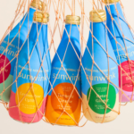
However, onto the good stuff – and it’s here in abundance. The absolute standout element of this project for me is the packaging: it’s so simple, the colour choice is just gorgeous – just an almost Yves Klein-ish rich blue, white and black.
And it does that smart thing where it’s sort of a lifestyle or beauty brand, but also heavily borrows from seemingly unrelated sectors – here, that’s a sort of boutiquey hip fast food joint. I love the burger wrapper style paper linings in the packaging boxes; the mixture of tactility and slick minimalism, the marriage of loud colour and short name, set in absolutely unapologetic all-caps typography.
The main brand font here is Field Gothic from Dublin-based foundry Signal – a deliciously chunky sans inspired by
Massimo Vignelli’s iconic Unimark subway signs. Its robust, but resolutely legible letterforms make it a great choice as a brand font and wordmark, but it’s also versatile enough to work in longer swathes of text, too.
Elsewhere, as a secondary font Creative Spark opted for another Signal sans, Tenon, described by its creators as “a plain, efficient sans that marches through the uncanny valley between grotesk and geometric, with almost circular bowls that lend extra energy to the line”. Again, it’s all about clarity, making the whole Leo brand a love letter of sorts to the striking simplicity of Mid Century Swiss Modernism – both in type and colour palette – but striking enough to feel totally contemporary, and crucially, also convey the idea of trustworthiness that’s essential for brands in a sector like hair loss.
That emphasis on clarity extends far beyond the visual identity. Creative Spark’s strategy was rooted in the idea that while plenty of competitors have elevated the category aesthetically, few have addressed the emotional realities underpinning hair loss. Through conversations with specialists, barbers and people experiencing hair loss themselves, the studio identified a tension that feels immediately recognisable: the uneasy space between wanting to do something about hair loss and not wanting that desire to be mistaken for vanity.
It’s an approach that informs everything from the naming and verbal identity to the straightforward, often gently humorous tone of voice, as exemplified in the central proposition: “wherever your head’s at”.
The illustration also plays into that gentle playfulness: I love the simple, almost skate-sticker-like style here, which (another nod to that subtle humour here) seems to focus largely on cute little images of spiky cactuses – plants that are famously sort of hairy, sort of not, and always iconic.
The resulting brand feels refreshingly human. Where so many players in the category lean heavily into either medical authority or glossy aspiration, Leo occupies a middle ground that acknowledges vulnerability without wallowing in it.
Most importantly, it demonstrates that differentiation in crowded sectors doesn’t always come from inventing something radically new. Sometimes it’s simply about speaking to people with a greater degree of empathy, candour and understanding than everyone else.
Leo’s identity succeeds because it recognises that hair loss isn’t only a physical concern: it’s wrapped up in ideas of identity, confidence and self-perception. Creative Spark has translated those complexities into a brand that feels optimistic, distinctive and, above all, confident and sincere.