Studio Blackburn’s branding for Ellis Butchers is unflinchingly carcass-centric, yet somehow so full of warmth
Opinion by Emily Gosling Posted 7 July 2026

As a vegan of two decades, and a squeamish one at that, the thought alone of a “whole-carcass butcher business” makes me feel rather queasy – so it’s a testament to Studio Blackburn’s incredible skill that despite my personal nonsense, I absolutely adore this branding project. And I love it not in spite of things like the utterly unflinching, raw-flesh-laden art direction, but in part because of it.
The project in question is Studio Blackburn’s work for Ellis Butchers, for which the London-based studio was tasked with working across the brand strategy and architecture, visual and verbal identity, character Design and Illustration, environmental graphics and signage, and packaging designs.
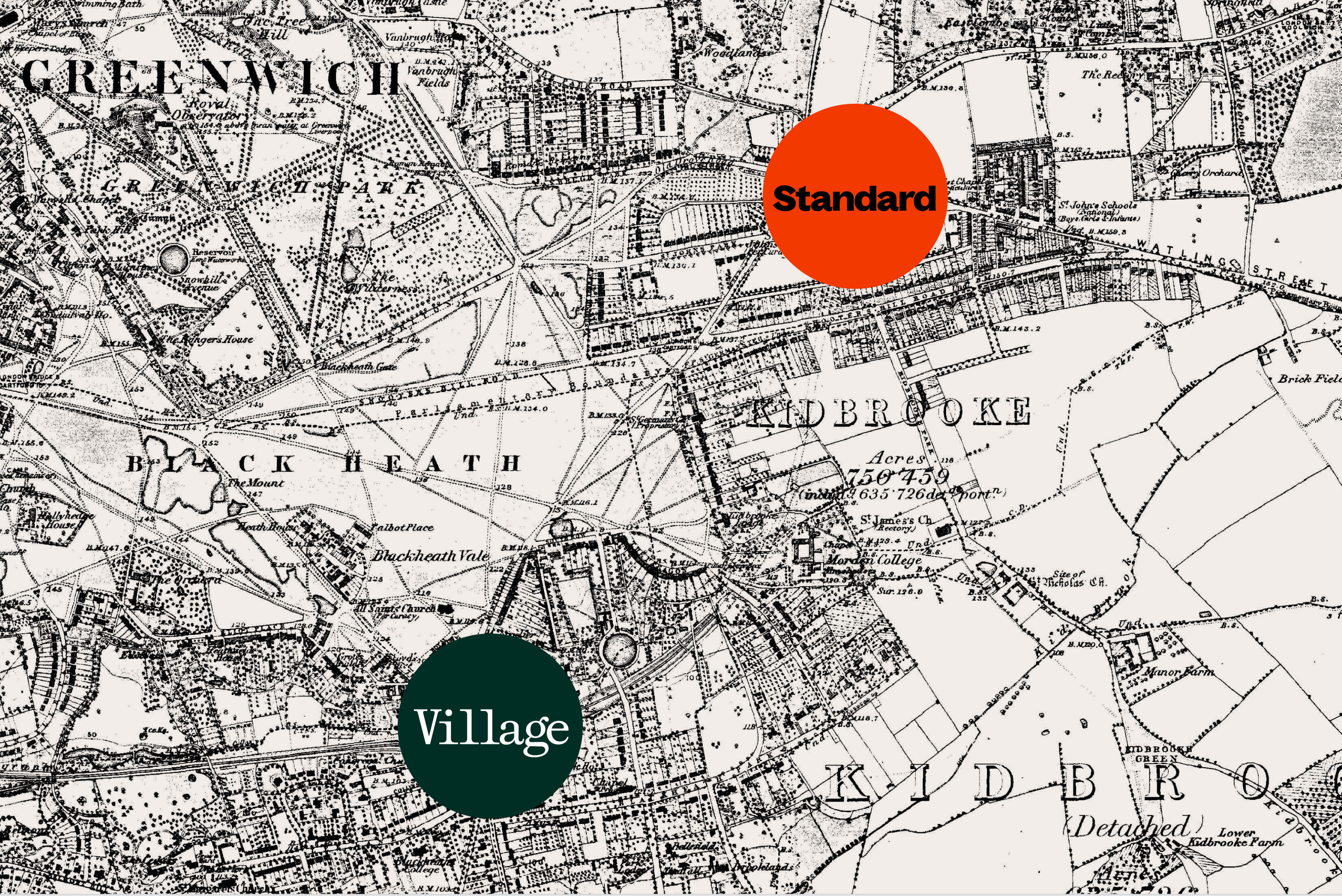
Ellis Butchers was founded by Nick Ellis, a butcher who’s been in the trade for 20 years and counting. The business comprises two shop locations in Blackheath, south London – one in Blackheath Village, the other in an area called Blackheath Standard.
Studio Blackburn was briefed to create a new brand strategy that would help shift the business into a “pioneering, sustainable whole-carcass butcher business”, with an identity that served to differentiate the two locations to serve their specific local audiences while maintaining a cohesive, premium parent brand.

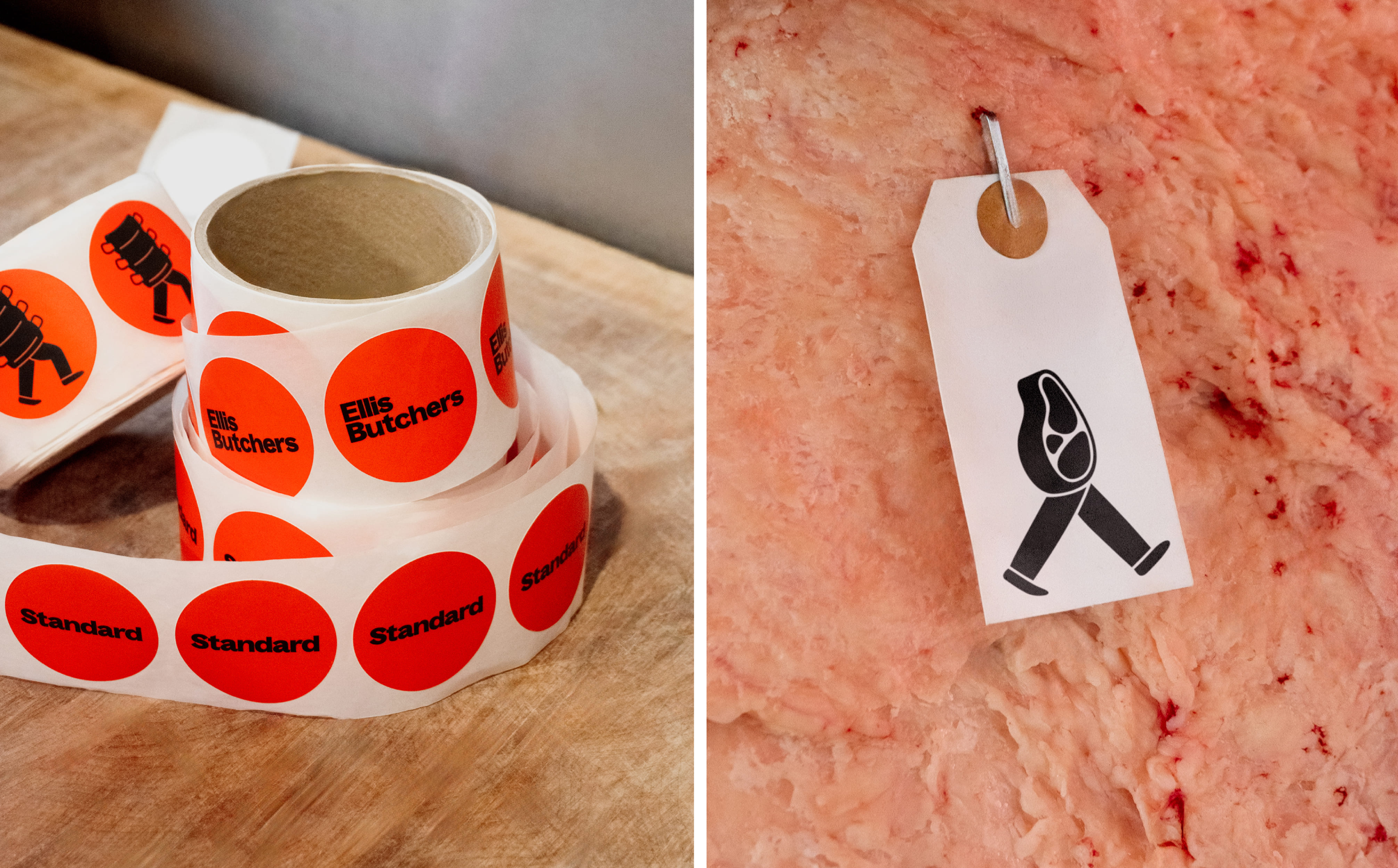
The wordmark is set in the bold condensed weight of Bagoss by Prague-based Displaay Type Foundry. It’s a great choice and a gorgeous font which reveals its quirks gradually, the more time you spend looking at it – the square dot on the ‘i’, the sublime exaggerated contrasts on the strokes of the lowercase ‘u’ – a dream as a brand font for something like Ellis Butchers, succinctly communicating modernity and prestige, while feeling absolutely ownable and timeless.
Bagoss is also used across the majority of brand applications, from signage to stickers, packaging, labels, tags and more. It’s supported by Gaisyr by Berlin-based foundry ABC Dinamo as a secondary typeface, a serif which, again, becomes more and more unusual as you spend time with the letterforms.
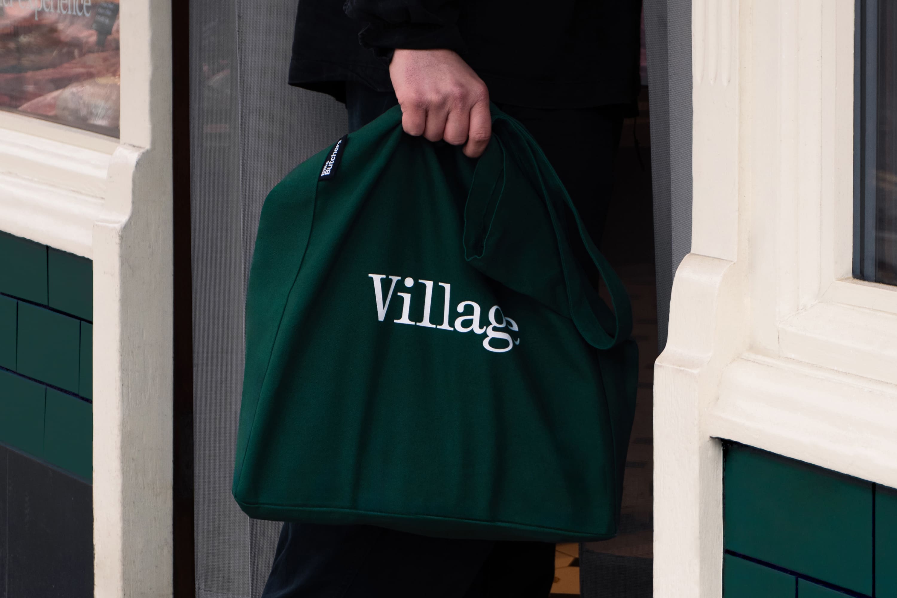
Gaisyr is used sparingly, but where it is used, it’s strangely powerful: the letterforms are truly elegant, delighting in a “tension between strict geometry and loopy hand-held gestures” – and according to the font’s designers, these letterforms’ starting point was sketches by the early 18th Century royal typographer for King Louis XIV, Jacques Jaugeon, no less. As such, the ornate stuff makes sense, and again, it works brilliantly for a business like this one.
Where Studio Blackburn really shows its deftness of hand here is in the effortless balance of playfulness and prestige: I am obsessed with the illustrations – they’re borderline silly at times, and all the better for it – but alongside the font choices and art direction, never veer away from absolute professionalism and trustworthiness.



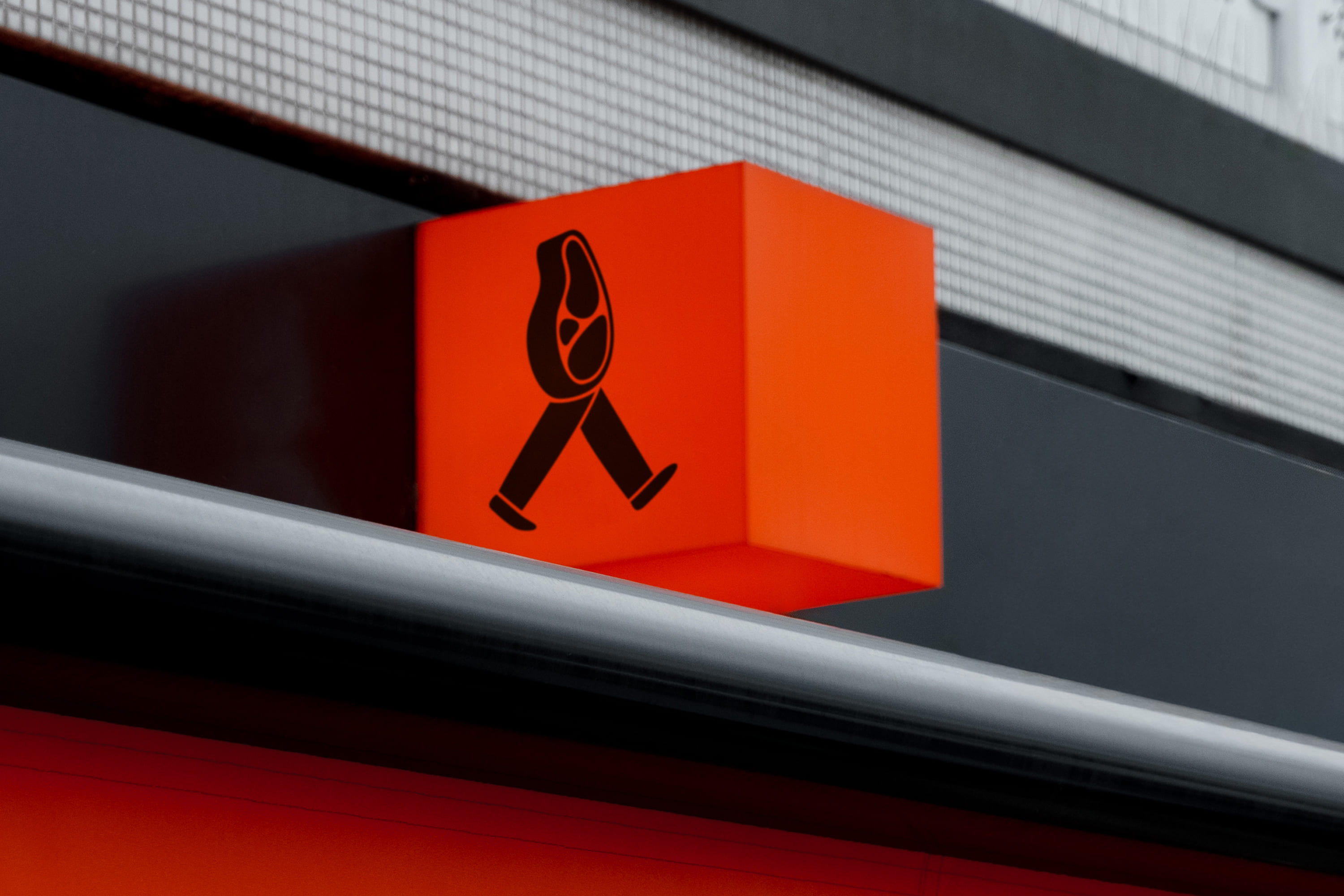
But yes, let’s talk about those superb illustrations – all thick black linework and proof of the power of simplicity when done well. How on earth Studio Blackburn has managed to make the potentially rather grisly Pink Floyd-esque sausage making machine so totally adorable is beyond me, but my god have they done just that.
The cast of meaty illustrated entities is led by a character Studio Blackburn has dubbed Meat Ellis, and according to the studio, these creatures aim to embody the overarching spirit of the identity. As such, they aren’t just decorative, but a key part of the brand’s tone of voice – one that looks to be as humorous as it is traditional. They work seamlessly across physical and digital touchpoints, appearing on signage, online, on social and on merch such as some delightfully lurid orange tote bags.

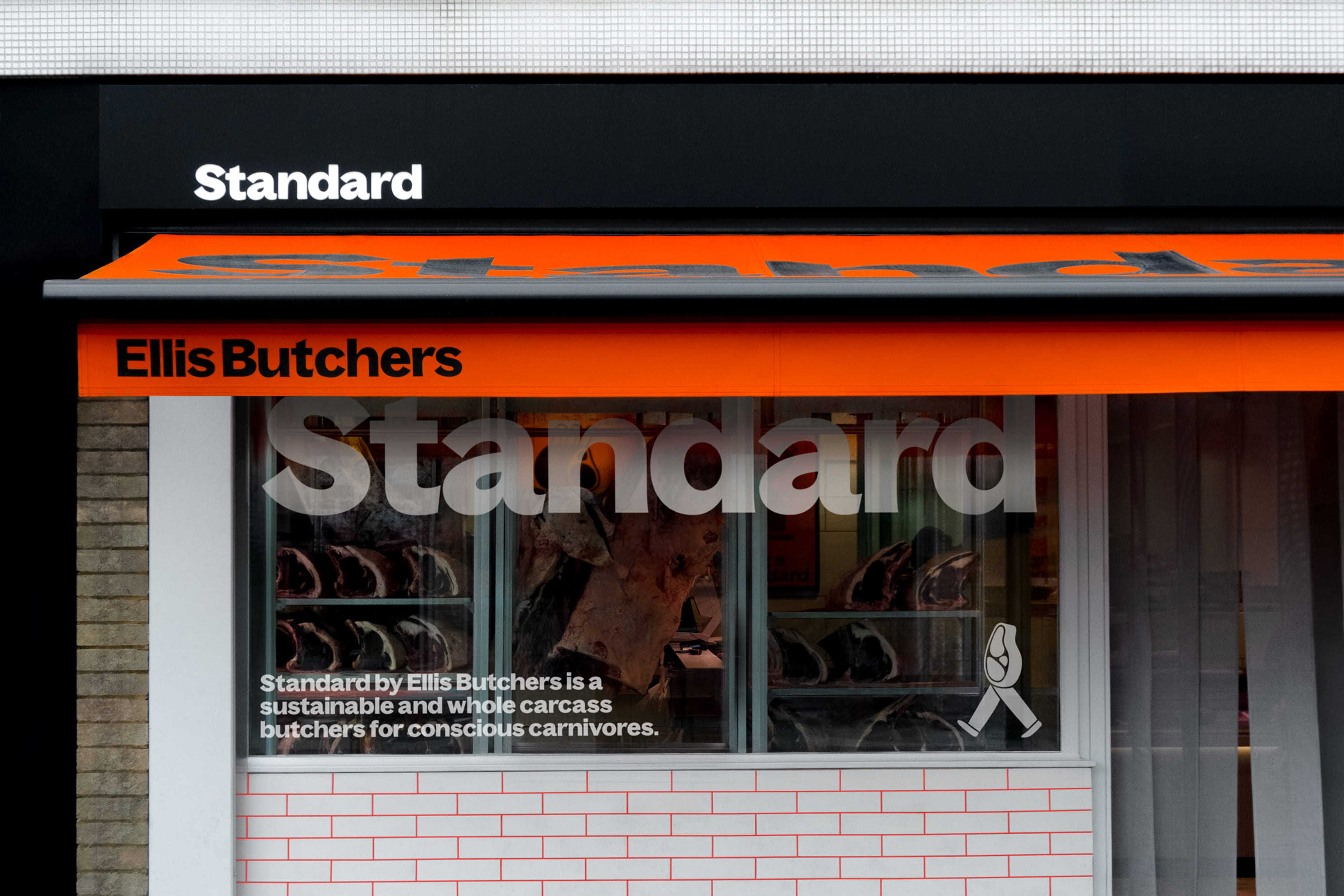
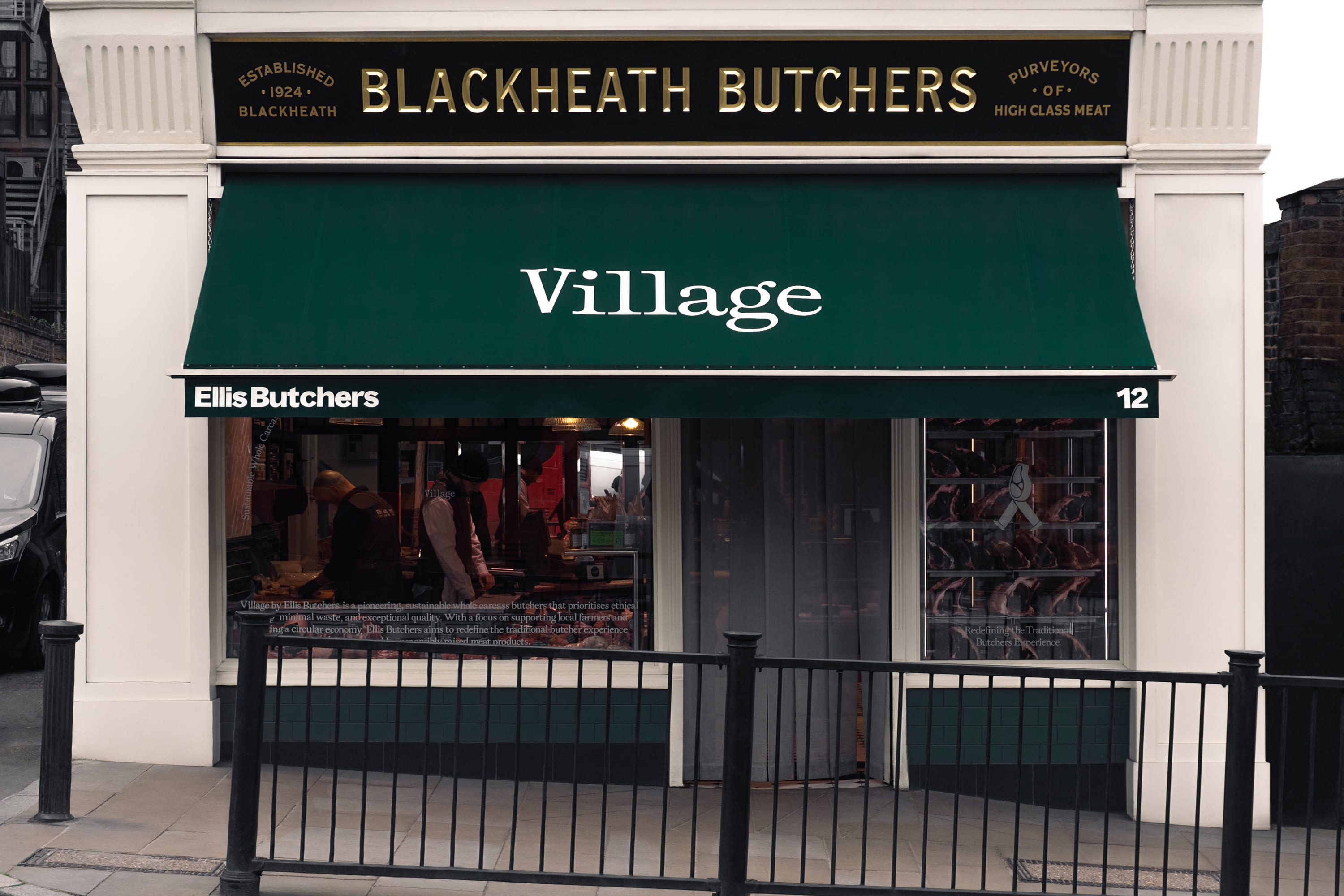
That ridiculously loud orange hue is the main way that the identity differentiates between the two sites. To mark the fact that the Blackheath Village site has significant historical value: having been purpose-built as a butcher’s more than 100 years ago, it is the only shop in Blackheath Village that has continuously operated in its original role.
This is denoted by the use of a classic-looking logotype and a dark, sophisticated green colour palette; as well as with interior flourishes such as the use of traditional tiles. It’s very Country Life magazine – so much so that it might as well be wearing a Barbour and speaking in that accent that’s so posh as to sound like a soup of vowels rather than discernable English words. But that’s ok, that’s probably the point – it’s very obviously ‘classy’.
Meanwhile the orange comes into play for the Blackheath Standard location, which bears a much more modern, vibrant identity: the type is bolder, the colour is unmissable and unapologetic, and therefore more youthful by default than the racing green of its Village sibling. Both are united under a parent brand that stands for absolute excellence and ethical sourcing.
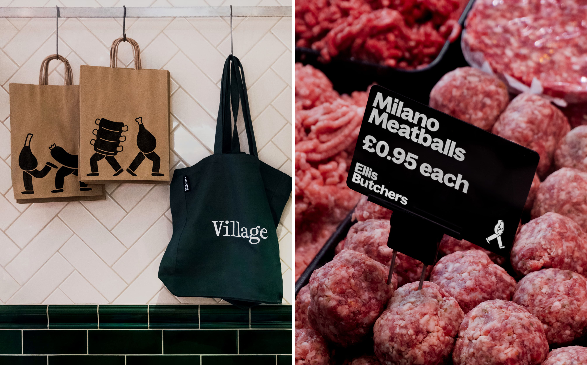
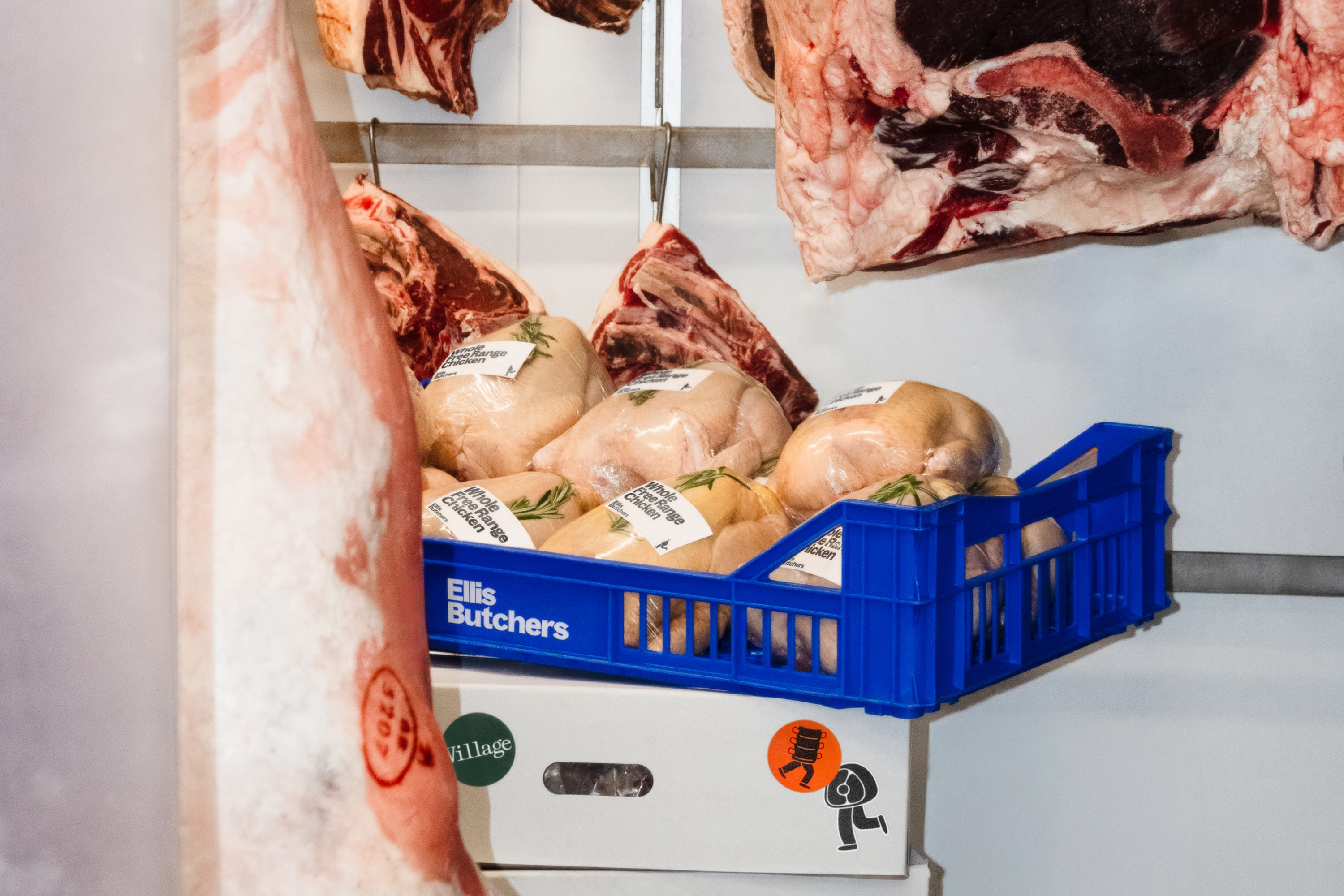
I’ve never understood brands that are about meat, or a particular animal-based product, and yet blithely use depictions of the living version of said animal as a brand asset – and Ellis Butchers’ identity couldn’t be further from this. The photography is graphic as hell – it’s very carcass-centric, very bright, very fleshy and gristly and no-nonsense, and I admire it all the more for that. After all, if you’re going to eat meat, let’s not shy away from the fact it’s literally a corpse.
Even squeamish little vegan me is very much down with these design decisions, because of how they fit into the overarching brand strategy and visual system: the general sensation here is absolutely one of warmth; community; connection – a hard-learned, decades-honed craft at the heart of a very local business, but one which now has an identity as articulate and robust as any household name brand.