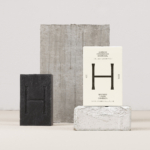
Minimalist packaging started life in galleries. Today it’s on bathroom shelves, in grocery baskets and commanding a premium in categories where consumers increasingly equate simplicity with quality. What began as a design philosophy has become one of the strongest visual signals of quality, purity and value.
A study of more than 1,000 consumer products sold through the largest supermarket chain in the US found a direct positive relationship between packaging simplicity and retail price. Consumers consistently associated simpler packaging with higher value. Fewer design elements suggested fewer ingredients, which in turn strengthened perceptions of purity and quality. In categories built around naturalness and clean labels, simplicity has become another ingredient.
The thinking behind it stretches back much further than supermarket shelves. “Less is more” is usually credited to Mies van der Rohe, but the phrase was passed to him by his employer Peter Behrens around 1907 after Mies presented too many design options for a factory façade. Robert Browning had already written the same words in Andrea del Sarto more than fifty years earlier. Mies simply turned the phrase into one of the defining principles of modernist design.
Those ideas eventually reached packaging. Apple, Muji and Aesop built their identities on exactly that idea long before minimalism became fashionable.
Aesop’s amber glass bottles, still the brand’s defining asset nearly four decades after launch, weren’t originally chosen to create a recognisable identity. Founder Dennis Paphitis selected amber glass because it protected plant-based formulations from UV degradation without relying on additional preservatives. The material solved a technical problem while giving the products a pharmaceutical appearance at a time when skincare was dominated by glossy finishes, pastel colours and fragrance-led branding. Restrained typography, generous negative space and understated labels all followed naturally from that original decision.
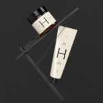
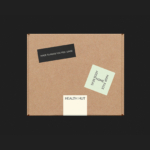
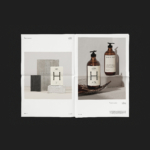
LG2’s rebrand for Health Hut centres the identity around a single symmetrical “H”, developed around the idea of balance. Applied consistently across amber bottles and off-white labels, it works simultaneously as logo, graphic device and layout structure. The same symbol holds the range together whether you’re looking at a bottle, a carton or a shelf full of products.
That distinction matters. A Journal of Marketing study found that store-brand products using minimalist packaging don’t benefit from the same quality perceptions as established brands because consumers already associate own-label with lower investment. Material choice, structure and brand positioning all influence whether simplicity is read as confidence or simply as less.
Minimalism is not a shortcut and it won’t suit every brand but when the category, product and story align, it’s still one of the most persuasive tools in design.