JKR overhauls football club Sporting CP by doing what it does best : plundering heritage to build a robustly simple, contemporary brand identity
Opinion by Emily Gosling Posted 9 July 2026
JKR is perhaps – in recent-ish years at least – best known for its work with Burger King, undoubtedly one of the most oft-cited rebrands of the last decade in design circles. Then it did KFC; before that, the RSPCA, alongside a raft of other household name entities which aren’t acronyms – Uber, Boddingtons, Yahoo, Billington’s sugar. In short, hugely famous brands overhauled by a hugely famous agency.
It’s interesting, then, to see JKR’s latest project tackle a name that’s likely massive in its native Portugal, but far less so outside of it (especially to the football-uneducated, like moi): Lisbon Primeira Liga football club Sporting Clube de Portugal, better known as Sporting CP, which is famed for nurturing the early careers of footballing greats including Cristiano Ronaldo and Luís Figo.
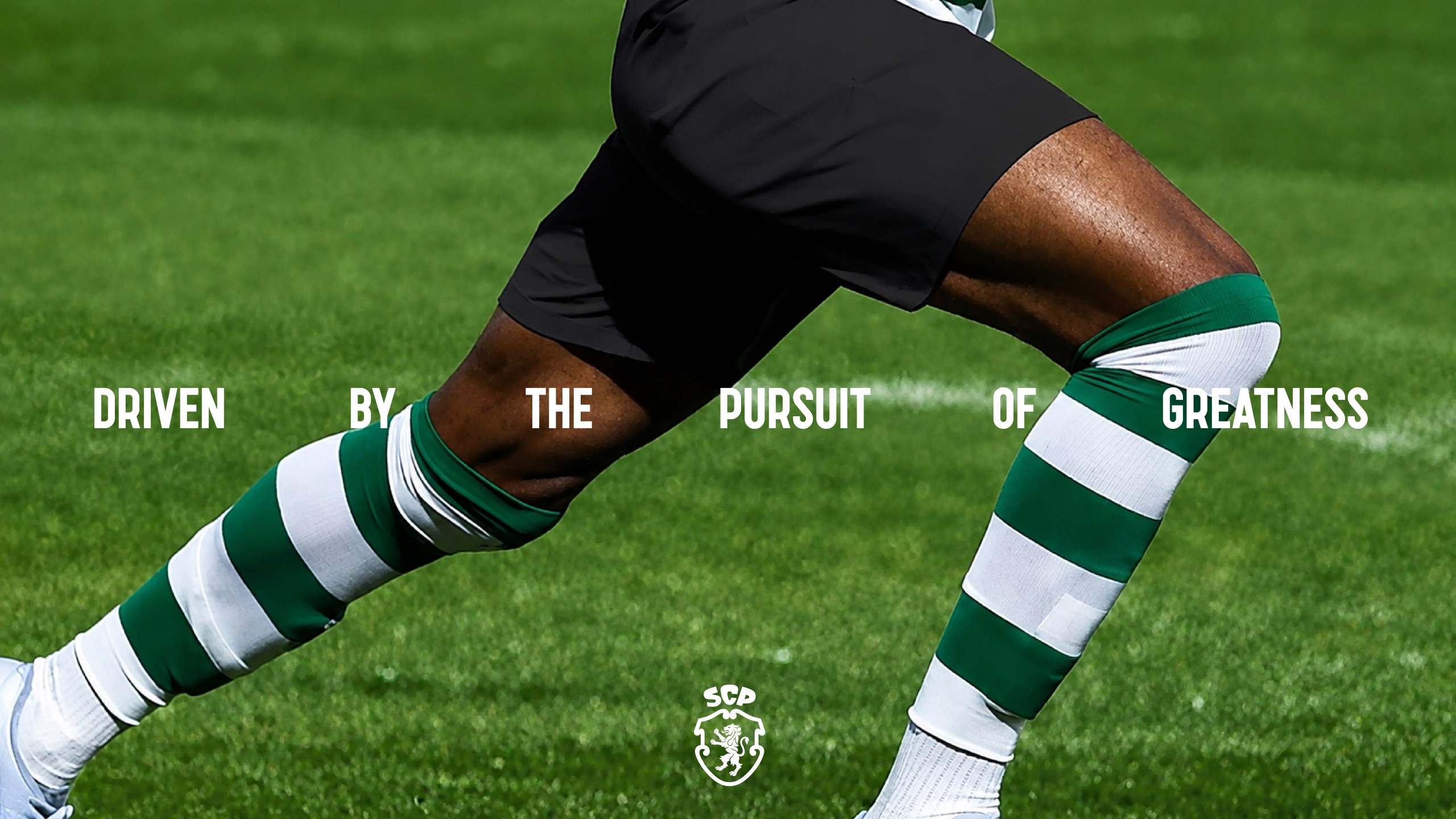
JKR was brought in to create a new identity for the club to mark its 120th anniversary, one which would directly wear its history and legacy proudly – respecting and retaining Sporting CP’s faithful longstanding fans – while also looking to attract newer, younger audiences. So far, so typical when it comes to design briefs, then.
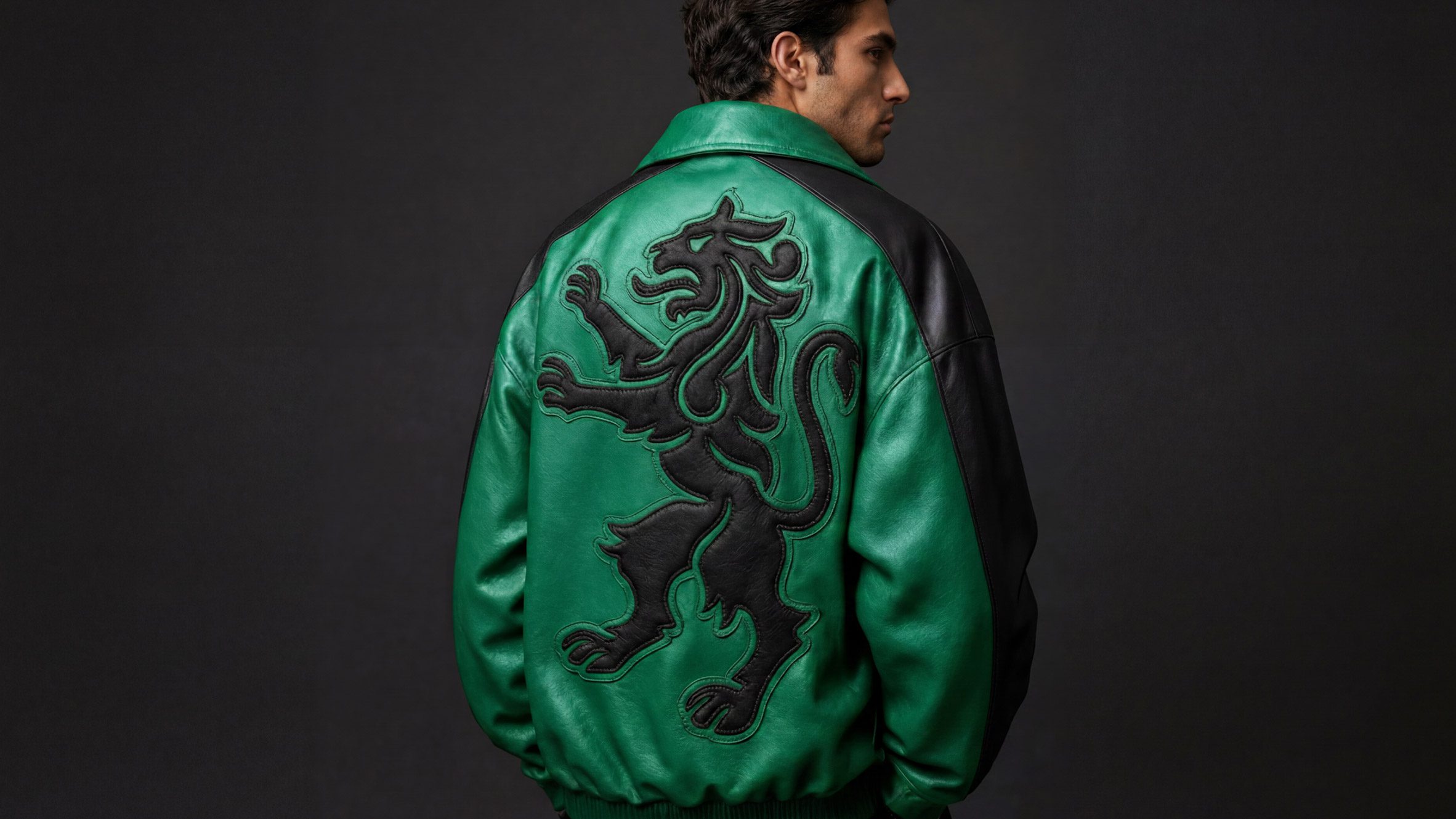
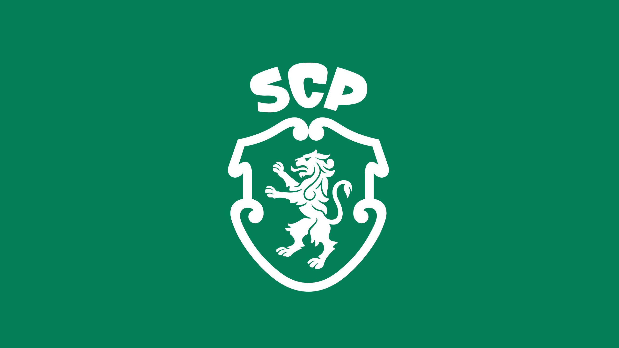
A key part of the project was redesigning the club’s badge, with the default logo being the club’s crest. And like JKR’s beloved Burger King project, where this work really excels is in how it’s plundered and repurposed designs from the brand’s history to bring it slap bang into the present, and help propel it into the future.

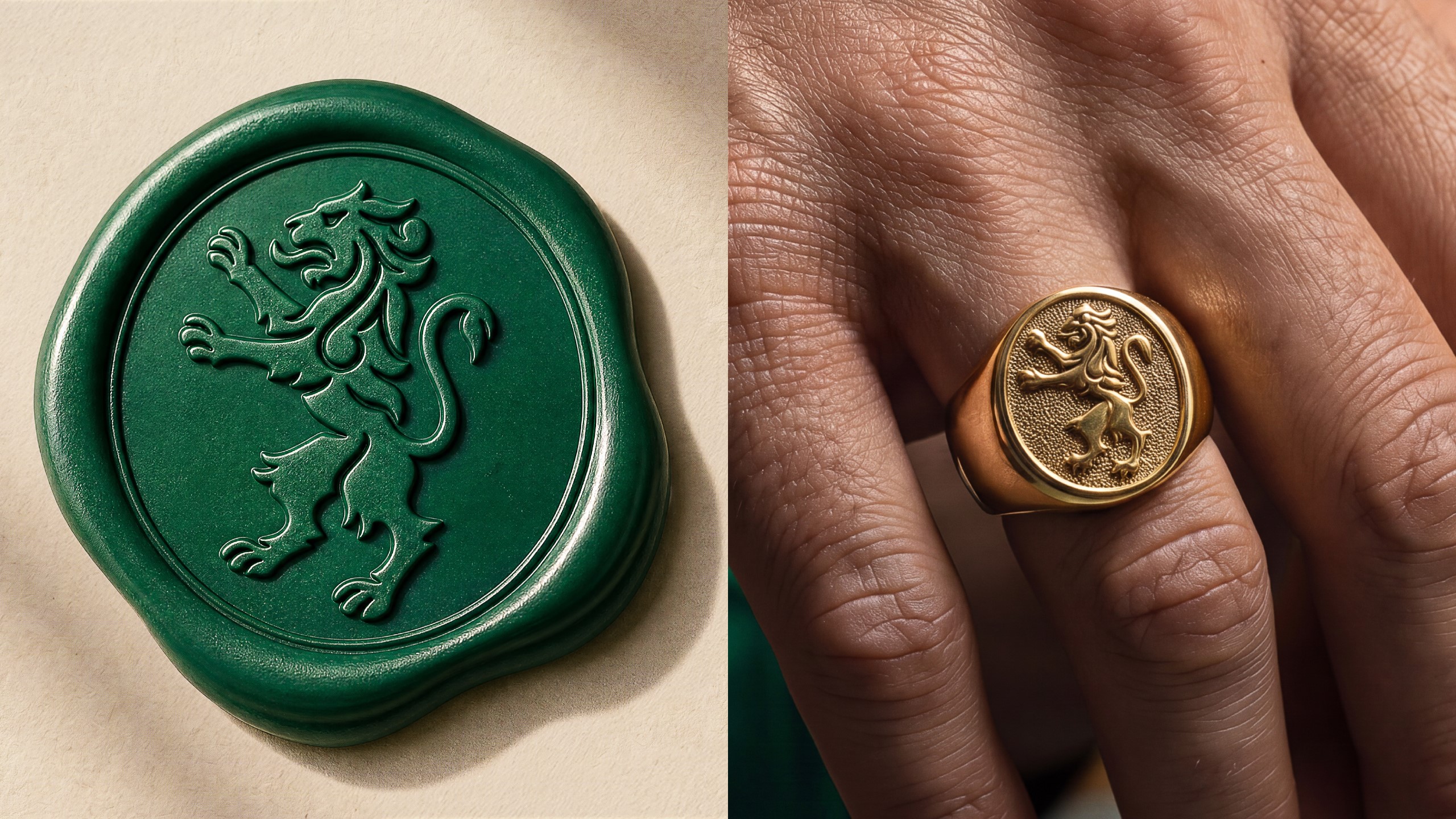
Rather than reinventing things wholesale, the new crest pares back decades of accumulated detail, taking cues from a much-loved 1945 version while placing renewed emphasis on the lion at its heart.
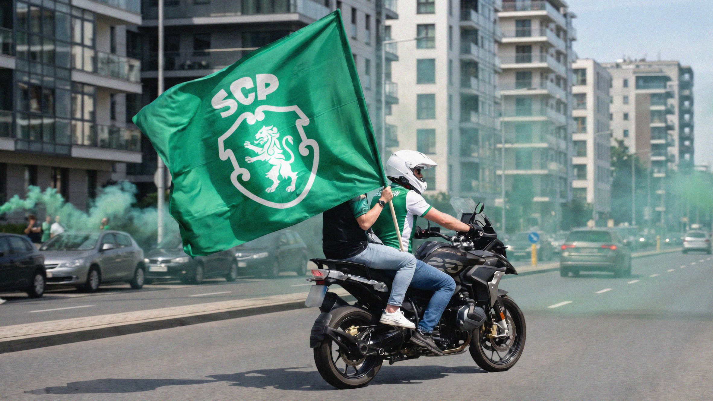
The outer shield has been stripped away, the lion redrawn with softer, more fluid lines and recoloured white to reinforce the club’s signature palette, while its tail now curls into a subtle ‘S’. Elsewhere, the shield itself has evolved into a graphic device used throughout the wider identity, and the SCP initials are stacked above it to create a crown-like form, tying together several of the club’s most enduring symbols into a cohesive visual system.
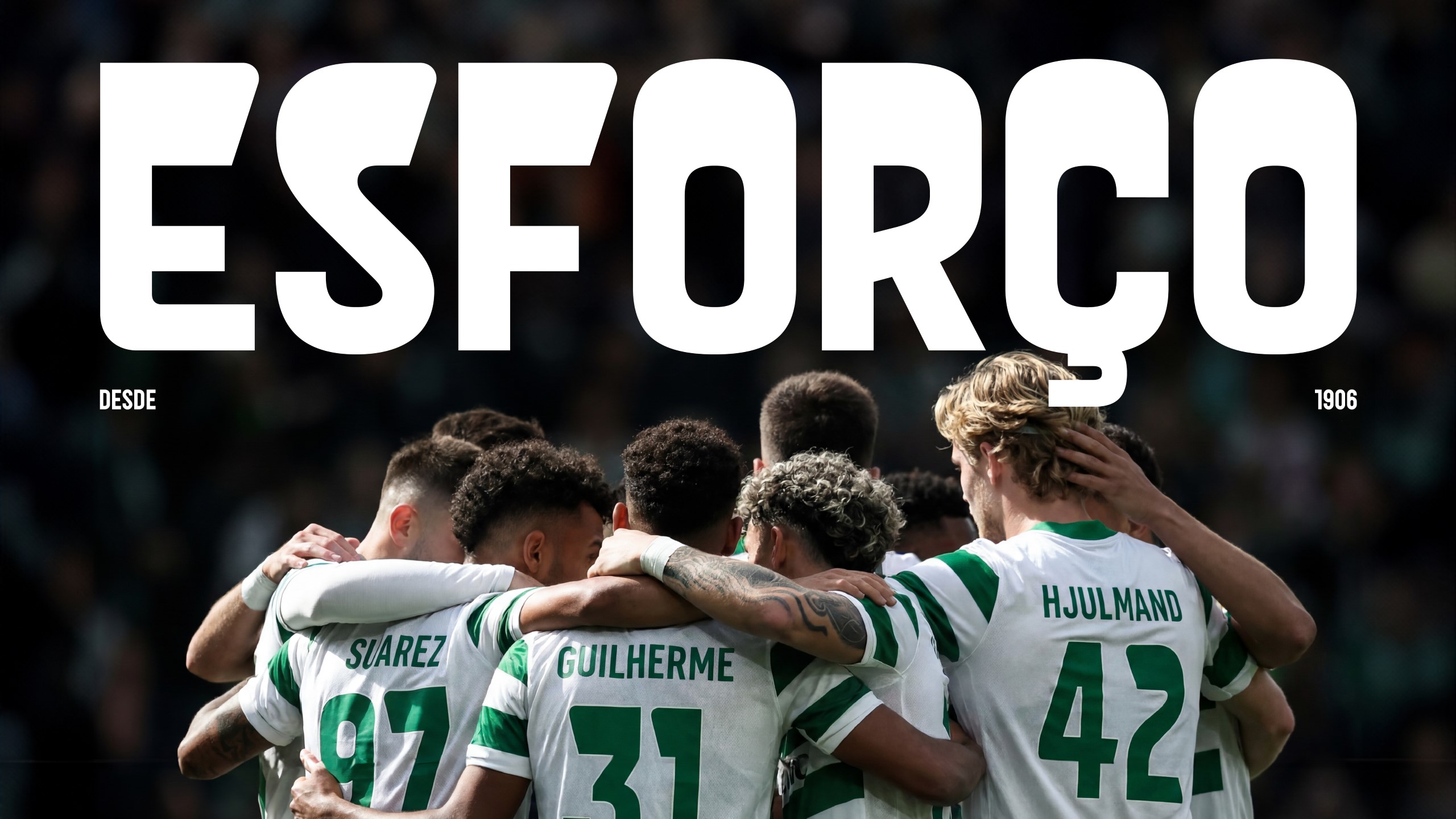
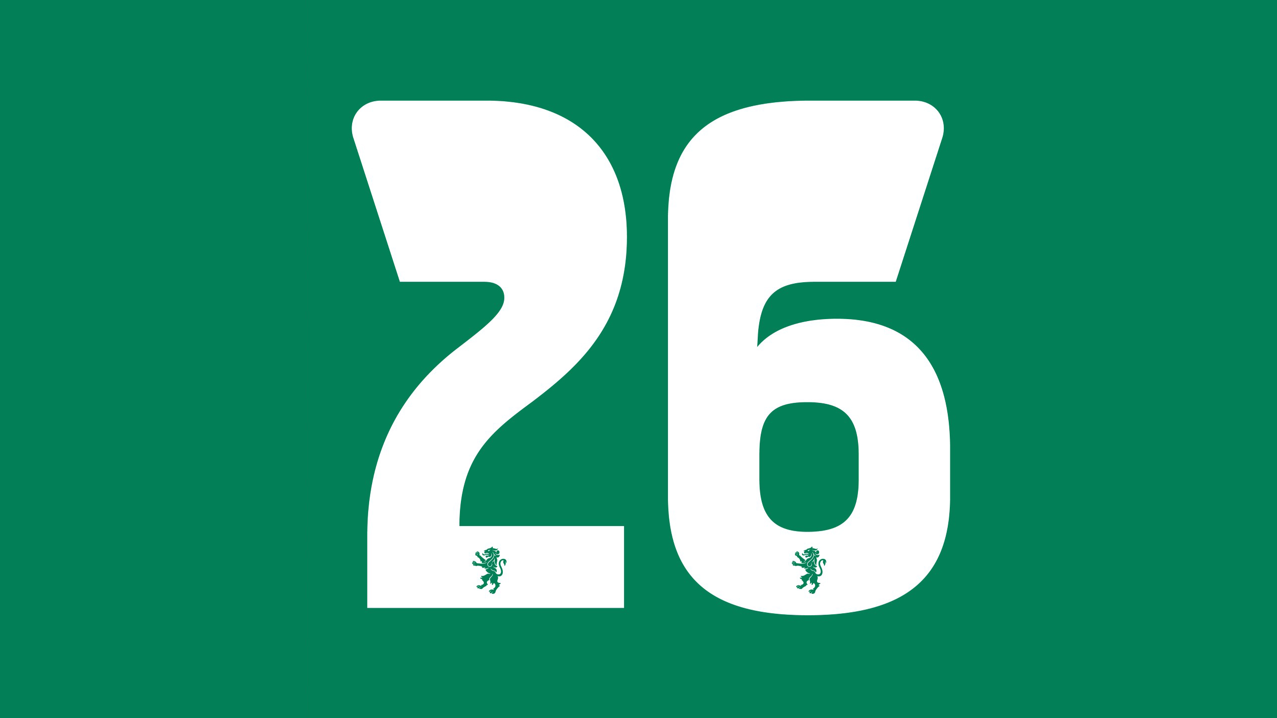
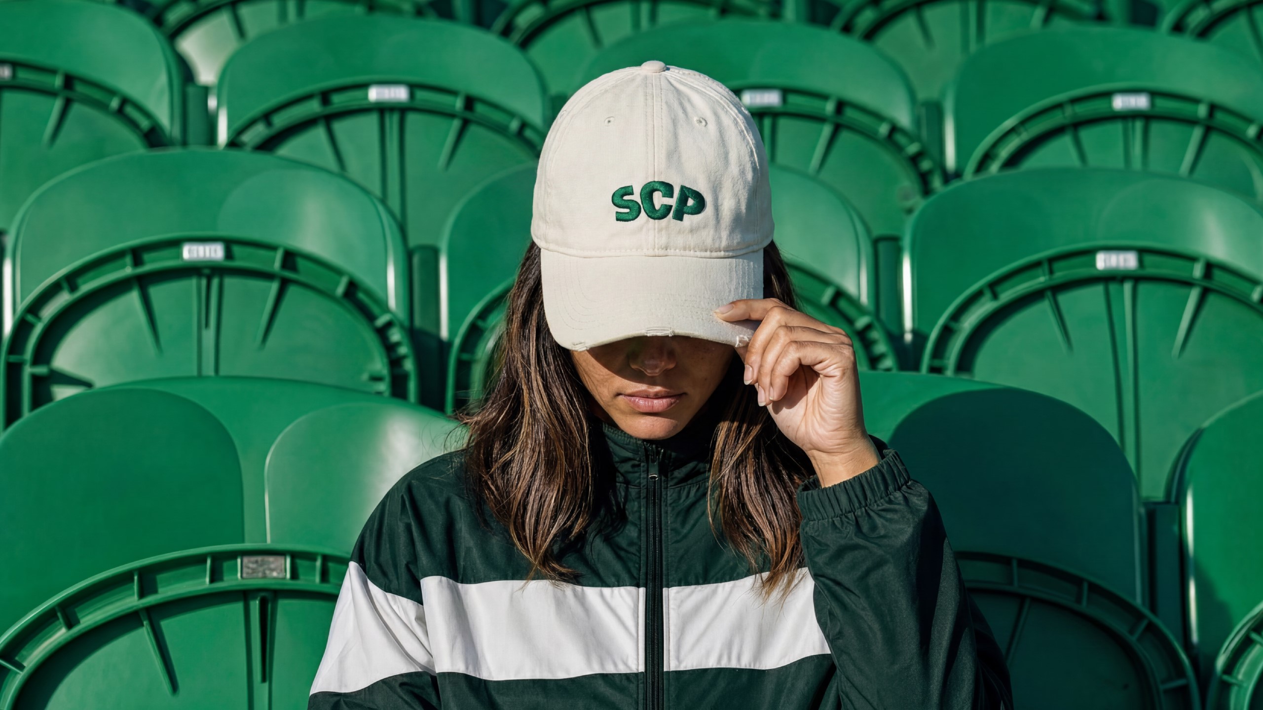
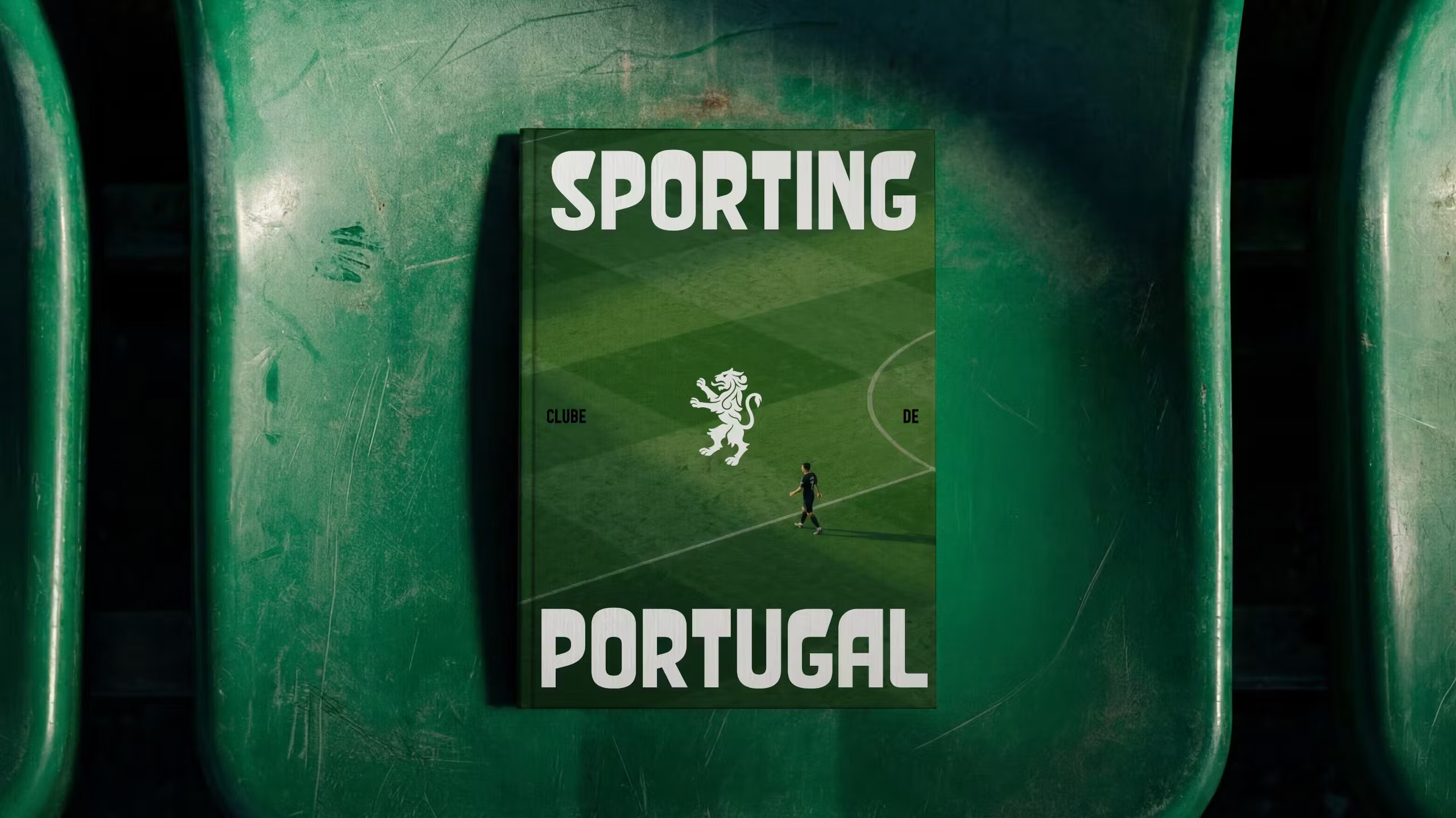
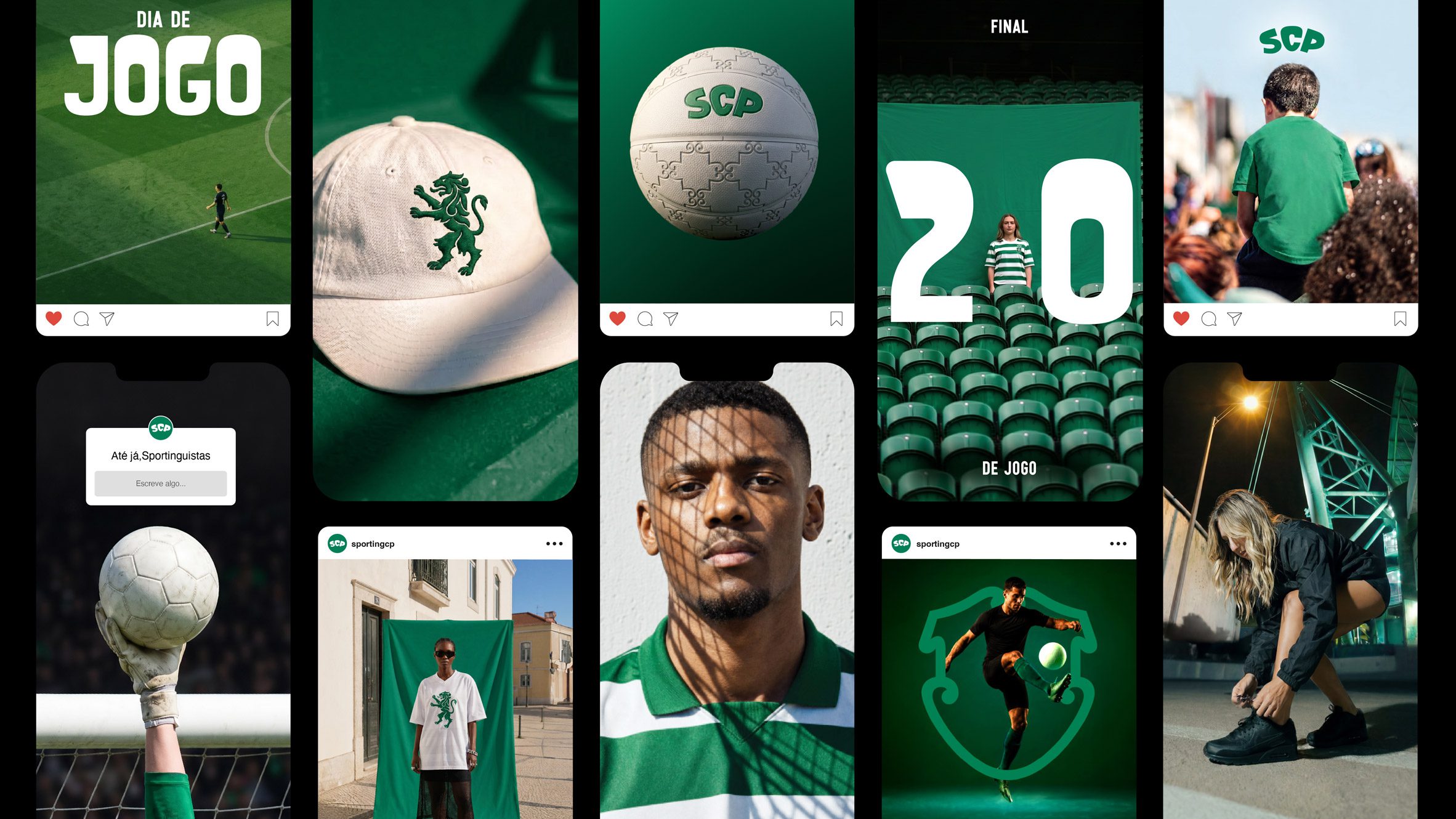
I absolutely love the new custom brand font, Sporting Sans, which was created by Manchester-based type foundry F37 in collaboration with JKR. It doesn’t feel like a football font in many ways: it’s pretty out-there, more suited to something like a record sleeve or magazine masthead, and it’s all the better for it. It could be seen as a brave move, what with it seeming to be such a departure not only from the designs of its peers, but from the whole idea of legacy, but JKR’s deftness and the way in which the type fits into the broader, skillfully cohesive brand world means it really does work.
The typography is, then, highly distinctive across both letters and the numerals that are perhaps more crucial to sports team brands than many other entities. As such, the font system is cleverly utterly ownable to Sporting CP. F37 and JKR drew from the crown element in the newly redesigned Sporting CP crest for inspiration, forging a typeface with thick, inflated upper components with thinner stems, and unusually soft, rounded angles. It looks sort of inflatable, bouncy, always in motion – just teetering on the edge of being able to be taken seriously, but as mentioned before, the way the font sits within the overarching brand system means that playful never becomes silly, and crucially, legibility is never compromised either.

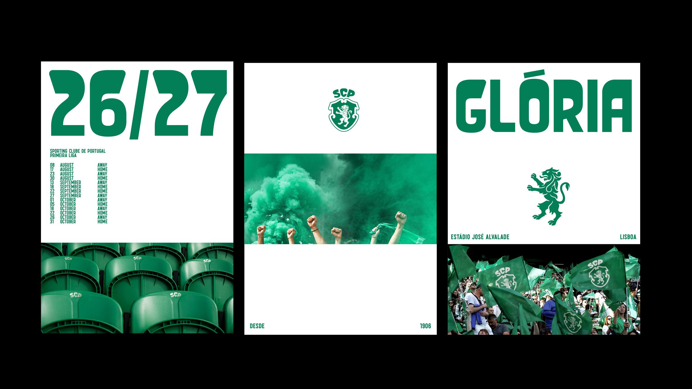
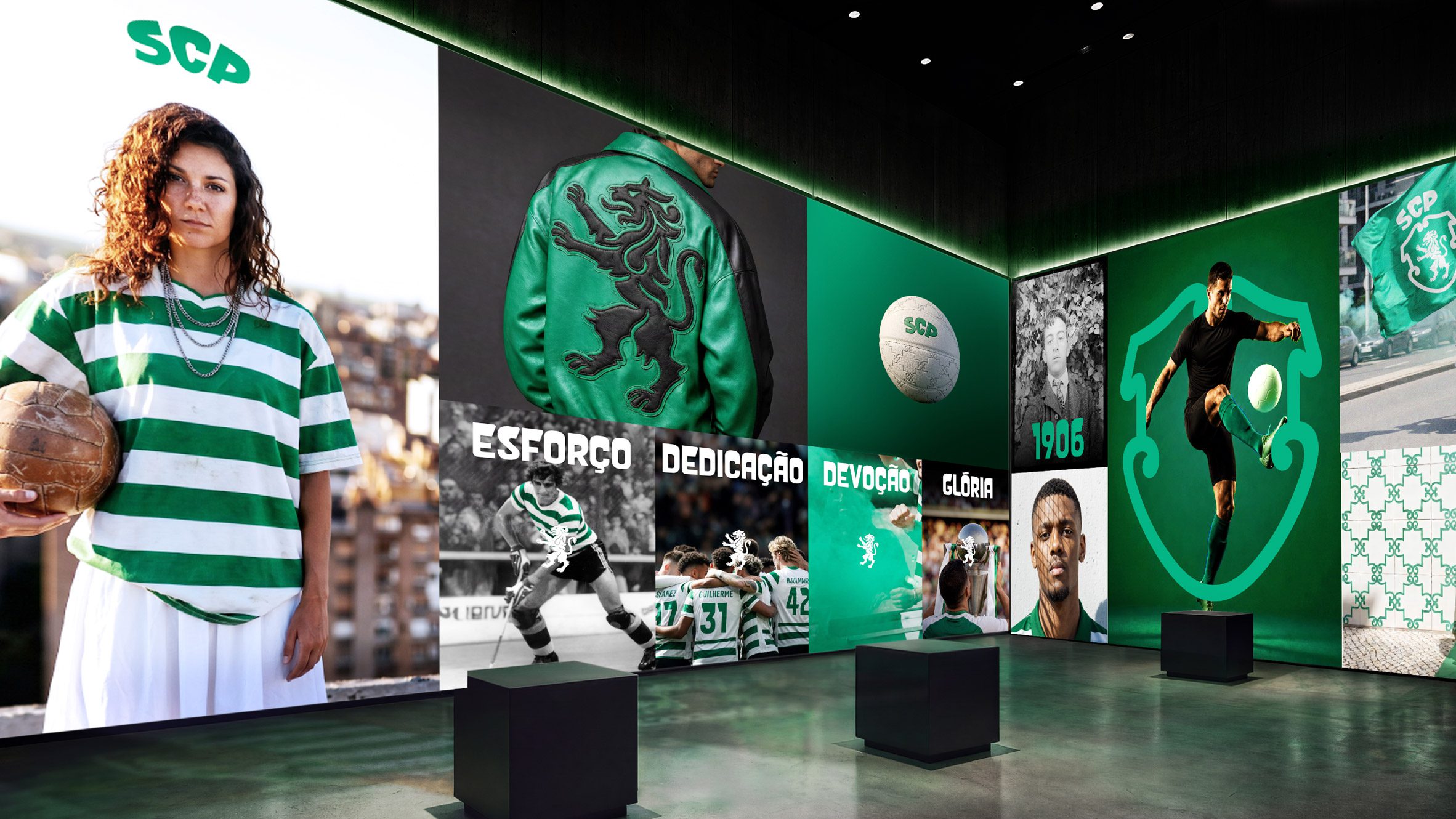
Sporting Sans is used across all official club communications, including print applications such as posters, billboards and a club book; online and social media; and of course, this being football, a wealth of merch; as well as for the graphics and signage at the club’s physical fan experience site.
Where JKR is so strong is in its proven ability to do a little with a lot; to distill a brand right down to its most essential, most powerful, and crucially, most subtly emotionally resonant elements and really make them sing.
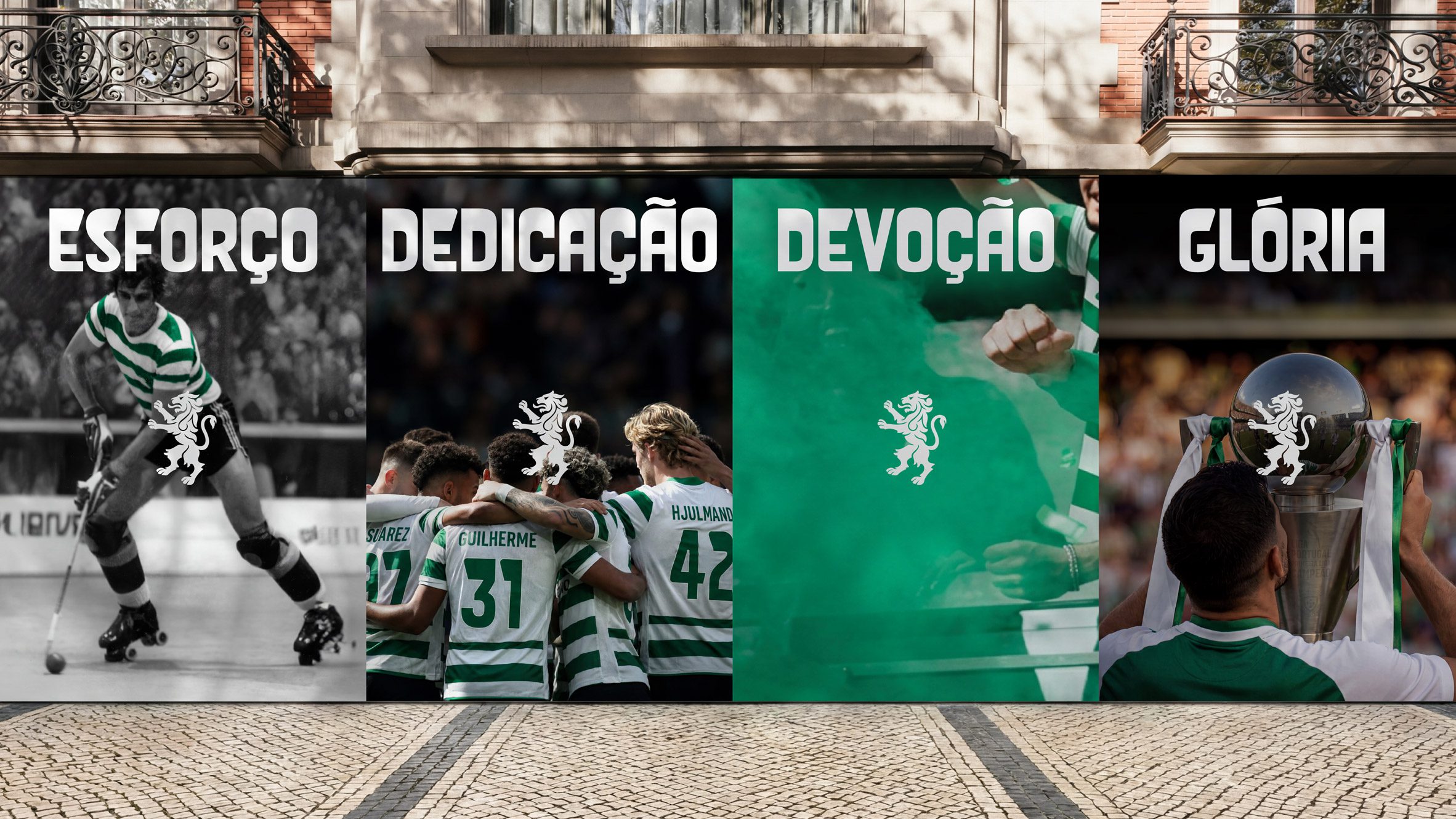
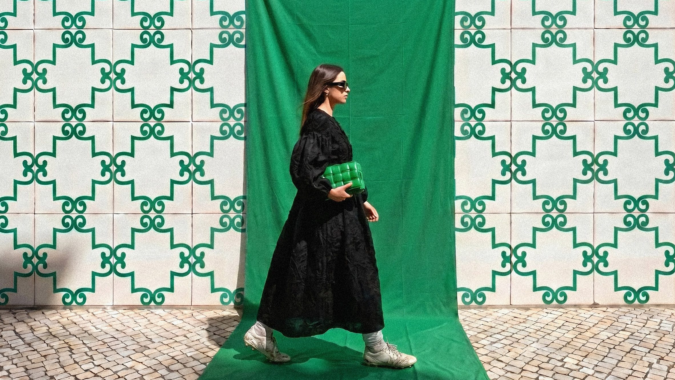
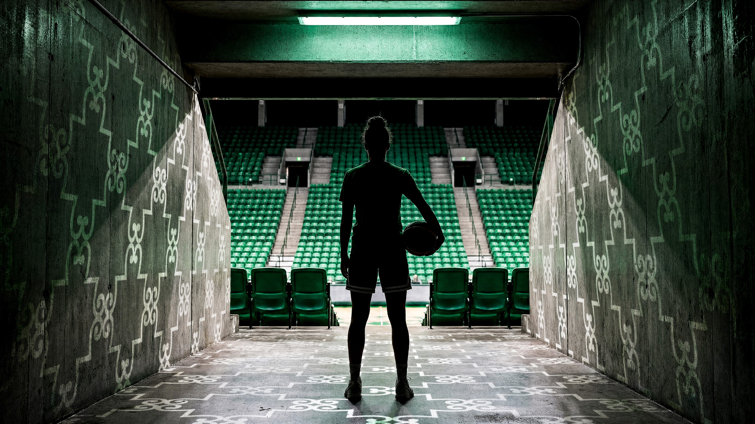
In the case of Sporting CP, this meant building an identity around five key, iconic longstanding club symbols: the lion, shield, crown, stripes and Porta 10-A, the wrought-iron gateway through which players emerge at their home territory, the Estádio José Alvalade.
These elements each take on lives of their own throughout the branding, from graphic patterns derived from the gate’s ironwork to a motion design language inspired by the club’s famous green-and-white stripes.
Another reason so much of JKR’s work is so highly regarded and successful is that it doesn’t just make things look nice: it makes a brand feel like it really belongs – to its loyal devotees, to the people it wants to speak to in future, and to culture more widely. These brands know they aren’t a proverbial island: they must, and do, sit within a far broader cultural milieu and do so in a way that’s somehow both graceful, and eye-catching.
Rather than attempting to drag Sporting CP into modernity through disruption, the project mines the club’s own history for ideas that still feel remarkably contemporary, building a brand world that gives equal weight to legacy, fandom and future ambition. It’s a careful balancing act, but one that lands with the confidence of a club that clearly understands exactly who it is, creating an identity that feels expansive without losing sight of the heritage underpinning it.