Pentagram’s designs for male health brand Rugiet are unabashedly phallic, but they work
Opinion by Emily Gosling Posted 14 July 2026
One of the more hilariously on the, er, nose identities I’ve seen in recent times here in the form of Pentagram New York’s work for Rugiet, a men’s health brand offering personalised, clinically-backed treatments sold exclusively online.
Formerly better known as Rugiet Health, Rugiet was founded in Austin, Texas, in 2020 as a telehealth company. Back then, the company was entirely based around its sublingual erectile dysfunction medication, Rugiet Ready, which combines sildenafil (the generic name for viagra), tadalafil, and apomorphine into a single dissolving lozenge designed to absorb faster than traditional pills.
Last year, the company expanded its catalogue beyond ED by introducing its Go Long product, targeted at tackling premature ejaculation; now, the range includes sleep aids, various testosterone boosting products, weight loss medication (which seemingly contains a mixture of antidepressant/smoking cessation medication bupropion, alongside addiction medication and a diabetes drug which has no small number of NHS warnings attached to it), and various injectable treatments loosely grouped under the promise of ‘longevity’.
Pentagram (MoN Takanawa, Super Peach, Bacàn) was brought in to work with Rugiet this year after a period of major revenue growth, reportedly surpassing $100M in revenue. It also secured a multi-year marketing partnership with the UFC.
Overall, Matt Willey’s team at Pentagram created an identity which is undoubtedly very macho, but not relentlessly hetero – where it’s really successful is in making it never feel super ‘straight’, nor super ‘gay’ – it’s genuinely neutral in that sense.
I like Pentagram’s work here, I really do, and that’s in no small part down to the fact it’s actually very funny. Why not make typography/wordmarks/logomarks as phallic as possible without being glaringly obvious, when you’re working for a company that’s best known for its erectile dysfunction products? Art – well, design – sort of imitating life (hopefully), isn’t it?

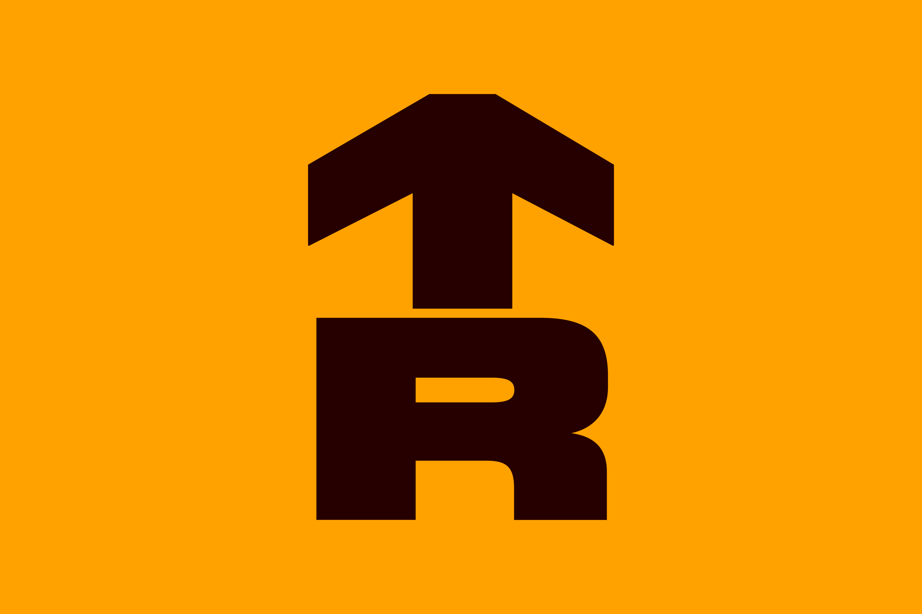
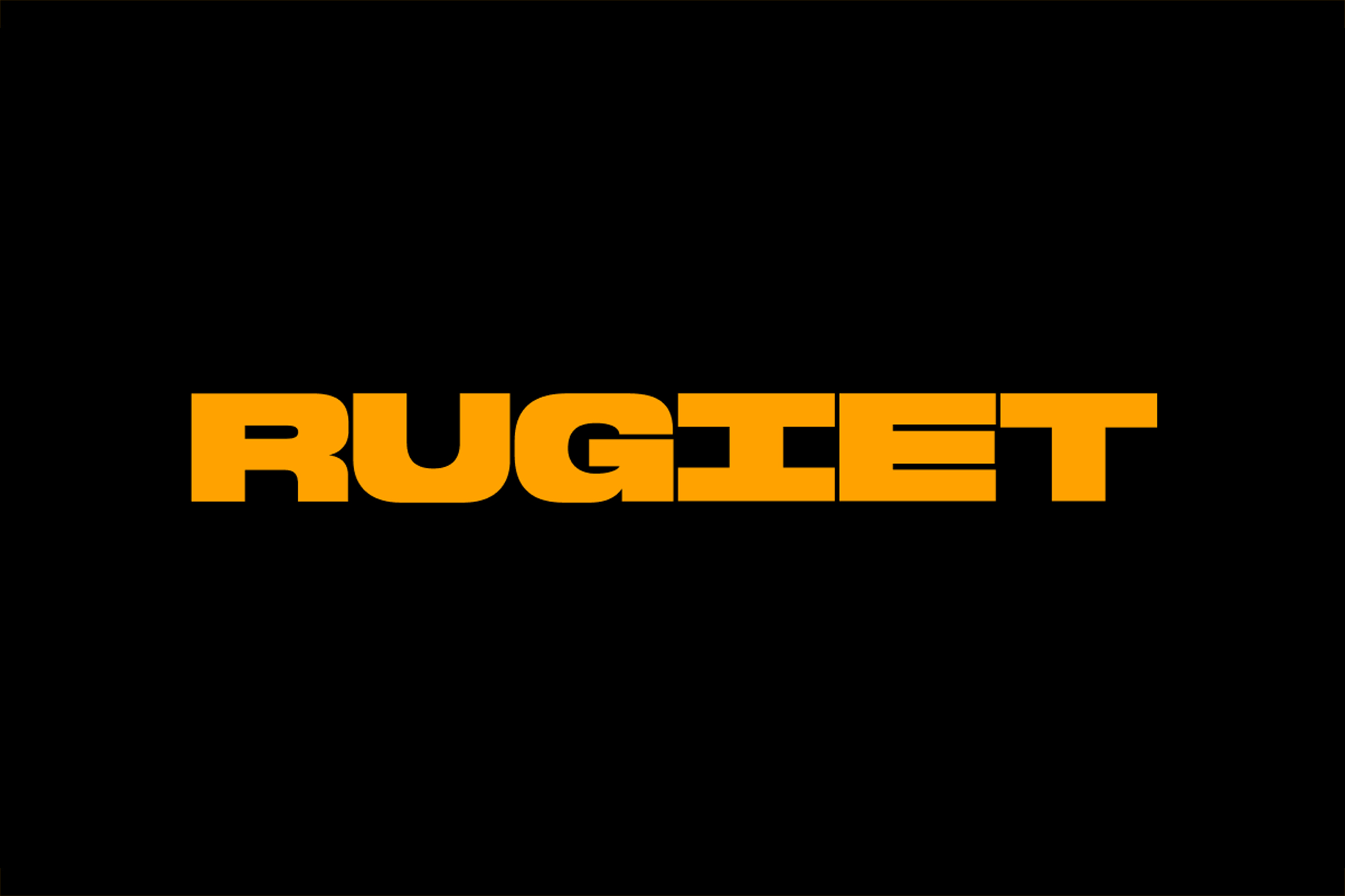
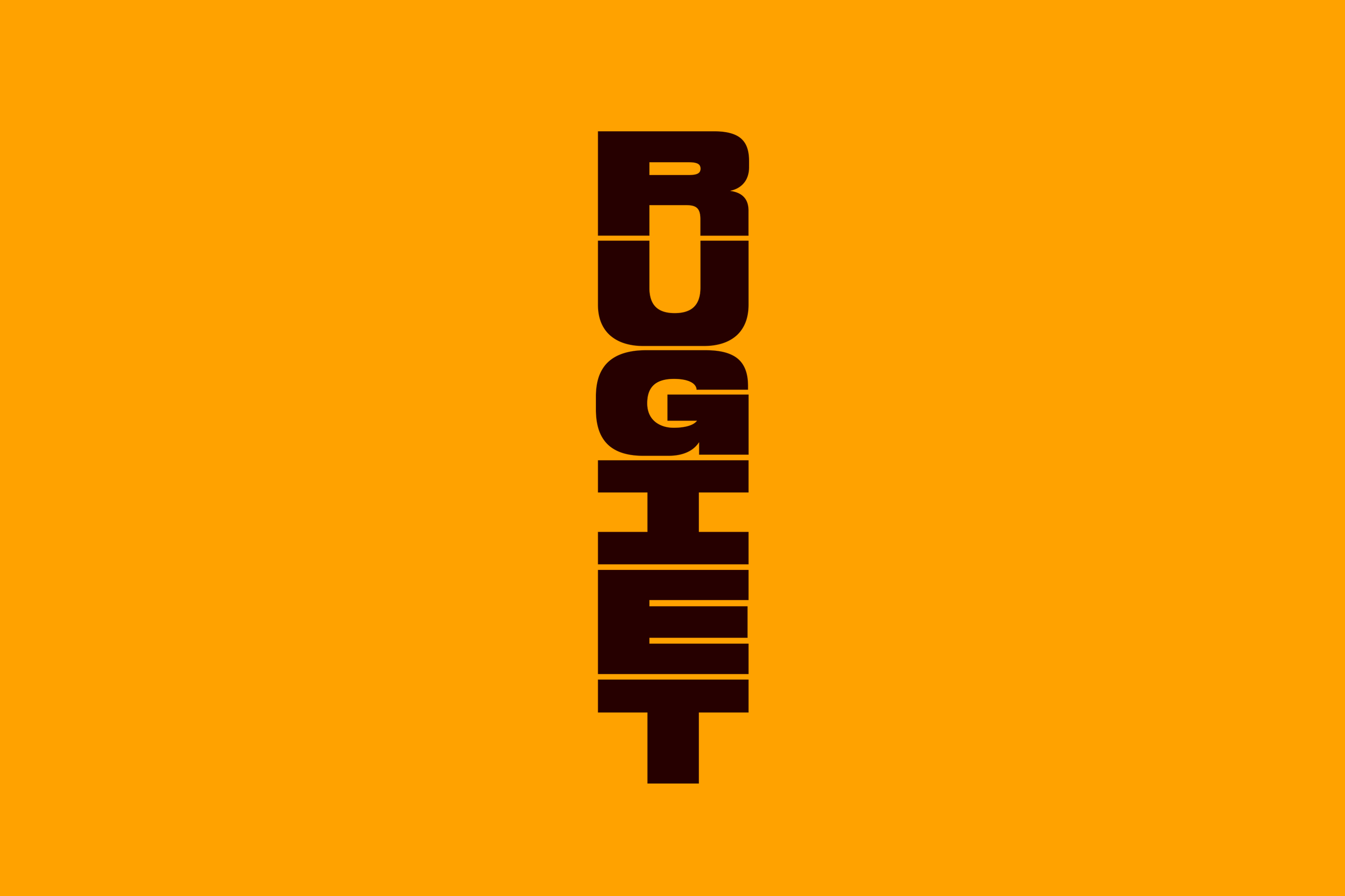
Said wordmark uses a bespoke brand typeface, Rugiet Tall, developed in collaboration with New York-based foundry Commercial Type. The font itself is designed to echo the vertical proportions of the logo – an arrow device – which is superbly male (i.e. this ♂️), as well as penis-like.
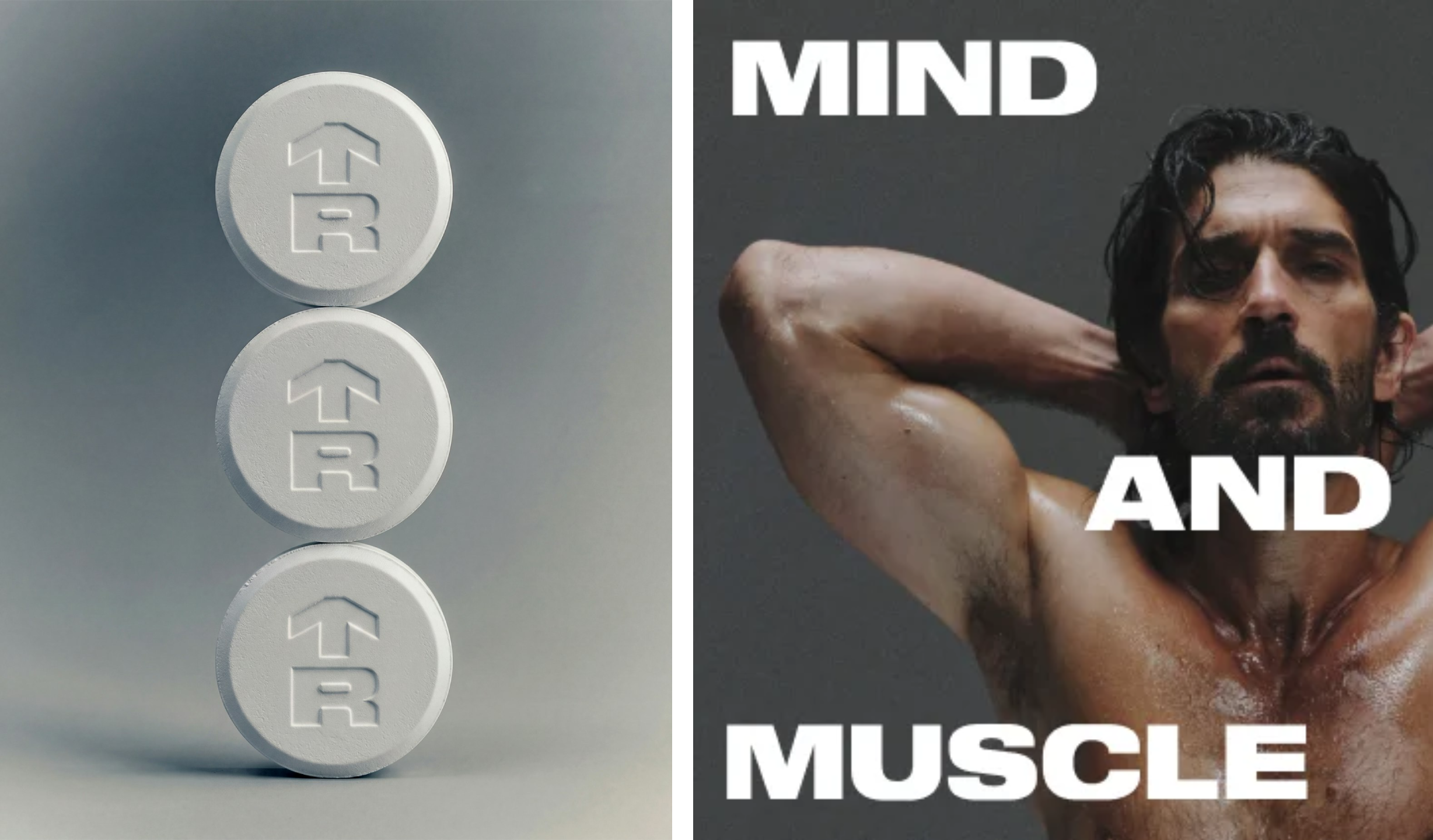
Rugiet Tall is, according to Pentagram, optimised for upright compositions and vertical headlines. It’s used for the most high-impact, snappy messaging – all of which once again goes hard on no-nonsense, sucker-punch-positivity: things like “Rise Up”; “Take Control”; “Mind and Muscle”.

Alongside the logo and wordmark, Pentagram also created a monogram merging the “R” with an upward arrow as a “straightforward signal of progress”.
Everything feels as though it’s delivered by a sort of pumped up, wise, ripped uncle – it’s on your side, it’s inspiring, but it has zero time to dick about.

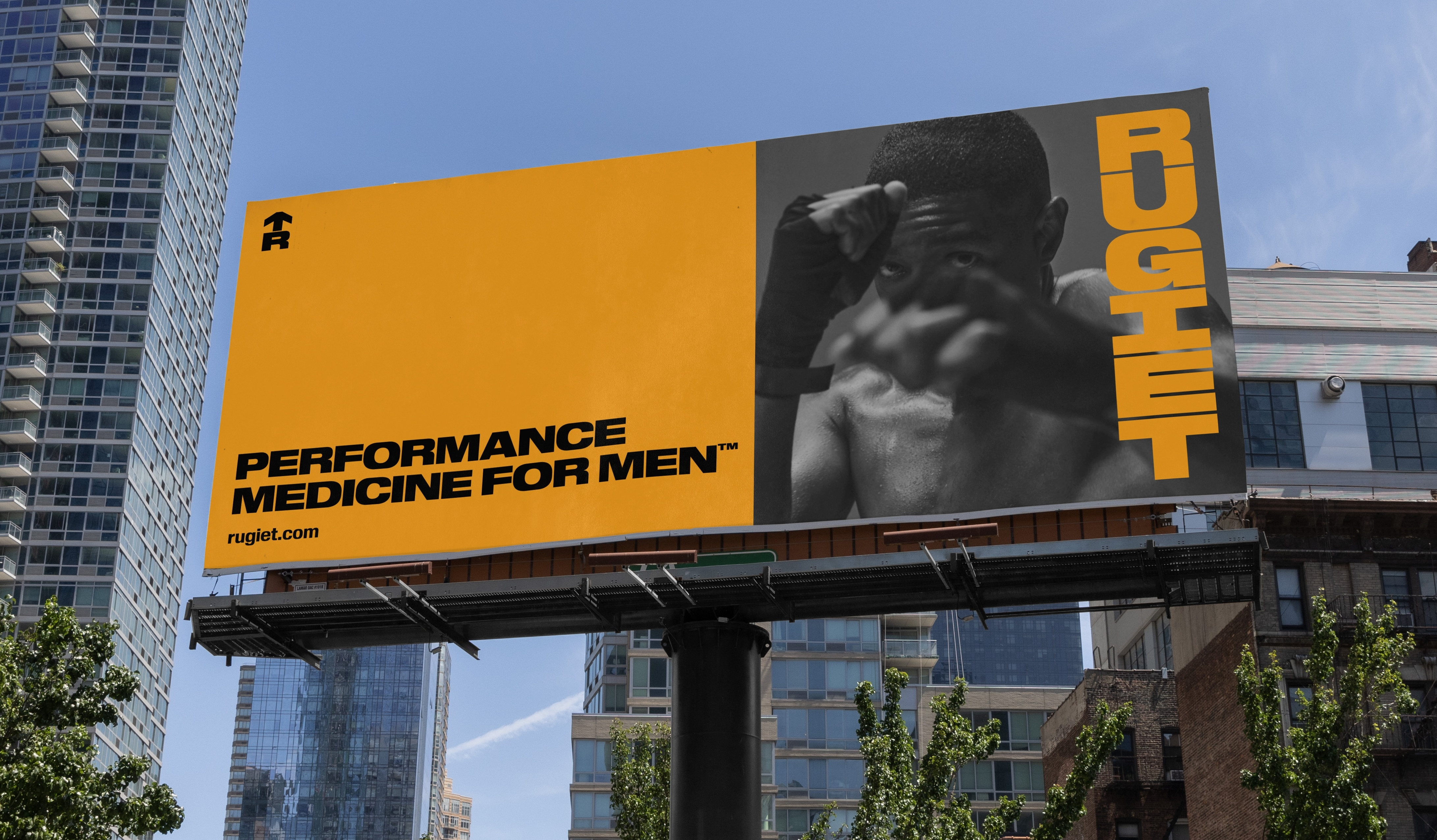
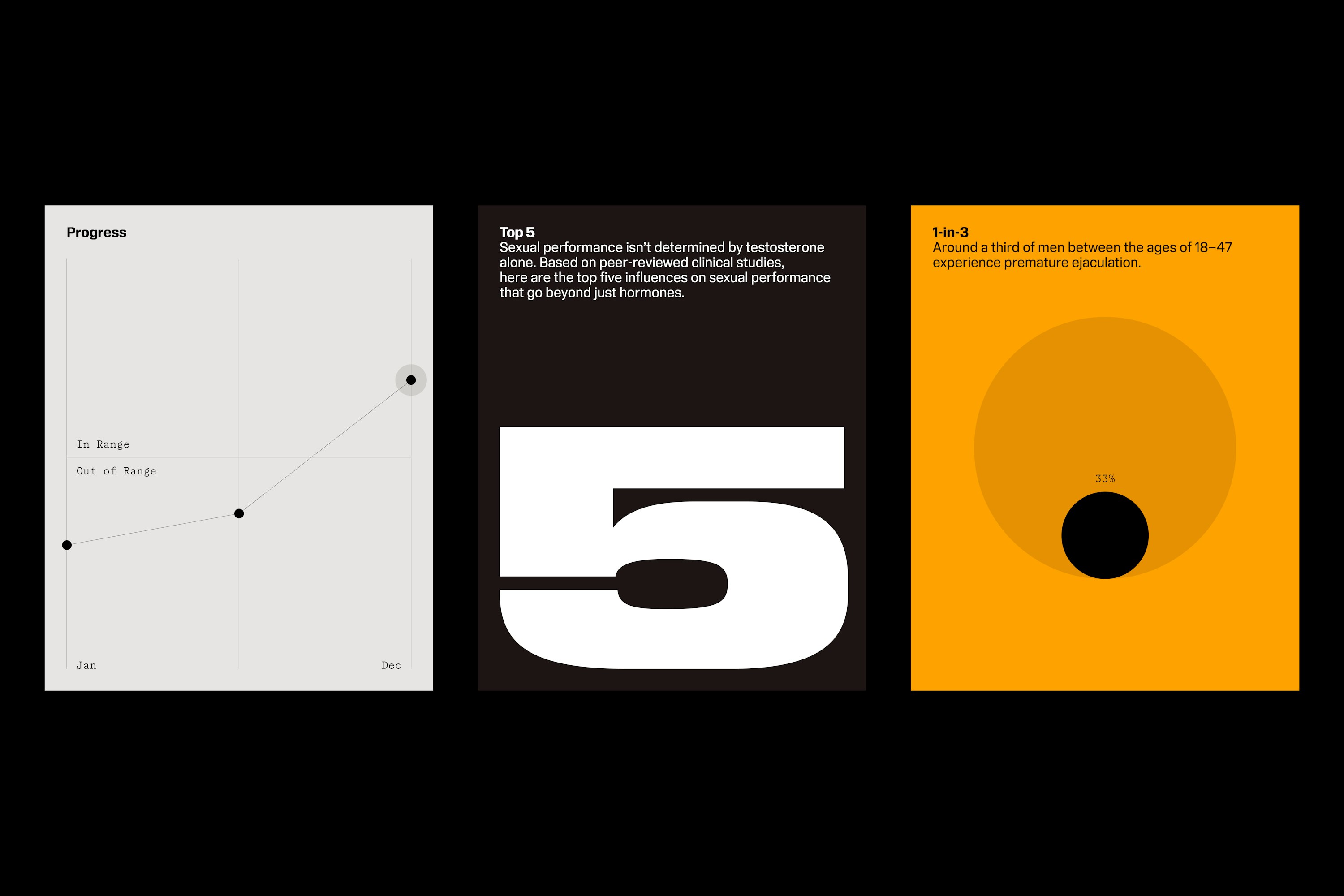
Even the colour palette has this weird sexy ‘time is money’ avuncular vibe: pretty much all brand assets use a simple mixture of black, white, grey, and a shade dubbed Rugiet Orange.
It’s bold, vivid and intense; perhaps a deliberate eschewal of the usual wellness category codes of either blandly scientific blue and white, or more gentle-parenting pastel shades.
Across the entire brand identity we find this mixture of boldness, clarity, masculinity and a sort of sense of visual urgency – the only exception perhaps being the art direction, which is a lot sensual and softer, all romance novel rippling muscles and serious, weight-of-the-world facial expressions and the odd tender embrace here and there.
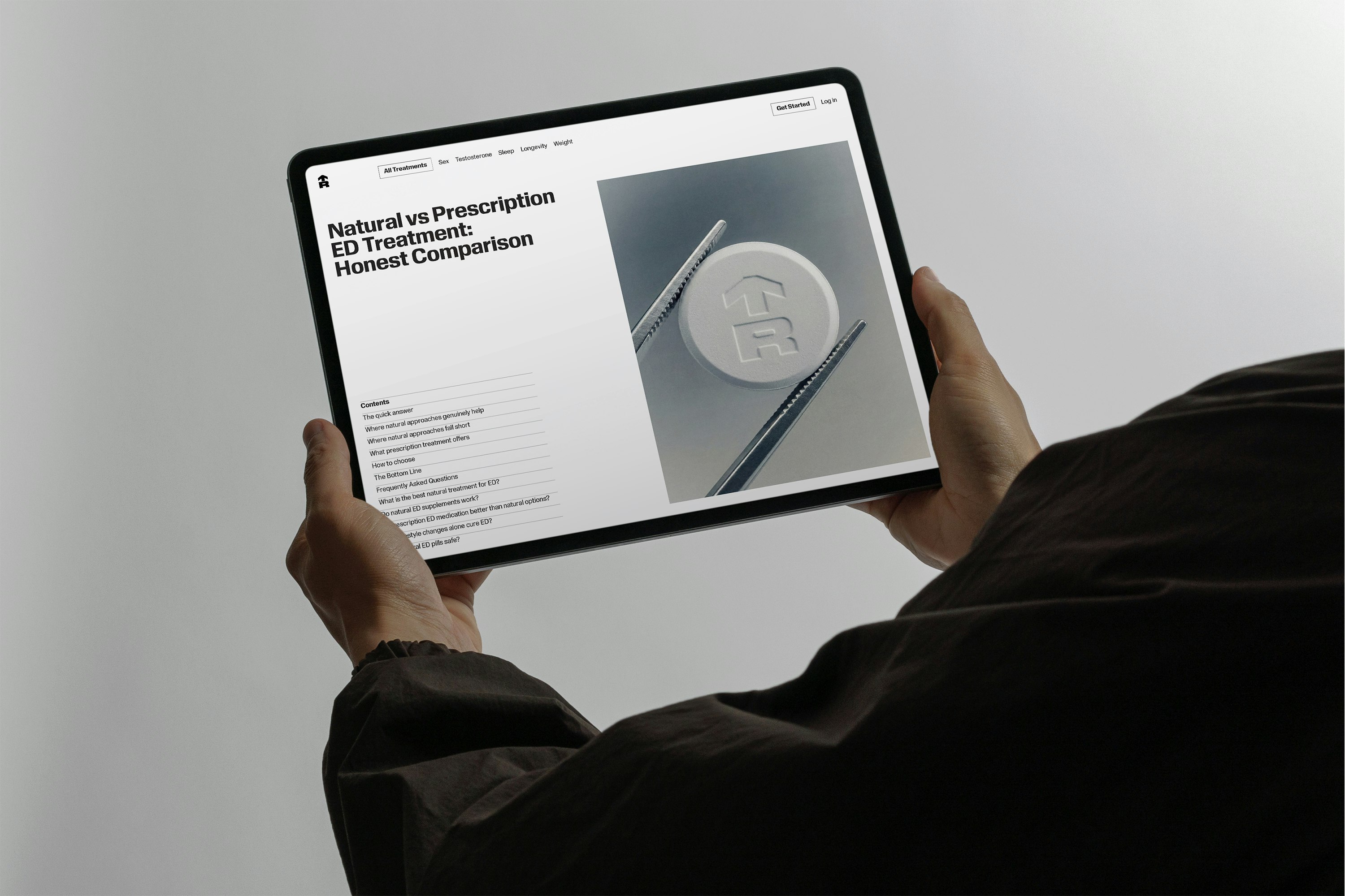
The visual language extends across the entire brand, from the logo embossed on Rugiet treatments to the packaging, promotional campaigns, and a new website designed in collaboration with New York-based creative agency Alright Studio.
It could have all become a bit daft – you know, all the fairly unambiguous references to dicks, and that – but it doesn’t, it actually looks very good, and that’s a testament to the skill of Matt Willey’s team and Pentagram for making that so