Koto gives programmer forum Stack Overflow a reason to exist in the age of AI
Opinion by Emily Gosling Posted 27 July 2026
Since starting life in 2008, Stack Overflow has functioned as a website/platform/forum that soon became a sort of internet go-to as a shared notebook or tool guide for programmers: somewhere they can ask questions, answer them, and have them answered by other actual real life people who’ve probably been there and done that, and want to impart the wisdom they’ve gleaned in doing so.
Over that near-two-decade period, naturally Stack Overflow built up an enormous, searchable archive of technical know-how in the process; by 2019 it had grown from scrappy forum into a fully fledged tech institution, complete with a business arm selling that same knowledge back to enterprise clients.

That’s not to say it doesn’t still look terrifyingly, but almost comfortingly, exactly what you’d expect a site where the techiest of the nerdiest folk chat to each other about the techiest and nerdiest stuff to look like: boundless text, unbroken by such fripperies as images or anything remotely resembling a layout designed for legibility (let alone prettiness or other aesthetic nonsense). To the non-programmer, it’s all a sea of jargon and acronyms and confusing numbers; like another language, really, which essentially it is.
It still feels as plain-text-ish as a website from the days of yore – and that’s not a bad thing. And to lift just the most recent question sitting at the top of this site when I checked it to write this piece, “Why does variable from is pattern compile under .NET Standard 2.1, but fail with CS0165 on .NET 10?” Well absolutely. Surely it’s the question on everyone’s lips.

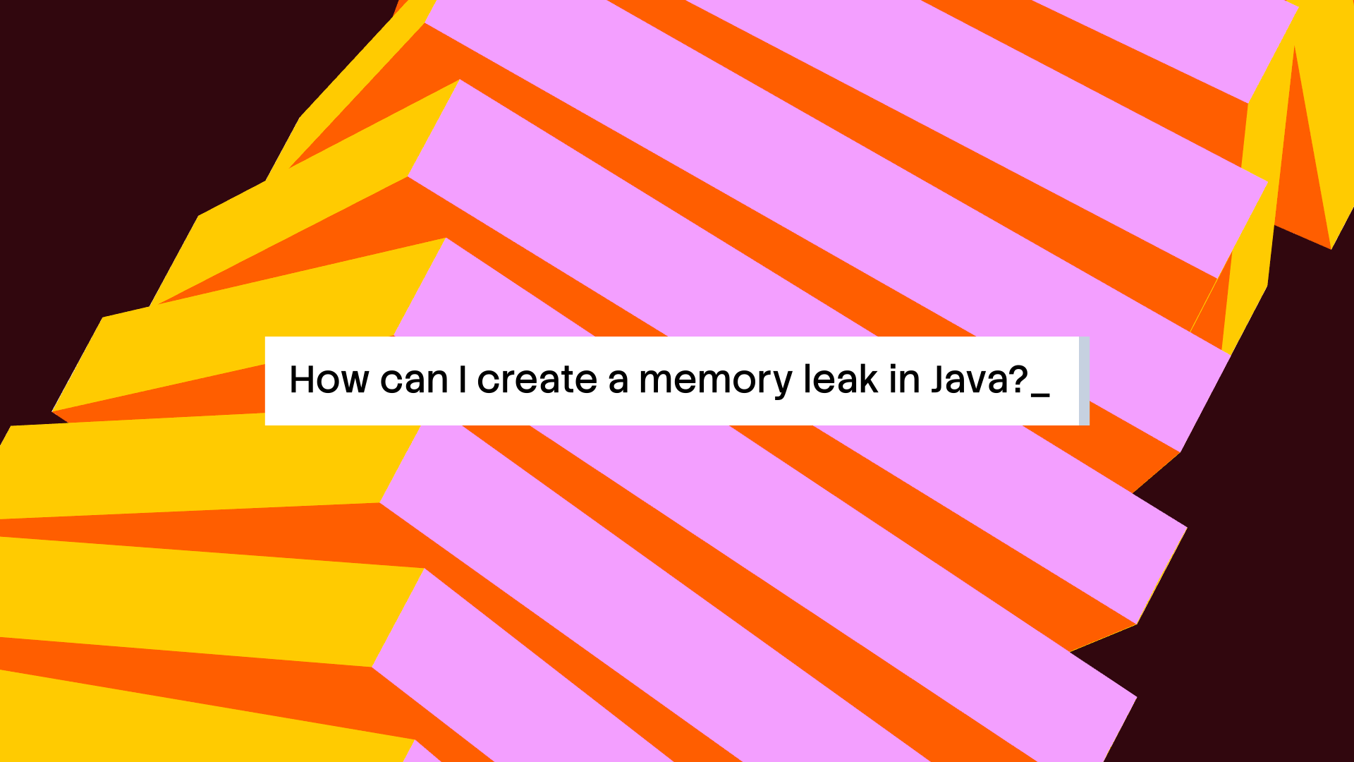
But while the site had been, and continued to be, undoubtedly not just useful but successful, things were scuppered a little with the surge in AI tools and the proliferation in their use by anyone and everyone. Large language models were trained on Stack Overflow’s archives, then began answering the very questions that used to send people there in the first place.
As such, traffic was dropping; suddenly a platform built on human answers had to work out what it was for in a world of instant machine ones. It seemed to be as much an existential issue as a branding problem – but that wasn’t to deter Koto (The Norton, Yazio, Marblex) which was tasked with creating a new identity for Stack Overflow, including a full strategic repositioning.
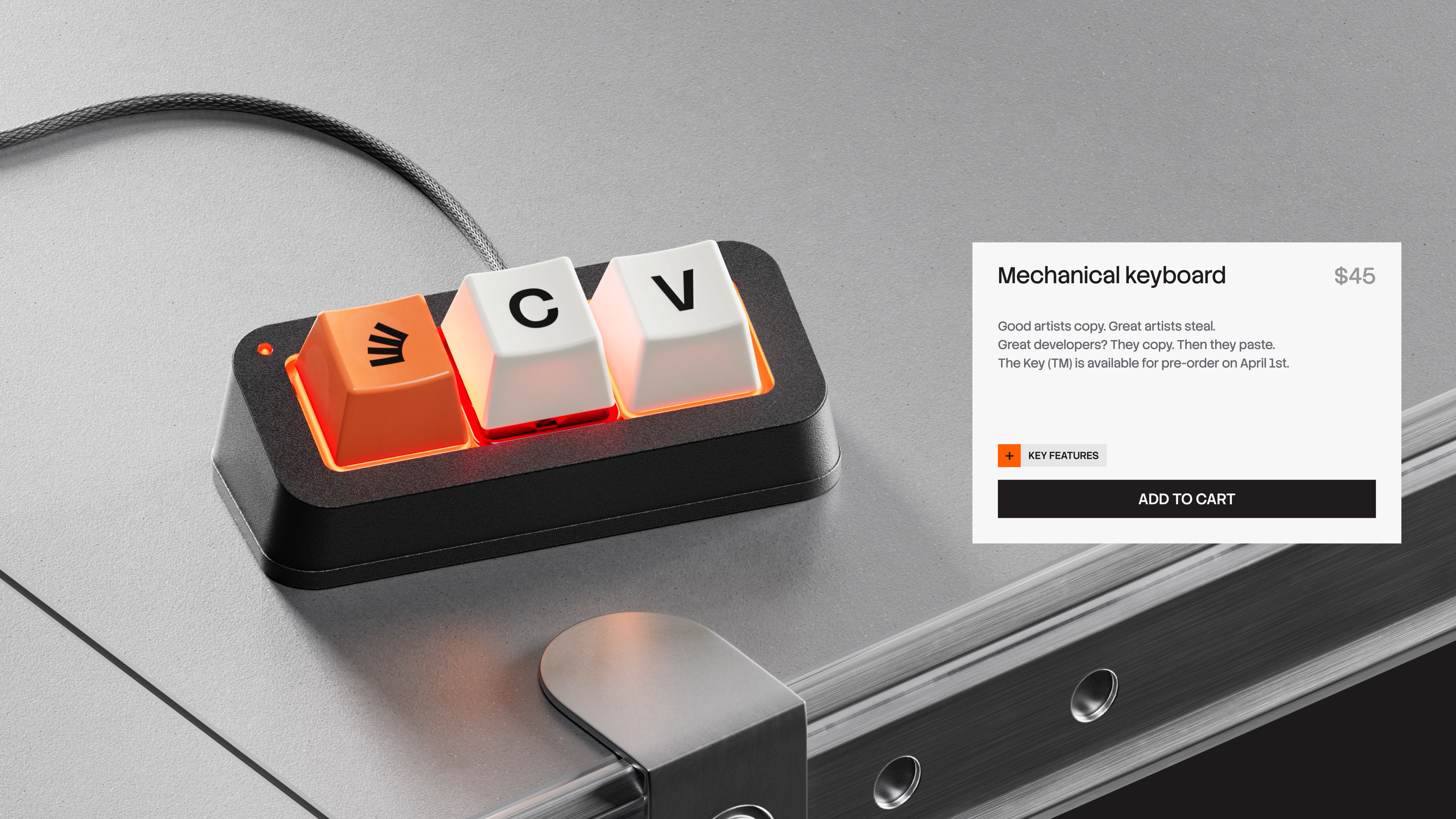
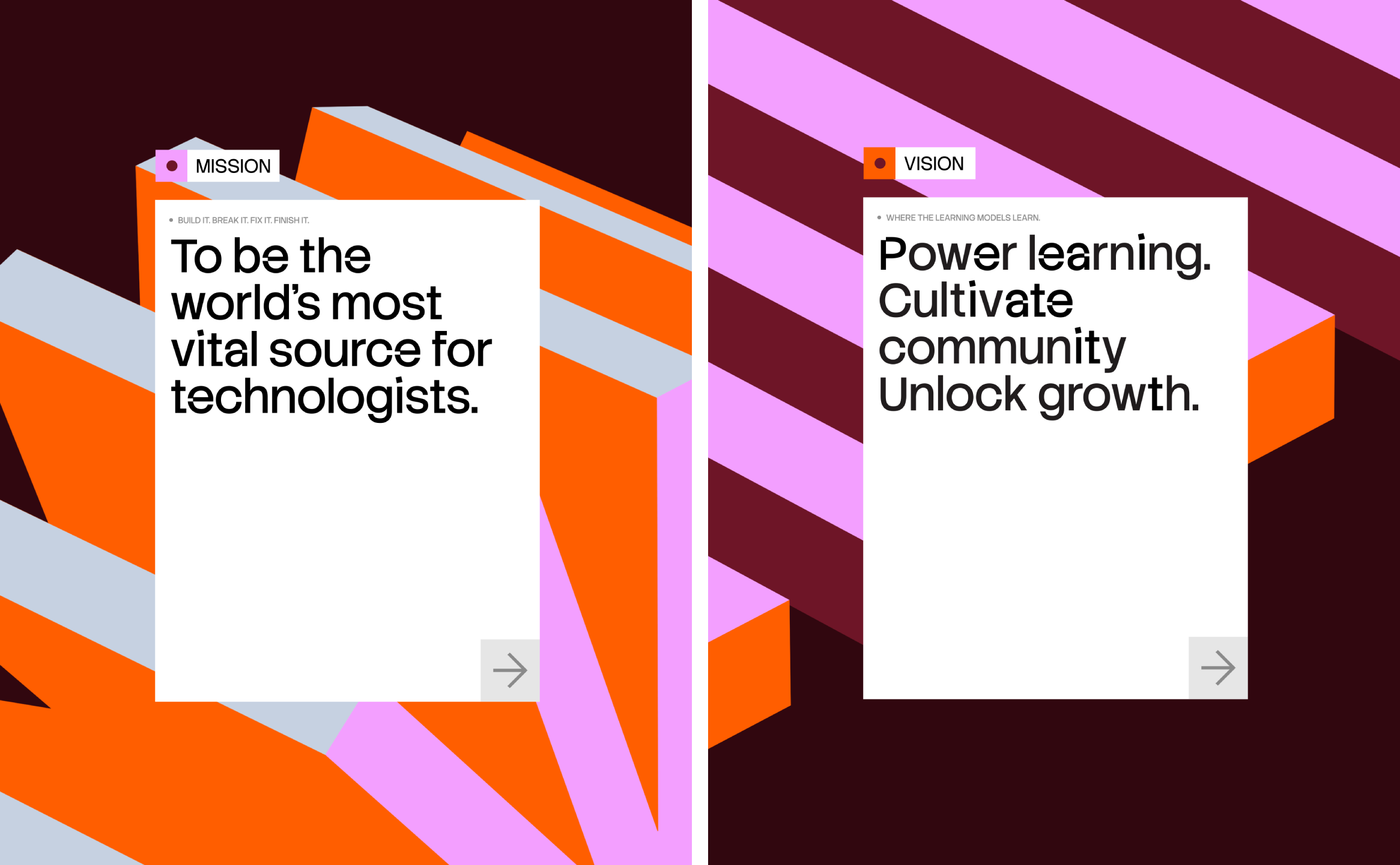
Where Koto has been incredibly smart is in flipping the narrative around the AI that almost spelled the demise of Stack Overflow: Koto looked to move the site from Q&A platform to, in the studio’s words, “the world’s most vital source for technologists” – a hub of human-verified knowledge that AI models are only as good as, rather than a relic they’ve made redundant. It’s a clever pivot: reframe the thing that AI is disrupting as the thing AI actually depends on.
The identity itself is built around a concept Koto dubbed “Always in Build” – the idea that technical knowledge, like code, is never really finished, only iterated on. It’s a decent enough hook, if a fairly pedestrian, or familiar one – the (re)brands claiming to be ‘ever-evolving’, or words to such effect, aren’t exactly scarce.

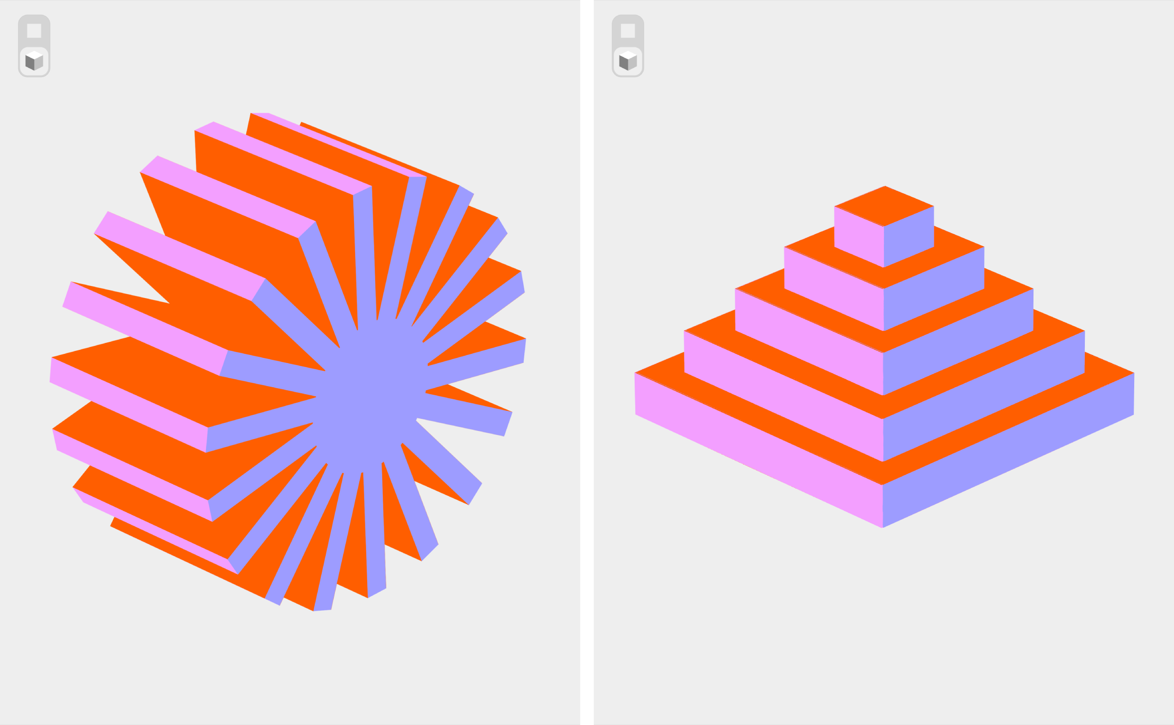
Visually, however, it makes a lot more sense – perhaps not on first look (to me it very much resembled eyelashes), but very shortly after. The new logo is a pared back, suitably sensible and clean, single-colour mark of stacked, offset blocks that nod to accumulation and layering – the idea of the brand’s core as being about knowledge piling up over time. It could also resemble a snapshot of a Jenga tower tumbling down, mid tumble, but that’s by the by: the winkiness works – namely because it feels both dynamic and human – but apparently, according to Koto, it’s also a deliberate callback to the old logo’s in-joke about the platform’s name (a nod to stack overflow errors), which is a nice bit of Easter Egg placement for the real programmer ‘heads’.
That stacking logic becomes the organising principle for the identity’s entire system in terms of its layout principles, motion design, the hierarchy of brand elements, and so on and so forth.
In a semi-strange sort of about-face, Koto has built a custom generative tool using Anthropic’s Claude for the brand guidelines – an AI tool built to help a human-knowledge brand defend itself against AI. Make of that what you will. If you can’t entirely beat ’em, join ’em, or something.
Colour stays sensibly conservative: the brand’s signature orange remains, now organised into layered blocks for hierarchy rather than reinvented from scratch. In terms of the typography, Koto has created a new custom typeface for the brand called Stack Sans, which has since been released for free usage on Google Fonts. It’s a really nice, robust geometric sans serif font that’s both legible and subtly distinctive: look closely and you’ll see some wee notched details – again borrowed from the visual language of ‘building’ – giving all the sensible stuff a decent bit of character and ownability.
The visual system is competent, confident and clearly well-crafted, but it’s also fairly restrained – sensible rather than surprising, which is absolutely no bad thing for a brand with a raison d’être based on trustworthiness and person-to-person knowledge-sharing.
There’s also something faintly uneasy, if not exactly hypocritical, about a brand with a newly articulated premise – one based around the idea of verified human wisdom over AI-led churning and re-churning building – its production pipeline on a generative AI tool. Likely Koto and Stack Overflow would argue that’s precisely the point (AI as production tool, not as source of truth), and it’s a reasonable distinction to draw, but it’s one worth sitting with rather than skating past.
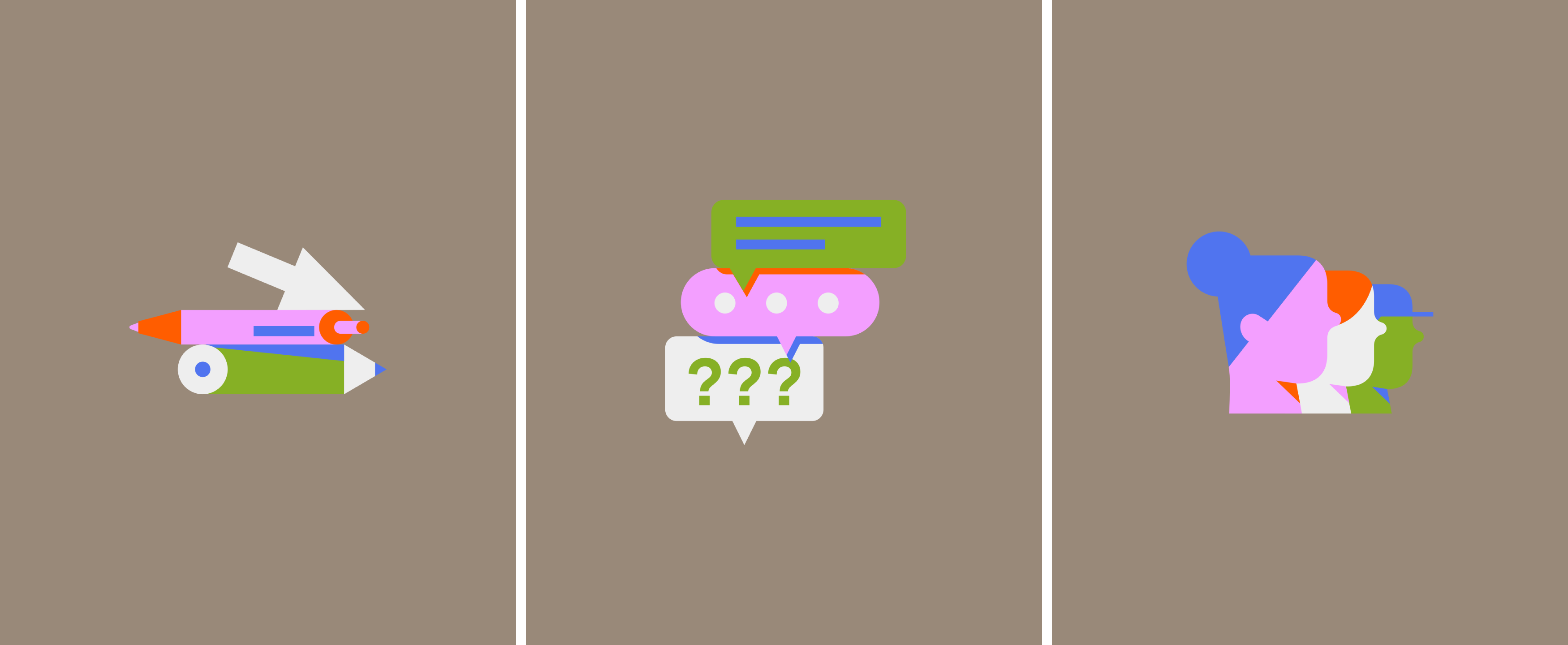
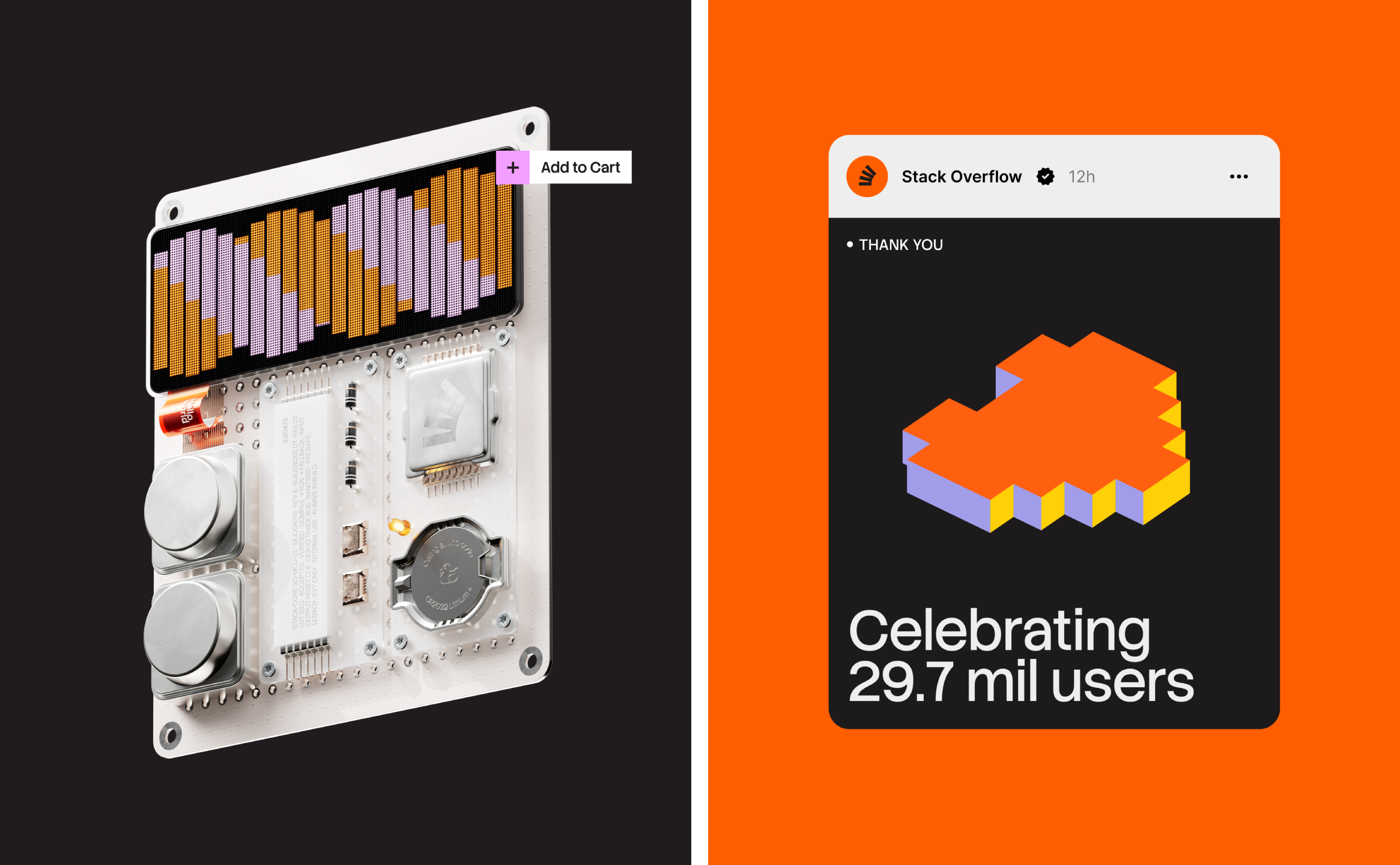
However, there’s tonnes to love here: I really like the illustrative elements, which all sit squarely within the ‘building’ concept but look genuinely lovely. They also double up as patterning where they need to, and add some sass more attuned to commercially facing brands to an otherwise utilitarian-focused identity.
What Koto has actually delivered, though, is a rebrand that understands its brief is bigger than a new logo: this isn’t about beauty or attention or throwing the baby out with the bathwater – almost the opposite, in fact. Because, lest we forget, the strongest identities come into their own more and more over time – or, you might say, are ‘always in build’.