20(Something) borrows from museum-modernity as much as tech in its new identity for civic software platform Open Point
Opinion by Emily Gosling Posted 28 July 2026
I’ve no idea what this trend is called, or indeed if it even has a name, but I’m seeing it around a hell of a lot lately: t-shirts (usually very crisp, almost box-fresh-clean, and white) with a tonne of text emblazoned across the back. It doesn’t seem to matter at all what the text says, to means, but there’s a definite alignment in font choices and how they’re used – 99% of the time, at least one is set in that nice if ubiquitous ‘post Chobani’ style of editorial-leaning serif, often used alongside something a little wackier, and frequently some cute characters or illustrative elements. Maybe a painterly depiction of an orange or something.
These t shirts, as I mentioned, have no particular message, and range in sensibility/sense-making/indication of a dicey translation job: there’s the Excel Centre Trade Show type slogan (but in French so instantly very chic despite the obvious banality), Pros de l’internet depuis 2008 (as you might expect, ‘internet pros since 2008’); the ‘Essex Aunty’s fridge magnet’ vibe-coded Paz, Amor y café [Peace, Love and Coffee] (obviously); the surreal yet boring (Clean Desk Policy), which you can only assume is a weird internet mistranslation.
For the lads, this trend is exemplified in such garments as those laden with wisdom such as Pomodoro Spaghetti; or a wealth of macho-motivational-manifestation-bro stuff (Grow Through What You Go Through). Then there are those slogans that simply rhyme, with seemingly no other reason to exist (Aspire to Retire).
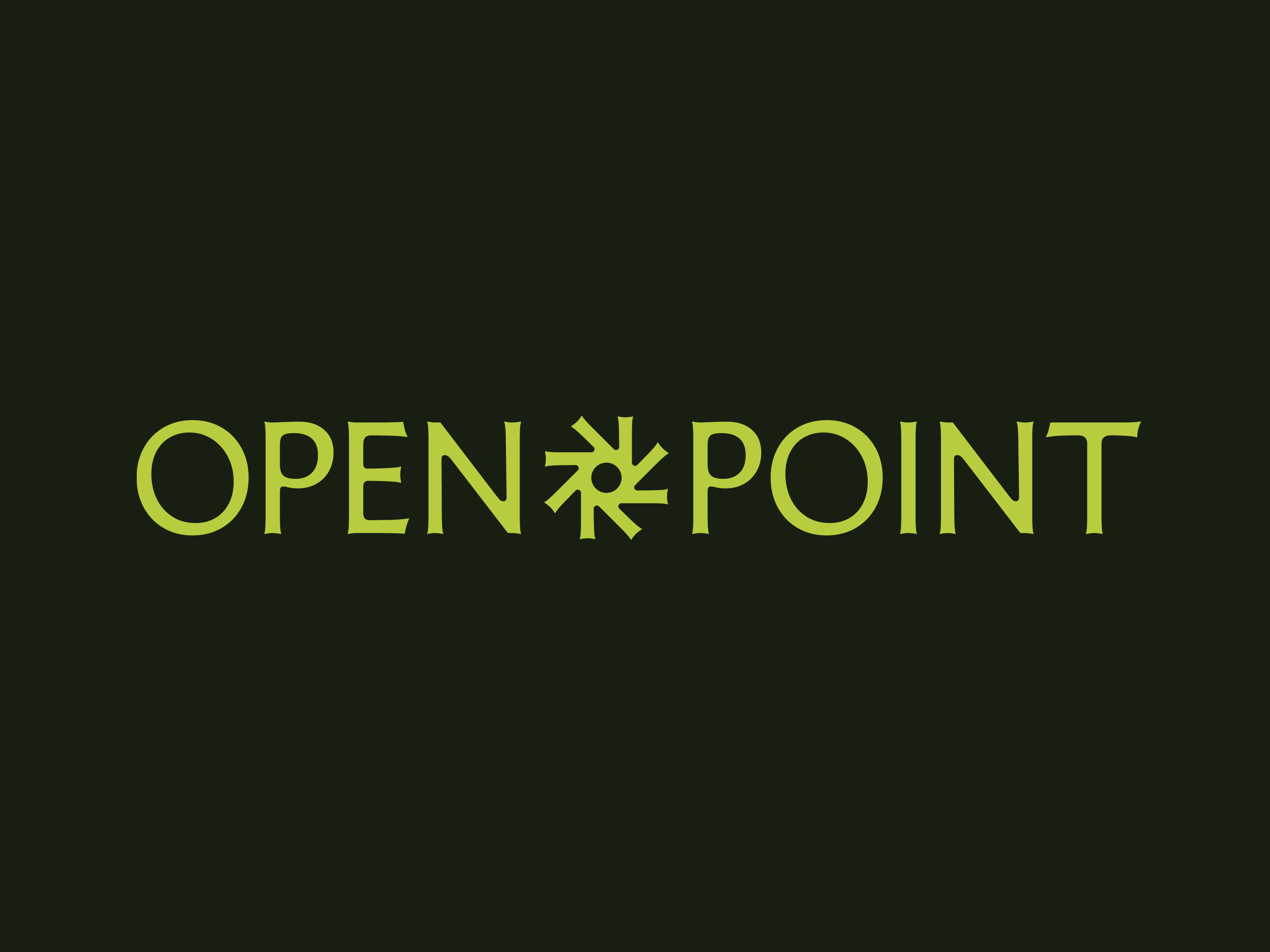
Anyway, I mention all this because it turns out that serif – the one that lives somewhere between a contemporary museum identity and an eyewateringly expensive B-Corp-certified oat-milk brand carton – is no longer reserved for any one particular corner of brand design. And one of its latest outings is in this new identity from London-based agency 20(Something) for civic technology company Open Point.
Open Point is (as far as I can understand) a platform which ultimately helps hundreds of organisations across local government, infrastructure and development with consulting the public on things like roads, homes and energy schemes that get built near them. It has been formed from a merger of two existing products – community engagement tool Social Pinpoint and stakeholder management system Consultation Manager – into a single connected platform.

20(Something) was tasked with creating a new identity that serves two main purposes: to appear credible and rigorous enough for the developers and civil servants who have to answer to regulators, while staying warm and legible enough for everyday people types who might be consulted about something like a new roundabout.
The agency’s answer was to sidestep all the obvious “civic engagement” clichés – no speech bubbles; no interlocking hands; no hideous stock photography of a uniformly good looking, but quite diverse bunch of people chuckling at something and nothing – and instead look to something else. Something more powerful, more primal, more storied in its history: the chisel.
Which makes sense when you think about chisel in relation to letterforms and their role in public life: early Latin letterforms, carved into the stone of civic buildings and public monuments, have functioned as a kind of visual shorthand for trust and authority for literally thousands of years.
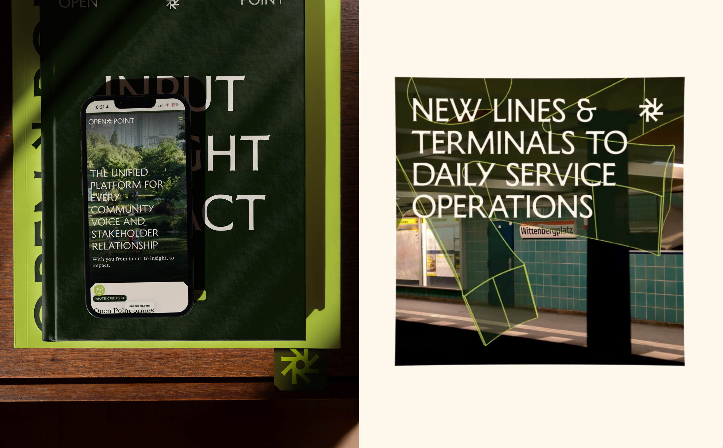
The whole identity leans on a high-contrast, chiselled typographic voice based around Memoir by Cologne-based Studio Daniel Gremme – a stately font indeed, with its Roman-inspired proportions, a gentle stroke contrast, and overall sense of confidence but heritage and warmth.
This is used alongside ABC Social, a gorgeous variable grotesque from Berlin foundry Dinamo which has some sublime little touches – see its dynamic lower-case ‘s’ and double-storey ‘a’.
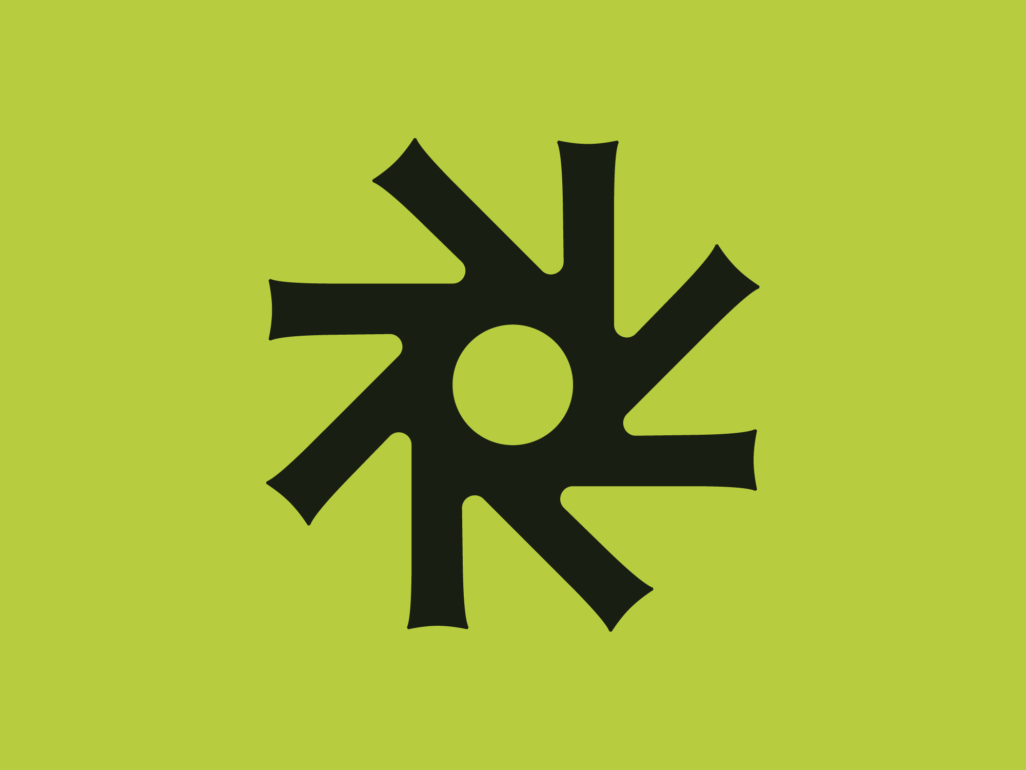
Open Point appears to have borrowed a little more than just the typeface from that project too: the icon used to demonstrate ABC Social’s various weights on Dinamo’s site – a round, open-countered device with six spikes radiating off it – looks suspiciously like the seed for Open Point’s own logo. Which, appropriately enough, is exactly what it says on the tin: open, and pointed. It’s a nice little mark though, somewhere between a tool you might find in the hands of pastry chef, a dominatrix, or an engineer.
The whole identity has more than a whiff of recent museum rebrand about it: the stately, cut-stone letterforms; a colour palette that’s all deep, quietly confident greens and smart neutrals and a range of purples – all very upper middle class, National Trust, ‘holidaying with family friends at their summer house’.
In short, it shouldn’t work for a tech product, and yet it does – likely because as tech products go, this is one that’s very much about human people and their lives, and the vast range of those which are possible.
One of the standout elements of the projects for me is the motion design as shown on the Open Point website: that turning 3D cog is so oddly beautiful and satisfying to watch, and I love the strange, very gently unconventional principles by which it spins.
I do wonder how far the compliance officers and planning consultants who make up a fair chunk of Open Point’s user base are quite as moved by a well-eased logo animation as the sort of people steeped in the world of brand design are, but perhaps that doesn’t matter. Maybe the point is that an industry that can be read as rather dry, something like this is exactly what’s needed: beautiful, but conceptually rooted chiselled lettering; National Trust greens; skillfully flexible and adaptable logo that works seamlessly across flat 2D applications and kinetic, 3D ones alike. So kudos to 20(Something) for being bold enough to pilfer from the gravitas of the museum gift shop (as well as the wisdom of a Clean Desk Policy t-shirt).