Studio Blackburn’s new identity for folding bike icon Brompton cements the brand’s place in British engineering heritage
Opinion by Emily Gosling Posted 20 August 2026
Pretty much the one and only memorable brand name when it comes to bikes you can fold up and carry around, Brompton – as its thoroughly British name might suggest – was founded in England in 1975 by engineer Andrew Ritchie, who developed the first prototype in his West London flat.
The original Brompton bike design specifically looked to tackle the problem of cycling and urban travel (namely how to carry a bike on the busy Tube system in the capital), so Ritchie developed that distinctive folding mechanism that allows the bike to be reduced to a compact package for carrying and storage.
While Brompton bikes are still designed and handmade in London, the five or so decades since starting life have seen the brand shift from a small British bicycle manufacturer into an international brand, with bikes sold across Europe, the USA, and Asia.
As well as its newly global-ish reach, the Brompton range has also expanded beyond the original folding bicycle – indeed, much had changed as the brand’s 50th birthday loomed.

The half-century milestone was used as a turning point for Brompton, which brought in London-based Studio Blackburn to develop a new global brand platform that would offer a more unified design system across digital touchpoints; retail and dealer spaces; ads and other comms, and more.
Over the decades Brompton had become synonymous with not just its signature folding bikes, but with its triptych logo mark. As such, Studio Blackburn did the smart thing here: leave that well alone. A symbol with so much longevity, familiarity and ownability deserves to remain, and so remain it did. All of that sage advice about avoiding throwing a baby out with its bathwater has definitely applied here.
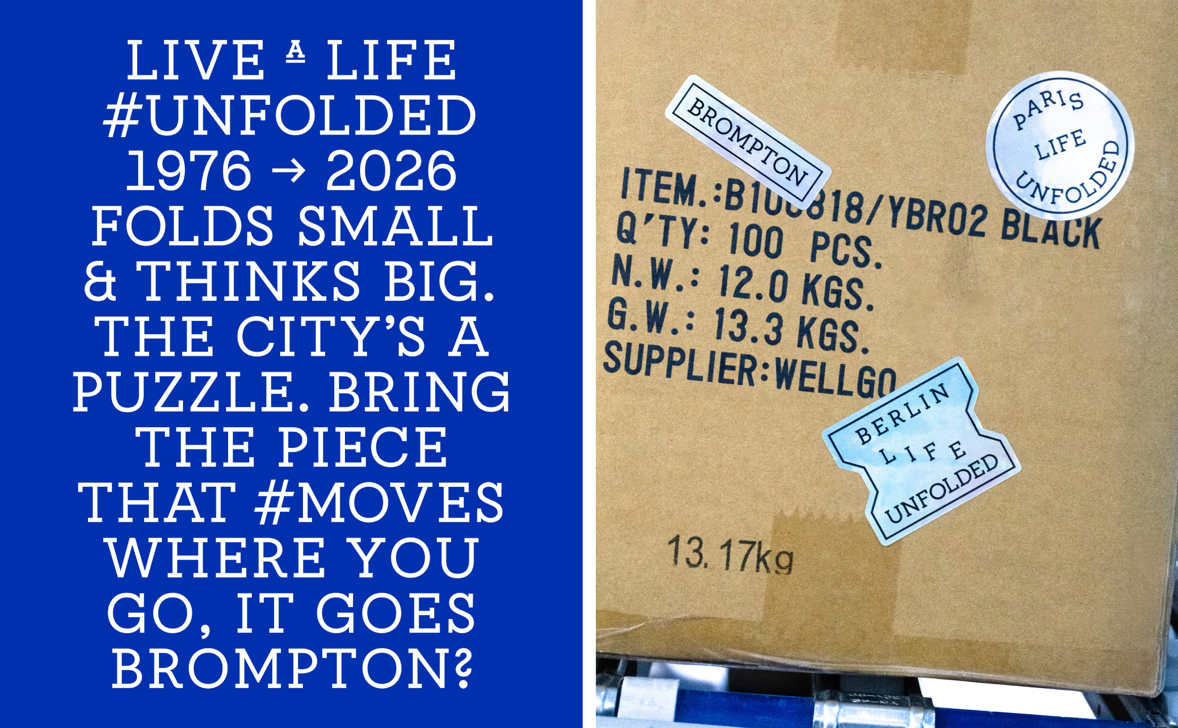
Where Studio Blackburn has really shone here is in how it’s expanded on, rather than necessarily changed or added to, the great branding elements that already existed here.
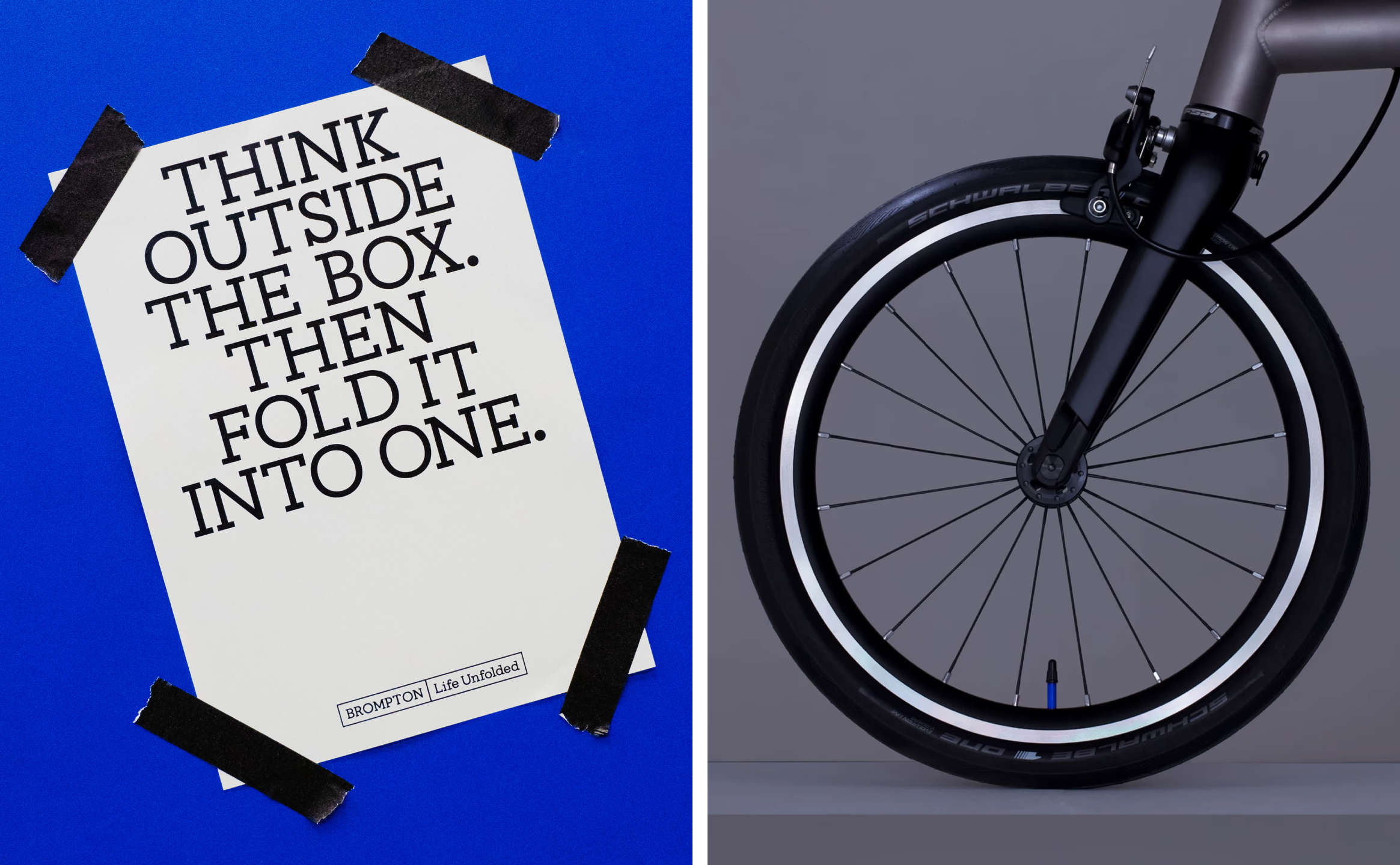
Everything falls under a strategy and organising principle dubbed ‘Life Unfolded;’ a neat encapsulation of the brand’s most standout asset– its product – and a stride to expand everything that product is all about into a broader realm.
It sums up the possibilities that owning a Brompton can offer: it allows its owner to move between different modes of urban life – cycling, walking, travelling by train, working, exploring. The folding, then, becomes as much a metaphor for freedom as a feat of engineering.
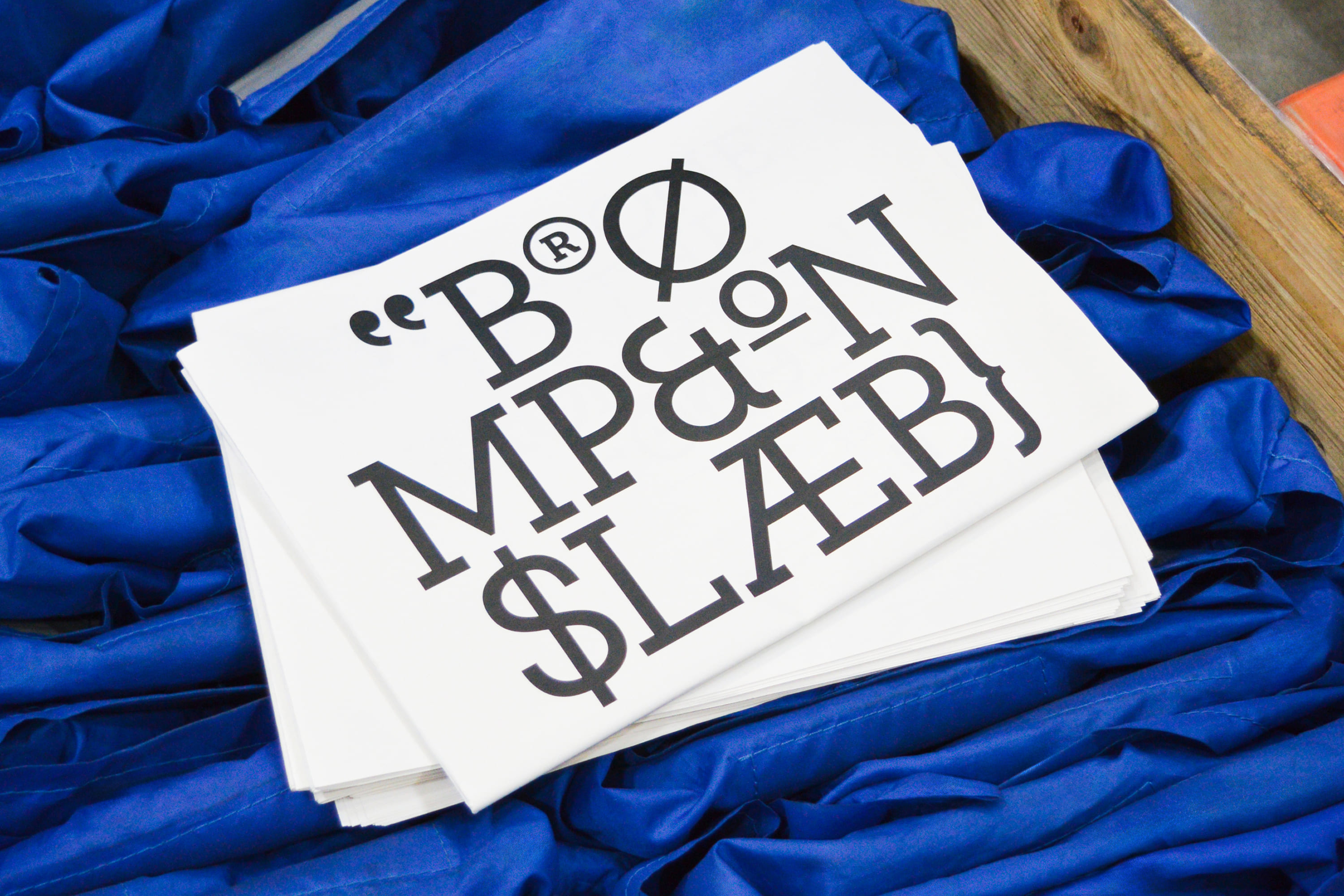
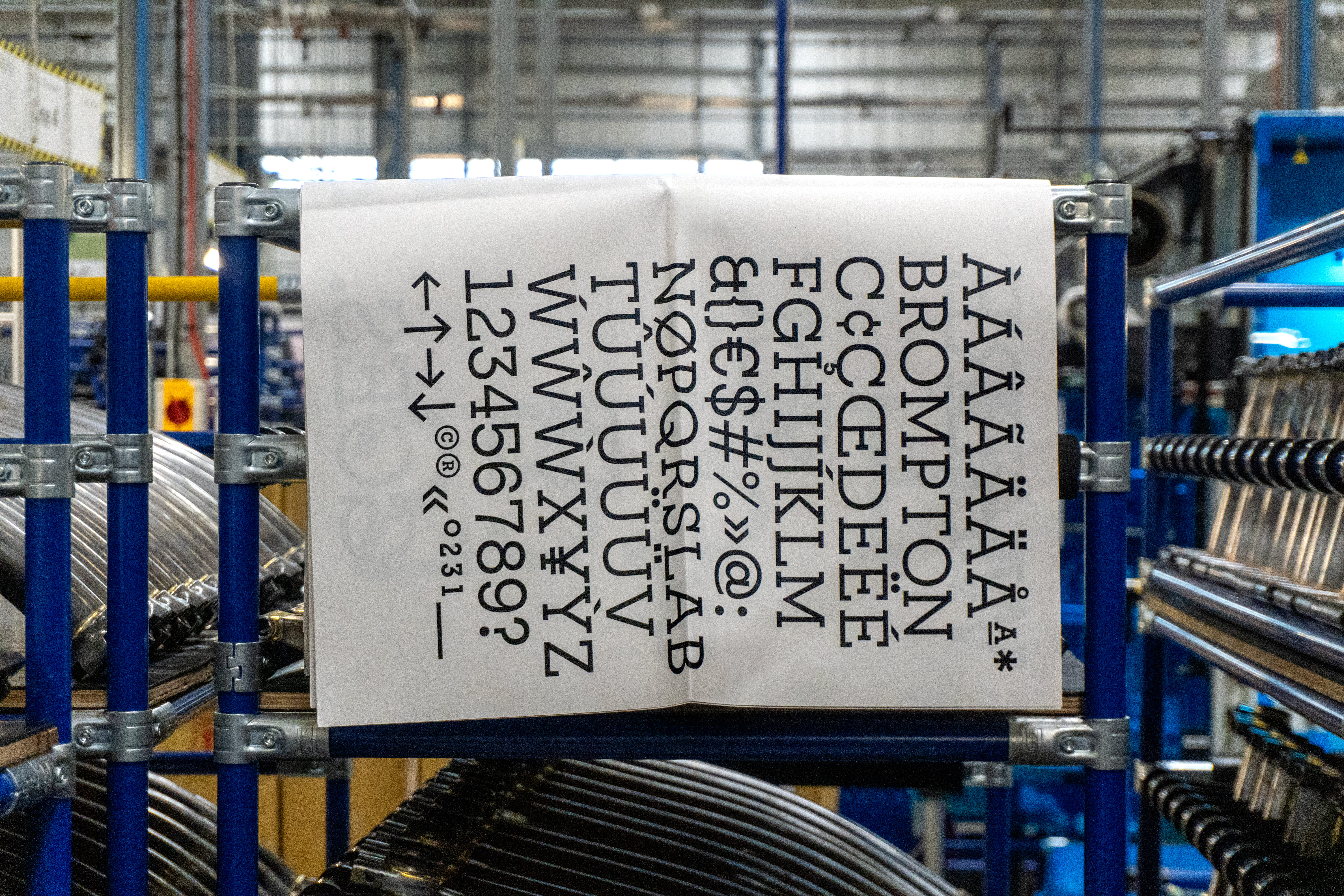
The absolute standout here is the typography. And it feels as though Studio Blackburn has probably really enjoyed this, too, delighting in the parallels between the mechanics of bike-making and of creating and deploying typography, oldschool-style.

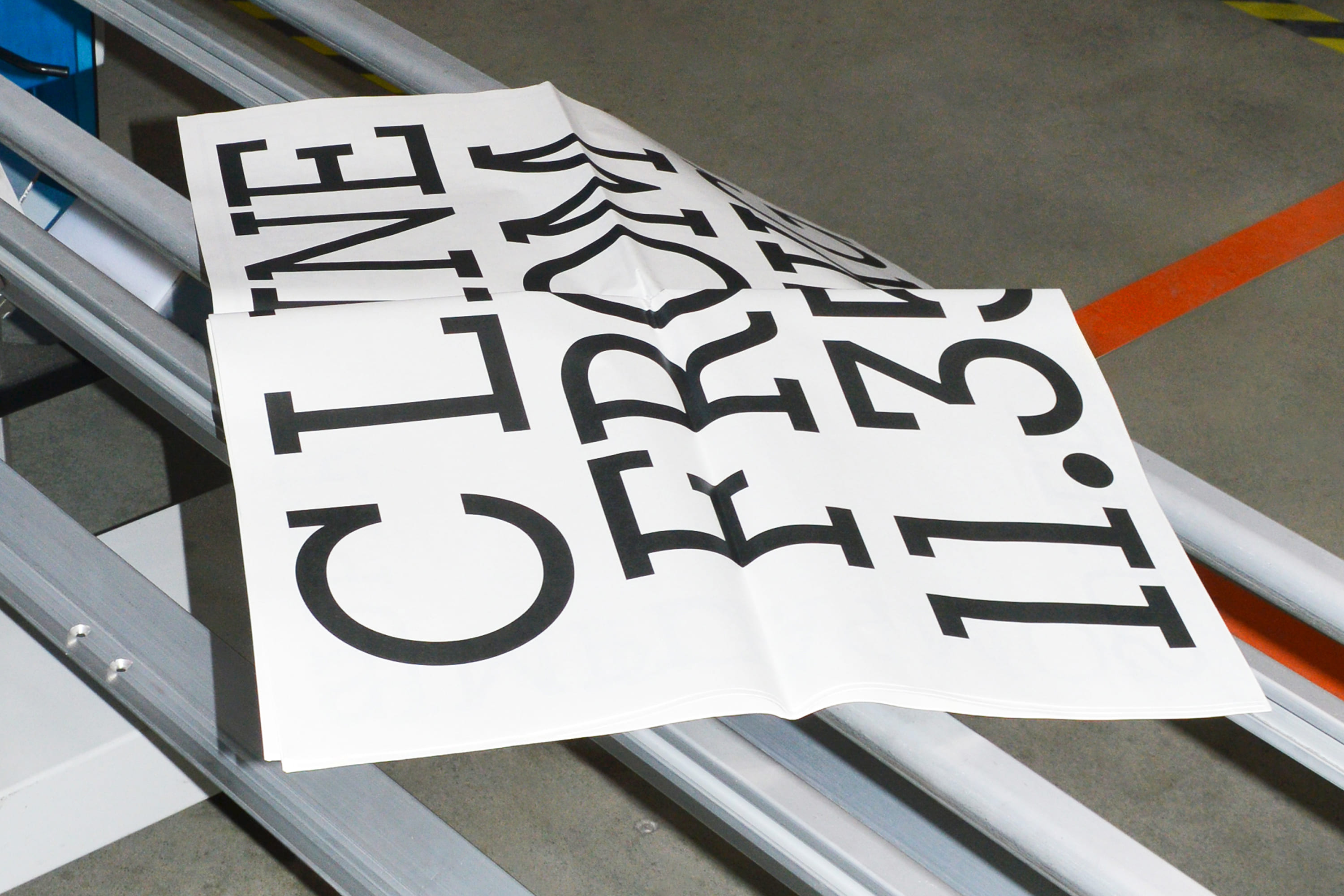
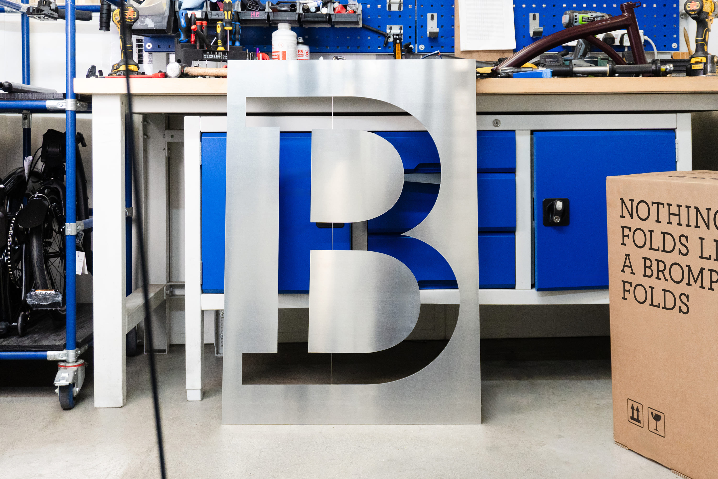
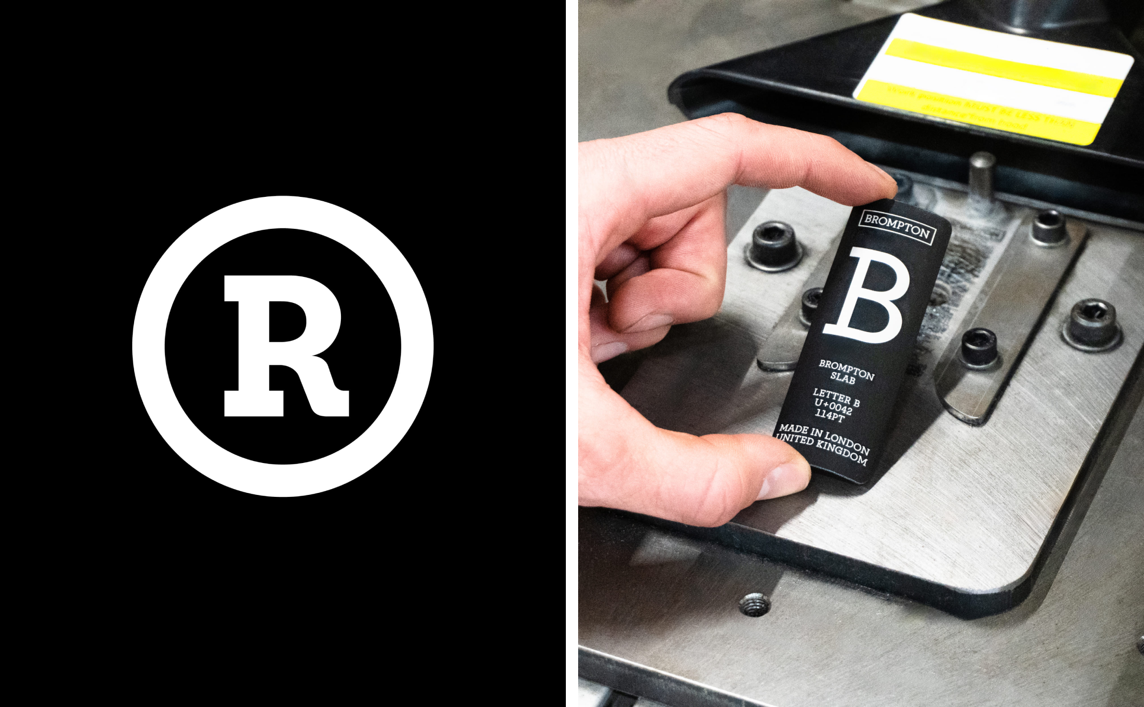
The studio took the geometry of the existing logotype and expanded it into a complete brand typeface called Brompton Slab in collaboration with type designer Sam White, who’s also based in London.
This is the first time Brompton’s lettering had been expanded into a full typographic system, and the letterforms therefore had to undergo some subtle modifications: the proportions of the ‘O’ were adjusted, for instance, to aid the move from logotype to expansive alphabet.
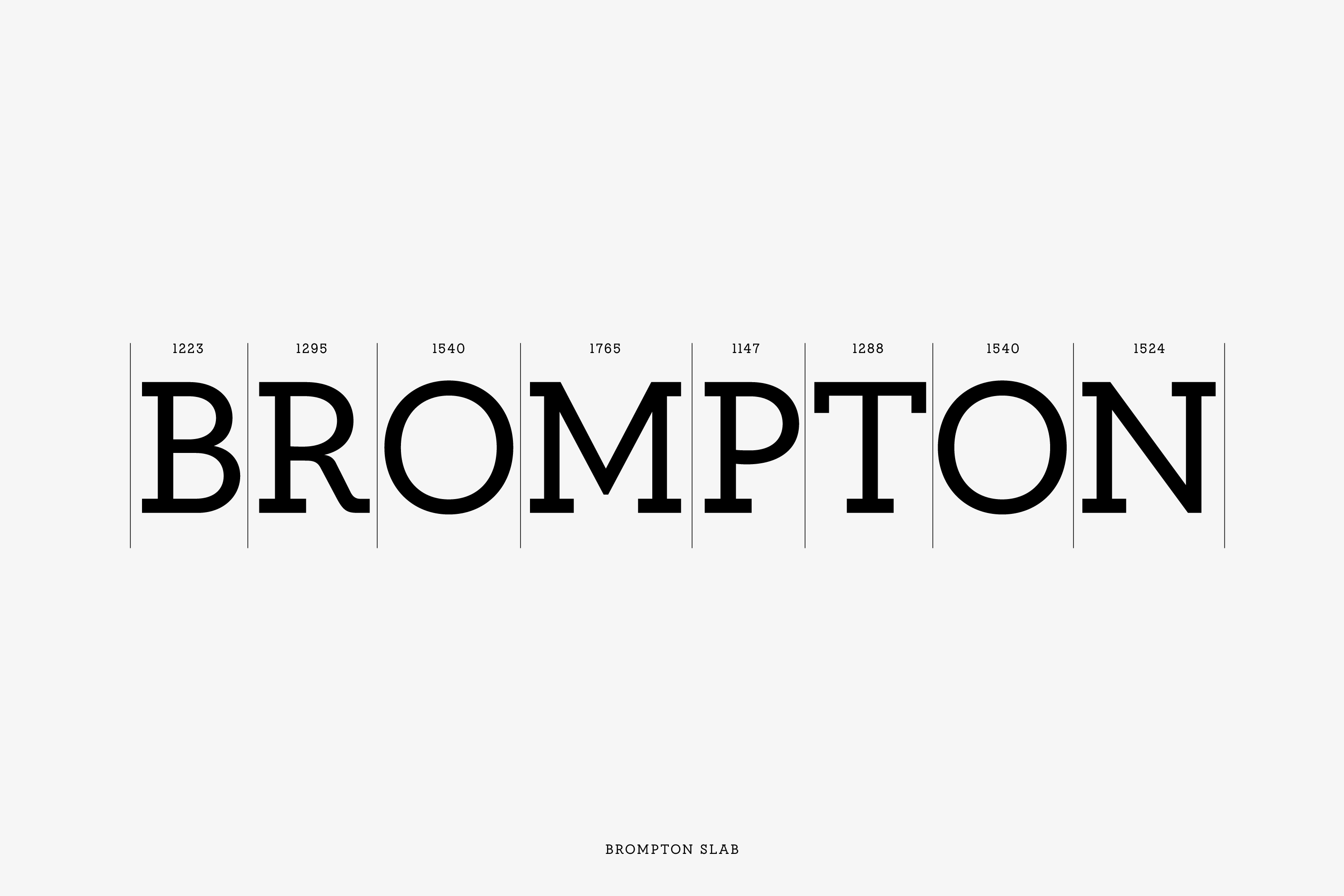
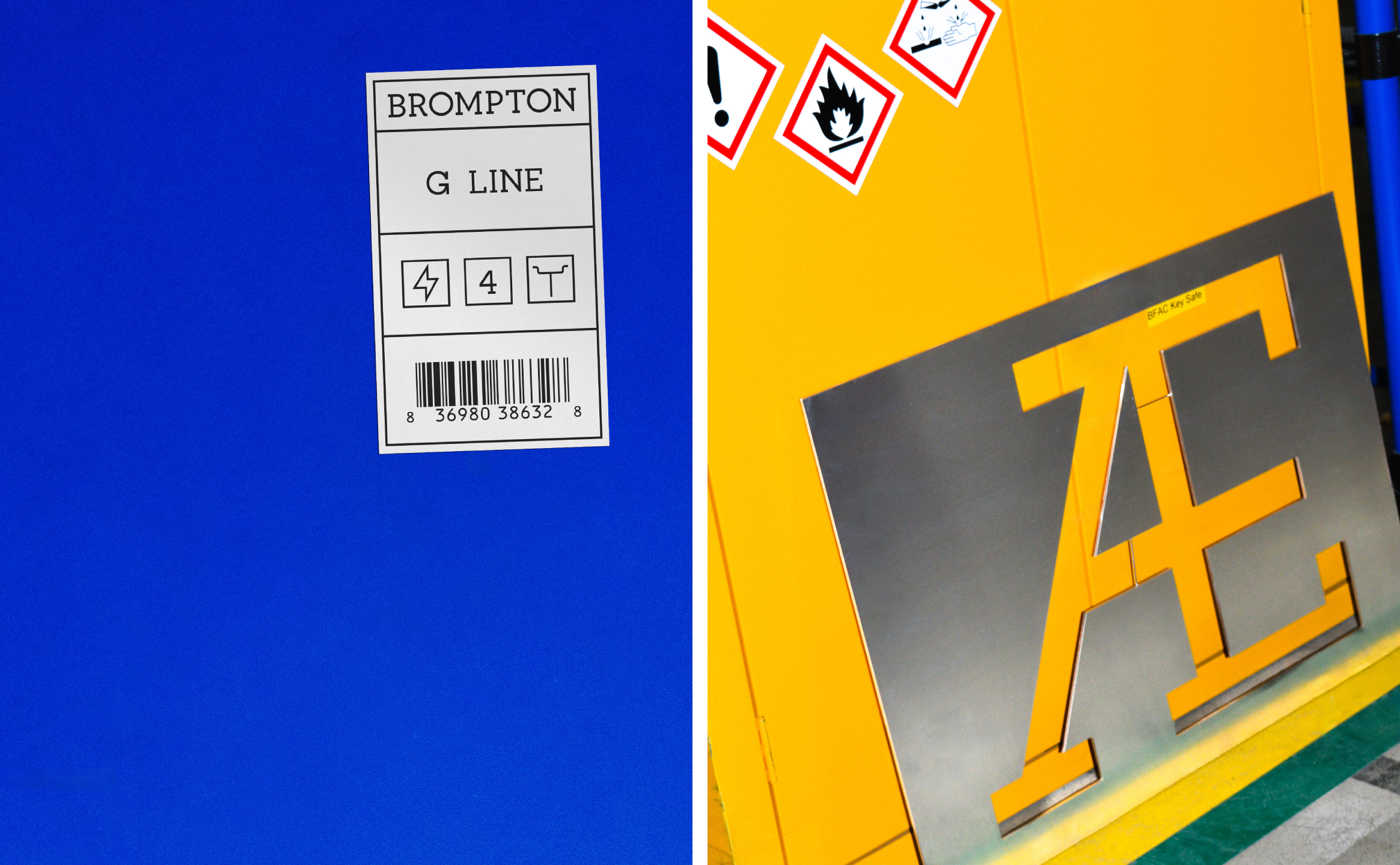
Rather than doing any of this typographic overhauling behind the scenes, Studio Blackburn made the process and the engineering of it all front and centre, making enormous metal versions of Brompton Slab’s letters on the company’s own factory floor.
Photographed alongside the machinery used to build the bikes, the letters provide a pleasingly literal connection between digital brand assets and physical manufacture. It’s a really nice move that cements the brand’s roots in homespun engineering expertise.
Motion is similarly rooted in the mechanics of the product, with the kinetic elements of the identity drawing inspiration from the final flick of the rear wheel as the Brompton unfolds and prepares to move.
Studio Blackburn translates this into a motion system that can operate at different levels of intensity – from relatively simple, smooth interface transitions to more complex, layered editorial compositions. The studio describes these as moving from “3-speed” to “12-speed” behaviour, nodding to bikes’ gear systems to further root the digital design in the vocabulary of both bikes and their mechanics.
The static graphic language is also derived from the folded Brompton box logo, with its geometric volume expanded into a modular framework. Content can sit within it, move through it or appear to unfold from it, giving layouts a sense of movement and a tonne of flexibility.
As for the colour, things are kept punchy but simple: Studio Blackburn has established Brompton Blue as a proprietary signature, a high-visibility industrial blue inspired by the colours of the factory itself. Elsewhere, it’s just black and white with flashes of an equally industrial, deliciously vivid yellow.
Things can expand beyond these tones, however, with Studio Blackburn ensuring the system can adopt custom palettes for collaborations and special projects such as Brompton’s collaborations with other fashion, cultural and sporting partners.
The strongest aspect of Studio Blackburn’s work, I would argue, is that it doesn’t mistake modernisation for reinvention. Brompton’s most valuable assets – the logo, the triptych, the fold, the London manufacturing story – are already there. What’s happened so skilfully across the new identity is that they’re articulated more clearly, and work even harder.
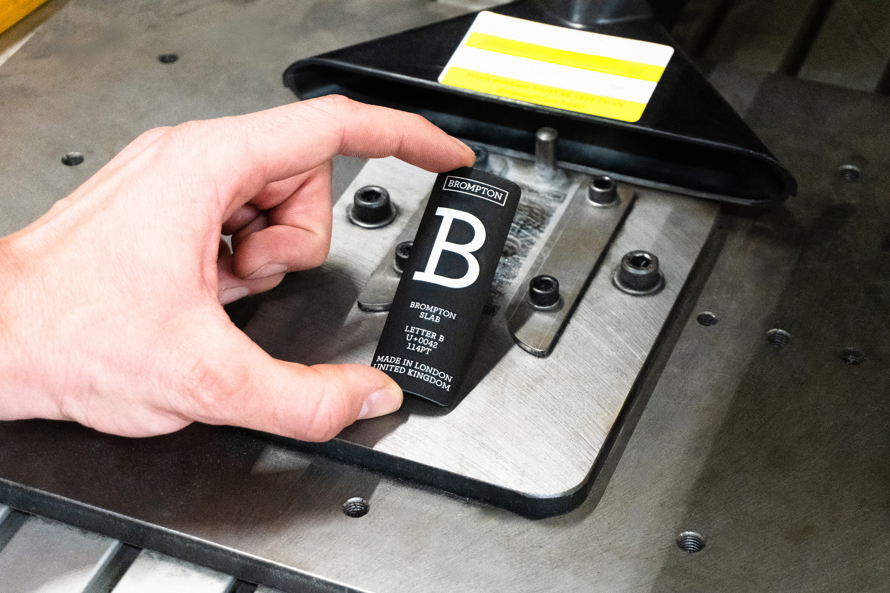
Everything constantly – and with varying degrees of overtness or subtlety – comes back to the mechanics, the engineering.
All of that – as well as the palpable joy in playing with type and articulating it in its most physical manifestations – makes the identity feel absolutely rooted in heritage but bang up t date and contemporary. It is, you could say, a sort of unfolding of what was already there. Which, for Brompton, is probably exactly the point.
img class=”aligncenter size-full wp-image-134207″ src=”https://bpando.org/wp-content/uploads/Studio-Blackburn-brompton-rebrand-design-identity-logo-wordmark-bpo-review-Brompton-Paper-1.jpg” alt=”Studio Blackburn brompton rebrand design identity logo wordmark bpo review Brompton-Paper-1″ width=”2000″ height=”1333″ />