‘I am the walrus’: Anatomy’s charming new identity for the Horniman Museum
Opinion by Emily Gosling Posted 3 September 2026
I struggle to think of a subculture I detest quite as viscerally and deeply as steampunks: not only is it aesthetically quite hideous, I just don’t really get it – it’s the past! But the future! But very dusty and everyone’s a creep! Inexplicably wearing goggles!
It all smacks of a man in the corner of your front room at 5am, who everyone else at the afterparty thinks someone else knows – a man with a pocket watch and a flat in Stoke Newington (despite no apparent job/income) and a slightly strange hat who’s almost definitely read The Game at some point during his formative years who relentlessly harps on about polyamory and speaks as though he’s auditioning for an undefined role in Oliver Twist, but quite a posh one.
It’s enough to put anyone off any sort of look and feel with even the faintest whiff of Victoriana appropriation; enough to make you shun vitrines and cogs and anything resembling them, in fact.
As such, this absolutely joyful new work for Horniman Museum and Gardens by London-based brand and design agency Anatomy is an absolute masterstroke, for once successfully taking ye olde accoutrements of 19th century gubbins and fusing them with everything we need from a 21st century museum identity.

Those who live in London or its outskirts have undoubtedly heard of the Horniman Museum: once it’s mentioned, you can put money on what happens next – someone will make some sort of joke about the ‘Horny man museum’, someone will mention the overstuffed walrus. Everyone knows about the walrus.
A more churlish or short sighted design agency might decide to do something ridiculous with that fact, and insist that the museum needs to communicate that the Horniman is about so much more than the walrus. It is, of course, but only the daft would deliberately throw out that strongest of word-of-mouth brand assets.
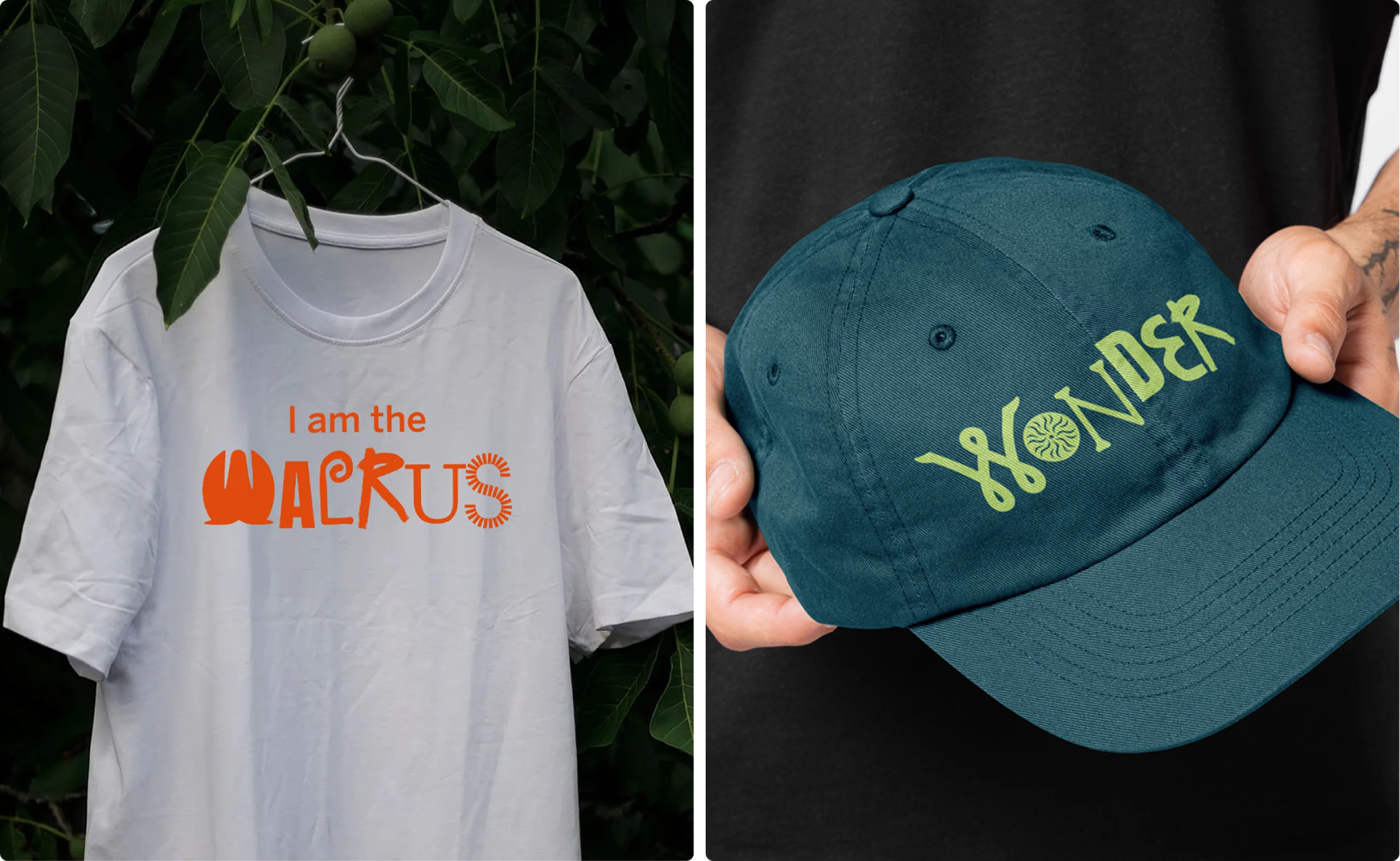
Indeed, it would be absolutely mental to not address that portly elephant in the room – well, its not-too-distant relative, the walrus in the room – and Anatomy has gone one better by doubling down on it as the unofficial mascot of the museum that it’s always been, and probably always will.
Not only does he appear in all his splendour and magnitude in campaign elements such as video, but he also flexes across copy on merch such as t shirts that bear the words ‘I am the walrus’ (a shrewd play indeed to lure in not just the historians and zoophilists, but that ever-lucrative Beatlemaniac market).

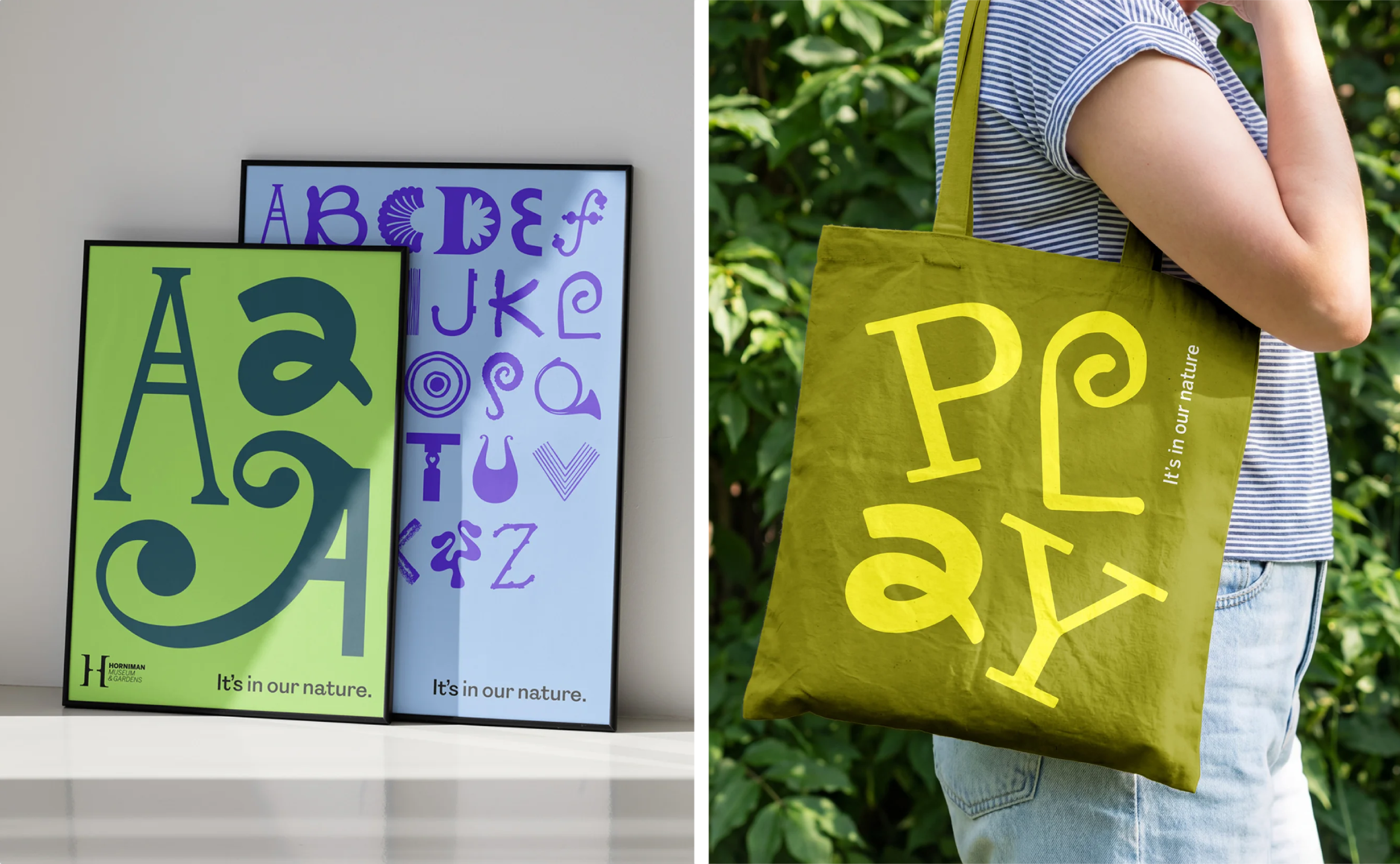
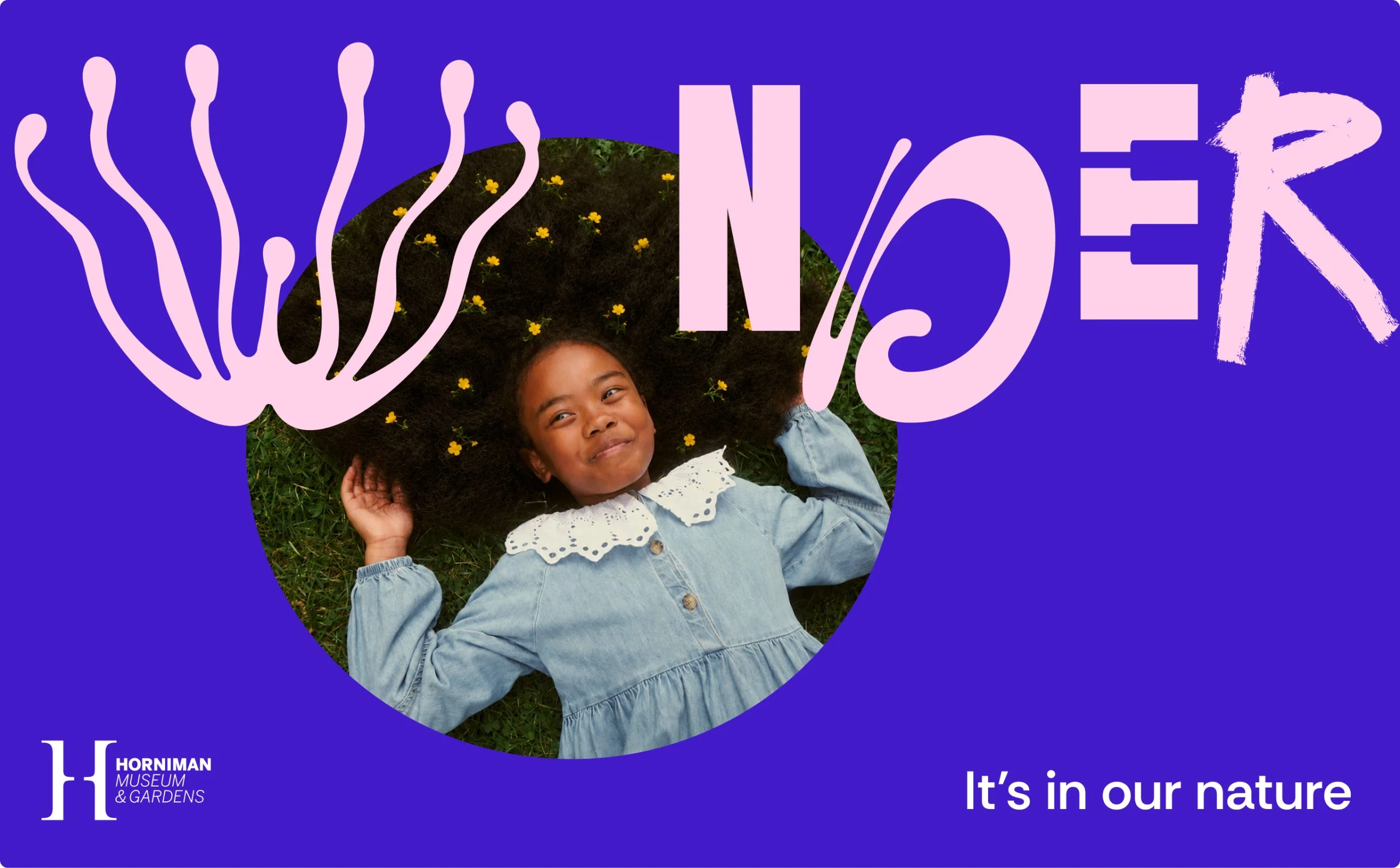
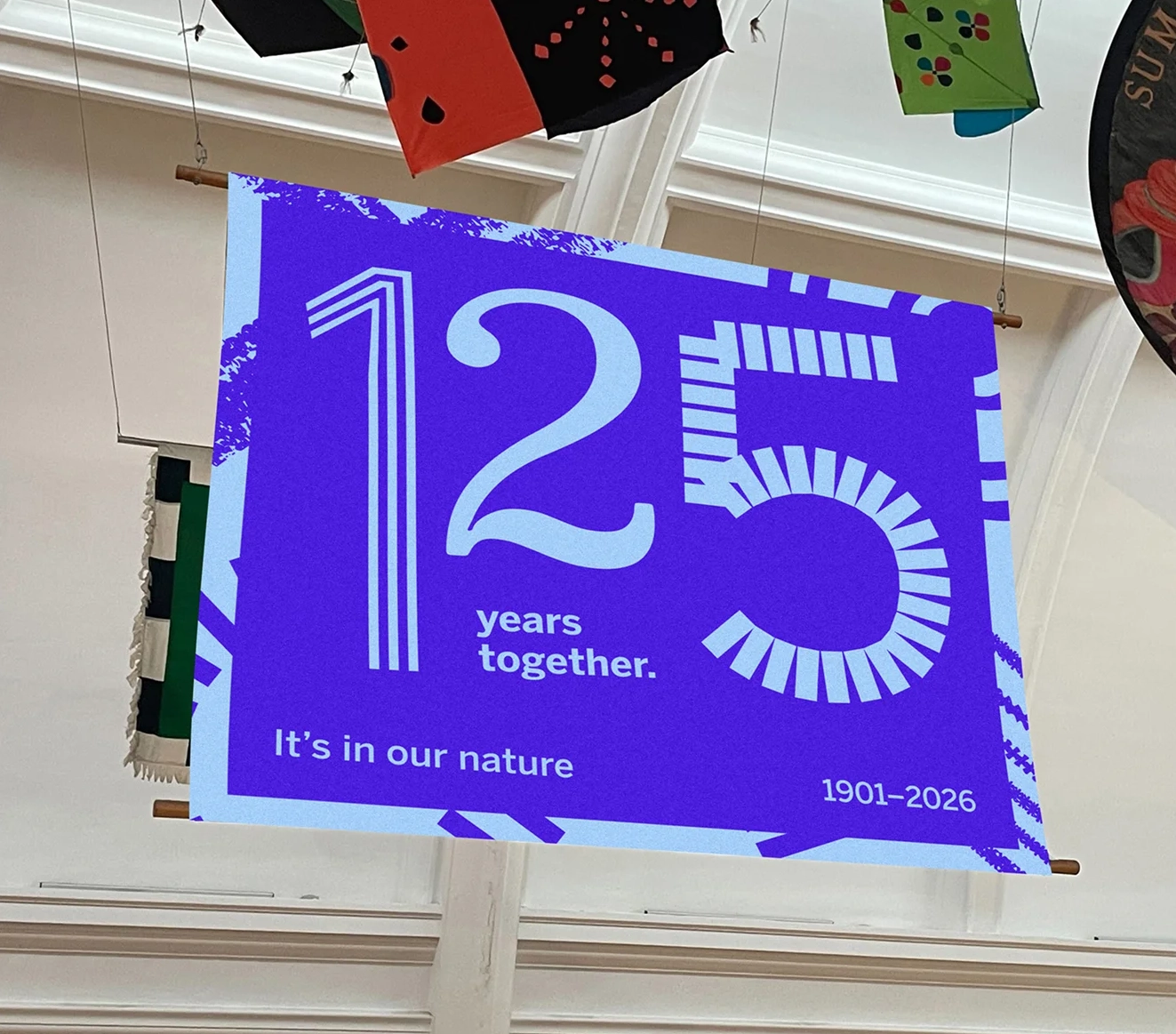
Anatomy was brought in to work with the Horniman on a new campaign and repositioning project as part of its 125th anniversary. This also saw the institution introduce a series of new visitor experiences including a nature-themed play space, community gardens, and a transformed Nature Gallery.
As with (or so it seems at least) 99% of museum projects, a pretty significant aspect here was aiming to attract new audiences, and while only of course time will tell, Anatomy’s approach here is surely as good as any.
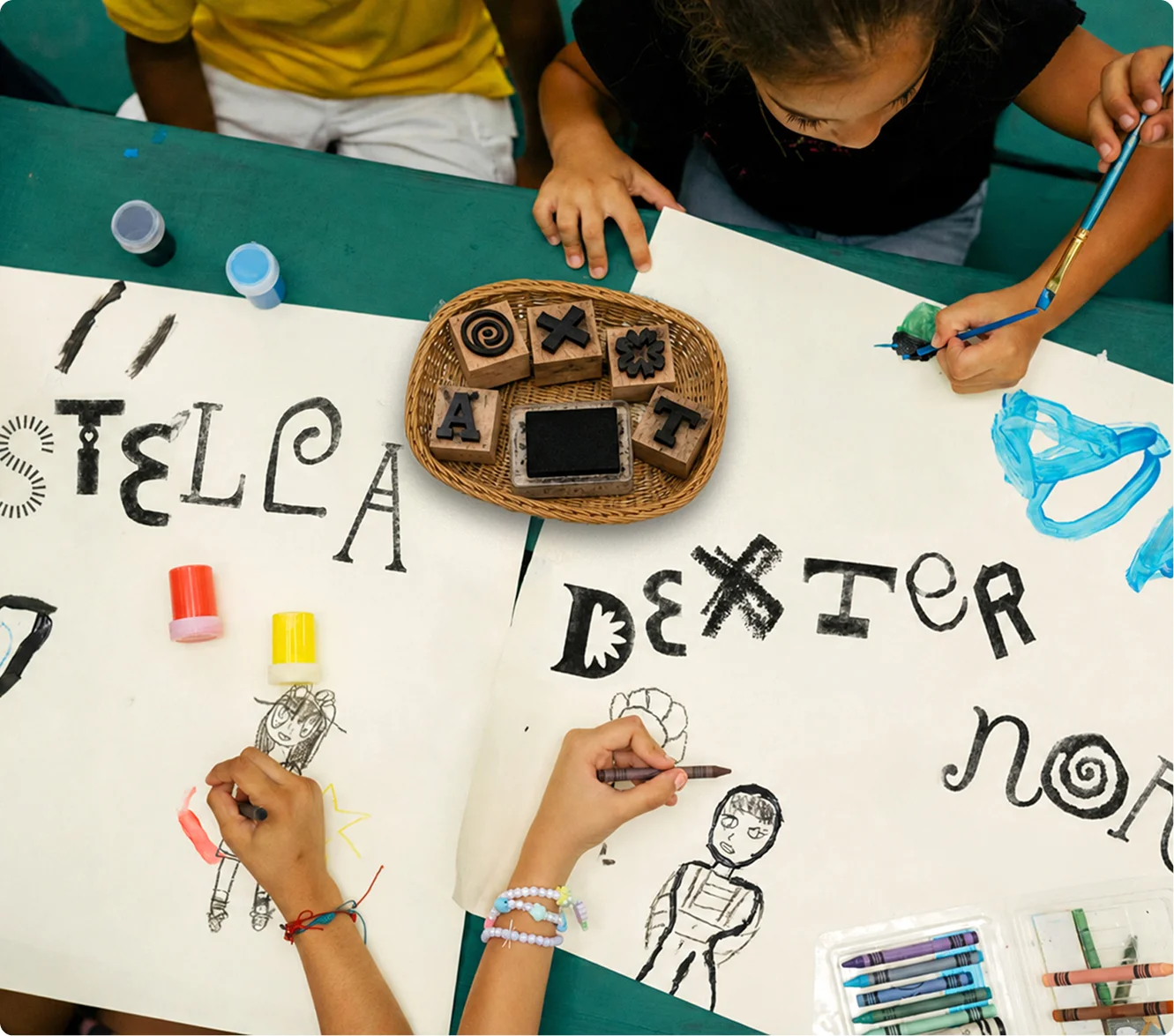
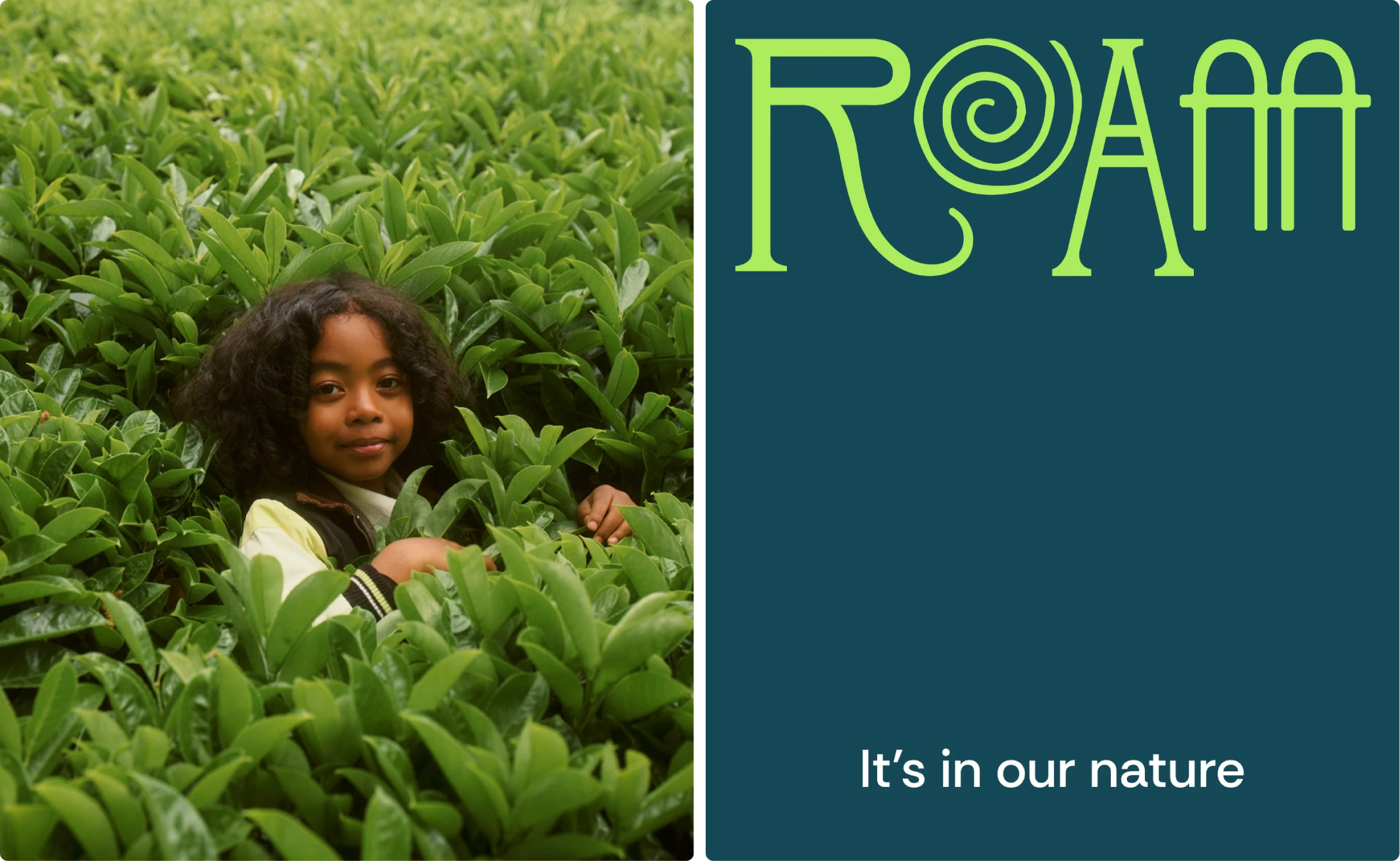
The copywriting throughout the identity here is really excellent: the perfect balance of clear, communicative and comprehensible without ever speaking down to people or trying too hard. The strapline “it’s in our nature” is succinct, witty, and does its job perfectly: not too obvious, not too oblique, nice double meaning, job done.
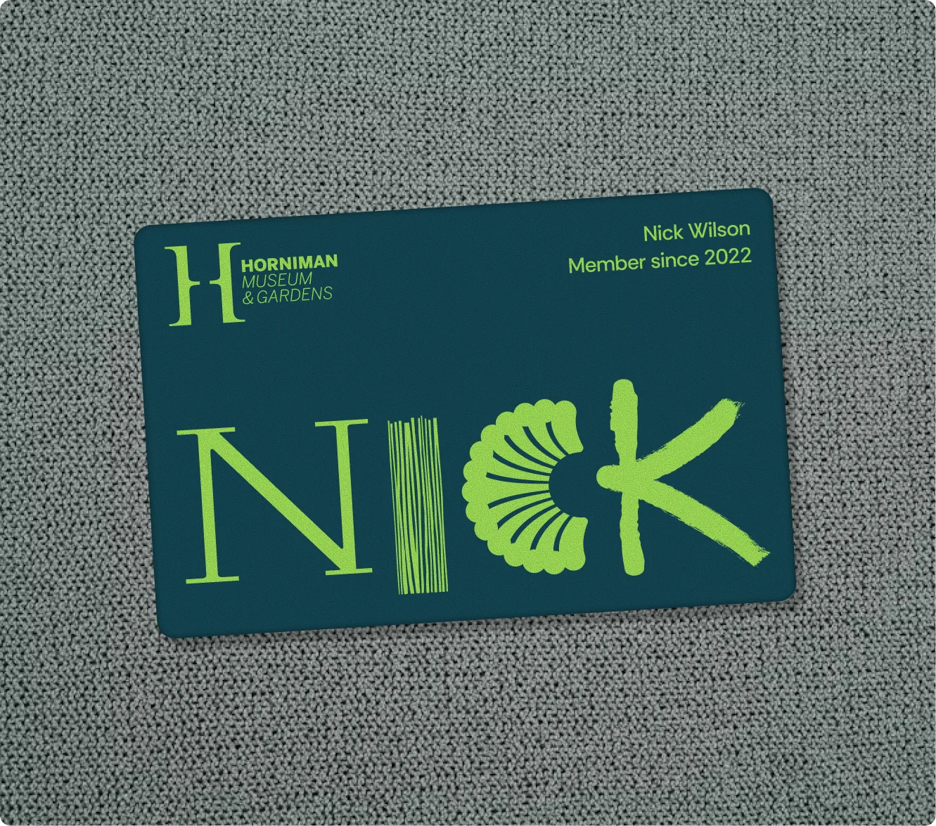
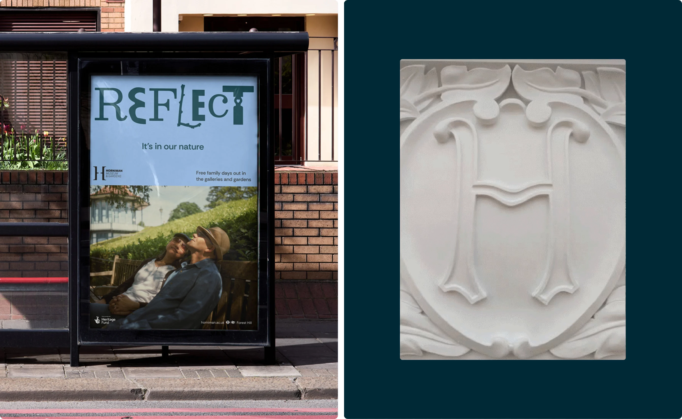
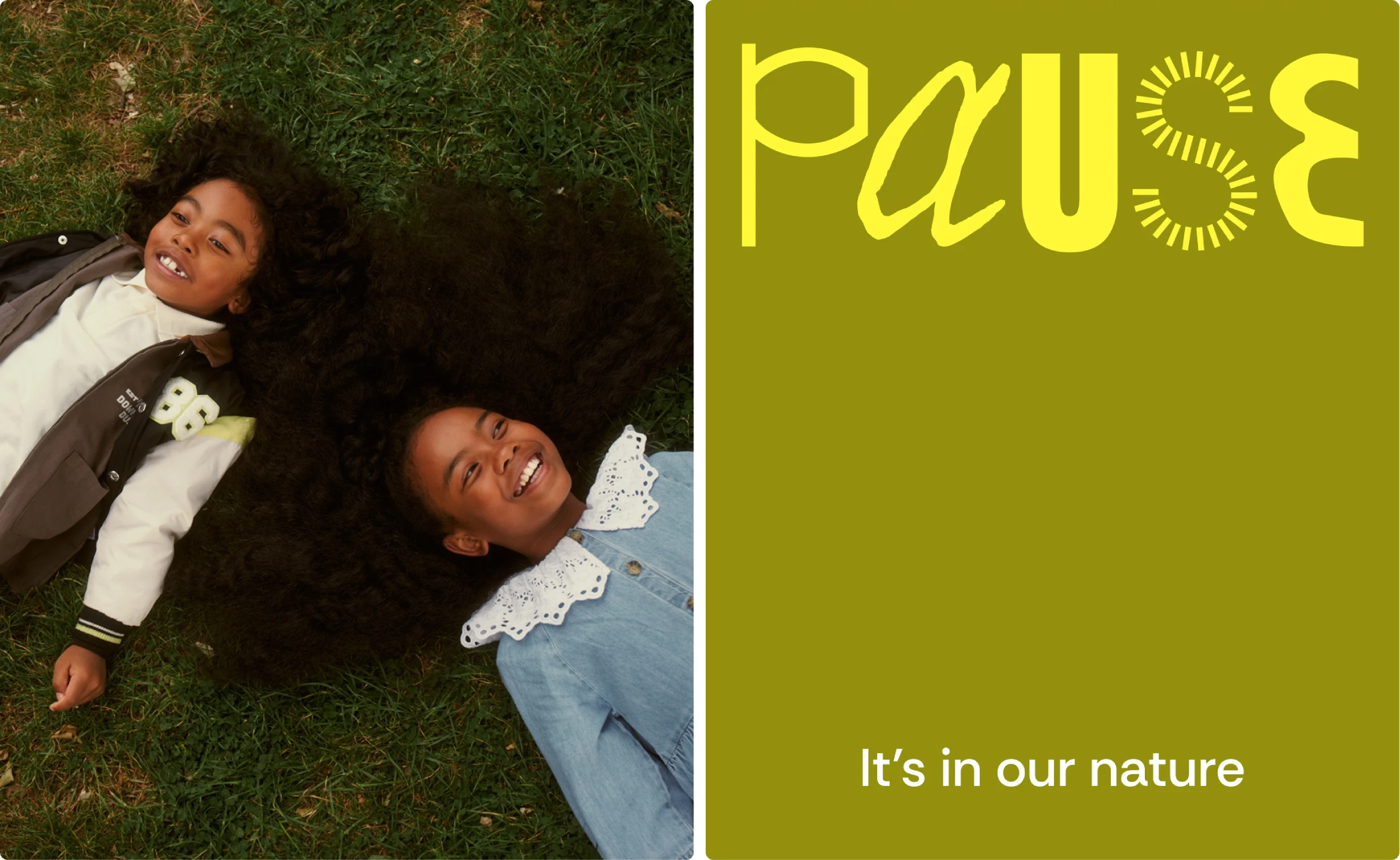
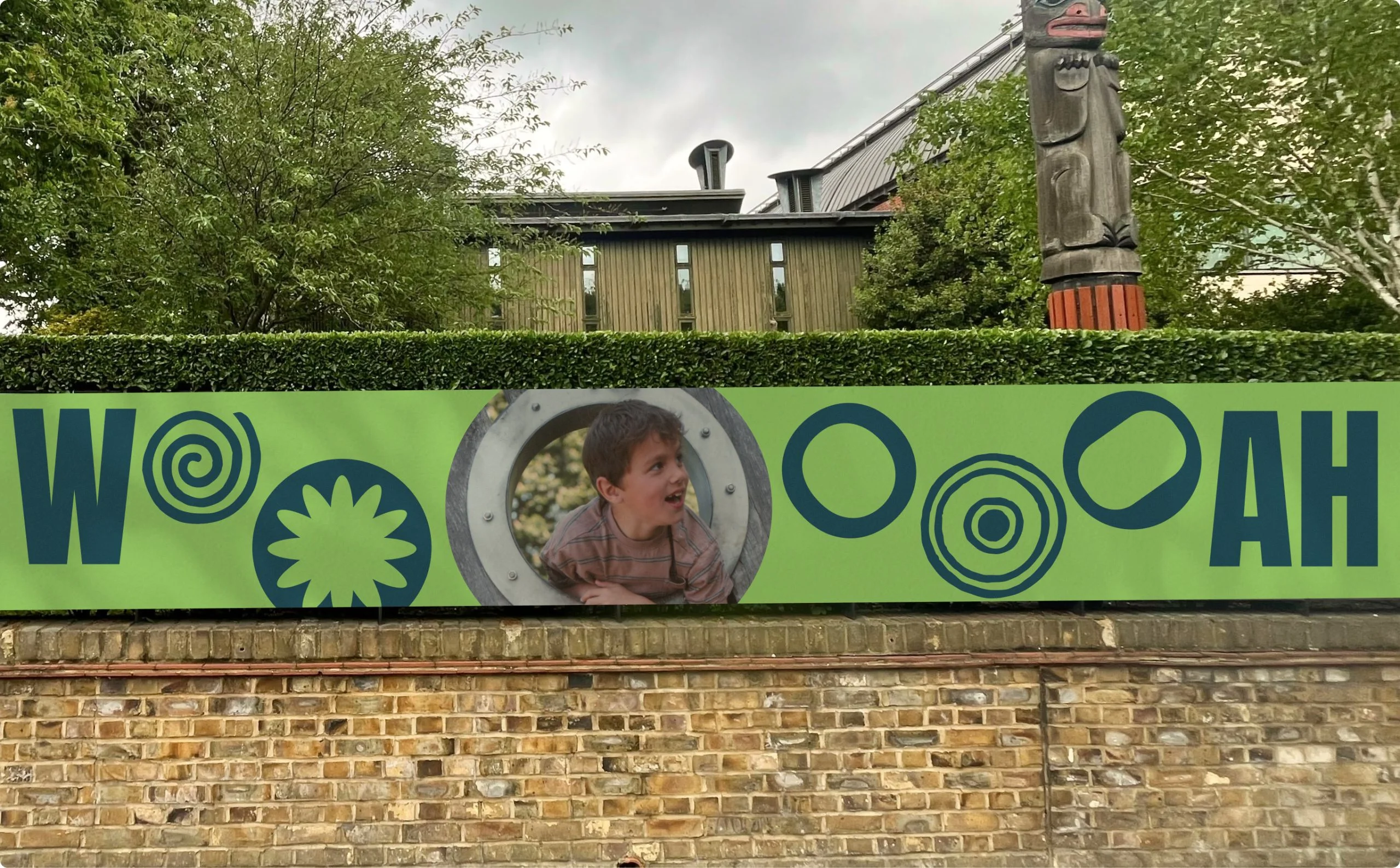
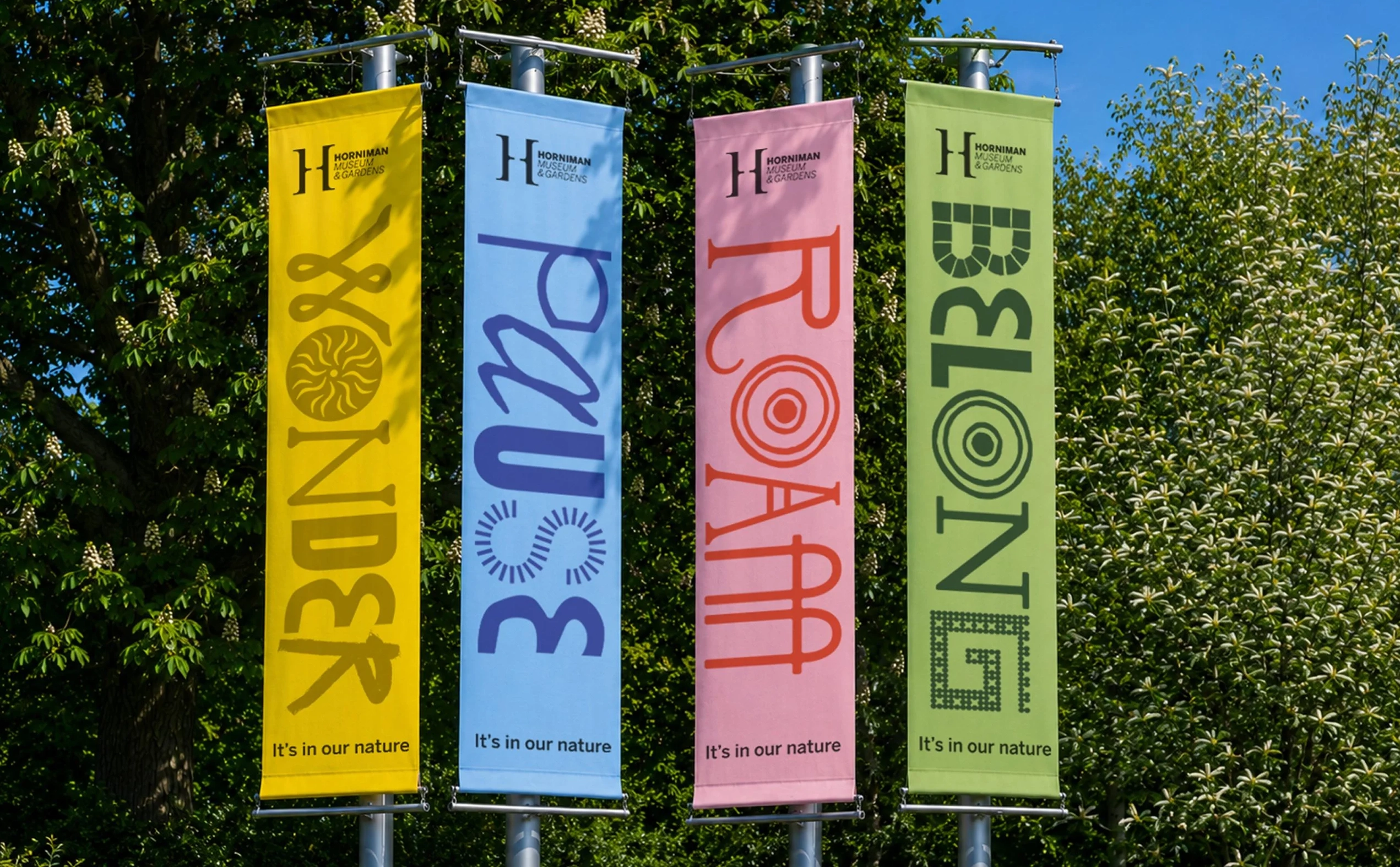
But the real joyfulness comes through in how that copy is conveyed – i.e. in the type. The lettering here is as much decoration and Easter Egg hunt as it is functional font, with Anatomy opting to use a bespoke system for the Horniman in which each letter seems to be directly taken from, or referring to, something that may or may not be in the museum’s displays or collections.
And while it’s nice to spot something you recognise here or there, recognition isn’t essential; the cumulative effect is simply that the alphabet feels curious, slightly wonky and entirely at home at the Horniman. Crucially, all the forms still have to function as letters – above all, they’re legible – and the resulting system can therefore move from big outdoor applications to social posts and on-site communications without collapsing under the weight of its own concept.
That idea of collecting and connecting also gives the layouts their character. The typography can act as a headline in its own right, but it can also sit alongside photography, graphic shapes and short, imperative words such as ‘Explore’, ‘Play’, ‘Seek’, ‘Roam’, ‘Gather’, ‘Wonder’, ‘Reflect’, ‘Pause’, ‘Share’ and ‘Belong’.
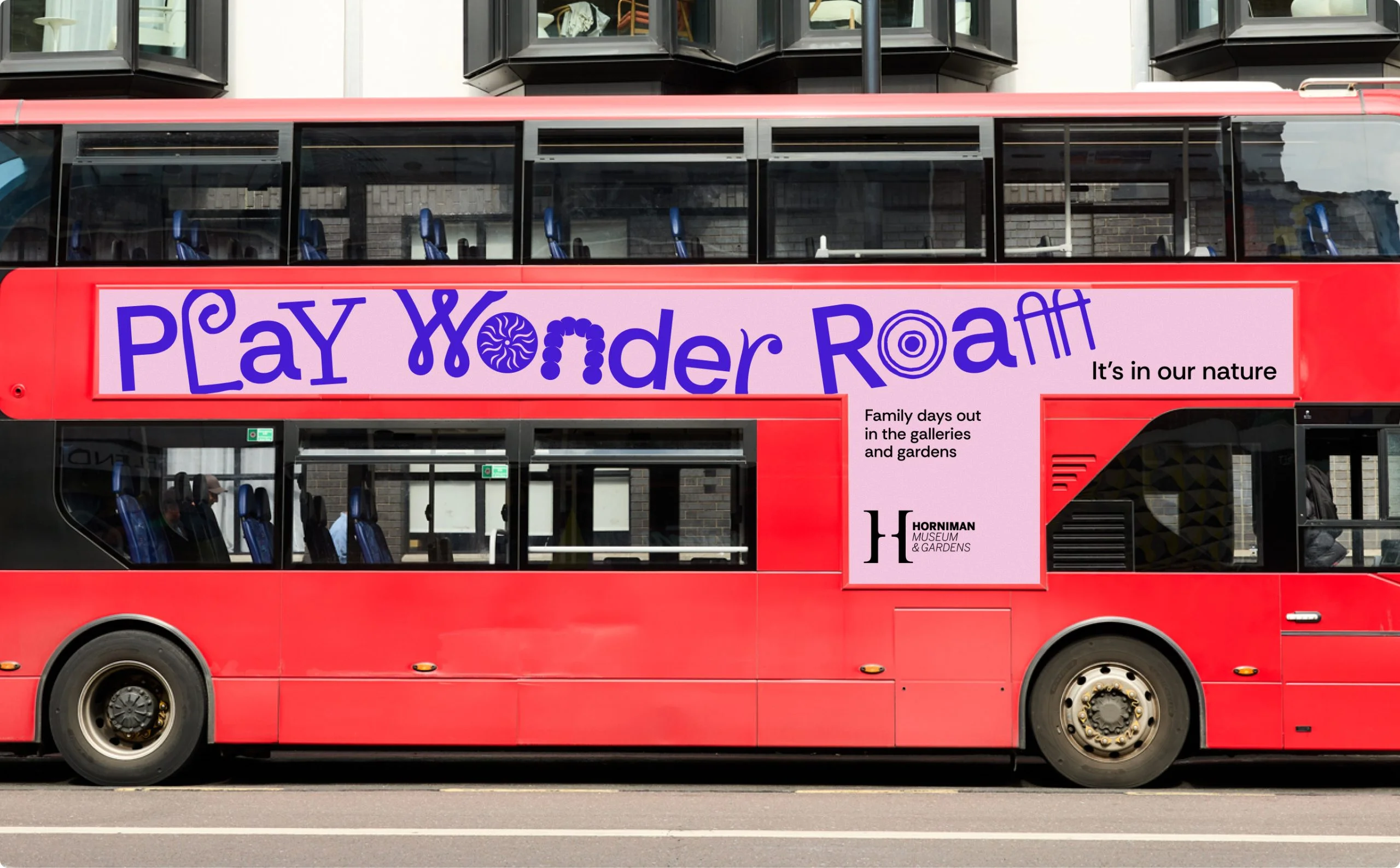
When it comes to the colour palette, there’s plenty of green, unsurprisingly, but it’s pushed beyond the safe, tasteful shades you might expect from a museum campaign about nature, alongside energetic yellows, pinks, reds and blue-purple tones.
The combinations feel warm and slightly unexpected, helping the identity communicate excitement and sociability rather than the hushed reverence that can so easily creep into cultural branding. It’s nature, yes, but nature as something colourful, messy and alive rather than a tasteful leaf motif slapped on a beige background.
I actually love this identity – it’s so effortlessly charming, and so very Ye Olde Victorian Gent without ever coming on too strong, too creepy, too pastiche, too twirly-mostachioed man holding eye contact for way too long and calling you ‘mi lady’.
It’s all curiosity cabinet wonders and flights but with none of the dust; all ornamentation and the faint sound of a wurlitzer without taking the piss: in short, perfect pitch when it comes to the resonance of Victoriana as transmitted in the here and now, communicating, and working blummin hard.