Mucca makes New York supermarket company Fairway’s everyday essentials anything but basic
Opinion by Emily Gosling Posted 8 September 2026
Founded in 1933, Fairway Market is an independent regional supermarket chain with stores across New York. The grocery retailer sells food and household goods, and over the past eight decades or so has built its reputation on an unusually broad selection of hard-to-find products and a distinctly New York character.
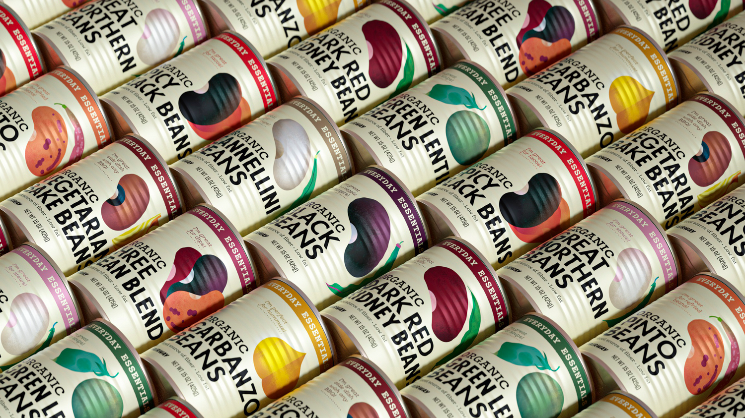
As well as selling a number of different brands, Fairway Market also offers more than 300 of its own-label ‘everyday essentials’ products – things like milk, butter, beans, broth, yoghurt. And while these had plenty of brand equity behind them, the packaging itself had become inconsistent and lacked much of a point of view.

After all, it can’t be easy figuring out how to position own-brand: they have to look affordable but consistent; easy to identify but never too showy.
The agency brought in to try and tackle all that was Mucca, a New York-based creative studio specialising in the world of food and drink.
Own-label basics have historically tended to fall into one of two camps: muted and anonymous, or deliberately loud, doubling down on the ‘cheap’ part of it all. Asda’s Just Essentials, for instance, took the latter approach when it launched in 2022, replacing Smart Price with a range in brash, wasp-like yellow and black – bold, resolutely legible typography, and absolutely no messing about.

The almost warning-sign-level of visibility was designed to make the products immediately findable, but attracted criticism from some shoppers who felt it made buying cheaper products unnecessarily conspicuous.
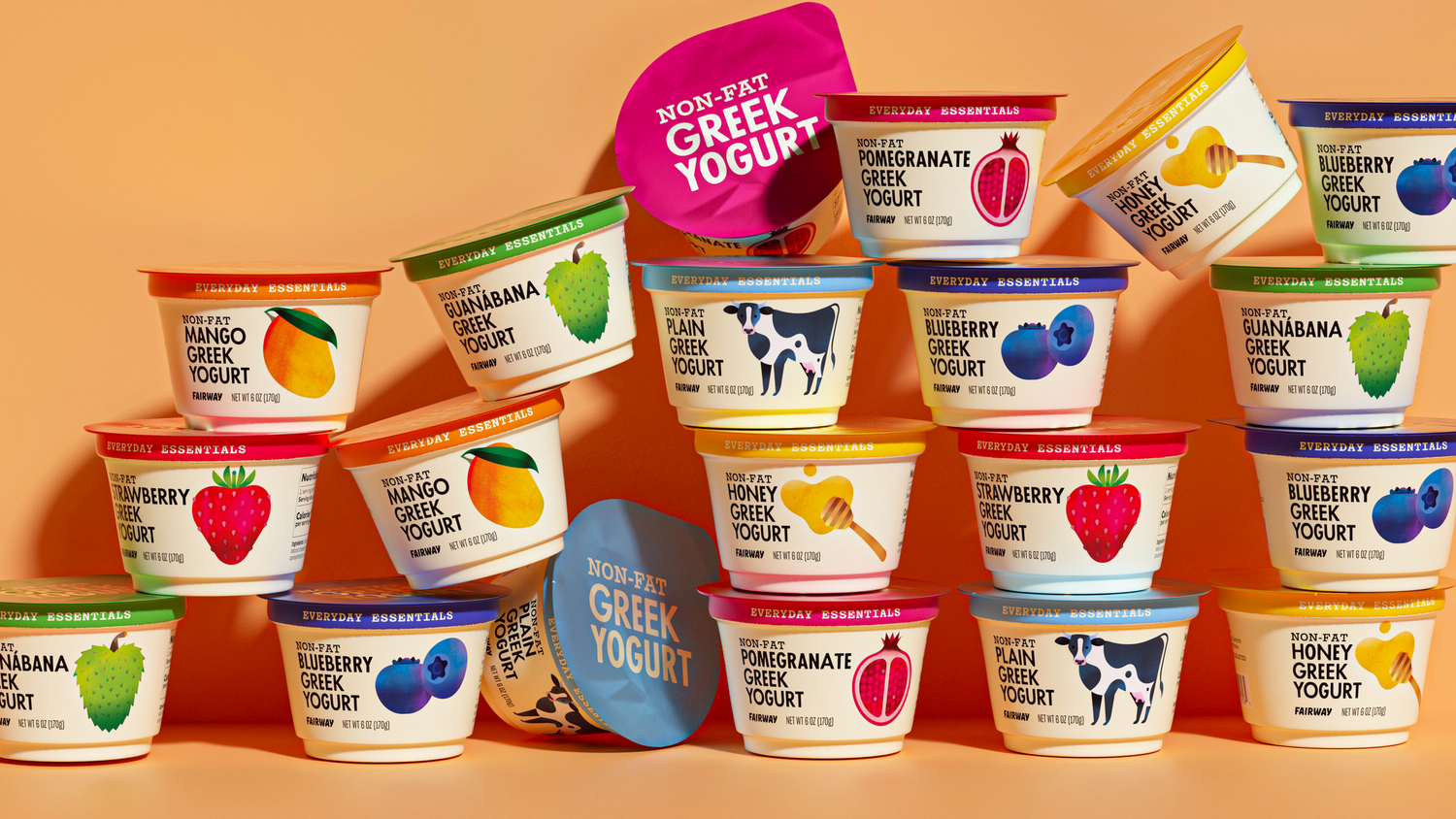
Fairway Essentials takes almost the opposite tack. Rather than loudly announcing that these are the ‘cheap ones’, Mucca makes them look gently premium – not high-end exactly, but pretty decent quality.
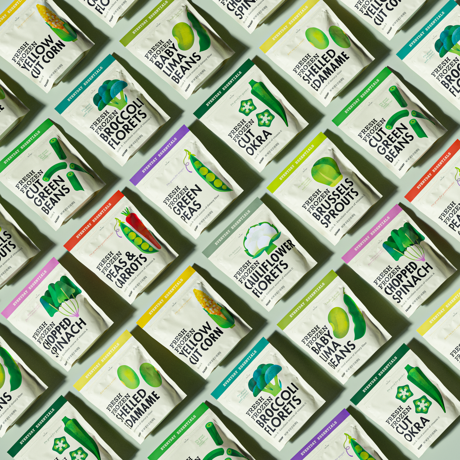
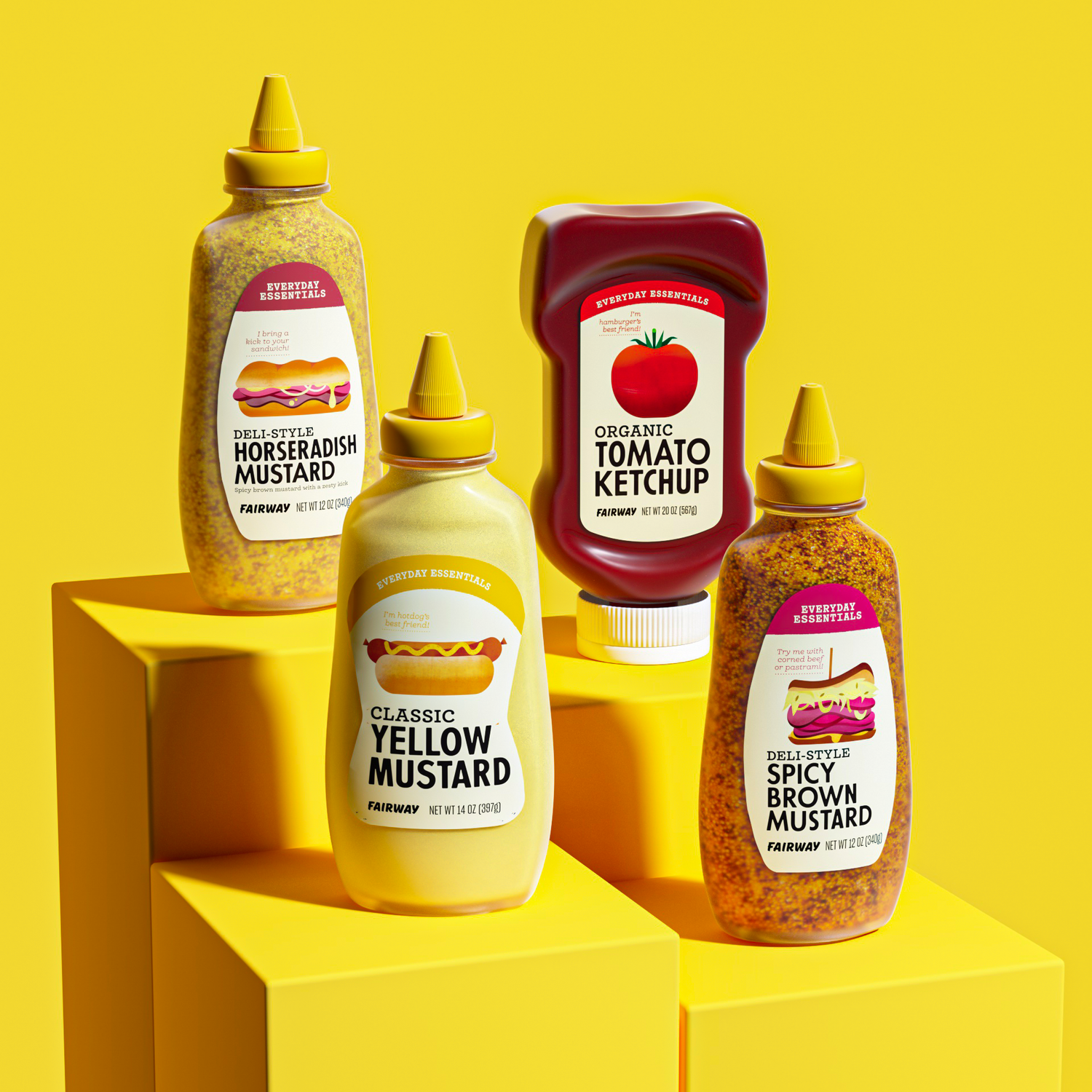
The agency has achieved this largely through an approach that prizes simplicity: clean, largely uncluttered layout puts the product name front and centre, with bold typography doing much of the heavy lifting.
The other star of the show here is a really charming series of product illustrations used across the packaging, developed with Amsterdam-based illustrator and designer Maya Stepien. Her simple-but-detailed illustrations, vivid colours and tactile textures give the range a visual personality that feels both contemporary and unusually cheerful for a collection of supermarket staples.


And this is where the identity really works. The packaging is neat and highly ordered, but never sterile; expressive without becoming noisy. There is plenty of information, but very little visual competition between it. The result is a system that can accommodate everything from butter and milk to tomato sauce and vegetables while maintaining a recognisable, uniform consistent identity that can carry well into the future and across any new products Fairway might launch.
Overall, Mucca here has shown how important it is to get visual hierarchy right: things are uncomplicated and restrained, while managing to convey all the information they need to.

That restraint becomes particularly apparent when viewed alongside the Fairway Collection, Mucca’s complementary premium line. Here, the studio takes a darker, more minimalist approach, using a striking black palette and distinctive typography to create what it describes as an “oasis of sophistication” on the supermarket shelf.
The two ranges therefore feel related without being confused: Essentials is bright, direct and approachable; the Collection is quieter, more considered and premium.

For a project involving hundreds of products, maintaining that distinction while creating systems flexible enough to work across different sizes, shapes and materials is no small feat.
The success of the Essentials range is partly in how little it appears to be trying: it doesn’t rely on an elaborate masterbrand device, nor does it try to make basic groceries look like luxury goods – it doesn’t need to. Instead, it finds a middle ground in which everyday products can simply sell well by looking deficient enough.