46 Parallels by Moving Brands
Opinion by Richard Baird Posted 14 November 2011

46 Parallels is a new investment fund focused exclusively on the Sub-Saharan region of Africa and is a collaboration between the JMH Group and Green Gate Strategic Partners. The company approached international brand development agency, Moving Brands, to develop an identity – which included a logo, stationery and website solution – that would reflect this unique and diverse area of investment (that also characterises their business approach) while appearing modern and distinctive within the sector.
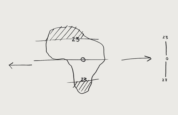
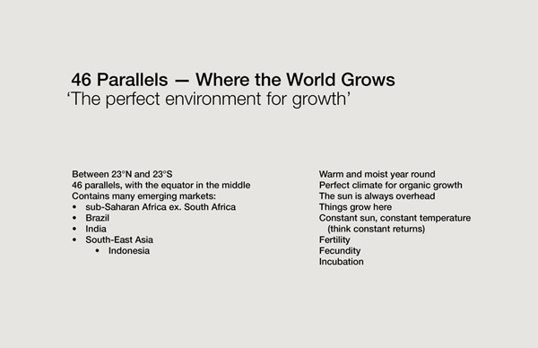
“46 Parallels represents the area between two key circles of latitude in Africa: the Tropics of Capricorn and Cancer, lying 23° degrees respectively North and South of the Equator. This developing region is synonymous with lush environments, new growth and fecundity. It is within this rich seam where 46 Parallels will operate — a pure expression of their business strategy.”
“Supporting the credentials of the young but highly experienced team was paramount. Their expertise and African heritage is key to the business’ offering and approach. Moving Brands has created an identity system that is bold and immediately distinct from ‘me too’ financial services companies.”
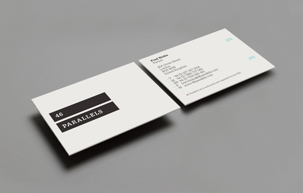
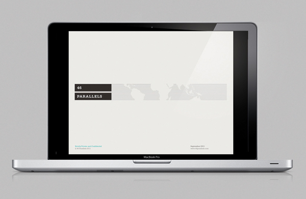
“The strong geographical cues of the brand name, drive the creative direction; bars and keylines bring the cartographic story to life in the identity. The wordmark’s serifs correspond exactly to a single unit within the logo’s overall grid. Colour is used sparingly as highlight to important content.”
“All the marketing applications re-enforce the hedge fund’s story through their design. The website is simple, informative and to the point. Locally produced photography brings the partner’s African heritage (Nigeria, Ghana and Kenya) to life authentically.” – Moving Brands
Moving Brands has a great reputation for simple but strategic identities that have a timeless simplicity and holistic resolve. Luckily for BP&O they also clearly put a lot time into presenting their processes on-line. (See more images on the project page of their website).
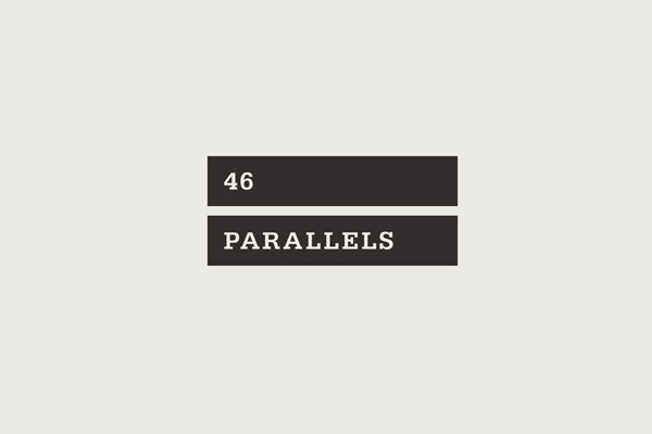
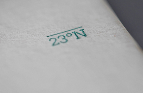
The key identity, two parallel containers and a simple but very tight typographic direction, is minimal but well executed. The idea of two divided regions represented as large solid bands and use of negative space, to represent the less populated regions around the equator, delivers a strong sense of inclusivity. For me there is also a reference to mathematics, where equals (=) is associated with results, fairness, the culmination of financial investment, hard work, energy, and the successful resolution of ideas and cultures, giving the mark a smart dual nature. The slab serif typography is an interesting union of formality and utility that resolves a professional but ground level approach to business and is neatly balanced within the two containers. The addition of the 23°S and 23°N typographic assets is a nice device to contain company information on the business cards and are a subtle detail that avoids forcing too much into the brandmark. The strong geometric resolution, the black colour palette and straightforward application across the stationary have a clear and honest aesthetic that works well in today’s volatile and distrusting financial market while the turquoise foil treatment ties it neatly back to the idea of wealth and currency. The images on-line manage to resolve the cultural aspects of the brand without trying to compound too many themes into a wonderfully minimal identity.
