Think Packaging by Seachange
Opinion by Eleanor Robertson Posted 29 March 2022
Cutting and creasing since 2010, Think is a design-driven structural packaging agency with an over-arching emphasis on form: ‘the neat bevels, the tight creases, the perfect fit’. The team of cardboard engineers has an international reputation thanks to its portfolio of award-winning work for global studios and brands, from startups to industry leaders, including Marx and Supply (New Zealand), OMSE and Socio (London), Hype Type (Los Angeles).
The small family-run business is based in Auckland and led by Mat Bogust, an extroverted character who’s both passionate about his craft and up for a good time. In Seachange’s own words: ‘he’s full on and loves a laugh’ but ‘he always delivers an exceptional, professional and unexpected result, whether it be a giant cardboard penis mailer, or packaging for a luxury brand’. Each project is unique, and sustainability is considered at every step of the process.
This post includes Extended Insights for BP&O Plus members.
Find out more and sign-up here.
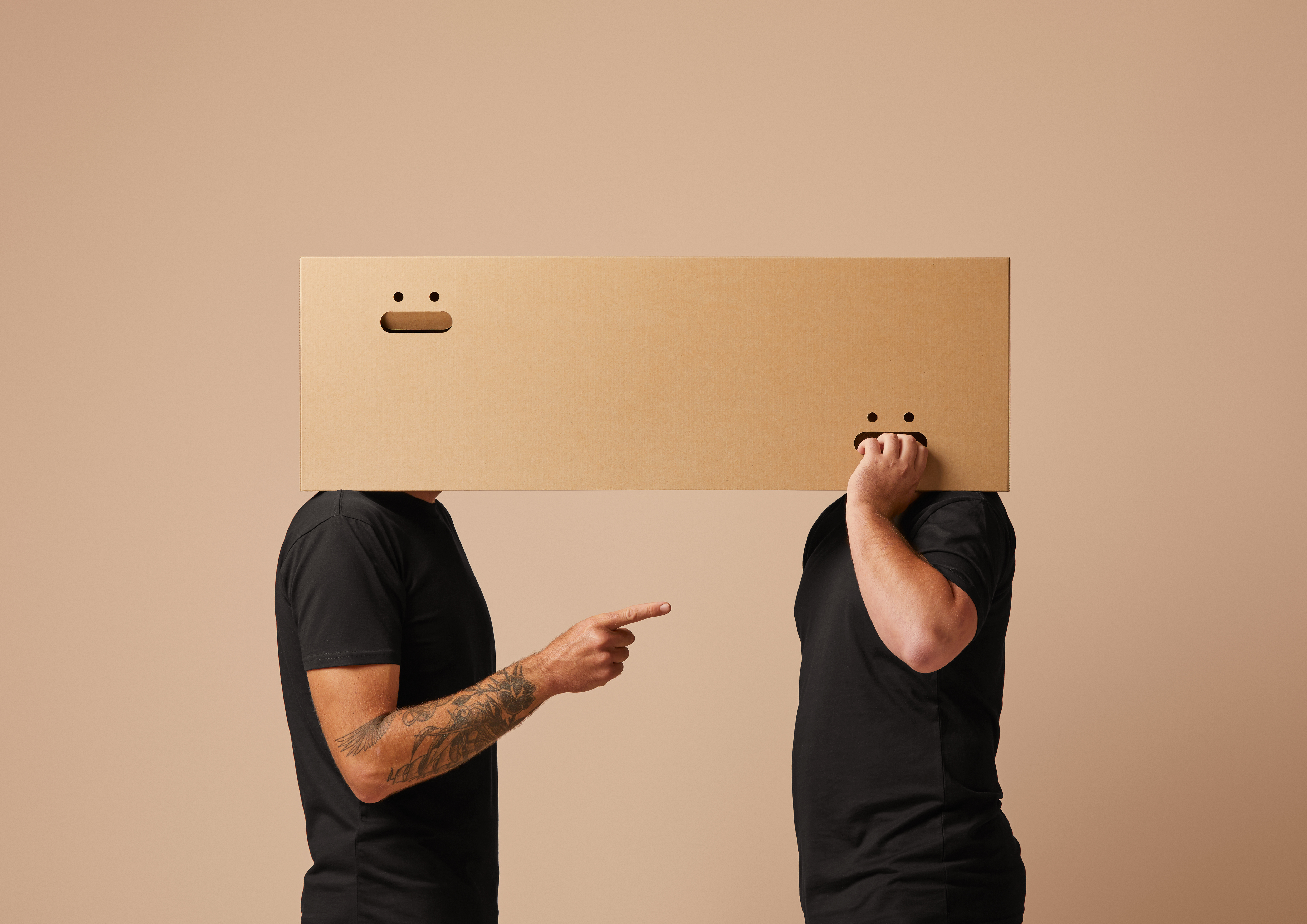


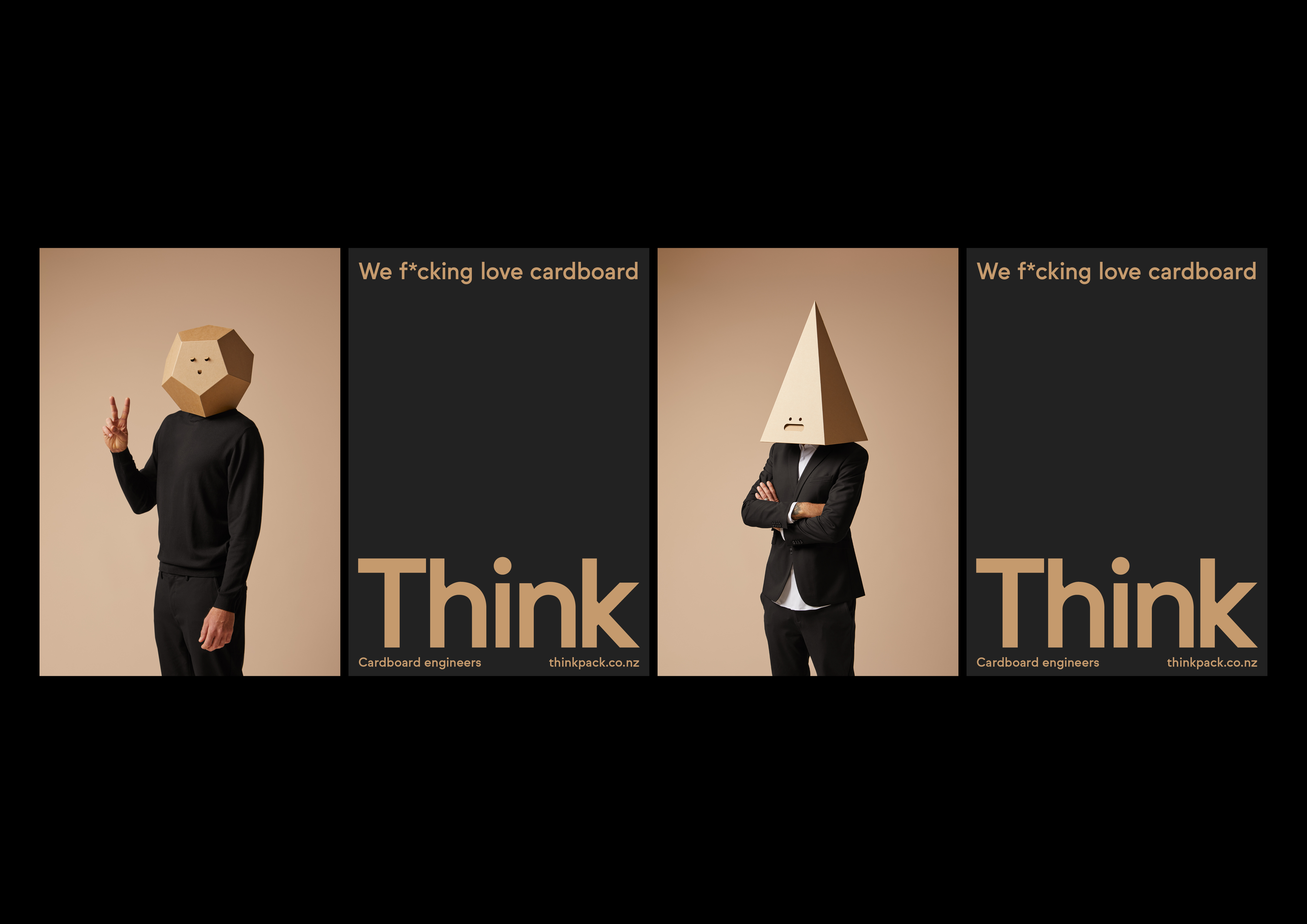
To coincide with the launch of a new website, Think asked Seachange to create an engaging communication piece, something that would generate curiosity, express the company’s personality and reflect its passion for cardboard. ‘Cardboard is in our blood,’ Bogust announced, and so the studio wondered what someone would look like if they were so obsessed with cardboard that it consumed them – a superhero origin story for packaging geeks.
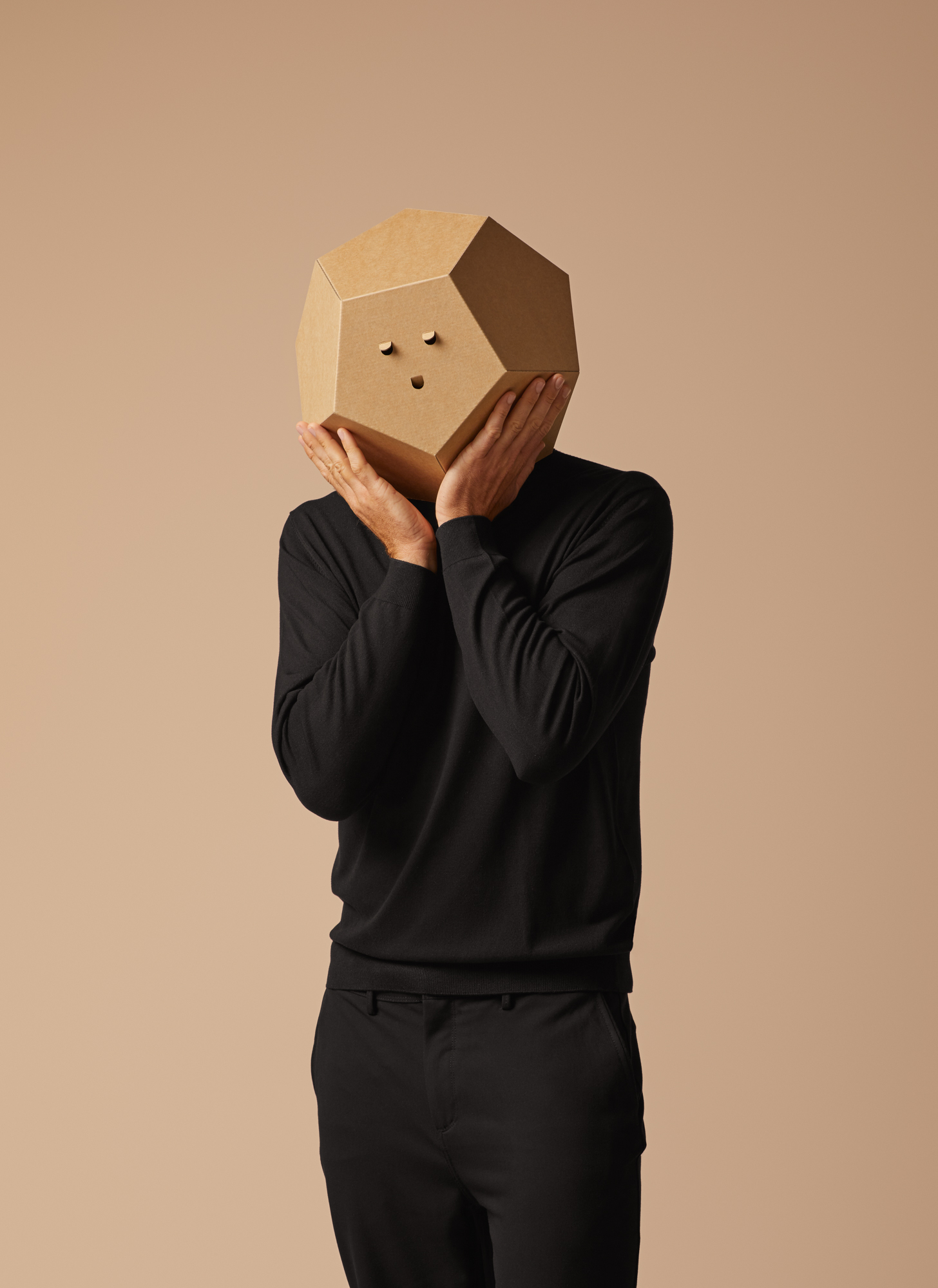
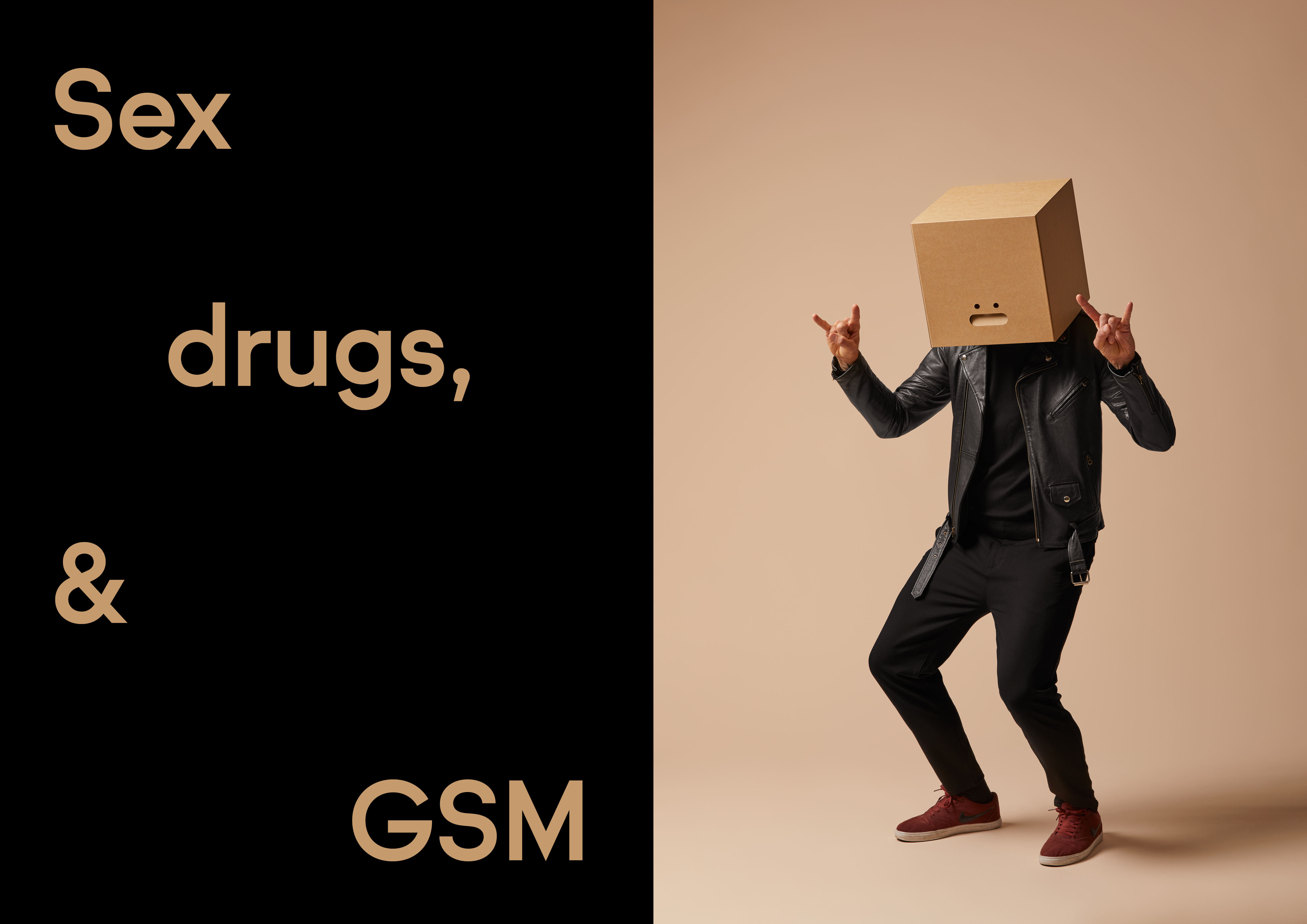
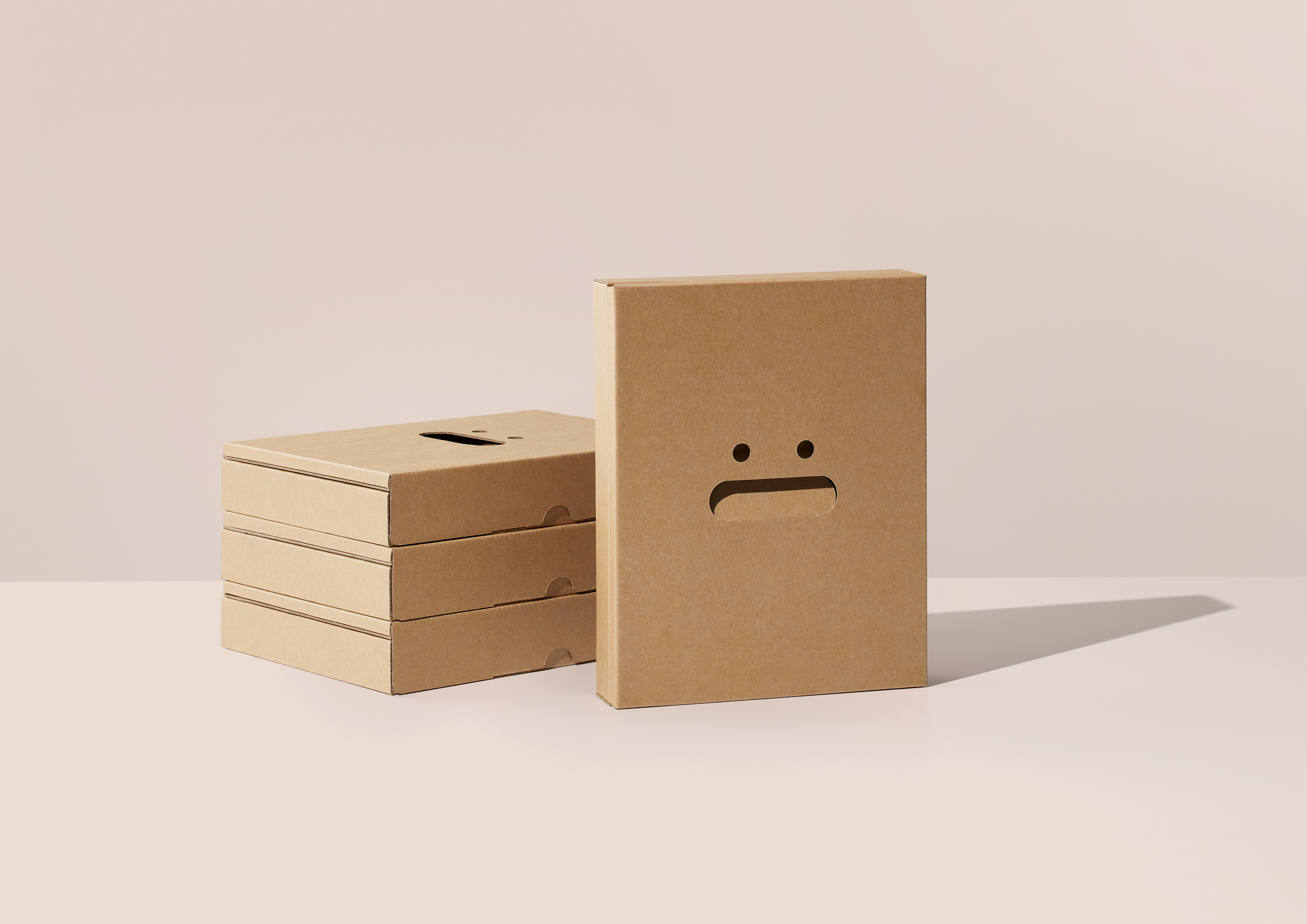
‘We imagined an alternative reality where the Think team had turned into half box half human – a cardboard Blade Runner or Ex Machina,’ Seachange explains. The result is a deliberately absurd series of images in which the packaging designers don immaculately engineered box heads in a range of geometric shapes. Simple punched circles transform box handles into expressive faces while a sequence of theatrical poses develops a storyboard (of sorts).
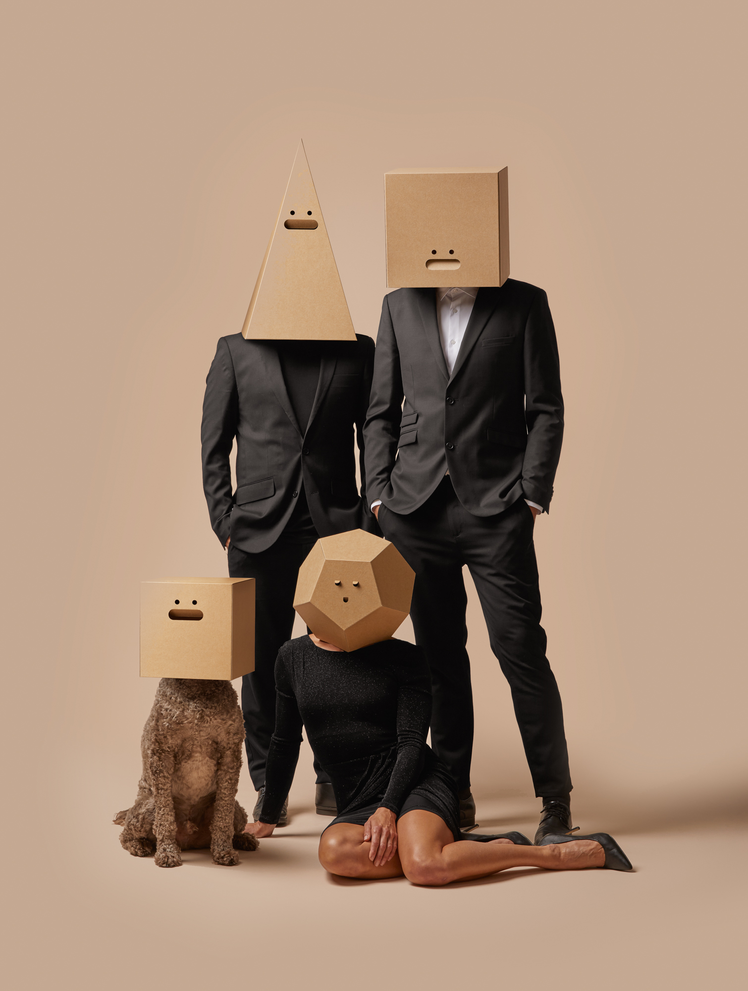
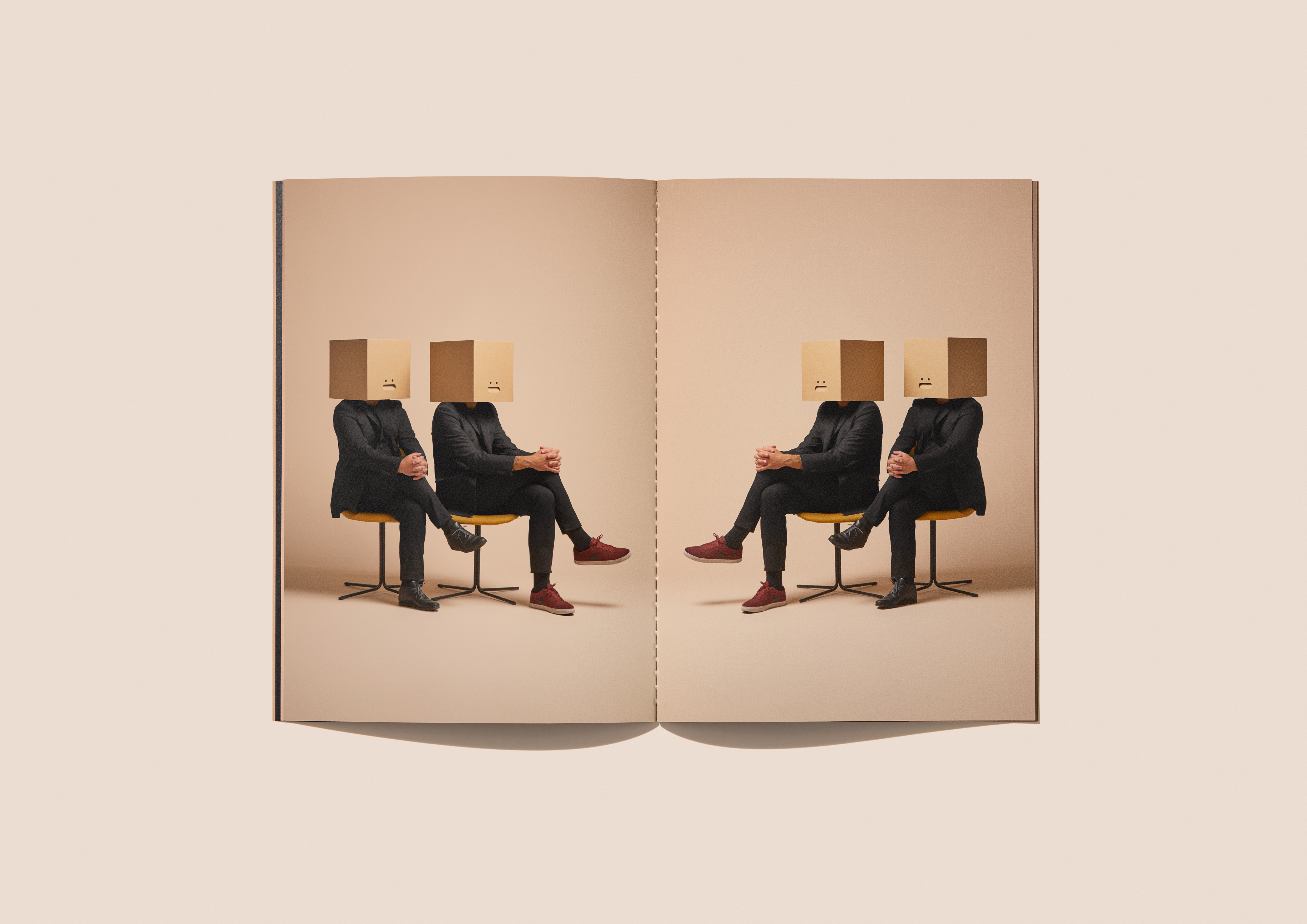
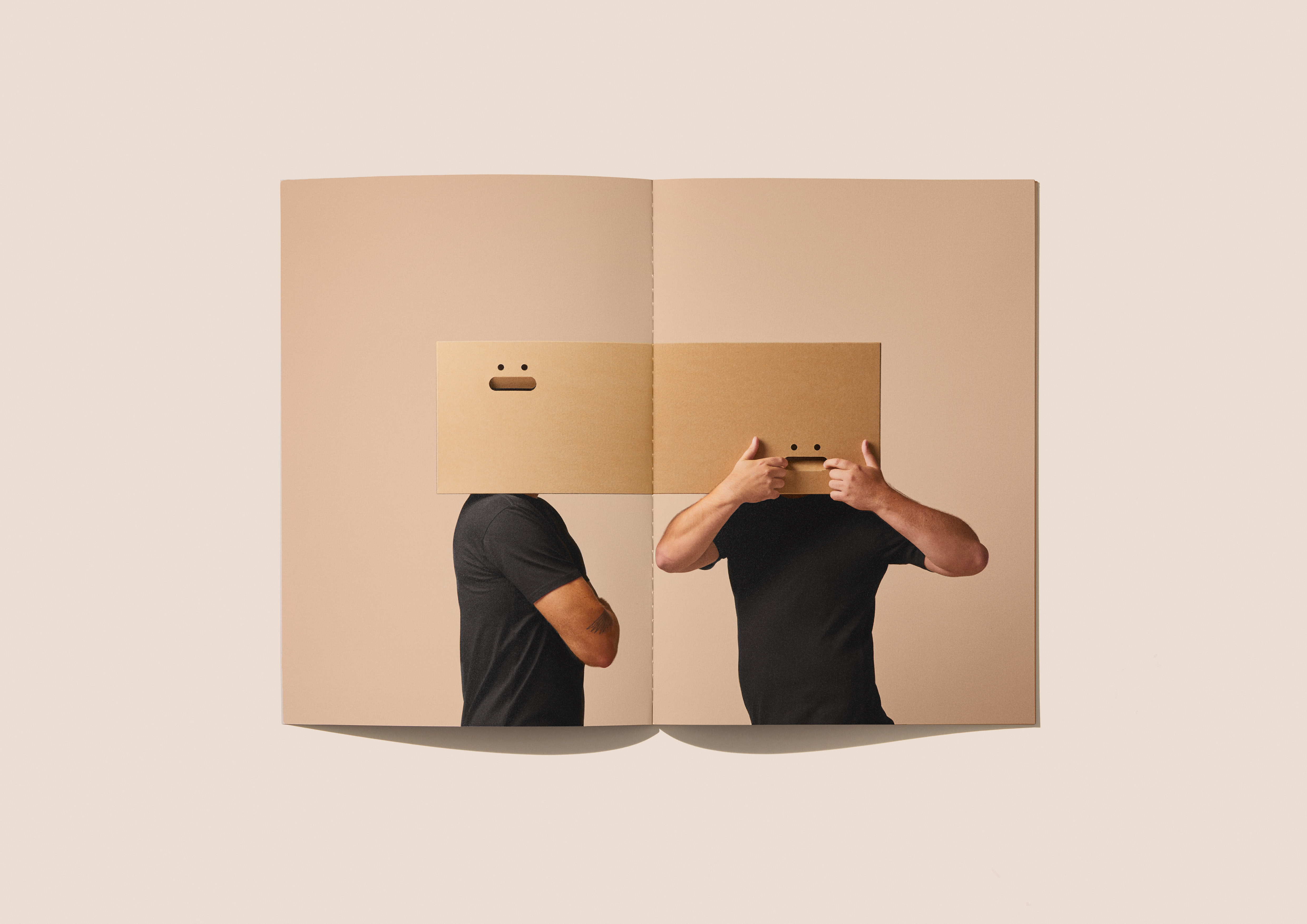
The understated styling is precise and the photography is polished to deliver a crisp editorial piece that toys with the tropes of high-end shoots. Muted backgrounds and sharp black suits add to the sober silliness, creating some of the formality found in Victorian family portraits or the corporeal mime of Étienne Decroux – an eccentric seriousness that it is hard to take seriously. The campaign is comically earnest, and even the dog is in on the joke.
The frivolity is driven by a business objective: by remaining true to the Think team’s lighthearted nature, ‘the images aim to attract clients willing to push their work in more playful directions’. In this sense, the project shares the experimental energy of the Bauhaus costume parties, which elevated ‘serious play’ to foster a common creative spirit. There are further crossovers in the sculptural costuming, celebration of raw materials, primary shapes and conceptual simplicity.
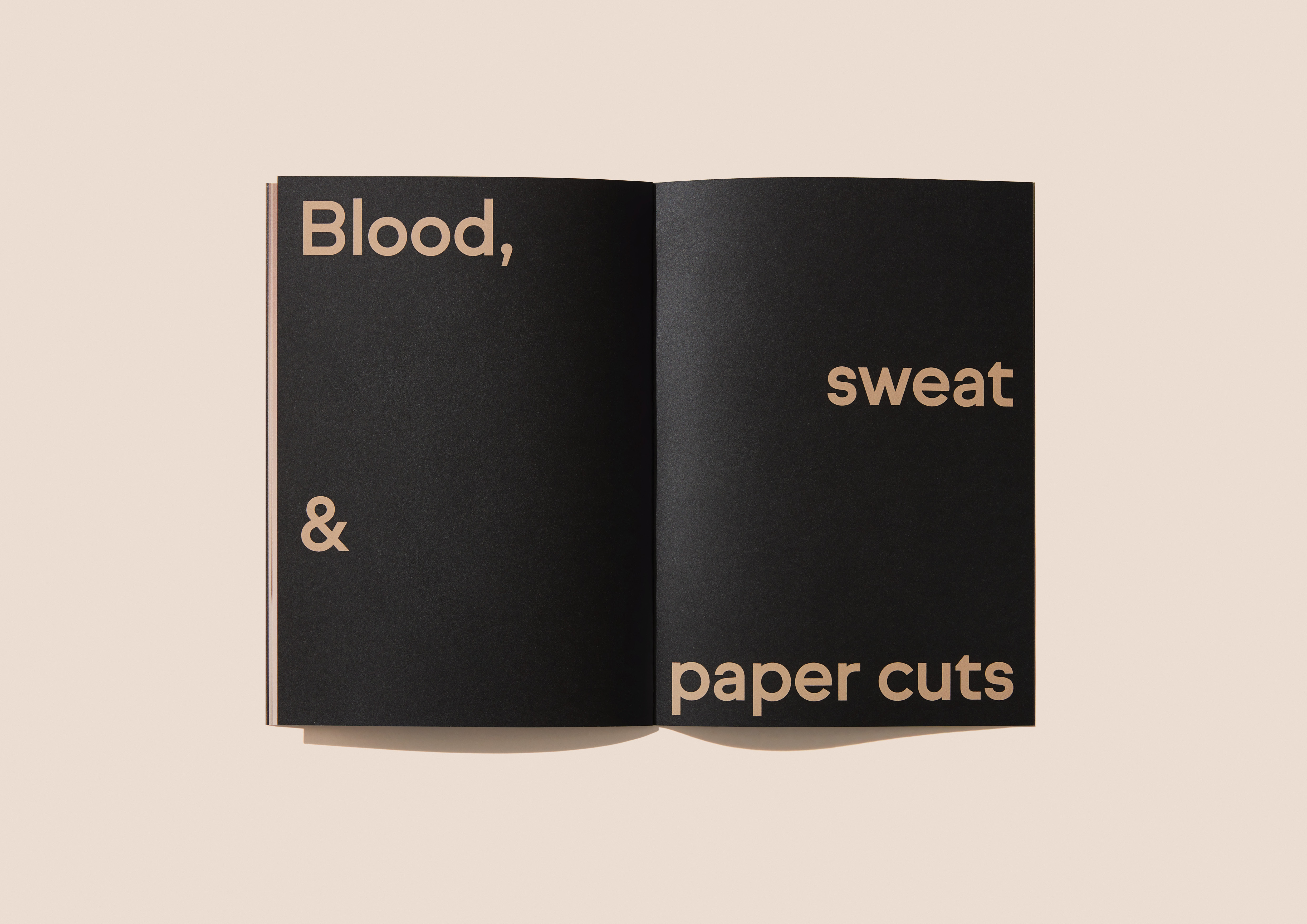
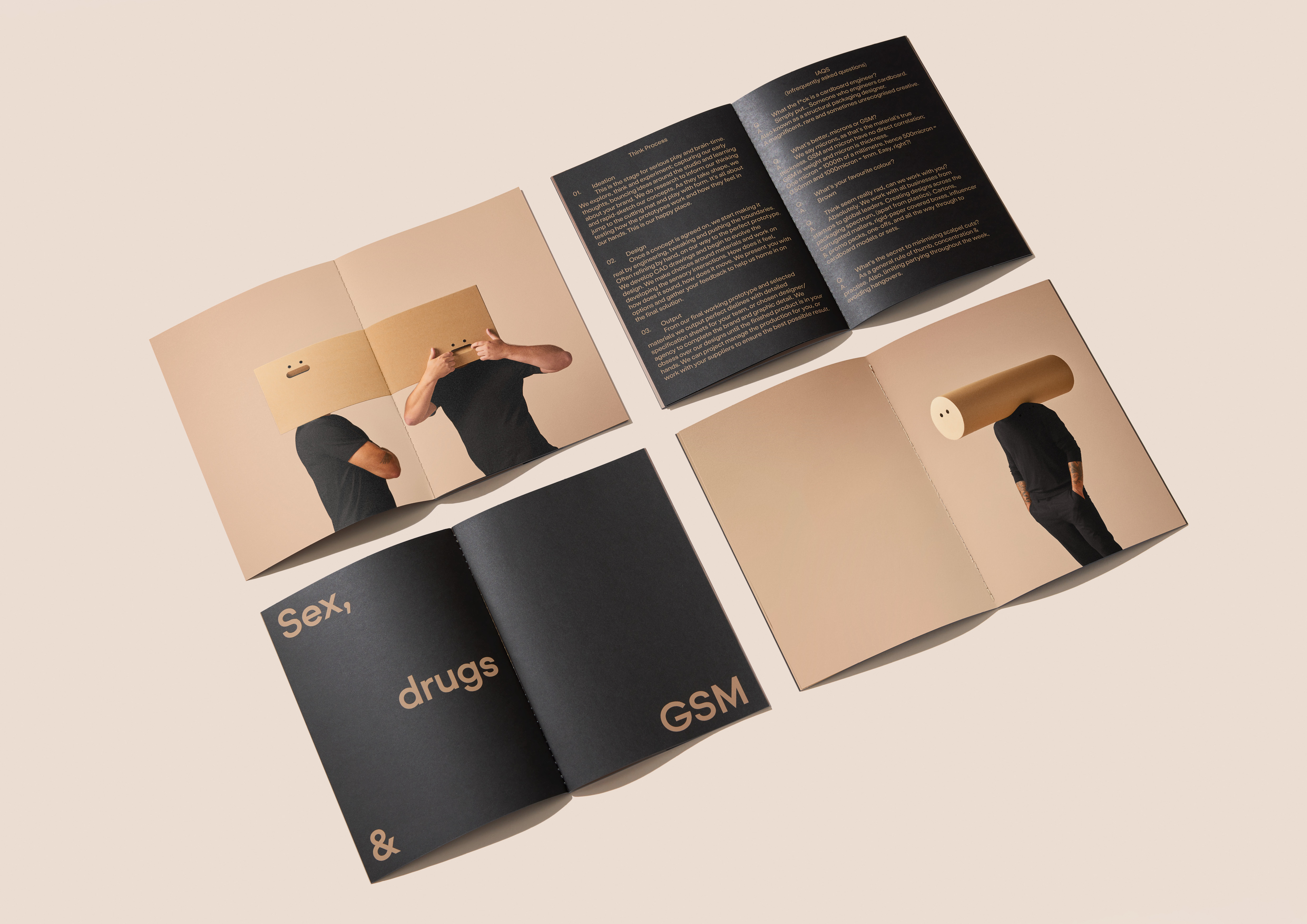
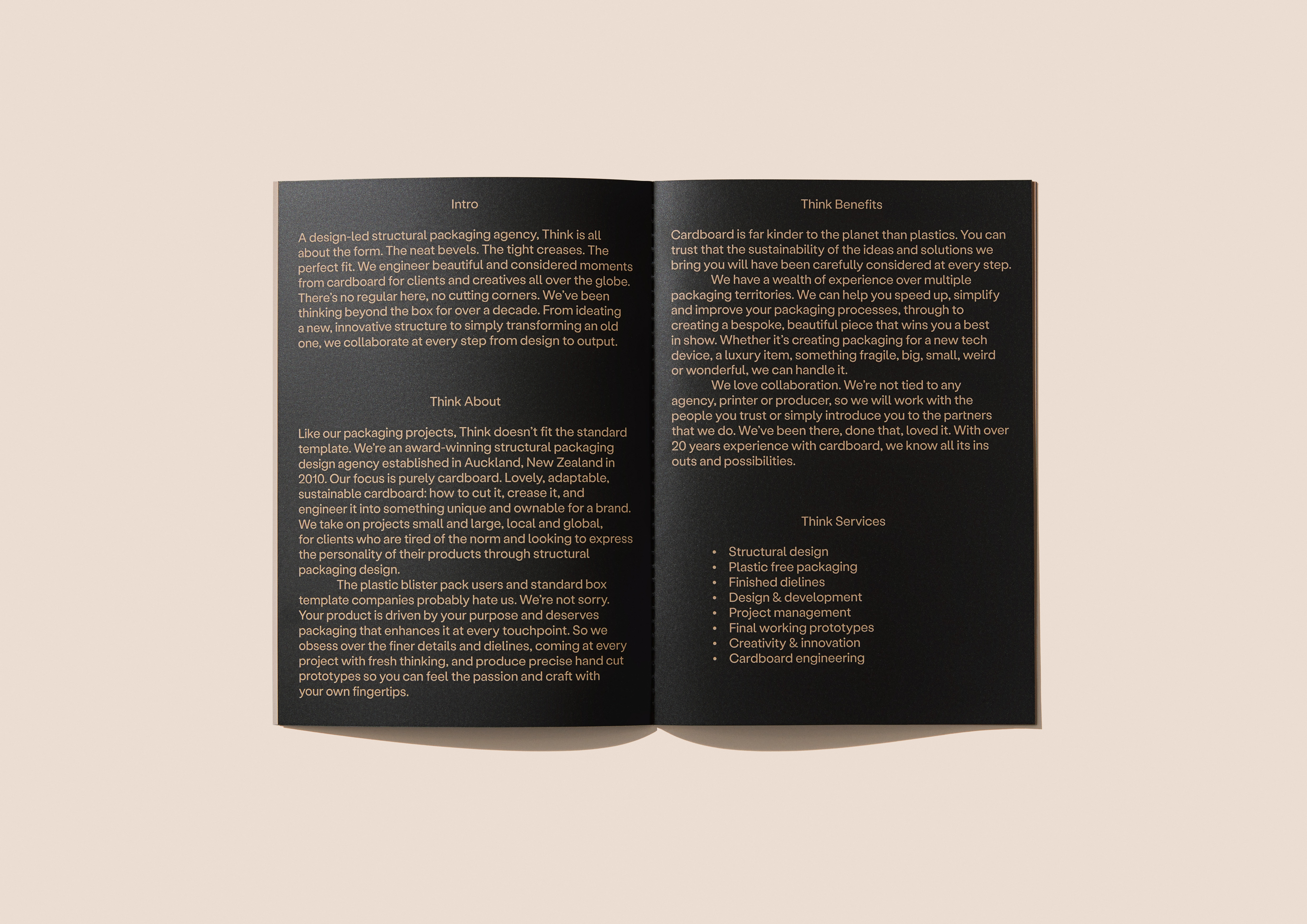
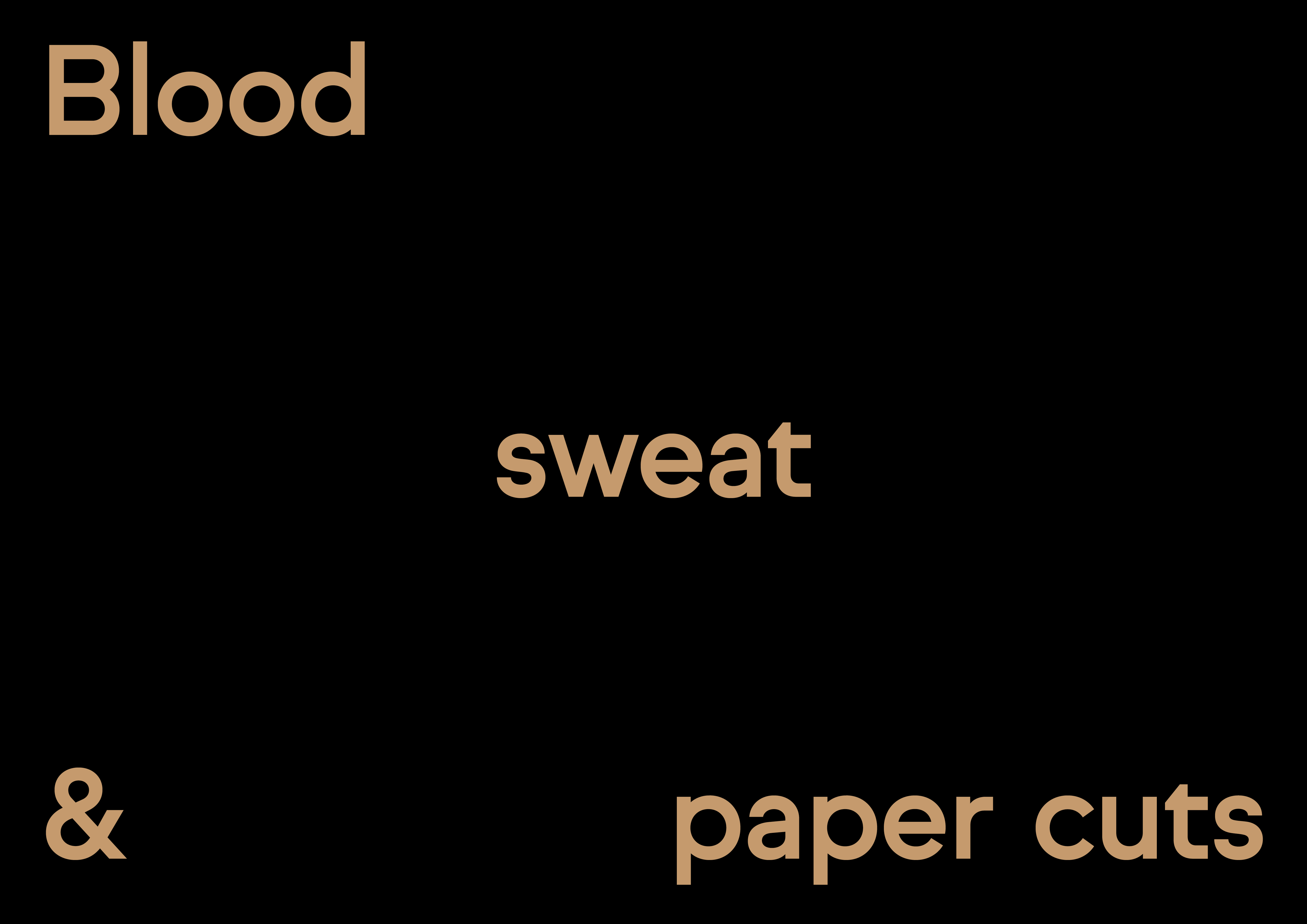
To support the imagery, Seachange wrote a range of targeted headlines offering adventurous audiences the temptations of ‘blood, sweat and paper cuts’ or ‘sex, drugs and GSM’. The accompanying copy is colloquial. The About page of the website highlights all the standard stuff alongside an irreverent ‘IAQ’ section covering infrequently asked questions. If you ever wondered how to minimise scalpel cuts, the answer is ‘limiting partying throughout the week, avoiding hangovers’.
At times, however, the language crosses from daring to vulgar, in the footer for example: ‘we f*cking love cardboard’. This attempt at shock value is slightly cringe-inducing, not least because the expletive is tamed by an asterisk – if Think simply don’t give a ‘f*ck’, then why self censor? Nevertheless, we are told that ‘the communication piece was a huge success, attracting a record number of hits to Think’s new website and securing multiple new business leads’.
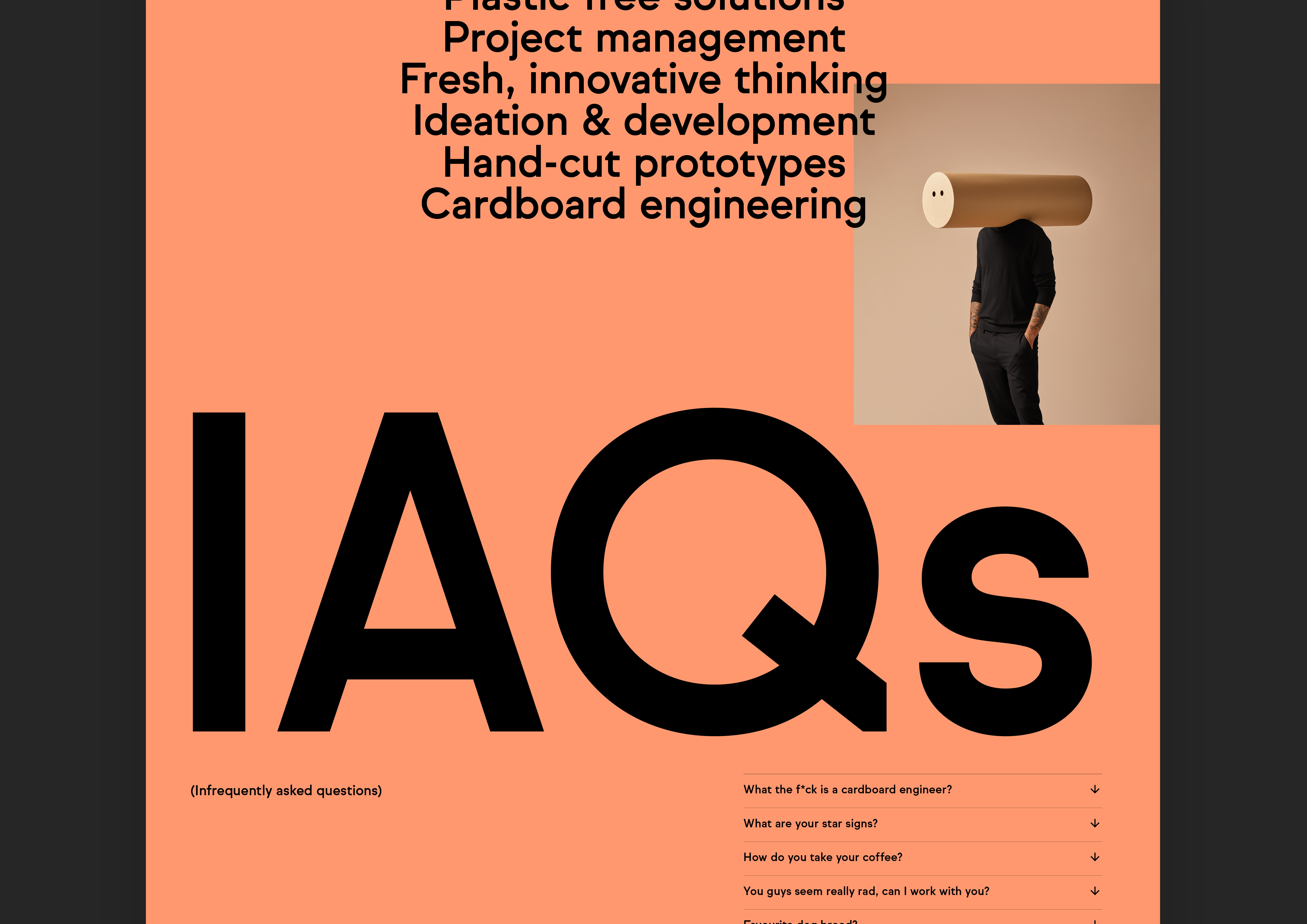
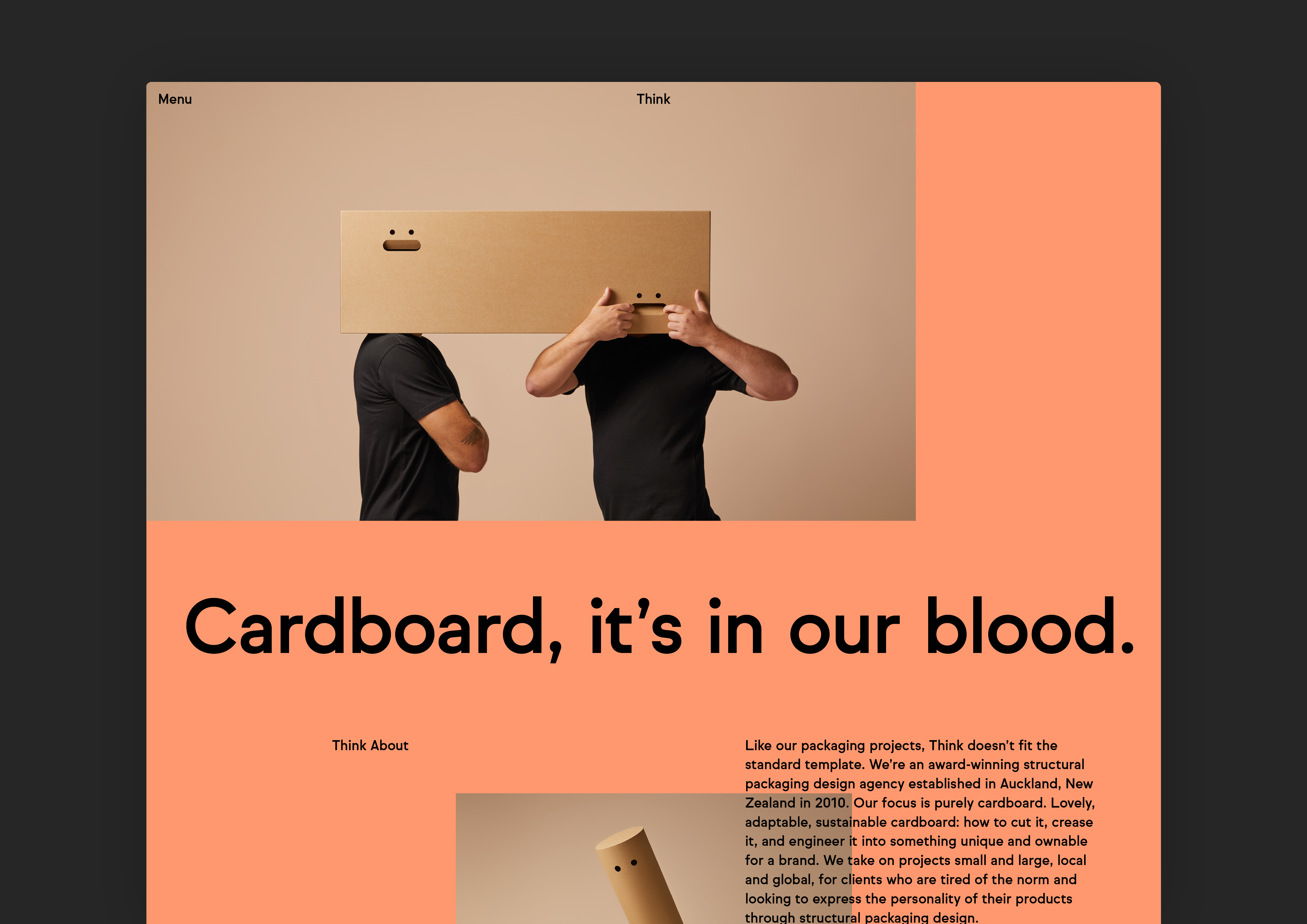
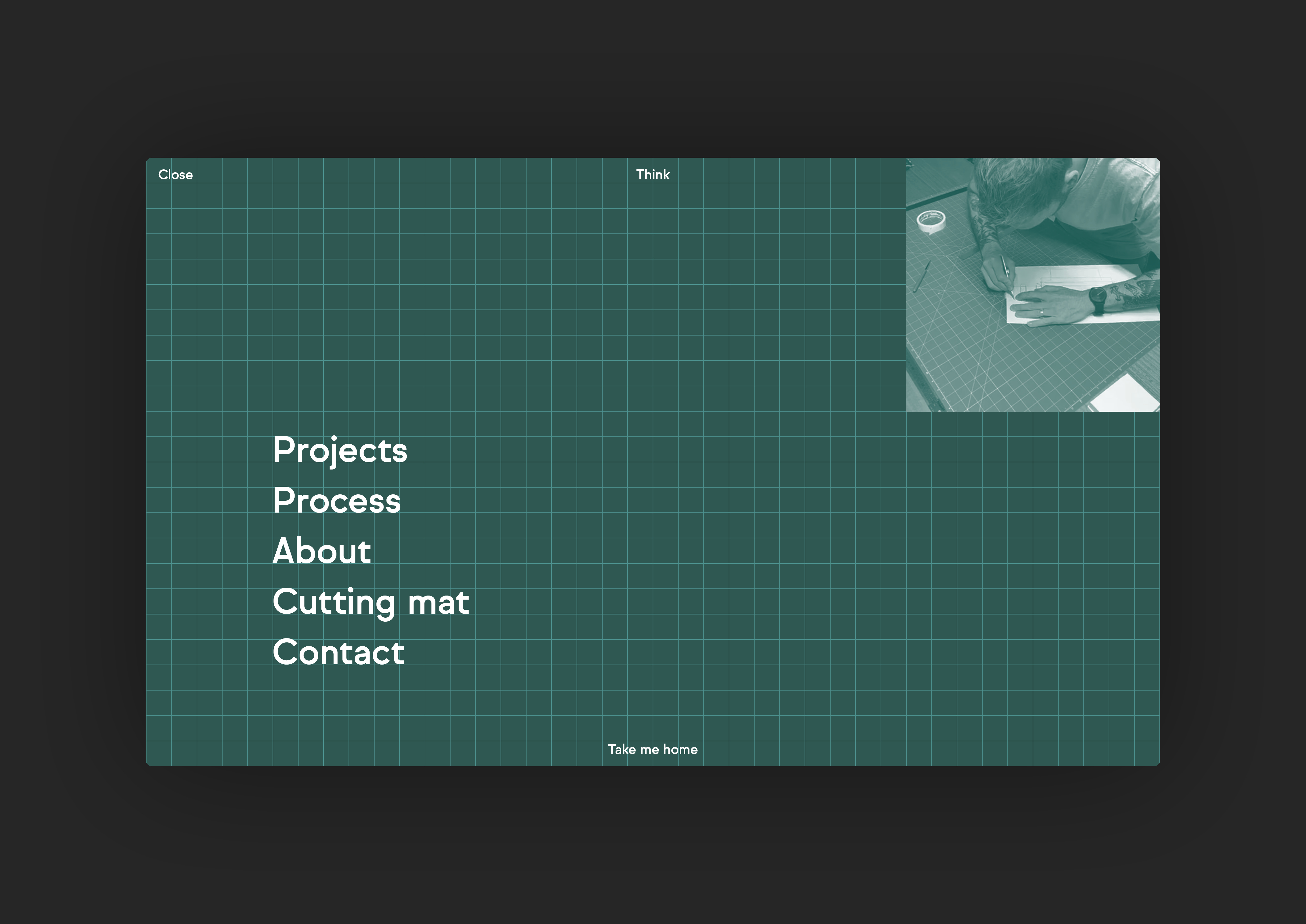
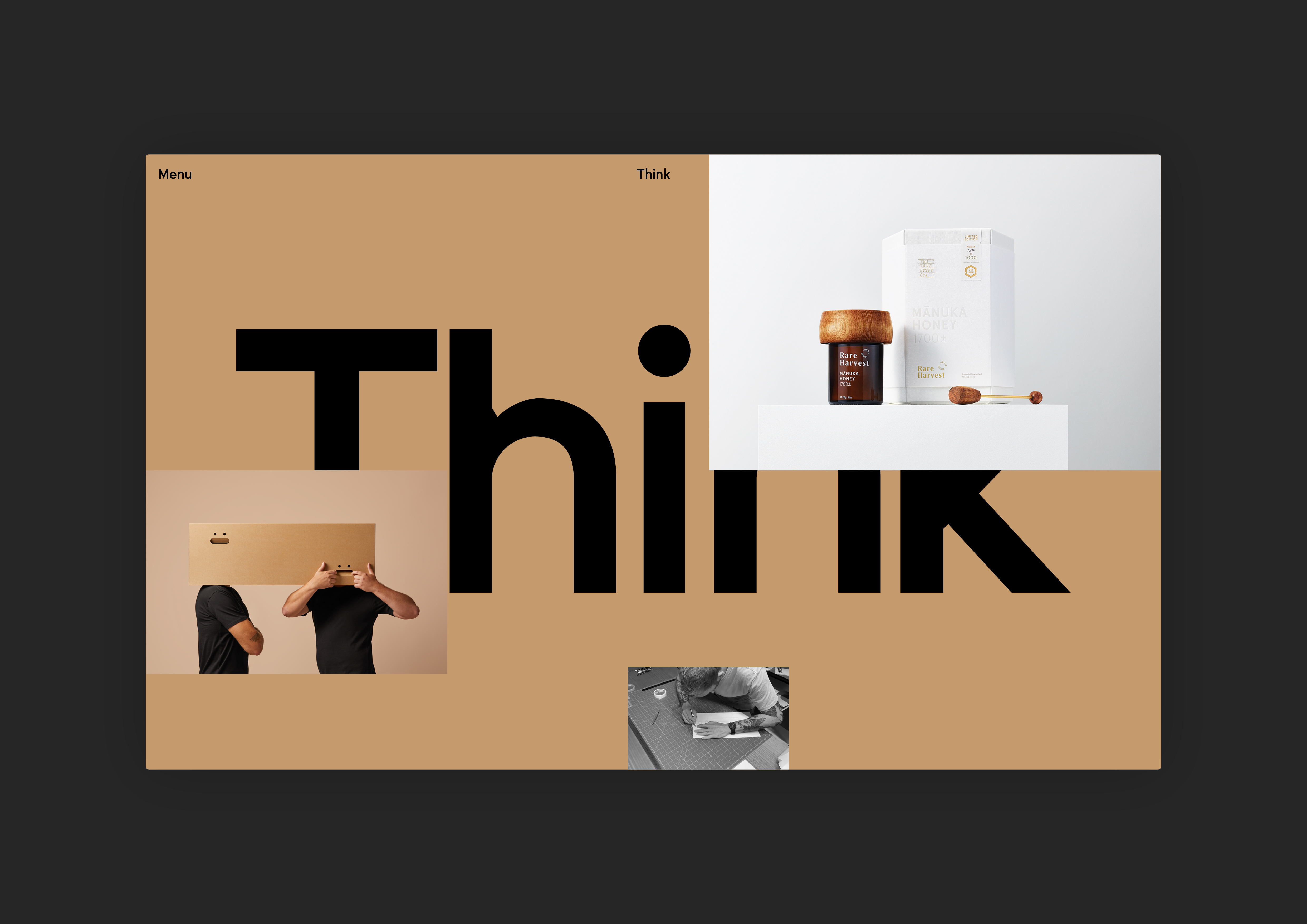
Other aspects of the site communicate Think’s anti-corporate attitude with more nuance. The overall design references scrapbooks and messy cutting boards, with layered content, image parallax, high speed video and playful hover states. Personality is further expressed through transition screens, featuring dancing typographic messages. There is a good balance of interactivity and functionality, showcasing Think’s expertise, process and bespoke services.
Think is single-minded about working with cardboard, and so the colour palette is a tonal selection of Kraft browns, accompanied by ‘cutting mat green’ and accented by a bright peach. The primary typeface is Sul Sans from R-Typography, a modern sans serif that combines engineered geometry with a sense of Kiwi openness and approachability. The neutrality of these elements allows the team portraits and case studies to take centre stage.
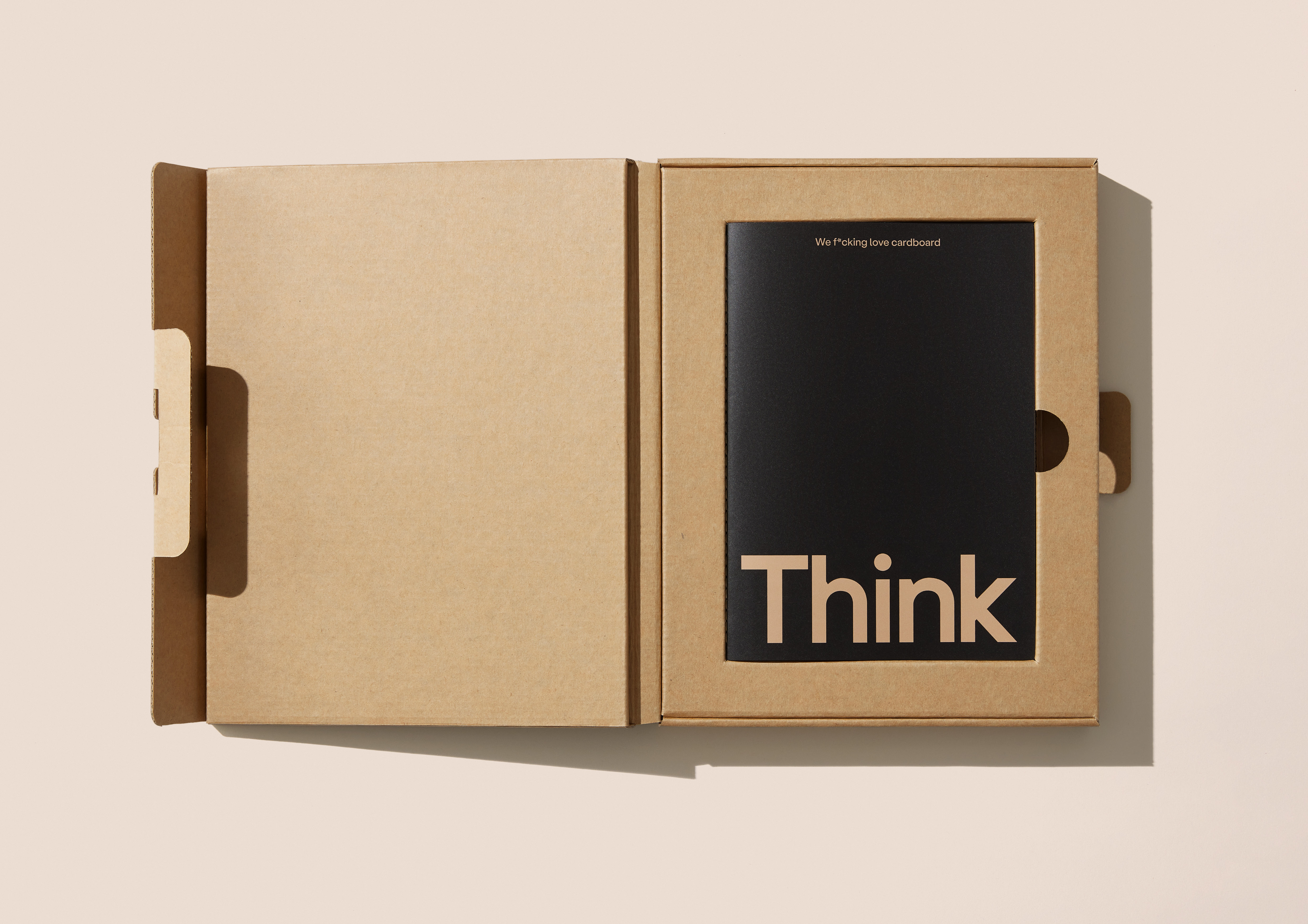
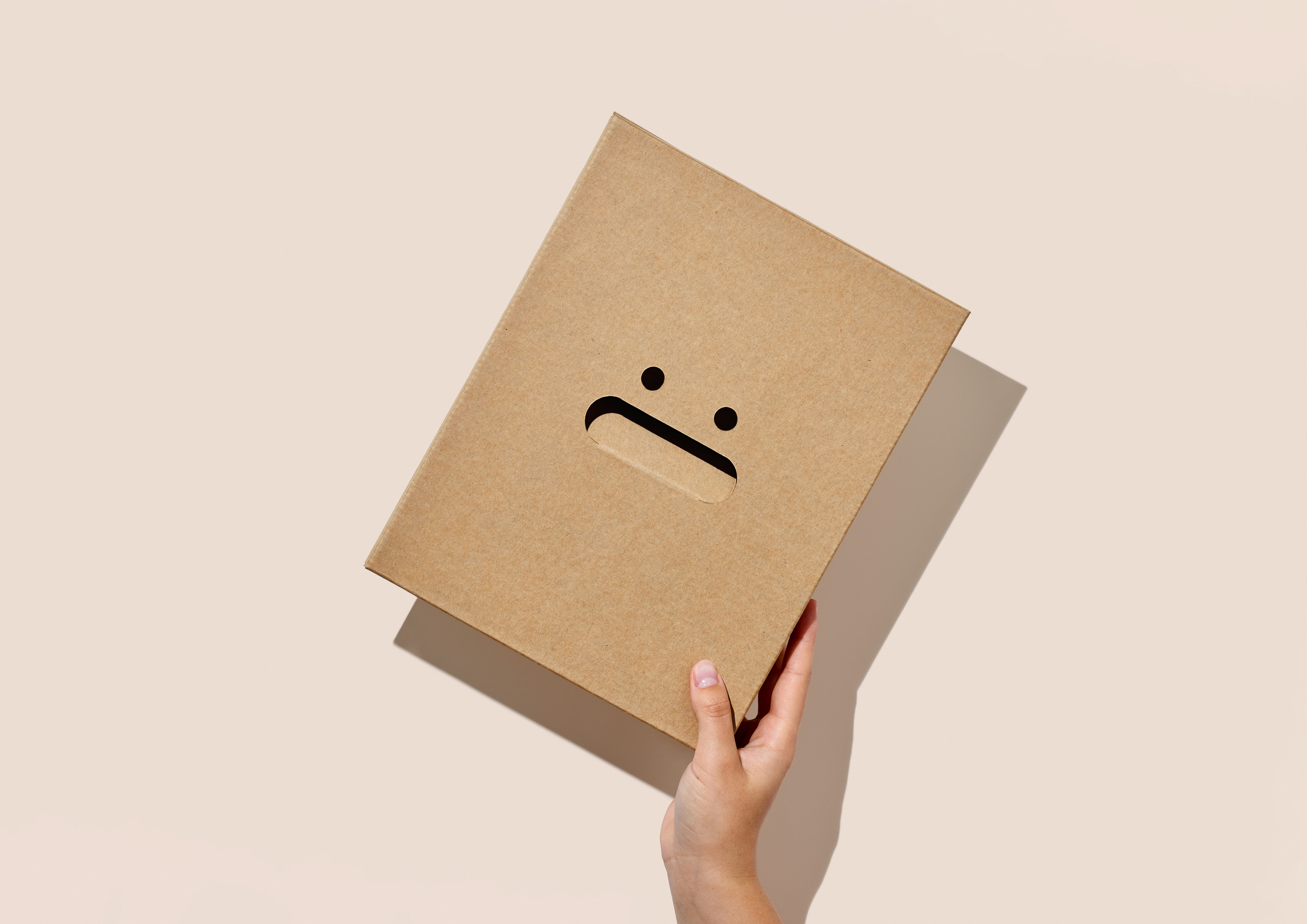
The wordmark is also based on Sul Sans with custom characters drawn from scratch by Seachange. ‘Think are incredibly hands-on with their process’, the creative director explains, ‘they create prototype after prototype, with just a scalpel and cardboard’. The logo quietly alludes to this with ‘small nicks’ in an almost perfect geometric construction, as if cut out with a blade.
On the whole, the project is simple, stylish and well-balanced – it’s a conversation starter. Approaching the work critically, it could be said that Toaki Okano’s minimal ‘still life’ style photography doesn’t exactly shout ‘structural packaging’ in the same way that Made Thought’s campaign images for G.F Smith creates desirability for specialist papers, or its marketing materials for Imprimerie Du Marais capture the potential of print, for example. In fact, at a glance, it wouldn’t be a stretch to assume that the campaign is continuation of Okano’s striking marketing photos for contemporary theatre producer Silo (art-directed by Alt Group).
But the visuals certainly grab attention and resonate with a creative audience. There is something refreshing about a sales pitch that delivers the challenge of a blank canvas rather than a portfolio of other clients’ innovations. We don’t need to be shown the full range to understand Think’s full potential, but we do get a sense of the company’s attention to detail, commitment to cardboard and its boisterous personality.
