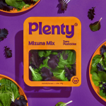
Everybird by Marx Design
Opinion by Richard Baird Posted 11 August 2022
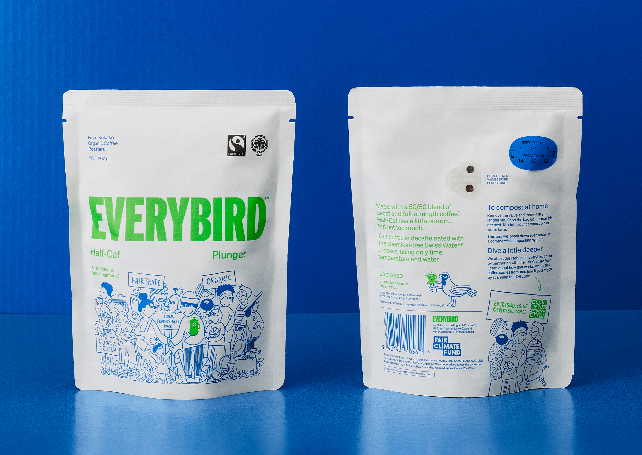
Few products have successfully integrated ethical, sustainable and environmental concerns with a product than coffee. It’s hard to imagine a time when the conditions of cultivation (both human and environmental) were not equal to flavour and – if we’re getting technical – whether the roast is blended or single origin.
With its smaller volumes, the speciality coffee market has challenged big brands’ often opaque approach to sourcing, championing direct negotiation with producers through increasingly D2C and subscription models. While this has had an impact on purchasing factors, there’s still a divide between third-wave speciality coffee and FMCG.
To mark this distinction, much like craft beer cans and sourdough pizza boxes, the artisanal coffee pouch has become a canvas for political statement as much as disruptive design, connecting coffee consumption with an ethical commitment not to exploit others. If you can afford this level of conscientiousness, you may want to further the cause, by letting people know.
This post includes Extended Insights for BP&O Plus members.
Find out more and sign-up here.
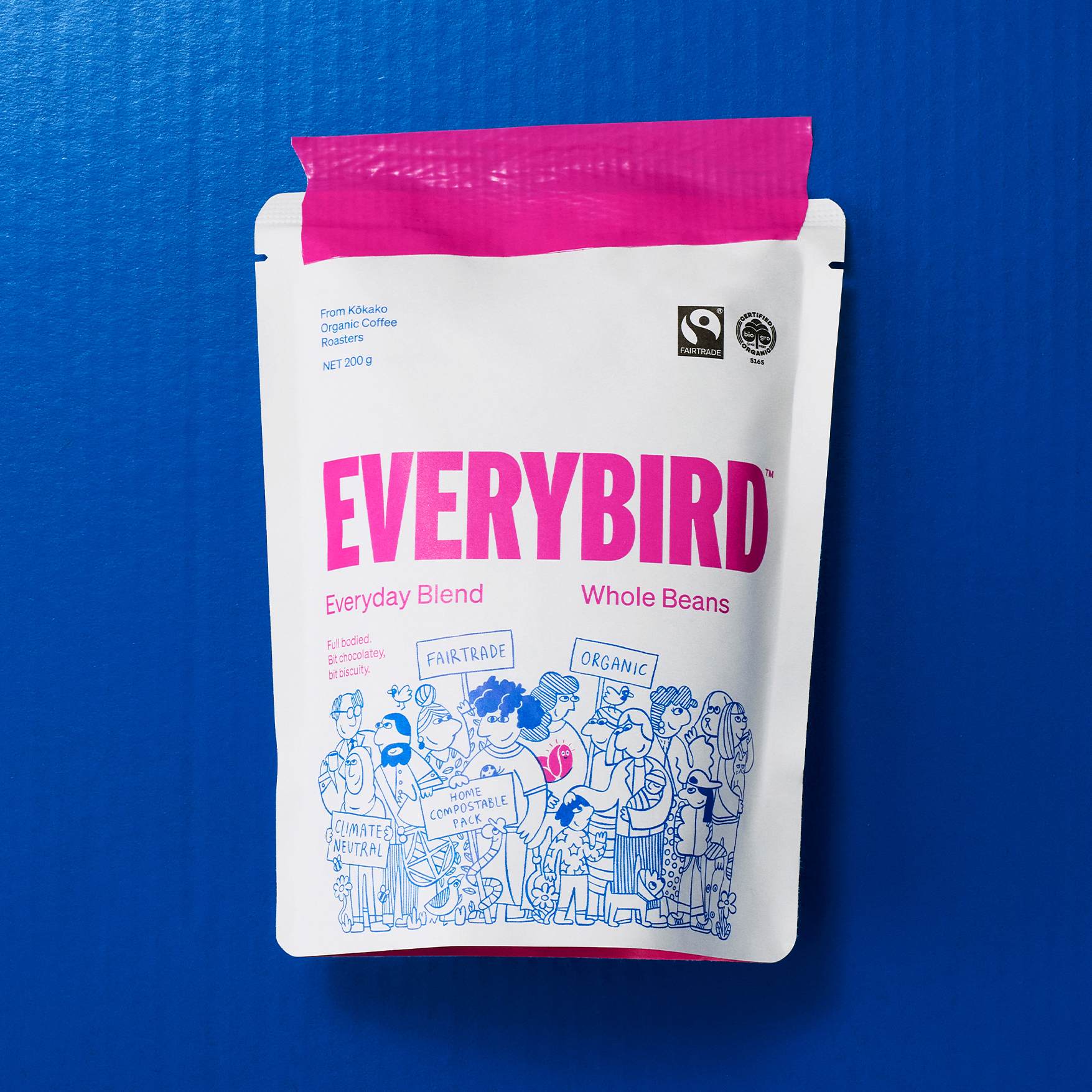
Across the industry, material language is functional with little variation, but the surface of the aerated pouch has become an expressive and competitive playground. The latest product-as-campaign is Everybird, a specialty coffee from Kiwi cafe Kōkako Organic Coffee Roasters who wanted to deliver an ethical shakeup to the everyday consumer in-store.
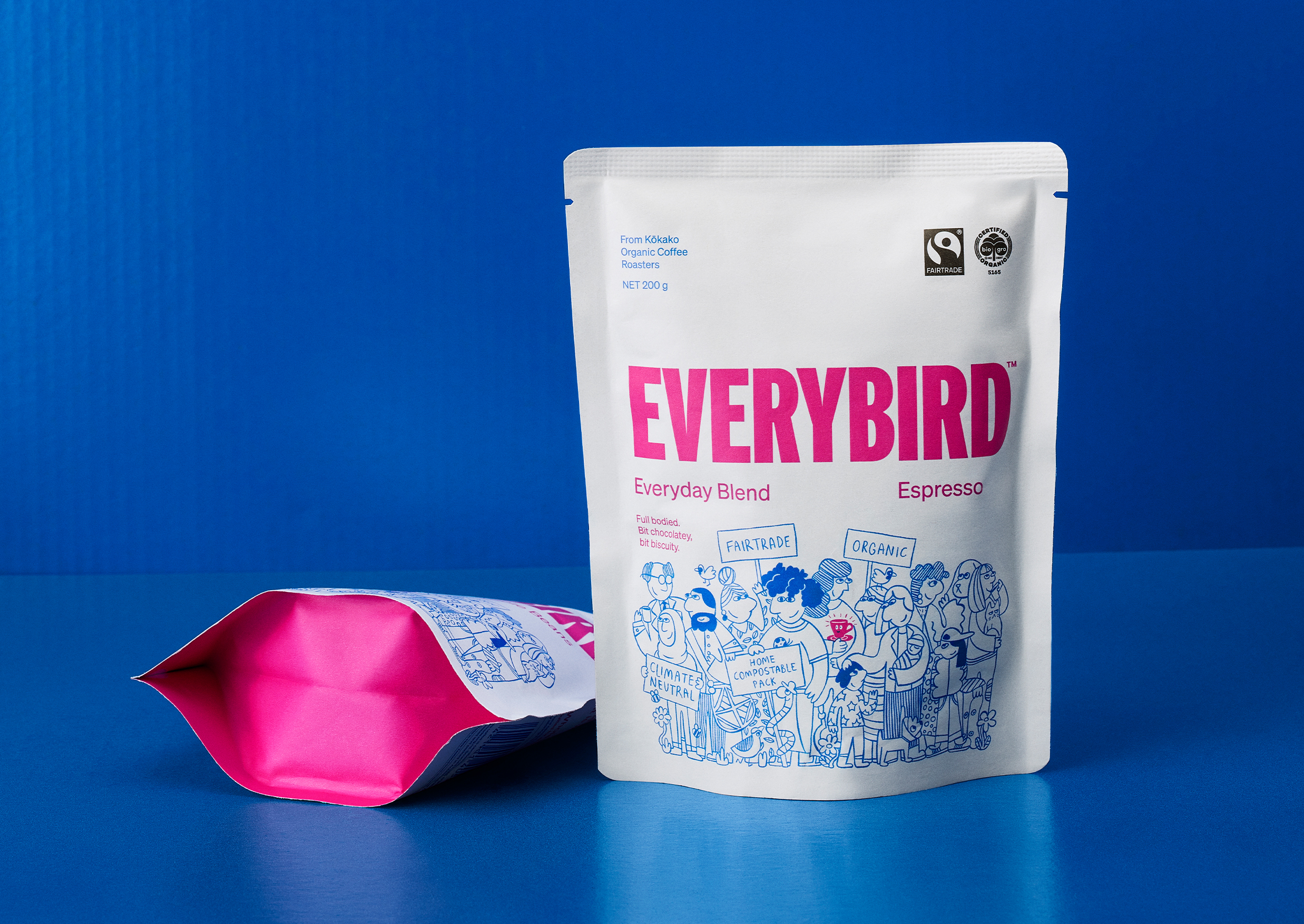
Everybird ticks all the boxes. It’s Fairtrade and organic. It’s climate neutral and the packaging is home-compostable. If you can afford it, you can enjoy your morning brew without the weight of the world on your shoulders. But the brand goes further, positioning purchase as a form of ‘consumer activism’: to buy Everybird furthers an ideal, to have it on your kitchen counter expresses that.
This might be seen a virtue signalling, were it not for the sheer conviviality of the work by Marx Design to position Everybird for ‘everybody’, focusing on civic responsibility as a collective effort. Saving the world doesn’t have to be a burden, but rather it can be an endeavour that brings people together. This informs naming, illustration and tone of voice.
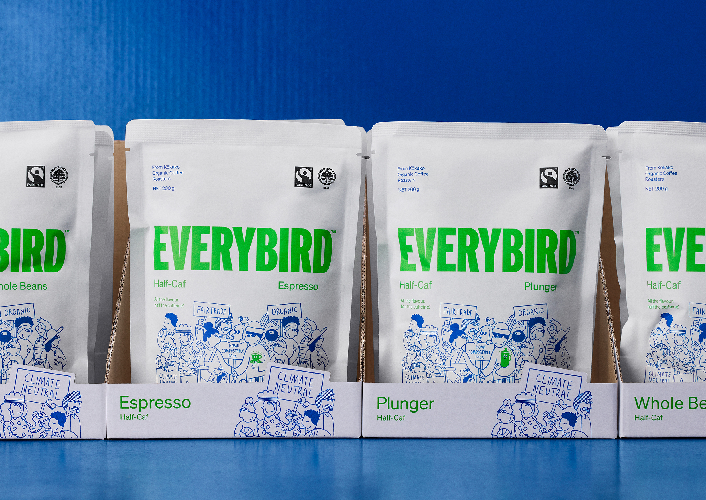
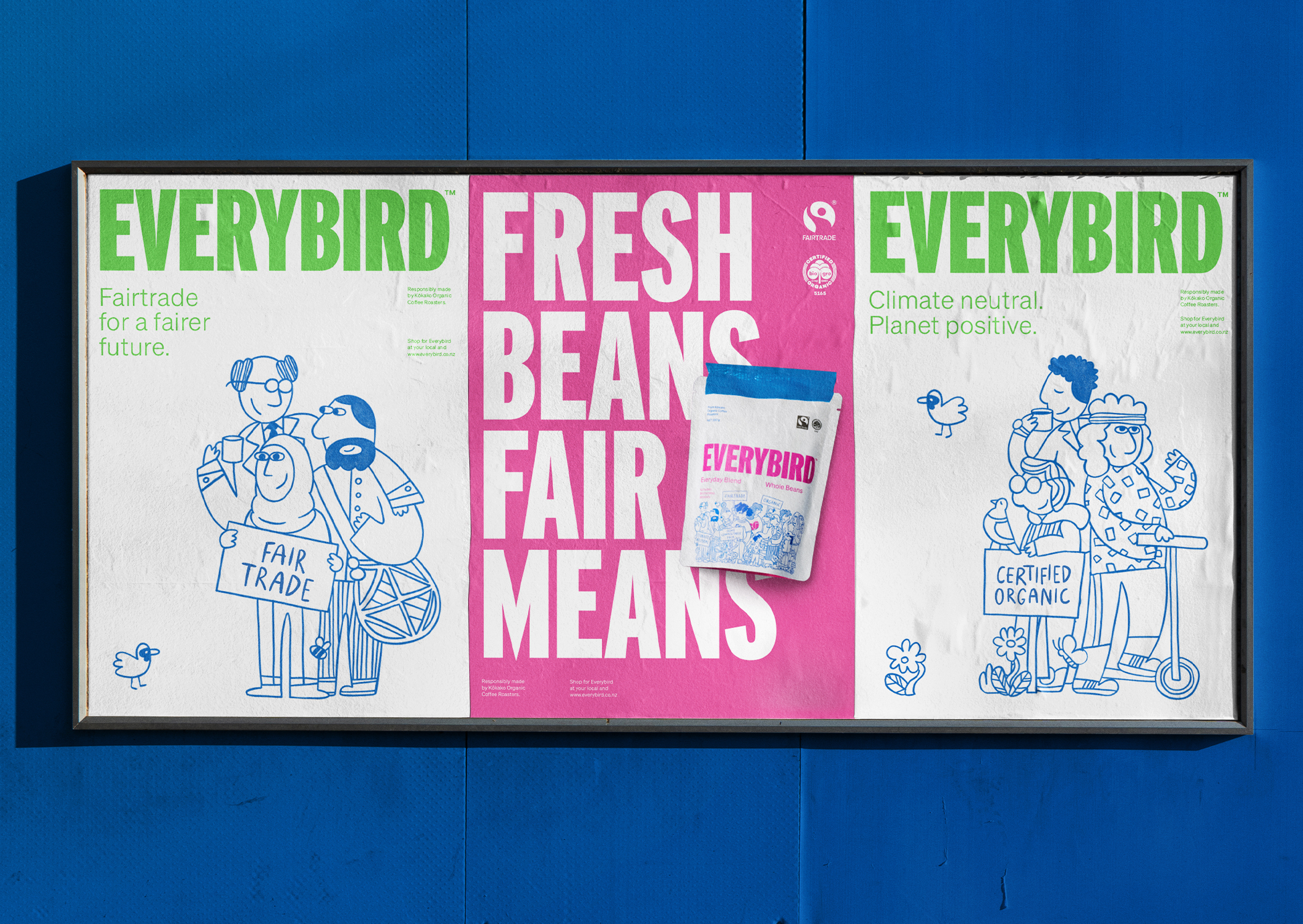
The illustrations centre pack are well-realised with fine lines and colour blocking, and elements of both abstraction and detail. They tell a story of representation and integration under a common cause through placards, people and some wildlife (both animals and plants) as reminders of our ecological responsibilities. The theme of diversity is continued with decent variation across packaging, newsprint and social media.
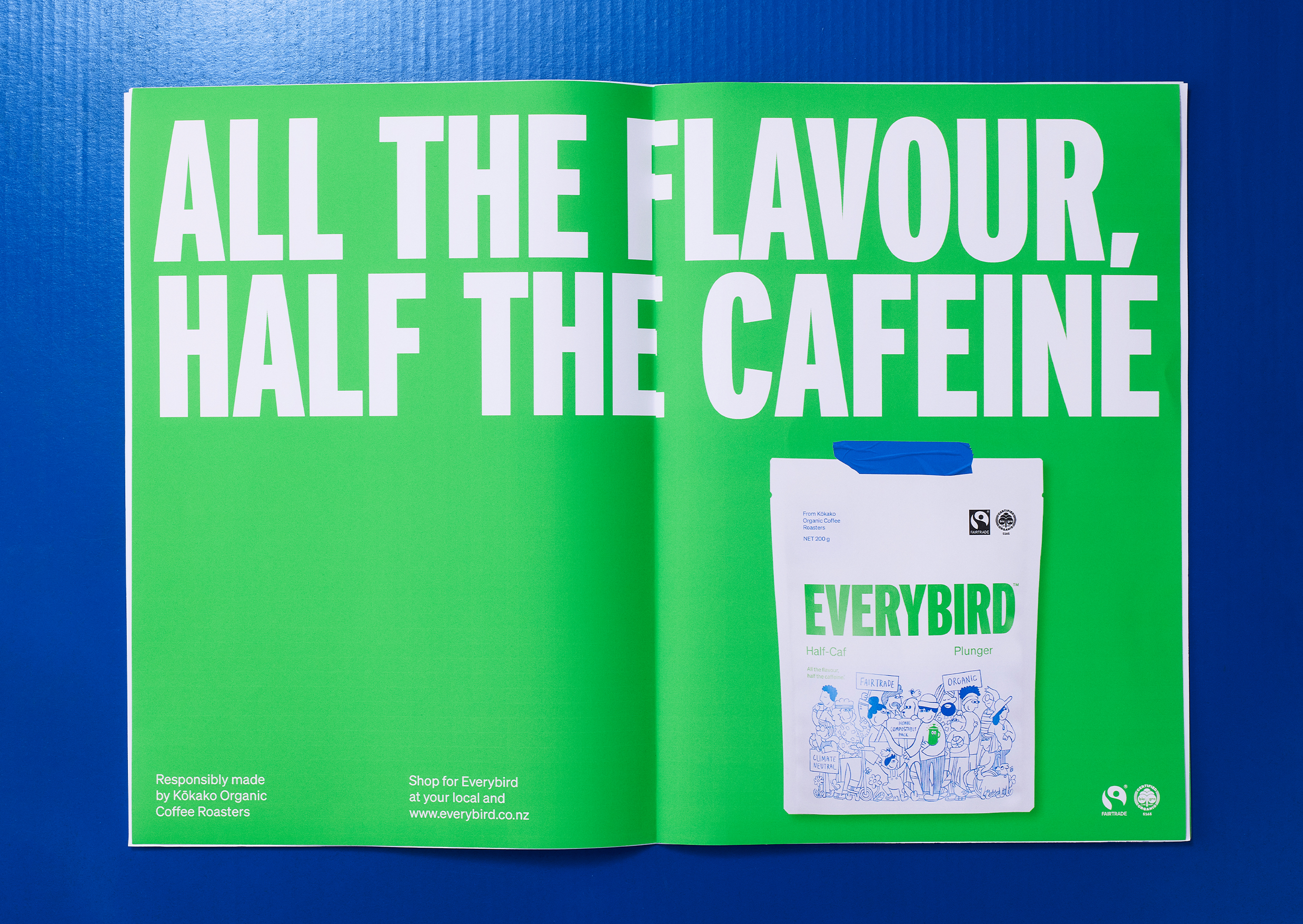
The landing page avoids anything esoteric or confrontational, with phrases like ‘a bit chocolatey’ and ‘a bit biscuity’. It’s invitational for the uninitiated. ‘Fresh beans, fair means’ is a satisfying rhyme that gets the point across, while ‘Wake up people’ has the clever double meaning relating both to environmental concerns and a decent caffeine hit in the morning.
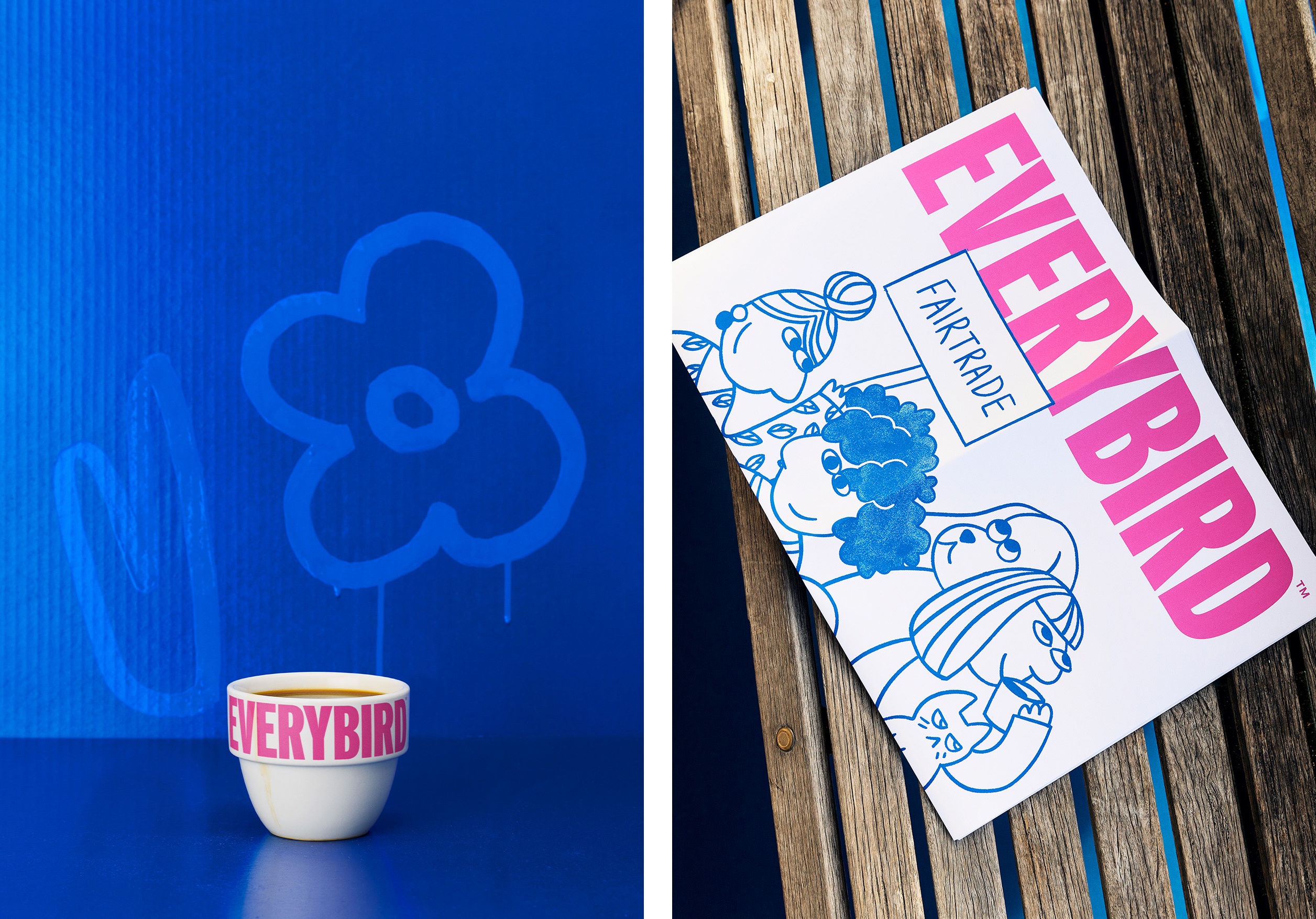
Typography catches the eye with a vocal uppercase condensed sans serif and the application of bright spot colour, which has impact against a white substrate, helping to stand out in a crowded market. In comms, brand statements are supported by blown up illustrative details – although stylistically different, there’s a thematic link between the text and the visuals, delivering contrast and interest, but also narrative continuity. Compositionally, these elemetns are clearly delineated in all contexts, print and digital, so the overall impression isn’t confused or muddy.
Everybird needed to leverage the credentials of parent brand Kōkako, to borrow some of its credibility in conversations about socio-environmental issues. The crossovers have been seen in the illustrative line work, colour blue and in the precision of execution. But while Kōkako’s brand language is formal, restrained and somewhat serious, Everybird is an accessible younger sibling. While Kōkako is a specific type of bird – an endangered forest birds that is endemic to New Zealand, to be precise – Everybird is, well, every bird.
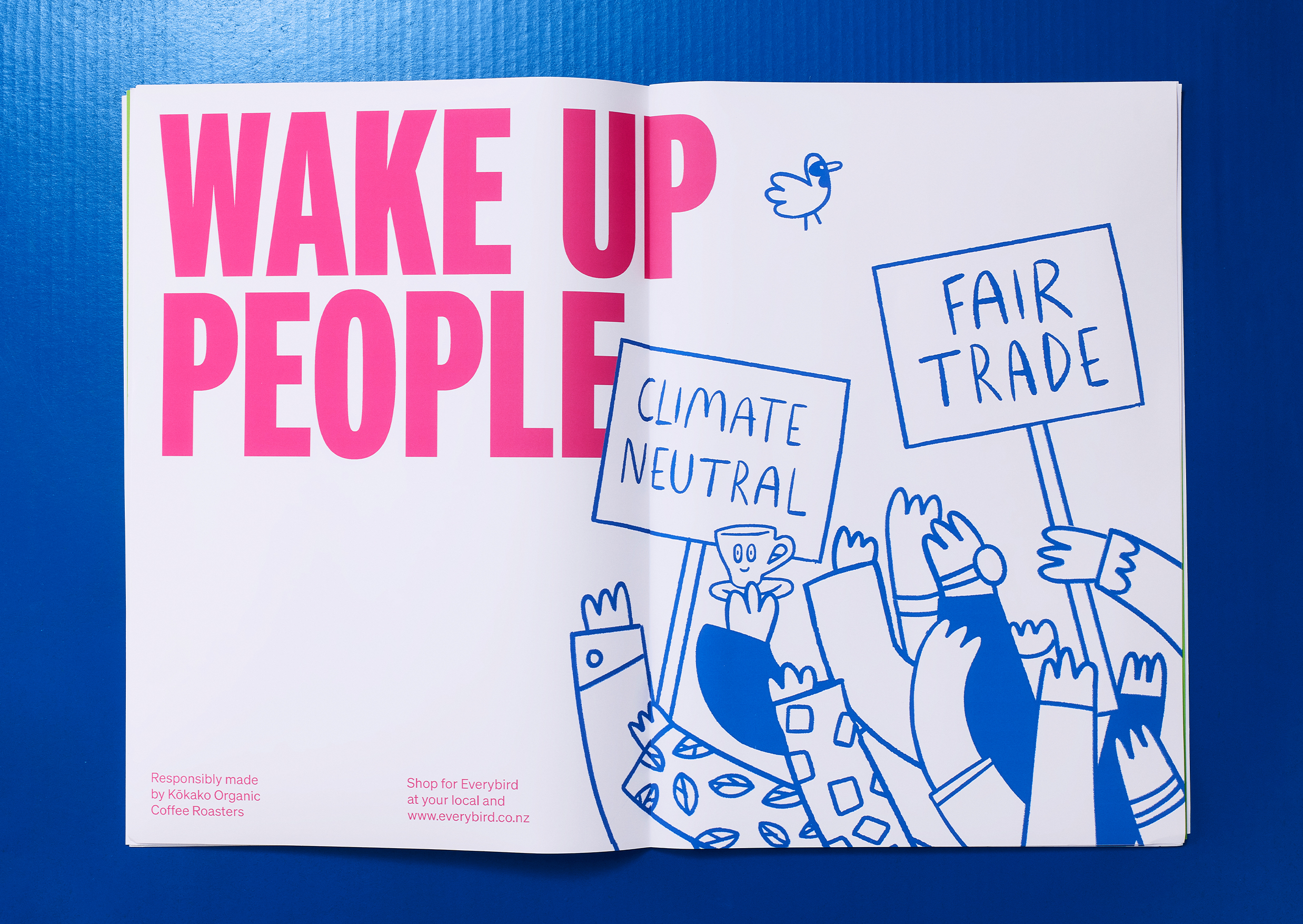
It’s fun, but to the point; it has a message, but doesn’t feel sanctimonious. The issues are adult but Marx Design has intelligently woven together assertiveness (type, colour and messaging) with welcoming and approachable personality traits (diversity and creativity). Typically, designers want to clarify, to seek immediacy and resonance – and there’s a risk of simplifying and infantilising in this process. But the studio has brought coherence to complexity.
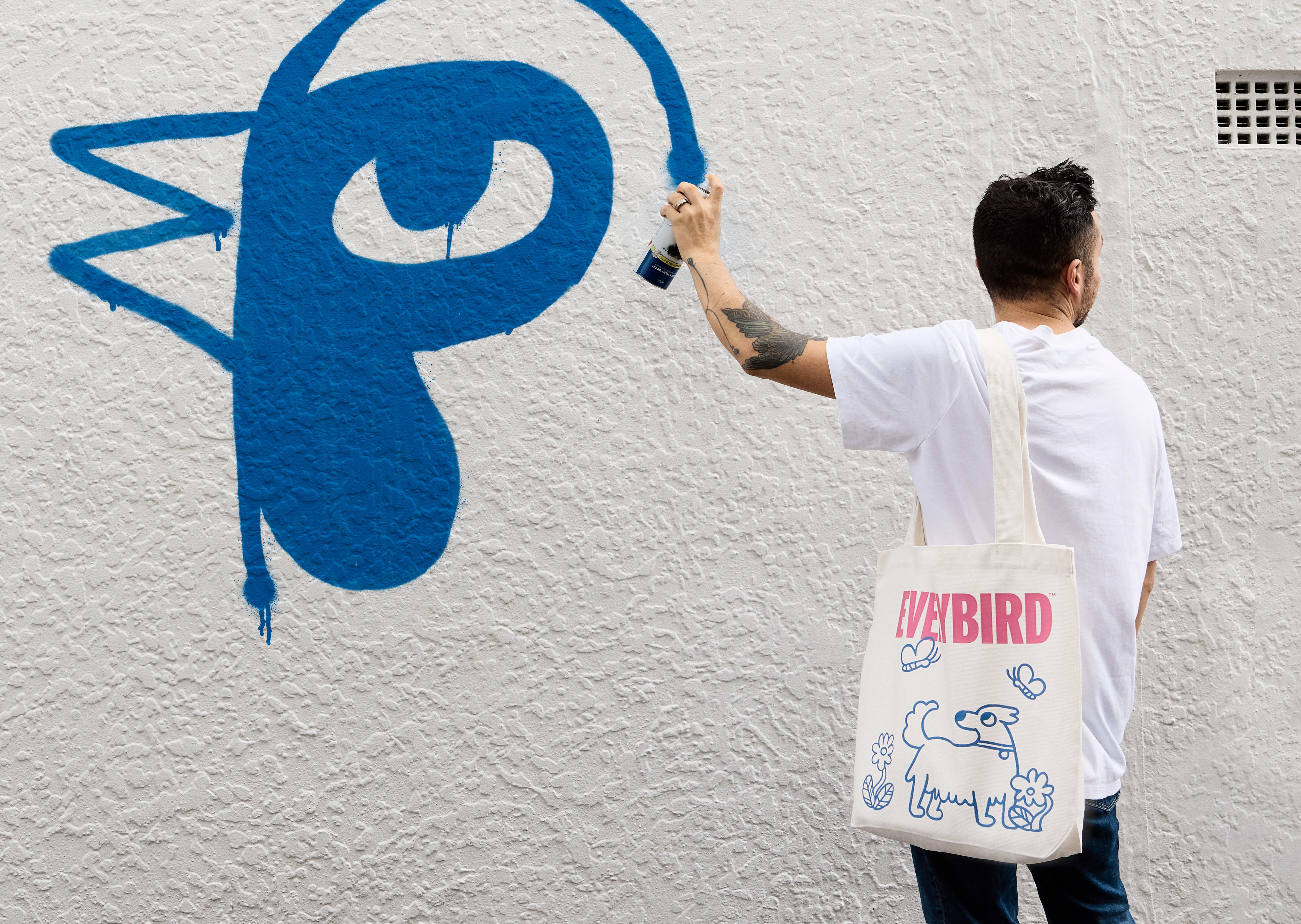
Our ethical, sustainable and environmental responsibility is a shared concern, and more people should be able to take action through the choices they make about the consumables they purchase. Everybird is positioned to facilitate this. With charming illustration that combines community (a cross-section of New Zealanders and their pets) and activism (placards and some graffiti for good measure), the brand prioritises messaging and the people that these people need to reach – all of them.
